
School Spirit
Webcomic Above Thread :o



McDuffies
Website: Very cute navigation that?s easy one the eyes color wise. I really love the navigation menu, it?s really cute ^^. I wish the bottom of the homepage was more organized, though. That McDuffies map is awesome. You do have a few broken links on you Banners page and on the bottom of each picture on some of your art pages and one on the Links page. Your Forums link is broken, too. Your author page is cute and funny, but I think some of the pictures could use some rearranging. All in all, good site design.
Writing: Honestly, I think the writing started pretty rough. There were some punctuation problems, spellings problems, and wording problems that were pretty severe. (Though I don?t really think this is a writing thing but?) you had some words falling out of the speech bubbles. I thought this page had really awkward wording:
http://mcduffies.keenspace.com/d/20011109.html
I think the last thing Beckie says can be reworded. The writing is funny all the way through, though, and gets much better as it goes on. These are some of my favorite pages:
http://mcduffies.keenspace.com/d/20011117.html (hygiene with blood? ha)
http://mcduffies.keenspace.com/d/20011204.html (last panel )
)
http://mcduffies.keenspace.com/d/20011207.html
(and lots of other ones I won?t list here).
Another thing (again, not sure if it?s a writing issue) is that there are so many cast members *_*. It?s kind of hard to keep track of everyone, and some people look the same. I find my self often forgetting names. Gordon and Rebecca are the most memorable characters for me, though. I think they have the most noticeable personalitites.
Art: Like the writing, the artwork started out bumpy. Sometimes it seemed to crowded/messy for me to know what was what. Like here, for example:
http://mcduffies.keenspace.com/d/20011123.html (second panel, I?m assuming he?s shooting but it doesn?t look really clear to me?)
http://mcduffies.keenspace.com/d/20020103.html (not sure what he?s grabbing in the first panel)
http://mcduffies.keenspace.com/d/20040925.html (first panel...)
Also, I would suggest varying your lines a little more. I think that would make some things a bit more clear. Like here:
http://mcduffies.keenspace.com/d/20040918.html
Other: Update mooooore! I really like your comic, but there?s a lack of updates ;__;
Overall: While the writing can use some work in many places, this is a really funny comic. Keep up the good work! 4/5
A little Rebecca art because I took so long. I'm really sorry:

Website: Very cute navigation that?s easy one the eyes color wise. I really love the navigation menu, it?s really cute ^^. I wish the bottom of the homepage was more organized, though. That McDuffies map is awesome. You do have a few broken links on you Banners page and on the bottom of each picture on some of your art pages and one on the Links page. Your Forums link is broken, too. Your author page is cute and funny, but I think some of the pictures could use some rearranging. All in all, good site design.
Writing: Honestly, I think the writing started pretty rough. There were some punctuation problems, spellings problems, and wording problems that were pretty severe. (Though I don?t really think this is a writing thing but?) you had some words falling out of the speech bubbles. I thought this page had really awkward wording:
http://mcduffies.keenspace.com/d/20011109.html
I think the last thing Beckie says can be reworded. The writing is funny all the way through, though, and gets much better as it goes on. These are some of my favorite pages:
http://mcduffies.keenspace.com/d/20011117.html (hygiene with blood? ha)
http://mcduffies.keenspace.com/d/20011204.html (last panel
)http://mcduffies.keenspace.com/d/20011207.html
(and lots of other ones I won?t list here).
Another thing (again, not sure if it?s a writing issue) is that there are so many cast members *_*. It?s kind of hard to keep track of everyone, and some people look the same. I find my self often forgetting names. Gordon and Rebecca are the most memorable characters for me, though. I think they have the most noticeable personalitites.
Art: Like the writing, the artwork started out bumpy. Sometimes it seemed to crowded/messy for me to know what was what. Like here, for example:
http://mcduffies.keenspace.com/d/20011123.html (second panel, I?m assuming he?s shooting but it doesn?t look really clear to me?)
http://mcduffies.keenspace.com/d/20020103.html (not sure what he?s grabbing in the first panel)
http://mcduffies.keenspace.com/d/20040925.html (first panel...)
Also, I would suggest varying your lines a little more. I think that would make some things a bit more clear. Like here:
http://mcduffies.keenspace.com/d/20040918.html
Other: Update mooooore
! I really like your comic, but there?s a lack of updates ;__;Overall: While the writing can use some work in many places, this is a really funny comic. Keep up the good work! 4/5
A little Rebecca art because I took so long. I'm really sorry:
Last edited by Nicotine on Tue Nov 22, 2005 7:15 am, edited 3 times in total.
<A href="http://www.drunkduck.com/Presence/" target="_blank"><img src="http://img.photobucket.com/albums/v160/ ... anner3.jpg" alt="Presence">

First Impressions: A solid title, good art, nice toning, comparable art to Noir et Compagnie, yet a little more serious.
Art: It is a good start. The beginning is fairly detailed, and the settings are comprehensible, if not especially detailed. The backgrounds are sparse, which I think is crippling the comic. If you're going to have an action comic set in a city, it would be best to draw some backgrounds. Even just a target in front of the female cop would really help.
Writing: It's an interesting start. I like the idea of a dystopic future, and including Mormons in the dystopia (though it could be offensive to Mormons) is something that piques my interest, since I think it is possible. There are a number of spelling mistakes, some which really ought to be fixed to avoid insulting anyone. (Mormons is misspelled as morons on the Sep. 10th comic) It's a really sensitive thing, and I'd be sure I knew a lot about mormon culture before doing something like this. You may, and more power to you if you do.
Overall: I think it's a good start. It's difficult to make an accurate judgement, since it's just started. But I can say that I'm interested in the main character's motivation and her search for justice, and I'll keep an eye on this one.
7/10
Art: It is a good start. The beginning is fairly detailed, and the settings are comprehensible, if not especially detailed. The backgrounds are sparse, which I think is crippling the comic. If you're going to have an action comic set in a city, it would be best to draw some backgrounds. Even just a target in front of the female cop would really help.
Writing: It's an interesting start. I like the idea of a dystopic future, and including Mormons in the dystopia (though it could be offensive to Mormons) is something that piques my interest, since I think it is possible. There are a number of spelling mistakes, some which really ought to be fixed to avoid insulting anyone. (Mormons is misspelled as morons on the Sep. 10th comic) It's a really sensitive thing, and I'd be sure I knew a lot about mormon culture before doing something like this. You may, and more power to you if you do.
Overall: I think it's a good start. It's difficult to make an accurate judgement, since it's just started. But I can say that I'm interested in the main character's motivation and her search for justice, and I'll keep an eye on this one.
7/10

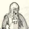
The Green Avenger
First impression: Superheroes light.
Story: Starts off rather light and humourous, but gains seriousness over time, and evolves into a addictive story with the qualities of a good television series: You want to know what's going to happen next. Good superheroes jokes.
Art: Frankly, the first page is not very inviting. The art does, however, improve at an almost frightning pace, and very quickly become rather good. I would suggest a makeover of the first two pages, to encourage new readers. As of late most pages have been coloured as well.
Web page: The colour theme is consistant with the story, and navigation is simple. The page does not contain much besides the comic, though. The art gallery isn't innovative in any way, but it works, and is easily navigateable. The cast page only contains info on the main hero.
Over all: One of my regular reads.
First impression: Superheroes light.
Story: Starts off rather light and humourous, but gains seriousness over time, and evolves into a addictive story with the qualities of a good television series: You want to know what's going to happen next. Good superheroes jokes.
Art: Frankly, the first page is not very inviting. The art does, however, improve at an almost frightning pace, and very quickly become rather good. I would suggest a makeover of the first two pages, to encourage new readers. As of late most pages have been coloured as well.
Web page: The colour theme is consistant with the story, and navigation is simple. The page does not contain much besides the comic, though. The art gallery isn't innovative in any way, but it works, and is easily navigateable. The cast page only contains info on the main hero.
Over all: One of my regular reads.

-
Dutch!

- Red galah
- Posts: 4644
- Joined: Sat Jun 19, 2004 4:39 am
- Location: The best place on this little blue rock
- Contact:
In a bid to get this thread rolling again, I'm gonna jump in and give Turi a review. After all, he's done one himself, he deserves one in return. Otherwise it's just not fair. If anybody wants to continue this thread, that's fine. if not, at least we all end up with a review and it can close fairly.
Okay then...
VEDRBLAKA'S SAGA (I think that's how you spell it)
SITE:
It's pretty much the bare minimum. There's the comic in the middle, a tagboard down the sign, a text link to the forum, and a few text links of favourite comics. Also, there is a small calendar, and at least a story dropdown to help out with quicker navigation. Maybe an archive page or option would be useful too, but otherwise, except the possibility of background information on the culture and mythology the story and world is based on, the site has enough covered to be serviceable.
It could be set out a little cleaner, perhaps with a few borders or things to separate the various bits and pieces, but it works well enough.
ART:
It's all pencil work, and with a hastily sketchy style. It gets better throughout the relatively short archive, but I found it looked pretty good and was suitable for the comic. It reminded me of the old style novels where every chapter there would be a small illustration sketched amongst the prose.
My main gripe would be about the finishing of the artwork. The whole page has been scanned in, and it looks like eraser smudges and so forth have been left in (or at least scanned in). Maybe a bit of cleaning between the panels would help it stand out better. Also, I think the comic itself could do with a border or something to separate it from the site background.
One strip late in the archive experimented with computer fonts for text, but it stood out so much that I'm glad the writer went back to handwritten text. The handwritten text suits the sketchy style, although it would be better to take more time planning out the text and writing a little more legibly in places. Most of the pencil work is dark enough to see clearly, except for the current strip, but it appears this is an experiment with different pencils.
WRITING:
I get the feeling this story is based on Scandinavian mythology and the names or places and plants and so forth appear very Norse. I quite liked the fantastical feel this gave the strip, but this is one instance where the handwriting needs to be clear so these sort of names and spellings can be clearly seen.
The story hasn't really progressed too far. It's an easy read, which is good, although at times some little events seem to be included for no apparent reason and don't yet seem to link in with the rest of the world. This may be proven wrong with future updates though. The comic is on hiatus for the moment while school work reigns supreme, so it is not known when it will once more continue.
When it does, I may just drop back by and give it a further look.
Right. Now everyone who has reviewed already either has a review, or is awaiting one from the poster after them. Provided those post their promised reviews, it doesn't matter so much if this thread dies.
I'll leave it here then, and we'll see what happens next.
Cheers.
Okay then...
VEDRBLAKA'S SAGA (I think that's how you spell it)
SITE:
It's pretty much the bare minimum. There's the comic in the middle, a tagboard down the sign, a text link to the forum, and a few text links of favourite comics. Also, there is a small calendar, and at least a story dropdown to help out with quicker navigation. Maybe an archive page or option would be useful too, but otherwise, except the possibility of background information on the culture and mythology the story and world is based on, the site has enough covered to be serviceable.
It could be set out a little cleaner, perhaps with a few borders or things to separate the various bits and pieces, but it works well enough.
ART:
It's all pencil work, and with a hastily sketchy style. It gets better throughout the relatively short archive, but I found it looked pretty good and was suitable for the comic. It reminded me of the old style novels where every chapter there would be a small illustration sketched amongst the prose.
My main gripe would be about the finishing of the artwork. The whole page has been scanned in, and it looks like eraser smudges and so forth have been left in (or at least scanned in). Maybe a bit of cleaning between the panels would help it stand out better. Also, I think the comic itself could do with a border or something to separate it from the site background.
One strip late in the archive experimented with computer fonts for text, but it stood out so much that I'm glad the writer went back to handwritten text. The handwritten text suits the sketchy style, although it would be better to take more time planning out the text and writing a little more legibly in places. Most of the pencil work is dark enough to see clearly, except for the current strip, but it appears this is an experiment with different pencils.
WRITING:
I get the feeling this story is based on Scandinavian mythology and the names or places and plants and so forth appear very Norse. I quite liked the fantastical feel this gave the strip, but this is one instance where the handwriting needs to be clear so these sort of names and spellings can be clearly seen.
The story hasn't really progressed too far. It's an easy read, which is good, although at times some little events seem to be included for no apparent reason and don't yet seem to link in with the rest of the world. This may be proven wrong with future updates though. The comic is on hiatus for the moment while school work reigns supreme, so it is not known when it will once more continue.
When it does, I may just drop back by and give it a further look.
Right. Now everyone who has reviewed already either has a review, or is awaiting one from the poster after them. Provided those post their promised reviews, it doesn't matter so much if this thread dies.
I'll leave it here then, and we'll see what happens next.
Cheers.
Remember when your imagination was real? When the day seemed
longer than it was, and tomorrow was always another game away?

longer than it was, and tomorrow was always another game away?
-
Dutch!
- Red galah
- Posts: 4644
- Joined: Sat Jun 19, 2004 4:39 am
- Location: The best place on this little blue rock
- Contact:
Bumping this one up as a nice, polite reminder to those still in the middle somewhere to pull their fingers out and finish their promised reviews of the strips above them.
Again, I'm not particularly fussed if my missing one doesn't get done, cos I received one in this thread already, but there are still three others that are waiting for reviews as well.
After all, you put your hand up for something like this, you've got the obligation, eh?
Again, I'm not particularly fussed if my missing one doesn't get done, cos I received one in this thread already, but there are still three others that are waiting for reviews as well.
After all, you put your hand up for something like this, you've got the obligation, eh?
Remember when your imagination was real? When the day seemed
longer than it was, and tomorrow was always another game away?
longer than it was, and tomorrow was always another game away?
-
Rocknjosie

- Regular Poster
- Posts: 217
- Joined: Wed Oct 05, 2005 11:22 am
- Location: Berkeley, CA
- Contact:
Well since you posted twice, I thought I'd take a crack at a review even though McDuffies has a placeholder. Two reviews are better than one, no? So...
Art
Personally, I liked the comic better without color. You use mostly curves and circular shapes, which creates the innocence which essentially is the charm of any childhood strip. But when combined with the uber clear colors a computer can produce, it looks overly perfect. The shadows feel randomly placed too. Taking your latest comic as an example, the shadows aren't relative to any light source. The school looks like it has spotlights searching the area, and inside the school house, which really shouldn't have too many shadows as its nothing but flourescent lighting beaming down on you from above, the teacher looks like she's been sitting in a gutter all day.
Contrasting that with your earlier strips, such as here
http://schoolspirit.comicgenesis.com/d/20040623.html
the art stands more on its own, though you still used a gray to white gradient for the background which irks me.
Now here, http://schoolspirit.comicgenesis.com/d/20041230.html is a much better color job, but even still the shadows are almost at random. The colors are much more toned down though, they aren't so bright and agressive.
Site
The site is quite cute. It's set up to look like a schooldesk which goes right along with the comic. I think it would add a ton if you altered the background to have scratches and pen markings, as any schooldesk worth its weight should have. It would solidify it's position as a desk and not just the side of a tv table or something. Also, going through your archives I was accosted by some adds, a metabolife add went so far as to cover your comic, with no visible way to close it. I don't mind adds, I mean its between that and pandering for money, so I'll take another classmates.com add over a donate-o-thon but when they interupt my ability to actually read the comic, then they've gone too far
Story
For the most part I enjoy the writting. The characters are endearing, and it paints a pretty believable picture of childhood. Sometimes I feel like I'm being overly punned (school spirit, main character casper, cemetary next door to the school) or here
http://schoolspirit.comicgenesis.com/d/20050118.html
All in all an enjoyable strip, 3 out of 5
Art
Personally, I liked the comic better without color. You use mostly curves and circular shapes, which creates the innocence which essentially is the charm of any childhood strip. But when combined with the uber clear colors a computer can produce, it looks overly perfect. The shadows feel randomly placed too. Taking your latest comic as an example, the shadows aren't relative to any light source. The school looks like it has spotlights searching the area, and inside the school house, which really shouldn't have too many shadows as its nothing but flourescent lighting beaming down on you from above, the teacher looks like she's been sitting in a gutter all day.
Contrasting that with your earlier strips, such as here
http://schoolspirit.comicgenesis.com/d/20040623.html
the art stands more on its own, though you still used a gray to white gradient for the background which irks me.
Now here, http://schoolspirit.comicgenesis.com/d/20041230.html is a much better color job, but even still the shadows are almost at random. The colors are much more toned down though, they aren't so bright and agressive.
Site
The site is quite cute. It's set up to look like a schooldesk which goes right along with the comic. I think it would add a ton if you altered the background to have scratches and pen markings, as any schooldesk worth its weight should have. It would solidify it's position as a desk and not just the side of a tv table or something. Also, going through your archives I was accosted by some adds, a metabolife add went so far as to cover your comic, with no visible way to close it. I don't mind adds, I mean its between that and pandering for money, so I'll take another classmates.com add over a donate-o-thon but when they interupt my ability to actually read the comic, then they've gone too far
Story
For the most part I enjoy the writting. The characters are endearing, and it paints a pretty believable picture of childhood. Sometimes I feel like I'm being overly punned (school spirit, main character casper, cemetary next door to the school) or here
http://schoolspirit.comicgenesis.com/d/20050118.html
All in all an enjoyable strip, 3 out of 5

-
Blackaby
- Regale her
- Posts: 3441
- Joined: Wed May 25, 2005 3:34 pm
- Location: Sitting on the pudge.
- Contact:
Waist High is about a group of little girls (and a few boys thrown in for colour) who get up to adventures and hijinks. In terms of characters and styles it resembles strips like Peanuts, but with a more modern and adult twist - for example there are jokes about stuff that wouldn't get mentioned by Schultz!
The comic is funny although I didn't exacty laugh out loud. Some of the jokes (Like the "You know we're seven" punchline) I'm pretty sure are from Peanut strips, which is good because it's a kind of 'pointed' reference, but not as funny when it's the second time around.
Okay, characters... In the beginning, before Josie goes to private school, you have a pretty typically Peanuts set up where the girls are (mainly) totally pwning the weaker, ineffective boys. Sure it's kind of funny but it isn't anything new. Later though, at the private school, the characters start to develop and grow, and the story brings in issues of bullying, etc. Having read the archive I think this is going to be the point where the comic really starts to move out into its own territory and will address some of the modern issues about growing up.
Other characters: the adults in the story are kind of invisible - but only in so much as it doesn't show their faces, other than that the adults are fully involved in the stories. I'm not sure what the point of that is - if it's yet another nod to Peanuts, because it doesn't seem to sit right if the adults actually talk. And I don't know WTF that rabbit thing is. Yikes. That really creeped me out.
Moving on...
The main problems I had with Waist High are the art, which is done in a "primary school" style, like kids would draw it. This is a pretty cool idea but for several reasons it doesn't achieve its full potential. Firstly the scanning of the images is pretty terrible, the line art isn't very smooth, and the colouring (when the comic is coloured) rarely reaches the edges of the artwork. It's kind of a waste of a good idea, and all it really needs to fix it up is for more time to be spent on the drawing.
I can see there have been improvements recently, such as a changed size in the comic (YAY) and also it went back to hand-lettering, which is so much more attractive especially on this style of comic. Even the scanning seems better.. but please rub out your pencil lines! I do think the comic looks best when it is coloured - but some of the choices of colours are kinda weird. I especially don't like the colour of Josie's skin... She's meant to be black but because of your colour choice she has a weird green tinge that makes her look like a zombie. If you're serious about colouring, you're going to have to actually pick a palette of colours to use instead of just going of primaries with the odd weird-ass colour thrown in.
The website is bare bones, nothing much to speak of, not really worth commenting on...
Okay in summary, I feel the comic is still finding its way and trying to work out where it is going. There are some good characters there and it is a potentially interesting set up, moreso now since it's started to ditch the Peanuts thing. The writing is strong and is gradually entering some very original and novel territory. I wouldn't recommend it yet, because there are a lot of improvements that need to be done, but it looks like in the long run it'll be a fun and relevant comic.
The comic is funny although I didn't exacty laugh out loud. Some of the jokes (Like the "You know we're seven" punchline) I'm pretty sure are from Peanut strips, which is good because it's a kind of 'pointed' reference, but not as funny when it's the second time around.
Okay, characters... In the beginning, before Josie goes to private school, you have a pretty typically Peanuts set up where the girls are (mainly) totally pwning the weaker, ineffective boys. Sure it's kind of funny but it isn't anything new. Later though, at the private school, the characters start to develop and grow, and the story brings in issues of bullying, etc. Having read the archive I think this is going to be the point where the comic really starts to move out into its own territory and will address some of the modern issues about growing up.
Other characters: the adults in the story are kind of invisible - but only in so much as it doesn't show their faces, other than that the adults are fully involved in the stories. I'm not sure what the point of that is - if it's yet another nod to Peanuts, because it doesn't seem to sit right if the adults actually talk. And I don't know WTF that rabbit thing is. Yikes. That really creeped me out.
Moving on...
The main problems I had with Waist High are the art, which is done in a "primary school" style, like kids would draw it. This is a pretty cool idea but for several reasons it doesn't achieve its full potential. Firstly the scanning of the images is pretty terrible, the line art isn't very smooth, and the colouring (when the comic is coloured) rarely reaches the edges of the artwork. It's kind of a waste of a good idea, and all it really needs to fix it up is for more time to be spent on the drawing.
I can see there have been improvements recently, such as a changed size in the comic (YAY) and also it went back to hand-lettering, which is so much more attractive especially on this style of comic. Even the scanning seems better.. but please rub out your pencil lines! I do think the comic looks best when it is coloured - but some of the choices of colours are kinda weird. I especially don't like the colour of Josie's skin... She's meant to be black but because of your colour choice she has a weird green tinge that makes her look like a zombie. If you're serious about colouring, you're going to have to actually pick a palette of colours to use instead of just going of primaries with the odd weird-ass colour thrown in.
The website is bare bones, nothing much to speak of, not really worth commenting on...
Okay in summary, I feel the comic is still finding its way and trying to work out where it is going. There are some good characters there and it is a potentially interesting set up, moreso now since it's started to ditch the Peanuts thing. The writing is strong and is gradually entering some very original and novel territory. I wouldn't recommend it yet, because there are a lot of improvements that need to be done, but it looks like in the long run it'll be a fun and relevant comic.
Last edited by Blackaby on Mon Oct 24, 2005 3:22 pm, edited 2 times in total.


-
Anywherebuthere

- Cartoon Hero
- Posts: 1500
- Joined: Tue Jan 04, 2005 8:29 pm
- Location: North-da-fucking-kota
- Contact:
Blackaby
The Concept:
Imagine, if you will, a world where the Addams Family, Dilbert, and the book of Revelations wind up having one big party and everyone goes home drunk in some sort of three way of Caligulian proportions.
Sure, mistakes are made, and 3 months later the whore of babbylon births...well...something like Blackaby.
Where Dillbert's mantra is "work is hell"...Blackaby's underlying theme is "Hell is Work".
Which, all things considered, hell IS work for those who have to do it. You schulpp your pitchforks, you lift your gillotines. Punch the time card, go home, shag an Angel, or get shagged by some thing who's name is completly unpronouncable without a beak and 17 tounges, and go back in for another 9-5 of torturing souls and tempting little children with heavy metal lyrics.
Toss in the type of black humor that Charles Addams and Richard Gorey made infamous and you get a very interesting comic with a rather tasty read.
The Art:
Blackaby has a rather interesting setup for art duties. Primairly, storylines appear to be handled by Viger...not to be confused with Vigo, the Carpathian.
Viger's line work is rather crisp, and conveys a great deal of detail, as well as a great deal of emotion.
The color is rather vibrant, even for hell...which leads me to believe that hell is...well...rather electric. It works VERY well for the strip.
However, Blackaby feels almost like a montly comic anthology. We've been introduced to two other Guest Artists at this time, both with vastly different styels from Vigers line work. Both work well, and yet, it does feel a bit distracting.
I'm not complaining, as much as noting that having the different artists does feel a little shocking. And yet, it's very interesting to see the characters each rendered in a different artistic style.
The Writing:
The Writing in Blackaby is...dry. Like a fine fine fine Martini. Hell is a corporate world...or is it the corporate world is hell...
Again, hard to remember some times.
The humor is straight up dry humor, where the weight of nuclear winter is met with as much seriousness as downloading a Metallica album.
Personally I love it.
The normality of the macabre is just fun to run around in. Again, I'm reminded of Charles Addams strips where the horror of death is so offset of the humor of the situation that one cannot help but laugh out loud and realize that you're soul just died a little.
Which, given it's a strip about hell...makes it even more ironic I guess.
The Web Site:
My only complaint about the web site is just how hard it is to find the individual "issues" of Blackaby. I'm almost advising that Blackaby utilize the keen storyline dropdown or perhaps completly revamp the archive section....perhaps something using "covers" or issue numbers, or puppies.
EVERYONE LOVES PUPPIES!
I don't know. The only real problem that I can find in Blackaby is the navigation. Everything else makes me HIGHLY reccomend this web...comic? No, Blackaby feels more like a WEB SERIES?
Web series....I like that, does anyone have a copyright on that?
DRAT.
Well it's a great web comic. Highly reccomended...
Cheers
-Jason
The Concept:
Imagine, if you will, a world where the Addams Family, Dilbert, and the book of Revelations wind up having one big party and everyone goes home drunk in some sort of three way of Caligulian proportions.
Sure, mistakes are made, and 3 months later the whore of babbylon births...well...something like Blackaby.
Where Dillbert's mantra is "work is hell"...Blackaby's underlying theme is "Hell is Work".
Which, all things considered, hell IS work for those who have to do it. You schulpp your pitchforks, you lift your gillotines. Punch the time card, go home, shag an Angel, or get shagged by some thing who's name is completly unpronouncable without a beak and 17 tounges, and go back in for another 9-5 of torturing souls and tempting little children with heavy metal lyrics.
Toss in the type of black humor that Charles Addams and Richard Gorey made infamous and you get a very interesting comic with a rather tasty read.
The Art:
Blackaby has a rather interesting setup for art duties. Primairly, storylines appear to be handled by Viger...not to be confused with Vigo, the Carpathian.
Viger's line work is rather crisp, and conveys a great deal of detail, as well as a great deal of emotion.
The color is rather vibrant, even for hell...which leads me to believe that hell is...well...rather electric. It works VERY well for the strip.
However, Blackaby feels almost like a montly comic anthology. We've been introduced to two other Guest Artists at this time, both with vastly different styels from Vigers line work. Both work well, and yet, it does feel a bit distracting.
I'm not complaining, as much as noting that having the different artists does feel a little shocking. And yet, it's very interesting to see the characters each rendered in a different artistic style.
The Writing:
The Writing in Blackaby is...dry. Like a fine fine fine Martini. Hell is a corporate world...or is it the corporate world is hell...
Again, hard to remember some times.
The humor is straight up dry humor, where the weight of nuclear winter is met with as much seriousness as downloading a Metallica album.
Personally I love it.
The normality of the macabre is just fun to run around in. Again, I'm reminded of Charles Addams strips where the horror of death is so offset of the humor of the situation that one cannot help but laugh out loud and realize that you're soul just died a little.
Which, given it's a strip about hell...makes it even more ironic I guess.
The Web Site:
My only complaint about the web site is just how hard it is to find the individual "issues" of Blackaby. I'm almost advising that Blackaby utilize the keen storyline dropdown or perhaps completly revamp the archive section....perhaps something using "covers" or issue numbers, or puppies.
EVERYONE LOVES PUPPIES!
I don't know. The only real problem that I can find in Blackaby is the navigation. Everything else makes me HIGHLY reccomend this web...comic? No, Blackaby feels more like a WEB SERIES?
Web series....I like that, does anyone have a copyright on that?
DRAT.
Well it's a great web comic. Highly reccomended...
Cheers
-Jason
Last edited by Anywherebuthere on Sun Oct 23, 2005 7:18 pm, edited 2 times in total.


-
Faub

- The Establishment (Moderator)

- Posts: 3698
- Joined: Tue May 20, 2003 2:53 pm
- Location: Missouri, USA
- Contact:
Anywhere but here. MINE! 
And so:
http://www.abh-comic.com/d/20050131.html
Yup. We're all thinking this one. Doonsbury and Bloom County. Probably the latter since you've included a lizard as a roommate.
I'm having a hard time getting a handle on the characters and how they're related. Your main character is quite easy, of course. He has a dating problem that doesn't go away. The women seem to come out of nowhere. There really isn't any way of telling them apart. They could all be the same person for all it matters.
http://www.abh-comic.com/d/20041210.html <-- last panel seems to be the coffee lady
http://www.abh-comic.com/d/20041215.html <-- she's familiar with the main character but I have no idea who she is. Nor does she show up again as far as I can tell.
http://www.abh-comic.com/d/20050112.html
Then there's this guy. I don't have a clue where he came from. He doesn't seem to have a purpose other than to be the other guy talking.
http://www.abh-comic.com/d/20050301.html
More completely unknown people appear.
http://www.abh-comic.com/d/20041223.html
Random Sonic the Hedgehog character appears. Turns out this is an iguana.
Your characters don't seem to be introduced as much as dropped on the audience. You DO state there's a large section of the comic that's missing. Okay. Will that introduce these characters? Without a decent introduction, the characters have very little effect on the reader. They're just another head in the panel for the main character to bounce his ideas off.
When we get a run of story, it's well written. There don't seem to be any transitions, though.
http://www.abh-comic.com/d/20050603.html
 That was just WAY too awesome. Thank you.
I'm catching several spelling errors and the black bars don't help the dialog. I actually like the !@#!@ better in a way. It doesn't have the same attention grabbing stop. You even have a spelling error in your dropdown.
http://www.abh-comic.com/d/20050820.html
Information you can't get from reading the strip. There's only one mention of his band and it's not even stated. It's implied.
Artwise, I think you still need to work on proportions of your characters. You fudge a lot on backgrounds and your character designs are blatantly ripped off from Bloom County. Despite this, your technique has improved. It's surprising what you can do with sharpies. You should try crow quill pens sometime. I think they would work very well with your style. Or go the Bloom County route and use a brush. Proportions and backgrounds are important, though.
Despite a rough beginning, your writing is excellent. You have some really funny scenes and you have some REALLY funny scenes. I wouldn't have expected it but Mongo's cow darts made me laugh. I don't laugh at comics, even funny ones. Not out loud. You have the right amount of sick and twisted mixed in with a kind of realism that's hard to describe. Your characters are unrealistic in many ways, but their personalities are very human. Great job.
You have some really great positives and some really glaring negatives. Most of the negatives have been relegated to the past, though. Just keep them in mind as you continue. You know, the only two characters whose names I remember are Bill and Mongo/Chuck. That makes it really hard to talk about this comic.
Due to the glaring problems of the past and a lack of information about the secondary characters, I would give this comic a B- but it was worth the read.
And so:
http://www.abh-comic.com/d/20050131.html
Yup. We're all thinking this one. Doonsbury and Bloom County. Probably the latter since you've included a lizard as a roommate.
I'm having a hard time getting a handle on the characters and how they're related. Your main character is quite easy, of course. He has a dating problem that doesn't go away. The women seem to come out of nowhere. There really isn't any way of telling them apart. They could all be the same person for all it matters.
http://www.abh-comic.com/d/20041210.html <-- last panel seems to be the coffee lady
http://www.abh-comic.com/d/20041215.html <-- she's familiar with the main character but I have no idea who she is. Nor does she show up again as far as I can tell.
http://www.abh-comic.com/d/20050112.html
Then there's this guy. I don't have a clue where he came from. He doesn't seem to have a purpose other than to be the other guy talking.
http://www.abh-comic.com/d/20050301.html
More completely unknown people appear.
http://www.abh-comic.com/d/20041223.html
Random Sonic the Hedgehog character appears. Turns out this is an iguana.
Your characters don't seem to be introduced as much as dropped on the audience. You DO state there's a large section of the comic that's missing. Okay. Will that introduce these characters? Without a decent introduction, the characters have very little effect on the reader. They're just another head in the panel for the main character to bounce his ideas off.
When we get a run of story, it's well written. There don't seem to be any transitions, though.
http://www.abh-comic.com/d/20050603.html
That was just WAY too awesome. Thank you.I'm catching several spelling errors and the black bars don't help the dialog. I actually like the !@#!@ better in a way. It doesn't have the same attention grabbing stop. You even have a spelling error in your dropdown.
http://www.abh-comic.com/d/20050820.html
Information you can't get from reading the strip. There's only one mention of his band and it's not even stated. It's implied.
Artwise, I think you still need to work on proportions of your characters. You fudge a lot on backgrounds and your character designs are blatantly ripped off from Bloom County. Despite this, your technique has improved. It's surprising what you can do with sharpies. You should try crow quill pens sometime. I think they would work very well with your style. Or go the Bloom County route and use a brush. Proportions and backgrounds are important, though.
Despite a rough beginning, your writing is excellent. You have some really funny scenes and you have some REALLY funny scenes. I wouldn't have expected it but Mongo's cow darts made me laugh. I don't laugh at comics, even funny ones. Not out loud. You have the right amount of sick and twisted mixed in with a kind of realism that's hard to describe. Your characters are unrealistic in many ways, but their personalities are very human. Great job.
You have some really great positives and some really glaring negatives. Most of the negatives have been relegated to the past, though. Just keep them in mind as you continue. You know, the only two characters whose names I remember are Bill and Mongo/Chuck. That makes it really hard to talk about this comic.
Due to the glaring problems of the past and a lack of information about the secondary characters, I would give this comic a B- but it was worth the read.
Last edited by Faub on Sun Oct 23, 2005 8:59 pm, edited 1 time in total.


-
Wishmaster

- Regular Poster
- Posts: 492
- Joined: Tue May 10, 2005 9:06 am
- Location: Your Local Strip Club
- Contact:
Alright, it only took me three pages to get how this thread works. I say I'm going to review faub and then I post the review in this spot once I'm done typing it. Close? Almost? Something like that anyway. Here we go...
Fallen Angel Used Books
Art: The art is very good overall. Plenty of backgrounds, buildings, vehicles, facial expressions, and all the other things I expect out of a more realistic strip. I do like the sketchiness of the earlier strips, but the later addition of inks to darken up certain lines/areas is very welcome. Your work reminds me of an artist that used to do strips in Heavy Metal, but I am completely blanking on the name at the moment. In any case, I like.
Occasionally, there are size, age, and proportion issues - - nothing major, but - given that many of the main characters are supernatural beings - here and there I had a hard time figuring out if someone was meant to appear suddenly taller/younger/etc. or if it was just a slip up. Also, though I understand that they are supposed to be similar looking (siblings?), sometimes it is especially hard to tell Sandy, Mars, and the lawyer girl apart. A few of the panels and/or the panel-to-panel flow, most often early on in the series than otherwise, were very crowded or otherwise confusing.
Writing: The writing is a mixed bag. Some of it I really enjoyed. Other bits not so much.
On the one hand, things move along briskly, there are enough mysterious goings on to maintain reader interest, and the characters (human and otherwise) come across as very human and easy to identify with. On the other hand, there are confusing and often jumbled word bubble arrangements (mostly early on so it could be this has already been solved), muddled narration (sometimes it's Racheal, sometimes Sandy, etc.), and I think it is too often assumed the reader understands precisely what is going on.
I'm pretty quick on the uptake, but I still find myself scratching my head from time to time especially at some of the end-of-the-page things the characters laugh about. The reader should never be spoonfed, but they shouldn't have to snatch things off your plate either. It's good, but could use some polishing.
Site: The site design is simple and effective. The blue background is easy on the eyes and I had no trouble finding and navigating the archives. I've never been one for all the electronic bells and whistles, so coming from me, simple and effective is high praise.
Conclusion: I like it. The comic, barring a few glitches here and there (some of those word early bubble arrangements really drive me crazy), has a very professional feel. There is something very serene and dreamlike about everything so far, even the sporadically darker moments of the story, though every 20 pages or so I found myself wishing something really crazy would happen. There are tantalizing hints of things yet to come, so I'll definitely be checking back in on faub to see how things progress. Racheal and Sylvester (the recent bit with the umbrella vs. broken bottle was fun) are probably my two favorite characters so I hope to see more of them both.
Fallen Angel Used Books
Art: The art is very good overall. Plenty of backgrounds, buildings, vehicles, facial expressions, and all the other things I expect out of a more realistic strip. I do like the sketchiness of the earlier strips, but the later addition of inks to darken up certain lines/areas is very welcome. Your work reminds me of an artist that used to do strips in Heavy Metal, but I am completely blanking on the name at the moment. In any case, I like.
Occasionally, there are size, age, and proportion issues - - nothing major, but - given that many of the main characters are supernatural beings - here and there I had a hard time figuring out if someone was meant to appear suddenly taller/younger/etc. or if it was just a slip up. Also, though I understand that they are supposed to be similar looking (siblings?), sometimes it is especially hard to tell Sandy, Mars, and the lawyer girl apart. A few of the panels and/or the panel-to-panel flow, most often early on in the series than otherwise, were very crowded or otherwise confusing.
Writing: The writing is a mixed bag. Some of it I really enjoyed. Other bits not so much.
On the one hand, things move along briskly, there are enough mysterious goings on to maintain reader interest, and the characters (human and otherwise) come across as very human and easy to identify with. On the other hand, there are confusing and often jumbled word bubble arrangements (mostly early on so it could be this has already been solved), muddled narration (sometimes it's Racheal, sometimes Sandy, etc.), and I think it is too often assumed the reader understands precisely what is going on.
I'm pretty quick on the uptake, but I still find myself scratching my head from time to time especially at some of the end-of-the-page things the characters laugh about. The reader should never be spoonfed, but they shouldn't have to snatch things off your plate either. It's good, but could use some polishing.
Site: The site design is simple and effective. The blue background is easy on the eyes and I had no trouble finding and navigating the archives. I've never been one for all the electronic bells and whistles, so coming from me, simple and effective is high praise.
Conclusion: I like it. The comic, barring a few glitches here and there (some of those word early bubble arrangements really drive me crazy), has a very professional feel. There is something very serene and dreamlike about everything so far, even the sporadically darker moments of the story, though every 20 pages or so I found myself wishing something really crazy would happen. There are tantalizing hints of things yet to come, so I'll definitely be checking back in on faub to see how things progress. Racheal and Sylvester (the recent bit with the umbrella vs. broken bottle was fun) are probably my two favorite characters so I hope to see more of them both.
Last edited by Wishmaster on Mon Oct 24, 2005 2:35 pm, edited 1 time in total.


-
Jackhass
- Cartoon Hero
- Posts: 3243
- Joined: Wed Jun 23, 2004 3:34 am
- Location: Starring in your latest sex dream.
I'll give Wish in One Hand a review...
Wish in One Hand
Art:
The backgrounds are well done...fairly complex with some nice effects here and there and some well done shading.
The characters are also fairly good. They're all quite distinctive and the artist does a good job with expressions. Lines are nice and sharp and varied in width. There are some anatomy problems...but they're not glaring or anything.
Writing:
The writer has a fairly good ear for dialogue...the words coming out of these guys mouths sound believable and realistic. The comic is generally easy to follow and packs some minor laughs.
Unfortunately the main weakness is the storyline...it's very meandering and doesn't seem to be going anywhere in particular...and worse it's going nowhere in particular slowly. A month worth of comics will cover 5 minutes of so of time in these character's world. Also there's some annoying bait-and-switch stuff going on here...the writer introduces the possibility of an alien invasion, milks it for a couple week's worth of strips then gives up on it and claims it was just swamp gas (or something). Cheesy.
Site:
Generally well laid out with a pretty cool looking banner/logo...in fact it's probably the nicest looking thing on the site.
Overall:
Clearly the writer/artist here has some talent. The art here is pretty good, the dialogue is well written and the site is well designed. Unfortunately it's all in the service of a slow pointless story. My advice? Keep up the generally good work...but have something happen, and don't have it take months for it to play out either.
Score: 3 out of 5
Wish in One Hand
Art:
The backgrounds are well done...fairly complex with some nice effects here and there and some well done shading.
The characters are also fairly good. They're all quite distinctive and the artist does a good job with expressions. Lines are nice and sharp and varied in width. There are some anatomy problems...but they're not glaring or anything.
Writing:
The writer has a fairly good ear for dialogue...the words coming out of these guys mouths sound believable and realistic. The comic is generally easy to follow and packs some minor laughs.
Unfortunately the main weakness is the storyline...it's very meandering and doesn't seem to be going anywhere in particular...and worse it's going nowhere in particular slowly. A month worth of comics will cover 5 minutes of so of time in these character's world. Also there's some annoying bait-and-switch stuff going on here...the writer introduces the possibility of an alien invasion, milks it for a couple week's worth of strips then gives up on it and claims it was just swamp gas (or something). Cheesy.
Site:
Generally well laid out with a pretty cool looking banner/logo...in fact it's probably the nicest looking thing on the site.
Overall:
Clearly the writer/artist here has some talent. The art here is pretty good, the dialogue is well written and the site is well designed. Unfortunately it's all in the service of a slow pointless story. My advice? Keep up the generally good work...but have something happen, and don't have it take months for it to play out either.
Score: 3 out of 5

-
Dark Spider

- Regular Poster
- Posts: 165
- Joined: Wed Jun 15, 2005 8:26 am
- Contact:
This is a review of Zoology. Since it takes me a hellish long time to do a substantive reviews, this review is a bit of a quickie (but full of honest opinions, so it counts)
Concept:
A "gag a day" format with a cast of various animals at the zoo. The comic also ventures into mild short stories from time to time.
Art:
The art is pretty good...nice and easy to read. It has a nice distinctive cartoony style to it. It has a daily newspaper feel to it. I personally tend to shy away from newspaper looking strips because I want to read something with a different look. I'm in no way knocking down your artwork by saying that, I like it, but that's just my personal feelings.
Writing:
The writing is decent at best. Nothing was LOL funny, but it got a light hearted chuckle out of me. Sometimes the best comics aren't guaged by how funny they are, but by how much entertainment they bring. I can see the comic bringing entertainment to someone who might follow it, so it does its job well.
Website:
The website does its job well. An easy to follow comic navigation system. A dropdown archive is suffiecient. A couple of extras like links and a sketchbook. I do think you can do better than a simple black background however...I don't think it suits your comic that well....like its supposed to be a dark comic when its not.
Overall:
The author has a knack for newspaper-esque comics and is pretty decent at the gag a day structure. Definitely a comic to keep track of if you're looking for some light humor in your day, and we all need it. Once I get my own computer, I'll definitely bookmark your site for future reference. Sorry I couldn't give you a more in depth review.
Concept:
A "gag a day" format with a cast of various animals at the zoo. The comic also ventures into mild short stories from time to time.
Art:
The art is pretty good...nice and easy to read. It has a nice distinctive cartoony style to it. It has a daily newspaper feel to it. I personally tend to shy away from newspaper looking strips because I want to read something with a different look. I'm in no way knocking down your artwork by saying that, I like it, but that's just my personal feelings.
Writing:
The writing is decent at best. Nothing was LOL funny, but it got a light hearted chuckle out of me. Sometimes the best comics aren't guaged by how funny they are, but by how much entertainment they bring. I can see the comic bringing entertainment to someone who might follow it, so it does its job well.
Website:
The website does its job well. An easy to follow comic navigation system. A dropdown archive is suffiecient. A couple of extras like links and a sketchbook. I do think you can do better than a simple black background however...I don't think it suits your comic that well....like its supposed to be a dark comic when its not.
Overall:
The author has a knack for newspaper-esque comics and is pretty decent at the gag a day structure. Definitely a comic to keep track of if you're looking for some light humor in your day, and we all need it. Once I get my own computer, I'll definitely bookmark your site for future reference. Sorry I couldn't give you a more in depth review.
This has been the Dark Spider...

My webcomic on Comic Genesis, check it out!
My webcomic on Comic Genesis, check it out!

place holder for Neice Web, I gotta go stake trees again...
Warning...I'm a rambler...I can't help it.
Concept:
It says it's going to be story archs. but at the moment it finishes it's first, and then seems to go into gag a day variety.
It's about Dark Spider, who everyone calls DS. He's a guy who through events not explained in any way ends up being the gaurdian of his 4 quadruplet neices, who are all named for the 4 seasons. The rest of the cast consists of his 3 friends, 2 run of the mill male characters and a lesbian; and of two former friends who are interested in Dark Spider. From what I gather it's supposed to be their day to day "adventures" as a "makeshift family".
Art:
The art is solid enough for a first time comic. There's improvement as can be expected, nothing drastic as his archive is short. There are proportion issues, esspecially in the beginging. The age difference between the main characters and his neices isn't obvious in the face, as all the faces look the same age. Instead he shows age through height, but the neices are teenagers (14), which would make Dark Spider reasonably an adult since it's clear he's passed a college age and lives on his own in a house big enough for 5 people.
Also just pointing out it's hard to brush sommeone's hair if it's pulled back in a ponytail..http://nieceweb.comicgen.com/d/20050726.html
Writing:
The writing in this...well he tries to give it character depth and individuality but he runs into the problem of throwing information at the reader. Instead of progressively discovering things he lays it out. But honestly, who sits around setting up a character's backstory in a conversation with friends. http://nieceweb.comicgen.com/d/20050729.html
He also tries to use his "comentary" section beneath the comic to explain the events of the comic. But that's why you read the comic so you can see what happens for yourself.
He seems to not know the 1st thing about women. And this is BAD when the majority of the cast is female. It just comes off that every woman is a bitch who just wants to be a catty shrew. Even the lesbian.
In the start of the comic he introduces the 4 neices, Dark Spider. and Melony a girl no one seems to like and everyone finds obnoxious(and no one can go without mentioning her notorious bad breathe) so WHY does he want to make out with her? He even says he doesn't like her. But he welcomes her advances...
Also in the second comic a Neoma is mentioned but we have no idea who this person is, but apparently it's someone who everyone knows...unlike the Melony who is appearing after a few years. My main advice for the writing is work a little more on sublte writing and talk to a woman or two..ask them what they'd say/do in some of the situations you have them in.
And on the topic of leaving the seat up, it's no fun to go to the bathroom to pee and then fall into a cold porcelain bowl cause some guy was being thoughtless after he took a piss.
http://nieceweb.comicgen.com/d/20051008.html
Website:
The graphic at the top is a few pixels too long, and the pictures on it are blurry. Not attractive at all. But it's basic and easy to navigate. I could do without the self praising, comic expalining "Comentary" section beneath the comics. As I said before the reader reads the comic to know what it's about, they don't need the events of the page described to them beneath it.
Overall:
I don''t give numbers...but I'll say this the writing and dialogue would have to improve greatly for me to bookmark it but keep trying, it is only your first comic after all. Just do a little more reasearch into your subject matter.
Warning...I'm a rambler...I can't help it.
Concept:
It says it's going to be story archs. but at the moment it finishes it's first, and then seems to go into gag a day variety.
It's about Dark Spider, who everyone calls DS. He's a guy who through events not explained in any way ends up being the gaurdian of his 4 quadruplet neices, who are all named for the 4 seasons. The rest of the cast consists of his 3 friends, 2 run of the mill male characters and a lesbian; and of two former friends who are interested in Dark Spider. From what I gather it's supposed to be their day to day "adventures" as a "makeshift family".
Art:
The art is solid enough for a first time comic. There's improvement as can be expected, nothing drastic as his archive is short. There are proportion issues, esspecially in the beginging. The age difference between the main characters and his neices isn't obvious in the face, as all the faces look the same age. Instead he shows age through height, but the neices are teenagers (14), which would make Dark Spider reasonably an adult since it's clear he's passed a college age and lives on his own in a house big enough for 5 people.
Also just pointing out it's hard to brush sommeone's hair if it's pulled back in a ponytail..http://nieceweb.comicgen.com/d/20050726.html
Writing:
The writing in this...well he tries to give it character depth and individuality but he runs into the problem of throwing information at the reader. Instead of progressively discovering things he lays it out. But honestly, who sits around setting up a character's backstory in a conversation with friends. http://nieceweb.comicgen.com/d/20050729.html
He also tries to use his "comentary" section beneath the comic to explain the events of the comic. But that's why you read the comic so you can see what happens for yourself.
He seems to not know the 1st thing about women. And this is BAD when the majority of the cast is female. It just comes off that every woman is a bitch who just wants to be a catty shrew. Even the lesbian.
In the start of the comic he introduces the 4 neices, Dark Spider. and Melony a girl no one seems to like and everyone finds obnoxious(and no one can go without mentioning her notorious bad breathe) so WHY does he want to make out with her? He even says he doesn't like her. But he welcomes her advances...
Also in the second comic a Neoma is mentioned but we have no idea who this person is, but apparently it's someone who everyone knows...unlike the Melony who is appearing after a few years. My main advice for the writing is work a little more on sublte writing and talk to a woman or two..ask them what they'd say/do in some of the situations you have them in.
And on the topic of leaving the seat up, it's no fun to go to the bathroom to pee and then fall into a cold porcelain bowl cause some guy was being thoughtless after he took a piss.
http://nieceweb.comicgen.com/d/20051008.html
Website:
The graphic at the top is a few pixels too long, and the pictures on it are blurry. Not attractive at all. But it's basic and easy to navigate. I could do without the self praising, comic expalining "Comentary" section beneath the comics. As I said before the reader reads the comic to know what it's about, they don't need the events of the page described to them beneath it.
Overall:
I don''t give numbers...but I'll say this the writing and dialogue would have to improve greatly for me to bookmark it but keep trying, it is only your first comic after all. Just do a little more reasearch into your subject matter.

NJ: "You know the drill, you're AWESOME!"
I am the artist formerly known as M2
JunkRIOT
Art: Pretty good. It improves immensely from the beginning, though there are still some little hiccups, such as what I like to call Liefeld eye, which you can see on Lina in the last panel of this comic... http://junkriot.comicgen.com/d/20050624.html. You can see her eye drifting a little bit lower than the other one, which is a problem that Lina has in particular. The coloring is lush and really creates a mood. I love the way the shading looks (so much so that I pre-empted the whole airbrush shading for my own comic, though I do it differently.) I do personally dislike the yellows and oranges, but that's just personal preference, and really has no bearing on how I feel about the comic. The poses are really good, but I feel like the faces could be a bit more expressive.
Story: The story is too slow!! (By which I mean it goes at a completely fitting and terrific pace which makes me anxious to get my questions answered... Like what exactly happened when Brad died?? What's Alice's deal? Why TACOS??) I think this could be remedied with MORE UPDATES. FASTER. I don't really see anything at all wrong with the writing, except that I'm a spelling nazi and there are a few dumb little errors.
Overall: I can't stop reloading!! As much as everyone loves your pinups, (including me) MM, part of me wishes you'd invested that time and effort into your comic, so there'd be more!! If only we had two of you.
Score: 8.5/10
Art: Pretty good. It improves immensely from the beginning, though there are still some little hiccups, such as what I like to call Liefeld eye, which you can see on Lina in the last panel of this comic... http://junkriot.comicgen.com/d/20050624.html. You can see her eye drifting a little bit lower than the other one, which is a problem that Lina has in particular. The coloring is lush and really creates a mood. I love the way the shading looks (so much so that I pre-empted the whole airbrush shading for my own comic, though I do it differently.) I do personally dislike the yellows and oranges, but that's just personal preference, and really has no bearing on how I feel about the comic. The poses are really good, but I feel like the faces could be a bit more expressive.
Story: The story is too slow!! (By which I mean it goes at a completely fitting and terrific pace which makes me anxious to get my questions answered... Like what exactly happened when Brad died?? What's Alice's deal? Why TACOS??) I think this could be remedied with MORE UPDATES. FASTER.
I don't really see anything at all wrong with the writing, except that I'm a spelling nazi and there are a few dumb little errors. Overall: I can't stop reloading!! As much as everyone loves your pinups, (including me) MM, part of me wishes you'd invested that time and effort into your comic, so there'd be more!! If only we had two of you.
Score: 8.5/10

I'm gonna go grab Green Avenger. I've been wanting to read it for a while.
EDIT: Done.
First off, I would just like to say that Ryuko, this is one wonderful piece of work that just freakin kicks ass and I'm wondering why I haven't checked this out before until now. Whew. Now, on to the review:
First Impression: Meh.
Art: The first few pages of Green Avenger leave a lot to be desired, really. However, I saw Turi's review above saw his use of 'frightening' to describe your improvement, so I decided to check it out.
And holy hotcakes. Your improvement is frightening. From the early scratchy pencilled work to the wonderful dreamscapes which are just inspiring, and the lovely colored inkwork of now. Man, you're just awesome.
Story: What I like about GA is it's heart. Abby is believable, and comes off as a real person - not unlike one of them cookie-cutter caricatures commonly found in most superhero comics. You can tell that the author has a person she uses as a reference for the protagonist - since the characterization is lovingly pulled off.
Some of her gag comics are wonderful too. Smart, tender, and while not overly funny, it had me guffawing. Hee.
The plotlines are wonderfully done as well. Ryuko manages to keep things fresh while still trodding along the superhero line. Just awesome.
Site: Well, I'm not too fond of the green background, but it's okay. The archives need help though, as it's a bit wonky. Other than that, it's alright.
My impression now? Miss Ryuko, you rock so friggen hard I'm going dizzy. In a good way!
This is so going to my bookmarks. And expect some fanart soon!
Overall: A+
EDIT: Done.
First off, I would just like to say that Ryuko, this is one wonderful piece of work that just freakin kicks ass and I'm wondering why I haven't checked this out before until now. Whew. Now, on to the review:
First Impression: Meh.
Art: The first few pages of Green Avenger leave a lot to be desired, really. However, I saw Turi's review above saw his use of 'frightening' to describe your improvement, so I decided to check it out.
And holy hotcakes. Your improvement is frightening. From the early scratchy pencilled work to the wonderful dreamscapes which are just inspiring, and the lovely colored inkwork of now. Man, you're just awesome.
Story: What I like about GA is it's heart. Abby is believable, and comes off as a real person - not unlike one of them cookie-cutter caricatures commonly found in most superhero comics. You can tell that the author has a person she uses as a reference for the protagonist - since the characterization is lovingly pulled off.
Some of her gag comics are wonderful too. Smart, tender, and while not overly funny, it had me guffawing. Hee.
The plotlines are wonderfully done as well. Ryuko manages to keep things fresh while still trodding along the superhero line. Just awesome.
Site: Well, I'm not too fond of the green background, but it's okay. The archives need help though, as it's a bit wonky. Other than that, it's alright.
My impression now? Miss Ryuko, you rock so friggen hard I'm going dizzy. In a good way!
This is so going to my bookmarks. And expect some fanart soon!
Overall: A+
Last edited by Levi-chan on Thu Oct 27, 2005 2:17 am, edited 1 time in total.
-
Noise Monkey

- Smells of pee
- Posts: 5848
- Joined: Mon Jun 16, 2003 7:14 am
- Location: A little short...
- Contact:
I know I'm gonna regret getting into this (I already know about my shoddy work) but I'll call placeholder for Hopscotch...and done!
Art: If you've been around for very long, you've probably been exposed to Levi's art. It is, indeed, sweet. The character designs, for the two characters we've seen, are pretty standard, the everyman male character and the pretty girl-next-door type female that he's mastered. There's a slight progression in the relatively small archive that's mostly due to a technique shift; the interior linework gives way to shading around the 11th or 12th update. Though it's there from the beginning, the shift enhances the memory-like feel of the strip. It becomes a bit less solid, like something remembered often feels. The only problem that really shows is on the April 16th update where Mike looks like he's considerably smaller than "Her" (as she's reffered to on the character page). This is due, in part, to positioning, both of the "camera" and the characters. The main culprit here is also that Mike doesn't seem to be any closer to us than she is, making her look like an Amazon because my eyes EXPECTED him to be larger by perspective. The shift to having the characters in color, as opposed to monochrome, in the last two updates (as of 10-25) is a noticeable change, but depending on where the story goes next, it could be a device to convey a shift in mood. Hard to say this early on. Because of presentation, the otherwise text-heaviness (per "panel") doesn't really become a problem. It's like looking at snapshots in a photo album with someone narrating to you.
Writing: Hopscotch is well-written. Each update contains what, in other comics, might be one panel, with narration. The mood of the comic may be what's saving it from being weighed down (other than what I mentioned before) because none of it feels like it's happening now. We're being told the story, and there's no hiding it. Show, don't tell, they say, but the showing is in the subtext as well as the pictures. We aren't being told everything, especially at this point. We don't know much about Mike except that he's telling the story from a place, emotionally, that isn't much better than where he is in the beginning of the story. He talks about things that we only know by reference. The whole thing comes off very smoothly. It could just as easily be reading someone's diary as it is a comic.
Website: If minimalism is your thing, this is the way to do it. All the requisite parts are there, the title logo, the nav bar, the forward and backward buttons, even the rantspace, but you wouldn't think anything of it because none of it intrudes in the comic's area. The plain white background blends perfectly with the edges that give the whole thing a dream-like feel. There's no jarring intrusion from the site, yet it's all quite functional.
Overall: Great read. It'd be a shoo-in for a bookmark if it weren't so bleeding long between updates. That doesn't mean I'm not going straight back to Dim Bulb to update my links as soon as I finish this, it just means that if you don't have the patience of Job, you may want to give Levi the time to build up his archive so you can read a huge chunk at a time. As a bit of an art snob (I only buy the comic books I like the art in, screw the story), I knew I'd enjoy this one going in. The heart of the story kept my brain as happy as my eyes were.
(Vapor Lock is the comic that's open to review...Troubled Times is a collaboration and Crooked Halo isn't mine..I'll warn whoever's next about the navigation....I'm on Tuesdays and Thursdays except when I'm not... )
)
Art: If you've been around for very long, you've probably been exposed to Levi's art. It is, indeed, sweet. The character designs, for the two characters we've seen, are pretty standard, the everyman male character and the pretty girl-next-door type female that he's mastered. There's a slight progression in the relatively small archive that's mostly due to a technique shift; the interior linework gives way to shading around the 11th or 12th update. Though it's there from the beginning, the shift enhances the memory-like feel of the strip. It becomes a bit less solid, like something remembered often feels. The only problem that really shows is on the April 16th update where Mike looks like he's considerably smaller than "Her" (as she's reffered to on the character page). This is due, in part, to positioning, both of the "camera" and the characters. The main culprit here is also that Mike doesn't seem to be any closer to us than she is, making her look like an Amazon because my eyes EXPECTED him to be larger by perspective. The shift to having the characters in color, as opposed to monochrome, in the last two updates (as of 10-25) is a noticeable change, but depending on where the story goes next, it could be a device to convey a shift in mood. Hard to say this early on. Because of presentation, the otherwise text-heaviness (per "panel") doesn't really become a problem. It's like looking at snapshots in a photo album with someone narrating to you.
Writing: Hopscotch is well-written. Each update contains what, in other comics, might be one panel, with narration. The mood of the comic may be what's saving it from being weighed down (other than what I mentioned before) because none of it feels like it's happening now. We're being told the story, and there's no hiding it. Show, don't tell, they say, but the showing is in the subtext as well as the pictures. We aren't being told everything, especially at this point. We don't know much about Mike except that he's telling the story from a place, emotionally, that isn't much better than where he is in the beginning of the story. He talks about things that we only know by reference. The whole thing comes off very smoothly. It could just as easily be reading someone's diary as it is a comic.
Website: If minimalism is your thing, this is the way to do it. All the requisite parts are there, the title logo, the nav bar, the forward and backward buttons, even the rantspace, but you wouldn't think anything of it because none of it intrudes in the comic's area. The plain white background blends perfectly with the edges that give the whole thing a dream-like feel. There's no jarring intrusion from the site, yet it's all quite functional.
Overall: Great read. It'd be a shoo-in for a bookmark if it weren't so bleeding long between updates. That doesn't mean I'm not going straight back to Dim Bulb to update my links as soon as I finish this, it just means that if you don't have the patience of Job, you may want to give Levi the time to build up his archive so you can read a huge chunk at a time. As a bit of an art snob (I only buy the comic books I like the art in, screw the story), I knew I'd enjoy this one going in. The heart of the story kept my brain as happy as my eyes were.
(Vapor Lock is the comic that's open to review...Troubled Times is a collaboration and Crooked Halo isn't mine..I'll warn whoever's next about the navigation....I'm on Tuesdays and Thursdays except when I'm not...
)-
Netpoet

- Cartoon Hero
- Posts: 1356
- Joined: Thu Feb 24, 2005 9:19 am
- Location: Hiding from my employers in the interwebs!
- Contact:
I'll grab vapor lock, soon as I can figure out where it is.Noise Monkey wrote: (Vapor Lock is the comic that's open to review...Troubled Times is a collaboration and Crooked Halo isn't mine..I'll warn whoever's next about the navigation....I'm on Tuesdays and Thursdays except when I'm not...
**placeholder for Vapor Lock**
**edit : erm, is there any vapor lock from after 2004? It seems to have stopped at the walmart parody plotline **
***edit*** ok, that's cleared up.
*******************
Review of Vapor Lock, hidden throughout the Dim Bulb comics
initial impression and website
Hrm. Initially, the website itself was a bit confusing. I don't like how nearly every section has a scroll bar to it... I'd much rather have one longer scroll bar, instead of all those you have. Ok, on to reading.
Artwork
Not bad. I'm no judge of how to improve artwork, but the characters are drawn well and everything looks reasonably in proportion.
Writing
a mix of joke and longer stories. Personally, I enjoyed the longer stories over the joke ones, especially the walmart one.
I'd suggest sticking to longer plotlines (the current treasure map one looks fun) but what you've got looks like it's doing well for you.Edit after sleeping on it:
Almost forgot. The way the characters talk to each other is pretty well done. It seems casual, natural... the way it should be. Kudos for that.
Overall
Overall, a pretty good read. However, one complaint.
I did not like having to click on every Tues and Thursday to read just the one series. I'd suggest you set up a separate section that has links to just the specific comics for the specific series... it'd make reading the various series easier.
But someone new finding your comic would likely get confused by the constant switching between series like you have in your archive. Just my two cents... not bad at all.
>Net
Last edited by Netpoet on Fri Oct 28, 2005 4:56 am, edited 2 times in total.


(Placeholder for TTG)
(Am I going to be on this page three times? Why yes I am.)
The Traveling Gnome!
First impressions: Wow.
Obviously the art is spectacular, rich and colorful and pretty much awesome, so I don't really have to go into that.
Since the author is the one I'm reviewing, I figured I'd skip the art and just review the story... So...
Writing: The Traveling Gnome is a high-fantasy story. It reads like a D&D game if one happened to show up at the table while all of the action is going on. That's it's weakness, I think, (that and the fact that there are so few updates so far) that it starts in the middle. Despite the fact that starting right in the middle of the action makes it more interesting for a new reader, it makes it a lot more difficult for the reader to catch on to the characterizations. The only reason I feel I know the characters is because I read their dossiers as well. However, I think this will probably be mitigated by later comics. I'm sure the readers had no idea what my characters were necessarily like fifteen comics in. Looking at their backstories, even the seemingly extraneous and ostensibly not-character-related things the characters do have something to do with who they are. Minor mentions have something to do with their backstory, etc. I would like to see some more of this story before I make a really strong judgement on it. On the other hand, it's already impressed me from the get-go. I guess it could go either way with this one.
Bottom Line: 8/10 so far. (UPDATE FASTER)
(Am I going to be on this page three times? Why yes I am.)
The Traveling Gnome!
First impressions: Wow.
Obviously the art is spectacular, rich and colorful and pretty much awesome, so I don't really have to go into that.
Since the author is the one I'm reviewing, I figured I'd skip the art and just review the story... So...
Writing: The Traveling Gnome is a high-fantasy story. It reads like a D&D game if one happened to show up at the table while all of the action is going on. That's it's weakness, I think, (that and the fact that there are so few updates so far) that it starts in the middle. Despite the fact that starting right in the middle of the action makes it more interesting for a new reader, it makes it a lot more difficult for the reader to catch on to the characterizations. The only reason I feel I know the characters is because I read their dossiers as well. However, I think this will probably be mitigated by later comics. I'm sure the readers had no idea what my characters were necessarily like fifteen comics in. Looking at their backstories, even the seemingly extraneous and ostensibly not-character-related things the characters do have something to do with who they are. Minor mentions have something to do with their backstory, etc. I would like to see some more of this story before I make a really strong judgement on it. On the other hand, it's already impressed me from the get-go. I guess it could go either way with this one.
Bottom Line: 8/10 so far. (UPDATE FASTER)
Last edited by Ryuko on Sat Oct 29, 2005 4:38 am, edited 1 time in total.


Weview for THE GREEN AVENGER
Well, I read it all in 2 days! What I have to say about it:
The beginning was kind of shaky. The art was a little sketchy and the characters somewhat out of proportion. It also smacked, to my limited and of course, inexperienced and talentless eyes, of a style derivative of manga that wasn't nearly as well done.
The story then, it seemed, was also somewhat shaky and sketchy - it often seemed to be simply Abby flying around and being ditzy. That period, however, soon passed to the strip's current manifestation, which shows a marked improvement both in artistic quality and in story development.
The use of colour, I think, greatly improves the experience of this comic, and the linework is bold and clean; a perfect combination for a superhero comic. Character is also more expressed here, especially in the latest story about the Psychic Vampire. We really get a 'feel' for who these people are, rather than the slightly superficial feeling that we get in the earlier parts of the strip. I think that's just natural - you're settling down, exploring your comic, realising your potential.
Even though the subject matter isn't exactly "my cup of tea" - that is, superhero comics and introspection per se - I can realise when it is well-drawn and well-written, and congratulate you for this accomplishment. It takes devotion.
Reccommendations:
For some reason, I feel that it is rather, in a sense 'mundane'. Very down-to-earth, despite the titular protagonist's ability to fly, we still get a sort of plain, frankness that comes with a critical examination of the lives of the ordinary folks. Not that is is necessarily a bad thing, but your comic seems to be standing amidst the gulf between the "realistic" comics about ordinary peoples' lives, and the "fantastic" comics of the affairs and travails about superheroes, and this, I feel, is something that will resolve itself eventually towards one side or the other.
I, being a tasteless, uncultured Philistine, would reccommend that we see more superhero stuff. Elaborate on the powers - how did the Green Avenger et. al. fall into their abilities? How about a larger, more majestic storyline, with a really twisted supervillain? Try to be a little more original in your take on superpowers - now I know that this is a very difficult thing, given the expansiveness of the superhero genre, it often seems like there is nowhere to go, no new and interesting powers to explore and create, but it'd be interesting to see your take on this.
But, of course, you seem to be leaning towards the former side, elaborating the heartfelt dramas of people, of the daily affairs and travails that inevitably comes with living. Strong relationships, beautifully developed characters, and keen writing.
Perhaps you shall be able to reconcile the two in a timely and well-done manner, as I've seen you do with the artistic aspect, creating your own unique style of drawing and your own unique voice. Only time will tell.
I, for one, eagerly anticipate the myriad possibilities that are only just beginning to unfold from this especially well-done comic.
Congratulations!
9/10
@~[AOD]
(I hope that my comic isn't so horrible as to make this post the tombstone of this thread....)
Well, I read it all in 2 days! What I have to say about it:
The beginning was kind of shaky. The art was a little sketchy and the characters somewhat out of proportion. It also smacked, to my limited and of course, inexperienced and talentless eyes, of a style derivative of manga that wasn't nearly as well done.
The story then, it seemed, was also somewhat shaky and sketchy - it often seemed to be simply Abby flying around and being ditzy. That period, however, soon passed to the strip's current manifestation, which shows a marked improvement both in artistic quality and in story development.
The use of colour, I think, greatly improves the experience of this comic, and the linework is bold and clean; a perfect combination for a superhero comic. Character is also more expressed here, especially in the latest story about the Psychic Vampire. We really get a 'feel' for who these people are, rather than the slightly superficial feeling that we get in the earlier parts of the strip. I think that's just natural - you're settling down, exploring your comic, realising your potential.
Even though the subject matter isn't exactly "my cup of tea" - that is, superhero comics and introspection per se - I can realise when it is well-drawn and well-written, and congratulate you for this accomplishment. It takes devotion.
Reccommendations:
For some reason, I feel that it is rather, in a sense 'mundane'. Very down-to-earth, despite the titular protagonist's ability to fly, we still get a sort of plain, frankness that comes with a critical examination of the lives of the ordinary folks. Not that is is necessarily a bad thing, but your comic seems to be standing amidst the gulf between the "realistic" comics about ordinary peoples' lives, and the "fantastic" comics of the affairs and travails about superheroes, and this, I feel, is something that will resolve itself eventually towards one side or the other.
I, being a tasteless, uncultured Philistine, would reccommend that we see more superhero stuff. Elaborate on the powers - how did the Green Avenger et. al. fall into their abilities? How about a larger, more majestic storyline, with a really twisted supervillain? Try to be a little more original in your take on superpowers - now I know that this is a very difficult thing, given the expansiveness of the superhero genre, it often seems like there is nowhere to go, no new and interesting powers to explore and create, but it'd be interesting to see your take on this.
But, of course, you seem to be leaning towards the former side, elaborating the heartfelt dramas of people, of the daily affairs and travails that inevitably comes with living. Strong relationships, beautifully developed characters, and keen writing.
Perhaps you shall be able to reconcile the two in a timely and well-done manner, as I've seen you do with the artistic aspect, creating your own unique style of drawing and your own unique voice. Only time will tell.
I, for one, eagerly anticipate the myriad possibilities that are only just beginning to unfold from this especially well-done comic.
Congratulations!
9/10
@~[AOD]
(I hope that my comic isn't so horrible as to make this post the tombstone of this thread....)