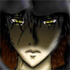
The artwork is very, very good, and I'm jealous.

It is done in manga style, as far as I can tell, and that puts me off a bit, but the only complaints I have against the artwork are against the style itself, so they're not worth stating.
The story is progressing very slowly, and that makes it difficult for me to get intrigued by the comic. I think part of it is that you have very little dialogue, and many pages in which nothing happens but a single image or action shot. You show everything and tell almost nothing, which may be good writing theory but it can make for a story that moves rather slowly. I don't think this is anything to worry about -- before long you'll find your groove, and your pacing will improve.
If I have any specific suggestions, I'd say that when you do have speech, your speech bubbles don't seem to fit the text very well and the text font itself is too blocky (is it Arial?). Ch. 2 page 9 is a good example of blocky speech in ugly speech bubbles -- it just doesn't match the smooth lines of the rest of your comic. Look for fonts called DigitalStrip or Mighty Zeo, I think they'd suit your comic better, and loosen up the bubbles some.
Other than that, I think you're doing great, and as I said, I'm jealous.