I'll review your webcomic.
-
IVstudios

- Cartoon Hero
- Posts: 3660
- Joined: Sun Dec 14, 2003 11:52 am
- Location: My little office
- Contact:
Re: I'll review your webcomic.
Yeah, He's written for Cracked a few times, but I haven't seen anything from him in a while. It's always weird when someone from the forums turns up randomly in a non-forum setting.
-
LibertyCabbage
- Cartoon Hero
- Posts: 4667
- Joined: Tue Jan 25, 2005 4:08 pm
- Location: bat country
- Contact:
Re: I'll review your webcomic.
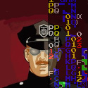
Webcomic: Inhumation
URL: http://ivstudios.net/inhumation/
Creator/s: Carl Schulz
Run: 4/05-current
Schedule: ?
Website: The hellish color scheme and background make it stand out more than a typical WordPress webcomic, and the large, colorful banner serves as an attractive introduction to the main characters. Along with a nice selection of extras, there's a "New to the Comic?" page of doodle-summaries that's both useful and pretty funny.
Writing: The first six chapters of Inhumation are a decent pilot episode for an ambitious afterlife story, but it's disappointing that the webcomic's still in its infancy eight-and-a-half years after its debut. Roughly 200 pages in, the comic has managed to leisurely introduce its female protagonists, show where they work, and build their friendship, but, unfortunately, I'm left with too many basic questions unanswered for the story to hold my interest. Some of these questions are:
- What's Hell like?
- Who's in charge of Hell?
- How do people feel about being in Hell?
- Where do the various commodities come from?
- What are the different areas of Hell?
- What's the deal with the Wardens?
- Where are all the demons at?
- What are the laws and punishments in Hell?
- Why isn't Hell more unpleasant for its residents?
- Why do some businesses have demonic names and imagery?
- What kind of jobs do people have besides fast-food employees and street vendors?
- What do people do in their free time besides go shopping?
Above-average slice-of-life drama and humor fill up page space while the creator avoids revealing any of this essential information. Some of the more patient readers out there might feel comfortable waiting for Inhumation to finally get to The Good Part, but, personally, I'd rather just read another webcomic that's already at The Good Part.
Now, from a more sympathetic point of view, I could say that the creator's doing the best he can as a hobbyist with limited time, that the webcomic's slow to develop because it's only been updated about twice a month on average, and that he deserves some credit for his willingness to stick with a project for this long and try to fulfill his creative vision. I don't necessarily disagree with any of these points, but I think it'd be more relevant to consider what adjustments the creator could make in regards to his particular situation. Simply, a webcomic that updates twice a month doesn't have the same luxury of deliberate pacing that a webcomic updating eight or 12 times a month has, or a print comic with monthly 24-page issues has. Barring the creator suddenly starting to crank out pages at an unprecedented rate, he needs to develop a faster-paced, plot-oriented writing style if Inhumation's ever going to get on the right track. Chapter 6 is somewhat of an improvement since the creator creatively addresses how memories can be bought and sold in Hell, but there are still too many pages devoted to this subject and to Kame's confrontation with the sleazy vendor.
Finally, the creator has a strange habit in which he often misspells common words while doing fine with more difficult words. Here are the basic spelling mistakes in Chapter 6:
- "cloths" instead of clothes
- "cheep" instead of cheap
- "hypster" instead of hipster
- "pleanty" instead of plenty
- "cheakbones" instead of cheekbones
- "explaine" instead of explain
- "wierd" instead of weird
- "somewhear" instead of somewhere
I get the impression that the creator's rushing while lettering the comic, and if that's the case, then he needs to slow down and pay more attention to what he's writing.
Art: The most notable aspect of the style, aside from the colored digital inking, is the pervasive use of three-fourths perspective. Because of this, most of the panels are basically identical, and while the characters are at least redrawn every time, this repetitive technique isn't much more appealing than liberal copy-pasting would be. A good example of this problem is this page, in which everyone's drawn from the same angle and are all talking to the back of people's heads, with the lone exception being the panel where the creator's forced to draw the mom facing the background in order to show her taking a picture of it. Merely adding basic front-on and profile shots to his arsenal would be a major improvement for the creator, and eventually practicing more complicated poses and perspectives would take the artwork to another level.
Other than that, though, the cartoony style is capably done, with the exception of Kame, whose wide head, pug nose, and pointy cheeks make her look like a Muppet. Her goofy portrayal is somewhat made up for, though, by the strong illustrations of the intimidating Wardens. Backgrounds are another high point for the webcomic, with the creator enhancing some of more mundane scenes by rendering them with a significant amount of detail (1, 2, 3). I would've liked to see Hell's exotic locations at some point, though, if there are any.
Overall: As it is, I think Inhumation would've been better as just a regular slice-of-life webcomic about two roommates who work crappy jobs. As a supernatural story, though, the positive aspects get overshadowed by the sense that the comic could be so much cooler and more interesting if the creator was willing to elaborate on the setting a bit more. It's also clear that the artwork isn't improving as quickly as it should be, as the earlier chapters actually have more variety in their perspectives than the latest ones. There are some parts of the comic that are well-executed, such as the dialogue and the art style, but the creator still needs to work further on getting the basics down before his webcomic can reach its full potential.
3/5


"Seems like the only comics that would be good to this person are super action crazy lines, mega poses!"
-
IVstudios
- Cartoon Hero
- Posts: 3660
- Joined: Sun Dec 14, 2003 11:52 am
- Location: My little office
- Contact:
Re: I'll review your webcomic.
Thanks, LC.  Very helpful. You pointed out a lot of things I already knew but wasn't sure if people noticed, and a lot of stuff I never thought about.
I agree completely with this, and I have made it the main thing I'm trying to improve in the next chapter. I've kind of brushed all that aside on the early chapters, because I preferred to deal with the character interactions. But you're right, it is kind of pointless to set the comic in hell and not make use of that setting. To that end:
are things I'm planning to specifically address in the next chapter.
I have always been awful at spelling. For most other writing things (this post, for example) I usually run them through a spell check and a speech program before I finalize them, but you can't do that with handwritten text so a lot of mistakes make it through. I'm going to have to start typing out my finalized dialog before I write it in.
Yeah. It's one of those vicious cycle things. I don't draw people at other angles because I'm not good at it, so I never get any better. I've started using Sketchup to help me compose more varied/interesting shots.
Now this makes me happy, because for a long time I would have considered backgrounds to be the hands-down thing I was worst at. Like half the point of setting Chapter 6 in a crowded flea market was to force me to do more backgrounds. The fact that you would consider them the high point of my art pleases me to no end.
Thanks for the review! I appreciate it.
LibertyCabbage wrote: Writing: The first six chapters of Inhumation are a decent pilot episode for an ambitious afterlife story, but it's disappointing that the webcomic's still in its infancy eight-and-a-half years after its debut. Roughly 200 pages in, the comic has managed to leisurely introduce its female protagonists, show where they work, and build their friendship, but, unfortunately, I'm left with too many basic questions unanswered for the story to hold my interest.
I agree completely with this, and I have made it the main thing I'm trying to improve in the next chapter. I've kind of brushed all that aside on the early chapters, because I preferred to deal with the character interactions. But you're right, it is kind of pointless to set the comic in hell and not make use of that setting. To that end:
LibertyCabbage wrote: - Where do the various commodities come from?
- What kind of jobs do people have besides fast-food employees and street vendors?
- What do people do in their free time besides go shopping?
- What are the different areas of Hell?
are things I'm planning to specifically address in the next chapter.
LibertyCabbage wrote: Finally, the creator has a strange habit in which he often misspells common words while doing fine with more difficult words. Here are the basic spelling mistakes in Chapter 6:
I have always been awful at spelling.
LibertyCabbage wrote: The most notable aspect of the style, aside from the colored digital inking, is the pervasive use of three-fourths perspective. … Merely adding basic front-on and profile shots to his arsenal would be a major improvement for the creator, and eventually practicing more complicated poses and perspectives would take the artwork to another level.
Yeah. It's one of those vicious cycle things. I don't draw people at other angles because I'm not good at it, so I never get any better. I've started using Sketchup to help me compose more varied/interesting shots.
Now this makes me happy, because for a long time I would have considered backgrounds to be the hands-down thing I was worst at. Like half the point of setting Chapter 6 in a crowded flea market was to force me to do more backgrounds. The fact that you would consider them the high point of my art pleases me to no end.
Thanks for the review! I appreciate it.
-
LibertyCabbage
- Cartoon Hero
- Posts: 4667
- Joined: Tue Jan 25, 2005 4:08 pm
- Location: bat country
- Contact:
Re: I'll review your webcomic.
It's not just "pointless," though, but, rather, misleading, in the sense that the comic hooks readers with its cool afterlife concept and then fails to follow through with it. I've referred to this technique before as "teasing," and it results in a negative experience for readers in the long-term.IVstudios wrote:But you're right, it is kind of pointless to set the comic in hell and not make use of that setting.
Spell-check would've caught all of the mistakes I listed, so that sounds like a good idea. Just don't forget to double-check for grammar mistakes (e.g., their/there/they're, your/you're, its/it's) as well because a spellchecker probably won't catch those.IVstudios wrote:I'm going to have to start typing out my finalized dialog before I write it in.
It's a textbook example of "comfort zone," and all you can really do about it is practice other angles a ton until they become part of your comfort zone as well.IVstudios wrote:It's one of those vicious cycle things. I don't draw people at other angles because I'm not good at it, so I never get any better.
Well, I don't know how everybody else feels about it, but I definitely appreciate all the background characters, buildings, and all the other stuff the comic's got going on in the backgrounds, and I noticed that Chapter 6 is an improvement in that regard.IVstudios wrote:Now this makes me happy, because for a long time I would have considered backgrounds to be the hands-down thing I was worst at.
No problem, it was fun to write.IVstudios wrote:Thanks for the review! I appreciate it.
"Seems like the only comics that would be good to this person are super action crazy lines, mega poses!"
-
IVstudios
- Cartoon Hero
- Posts: 3660
- Joined: Sun Dec 14, 2003 11:52 am
- Location: My little office
- Contact:
Re: I'll review your webcomic.
There is one thing that I'm curious about: how were you able to figure out that the comic had been running for 8 years? I mean, that's correct (I think), but I had to really think about it to determine that. The site has been redone and all the comics re-uploaded at least 3 times so that none of the "published on" dates are correct for anything older than this year.
-
LibertyCabbage
- Cartoon Hero
- Posts: 4667
- Joined: Tue Jan 25, 2005 4:08 pm
- Location: bat country
- Contact:
Re: I'll review your webcomic.
I Googled "inhumation webcomic," and this Cornstalker thread from April 29, 2005, came up on the first page of results.IVstudios wrote:There is one thing that I'm curious about: how were you able to figure out that the comic had been running for 8 years? I mean, that's correct (I think), but I had to really think about it to determine that. The site has been redone and all the comics re-uploaded at least 3 times so that none of the "published on" dates are correct for anything older than this year.
"Seems like the only comics that would be good to this person are super action crazy lines, mega poses!"
-
LibertyCabbage
- Cartoon Hero
- Posts: 4667
- Joined: Tue Jan 25, 2005 4:08 pm
- Location: bat country
- Contact:
Re: I'll review your webcomic.
Webcomic: Blüdnekk the BaraBarian
URL: http://www.bludnekk.blogspot.co.uk
Creator/s: Paul Jon Milne
Run: 2/13-current
Schedule: Random
Note: You should assume that all the links in this review are Not Safe For Work. You'll know why in a moment.
Website: Aside from the extremely bland layout, something that quickly stands out is that there isn't any name attached to the comic. Readers who do their homework, though, can figure out that it's made by Paul Jon Milne, the Scottish creator of the indie magazine Guts Power who sometimes goes by the alias Jean-Paul Malone.
Blogger's a weird choice to host the comic, as Blogger's main appeal is its customizability, and the creator doesn't do anything to try to customize the site besides add a banner at the top of the page. Organizing the archives by month also doesn't make a lot of sense for a webcomic. If the creator wants to use a blog for his comic, then WordPress with a webcomic plugin would probably be a more natural fit.
The update schedule's very random. Out of the 10 months the comic's been running, five have had 13 or more updates, while the other five have had seven updates or less. The most prolific month, October, had 26 updates, while the least active month, July, only had four updates. A regular schedule combined with a buffer would help this webcomic achieve some level of consistency.
Finally, while going through the archives, I noticed that the Next button on Page 102 goes to Page 1 instead of Page 103.
Writing: So, basically, this is a bizarre, plotless comic about some barbarians (or "BaraBarians," whatever that means) who are extremely violent, extremely horny, and extremely gay. For most of the comic, the naked or mostly naked characters are either trying to kill each other, talking about their "rock-hard party boners," calling each other "babe," commenting on each other's "hott" bodies (that's right, with two "t"s), or declaring how great science is. But before you expect this to be the kind of review you'd see on The Bad Webcomics Wiki, I have the task of trying to explain why I actually really enjoyed reading this webcomic. (And, no, it isn't 'cause I get off on seeing big, sweaty guys in thongs.)
To start off, the comic has a certain irreverence and lack of restraint that I find refreshing and strangely appealing. If a typical webcomic is a suburban residence with a "Welcome" mat out front, Blüdnekk is a Halloween haunted house daring you to come in and experience the freaky stuff waiting inside. It's crude and demented, sure, but beyond that's a sense of sheer pleasure at breaking all the rules and creating something so completely awful and inappropriate. On the comic's 100th page, the creator comments, in all caps, "I HOPE YOU ARE LOSING YOUR SHIT," and y'know what? By the time I read that, I kinda was.
The story starts off seeming like some kinda Conan the Barbarian parody, with Blüdnekk shown fighting goblins (or "globbins," as they're called in this setting) and then arriving in a medieval village. The townsfolk there then ask the barbarian to rescue them from an evil prince who's taxing them into poverty. If you're unfamiliar with the comic, you might guess that what happens next is Blüdnekk kicks the prince's ass and is celebrated as a hero by the villagers. Instead, though, Blüdnekk slaughters the villagers, tries to become the prince's sex slave, talks to a hallucination of the B-52s' Fred Schneider, gets his legs cut off and upgraded to goat's legs, watches his dick suddenly explode, and then, finally, gets ejaculated on by psychedelic, music-playing treefolk. And that's probably the most normal and coherent part of the story. (Soon afterwards, a sword asks, "Wanna fuck?" to a halberd, which is followed by a montage of the weapons trying to have sex.)
Oh, yeah, so back to the part about this actually being a good webcomic and not some God-awful abomination. Well, first of all, the creator's top-notch when it comes to writing ridiculous, over-the-top dialogue. For example, here's Doc Muscle's first lines, which I imagine being spoken in a California surfer's voice: "Wazzzuuup, science dweebs! This demonstration is DOG. SHIT. NOT! Peeps are all 'science doesn't fit into my life!', but it does! SCIENCE FITS... llllike a glove!" It's something perfectly absurd for a goofy-looking macho-guy to say. And while pop-culture references are usually pretty lame, the creator manages to make Fred Schneider a weird character with a distinct personality, saying lines like (in all caps, of course), "YOU'VE REALISED WHAT'S IMPORTANT: THAT NO MATTER HOW TOUGH THINGS GET, YOU GOTTA REALISE YOU'RE NEVER MORE THAN ONE SCHNEIDER AWAY FROM A PAAARTAYYY!" Secondly, while you've hopefully gotten a good idea so far of how wild and nonsensical this comic is, it kept surprising me when I thought it couldn't get any more wilder and more nonsensical than it already was. As if it wasn't already hard enough to keep up with what's going on, the creator further convolutes the story with alternate realities, virtual realities, time-jumps, and metafiction, which leads to there being several Blüdnekks who fight each other. In addition, severe injuries -- even fatal ones -- tend to get ignored or forgotten about several pages later, and I think Blüdnekk's had his dick destroyed in some manner at least three times. This kind of nonsequitor should get boring eventually, but, so far, the creator's been able to somehow find enough material to keep the story fresh after more than 100 pages. And, finally, the creator occasionally really throws readers a curveball by including social commentary, and it's never particularly clear whether they're supposed to be brief moments of clarity or just more twisted jokes. See what you make of this speech from Blüdnekk, for instance: "Sure, 'shame' might be a component of what made some of my sexy adventures so erotic! But it was on MY terms! The 'shame' you speak of is a harmful tool of the oppressor... used to diminish and curtail experiences I've had which harmed NO-ONE!" It actually sounds sort of reasonable, but then, later, the same guy's saying "sxxxyy" and publicly masturbating, and it's difficult to take what's going on seriously.
The biggest mystery of the webcomic, though, is that even though the characters are constantly calling each other "hott babes" and saying how horny they are, none of them ever actually try to have sex. It's a head-scratcher that I just don't have a good explanation for. The closest the comic comes to showing it is when Future Blüdnekk "transmits data" in cyberspace by plugging his dick into another guy's dick, but penis-to-penis sex is so ridiculous an idea that it doesn't even seem like they're actually having sex. I mean, I get that Blüdnekk's a nasty jerk who doesn't get along with other people, but this is a guy with so much libido that he had sex with his own poop. As sort of an aside, on the creator's Etsy page, he describes his comics as, in quotation marks, "'a grotesque exploration of gender and sexuality,'" as if it's either somebody else's words or it's meant skeptically. And elsewhere on his Etsy page, he features ugly, Blüdnekk-style drawings of various superheroes, paired with the following description: "Love superhero comics but are fed up with their relentless, heteronormative misogyny? Then these colourful A5 prints are for you! Provocatively dressed and packed with confidence in their LGBTI-spanning sexuality, these posing, muscular super-characters subvert the male gaze and make their universes that little bit more of a progressive place to be." The creator has an odd way of phrasing these sort of things, almost as if he's both supporting and mocking LGBTI people at the same time. And, similarly, is Blüdnekk a parody of our culture's hypermasculine action heroes, or is it just an endless series of dick jokes that mischievously invites overanalysis? Your guess is as good as mine, but, in any case, this webcomic's a lot more interesting than your typical superhero or yaoi comic.
Art: I'm not gonna write much about the crude artwork, although I'll say it's a fitting match for the crude dialogue. The art's deceptively nonchalant, though, as a high level of cartooning ability's conveyed in the advanced perspectives and compositions, and the creator's skillful at drawing the barbarians' exaggerated muscles. The comic has a few miscellaneous illustrations (like this one) that prove the creator can do better when he tries to, and while the minimalistic drawings have some charm, I imagine the comic would benefit if the creator treated it as a more serious project.
Also, with sexuality at the forefront of the comic, it's surprising how unattractive the creator tries to make the characters. Practically all sexual webcomics lure in readers with racy shots of "hott" guys or gals, but I'm having a tough time imagining even the most perverse individuals finding anything sexy about this comic's disgusting, sloppily-drawn oafs. (Oh, who am I kidding. I'm sure this blog's search referrals will be flooded with variants of "bludnekk hott gayy sexx.")
Overall: I was a little reluctant to review Blüdnekk at first, as it looked like some crappy shock-humor comic that didn't even have a real website. I now see it as one of the Internet's hidden gems, and while it's far from perfect, the comic manages to get a lot right. Actually, I'd say it's more compelling than prominent superhero webcomics like Grrl Power and Spinnerette, which might just -- wait for it -- make this the best superhero webcomic out there. So, if you're ready to lose your shit, then grab your rock-hard party boner and give this sxxxyy comic a look.
4/5
"Seems like the only comics that would be good to this person are super action crazy lines, mega poses!"
-
LibertyCabbage
- Cartoon Hero
- Posts: 4667
- Joined: Tue Jan 25, 2005 4:08 pm
- Location: bat country
- Contact:
Re: I'll review your webcomic.
Webcomic: A Link to the Webcomic
URL: http://alinktothewebcomic.smackjeeves.com
Creator/s: Philip Howell
Run: 11/13-current
Schedule: About four strips a week
Note: This is the second Zelda fancomic reviewed on this site. If you're interested in the Zelda series, you should check out the review of Legend of Zelda: The Edge and the Light, which can be read here.
Website: I don't mind people making fancomics, but if they're going to use a company's characters and copy the company's artwork, then they should at least have the common sense to give the company some amount of credit. Instead, the creator copies the title screen of A Link to the Past, changes the words in the title, and puts "© 2013 By: Philip Howell" underneath the copied image. Meanwhile, Nintendo isn't credited anywhere on the site.
It gets worse, though. According to the creator, he needs money to buy a Nintendo 3DS XL and the new Zelda game, so he made a few unlicensed Zelda T-shirts and is trying to sell them online. Got that? He's basically trying to steal from Nintendo so he can use the money to buy Nintendo products. And if you look at the shop, right below the T-shirts is a section titled "Intellectual Property" that says the following: "In the Terms of Service, Spreadshirt prohibits shop owners from setting up or putting into circulation any merchandising articles that infringe the original author, brand or copyrights of a third party." I don't think the creator has any excuse for not realizing that what he's doing is inappropriate.
Writing: So, who do you think is the best video game character of all time? GameFAQs began attempting to answer that question in 2002 with its first annual Character Battle (or at least have some harmless fun trying). In the final round, Link beat Mario by about 25,000 votes. But, what is it, exactly, about these Nintendo superstars that makes them so popular? Their personalities can't be the reason, as Link doesn't have any dialogue, and Mario doesn't say anything more complex than, "It's-a me, Mario!" Plot-wise, their games aren't anything special, with Mario beating up bad guys to rescue the princess, and Link... beating up bad guys to rescue the princess. It's no secret, though, that the story isn't meant to be a big deal in their games.
It's clear that what made the Legend of Zelda and Mario series have hit after hit for years is their excellent gameplay, and it seems that these non-characters benefit from the enjoyment players get from the games they love. Seeing a picture of Link, for example, reminds players of the positive experiences they've had playing the Zelda games, and they come to associate Link with positive feelings. It helps, too, that a lot of players got their hands on their first Zelda game when they were very young, meaning that Link also carries an association with the innocent, happier, and more carefree times of a player's childhood. In this way, Link has become more of a symbol than a fictional person with a background and personality.
Another way of looking at it, though, is that the lack of personality actually makes the characters more likable. Since Link and Mario are essentially blank slates, it makes it easy for players to imagine that it's the player who's shooting arrows or fireballs. Shigeru Miyamoto, the creator of both Link and Mario, explained this phenomenon at E3 a few years ago, saying that he "wants the player in a Zelda game to actually feel as if they were going on the adventure themselves, rather than just controlling a character down a path. [...] One would expect you to better remember the experience as your own, rather than one of just guiding Link." In addition, controlling a player-avatar lets players get right to the action without being interrupted by dialogue, which, back in Nintendo's earlier days, would've probably just been translated at the last minute by an unpaid intern anyways. But there's also a certain mysteriousness that surrounds a character players know practically nothing about. They're left to use their imagination to form their own idea of where the characters came from, how they act, what they do when they're not adventuring, and what happens with them and the princess after the credits roll. (Or they could just watch the Saturday morning cartoon version, I guess.)
A Link to the Webcomic, then, has free reign for the creator to elaborate on the Zelda series, but, instead, he makes the mistake of presenting Link as the same personality-of-a-rock non-character as he is in the games, except that here he actually talks... a lot. All the creator's doing is piggybacking off of the huge success of the series while contributing nothing of his own aside from some lame gags. As I explained earlier, players love the Zelda series for its gameplay, and this webcomic is basically just Zelda without the gameplay.
Most of the gags are too forgettable to be worth mentioning, but the comic reaches its low point when it makes a "Navi the fairy's annoying and useless" joke. This flaw was pretty obvious when Ocarina of Time came out in 1998, and The Powerpuff Girls already did a spoof of it in an episode that originally aired on Aug. 18, 2000. In other words, the creator's idea of cutting-edge Internet humor is ripping off a joke that a kids' TV show did more than a decade ago.
Art: On the bright side, it isn't a sprite comic. However, since the creator copy-pastes the characters in every panel, the result isn't much better than a sprite comic. Link stands in the same position in every strip, and while it's nice that his outfits change, it seems more like the creator's dressing a mannequin than illustrating a comic. Any changes to the template seem to be a struggle, as the facial expressions are overly simplistic and the proportions of Link's arms are inconsistent. Some of the monsters look decent, but they're boring because all they ever do is stand still.
Backgrounds are another problem with the artwork. In this strip, for example, not only is the background just a dark void for some reason, but the height of the horizon line changes, and it looks like Link's either walking up a wall or is gigantic. Here, not only is the background boring, but the water's so high above the horizon line that it looks like a huge tidal wave's coming towards Link. And here, the page is oddly two-dimensional, as some objects are shaded while others aren't, the leaves and Link are both drawn with the same line thickness, and, again, the perspective makes it look like Link is either huge or is walking down a hill.
Finally, the lettering can sometimes be confusing. See this page, for instance. In the first panel, Link, on the left, says, "Yessss?" and Zelda, on the right, says, "Hey, Link?" Reading left-to-right, it looks like Link is the one speaking first, which doesn't make sense since he's responding to Zelda. And here, Link's on the left again, saying a response to Fledge even though Link's speech bubble's left of Fledge's. Link always appears on the left side of the strips, and a simple solution would be to flip him and put him on the right side for a change.
Overall: A Link to the Webcomic would be a run-of-the-mill humorless humor comic, but its creator's dopey idea to try to sell merch with copied artwork and characters earns it its one-star rating. Given Zelda's 25-year history, it seems like there's a lot of material there to elaborate on or make fun of, but, unfortunately, the creator puts as little effort and imagination into his project as possible.
1/5
"Seems like the only comics that would be good to this person are super action crazy lines, mega poses!"
-
Peripheral Descent
- Regular Poster
- Posts: 41
- Joined: Tue Feb 19, 2013 11:07 pm
Re: I'll review your webcomic.
It's always interesting to see the things you pick up on, lol!LibertyCabbage wrote:Webcomic: A Link to the Webcomic
Website: I don't mind people making fancomics, but if they're going to use a company's characters and copy the company's artwork, then they should at least have the common sense to give the company some amount of credit. Instead, the creator copies the title screen of A Link to the Past, changes the words in the title, and puts "© 2013 By: Philip Howell" underneath the copied image. Meanwhile, Nintendo isn't credited anywhere on the site.
Also, I stumbled upon your web site again a few days ago and read a bunch of the reviews. Some of them I've already read here, but either way, they were fun. I'm not sure who the author of the Angel Corps review was, but you should try and ask him to do some more reviews. His reactions were really entertaining.
-
RobboAKAscooby
- Cartoon Hero
- Posts: 1140
- Joined: Thu Aug 07, 2008 1:00 pm
- Location: Brisvegas
- Contact:
Re: I'll review your webcomic.
This page reminds me of a pain in the arse trend on deviantArt art known as "doll bases" where "artists" use the same base drawing and just change hair/clothes/etc and "BAM look at my new [insert Disney character] fan art that looks nothing like my [random Anime character] fan art" and proceed to get a gazillion faves.LibertyCabbage wrote:the creator copy-pastes the characters in every panel
Admittedly some are pretty good at the costume design stuff but the laziness just shits me off - I mean I can do the same basic pose over-and-over again but at least I'm drawing it each time (not actually a positive I need more variation in my work).
On a side note, LC, I'm about 40 pages off being willing to let you
On a different side note, I should totally make some copyright infringing t-shirts, I need cash...
 Deviantart~tumblr
"Your service is to the story and to the characters. Fuck the audience and fuck your own whims." - Yeahduff
-
LibertyCabbage
- Cartoon Hero
- Posts: 4667
- Joined: Tue Jan 25, 2005 4:08 pm
- Location: bat country
- Contact:
Re: I'll review your webcomic.
Webcomic: Insert Image
URL: http://www.insertimg.com
Creator/s: Wes Molebash
Run: 8/12-current
Schedule: Mondays
Website: It's everything a webcomics website can be, with attractive imagery, an obvious update schedule, an easy-to-use archive with named strips, a frequently updated blog, a cast page, and a bunch of miscellaneous extras. Clearly, a lot of attention's been given towards making the comic more appealing to readers, whether it's by responding to comments, elaborating on the jokes, or even including a parental disclaimer regarding some of the more adult-oriented strips.
Also, the creator seems to be more well-known for his previous webcomics, You'll Have That and Max vs. Max, but I wasn't able to find them anywhere online. The closest I got was a print version of You'll Have That, which is available on Amazon. It isn't clear why these older comics have vanished, but perhaps the creator just felt like he needed a fresh start.
Writing: "The joke is that the artist's name is 'Wes Molebash,' right?"
That's a quote from poster "JustPlainPavek" on the Penny Arcade forums in response to "Bad-Beat" posting a strip from Max vs. Max. In the thread, 10 posters take turns either trying to understand what the joke's supposed to be or making fun of how unfunny the strip is. "MacGuffin" is the most interested in the strip, deconstructing every aspect of it and complaining in frustration, "I don't get it. I'm not even sure if there is something to get. [...] I'm really at a loss here. It's just some people sitting there. Is this some type of meta joke where he made fun of the lack of humor? Is that what's going on here?" Other posters express similar confusion, with "Seriously" adding, "I got nothing," "Wren" stating, "I don't get it," and "L|ama" wondering aloud, "is there a joke? is the lack of a joke the joke?" Finally, "SLyM" chimed in, joking, "This one comic is fueling more speculation than your average homestuck update!"
But, then, with the creator's new, Christian webcomic, Insert Image, you've got some very different kinds of comments. Author/musician Justin McRoberts wrote, "Wes Molebash cracks me up." Author Matt Appling noted, "Wes' 'Insert Image' captures the magic of unwitting comedians," with blogger Sammy Adebiyi calling the creator "laugh-out-loud hilarious" and referring to him as "pretty much the Tom Brady of comic strips." Is it really possible that merely changing projects has had such a profound effect on the creator's ability to tell jokes?
Well, it's probably worth mentioning that all three of the people I just quoted are church pastors, and the creator's actually a pastor as well. Technically, he's considered a "Growth Pastor," and his description of his job is "overseeing our church’s small group ministries." It's understandable, then, that this crowd might get a kick out of references to Rob Bell, Joel Osteen, Donald Miller, Mark Driscoll, and the bands Hillsong and Five Iron Frenzy, who are all, apparently, important figures in Christian subculture. Insert Image is kind of like this group's Penny Arcade, with characters arguing about Bible translations instead of gaming consoles.
And speaking of Penny Arcade, the comparison runs a little deeper than just both webcomics being about two guys who talk about a niche subject. Probably the first thing most readers will notice about this comic is that the art style and layout look really familiar, and it's no surprise that the creator lists PA's Mike Krahulik as one of his biggest inspirations. But the characters are eerily similar as well, with Miles basically being Tycho and JP basically being Gabe. The characterization and writing styles are close enough that I felt like, at times, that I was reading a bizarre, PG-rated Penny Arcade fanfiction, like when JP talks about his character in Guild Wars 2.
PA has a different dynamic going on, though. Since it's made by two creators, it's natural for their avatars to be co-stars, and they each have interesting personalities that play off of each other. With Insert Image, though, JP/Gabe is clearly the main character, with Miles/Tycho having a smaller role as The Straight Man. A typical strip is JP doing something wacky (such as eating Cinnamon Toast Crunch for dinner), while Miles comments on how wacky JP's behavior is. It's probably more like Ethan and Lucas from Ctrl+Alt+Del, really, which isn't a good sign for this comic considering that Jerry Holkins is a much better writer than Tim Buckley. To give the creator some credit, though, Miles does show a bit of personality in the earliest strips, like when he's depicted as a coffee snob. Unfortunately, though, about 10 or so strips in, the comic becomes all about JP, and Miles' quirky coffee obsession doesn't even get mentioned again.
* continued in the next post 'cause of the links limit *
"Seems like the only comics that would be good to this person are super action crazy lines, mega poses!"
-
LibertyCabbage
- Cartoon Hero
- Posts: 4667
- Joined: Tue Jan 25, 2005 4:08 pm
- Location: bat country
- Contact:
Re: I'll review your webcomic.
Something that bugs me about JP, though, besides him just being a goofy manchild, is that he really comes across as an asshole in this comic. At first, I thought maybe he just lacked social etiquette and said inappropriate things at times, but it's impossible to ignore how relentlessly mean-spirited he is throughout the comic when he:
- Calls someone "a huge nerd" (link)
- Curses out Mike Driscoll on Twitter (link)
- Brags to Miles about being a better Christian than he is (link)
- Insults someone while bragging about his own popularity (link)
- Makes a blog post titled, "I'm Right, You're Wrong" (link)
- Screams at a mom who's breastfeeding in public (link)
- Yells at a receptionist at Christian Mingle for something she had no control over (link)
- Gets kicked out of a college for harassing non-Christians (link)
- Pretends to be friends with a gay guy he doesn't like in order to boost his "street cred" (link)
Meanwhile, JP never really does anything nice or friendly in the comic to balance out his narcissism. The closest is probably when he buys Miles a ticket to see The Hobbit, but he knows that Miles doesn't want to see the movie, so it's really just another instance of JP being intolerant. It isn't funny seeing him treat other people disrespectfully, and all it does is make him seem annoying and unlikable. What might actually be a little amusing would be to see JP get punished for his arrogant behavior, but that has yet to happen in the comic.
Finally, the webcomic has some merit in the earlier strips when it's being more on the slice-of-life side and covers some of the problems that come with running a small-town church. One of the most interesting strips, in my opinion, is the one where the social media-savvy protagonists express their frustration at trying to promote the church to older people. The autobiographical touches are appealing as well, as Paper City Church seems to be based on the creator's own church in Chillicothe, Ohio, which, like the webcomic version, used to be inside an old movie theater. However, the more realistic aspects of the comic clash with JP's absurdity. Readers are supposed to accept that he's married, owns a house, and has a graphic design job, but it'd be a lot more believable to me if he was unemployed, single, and living with his parents, like Alan from The Hangover movies. Check out, for example, when JP says, with a straight face, "I'm going to sit around in my boxers drinking beer [for an entire year] while Kendra serves me sandwiches," as if she wouldn't just divorce someone who's such a loser (and who already maxed out all of his credit cards so he could afford his "trampoline room addition"). If JP's really a capable adult, then I'd like to see that be explored more fully instead of just being a minor footnote to his wacky shenanigans. Currently, there are only a few strips that show JP sort of working (which include him playing a game on his iPhone during a meeting and suggesting setting fire to the church), and his wife only shows up in one panel of a Valentine's Day strip. It's true that the Penny Arcade guys are pretty goofy as well, but they seem more eccentric than dysfunctional.
* Yeah, this is a pretty long review, isn't it. *
"Seems like the only comics that would be good to this person are super action crazy lines, mega poses!"
-
LibertyCabbage
- Cartoon Hero
- Posts: 4667
- Joined: Tue Jan 25, 2005 4:08 pm
- Location: bat country
- Contact:
Re: I'll review your webcomic.
Art: It's a decent imitation of Krahulik's style, with JP getting Tycho's rectangular face and Miles getting Gabe's rounder face. The three-panel layout is also very similar to PA's to the point of being almost indistinguishable. (Insert Image's strips are about 5 percent larger, but PA has smaller margins between its panels.) The creator's clearly a pretty good artist, but the strip's going to have the problem of readers viewing it as "Penny Arcade lite" rather than recognizing it for its own merits.
One thing that PA does much better, though, is facial expressions, which are pretty important for a gag comic. I think what this comic gets wrong is that the creator changes the mouth but keeps the eyes, eyebrows, head, and body the same, and it makes the characters look unnatural and puppet-like. One example of this is in first two panels of the Guild Wars 2 strip, where the creator basically just flips and rotates the mouth while keeping everything else virtually identical. And take a look at the breastfeeding strip: JP goes from friendly to outraged, but all that happens is his mouth gets a little wider and his eyebrows change; everything else is copy-pasted, making it a lame visual aid to an unfunny scene. Here's another one where JP's eyes, eyebrows, head, and body are the same in every panel, and it looks really weird, like JP's in some sort of trance; and here, his eyes, eyebrows, and head stay the same for five panels even though his dialogue and mouth go back and forth from silly to serious. On the other hand, the facial expressions can be pretty good when the creator puts some effort into them, such as in the fourth panel here, which is probably the funniest part of the whole comic. A goofy, carefully drawn face can't save a bad joke, but it can turn a mediocre joke into a good one, or a good one into a great one.
Insert Image does top PA with its backgrounds, though, and it probably helps that the former updates once a week versus the latter's three-a-week schedule. Strips like this are fairly detailed for a gag comic, but there are also sometimes longer, full-page strips like this and this, which is something I don't recall PA ever doing, at least not on their website.
Overall: A big part of Penny Arcade's success is that gamers can easily relate to its main characters. The protagonists of Insert Image, though, aren't as relatable, as Miles is boring and JP's a childish egomaniac. Ultimately, though, judging a gag comic like this comes down to one question: Is it funny? Some Christians will think so, but, personally, I found the webcomic to be a chore to get through. Still, it's at least trying to do something new, and it'd be great if it can attract an audience that wouldn't normally be interested in webcomics.
3/5
"Seems like the only comics that would be good to this person are super action crazy lines, mega poses!"
-
LibertyCabbage
- Cartoon Hero
- Posts: 4667
- Joined: Tue Jan 25, 2005 4:08 pm
- Location: bat country
- Contact:
Re: I'll review your webcomic.
It helped that I played A Link to the Past when I was a kid, 'cause I recognized the title screen right away. But I was looking for a "copyright Nintendo" somewhere right from the start, so the self-crediting quickly stood out.Peripheral Descent wrote:It's always interesting to see the things you pick up on, lol!
Oh, also, the guy kinda lost his shit about the review, and then tried to make it seem like he never e-mailed me to request it. Also, he sent me this e-mail after he wrote the post:
That's pretty fucked up. I'm blocking your email so don't bother writing back.
I'm glad you're liking the site.Peripheral Descent wrote:Also, I stumbled upon your web site again a few days ago and read a bunch of the reviews. Some of them I've already read here, but either way, they were fun. I'm not sure who the author of the Angel Corps review was, but you should try and ask him to do some more reviews. His reactions were really entertaining.
The comic would still look bad if the guy had tried to draw it, but he would have at least eventually gotten better at drawing that way.RobboAKAscooby wrote:This page reminds me of a pain in the arse trend on deviantArt art known as "doll bases" where "artists" use the same base drawing and just change hair/clothes/etc and "BAM look at my new [insert Disney character] fan art that looks nothing like my [random Anime character] fan art" and proceed to get a gazillion faves.
Admittedly some are pretty good at the costume design stuff but the laziness just shits me off - I mean I can do the same basic pose over-and-over again but at least I'm drawing it each time (not actually a positive I need more variation in my work).
Sounds like around W.A.Y. 2014. (Shit, I need to get some new pages up by then, too.) Again, if it's still bad, I should be able to come up with a creative way of approaching it, 'cause "This is Flying Tigers 2.0. It's still bad. The End." wouldn't be enjoyable for anybody.RobboAKAscooby wrote:On a side note, LC, I'm about 40 pages off being willing to let you tear apart review my new comic, so at the pace I'm going right now that's gonna be about May-ish (bad mental math).
As for what's coming up on the blog, I'll be starting a review contest (hopefully tomorrow) with some prizes*, and then I'll be doing a "How Not to Run a Review Blog" piece calling out other review blogs on things I don't like about them. And then I'll probably just get some more requests done.
* To VCC: It's meant for new contributors, so I'll probably exclude people who've contributed before from being finalists. =/ But I'll add a rule that previous contributors can still get a participation prize if they want.
"Seems like the only comics that would be good to this person are super action crazy lines, mega poses!"
-
VeryCuddlyCornpone
- Cartoon Hero
- Posts: 3245
- Joined: Tue Feb 10, 2009 3:02 pm
- Location: the spoonited plates of Americup
- Contact:
Re: I'll review your webcomic.
Sounds good.
I've clicked on Insert IMG a few times when seeing it linked on Just the First Frame, and I'm usually pretty easily sold on gag comics, but it just never really gripped me enough to put it on my "must read" list.
As for A Link to the Webcomic, what a sad response. The only thing it was missing was "Well, maybe i'll just delete the whole comic then, if that's what you think, if that would make you happy!!!!" that some creators sarcastically whip back. Whoa, there, you sure showed me, yeah, put those words in my mouth. Oh no, don't threaten to remove your comic, that would sure prove a point.

Don't kid yourself, friend. I still know how.
"I'd much rather dream about my co-written Meth Beatdown script tonight." -JSConner800000000
-
Peripheral Descent
- Regular Poster
- Posts: 41
- Joined: Tue Feb 19, 2013 11:07 pm
Re: I'll review your webcomic.
LC, Thanks for the link to the reviewer! I'll be checking him out soon.
It's really too bad that people don't understand criticism. When it comes to any kind of art, there seems to be almost a "with me or against me" mentality. It is VERY possible for someone to criticize your art without hating you. Moreover, a review represents the thoughts of the single individual writing that review. If you don't agree with the review, or you think it's cruelly worded, go and get it reviewed somewhere else. If the second person says the same thing, well. Maybe the criticisms are valid, and the person wasn't being cruel for cruelty's sake. If he emailed you, he must have found out somewhere that you do reviews, and he must have read at least one or two to see if you were up to his standards. Some of his arguments, though...LibertyCabbage wrote: Oh, also, the guy kinda lost his shit about the review, and then tried to make it seem like he never e-mailed me to request it.
I was curious when I read the above quote, that he seems to differentiate between the Link on the shirts he's selling and the Link that is copyrighted (because his Link talks), so I took a peek at his comic again to try and find the shirts he was selling, and I found this:Also, on none of the shirts does it say Zelda or Link. I even made a shirt where my character states that Link doesn't talk. Meaning he isn't THAT Link. If you want to play semantics.
I think he actually didn't understand parts of your review because he was so emotional.I just read a hilarious review by someone so unattached with reality it hurts! lol
For the record, I hope everyone knows I don't own the original Nintendo characters (duh), but I do own the characters I drew and am allowed to put them on a shirt. I can't say LEGEND OF ZELDA, but parody shirts are allowed. Also, this comic is supposed to be funny, but not hilarious or even original/cutting edge. It's just supposed to be fun. Not everything should be so serious.
I'm sure we all know someone like this person...it's kinda sad actually.
I'm sure everyone who reads my comic is smart and knows this, so have a Happy Thanksgiving!
Oh, and also...I'm poor. I draw this whole comic with a mouse in Flash. Sorry if it isn't better, but I'm working with what I've got.
-
VeryCuddlyCornpone
- Cartoon Hero
- Posts: 3245
- Joined: Tue Feb 10, 2009 3:02 pm
- Location: the spoonited plates of Americup
- Contact:
Re: I'll review your webcomic.
I can't really make sense of his reasoning over the sound of sniffling and a voice screaming "SOMEONE EXPECTS MY COMIC TO BE GREAT BUT I AM SATISFIED WITH MEDIOCRITY!!! HOW CA-ROO-ELL"
I wonder, if someone told him, "Your comic is absolutely perfect and the best comic I've ever seen! Its strengths are unparalleled! My favorite!" surely his response would be, "Not at all, you fool, it's actually a deliberately low-effort venture that's just for my personal enjoyment, don't try to make it something it's not!" Right?
I checked out his SmackJeeves profile, his age isn't listed, so I'm hoping that means he's a teenager and therefore I give him a little leeway with regards to this behavior. If not... well, it was only going to be a little leeway, anyway.
The fact that he was the one to request his own review casts a glamorous sheen upon the experience.
Don't kid yourself, friend. I still know how.
"I'd much rather dream about my co-written Meth Beatdown script tonight." -JSConner800000000
-
LibertyCabbage
- Cartoon Hero
- Posts: 4667
- Joined: Tue Jan 25, 2005 4:08 pm
- Location: bat country
- Contact:
Re: I'll review your webcomic.
The contest is here. Lemme know if there's anything I forgot to add. I haven't done anything like this before, so I'm just kinda going with it and seeing what happens. It's fun to do something a li'l different once in a while.
It seems like something a reader will either totally love or not care for at all. It's probably not worth bothering with if you aren't into Christian subculture, though. In any case, the comic doesn't have any surprises, so someone can probably read one strip of it and tell if it's something they like.VeryCuddlyCornpone wrote:I've clicked on Insert IMG a few times when seeing it linked on Just the First Frame, and I'm usually pretty easily sold on gag comics, but it just never really gripped me enough to put it on my "must read" list.
He got a link out of it, at least, and on the Internet you gotta take what you can get, even if it's in a not-so-great context. It's very possible that this is the only time anyone will ever link to his comic, and even if people are visiting it to just see how bad it is, it's more traffic than he would've gotten if he hadn't made the request.VeryCuddlyCornpone wrote:As for A Link to the Webcomic, what a sad response. The only thing it was missing was "Well, maybe i'll just delete the whole comic then, if that's what you think, if that would make you happy!!!!" that some creators sarcastically whip back. Whoa, there, you sure showed me, yeah, put those words in my mouth. Oh no, don't threaten to remove your comic, that would sure prove a point.
He's probably got enough to keep you busy for days. He might have, like, at least 20 reviews of just Sonichu. My favorite I've seen so far's probably his three-part What Dreams May Come series.Peripheral Descent wrote:LC, Thanks for the link to the reviewer! I'll be checking him out soon.
It's strange how he keeps repeating over and over that he's doing the comic "for fun" and doesn't care what people think about it, yet he has this kind of severe reaction to a bad review. I think it's pretty clear that he actually does care about what people think about his comic, and if that's the case, then he really needs to just take the ego hit if he's ever going to figure out how this whole "entertaining people" thing works.Peripheral Descent wrote:It's really too bad that people don't understand criticism. When it comes to any kind of art, there seems to be almost a "with me or against me" mentality. It is VERY possible for someone to criticize your art without hating you.
That sounds exactly like something I might've written about a year ago, but, from my experience, it's very rare that someone's willing to do what I do. In the webcomics community, the appropriate social etiquette for handling people like this is to ignore them completely, even if they go out of their way to request feedback. If they're lucky, someone will say, "Oh, uh, I guess I'll give it a look..." and then vanish. But, anyways, sometimes people kinda forget that what they say online sticks around for a while. Say that, a few months down the road, the guy wises up and asks for another review, and the potential reviewer does a little research and finds these comments. Chances are, the potential reviewer decides it's not worth the drama and hassle and doesn't bother, and he or she would be totally right for doing so.Peripheral Descent wrote:Moreover, a review represents the thoughts of the single individual writing that review. If you don't agree with the review, or you think it's cruelly worded, go and get it reviewed somewhere else. If the second person says the same thing, well.
He actually wrote "you really know your stuff" and "keep up the good work." It's another example of "good review, good reviewer; bad review, bad reviewer;" which is about the dumbest thing ever.Peripheral Descent wrote:Maybe the criticisms are valid, and the person wasn't being cruel for cruelty's sake. If he emailed you, he must have found out somewhere that you do reviews, and he must have read at least one or two to see if you were up to his standards. Some of his arguments, though...
Captain Marvel.Peripheral Descent wrote:I was curious when I read the above quote, that he seems to differentiate between the Link on the shirts he's selling and the Link that is copyrighted (because his Link talks),
I think he just really wants that Nintendo DS but won't do any actual work to earn it.Peripheral Descent wrote:I think he actually didn't understand parts of your review because he was so emotional.
"I WOULD'VE SOLD 100 T-SHIRTS IF I GOT A GOOD REVIEW, BUT I GOT A BAD ONE INSTEAD AND NOW I CAN'T BUY MYSELF A NINTENDO DS FOR CHRISTMAS!!! I'M GOING TO GET REVENGE BY CALLING THE REVIEWER A DOODYHEAD"VeryCuddlyCornpone wrote:I can't really make sense of his reasoning over the sound of sniffling and a voice screaming "SOMEONE EXPECTS MY COMIC TO BE GREAT BUT I AM SATISFIED WITH MEDIOCRITY!!! HOW CA-ROO-ELL"
Right. I thought his comic "wasn't supposed to be funny," or something like that.VeryCuddlyCornpone wrote:I wonder, if someone told him, "Your comic is absolutely perfect and the best comic I've ever seen! Its strengths are unparalleled! My favorite!" surely his response would be, "Not at all, you fool, it's actually a deliberately low-effort venture that's just for my personal enjoyment, don't try to make it something it's not!" Right?
I'd be curious to know. I did a little Googling, and the guy's a total mystery. I did find a couple Phil Howells on DeviantArt, but I don't think this guy is either of them.VeryCuddlyCornpone wrote:I checked out his SmackJeeves profile, his age isn't listed, so I'm hoping that means he's a teenager and therefore I give him a little leeway with regards to this behavior. If not... well, it was only going to be a little leeway, anyway.
It's too bad he didn't bring up this whole "my comic sucks on purpose" thing beforehand, 'cause then I could've just given him a few pointers in private and reviewed a different comic instead.VeryCuddlyCornpone wrote:The fact that he was the one to request his own review casts a glamorous sheen upon the experience.
"Seems like the only comics that would be good to this person are super action crazy lines, mega poses!"
-
RobboAKAscooby
- Cartoon Hero
- Posts: 1140
- Joined: Thu Aug 07, 2008 1:00 pm
- Location: Brisvegas
- Contact:
Re: I'll review your webcomic.
I think I've said this before around here but I will always appreciate bad art that shows obvious effort over okay art with no effort. Maybe I'm just weird but laziness kind of turns me off.LibertyCabbage wrote:The comic would still look bad if the guy had tried to draw it, but he would have at least eventually gotten better at drawing that way.
Also when there's obvious effort involved, there is more chance of a reviewer using a softer touch while still giving the creator the truth they need to hear. For example phrasing a comment "you should try loosening up your poses" as opposed to "the artwork is stiff", both phrases say the same thing essentially but, I at least, would be less inclined to use the more polite/helpful phrase when the creator clearly doesn't give a crap.
Ha ha, that's almost as quotable as Cuddly's comment on my first comic a few years back "at least it has fan-service".LibertyCabbage wrote:Sounds like around W.A.Y. 2014. (Shit, I need to get some new pages up by then, too.) Again, if it's still bad, I should be able to come up with a creative way of approaching it, 'cause "This is Flying Tigers 2.0. It's still bad. The End." wouldn't be enjoyable for anybody.
All I'm really gonna hope for is a less negative review. Comics are not my strong point, I've accepted that, but they are something that has become enjoyable to do (largely because of the community here).
I'd like to think that webnovel version of FT would get a more positive response but frankly I'd rather not test that hypothesis (my tiny ego is a bit fragile right now). That said I'm also aware that I am not presenting the best of what it could be due to the fact that I don't have an editor and any really good creation is a collaborative effort, especially in the world of writing, editors are a very important part of making a work the best it can be.
The subject of people responding negatively to reviews and the way-to-often "I'm just doing this for fun" response has me thinking.
It is possible to do a project for the fun of it, even if you're putting out for public consumption, but it is rarely the only motivation.
I mean, with my comic, I'm doing it largely for the enjoyment factor but I'm also doing it as a way to improve my inking (hence mostly black and white), to improve my art in general and a few other little personal reasons. And since I've got it online I would obviously hope for some positive feedback - we all hope for that no matter what our other motivations, if we show our work to others we are hoping for a little bit of an ego boost.
While it certainly sucks to get negative feedback I think that if our motivation is an internal reward it is easier to accept the flaws of our work and that an internal reward is a bit more satisfying than an external reward.
For myself, if all I wanted was praise I could just churn out pics of Disney girls in bikinis on dA, or make a comic of the same (tempting....no, no Scooby don't), but that just wouldn't satisfy me. As much as potential negative feedback sucks, it is a price I have to pay for the other positives I get from creating.
Deviantart~tumblr"Your service is to the story and to the characters. Fuck the audience and fuck your own whims." - Yeahduff
-
LibertyCabbage
- Cartoon Hero
- Posts: 4667
- Joined: Tue Jan 25, 2005 4:08 pm
- Location: bat country
- Contact:
Re: I'll review your webcomic.
It's not weird, and I think most people in the webcomics community would agree with you. I'll quote part of a Ryan Estrada article I read on this recently, though, 'cause he talks about it better and more interestingly than I would:RobboAKAscooby wrote:I think I've said this before around here but I will always appreciate bad art that shows obvious effort over okay art with no effort. Maybe I'm just weird but laziness kind of turns me off.
STEP 1: Practice
To become a good artist:
Focus on making perfect art. Don’t show weakness. Use the tools that everyone else recommends. If you can’t draw hands, put them in pockets. If you can’t draw feet, crop them off the page. If you’re not very good at an instrument, play something easier. If you’re not knowledgable in a subject, write about something else.
To become a great artist:
Just make a bunch of crappy art. Do things wrong. Trust me, even the art you think is great, give it a few years and you’ll think it’s crap. So you might as well shoot for the moon. Grab tools that no one else has ever even imagined using, and see what happens. Draw everyone on horses even though you know the legs are going to come out all weird. Perform that long, flowery monologue you know you’re going to forget the words to. Film that science fiction epic even though the only creature effects you can afford are sticking Halloween stuff on your cat. Doing things you know you can’t do well so that you can do them later is the whole idea behind exercise.
I don't know if "softer" is necessarily right, but I'd say there's an inclination to put more effort into a review when it seems like the creator's putting a lot of effort into their work. But, more importantly, I think readers, and people in general, respond very positively when someone's passionate about what they're doing. (Well, unless they're passionate about murdering people, or something.)RobboAKAscooby wrote:Also when there's obvious effort involved, there is more chance of a reviewer using a softer touch while still giving the creator the truth they need to hear. For example phrasing a comment "you should try loosening up your poses" as opposed to "the artwork is stiff", both phrases say the same thing essentially but, I at least, would be less inclined to use the more polite/helpful phrase when the creator clearly doesn't give a crap.
I'll have to dig that one up and check it out. But, yeah, I mean, my posts are just blank spaces I can do whatever I want with, even if it's something like just covering anatomy and not doing a grade. My Sinfest posts are a good example, in that I just kinda ranted about the comic instead of critiquing it, 'cause that's just what I felt like doing at the time. I don't make any money from my writing, but that means I ain't got no boss telling me what to do, either.RobboAKAScooby wrote:Ha ha, that's almost as quotable as Cuddly's comment on my first comic a few years back "at least it has fan-service".
As long as you're improving at all then I'd say you've at least accomplished something. If you've been making comics for five years or whatever and haven't gotten any better at it, then, yeah, something's pretty wrong.RobboAKAScooby wrote:All I'm really gonna hope for is a less negative review. Comics are not my strong point, I've accepted that, but they are something that has become enjoyable to do (largely because of the community here).
I'd like to think that webnovel version of FT would get a more positive response but frankly I'd rather not test that hypothesis (my tiny ego is a bit fragile right now). That said I'm also aware that I am not presenting the best of what it could be due to the fact that I don't have an editor and any really good creation is a collaborative effort, especially in the world of writing, editors are a very important part of making a work the best it can be.
I think people sometimes say "I'm just doing this for fun" because they think it sounds good, even if they don't really mean it.RobboAKAScooby wrote:The subject of people responding negatively to reviews and the way-to-often "I'm just doing this for fun" response has me thinking.It is possible to do a project for the fun of it, even if you're putting out for public consumption, but it is rarely the only motivation.
That's a great attitude to have, and you're right that that internal rewards are important since pursuing external rewards almost always just leaves people disappointed and frustrated. There has to be some sort of reward involved, or else it's really hard to feel motivated to spend hours upon hours working on something difficult.RobboAKAScooby wrote:I mean, with my comic, I'm doing it largely for the enjoyment factor but I'm also doing it as a way to improve my inking (hence mostly black and white), to improve my art in general and a few other little personal reasons. And since I've got it online I would obviously hope for some positive feedback - we all hope for that no matter what our other motivations, if we show our work to others we are hoping for a little bit of an ego boost.
While it certainly sucks to get negative feedback I think that if our motivation is an internal reward it is easier to accept the flaws of our work and that an internal reward is a bit more satisfying than an external reward.
That's sort of the thing: Short-term gains cause problems in the long term. Like, yeah, someone can avoid criticism and feel good about their work in the present, but, eventually, it'll hit them that they aren't getting the kind of reader response they were expecting, and that can be pretty hard to deal with. And with fan-service, yeah, T&A will get some hits in the present, but that creator will fail if they ever attempt a real story because they never learned how to write anything better, and they get stuck being just a T&A artist forever.RobboAKAScooby wrote:For myself, if all I wanted was praise I could just churn out pics of Disney girls in bikinis on dA, or make a comic of the same (tempting....no, no Scooby don't), but that just wouldn't satisfy me. As much as potential negative feedback sucks, it is a price I have to pay for the other positives I get from creating.
"Seems like the only comics that would be good to this person are super action crazy lines, mega poses!"