Webcomic Above You VI - DISCUSSION THREAD

For discussions, announcements, non-technical questions and anything else comics-related or otherwise that doesn't fit in any of the other categories.
User avatar
VeryCuddlyCornpone
Cartoon Hero
Posts: 3245
Joined: Tue Feb 10, 2009 3:02 pm
Location: the spoonited plates of Americup
Contact:

Re: Webcomic Above You VI - DISCUSSION THREAD

Post by VeryCuddlyCornpone »

RobboAKAscooby wrote:Sadly with the way my hands are if I use felt tip or brush tip pens the lines are either too thick or shaky as hell, but I think that quick pic in the doodles thread had decent enough line variance (and I did it all with a 0.5 copic liner) so I just need to adapt that to my comic style.
It should be said I do actually use a variety of different sized pens (0.005 to 0.8) I just don't use them well, time to fix that.
Interesting, okay. Personally I've found that a thicker line often looks less shaky than a thin line but that might just be in my own work. The nice thing about a marker/brush as opposed to a technical pen is that varied pressure produces more of a gradation within one line in a marker/brush, whereas a nib is a fixed width and its ability to appear thicker or thinner (within one stroke) has a smaller range. Of course, there's nothing stopping you from taking a pen and going back to a line to add thickness to it, which I figure is what you do when you do vary the lines.

RobboAKAscooby wrote:I can't believe I'm actually about to show this but here is the very first comic I drew a little over three years ago and three years ago today. NO LAUGHING!
AWWWWW!! Yeah, the amount of improvement you've shown over just three years is astounding. And this reminds me that we need another character evolution thread soon.
Image
Don't kid yourself, friend. I still know how.
"I'd much rather dream about my co-written Meth Beatdown script tonight." -JSConner800000000

User avatar
Risky
69
Posts: 3833
Joined: Tue May 04, 2004 8:41 am
Location: San Francisco
Contact:

Re: Webcomic Above You VI - DISCUSSION THREAD

Post by Risky »

Or a character randomly changing appearance thread, for people like yours truly.

User avatar
RobboAKAscooby
Cartoon Hero
Posts: 1140
Joined: Thu Aug 07, 2008 1:00 pm
Location: Brisvegas
Contact:

Re: Webcomic Above You VI - DISCUSSION THREAD

Post by RobboAKAscooby »

VeryCuddlyCornpone wrote: And this reminds me that we need another character evolution thread soon.
At least that could only lead to positive comments...right?
ImageDeviantart~tumblr
"Your service is to the story and to the characters. Fuck the audience and fuck your own whims." - Yeahduff

User avatar
McDuffies
Bob was here (Moderator)
Posts: 29957
Joined: Fri Jan 01, 1999 4:00 pm
Location: Serbia
Contact:

Re: Webcomic Above You VI - DISCUSSION THREAD

Post by McDuffies »

RobboAKAscooby wrote: I've actually got a plan now - been working out how I'd re-write the beginning but I'll talk about that more in the other topic.
There is a possibility that after you labour with the new beginning, in six month or so, as you progress, you find yourself wanting to rewrite it again. Every artist looks at his beginnings and finds things he'd like to fix, but succumbing to it is a kind of neverending cycle.

HOPEFULLY THIS WILL BE MY LAST PROPER RESPONSE

I don't think I'm silly enough to submit for another review.
Well who would review it? Everyone already did.

User avatar
RobboAKAscooby
Cartoon Hero
Posts: 1140
Joined: Thu Aug 07, 2008 1:00 pm
Location: Brisvegas
Contact:

Re: Webcomic Above You VI - DISCUSSION THREAD

Post by RobboAKAscooby »

McDuffies wrote:
RobboAKAscooby wrote: I've actually got a plan now - been working out how I'd re-write the beginning but I'll talk about that more in the other topic.
There is a possibility that after you labour with the new beginning, in six month or so, as you progress, you find yourself wanting to rewrite it again. Every artist looks at his beginnings and finds things he'd like to fix, but succumbing to it is a kind of neverending cycle.
Yeah there is always that - especially considering this is already my second attempt to use these characters.
McDuffies wrote:
RobboAKAscooby wrote: HOPEFULLY THIS WILL BE MY LAST PROPER RESPONSE

I don't think I'm silly enough to submit for another review.
Well who would review it? Everyone already did.
I could always review it myself :D
ImageDeviantart~tumblr
"Your service is to the story and to the characters. Fuck the audience and fuck your own whims." - Yeahduff

User avatar
RobboAKAscooby
Cartoon Hero
Posts: 1140
Joined: Thu Aug 07, 2008 1:00 pm
Location: Brisvegas
Contact:

Re: Webcomic Above You VI - DISCUSSION THREAD

Post by RobboAKAscooby »

OH MY GODDESS!!! A newbie has joined the webcomic above topic!!!
ImageDeviantart~tumblr
"Your service is to the story and to the characters. Fuck the audience and fuck your own whims." - Yeahduff

User avatar
VeryCuddlyCornpone
Cartoon Hero
Posts: 3245
Joined: Tue Feb 10, 2009 3:02 pm
Location: the spoonited plates of Americup
Contact:

Thanks Scoob & Risky!!

Post by VeryCuddlyCornpone »

So to observe chronological order, I'll address Scoob's review first. Here goes!
RobboAKAscooby wrote:sometimes the dialogue style is a little too modern for the setting however with the way most movies/tv shows/etc are nowadays I don't see this as a major issue but at times it is a little jarring
This is a problem that has continually plagued me. I'm so used to writing dialogue in modern vernacular that something that flows perfectly in my mind is entirely out of line for the time period. I can catch them from time to time, but obviously errors slip through.
scoob wrote:The artwork in Loud Era is a very story-book style that compliments the story and setting, additionally it is a style that doesn't really resemble any of the current crazes going out there, it catches the eye without being an obnoxious "hey look at me" flashy style.
Thanks :)
scoob wrote:backgrounds can be a little sloppy sometimes and where background and characters meet there is a problem in so much as they often don't meet, often there tends to be a white outline around characters where the background colouring has stopped.
Yeah, this is a dumb fault of mine. In the end of the first chapter it happens a lot because I was being miserably sloppy and coloring it all the way from my lap as I watched a baseball game. No real excuse for this, and is something that I'm planning to go fix as it shouldn't take a lot of time at all.
scoob wrote:There is a romantic melancholy underlying the writing, a rather wistful tone hiding behind the cheesy jokes and drama, the sense that somewhere down the line something bad is going to happen which is kind of sad because the characters are so likable.
I appreciate this compliment a lot. I know that my story moves at a glacial pace, but eventually there will be some actual drama that I am desperately trying to get toward.
scoob wrote:Loud Era is a funny and sweet little story with a likable cast and mostly solid writing, it's not flawless but it's charms far outweigh it's flaws.
I was already a fan coming into this review and will continue to be one.
Thanks a lot, Scoob! (schoob) This review helped me understand the things I've been doing that are right.


Risky's review is also helpful for the converse reason of helping to point out where I've gone wrong. Let me know if I should post this as two separate posts, but I figured I'd not clog the thread :)
Risky wrote:The thing that first caught my eye was the quality and consistency of the art. It's great, it has depth and variety, the shading, lines, and coloring are all great. However, in some early comics such as the title page, the women look a bit mannish. Given that in later comics this effect seems to have been reduced some, it's hard to give it a break as intentional.
Thanks for the compliment. As for the unintentional masculinity, yeah, that's something that has plagued my art throughout most of my working days. Masculine forms are easier for me to draw than feminine forms, perhaps because I've spent more of my adolescence observing them :wink:. That's no excuse though, and it's something I do need to keep working on. Although Cecilia is supposed to be considerably masculine looking (which is tangentially explored in a coming chapter) and Marie is intentionally androgynous, they often come across moreso than I want them to, and for Clarabelle and Aggie there is no excuse whatsoever.
Risky wrote:Another is the occasional rushed seeming page, like this: http://lateralgeotaxis.comicgenesis.com/d/20091004.html. It's possible this was just because of the effect that was being attempted, but this "page" lacks the character of the comic entirely, and could really be by anyone or no one.
Oh God that page is abysmal shit, yes it was rushed, and there's no excuse for it to have remained up this long, lol. Thank you for reminding me that it is there. A while ago I went through and added some transitional pages to the first few chapters because I noticed it kind of jumped from place to place senselessly (and of course still does, but I think I fixed it at least a bit) and that was one page where I was not in the mood to draw it, didn't care enough to put the proper effort into it, and decided I could "fix it up on the computer" when I edited it. I wasn't satisfied with it at that point and it's even more bothersome now, so I'm going to attack that once I get a chance to. Again, thanks for reminding me of it.
Risky wrote:The characters are all interesting and seem like they are pretty distinct, however having finished the available chapters, I seem only have a grasp on a handful of them. More time setting up each of the characters would have been beneficial, particularly given there are a fair number of them for the amount of pages there have been. I checked the cast page to try to help me winnow them out, but unfortunately it was under construction. The characters' distinguishing characteristics are not always consistent; Clarabelle in particular has changed face shape, nose shape, eye shape, hair style, facial hair, clothes, and mouth size often enough that her hair color is sometimes her only distinguishing feature, which isn't unique. I didn't even realize the numbered image of Clarabelle was her, at least in part since it was in black and white. The guys don't have this problem when they are together, but sometimes separately Eddie, Joe, and Uly are hard to recognize.
This is something that's been brought to my attention quite a bit, the character introduction thing. I've been considering creating a prologue so that it's not so glaring. The only thing that's been holding me back is the hope that within the next few chapters, characterization will have become stronger. Of course, it shouldn't take a reader over a hundred pages to get acquainted with a cast, even an eight-character one. I'll have to figure something out about this down the line.

I never realized how badly Clarabelle's design has changed over the chapters until you pointed it out. The weird thing is that I haven't intentionally changed the method I use to draw her, I feel like I'm going by the same standards I always have. I admit though that she's one of the more difficult characters to draw and perhaps that's causing part of the problem. Thanks for bringing it up!
Risky wrote:I also got a bit confused in the middle because this page http://lateralgeotaxis.comicgenesis.com/d/20110502.html links from "next" to the home page, but isn't at all the penultimate page. Er, I'd better go back and read the rest!
W...what the hell? I think I've had this glitch happen before but don't remember how I fixed it. Jaysus, that's a really bad one. I wonder what's causing that?
Risky wrote:The last chapter does seem to be picking up a bit. On the one hand, the "curtain" set-up didn't turn out as direly as expected, on the other hand the actual result was a bit anticlimactic. The whole story is a bit anticlimactic. It tends to go "oh my gosh, how can they not realize what's going on / going to happen? Oh no, it's looking worse! So many things could happen! Oh wait, no, it's fine. They figured it out and nobody got hurt. Actually pretty much nothing happened. Everyone can go home now." The current storyline with Mick (cough) is picking up, there's some angst and I'm currently sucked in, however it seems likely to end the same way. "Oh, okay, it's over, we know the outcome. Yep. Coulda gone better, coulda gone worse."
Heh, I guess that's a failed attempt at comedic outcomes. Part of my writing comes from my own experiences where there are threatening outcomes where everything turns out fine and the anticipation was humorously overreactive. I guess the humor is too subtle to come across and instead only functions as a plot letdown. I'll admit that writing drama has never been a strong point for me. I'll keep this in mind in the future.
Risky wrote:To sum: your art is great, but don't slack off on it, and work on story and characterization. I wouldn't suggest redoing it, nor stopping it, I think you should continue on and make it as great as you can fueled by this so-called advice and the advice of your other reviewers. It's not long enough at this point that it needs to have these issues worked out, a reader wouldn't have to be that patient to get to this point if the story only gets better from here.
Thanks so much, Risky! There are a few things I intend to fix within existing comics (such as that abomination that you pointed out) and you've given me some good advice I can use with regard to future plot points. Glad to know that the blandness within has not grown out of control to the point that I need to take a defibrillator to it, haha.

Once more just a big thanks to both of you. I will keep your comments in mind as I move forth with my work.
Image
Don't kid yourself, friend. I still know how.
"I'd much rather dream about my co-written Meth Beatdown script tonight." -JSConner800000000

User avatar
Bookwyrms2
Newbie
Posts: 13
Joined: Thu Jun 04, 2009 9:05 am
Contact:

Re: Webcomic Above You VI - DISCUSSION THREAD

Post by Bookwyrms2 »

RobboAKAscooby wrote:OH MY GODDESS!!! A newbie has joined the webcomic above topic!!!
If you're refering to me, I'm not technically a newbie. I'm an oldbie who has been inactive so long I can't get into my original forum account. :) In fact, I posted in the original Webcomic Above You thread (under Chascraw4d). Still, I've been out of circulation a while.
Charlie 'Rikiji' Crawford
http://bookwyrms.comicgenesis.com/

User avatar
Risky
69
Posts: 3833
Joined: Tue May 04, 2004 8:41 am
Location: San Francisco
Contact:

Re: Webcomic Above You VI - DISCUSSION THREAD

Post by Risky »

You're welcome.
Bookwyrms2 wrote:
RobboAKAscooby wrote:OH MY GODDESS!!! A newbie has joined the webcomic above topic!!!
If you're refering to me, I'm not technically a newbie. I'm an oldbie who has been inactive so long I can't get into my original forum account. :) In fact, I posted in the original Webcomic Above You thread (under Chascraw4d). Still, I've been out of circulation a while.
Oh yeah, that guy. Welcome back! Sorry you lost your seniority while you were gone.

User avatar
VeryCuddlyCornpone
Cartoon Hero
Posts: 3245
Joined: Tue Feb 10, 2009 3:02 pm
Location: the spoonited plates of Americup
Contact:

Re: Webcomic Above You VI - DISCUSSION THREAD

Post by VeryCuddlyCornpone »

Bookwyrms2 wrote:
RobboAKAscooby wrote:OH MY GODDESS!!! A newbie has joined the webcomic above topic!!!
If you're refering to me, I'm not technically a newbie. I'm an oldbie who has been inactive so long I can't get into my original forum account. :) In fact, I posted in the original Webcomic Above You thread (under Chascraw4d). Still, I've been out of circulation a while.
LOL. I thought your name looked familiar. Brotha man, I just creeped on your old profile for this site, on account of I went looking through the old Webcomic Above You threads and was wondering what happened to those lost souls I didn't recognize. So hello, from someone whom you are now probably creeped out by.
Image
Don't kid yourself, friend. I still know how.
"I'd much rather dream about my co-written Meth Beatdown script tonight." -JSConner800000000

User avatar
RobboAKAscooby
Cartoon Hero
Posts: 1140
Joined: Thu Aug 07, 2008 1:00 pm
Location: Brisvegas
Contact:

Re: Webcomic Above You VI - DISCUSSION THREAD

Post by RobboAKAscooby »

Bookwyrms2 wrote:
RobboAKAscooby wrote:OH MY GODDESS!!! A newbie has joined the webcomic above topic!!!
If you're refering to me, I'm not technically a newbie. I'm an oldbie who has been inactive so long I can't get into my original forum account. :) In fact, I posted in the original Webcomic Above You thread (under Chascraw4d). Still, I've been out of circulation a while.
Oops my bad, welcome back.


Cuddly a full update should fix the glitch if not delete the public page and comic that has the glitch re-upload the comic and run the update again.
ImageDeviantart~tumblr
"Your service is to the story and to the characters. Fuck the audience and fuck your own whims." - Yeahduff

User avatar
VeryCuddlyCornpone
Cartoon Hero
Posts: 3245
Joined: Tue Feb 10, 2009 3:02 pm
Location: the spoonited plates of Americup
Contact:

Re: Webcomic Above You VI - DISCUSSION THREAD

Post by VeryCuddlyCornpone »

A full update did fix the problem! Whew.
Image
Don't kid yourself, friend. I still know how.
"I'd much rather dream about my co-written Meth Beatdown script tonight." -JSConner800000000

User avatar
RobboAKAscooby
Cartoon Hero
Posts: 1140
Joined: Thu Aug 07, 2008 1:00 pm
Location: Brisvegas
Contact:

Re: Webcomic Above You VI - DISCUSSION THREAD

Post by RobboAKAscooby »

VeryCuddlyCornpone wrote:A full update did fix the problem! Whew.
Schooby is glad to help.
ImageDeviantart~tumblr
"Your service is to the story and to the characters. Fuck the audience and fuck your own whims." - Yeahduff

User avatar
Forsakenstars
Regular Poster
Posts: 115
Joined: Thu Oct 15, 2009 8:11 pm
Location: Fresno, California
Contact:

Re: Webcomic Above You VI - DISCUSSION THREAD

Post by Forsakenstars »

Before I get into the review I'd like to mention that I wrote this review while reading the comic so there is a mix of initial reactions and afterthoughts.
Cool. I'm curious, did you check out FS on Comic Genesis or at forsakenstars.com? This is also my first official review, to my recollection, so I would love it if it were posted on a blog somewhere that I could link to? Otherwise, I guess I could link to the CG thread from say my facebook page or twitter account? In any case, thanks so much for the feedback, Scooby, it's much appreciated.
Okay here goes...

Review of Forsaken Stars

- First Thoughts -
First thing one sees when starting on the comic (after something dark and mysterious busts out of a coffin) is the lead character in the shower, now I like non-gratuitous fan-service (and there's plenty here) as much as the next person so this isn't a problem for me however I do think that your Web14 should be above the comic - perhaps on the banner - rather than below it where honestly most people won't scroll to and by the time they've seen the warning it's too late anyway.
Just a little nit-pick here but I'm curious as to why on this page she went past the t-shirt for the little singlet instead? Most girls would grab the quick cover-up of the t-shirt instead in that kind of situation I think.
Though I've lightened up on the nudity, FS is billed as sci-fi, fantasy & horror, but I guess in a world where Goosebumps and Twilight exist as horror for kids and tweens, I guess it's a good idea to post the rating as near the top as possible.
- The Art -
First impressions are of a callback to the pulp-sci-fi comics of the 50s - and I like it, there's a certain charm to the art that's missing from a lot of modern comic styles - but with just enough tweeks to make in feel new.
Thanks! Although I have always considered myself more of a writer than an artist, and early on I realized that I probably don't have the focus, talent or energy to make a living as a comic artist, I felt that telling this particular story required this format and this style, so I'm jazzed you like the look. I wanted a retro/futurist/no-tech/hi-tech look that both paid homage to the sci-fi I grew up with, yet still breathed with plenty of my own concepts, and that fell in my range of ability to draw. I also decided somewhere along the line that it's possible to do this with the idea that maybe I can improve to a degree where I could maybe not make a living for it, but at least someday be recognized for it, even if its a niche audience.
The other big first impression is that the blacks just aren't black enough, they're a washed out gray that doesn't quite blend properly with the background fills or the on-page text. I have similar problems with my comic and would suggest you adjust the levels a bit in whatever editing program you use - since you don't have to deal with colour it will be an easy task.
But as it stands the gray linework on mostly white pages makes it difficult to look at for long periods and honestly gets a little boring after a while, which is a big shame because the artwork itself is very well done. The occasional touch of colour does a wonder.
While I don't want to blame my tools, and I do shy away from both color and true blacks, it turns out my ancient monitor was making everything dark. When I browsed stuff on other computers it dawned on me that my darks weren't as dark as I thought I was making them. So I got a new monitor last week! And it crashed. So I took it back and got an even better new monitor! Everything is really bright now, so I'll see what I can do about making the contrast starker. I really struggle with wanting to do full color for the web, but also knowing I just can't afford to print the interiors in color. Maybe one day...
The character designs are nicely done and usually fairly consistent, even if sometimes the facial expressions don't match the mood.
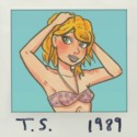
Unfortunately at times Sera's body looks a little masculine due to the lack of hips, even small/athletic women will have more of a curve to them so this is something you might like to look at, however I do appreciate the small boobs (especially in a genre where big is the standard).
Sera is based on a very beautiful, very young ballet dancer I knew once. I do try to give her hips a little curve, depending on the angle and body positioning, but Sera is pretty lean.
The assortment of different beings that make up the council are an impressive array, to be honest I would like to see more of them outside of the council environment but I'll talk about that later on, so the appearance of more aliens later on was a nice treat.
Aliens! Robots! Elves! Unicorns! Werewolves! Yeah, I threw as many as I could in there and made them "aliens." I've also designed a few of my own, like the Clarus, Vidoru and Quarveil. I've got about 94 total so far, and I hope by story's end I can reach the 200 mentioned in the first issue. You may not see them all in this series, but I hope to put out a Forsaken Stars Sourcebook with most of them illustrated.
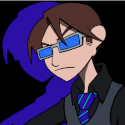
The only character design I have problems with is Azzi, a monster like him should be menacing - and I think you've tried to write him that way - but I just can't look at him and take him seriously. And it just gets worse as the story goes on, he becomes almost muppet-like.
I'm sorry you don't like Azzi. The concept is that he used to have a very expressive face and he is now reduced/has reduced himself to an immovable mask as a form of self-punishment and a way of removing himself from society, although I have tried to make his eyes as expressive as possible. We'll see if the mask ever comes off.
Also something I noticed is that occasionally in long shots like the last frames here the simplified character design clashes with the detail of the rest of the page, including the background of the same frames.

Your action sequences are reasonably well drawn (better than mine that's for sure) but on occasions there is a lack of power and knowledge of fight bio-mechanics, for instance in the page I linked Azzi's arm would be more bent - plus as a tip from a former martial artist his long talons would make an effective fist impossible, I'd suggest a strike with the elbow or heel/blade of the hand.
The space-battles on the other hand are beautiful - I could see full colour wallpaper of that being very popular.
I try to act out the fight sequences as much as I can and look up reference material or chat with my buddies that are more adept at the fight game than I am. And ha, yeah, I'm aware of the length of Azzi's claws making a fist impossible, but I err on the side of artistic license. If it were a movie, yeah, he'd be backhanding or using his elbows or just kicking a lot. :)
Last word on the art - I'm not sure whether your shading is done with pencil or ink but (aside from a few place where it looks rushed) it works, there's a loose flowyness to most of the linework that I find appealing - I find I lose a lot of the looseness in my art when I ink so kudos to you.
Thank you, thank you, thank you. I draw on 8.5" x 11" cardstock, so sometimes I give myself hand cramps trying to get it all inked. I've gotten some finer pens that I hope help that, and on my next project (which I'll be doing concurrently) I'm going to a larger size paper. But basically I try to enjoy every step of the process. Sometimes that means taking my baby sweet time about it, but I'm glad it shows.
- Story -
I hate to say this - and I'll admit it comes mostly from personal bias - but I did not enjoy the story that much.
Which was a pity because I really like the artwork and the pulp-sci-fi type world - I liked just looking at the pages - I've actually been looking forward to checking out you comic for a while so I was disappointed to not like what I found

I'm not into proselytizing or theological opinioning - which is how Forsaken Stars often reads - and there are many points in the first two chapters (particularly with the council) that this occurs and it became hard to keep reading. In fact the overwhelming theological overtones to the story are a major turn-off.
However, for what it is, it is well enough written and there is definitely an audience out there for it. However I think you've made the opposite mistake to what I myself did - information vomit as opposed to no info - there is just too much trying to be said early on and it's about things that should be the undertone of the story instead of feeling like it is the story itself.
Big themes need to be treated delicately in a medium such as webcomics, where the storytelling is ongoing, unlike books or movies you can't edit the finished product for balance before release.
The story isn't for everyone, though I hope as many people as possible give it a shot, but it's a story I don't think I've seen done before in quite this way. It's built upon everything I learned growing up, and everything I've unlearned as I continue to grow up. I hope to show several points of view before I'm done, but in the end I'm looking at this as a kind of sequel to the Bible and well, every other [genre] story that's ever been written, so it's not for the faint of heart, gag-a-day, or non-spiritual people. That said, I still want to make it an entertaining and fun adventure story, and I know that it started so high concept that it's a tough one to get off the ground. I tried to make the first issue a sci-fi/horror story, the second issue a sci-fi/romance, the third issue sci-fi/action, the fourth issue good ol' space opera and the fifth is sci-fi/biblical, each conveying a chunk of the overall puzzle that makes up the whole of the story, hopefully requiring less and less exposition with each chapter.
Now I said it was mostly personal bias, the other problem is that the characters just aren't that likeable, which becomes a bigger problem as it becomes apparent that Azzi's story is one of redemption, for the story to work you need to care about the characters and by the time more of their back-stories come out it takes some effort to care.
The early characterization of Sera makes her seem little more than a spoilt teenager than the captain of a ship that runs less-than-legal missions - a character should be shaped by their experiences - and even though this improves as the story goes on there are still moments where she comes across as a Hollywood cliche character.
In general the characterization improves as the story goes, they're still not quite likable enough - and this has nothing to do with niceness, bastard characters can still be likable - but they're becoming more entertaining which is a step in the right direction.
While I won't go so far as to say the characters write themselves, I do try and create characters and plot that are intermeshed and not cookie cutter. I think about how each character has been created by their heredity and their culture, the world in which they live or they've been forced to live, and all these things dictate their actions. Sera is very much an of-the-moment character until she receives this paradigm-shifting pile of Azzi's memories that shakes the very foundation of her world. So she decides to take a chance on this guy and see where it all goes. XTL has a wealth of evidence given to her that has her on this path that she is sure is fated to align with Azzi's, so when he turns her help down, her world is shaken and she isn't quite sure what to do next, although she tries to put on a brave eyeface. Azzi has his moments of self-indulgence, petulance and emotion, but they typically happen when he focuses on how close he is to redemption. He has to tell himself to sit back and relax and let things unfold, yet knows he must balance that with action and initiative to get where he feels he should be. And President thinks he knows what is going on, but he doesn't have any real clues to go on, so he must speculate based on the Azzi he knew three hundred years ago.
That being said I found the chapters after their escape from Ohmworld far more enjoyable - even if the light-hearted turn it takes is a bit jarring with the earlier stuff - with those beautiful space-battle scenes, this is where I started paying full attention again.
The addition of Fabius has me intrigued. As does the sudden crispness of the writing - so I certainly won't be giving up on the story (consider it bookmarked & linked) - I hope that you keep it up as it is flowing much better now.
Thanks again! I do try to put myself back in the mindset of when I was seven or eight drawing those
Star Wars
space battles. Many more of those to come, I think I can say with some confidence! I'm really glad you are intrigued by Fabius. We need someone who is more powerful than Azzi to give readers that "oh, shit," factor, and yet he's insanely tricky to write when it comes to the moments where he's dangerously close to our heroes. Supernatural went the route of anti-angel spells, and Neil Gaiman has pretty much written the modern day book on angels, so I know I've got my work cut out for me on making Fabius unique. I imagine the sudden crispness of the writing can be attributed to the sheer simplicity of Fabius' tale, but I hope it's also because I've been thinking more about the webcomic format and making sure it doesn't get too wordy. Which is hard for me. 'Cause I can get downright Dickensian. Fortunately, back in November 2010, I joined the Fresno Sci-Fi and Fantasy Writers and they have already given me invaluable feedback on issues five and six, so hopefully my writing will get even crisper!
- Final Thoughts -
There is a lot of promise in Forsaken Stars - the artwork alone is worth giving it a try.
Almost all of the problems I had were in the first three chapters, I think Forsaken Stars suffers from the same problem that mine does which is a weak beginning - in your case it's due to lumpy dialogue, the beginning is a real hard slog to get through - but there is something really promising building up in there. So although I didn't enjoy the read through I do have hopes for where it is going.

Also don't forget to darken those blacks.

A final nit-pick, the bunch of fan-art at christmas and other places in the middle of the story kind of ruins the flow, it would be best to archive it or move it to between chapters where a reader can just skip over it.


Keep at it dude,
Thank you, once more. I plan on writing a prologue or short story that might take the weight of the first few issues and as time allows, I might take a crack at a re-write & draw. I'll see what I can do about the blacks and contrasts and maybe add a touch more color to the online version. I hesitate to archive the Comic Genesis fan art, since that would bury the links to the artists that contributed their time and effort and talent, and I feel that the best thank you I can give them is to showcase them on the main viewer, but I do plan on re-organizing the forsakenstars.com fan art a bit, since most of the artists have links in the side columns.
Image
Starring The Vampire Azzi & Captain Sera Besh. Updates Mon and Thurs.

User avatar
RobboAKAscooby
Cartoon Hero
Posts: 1140
Joined: Thu Aug 07, 2008 1:00 pm
Location: Brisvegas
Contact:

Re: Webcomic Above You VI - DISCUSSION THREAD

Post by RobboAKAscooby »

Forsakenstars wrote: Cool. I'm curious, did you check out FS on Comic Genesis or at forsakenstars.com? This is also my first official review, to my recollection, so I would love it if it were posted on a blog somewhere that I could link to? Otherwise, I guess I could link to the CG thread from say my facebook page or twitter account? In any case, thanks so much for the feedback, Scooby, it's much appreciated.
Yeah repost the review wherever you like, cool by me. I repost all my reviews no matter how good or bad they are :lol:
I checked out the CG one, didn't know about the other.
While I don't want to blame my tools, and I do shy away from both color and true blacks, it turns out my ancient monitor was making everything dark. When I browsed stuff on other computers it dawned on me that my darks weren't as dark as I thought I was making them. So I got a new monitor last week! And it crashed. So I took it back and got an even better new monitor! Everything is really bright now, so I'll see what I can do about making the contrast starker. I really struggle with wanting to do full color for the web, but also knowing I just can't afford to print the interiors in color. Maybe one day...
Yeah I have the same problem with my laptop screen but I have a second monitor from my old computer which is properly calibrated from back when I was still doing video work.
Thank you, thank you, thank you. I draw on 8.5" x 11" cardstock, so sometimes I give myself hand cramps trying to get it all inked. I've gotten some finer pens that I hope help that, and on my next project (which I'll be doing concurrently) I'm going to a larger size paper. But basically I try to enjoy every step of the process. Sometimes that means taking my baby sweet time about it, but I'm glad it shows.
Ha ha, I'm going to to be upsizing my paper soon too, I need more space on the page. And I hear you on the hand cramps, inking is a pain in the wrist.
I hesitate to archive the Comic Genesis fan art, since that would bury the links to the artists that contributed their time and effort and talent, and I feel that the best thank you I can give them is to showcase them on the main viewer, but I do plan on re-organizing the forsakenstars.com fan art a bit, since most of the artists have links in the side columns.
If you still want the fan-art on the main pages I'd go with my suggestion to move the pics to in between chapters so it doesn't disrupt the flow of the story so much.
ImageDeviantart~tumblr
"Your service is to the story and to the characters. Fuck the audience and fuck your own whims." - Yeahduff

User avatar
Risky
69
Posts: 3833
Joined: Tue May 04, 2004 8:41 am
Location: San Francisco
Contact:

Re: Webcomic Above You VI - DISCUSSION THREAD

Post by Risky »

Thanks for the review, Serge. Nothing to quibble about. I'll work on the points you mentioned.

User avatar
RobboAKAscooby
Cartoon Hero
Posts: 1140
Joined: Thu Aug 07, 2008 1:00 pm
Location: Brisvegas
Contact:

Re: Webcomic Above You VI - DISCUSSION THREAD

Post by RobboAKAscooby »

SergeXIII wrote:Line variation, do it.
VeryCuddlyCornpone wrote:One last suggestion that I should have mentioned earlier along with the gesture drawing is varying line width.
McDuffies wrote:Try to loosen up when you draw, to make lines more fluid.
*massive face slap*
Okay so I've kinda started working on line variation now (with varying results), and I just spotted some of my inked pages from across the room and even at a distance (and uncoloured) it looks better.
Why the heck didn't I try this earlier?
ImageDeviantart~tumblr
"Your service is to the story and to the characters. Fuck the audience and fuck your own whims." - Yeahduff

User avatar
VeryCuddlyCornpone
Cartoon Hero
Posts: 3245
Joined: Tue Feb 10, 2009 3:02 pm
Location: the spoonited plates of Americup
Contact:

Re: Webcomic Above You VI - DISCUSSION THREAD

Post by VeryCuddlyCornpone »

LOL! It's a little thing, it seems so pedantic, but it makes such a huuuge difference. But it's tough to get a grasp on what needs to be thicker than the rest, which is something I still have pause with, myself. Glad that it's working so far though!
Image
Don't kid yourself, friend. I still know how.
"I'd much rather dream about my co-written Meth Beatdown script tonight." -JSConner800000000

User avatar
SergeXIII
Cartoon Hero
Posts: 1809
Joined: Tue May 24, 2005 9:24 pm
Location: New Jersey
Contact:

Re: Webcomic Above You VI - DISCUSSION THREAD

Post by SergeXIII »

Risky wrote:Thanks for the review, Serge. Nothing to quibble about. I'll work on the points you mentioned.
Okay, I just want to clarify that it wasn't bad, just that that it could stand to refine some of the more subtle touches to make it struggle. Had that food poisoning metaphor on the mind all day, easy to misinterpret that as an insult.

User avatar
SergeXIII
Cartoon Hero
Posts: 1809
Joined: Tue May 24, 2005 9:24 pm
Location: New Jersey
Contact:

Re: Webcomic Above You VI - DISCUSSION THREAD

Post by SergeXIII »

Forsakenstars wrote: Sometimes actions are unclear. Take the last panel of this page for example: http://thirteenthchild.net/?p=45 It may have been to obscure the violent nature of the action, and the context of the next page informs what likely happened, but I'm just not sure how this guy went down.
This was a learning experience for me and I'm sure you guys can appreciate the lesson too. In the original story boards for this scene I had planned on making Ghost's first violent act very brutal in order to make the antifatalism theme that would develope out of this more potent. The original version had Ghost breaking the thug's arm at the joint, yanking for slak, then raming it into the chest, impaling him. When it came time to draw it I literally couldn't bring myself to do it, I lacked the will to create something like that, so I pulled my punch a bit, Ghost is now ripping the arm off, but obscuring the action in order to let the reader's imagination play. It is far weaker and I guess the point of the story is to know your limits before it gets too close to the deadline, not only what you can draw, but what you will draw.

Post Reply