You mean Formula D (drifting); it's the figure skating of motorsports. NASCAR slots just above Formula D in some kind of armwrestling on figure skates. Both are awful.Jackhass wrote:At least he didn't call him a Nascar driver.OBS wrote:ARRGGGG!!!!Mr.Bob wrote:He's more than just a rally driver!
Michael Schumacher was a Forumula One driver, not a WRC driver!! Don't insult his greatness by comparing him to rallying; that's peasant motorsports (unless it's group B)!!
Doodles 7 - This cat is a landmine.
-
Dragonkingdoms
- Regular Poster
- Posts: 564
- Joined: Mon Oct 17, 2005 11:08 am
- Location: A little place at the southeast end of America
- Contact:
Why must it always be at the end of the page when I post?

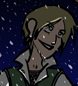
The first panel of something I'm trying. Not yet completed.
At least it probably sucks... less, anyway. Less thanthis one from the original.
The first panel of something I'm trying. Not yet completed.
At least it probably sucks... less, anyway. Less thanthis one from the original.
-
LibertyCabbage
- Cartoon Hero
- Posts: 4667
- Joined: Tue Jan 25, 2005 4:08 pm
- Location: bat country
- Contact:
Some suggestions:
-Using Fill to color is quick, but you have to use some of that time you're saving to get the spots that don't get colored.
-When you're drawing a character holding something, their hand has to be in a gripping position. In your drawing, the sword is basically just floating in mid-air.
-You should make it more obvious what the blue glowy skull thing is supposed to be, because I have no idea.
-You might wanna try some line width variation to add a sense of depth, and it'd help to separate the logo/lettering from the rest of the image.


"Seems like the only comics that would be good to this person are super action crazy lines, mega poses!"
-
Killbert-Robby
- Cartoon Hero
- Posts: 6876
- Joined: Sun Jan 08, 2006 12:28 am
- Location: in the butt

-
The Neko

- A Blithe ray of Schadenfreude
- Posts: 3878
- Joined: Tue Mar 18, 2003 6:16 pm
- Location: New York City
I would also suggest making sure you don't use colours that are saturated neons. The sky is not a neon turquoise colour like that. Perhaps if you can find something like a powder blue instead, that would look a lot better.
In general, perhaps looking at pastel colours could be a great benefit.
Anatomically... he doesn't seem to be holding the sword, as much as the sword is just sort of glued to his palm or maybe just floating there.
Compositionally, the whole thing looks like a stage, rather than a scene. The character is just standing there looking straight at the audience with a skull sitting right next to him. There's no interaction between the character and the skull (which must have some kind of significance, I wager) and no real context or concept being created by this cover. I think a lot of people mistake covers as "model sheets". I think the overall image is as if someone took a screencap of an older video game.


-
Turnsky
- Cartoon Hero
- Posts: 1488
- Joined: Fri Feb 13, 2004 8:11 pm
- Location: Devonport, Tasmania
- Contact:
and this is the finished result.

A note on the fur, i used specialised fur brushes within photoshop to perform the look, other folks draw each strand individually. like, a 1-3 pixel wide brush.
A note on the fur, i used specialised fur brushes within photoshop to perform the look, other folks draw each strand individually. like, a 1-3 pixel wide brush.

"when a hero dies, he becomes a legend, that legend, with time, becomes a myth, then a fable, that fable, is then carved in stone, and when that stone crumbles, it is lost" - Takahn.

-
The Neko
- A Blithe ray of Schadenfreude
- Posts: 3878
- Joined: Tue Mar 18, 2003 6:16 pm
- Location: New York City
I think my notes on the hand are the overall shape. The wrist seems to be missing. It goes from a suddenly very thick arm into the hand. It's a subtle transition normally. Also, the fingers don't look segmented, and end up looking like furry sausages. I had an art teacher call it "rubber glove" syndrome. Lastly, the palm and the back of the hand should be a bit longer, the knuckles would begin a bit higher given where the thumb connects to the hand.
A hand like that wouldn't be able to grip much.
The moon turned out really good, though. It's a bit obscured by the bloom effect, though.
A hand like that wouldn't be able to grip much.
The moon turned out really good, though. It's a bit obscured by the bloom effect, though.
-
Turnsky
- Cartoon Hero
- Posts: 1488
- Joined: Fri Feb 13, 2004 8:11 pm
- Location: Devonport, Tasmania
- Contact:
slightly overcast sky, i wanted to obscure the two moons, and the large gas giant in the background, i did try to make the fingers segmented, but couldn't make it work right with the fur, truth be told.The Neko wrote:I think my notes on the hand are the overall shape. The wrist seems to be missing. It goes from a suddenly very thick arm into the hand. It's a subtle transition normally. Also, the fingers don't look segmented, and end up looking like furry sausages. I had an art teacher call it "rubber glove" syndrome. Lastly, the palm and the back of the hand should be a bit longer, the knuckles would begin a bit higher given where the thumb connects to the hand.
A hand like that wouldn't be able to grip much.
The moon turned out really good, though. It's a bit obscured by the bloom effect, though.
yeah, i saw it later and thought the palm was a tad small, in reality i wanted to make it a PoV effect, hence the foreshortening attempt.
Truth be told, i do think i shoulda spent a lot more time on the hand itself, since it's the main part of the image.
i might revise it somewhat, when i get the time.
i did take your suggestions under advisement, however.

the blue's the original photoshop sketch.
"when a hero dies, he becomes a legend, that legend, with time, becomes a myth, then a fable, that fable, is then carved in stone, and when that stone crumbles, it is lost" - Takahn.
-
The Neko
- A Blithe ray of Schadenfreude
- Posts: 3878
- Joined: Tue Mar 18, 2003 6:16 pm
- Location: New York City
Hmm. Well, I guess if you want to do a hand that's furry, you could make it short, short fur, kind of the like the fur on a cat's face. It's far, far shorter than that on the rest of the body. I can't imagine a hand being very useful if it had hair that long all over it. That way you could still have some kind of definition for the fingers.
The problem with anthropomorphic characters is balancing the levels of human characteristics to animal.
The problem with anthropomorphic characters is balancing the levels of human characteristics to animal.


AN: clicking image leads to 2.4 MB image...yay for necromancers!
<a href ="http://www.viistar.com/images/2d/illust ... pencil.htm" target="_blank"><img src = "http://www.viistar.com/blog/necro_pencil_sml.jpg" border = 0 alt ="huh huh huh boner dragon... huh huh...."></a>
OMG i need more work with backgrounds... the perspective always comes out wrong ^^;
needs transfer and ink......
..
..
not <i>quite</i> looking forward to that.
<a href ="http://viistar.comicgenesis.com"><img src = "http://www.viistar.com/blog/raeuxbanner.png" border =0></a> updates on all even days
<a href ="http://www.viistar.com/comic">Raeux Mirrored site</a> updated 12.02.07
<a href ="http://www.viistar.com">VIIStar.com</a>
<a href ="http://www.viistar.com/comic">Raeux Mirrored site</a> updated 12.02.07
<a href ="http://www.viistar.com">VIIStar.com</a>

Another one of a girl just standing there.
You do not have the required permissions to view the files attached to this post.
Last edited by Brockway on Sun Jun 10, 2007 12:35 am, edited 5 times in total.
-
Turnsky
- Cartoon Hero
- Posts: 1488
- Joined: Fri Feb 13, 2004 8:11 pm
- Location: Devonport, Tasmania
- Contact:
indeed, shorter fur it needs, and the fur direction needs to go towards the fingers, instead of the other way it goes... see? i AM learning something!The Neko wrote:Hmm. Well, I guess if you want to do a hand that's furry, you could make it short, short fur, kind of the like the fur on a cat's face. It's far, far shorter than that on the rest of the body. I can't imagine a hand being very useful if it had hair that long all over it. That way you could still have some kind of definition for the fingers.
The problem with anthropomorphic characters is balancing the levels of human characteristics to animal.
"when a hero dies, he becomes a legend, that legend, with time, becomes a myth, then a fable, that fable, is then carved in stone, and when that stone crumbles, it is lost" - Takahn.