
Tell me what you think of this.
It is here
Your opinion (of course)


Let me preface this by saying that I have no room to really criticize here... but anyways:
The art is very messy, and most of the comic is set up to be two people talking to each other, and we usually only ever see their heads, which is visually boring. When you want to draw a straight line, I suggest using a ruler, it'll come out much neater. Your hand lettering is difficult to read; look around the forums, there should be links to good font sites somewhere around here. And (more a scripting problem than a drawing one) I have absolutely no idea what's going on.
The good thing is, you draw better than I do. =p
-
Dawn Sequence
- Newbie
- Posts: 8
- Joined: Thu Apr 07, 2005 7:49 pm
- Location: On the edge of uncertainty
-
Jen_Babcock
- Regular Poster
- Posts: 649
- Joined: Fri Dec 03, 2004 9:02 pm
- Location: Los Angeles/ New York City
I didn't really understand what was going on either... but maybe that was the point. The writing just seemed completely incoherent, particularly at the end.
There are lots of problems with the art- the anatomy, the perspective, etc.- but with time and practice, you can improve these things.
Rather than draw your balloons with your mouse after scanning it in, perhaps you should try to do it using linetools or some kind of template. Check out http://www.blambot.com as well.

-
Rkolter
- Destroyer of Words (Moderator)
")
- Posts: 16399
- Joined: Tue Jun 24, 2003 4:34 am
- Location: It's equally probable that I'm everywhere.
- Contact:
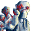
Readable, but incomprehensible. You need a bunch of extra panels to explain what's happening. How did we go from talking about aliens to sitting around a table? What happened to the guy (was he flipped over, or are those shaggy eyeballs)? Why?
Artwork is extremely basic, but tolerable if I could tell what was going on.
Artwork is extremely basic, but tolerable if I could tell what was going on.


Crossfire: "Thank you! That explains it very nicely, and in a language that someone other than a physicist can understand..."
Denial is not falsification. You can't avoid a fact just because you don't like it.
"Data" is not the plural of "anecdote"
As a cartoonist, you make a great plumber. Seriously...I don't like to tear anybody down, but a dose of realism never hurts. Leaving aside the technical issues of bad scanning, balance and contrast, the art is really, really bad. The characters are inconsistent and crudely rendered. The perspective and camera placement are shifting worse than a fat lady's undergarments. The sparse linework and failure to make any attempt at believably rendering anything makes this look like it was tossed off in about 30 seconds on the back of a napkin while downing tequila shooters in a poorly lit bar.
The good news is that you're not alone here...there's a lot of web cartoonists who couldn't draw a breath without the help of a ruler, and Ames guide and tracing paper. However, what some of them lack in the art skills, they make up for with their writing. Unfortunately, this does not appear to have that saving grace. This strip gives no sense of who the characters are, why they are here, what context they are in, or why we should give a hairy rat's ass about any of it. It's not funny, or interesting, or even briefly amusing. I would definitely not be interested in where this strip is going....nor, even, in reading anything else from this creator if it is the best he can do.
To attempt to be constructive:
If you want to do some cartooning, don't think that anything passes on the Net. While it is true, that you can get anything posted online, getting people to read it is another matter. Learn some basic cartooning skills...read some Chris Hart, or Will Eisner, or even some of the many fine online tutorials and learn what cartooning is about.
Learn how to draw. I don't mean how to put lines on paper...you can obviously do that. I mean how to construct and render a figure and how to create a believable environment. Burne Hogarth, George Bridgeman, Gray's Anatomy...all good reference. Hell, if nothing else, crank out at least one good set of character designs and do a copy and paste cartoon...it would be easier to look at than this thing.
Learn how to write a strip. Think of it as communicating a story or idea to another person...if the idea is not communicated, you have failed. The "dialogue" in this strip does not make sense at first read, and I really can't be bothered to put the effort into figuring it out.
Learn how to use a scanner. I have a hard time believing that you meant for this to look this dirty. Hell, I half suspect this is some webcomic version of "Punk'd" and you're really Pete Abrams or Scott Kurtz trying to see if we'll approve of anything that calls itself a webcomic.
And just for the record, I'm not trying to be a dingus; I'm not trashing your work for the fun of it. I'm just offering my opinion, as asked, and trying to be a little constructive in hopes of sparing the web from another bad comic. Please feel free to completely ignore anything I say, and I'll look forward to seeing your site as a Something Awful "Link of the Day".
Visit "The Journals of Simon Pariah"
http://simonpariah.keenspace.com
http://simonpariah.keenspace.com
-
Tears

- Regular Poster
- Posts: 295
- Joined: Fri Mar 11, 2005 5:28 am
- Location: keeping watch for the minions of sanity
- Contact:
Hmmm... well actually I've seen a lot worse... this actually isn't bad for something drawn by a kid... and I'm guessing it is because if there are adults in the world who talk like that then I really fear for the future... Anyway the art and the technical stuff will come with practice... what you might want to pay more immediate attention to is a little thing called originality... this reads like the sort of thing that would get passed round in class... in fact pretty much has been passed round in every classroom since the dawn of teaching... originality isn't easy, but if you have it you will probably be forgiven pretty much anything else, and if you don't then you'ld better be pretty darned good if you want to be taken seriously outside you immediate group of friends
Warning: this poster is addicted to ellipses...
I have a web comic called Tears of Eternity if you don't look you'll never know if you would have liked it.
I have a web comic called Tears of Eternity if you don't look you'll never know if you would have liked it.

Well, first off, I had officially no clue at all as to what was going on. Are those... eyeballs? Wow, didn't even notice that before rkolter mentioned it - I thought it was supposed to be a pair of really small aliens.
Honestly, though, your art isn't THAT bad, for a webcomic, (I know several people who draw much worse), and I'm sure you'll become good with practice. The scanning is also, well, very bad. It looks like you scanned it at 100dpi, greyscale - but again, that not critical to your comic. What IS critical, however, is the writing - It's quite simply impossible to make out what this particular strip is about. The other two strips in your archive made much more sense, even if they weren't splendidly written. Also, TAKE AWAY THE BLACK BOXES! They make baby Jesus cry.

Honestly, though, your art isn't THAT bad, for a webcomic, (I know several people who draw much worse), and I'm sure you'll become good with practice. The scanning is also, well, very bad. It looks like you scanned it at 100dpi, greyscale - but again, that not critical to your comic. What IS critical, however, is the writing - It's quite simply impossible to make out what this particular strip is about. The other two strips in your archive made much more sense, even if they weren't splendidly written. Also, TAKE AWAY THE BLACK BOXES! They make baby Jesus cry.
Warning: This poster regularly makes unintentionally sexual posts. Or at least "unintentional" is what she claims...


-
Thirdworldvillian
- Regular Poster
- Posts: 128
- Joined: Thu Nov 18, 2004 4:49 pm
-
Chibiartstudios

- Regular Poster
- Posts: 978
- Joined: Thu Apr 08, 2004 11:33 pm
- Location: Right behind you!
- Contact:
Yup! Those are some freaky googly eyes for some reason!
OK, unlike those other meanies I'll be nice!
*dodges gunfire*
My money is on the fact that you are young so it's not like youve been doing this for a decade. You are just behind where I started actually so don't feel THAT bad.
First off, I should explain WHY people are being hard on you. When you put a webcomic on the internet it beacomes more than just a hobby or a timekiller. It beacomes an art business. You expect people to pay in pageviews, ad clicks, time spent and hopefully one day cash in exchange for a comic that you produce. If you expect people to pay these things you must have a product worthy of spending that time and energy on over and over. If that's not true than you won't get many hits or ANY ammount of money.
Art is hard. It's as simple as that. If you want people to read your stuff take some time to make your work it's best. Pencil things out, use rulers, ink, and then scan and letter with photoshop. If all together a single page takes you less than 3 hours you aren't putting enough effort into your stuff. And just to be fair I spend 5 minimun on each of mine. (.5 for outlining, 2.5 for penciling, 1 for inkin, 1 for lettering. I can add another 2 if I digitaly color it.)
When you don't do these things it seems a little insulting to those who do and ask the exact same of people. Hence the anger.
Your job at this point is to learn. By all means keep what you have up. But try and make each one better than the last. Take art classes even if there is no focus on comics or cartooning. Learn anatomy through classes or just draw figgures in magazines. Whatever you do just draw. Alot. Eveyday.
If all this seems like a hastle... It is...
In all honesty alot of people do 30 (or just 1 in some cases) comics and quit because they realise that it's hard. Ask yourself why you are doing this. The first webcomics where artists building a portfolio to push on the newspaper syndicates. Later it beacame a way to spend time doing what you love. Then it became a way to tell a story you want to tell without editor intrusion. Which is a mixed blessing. What is YOUR motivation? Because if it's to get thousands of fans or to ger money you'll be really, really dissapointed. If it's to learn and to do something you love.
Well, then your in business! But in the end it's up to you.
So yes. My review for now is an F. But it's not hard to improve at this point. Make events clearer, use a ruler in your pannels. Draw in 3 stages (it looks like you skip to inkin) and scan at 300DPI and save in png or gif format. Do this and you are up a whole grade level and a half JUST FOR THAT.
So thats my two cents!
Help me live my childhood dream of becoming the head of an evil corrupt corporate conglomorate:

-
Christwriter

- Cartoon Hero
- Posts: 1915
- Joined: Fri Jan 30, 2004 11:56 am
Not the absolute worst I've seen, but it's still not very good.
Some of it IS that you aren't very skilled yet, and I have loads of sympathy for you, if for no other reason then because I sucked royally when I started too. Your lines are very dirty. Either you are using dirty paper, smudging pencil lines all over the place, or you need to learn how to scan properly/improve your scans once you take them. The drawings are disturbing, which would be a good thing if they were cleaner. They look like something I would find on the margins of my notebooks from five years ago. Clean them up a bit, practice drawing them until your lines come cleaner. Practice your style a bit more, maybe throw in a few hours of studying human anatomy per week. And learn perspective. A person can forgive a really grungy looking character but bad perspective is bad perspective. Having an actual vanishing point in the drawings is a Very Good Thing.
You have three pages. None of them make any sense at all. There is a thing in story-telling called "Continuity", a very good thing, that is required even if you aren't telling a story. You jump from education to having an unidentifyable object staring over the table. When you are starting out it helps to have something understandable for the reader to ease into, and it especially helps if there is some form of continuity between pages. Right now it doesn't seem like you've got anything here for me to be intrerested in, and it doesn't seem like you know where you're going or even where you want to go. Get some kind of idea of what it is you're trying to tell with this (story, jokes, international commentary on walnuts) and stick with it. Don't jump around.
I hope this helps you.
CW
"Remember that the definition of an adventure is someone else having a hell of a hard time a thousand miles away."
--Abbykat, NaNoWriMo participant '04
Coloring tutorial It's a little like coloring boot camp. Without the boots.
<a href="http://blueskunk.spiderforest.com"> </a>
</a>
<a href="http://www.nanowrimo.org"> NaNoWriMo </a> --for anyone who has ever aspired to write a novel. Insanity is also a requirement.
--Abbykat, NaNoWriMo participant '04
Coloring tutorial It's a little like coloring boot camp. Without the boots.
<a href="http://blueskunk.spiderforest.com">
</a><a href="http://www.nanowrimo.org"> NaNoWriMo </a> --for anyone who has ever aspired to write a novel. Insanity is also a requirement.
-
Chibiartstudios
- Regular Poster
- Posts: 978
- Joined: Thu Apr 08, 2004 11:33 pm
- Location: Right behind you!
- Contact:
-
Christwriter
- Cartoon Hero
- Posts: 1915
- Joined: Fri Jan 30, 2004 11:56 am
Alright. I'll sell you the rights for cat food. 
CW
CW
"Remember that the definition of an adventure is someone else having a hell of a hard time a thousand miles away."
--Abbykat, NaNoWriMo participant '04
Coloring tutorial It's a little like coloring boot camp. Without the boots.
<a href="http://blueskunk.spiderforest.com"></a>
<a href="http://www.nanowrimo.org"> NaNoWriMo </a> --for anyone who has ever aspired to write a novel. Insanity is also a requirement.
--Abbykat, NaNoWriMo participant '04
Coloring tutorial It's a little like coloring boot camp. Without the boots.
<a href="http://blueskunk.spiderforest.com">
</a><a href="http://www.nanowrimo.org"> NaNoWriMo </a> --for anyone who has ever aspired to write a novel. Insanity is also a requirement.
-
Chibiartstudios
- Regular Poster
- Posts: 978
- Joined: Thu Apr 08, 2004 11:33 pm
- Location: Right behind you!
- Contact: