So now that I'm back from vacation, I can properly respond to Cuddly's review of Steel Salvation. First off, it's an honor to receive such a thorough review, especially for a comic that's not even 20 pages long. We've had very little feedback from people we don't already know (and that hardly counts, does it?

), so it's exciting to see an in-depth and ultimately positive response from one of the more discerning reviewers in the community. Anyway, that's enough of that. On to the business.
VeryCuddlyCornpone wrote:The about page is a wordy thing, which is par for the course for about pages. The only suggestion I have here is to perhaps add some anchoring links at the top of the page to each section that gets discussed, only because the “world” section is so long that I don’t know how many readers would read that far or bother to scroll past it to see the additional sections underneath. Perhaps this section could even be shortened, but it’s just an extra page and not something that needs hand-wringing over.
It's funny you should mention this, because Alex has been working on collapsible menus for the About page in order to fix this problem. I agree that the "world" section is long, and it shouldn't be dominating the page like that, but I do love world building, and there are plenty of sci-fi fans who devour background lore for every meal of the day. The Mass Effect series knows this fact and exploits it to great effect, and I had the codex from those games in mind when I started the "world" section of the About page. Now, the Mass Effect codex is much more organized and visually pleasing than our page, but we
are working on it, and we could have a much improved About page any week now (although the comic itself takes priority).
VeryCuddlyCornpone wrote:My one and only issue with the design at all is the nature of the navigation buttons on either side of the comic. I love that they match the style, but because they’re so stylized and unusual I thought they were just site decoration at first and it took me a minute to figure out how to move to a different page. It might just be me being dumb, but I would suggest making them just a little bit bigger/more obvious.
Opinions have actually been pretty split on the navigation buttons. We assumed that the standard navigational arrow icons would make it clear to seasoned webcomic readers what the buttons were for, but we've had people who never read webcomics figure out the buttons immediately, and we've had webcomic veterans get confused like you did. I'm not sure if there's anything we can do to make it any clearer without messing up the aesthetic of the site, and in any case, if people do get confused, they always figure it out quickly and they're not likely to be confused a second time. I think we'll just have to accept that a little confusion comes with the territory in this case.
VeryCuddlyCornpone wrote:Onto the comic itself. The opening of the story is well done. The exposition is rather subtly conveyed through the text, almost poetic without getting overly prosacious.
It warms the clockwork timepiece I've been using as a heart to hear you say that. I'm a huge fan of the Ray Bradbury school of science fiction, which is more about crafting poetic visions of the future, rather than the so-accurate-it-comes-true Isaac Asimov school of science fiction. I'm always obsessing over where my writing falls on that edge between moving poetry and flowery bullshit. I've become so obsessed with it that I can't even tell anymore which side it ends up on, so it's a huge relief to hear from an outside perspective. And apparently, I've landed on the right side with Steel Salvation. At least so far.
VeryCuddlyCornpone wrote:It may be too early to tell yet, but it makes me think that beliefs, religion, faith, and theism in general may be a key theme in Steel Salvation, with Dy-Gar acting as an allegory for a person who has become disillusioned with a god they may or may not have ever really “believed” in, without outright denying the existence of such a being. Though it could be just gillywilly speculation on my part!
It's never too early for gillywilly speculation. Especially when you hit as close to the mark as you have. Religion and spirituality are big recurring issues in Steel Salvation, along with the comforting and corrupting power of self-delusion. They're pretty closely intertwined, actually. But I may be getting ahead of myself. I can't partake in the gillywilly speculating when I already know the story from start to finish.
VeryCuddlyCornpone wrote:Most of the subjects depicted are inorganic, so I understand the reasons behind keeping lines straight and clean, but playing up the natural warp of perspective could help to add some visual interest. I feel like because of the tone of the story, this is the kind of comic that could work with the art being clean and structural but a bit “off” and weird. After all, Dy-Gar talks for a bit about humans
infusing their creations with needless and organic-like imperfections. Using imagery to back this up could help readers understand Dy-Gar as a character more, as well as contribute to a more unsettling vibe.
I was wondering if you could elaborate a bit on that. And I may not know the first thing about art, but feel free to get as technical as you'd like. I can just copy/paste it for Evan and Alex to figure out. When you say "off," are you thinking of a kind of surrealist look, like with exaggeratedly crazy backgrounds and such? If so, that's something closer to what I originally envisioned for the story, but due to Evan's lack of experience with scenery and my lack of experience conveying my vision, that really hasn't come through, and I wonder if it might be too late now to start doing it. I'm actually a huge fan of German Expressionist films like
The Cabinet of Dr. Caligari and
Nosferatu, so if that's the kind of thing you had in mind, I'm right there with you. Perhaps I can bring this up at the BHC's next comic meeting.
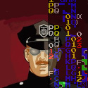
VeryCuddlyCornpone wrote:Steel Salvation is a bit unusual in the sense that the art is shaded entirely in
monochrome flats with occasional stepped gradients. I think the values could stand to be pushed a bit more, because that and line art are what really will
give this art style depth. They aren’t bad as-is, but I think they could be a little bolder and contrasting, like the
bottom half of this page,
and this one. I do like the flats. It’s unique because usually monochrome artists use hatching, screentones, or proliferous gradients. Flats tend to be the realm of color artists who either draw in a flash/modern “clean” style, or who don’t understand shading well enough to apply it to their own art (cough)
Humbug mentioned this too, and it's something we'll keep in mind going forward. I kind of like the contrast between the present day, where everything on Cykta has faded into an indistinguishable gray lump, and the scenes from the past, where the lights and the shading are sharper and more "alive." Of course, indistinguishable gray lumps aren't that interesting to look at, so even if it fits thematically, it's not the best choice from an artistic standpoint.
VeryCuddlyCornpone wrote:I like the simplicity, but I can’t help but feel, when I look at the art of Steel Salvation, as though something is missing. I think because of the size of the comic on my laptop screen, there’s so much room that I expect to see more details, though I’m not entirely sure they’d be needed. I imagine the clarity would make the comic superb for those reading on smaller screen mobile devices. In today’s times, I can’t really advise going against any designs that make a comic more appealing and accessible to mobile readers. I think this is what my issue is, mainly. The comic (aside from what would probably look to be too small of a font in this scenario, perhaps) is well suited to a smaller display. The mostly stable line thickness contributes to this. It’s not the kind of comic where you worry about all the small details you’re missing, because there are no small details.
I think what we need to do is work on our panel composition. Make sure all the spaces are filled and there's something interesting or important packed into every panel. With Alex's minimalistic style, adding more small details isn't really an option. It wasn't necessarily chosen with mobile readers in mind (our website design actually fucks up on smaller devices, so at the moment our most suitable viewing method is broken), but rather it came from Alex's background in graphic design mixed with Evan's simple and "cute" drawing methods. I'll try to describe each panel in greater detail in the script, and we'll continue experimenting with our style (I'm starting to get pretty excited about the German Expressionist angle). Hopefully we can nail down that missing element soon.
Thanks for the insightful review, Cuddly! I'll do my best to make sure Steel Salvation only continues to get better and better with time. And who knows? We might snag a few readers along the way


")

