Okay people it's time for some good old fashioned reviewing.
Here's hoping we'll get some new faces this time around - all will be welcomed.
*The Rules* (paraphrased from previous thread)
1) DO NOT POST TO THIS THREAD unless you are putting up a placeholder or posting a review. Comments, questions, anything else like that should go in another thread somewhere. Posts that are done that are NOT one of those two will be deleted by the mods.
2) Know what you're getting into. Guess what? We're all people here, with our own opinions and likes and dislikes. Not everyone here is going to like your comic, and not everyone here is going to hate your comic. Be straightforward with your reviews, and take your own reviews as constructive criticism.
3) Do not ask for a review unless you are completely intent upon reviewing the person before you. Reviews should be THOROUGH within reason. "Hey, I like it!" is not thorough. Read the comic and give it a good review, please shoot for at LEAST 200 words or more.
4) Have an archive for us to read, please. If you've got three comics and a title page, guess what? IT'S NOT LONG ENOUGH! Shoot for 25 or so pages, the longer the better. Note that if you only have one active comic, and you post here, it may be reviewed by default. If you have multiple comics please specify which you want reviewed.
Usually, someone that is posting will have a webcomic to review, however, this isn't always the case. If there is a webcomic that meets the above requirements, then the following post reviews it. If not, then nothing is reviewed that time around.
When you're done with a review, please remember to PM the creator of the comic.
NO REVENGE REVIEWING - If you don't like the review you get that's what the discussion thread is for, don't give a bad review back.
Here's the previous W.A.Y. for those who need an example.
DISCUSSION TOPIC IS HERE - TA DA!
*The Progress List*
N/A - Reviewed by RobboAKAscooby - N/A
Flying Tigers - reviewed by Robotthepirate - done
Robot The Pirate - reviewed by MichaelYakutis - done
And To Be Loved - reviewed by LibertyCabbage - done
Deep - reviewed by Cannetella - done
The Null And Void - reviewed by Terotrous - done
Comic Creatorz - reviewed by VeryCuddlyCornpone - done
Loud Era - reviewed by peterabnny - coming soon
Critters - reviewed by RobboAKAscooby - done
Flying Tigers - reviewed by VeryCuddlyCornpone - coming soon
Loud Era - reviewed by Liberty Cabbage - done
Orange Revolution - reviewed by RobboAKAscooby - done
Flying Tigers - reviewed by Yeahduff - coming soon
8:1 - reviewed by Terotrous - done
???
Webcomic Above You 2012
-
RobboAKAscooby
- Cartoon Hero
- Posts: 1140
- Joined: Thu Aug 07, 2008 1:00 pm
- Location: Brisvegas
- Contact:
Webcomic Above You 2012
Last edited by RobboAKAscooby on Fri Jun 29, 2012 9:16 am, edited 10 times in total.
 Deviantart~tumblr
"Your service is to the story and to the characters. Fuck the audience and fuck your own whims." - Yeahduff
-
robotthepirate

- Regular Poster
- Posts: 563
- Joined: Wed Mar 02, 2011 11:02 am
- Location: Staffordshire, UK
- Contact:
Re: Webcomic Above You 2012
Ok! I'm in. Shall begin reviewing Flying Tigers
Edit 11:37 DONE, first ever review BTW. This review might end up being confusing, I think in a confusing manner, I do things in a confusing manner, and I'm writing as I think and do.
----
Starting out reviewing Flying Tigers by Rob O'Brien, not Harli Dust as the banner might imply. I don't know if anyone's ever made this mistake for real, but I already knew our Scooby wrote it.
Before I started to read through I thought “How long is this?” so I looked for an archive section, and while I like the “...Diary”, “...Yearbook”, “Photo Album”, “...Hangouts” menu it's a little confusing. Putting what they really are in brackets would help, but it's up to you if you think it would spoil the mood. I'll stop reviewing the website rather than the comic now.
First page. The font. I'm dyslexic so “T”s that look like “4”s aren't great, I don't know if that would actually stop anyone else who's dyslexic from continuing on with the comic (especially when they realise its just for the diary/internal monologue) but it might take a little from the enjoyment factor. It also seems too uniform. I know it is uniform, because its a font, but because it's trying to be a handwritten font the uniformity becomes obvious when it's in such large amounts, its not so big a problem in the smaller thought bubbles once the story starts. Last thought on this page, “I hope they don't wear those trousers often” because they're really crotch-centric.
First characters mentioned, Doc and Storm. I might not have noticed if they weren't the only characters named so far, but I feel like I've strayed into a X-Men fan-fic. Next the Cobras, to me that says Grease (and it's also the name of a joke gang formed by Joey and Rachel in an episode of Friends), it doesn't sound real.
The attempted rape scene. I read this bit when you first started the comic, and honestly that's why I haven't read any more until now. Whatever message you're trying to put across in this bit it's uncomfortable and not handled well. Five seconds later she's fine again, worrying instead about her friend and thankful her food is fine. So is this a regular thing that people have become desensitised to it? Unless you're planning on making a big deal out of this, you're risking belittling it and there are support groups that would happily pummel you for that. I'll read on...
Story wise you're still introducing Harli and her friends so I find it hard to judge what this comic is about. From the title, 'Ric's comments, the picture in the banner and Doc's house, and Harli and 'Ric's apparent martial arts skills it's surmisable that the Flying Tigers are a martial arts group so presumably the comic is about them. All we (the readers) can really do at the moment is presume things, which is fine as long we're not doing that for too much longer.
Art wise I much prefer FT to SH so you're growing. I'm not the best to review your art but I always feel you need to “loosen up (man)” and add some fluidity to your poses. Have you tried the exercise where you draw someone around you (while waiting for a bus or at a café or something) in just a minute or two, you don't have time to get any details down so all you can aim for is an expression of their movement and form. Actually, comparing you early fight stuff to the boat fight scene (which the forward navigation seems to skip, you should look into that) you've improved a lot with that. Other than that I'm impressed with your colouring and shading they have an appealing organic feel. The difference between the tall and short people is massive, that's not entirely unusual, especially for school age, but it feels a little odd.
There's a fair bit in the wave café that's quite obviously C&Ved (and others, this was just the first I noticed), I know it can be boring to draw people sitting talking in pretty much the same pose again and again but you can always flip to another point of view to keep this interesting. You don't get away with it though, it is obvious, and if I bought it in a book I'd feel cheated.
So my thoughts. It's moving slowly. You're still introducing, which is cool, but 60 odd pages in I feel while lots has happened that nothing at all has happened, at the same time. It's not so much a bad thing. Taking your time and setting the scene with lots of minor occasions can give us a nice background to your characters.
Unfortunately referring to minor occasions brings me back to an earlier point. The attempted rape scene. None of them seem bothered by it in the slightest, as though because it was a failed attempt it's nothing to worry about. What would they have done if 'Ric hadn't been there? Then the very next morning two of your main characters a caught being voyeurs and everyone makes jokes. It really doesn't make sense, people don't react like that in real life and I think you would probably offend a lot of people if they read it.
So while you're improving in your art and I'm curious where the story is going, I'm put of reading it or recommending it by that gaping emotional hole and the only thing I can really suggest is to cut the Cobras altogether from what has already gone by in the story and re-introduce them more tastefully (make them the slime they are by all means, but not the way you have done). When that's done Flying Tigers will have enough credibility to show promise.


-
MichaelYakutis

- Regular Poster
- Posts: 71
- Joined: Fri May 04, 2012 9:24 am
- Contact:
Re: Webcomic Above You 2012
Ok, so I initially posted this in the wrong thread and got confused and I should have only done one review, but I did two. Long story....Here they are>
Robotthepirate: I read through the first chapter and I liked the look of your characters right off the bat. They made me laugh just looking at the first cover page. They're really cute and I like how they have to use their whole bodies to do simple things.
I'm not a big fan of the square word balloons, but that's just a personal preference. Although they would work quite well for the robot, but I think it'd be nice to see the rest of the characters have round balloons. It might work better with the story, since the characters themselves are round. Remember, word balloons in general can be used as a storytelling device (Dave Sim of Cerebus was the best at doing this). But also, in regards to the lettering, there are times when it's hard to determine who is talking first because the balloon isn't in quite the right place. For example, in Chapter 1, page 5, panel 2, it looks like the robot says all his lines first, which isn't actually the case. You should have brought the pup's word balloon closer to the pirate and fit it between the pirate's two lines.
For the type of story it is, I feel like each page needs to have more of a punch line to it, rather than it just leading to the next page. However, I feel compelled to keep reading and see the next page, so I guess it works!
RobboAKAScooby: I read a little ways through the second chapter and I like the direction the story is going. However, I feel like most of the pages don't feature enough writing and/or action. It seems like simple sequences are dragged out longer than they should be, perhaps as filler, I dunno. The writing isn't bad or anything, just slow very going.
The artwork took a while to grow on me. But I think it works fine for the story. The action sequences have some cool shots, but again, drag out a bit longer than they should.
One thing that really stood out to me near the start of the second chapter is the posters on Harli's walls. Personally, I don't really like using actual poster images. It's very distracting to see that when the rest of the page is illustrated.
I like how your banner has the cast on either side of the title: left has work clothes (I assume those are work clothes?), and the right has their martial arts uniform. Cool concept. I would, however, suggest changing the title card in the middle of the banner. It needs a little color to it as to better match up with the images on either side.
Either way, I'm looking forward to reading more when I have more time.
I'll try to review more comics another time. My internet is being sllloooowwww and is making me angry. Till then, take a look at And To Be Loved and let me know what you think! The series will be going through a HUGE change later this week, so watch out for that:
http://www.andtobeloved.com/archive/cha ... e-cover-3/

-
LibertyCabbage
- Cartoon Hero
- Posts: 4667
- Joined: Tue Jan 25, 2005 4:08 pm
- Location: bat country
- Contact:
Re: Webcomic Above You 2012
ALRIGHT LET'S DO DIS...
Webcomic: And To Be Loved
URL: http://www.andtobeloved.com/
Creator/s: Marisa Brenizer, Michael Yakutis
Run: 2/11-current
Schedule: W/Sa
Section/s: Ch. 7, "One Straw, Please"
Website: The site's background's a glaring orange color, and I found it to be extremely distracting against the black-and-white pages. I ended up taking breaks from the reading to give my eyes a rest, and eventually I just started loading the pages separately using my browser's "View Image" feature. Unfortunately, though, the pages actually have a wide orange border around them, so even using "View Image" didn't help as much as I'd hoped. I have to say, if I'd stumbled upon this site as a casual reader, I would've closed the browser within a few seconds and moved on to something else. It's also not necessary to have the border on the actual pages -- the same look can easily be achieved either by centering the pages inside a division with a background image, or by creating a nine-cell table.
There's a decent amount of extra features, although I dislike how the cast page is less developed than the more miscellaneous stuff. I mean, it doesn't make any sense to me that the creators' real-life fashion inspirations each get their own write-up, but the comic's characters have no information listed at all. Where are the creators' priorities at? The characters do have their own Facebook pages, which is kinda cool, but it's not a very clear way to present them to new readers.
The comic has a "YouTube Debut" video, too, which I thought would be really neat, but it ended up just being someone singing into a microphone for a few minutes. It's not obvious to me that it has anything to do with the comic.
The comic also has its own Facebook page, where fans are regularly informed of updates. It seems like a good idea to me.
Lastly, the bonus gag strips are a good concept, but this comic doesn't seem to work in the gag format at all, so it's somewhat of a wasted effort.
Writing: This chapter's essentially a big build-up to Thomas' dramatic, splash-page realization of R's homosexuality, and this is problematic in sense of the numerous clues the reader's bombarded with throughout the chapter. The creator suggests in the page's comments, "Thomas is dumb. I guess he only saw what he wanted to see," but this doesn't seem realistic enough to me. Instead, it appears the creators have passed Thomas the Idiot Ball in order to force R's goofy double-life scenario and the aformentioned climax. Observe some of the indications of homosexuality in this chapter that Thomas is, apparently, completely oblivious to, despite sharing a bedroom with R:
-- R calls Thomas "hot stuff," and calls it "gross" that Thomas had sex with his girlfriend (p. 114)
-- R walks around in just his underwear, and explains he's not interested in women because he's "asexual" (p. 115)
-- Thomas catches R looking at "gay porn," and complains that R once listed himself in the "men-for-men" section of a dating site (p. 116)
-- R takes his female date to a gay bar, which he calls "my happy place," and ignores her all night (p. 123)
-- R invites Thomas to dance with him, and puts his hands on Thomas' shoulders (p. 126)
-- R refuses to date women again, but succumbs in order to get a gift card to a clothing store (p. 127)
-- The first woman R meets at the speed dating event compliments him on his "metro" look (p. 131)
-- R picks up an attractive guy at the speed dating event (p. 135)
-- R invites his new guy friend over to watch America's Next Top Model, and he explains he likes to "pause it and critique Tyra's unfortunate wardrobe choices" (p. 136)
-- R mentions that he's taking his guy friend "to a show on Friday" (p. 138)
Despite all of this, Thomas never shows any signs that he suspects R might be gay, and doesn't even acknowledge that possibility until R finally says, "Open your eyes. It's right in front of you, Thomas." And that's when Thomas suddenly becomes aware, on pages 139 and 140, of some strange things in his own bedroom:
-- A RuPaul CD
-- A Lady Gaga poster
-- A unicorn doll
-- A poster of a naked man
-- A Care Bear doll
-- Pink clothing
"Thomas is dumb. I guess he only saw what he wanted to see." So is Thomas supposed to be in such an intense state of denial that he's mentally blocking out practically everything R says and does, as well as his own environment? That's too big of a stretch for me. And it's not just Thomas, either -- R's other roommate, Claire, discusses R's dating situation on two occasions, but also never infers she thinks R might be gay. And poor Jane, Claire's friend who gets ignored by R on their blind date, apparently never raises any suspicion to Claire about R.
This leads us to Robert Ebert's term Idiot Plot, which is "any plot containing problems which would be solved instantly if all of the characters were not idiots." I think this term definitely applies to And To Be Loved, and the plot really does fall apart under the consideration of how unrealistic and out-of-character the chapter is -- again, all for the sake of some induced irony and the overblown climax. And not only is the plot a mess, but this all-in climax doesn't work that well anyways, as readers should be reacting to Thomas' big revelatory expression of "He's GAY!" by thinking to themselves, "No shit, moron. You should've realized that 25 pages ago."
But enough of R's dating situation. I was more interested, actually, in Thomas and Claire's relationship, which is very underdeveloped. They're apparently supposed to be a pretty intimate couple (I mean, they're having sex and living in the same house), yet they sleep in separate rooms and basically ignore each other. It could be that they're in a spat, but they get along great when they're together; and I considered that they could be living in coed college dorms, but R shares a room with Thomas and said "no" when asked if he goes to school, so that rules that out. I'd like to see their relationship given a little more attention, and it doesn't help that whenever they're together, all they do is talk about R's dating issues. It wouldn't hurt to give Thomas and Claire some additional character development, anyways, since R hogs so much of the chapter's focus already.
Another problem I have with Claire is that she tends to pop up out of nowhere in a way that doesn't really make narrative sense. Specifically, I'm referring to this page and this page. In both cases, Thomas and R are talking about very private stuff that they wouldn't want Claire to know about (Thomas even says "Don't tell Claire!"), yet Claire's sitting just a few feet away from them, in a way that'd be impossible not to notice. The scene tries to sort itself out by having Thomas be surprised, asking, "How long have you been sitting there?", but this makes no sense, either -- again, how could Thomas be at the kitchen table with his girlfriend, openly contemplating cheating on her, yet be unaware that she's right next to him? The inevitably awkward scenes that follow seem very forced as a result. And how is it realistic at all that she somehow interprets Thomas' fish-related dating metaphor literally? It's either that, or she doesn't care that her boyfriend's talking about dating other women, which is equally unrealistic. And the last possible explanation, that she has headphones on or is distracted in some other way, isn't plausible -- she's obviously just sitting there listening to them. Really, all the scenes with Claire are poorly thought out, and it's a major issue since she's such a prevalent character.
Lastly, R isn't as interesting and multi-dimensional as his starring role demands. Throughout the chapter, he's arrogant, annoying, conceited, and materialistic, and while this simplistic approach might be alright for a minor character, it doesn't work for a character who gets an entire chapter based on revealing their sexual orientation. R needs to be more well-rounded, which would include giving him some positive characteristics.
Art: The comic's redeeming feature is its sharp, professional-quality artwork. The creator displays a knack for black-and-white renderings, utilizing a combination of heavy inking and hatching to skillfully convey details and shadows. This page in particular stood out to me as an example of the creator using his careful ink work to help convey the mood and tension of the scene. He's clearly also quite capable at drawing realistic and expressive people, with this series of intricate, portrait-esque pages being a highlight of the chapter. Some of the anatomy in the earlier pages is weaker, but the chapter's second half is very strong, and the creator really hits his stride there.
The backgrounds in this comic are outstanding, and it's like a breath of fresh air to me since so many webcomics blatantly neglect their backgrounds. All of the various scenes are time-consumingly rendered, with even a mundane kitchen scene being conveyed down to every drawer and appliance. The various outdoor scenes are also very detailed, with the big tree being used as an excellent prop and focal point. (Anyone remember me writing about using props in my review of How to Save the World I posted a few months ago?) Another instance I feel compelled to commend is here, where the creator goes out of his way to show the reflection of the room in the mirror, using very thin lines to achieve the right effect. I'd appreciate it if more webcartoonists tried to emulate And To Be Loved's background style, as it really helps the setting and characters seem more real and interesting.
One thing that bothered me with the art, though, is that every character has the exact same frame: thin torso, lanky limbs, and a large head, which makes all the characters look like scrawny young boys. The gay studs in this page and this page are probably the most extreme instances of this in the chapter. It'd be okay to have some of the characters like this, but to give all the characters, including the women and minor characters, a very similar body type comes across as a lack of variety and imagination to me.
The creators have obviously put some notable consideration into their characters' choice of clothing, and while this isn't an area that interests me much, I appreciate that the clothing shows a lot of detail, and that the creators have worked to portray each character as having their own unique sense of style. Something I'll point out's that I like how the creators added a graphic to Thomas' shirt in this page. It makes the panel more visually interesting, and it shows a bit of his personality as well.
Lastly, the dramatic colored pages at the end of the chapter look great, and I think it's a perfectly fine direction for the comic to go in. If anything, the color looks much better against the site's orange background, and that instantly makes the comic more readable.
Overall: And To Be Loved joins a myriad of GLBT webcomics out there, and while the story and characters aren't anything special, the exceptional artwork sets this comic apart to an extent, and should make it easy for it to draw in new readers once the site's made more appealing. A comic's reader base is largely fueled by attachment to the comic's characters, though, so quality art only goes so far -- elaborate characterization and an engaging plot are necessary elements for a dramatic story like this. Fundamental to this problem is that R fails at being the outrageous, exuberant, drama-filled protagonist the comic tries to portray him as, leaving the rest of the cast seeming like underdeveloped background characters in desperate need of a little T. L. C. in the writing department. It's up to the creators whether And To Be Loved will do a better job of giving R the center stage, or if it'll try to foster a more robust group of characters, but in any case, its plot's currently about as anemic as its empty cast page.
Last edited by LibertyCabbage on Wed Jun 06, 2012 1:29 pm, edited 1 time in total.


"Seems like the only comics that would be good to this person are super action crazy lines, mega poses!"
-
Cannetella

- Newbie
- Posts: 9
- Joined: Mon May 21, 2012 6:38 am
Re: Webcomic Above You 2012
Okay, so…review, GO!
Namely a review of Deep on ComicGenesis.
___
Site – It’s nice! I like it. It’s easily navigated and there’s a good amount of bonus content as well as a description of the people involved in making the comic. Five imaginary stars!
Story – I dig surrealism. I really do. One of my favorite webcomics on SJ is June, which is, in my opinion, surrealism done very well. The thing is that June makes more sense than Deep. Obviously neither story is conventional and so ‘sense’ isn’t necessarily the most important thing, but with Deep I feel like I’m almost missing out on information that the author was TRYING to give. I get that something is up with Elly. She’s insecure, and she feels odd. I think. And something happened to her mother. The plot is not necessarily bad, I just feel as if I didn’t get enough of it. Maybe that’s just me. I could have either missed things, or perhaps that really was all that was supposed to come across. Or maybe it’s all up for interpretation. Again, it’s not a bad thing necessarily, I just don’t know.
The main issue I have with the actual writing is that Elly didn’t capture my interest. I think maybe it’d be more interesting if she was developed a bit more as a character so that the reader cares about her. I don’t mean an extensive explanation of her life, it’s just that right now I’m not even sure about what her personality’s like. If I cared about her on some level, I’d like the rest of it a lot more.
Art – Deep is drawn by multiple artists, which is a neat idea. That being said, I’m not too sure the different artists mesh well. I say this because so much of making a really awesome surreal webcomic hitches on being able to create the right atmosphere, if that makes any sense. The thing about Deep is that I’d get so, so close to being immersed in certain images only to flip to the next page and be smacked in the face with some adorable anime-ish art. I’m sure there are readers that like that kind of contrast, I just don’t really think it benefits the feeling of the comic. I’m not saying that there’s no place for varied art styles in this sort of comic, though. Earlier I mentioned June, a comic which I think pulls that off. Most of the art in June is fairly uniform, but every now and then it will swap over into a much sketchier style. In that case, while the styles are clearly different, they still work together. The sketchy style still relates to the style of the rest of the comic and they go well together. With Deep I just have a lot of trouble seeing any kind of relationship between, say, Eric Martinson’s illustrations and Desfunk’s. They just don’t really flow into each other well.
Another thing I want to mention is the main character’s appearance. Elly is a woman of many faces. What I mean is that each artist draws her a different way, which is fine to an extent, but I think that in this case it should have been at least a little bit more consistent. Her very basic features (hair color, hair length, etc.) vary from artist to artist. This version has straight hair, that version has curly hair. This version has red hair, that version has brown hair, etc. I think it would have made more sense to lay out some physical traits for Elly and have every artist follow that outline.
Some of the background details are pretty neat, though. I really like the different settings and the designs of some of the side characters.
Conclusion – All in all, the idea is neat and the execution is a little off for me. I’m not necessarily a fan now, but I think that I could be if some of my above suggestions were taken into account. Deep isn’t a bad comic, I just feel like it has more potential than what we’re currently seeing.
Last edited by Cannetella on Wed May 23, 2012 3:30 pm, edited 2 times in total.
Updates Mondays.

Re: Webcomic Above You 2012
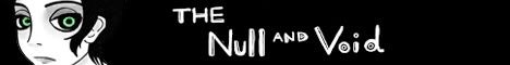
The Null and Void:
The first thing that jumps out at you when reading The Null and Void is that the art is very pretty. The comics are all very detailed, with huge, expressive panels. The comic also has a distinctive art style, with lots of curves and few straight lines, which gives the entire thing a surreal, dream-like quality. The use of colour also works well, with most everything being in greyscale except for sparing use of green to draw your attention to specific elements. Despite being heavily stylized, the art is also very clear and easy to grasp, so It all comes together very effectively.
Unfortunately, the large size of the panels means not much actually happens in each comic, and thus the pacing of the narrative is pretty slow. After 46 pages, the adventure is only really just getting started, so there's really not much I can say about the plot itself.
This is one of my favourite strips so far, and it's also a pretty good summation of what I've been talking about: The artwork here is totally gorgeous, I love the way this is laid out and the way the various curves fit together. But at the same time, the entire page has 19 words. And that's actually a little above average for the comic. That being said, if the entire comic looks this good I wouldn't mind having to read 200 pages for the plot to get anywhere.
The Null and the Void looks like it could be a lot of fun to get going when it gets established, but it seems that the comic is still very early in its life. Still, it definitely looks like a comic worth checking back on later when there's a few more comics to read.
For anyone trying to figure out my comics, Comic Creatorz is the one that still actively updates.
Last edited by Terotrous on Tue May 22, 2012 6:10 pm, edited 3 times in total.
What Lies Beyond - A Psychological Fantasy Novel
Stuff that updates sometimes:


I also did phbites.comicgenesis.com and hntrac.comicgenesis.com way back when.
Stuff that updates sometimes:
I also did phbites.comicgenesis.com and hntrac.comicgenesis.com way back when.
-
VeryCuddlyCornpone
- Cartoon Hero
- Posts: 3245
- Joined: Tue Feb 10, 2009 3:02 pm
- Location: the spoonited plates of Americup
- Contact:
Re: Webcomic Above You 2012
Ping pong!
I've been wanting to read Creatorz for a while now anyway, might as well put it to good use
My site isn't quite at the level I want it to be, so there are some changes I'll be enacting soon. But feel free to comment on anything anyway, perhaps you'll have some better ideas than I've got in the planning stages.
Hope you enjoy.
------------------------------------------------------------------------------------------------
Comic Creatorz by Tero
It's a webcomic about making webcomics!
So we enter this website, and the design is pretty outdated. The gray background, the vast unused space between elements of the page, everything just seems to imply that the layout hasn't been touched since the comic was initially created. This is kind of a shame as a design with better "voice" could provide an opportunity to really make reading the comic a more immersive experience.
Now, given that the comic is about two guys making college, while it's an interesting concept, there is admittedly limited demographic appeal. It's certainly possible to make such a comic accessible to non-Creatorz, with the trick being that the writing has to be really tight and captivating.
In general, I found the material in Creatorz to be silly, lighthearted, pushing no barriers really. It's cute but predictable, in the sense that as you read it you kind of think "Oh, now they're going to make this joke," and you smile because you know what makes the joke funny in the strip's context, but you don't really laugh because it's missing an element of surprise and newness. Now I get that a lot of it is tongue-in-cheek, fourth-wall-breaking kind of stuff, but I don't feel like the writing is strong enough to make it a good commentary or effective parody. Granted, many of the strips were made literally years ago, so perhaps the humor was fresher then. After a 5-year hiatus, the comic returned in January of 2011, which was promising, but I felt like the amnesia storyline was kind of stretched out, and the punchline/reveal didn't hold up to the weight of the arc.
Characterwise, we have the time-tested duo of wacky guy Dave and "normal" guy Kevin, who both vacillate between determined and competent, and lazy and wayward, with regards to working on their comic depending on the plot's demand. It's a gag-a-day comic, so I don't feel that deep, detailed, layered characters are necessarily required, but since we do have two recurring characters, I'd like to know a little bit more about them, have them fleshed out more as people than just as props to drape the story over. Kevin in particular ought to have more to his personality, right now he is defined totally by the presence or absence of Dave, his source of confusion and grudging reluctance. If I ran into him on the street, just us two, I'm not sure how he would act. In the real world there certainly are people like Dave who, intentionally or not, somehow control the lives of the people around them, and those like Kevin who, like a drifting piece of wood, are pushed from place to place with little command over their destinies. Within the context of the comic, though, I wish Kevin packed a little more punch. I wish he had a stronger personality to counterbalance the zany idealism of Dave.
Artistically the art is consistent, but also rather stagnant, with a typically distant perspective that rarely pulls us close to the characters. It makes me think we are looking at pictures taken of figures in a dollhouse, where you see most of the room, but rarely get pulled in closer to look at anything in isolation. The people in the strip remind me of the little rubber figurines that you can bend into some poses, but when you let go they kind of "unsqueeze" back to a more relaxed shape. The art is okay in that it gets the job done. I think it could be more dynamic, though at this point I feel the writing and art are about on the same level, so perhaps an improvement to one would lead to an improvement on the other.
This was a tough review to write because despite the decently sized archive, I didn't feel like I had much to grasp onto to critique or praise. Overall, I'd say Creatorz is an okay comic. I don't feel compelled to share it with my friends, nor do I feel compelled to warn them of it, but it's alright. There has been some improvement since the revival after the hiatus, but I feel that the comic could still be more and say more. If parody is the aim, it needs to be stronger and sharper. If it's sincere, well, I suppose the same conditions apply.
Last edited by VeryCuddlyCornpone on Fri Jun 29, 2012 6:46 am, edited 1 time in total.

Don't kid yourself, friend. I still know how.
"I'd much rather dream about my co-written Meth Beatdown script tonight." -JSConner800000000
-
peterabnny
- Regular Poster
- Posts: 606
- Joined: Mon Jun 08, 2009 6:40 am
- Location: Tintoonati, OH
- Contact:
Re: Webcomic Above You 2012
I'll take ya, Cuddly. Tho I won't be able to review anything until at least next week, so I guess this is a placeholder.
"I've come to accept a lot of what's wrong with this world, and there's not much I can do about it." - Johnny "Rotten" Lydon

Old school comic. New school flavor. Updated monthly.
http://www.crittersonline.org
Old school comic. New school flavor. Updated monthly.
http://www.crittersonline.org
-
RobboAKAscooby
- Cartoon Hero
- Posts: 1140
- Joined: Thu Aug 07, 2008 1:00 pm
- Location: Brisvegas
- Contact:
Re: Webcomic Above You 2012
Okay here goes:
First Impressions:
The website is very primitive, it looks like something from the 90s like a geocities website or similar, an impression not helped the big "under construction banner" with the spinning gifs that were pretty prominent on 90s free sites.
Also the lack of buttons/graphics for the links and navigation bugs me, it would take no more than a few minutes to make some simple graphics for the site and they would do wonders for the accessibility of the site.
Speaking of accessibility, the general layout of the site is a bit of a pain - having to scroll past a massive banner to get to the comic, then having to scroll past all the facebook/twitter/etc links to get to the additional content - thankfully this is just on the main page but if I was a casual browser looking for new comics I doubt I'd go past the main page unless the comic of the day was amazing. In this age of tabbed browsing the average webcomic reader will open several comic-links in tabs and give each a casual glance until something catches their attention so it is best that the comic itself is the most prominent thing on the page, some won't bother scrolling past a huge banner.
The layout of the archive pages is much better, though still lacking in graphics it is far more accessible.
Taking a look at the comic itself my first thought is that it looks like a cheap Looney Toons knock-off, this isn't necessarily a bad thing as the vast majority of webcomics out there have taken their styles from existing properties (especially prominent in manga-wannabes) so long as it's done well. The linework is tidy but a little boring, there seems to be a lack of width variation and although I like the various forms of shading you've used (pointilism, hatching, scribble-fill) they don't completely mesh with each other and can be occasionally jarring.
The Readthrough:
Getting to the meat of the review I have to comment again on how much better the archive layout is - cleaner, tidier, easier on the eyes.
The first few pages dialogue and events had me thinking that the characters were much older than they actually are, if not for the comic on the front page it would have been a bit of a shock to find they were school students, in fact I still had to check the cast page to make sure these were the same characters and not their children.
So it becomes apparent that Critters is a highschool/college tale, a genre I have mixed feelings about mostly because in the webcomic world there are a few common ways to do it poorly based mostly around the age of the creator - eg the younger artist fantasizing or the older artist writing like an older artist - and I can't help but apply that second one here, too often the character seem to feel like older people because of the way they talk, both word and subject choices don't sound like teens, which isn't helped by scenes where the cast are at a bar, then it's juxtaposed with scenes like this where the characters seem about 12 years old.
For the most part it's a typical gag-a-day set up with only the loosest continuity until the eight page "kamasutra" storyline (that incidently took the entire 2002 updates), the kamasutra storyline sets up for the "prim and proper" Belle to discover Frieda's book and spaz out but the joke just doesn't pay-off the effort of its setup.
There's a few other multi-page storylines after that but none of them really work that well, as a reader there is an investment in attention and an expectation that investment will be repaid. Although the pay-off for "girls night out" got a chuckle out of me.
With the "And Baby Makes Three" storyline there's obviously an aim for an emotional impact on the reader but it really feels forced and fake melodramatic, it's the kind of storyline that has appeared in almost every sitcom created and as such the revelation that Frieda wasn't pregnant after all was predictable. In fact the impact would have been better if she actually was pregnant since by this point Critters could really use a change to the status quo.
Artwise, as I mentioned earlier, the inking is done reasonably well but the mix of different shading styles in later strips is a little jarring.
But, and this is a problem I have with most black and white webcomics, after a while looking at b&w pages gets dull, especially since the blacks aren't as strong as they should be leaving it a washed out dark grey instead.
A bit of line variation, even if just a bolder outline to the characters, would also help prevent the dullness.
The "Tooni-Color" pages, which are just recolours of previous pages, are more visually appealing. On a few of these such as a Valentine's strip there's a decent grasp of lighting and colour mixing that it seems a pity the rest of the strips are in black and white.
Mostly the anatomy is passable, more so when the characters are clothed, but there is a problem with the heads not quite sitting right on the bodies. It's a problem that's common to anthro artists, I can only assume due to the blending of animal heads with human bodies, in the case of Critters it's most obvious on the foxes where the neck seems to go up the center of the head like a doll.
I will say however, it's clear that plenty of effort has gone into making a wide range of poses and camera angles to break up the monotomy.
The Extras:
Here we have the standard extras - cast page, bonus art, etc - and they're all reasonably well presented.
As with a lot of webcomics however the cast page paints a far more interesting view of the characters than is ever presented in the comic itself.
The Final Thoughts:
Okay this has to be said, 184 pages (including many pointless holiday strips) in 17 years just doesn't cut it for a simple, black and white, gag-a-day comic. That's less than once a month, which wouldn't be such a bad thing if not for the fact that the comic is dull.
That's the major impression I came away from Critters with, it's very dull - dull to look at, dull to read and the jokes rarely work.
But dullness is something that can be fixed by improving the quality of the art and writing - even just going full colour would help a lot in preventing a reader's eyes glazing over - a more pressing issue is that its mood/feel is confusing to define.
As I touched upon earlier I spent a good deal of the early comics trying to figure out how old these characters are supposed to be, one moment they seem late teens/early 20s the next they seem pre-teen then they speak like 30-somethings out of a bad soapie, and that comes down to the wild jumps in story tone.
There's cute, innocent misadventures wedged between sexually motivated stories and punctuated with the occasional serious moment that seems written from the point of view of someone approaching 40 - in short it doesn't seem as if the story knows what it wants to be.
While many of its parts work well they don't fit together to make a cohesive whole. Critters is muddled, confusing and very dull but it does have potential if only it could find direction.
~~~~~~~
Deviantart~tumblr"Your service is to the story and to the characters. Fuck the audience and fuck your own whims." - Yeahduff
-
VeryCuddlyCornpone
- Cartoon Hero
- Posts: 3245
- Joined: Tue Feb 10, 2009 3:02 pm
- Location: the spoonited plates of Americup
- Contact:
Re: Webcomic Above You 2012
I'm going to stop this thread from falling off the page, and also sign up to review Schoob's new work, since I haven't looked through it yet
Edit:
vvv OH MY GOD BUT YOU ALREADY REVIEWED ME WHAT'S GOING TO HAPPEN WE'RE ALL GONNA DIE
i am in the process of writing my sweebles for what it's worth
Edit: excuse me sir
Flying Tigers, by Schoob.
At first glance, the site is pretty spartan, and although the different links fit into the theme of "Things having to do with Harli's life," I feel like as a whole the page isn't cohesive, The background is just a solid color that, while soothing, doesn't add much to the page. Perhaps a subdued wallpaper-style background of sand with some seashells, and then maybe you could use an image map to place all the links on Harli's surfboard or something? It's pretty simple to do and I could help you out with it if you'd like (I can whip up an idea of how I'm picturing it if my wording is confusing)
I feel that the dropdown menu might be glitched, because it didn't seem that what I was clicking was taking me where I expected to go, though maybe it's just a problem on my end.
Artwise, you've refined your style a lot since years ago when I first reviewed Shit Happens. You've settled on a style for characters, but sometimes I worry that your style is confining you too much. Emotions are kind of limited to what the character can express with their eyebrows and mouths- I'd like to see them echoed more through body language and other parts of the face when applicable, if that makes any sense.
I feel that their arms are too spindly for the broadness of their torsos. I will say that htis has improved in recent pages, and anatomy in general is getting much better (the stiffness has improved a lot for one thing). Keep working on sketching dynamic poses, and studying the human form in general, but I think in particular the arms are what stand out now.
You've gotten to a comfortable place with drawing your characters, but I feel that backgrounds are still lacking. On this page, for example, it's as if the world is just this one long strip of land penetrating a dark blue void. Some trees and other buildings would make it seem more correct. I understand not wanting to spend loads of time drawing details in backgrounds, but treating them less as an obligation and more as something that enhances the world of your characters can make them less miserable to draw. They seem too empty and barren as it is, and sometimes it feels like- well, did you ever play the original Sims? The houses exist on this square plane floating in a gray abyss, like some bizarre magic carpet over a smoky stormcloud. Really extensive backgrounds don't need to be used in every panel if that's not what you're going for. I think Scott McCloud had a bit to say on how detailed to make your backgrounds- check out his book "Making Comics," as it's pretty helpful in other regards as well. My last comment on backgrounds is that you vary your line thickness with your characters, and it's just as helpful to do it with backgrounds. It helps to convey how large things are as well as how far away they are.
The use of copy/paste, while cutting down production time, does little to help the feel of the comic. Even if people are sitting and having one continuing conversation, expressions change, body language changes, people don't just sit very stoic and still. I don't think you've done this lately though, and if that's the case then my point is moot.
For organic forms such as the shrubs and grass, I think it would behoove you to add more details with pen as opposed to giving them texture with marker. Nothing serious, just defining some of the leaves on the shrubs and some patches of grass, and then just coloring with a solid color (and adding shadows where appropriate). I think this would fit better with the rest of your coloring which tends to be solid and full. Consider adding more details to things like the surface of water, too, because it isn't all one smooth surface and Harli and the gang are going to be in there a lot I presume.
My last art issue will be that sometimes speech bubbles seem to be pointing at the wrong person. In this example, Harli is the one talking but the speech bubble is pointing at Cara's throat. Even though contextually it makes sense that Harli is talking, the picture doesn't line up. Here I would place the tail of Harli's speech bubble over Cara's throat or shoulder somewhat so that there is less visual confusion.
I know a lot of people have already given you the runaround for the first scene, so I won't harp on that for a long time. I understand that you want to convey what happened, but the way it's done and the length of time it goes on for makes it seem really voyeuristic. I read that you're planning to redo it at some point, so keep it shorter, maybe even remove the dialogue and thought bubbles. Then the scene wouldn't be so off-putting (in a way other than how you intend), and would be taken more seriously.
On the topic of pacing, I feel that the comic moves too slowly. You might choose to work with more smaller panels as opposed to the current model of a few large ones. Here are two pages that I feel could be combined into one. I don't mean that you would want to take the second one and just slap it onto the end of the first one, but more that not much is happening over these two pages and combining them would help the story move faster. Really try to fit as much information onto every page as you can. Panels of the characters walking along or looking at things, when used outside of a suspenseful scenario, draw out the scene unnecessarily and take away from the story.
My last point is that, so far, the characters don't really stand on their own. Harli's bubbly and adventurous (though she'd object to the first adjective, but given how she reacts to really horrible scenarios it's kind of true), the boys are hapless pervs, Storm is a not-so-hapless perv, Nolan's a good guy, the Cobras are nasty and gross. But I feel like we should know more about them by now, we should see other sides to them, deeper things. Really the strongest quality that anyone has is how perverted they are and how they react to other people being pervs. In and of itself it's not a terrible characteristic, but it keeps the story at kind of a sophomoric level and makes it hard to take it seriously or care too much when the Cobras swoop in to wreak havoc.
Your work has changed a lot since I first reviewed SH back in I think '09? The story you're aiming to tell is of a different breed, and your art has improved, and I can understand that due to the problems you have with your hands, drawing can literally bring you some form or combination of blood, sweat, and tears. I think you're on the right track, but I think that fixing the pacing and having more smaller panels per page will help you a lot. You'll have more individual things to draw, but it'll only be one page of individual things as opposed to two. And larger panels will still be good when you need them, but for the general mundane scenarios, smaller ones may suit your work better (and be easier on your hands- less of a background to draw when you have less space to fill, and all that!)
Edit:
vvv OH MY GOD BUT YOU ALREADY REVIEWED ME WHAT'S GOING TO HAPPEN WE'RE ALL GONNA DIE
i am in the process of writing my sweebles for what it's worth
Edit: excuse me sir
Flying Tigers, by Schoob.
At first glance, the site is pretty spartan, and although the different links fit into the theme of "Things having to do with Harli's life," I feel like as a whole the page isn't cohesive, The background is just a solid color that, while soothing, doesn't add much to the page. Perhaps a subdued wallpaper-style background of sand with some seashells, and then maybe you could use an image map to place all the links on Harli's surfboard or something? It's pretty simple to do and I could help you out with it if you'd like
I feel that the dropdown menu might be glitched, because it didn't seem that what I was clicking was taking me where I expected to go, though maybe it's just a problem on my end.
Artwise, you've refined your style a lot since years ago when I first reviewed Shit Happens. You've settled on a style for characters, but sometimes I worry that your style is confining you too much. Emotions are kind of limited to what the character can express with their eyebrows and mouths- I'd like to see them echoed more through body language and other parts of the face when applicable, if that makes any sense.
I feel that their arms are too spindly for the broadness of their torsos. I will say that htis has improved in recent pages, and anatomy in general is getting much better (the stiffness has improved a lot for one thing). Keep working on sketching dynamic poses, and studying the human form in general, but I think in particular the arms are what stand out now.
You've gotten to a comfortable place with drawing your characters, but I feel that backgrounds are still lacking. On this page, for example, it's as if the world is just this one long strip of land penetrating a dark blue void. Some trees and other buildings would make it seem more correct. I understand not wanting to spend loads of time drawing details in backgrounds, but treating them less as an obligation and more as something that enhances the world of your characters can make them less miserable to draw. They seem too empty and barren as it is, and sometimes it feels like- well, did you ever play the original Sims? The houses exist on this square plane floating in a gray abyss, like some bizarre magic carpet over a smoky stormcloud. Really extensive backgrounds don't need to be used in every panel if that's not what you're going for. I think Scott McCloud had a bit to say on how detailed to make your backgrounds- check out his book "Making Comics," as it's pretty helpful in other regards as well. My last comment on backgrounds is that you vary your line thickness with your characters, and it's just as helpful to do it with backgrounds. It helps to convey how large things are as well as how far away they are.
The use of copy/paste, while cutting down production time, does little to help the feel of the comic. Even if people are sitting and having one continuing conversation, expressions change, body language changes, people don't just sit very stoic and still. I don't think you've done this lately though, and if that's the case then my point is moot.
For organic forms such as the shrubs and grass, I think it would behoove you to add more details with pen as opposed to giving them texture with marker. Nothing serious, just defining some of the leaves on the shrubs and some patches of grass, and then just coloring with a solid color (and adding shadows where appropriate). I think this would fit better with the rest of your coloring which tends to be solid and full. Consider adding more details to things like the surface of water, too, because it isn't all one smooth surface and Harli and the gang are going to be in there a lot I presume.
My last art issue will be that sometimes speech bubbles seem to be pointing at the wrong person. In this example, Harli is the one talking but the speech bubble is pointing at Cara's throat. Even though contextually it makes sense that Harli is talking, the picture doesn't line up. Here I would place the tail of Harli's speech bubble over Cara's throat or shoulder somewhat so that there is less visual confusion.
I know a lot of people have already given you the runaround for the first scene, so I won't harp on that for a long time. I understand that you want to convey what happened, but the way it's done and the length of time it goes on for makes it seem really voyeuristic. I read that you're planning to redo it at some point, so keep it shorter, maybe even remove the dialogue and thought bubbles. Then the scene wouldn't be so off-putting (in a way other than how you intend), and would be taken more seriously.
On the topic of pacing, I feel that the comic moves too slowly. You might choose to work with more smaller panels as opposed to the current model of a few large ones. Here are two pages that I feel could be combined into one. I don't mean that you would want to take the second one and just slap it onto the end of the first one, but more that not much is happening over these two pages and combining them would help the story move faster. Really try to fit as much information onto every page as you can. Panels of the characters walking along or looking at things, when used outside of a suspenseful scenario, draw out the scene unnecessarily and take away from the story.
My last point is that, so far, the characters don't really stand on their own. Harli's bubbly and adventurous (though she'd object to the first adjective, but given how she reacts to really horrible scenarios it's kind of true), the boys are hapless pervs, Storm is a not-so-hapless perv, Nolan's a good guy, the Cobras are nasty and gross. But I feel like we should know more about them by now, we should see other sides to them, deeper things. Really the strongest quality that anyone has is how perverted they are and how they react to other people being pervs. In and of itself it's not a terrible characteristic, but it keeps the story at kind of a sophomoric level and makes it hard to take it seriously or care too much when the Cobras swoop in to wreak havoc.
Your work has changed a lot since I first reviewed SH back in I think '09? The story you're aiming to tell is of a different breed, and your art has improved, and I can understand that due to the problems you have with your hands, drawing can literally bring you some form or combination of blood, sweat, and tears. I think you're on the right track, but I think that fixing the pacing and having more smaller panels per page will help you a lot. You'll have more individual things to draw, but it'll only be one page of individual things as opposed to two. And larger panels will still be good when you need them, but for the general mundane scenarios, smaller ones may suit your work better (and be easier on your hands- less of a background to draw when you have less space to fill, and all that!)
Last edited by VeryCuddlyCornpone on Wed Aug 08, 2012 2:23 pm, edited 2 times in total.
Don't kid yourself, friend. I still know how.
"I'd much rather dream about my co-written Meth Beatdown script tonight." -JSConner800000000
-
LibertyCabbage
- Cartoon Hero
- Posts: 4667
- Joined: Tue Jan 25, 2005 4:08 pm
- Location: bat country
- Contact:
Re: Webcomic Above You 2012
Webcomic: Loud Era
URL: http://loudera.comicgenesis.com
Creator/s: Michelle Mau
Run: 9/09-current
Schedule: Totally random
A Modern Lady: Marie's Crafty Gender Deviation in Loud Era
When considering the characters of Loud Era, one who stands out as being particularly complex is Marie Thayer, whose unusual appearance and behavior separate her from the rest of the cast. Her refusal to assume a conventional role in the comic's main events, which are the play and the prom, places her in a subversive position on the boundary of the central narrative. Through her aptitude in projecting a false persona and manipulating others, Marie's able to deviate from heteronormative behavior while also fulfilling her need for social acceptance.
Central to Marie's deceitful presentation is Eddie, who serves as just enough of a fleeting romantic interest for her to avoid too much suspicion. While both Aggie and Cecilia assume Marie's interested in Eddie, she rebuts them as prom approaches, saying here, "I gave up on Eddie," and here, "I don't like him anymore." This strategy of dropping the relationship on a moment's notice allows Marie to maintain the illusion of heteronormativity without obligating her to actually change her behavior. And why Eddie? As the shyest and least appealing male in her social circle, displaying a preference for Eddie's the safest way to avoid conflict and jealousy amongst the other women. In loosely maintaining this fickle pseudo-relationship, Marie has the flexibility to acknowledge an interest in Eddie when convenient, while discarding it whenever it becomes a problem.
Another way that men affect Marie's social life is that they threaten to direct the women's attention away from her. Marie responds to this concern by discouraging both Aggie and Clarabelle from pursuing their relationships, and she clearly demonstrates an understanding of Clarabelle's availability when she says, "You are a beautiful girl, and thousands of men would love to date you." With Aggie, she rubs in her poor judgment of character and how Aggie won't be with her boyfriend on prom night, and she persuades Clarabelle not to bake a cake for her ex-boyfriend, saying "it's a terrible plan" and that Clarabelle "should move on." Marie's fears manifest in chapter three, where Aggie, Cecilia, and Clarabelle each have a prom date, leaving Marie to wait for them afterwards at her house. But as they decline Marie's party and go elsewhere, Maria's concerns appear as being justified, and the women are clearly more interested in their men than they are in Marie's situation. While the comic's women lament their relationship problems, these problems prolong Marie's social relevancy, giving her good reason to feel relieved by them.
The main reason Marie's able to be so socially flexible is, as she explains here, that she's a "natural born actor," and this has several meanings. For one, her gender situation forces her to emulate heteronormative behavior in order to avoid being ostracized, which means she's grown up performing a certain role and is accustomed to presenting a false version of herself. Another aspect of this acting's that Marie presents herself as goofy and oblivious, at one point noting her own "hopelessness," and this helps make Marie seem less deliberate and subversive than she actually is. She also emphasizes these negative characteristics as a distraction from her gender issues, so that it appears that her inability to fit in is merely a result of a silly, flighty personality. In doing so, she successfully projects an air of immaturity, which averts hostility towards her gender abnormalities through the implication that it's something she'll naturally grow out of as she comes into adulthood. Marie expresses a desire to "preserve one's dignity," and while her clownish personality isn't glamorous, she considers it to be a superior alternative to revealing the full extent of her social deviance.
When Marie shows up on stage during the play, it's treated as a clumsy accident; however, Marie has some motivation to cause a disturbance. She's consistently portrayed as being an attention seeker, yet she's at the bottom of the social ladder; she's the complete opposite of the ultra-feminine Pearl, who's the star of the play and adored by everyone at the school. It's understandable that Marie would be envious of Pearl's popularity and attractiveness, and appearing on stage serves several objectives: it sabotages Pearl's entrance, puts Marie in the only center-stage role she has available to her, and sticks up for Cecilia getting stuck with such a measly role. It also works a protest against Mr. Butler's patriarchal authority and the social system in general; considered too feminine to be an usher like her father, but not feminine enough to act on stage, Marie's unusual gender prevents her from easily fitting into a conventional role, which prompts her to determine her role for herself. Marie's actions in this scenario demonstrate an effective form of subversion, while at the same time not being overly suspicious or abrasive.
Part of the necessity for Marie's manipulation is the overbearing pressure to conform that she's faced with. This is expressed in Clarabelle's situation with her parents, where she anticipates them having a severe overreaction to her getting her hair cut in a shorter, more "modern" manner. Marie's hair's much shorter than Clarabelle's, and while the comic doesn't convey a clear sense of Marie's family life, it can be assumed that her parents possess some of the conservative perspective Clarabelle's parents have, and would, to some extent, object to their daughter deviating from society's gender norms. Marie's younger brother criticizes her for not going to the prom, at least, saying it's because "no boys asked you," already at this early age ascribing an element of social inferiority to rejecting gender norms. Clearly, Loud Era's 1918 society considers having long hair and a date to the prom to be requirements for a young woman to fit in properly, and this presents an obstacle for Marie to overcome in order to maintain her social status amongst her family and peers.
Despite the offensive nature of Marie's behavior, her overwhelming stubbornness prevents her from making any changes to her appearance and personality in order to conform to society's expectations. As evidenced by her insistence on being involved in the play, she's fixated on having things go the way she wants them to. This is seen when Marie gets hostile when confronted by Aggie for looking "like a little man in a dress," resisting and discouraging any criticism her gender. She's also shown as being stubborn when her party doesn't go as planned; instead of adjusting to the news and going out with her friends anyways, Marie declines to attend an event she doesn't have control over. These instances help explain why Marie continually refuses to change her ways, even though her gender's an obvious detriment to her social acceptance.
As it would be socially unacceptable for Marie to be open about her gender deviance, it's justifiable that she would resort to disingenuity and manipulation in order to not be treated as an outcast. Gender is still a very sensitive subject today, and there's obviously an even stricter sense of gender definition in Loud Era's historical setting, which is set in a time when women still weren't allowed to vote. Clarabelle may view herself as "a modern lady" for trimming her hair, but Marie's certainly more modern by today's standards, which places her as a somewhat of a stranger to her own time.
Last edited by LibertyCabbage on Thu Jun 28, 2012 2:09 pm, edited 1 time in total.
"Seems like the only comics that would be good to this person are super action crazy lines, mega poses!"
-
RobboAKAscooby
- Cartoon Hero
- Posts: 1140
- Joined: Thu Aug 07, 2008 1:00 pm
- Location: Brisvegas
- Contact:
Re: Webcomic Above You 2012
- 2205857103_5dfa467ac0.jpg (101.56 KiB) Viewed 6027 times
So here I go squeezing my big gorilla backside into the Delorean...
...Back to 2006!
First Impressions:
So starting off, the site looks neat and tidy - basic black is always a good simple choice.
Most of the extra stuff such as shoutboxes and news are kept out of the way of the comic, keeping the comic as the focus of the page.
Looking at the comic itself I find that it has the same issue a lot of black and white comics have that is to say the blacks and lines aren't black enough, however I do like the look of the artwork it has a moody/emo feel to it and the character design is interesting.
The Readthrough:
Okay getting to the first page it is very murky, mostly grey even the text is surrounded by a grey halo.
The first scenes feature a bunch of identical looking, wide-eyed, bald people laying around dead or dying while a mysterious figure hunts them down in what I first assumed was a post-apocalyptic city. This dark serious atmosphere is soon broken up by jokes involving ice cream headaches completely ruining the admittedly weird mood. The bad jokes are followed by more brutal violence as the mysterious character takes out the rest of the gang led by a literal Ice Cream Man.
The next scene reveals the mystery man to be Agent Lime who is working for an offensive stereotype cowboy similar to the Texan from the Simpsons (lots of yehawing and wild shots in the air) who sets Agent Lime up on another assignment to hunt for aliens.
Returning the "apocalyptic city" setting Lime soon encounters a psychopath who is killing more of the same identical nobodies Lime was killing earlier. The two characters engage in an admittedly well-drawn fight and psychopath is introduced as Orangenius. Lime decides not to kill Orange just yet as he seems to be interested in the trouble the psychopath could cause.
And the chapter ends with a little more violence before Orange puts on a bandage and goes to bed. To be continued...
...never because obviously you abandoned the comic.
Artwise the comic left mostly positive impressions, yes it was too grey and washed out but that kind of worked for the bleak atmosphere, the fights scenes were above average for a webcomic even if the choreography was a bit off.
Character designs for Lime and Orange were rather interesting, especially the leaves for hair, and the nameless nobodies were kind of creepy at times. The only character that didn't really fit was the cowboy, alongside the more eccentric designs the cowboy looked like something from a bad political cartoon.
On the technical side there were some anatomy issues that stood out, unbalanced proportions and the last page it looks like there's a substantial difference in the size of Orange's arms. Additionally the linework/shading is rather rough and unfinished reminiscent of Megatokyo but without the pretention and outstated laziness of that comic.
The Extras:
There's a nice mix of the usual here, info about the creators, some bonus art, some fan art (surprising for such a short comic) but no additional information on the story or characters which is a pity.
Final Thoughts:
Okay since this is a dead comic I'll skip the tips for improvement.
It's a pity that this comic didn't continue, it has an uneasy mix of quirkiness and darkness that could make for an interesting project, if it had continued it could easily have gone one of two ways - stunningly awful like a classic b-movie or become a decent to above-average webcomic - I don't know which option I'd prefer.
Last edited by RobboAKAscooby on Wed Jun 27, 2012 2:38 pm, edited 1 time in total.
Deviantart~tumblr"Your service is to the story and to the characters. Fuck the audience and fuck your own whims." - Yeahduff


Re: Webcomic Above You 2012
Okay, I'll take Camilia Pandora Beads Camilia. Definitely one of the most uniquely named comics around.
Actually a placeholder for 8:1, which I probably should have read a long time ago.
8:1 by YeahDuff
8:1 is a story of two snobby socially inept misanthropes who spend most of their time being condescending or sitting around doing nothing (sometimes both). This could quickly become annoying, but thankfully the comic is pretty self-aware and does a good job at both poking fun at the foibles of its characters as well as showing the negative effects of their attitudes. 8:1 is also one of those comics that tries to mix humour and drama, which is something that frequently doesn't work all that well, but here it mostly does thanks to strong writing.
8:1's biggest strength, by far, is "economy of language". I've always been a believer that the humour or poignancy of a scene is usually maximized when you can get your point across with the fewest number of words, which is something Duff does very well, thanks to a combination of good comedic timing and highly expressive art. Just take a look at this strip, for example. Charles says absolutely nothing in this strip (and we can't even see much of his face), but the way this is staged makes it immediately clear what kind of atmosphere he brings to that table.
Unfortunately, it's along these lines that the strip somewhat loses its way at one point. In some of the middle chapters the comic starts to get a bit overly melodramatic and loses its clever pacing. Also, one of the characters who is from the south stahts to tahk lihk thias to maek it aahl cleah thaht shees a southan behle, despite the fact that this isn't really relevant to her character or the focus of any jokes, and it gets annoying fairly fast. It all comes to a head in "Some Things About You", where a simple joke about a character's first sexual experience takes three whole pages and the joke totally falls flat. Thankfully, after this chapter Duff seems to recognize this and the next chapter is back to a much better mix of humour and drama and the southern speak is minimized and the comic is at its best from then on.
When I first started reading 8:1, I didn't think there was any way I was going to care about the characters, as they're initially portrayed in such an unsympathetic manner and they're the kind of people I would totally hate in real life, but in the end I was wrong, after reading it all I want to know what happens between Charles and Mary / Lori next. 8:1 does a good job of giving its characters depth, even the bubbly record store clerk is a lot more than she appears to be at first. The only character who is completely unsympathetic is Jason, which is kind of a missed opportunity for drama as it makes it incredibly easy to root against him. But who knows, the comic isn't over yet, maybe he'll redeem himself eventually. Or get hit by a bus with an ironic quip from the main characters. Either way, I'm sure it'll be entertaining. 8:1 is a fun comic with an uncanny kind of charm even when its characters are being complete assholes. Even if the subject matter doesn't seem like it would be for you, it's probably worth a look.
What Lies Beyond - A Psychological Fantasy Novel
Stuff that updates sometimes:
I also did phbites.comicgenesis.com and hntrac.comicgenesis.com way back when.
Stuff that updates sometimes:
I also did phbites.comicgenesis.com and hntrac.comicgenesis.com way back when.
-
peterabnny
- Regular Poster
- Posts: 606
- Joined: Mon Jun 08, 2009 6:40 am
- Location: Tintoonati, OH
- Contact:
Re: Webcomic Above You 2012
Let's see... The Loud Era, The Loud Era... Ah, there it is...
Well, Cuddly, your comic sucks. The drawing is primitive, the writing reads like something a third grader would write, and the layout is confusing. Fail.
Okay, not really. I just wanted to see what it's be like being a dickhead reviewer. I feel dirty and syphilly...
Anyway, I got ya on the radar, Cuddly. I'm determined to get a review out this week...
"I've come to accept a lot of what's wrong with this world, and there's not much I can do about it." - Johnny "Rotten" Lydon
Old school comic. New school flavor. Updated monthly.
http://www.crittersonline.org
Old school comic. New school flavor. Updated monthly.
http://www.crittersonline.org
-
peterabnny
- Regular Poster
- Posts: 606
- Joined: Mon Jun 08, 2009 6:40 am
- Location: Tintoonati, OH
- Contact:
Re: Webcomic Above You 2012
Okay, here goes...
Loud Era by Michelle Mau
Being also a history nerd, a period comic like this appealed a good bit to me. The long and short of it is, I wasn't disappointed. The LE site has a lot of stuff, both in terms of comics and extras, and admittedly it looked daunting to me to really sit through it all and sort through it and give it a proper and fair review. Which is why it took this long in writing this review; I thought it'd take up more time than I readily had. As it turned out, tho, it really wasn't as big a task as I thought it would be, due to the engaging nature of Cuddly's comic. Once I got started reading it - and I started all the way from the very first comic - it quickly drew me in, and I just kept reading and reading and reading. By the time I noticed how long I'd been at it and was starting to lose attention, I hit the very last comic. You know you have something good when you can get someone with an attention span as short as mine to go through an entire long comicography spanning the course of three years!
If I could say anything about the LE's website, is that it's pretty bare-bones and simple of design. The main page itself is particularly spartian, with basically just the comic and a navigation cluster of links. I'm more used to seeing sites that offer a little more in the way of different graphics or links to different things, but to be honest, I don't know what more can be added here.
Where you're going to find the meat of the sandwich is in the different links. The archives page has two different formats for the listing of comics that I at first found confusing - a textual one that lists the comics and a calander graphic one that has individual links for the comics on different dates. I didn't really see the need for both formats on the same page, as one or the other formats would adequately navigate people through LE's history. The calander format is nice from the standpoint that it's brighter and has more visual interest, but the text format makes referencing individual comics easier. The only gripe I have about what Cuddly's done with the text half is the lack of consistency as far as comic titles go.
The news and about links are pretty dry as far as interest goes. The news in the news link in particular reminded me a great deal of the kind of stuff I used to write when I had a similar feature. Nobody read it anyway and it only added further negative points to potential reviewers, so I killed it.
The art and cast links offer far more to the reader. I like how Cuddly has the art page arranged, with fan art people have done for Cuddly as well as other miscellaneous stuff. Oftentimes I like those random pieces more than an artist's regular production pieces as I find it fun to see how their mind wanders and comes up with the stuff they do. And, of course, it's always fun to see other people's takes on your own characters.
I was particularly impressed with the cast page, and the amount of info Cuddly put into her characters. In addition to the obligatory head shot there's a rather lengthy and detailed description of a character - AND a link leading to the comic where they first appeared as well as a kind of self-assessment questionaire that each of the primary characters filled out! I've never seen an artist go to such lengths with their character descriptions! I have to admit, I find some of myself in a few of the LE's characters, particularly Cal, Uly and Tony. And Marie is so eerily close of a girl I know that if I didn't know any better, I'd have sworn that Cuddly added her fully and completely into the cast!
The only thing I need to mention about LE's links page is how blown away and honored I was upon finding a link to my own comic there. Thanks for the link, Cuddly! You remind me of how badly I need to update my own page with some fresh links.
Artistically, you can tell a huge difference between Cuddly's early work and her most recent. Every artist has their own unique style, and Cuddly's no different. Her earliest efforts look rough and unrefined, but she seemed to have caught on and settled into a regular style pretty quickly. The brightness of the colors in the comic perfectly stand out against the dark backdrop of the page they're shown against. If it was by design, I say good show! The colors have an interesting watercolor and pencil mixed-media look to them, even as they're done digitally on the computer. The only gripe I have regarding them are some of the skin tones used. I know Aggie and Elsie are supposed to be sporting faces of freckles, but at times they look more like they're being afflicted with measles or chicken pox, and their pale and pasty tones made me want to offer them vitamins and Ensure.
Not only do the backgrounds improve as the comic progresses through its history, the lettering improves as well. Lettering in the early comics looks rushed and undisciplined, and in places hard to read. However, although Cuddly's lettering still looks rushed in places, it's improved considerably since her early days. Facial expressions are very well done, and I found Cuddly's teeth detail interestingly prominent, especially in the case of Mr. Butler. Man, does that guy have anger management issues or what? The only gripe I have about Cuddly's comic format is the lack of consistency. One ep could be a whole page of story, and the next could be only two or three little frames. Granted, an artist has to edit a story to fit into a particular episode, but here the variance could be a potential problem with people if, after the previous installment was a full page of action, the next new installment has only a couple of panels and they have to wait for the next go-around. Sudden scene changes are another thing I didn't really care for. Even if Cuddly offers so much as a "Later..." or "Soon, back at the Galen's..." it would go a long way to smoothly transition the reader to another part of the story.
Humor-wise, I didn't find LE a particularly funny comic. But then again, I'm not entirely sure LE is supposed to be one. Cuddly does has a way with a story, and I had fun getting into the comic courtesy of the theater scene in Chapter 2. I did get a chuckle here and there out of two or three eps, but nearly all of them brought a smile to my lips, and gave me a reason to see what the next installment will bring. Nowhere did I find Cuddly funnier than when she did sight gags, such as here http://loudera.comicgenesis.com/d/20100527.html, where Cal wonders how to get Kelly out of her life, and especially here http://loudera.comicgenesis.com/d/20120108.html, where Cal reminesces about her old boyfriend.
As a technical aside, I don't know if it's a problem with the file or there was an upload problem, but this ep looks like it repeats itself unnecessarily: http://loudera.comicgenesis.com/d/20110824.html .
All in all, Loud Era is a solid, approachable comic with good storytelling and a unique artistic style. I'm glad I had the chance to get to know it, and after today Cuddly can count me as another loud fan.
"I've come to accept a lot of what's wrong with this world, and there's not much I can do about it." - Johnny "Rotten" Lydon
Old school comic. New school flavor. Updated monthly.
http://www.crittersonline.org
Old school comic. New school flavor. Updated monthly.
http://www.crittersonline.org
-
spoonyliger
- Regular Poster
- Posts: 296
- Joined: Fri Jul 29, 2011 5:38 pm
- Location: ComicGenesis 4evah!
- Contact:
CRITTERS Online! Review
CRITTERS Online! Review
by spoonyliger
As I plunge into the website I am greeted by FURRIES!
Hahahah! Just kidding. No, not by furries but by the simple, welcoming...
Site Design:
Yes, that is what I am going to tackle first. Don't get me wrong though, although the simple design is user/eye-friendly, I still think it could use a lot of improvement - it's a little rough around the edges. But nothing that spending a lot of time sanding those edges down won't fix. In the Archive pages, that faded-out CRITTERS Online! logo in the background of the website is acting as a distraction that my eyes aren't liking very much as I'm trying to read the comic. Not in itself but how it was used. I'm not a big fan of how the Home page's design doesn't match the other pages in the site and some of the links on the side menu don't have the same name. But alas, I see the site is still under construction.
Art:
This looks like your old newspaper bunnies... er, I mean funnies, sorry. The three to four panels strip comics is how most of the pages flow with the punch-line in the last panel. See? Newspaper funnies, they're great. I noticed some stippling in there, specially with April. Is it done by hand? I'm not a big fan of that technique but I admire whoever has the balls to do it. Stippling would drive me crazy. The character design is somewhat similar to the Looney Tunes, specially with the bunny characters, but not completely, there are some style differences I do notice. CRITTERS Online! has been going for a while now. I've noticed that, when an artist has been working on the same title for a few years, the art quality begins to improve. With this comic, I haven't noticed too much a change. Though the inking looks a little steadier and I noticed the pages aren't just one strip anymore. I also enjoy how some pages are TOONICOLOR!
Story:
As I've mentioned before, the comic started with 4-panel strip pages. So in terms of continuity I doubt the story was meant to have any to begin with. But that eventually changed. The comic has a few short stories that actually go on for more than one page in parts, thus removing the "gag in the final panel" thing from the strips. So reading just one strip might leave you a little confused on what's going on. And although the anthropomorphic characters give the comic a childish look, the plots aren't always that childish. Which I find very amusing.
Suggestions:
I would remove the logo from background and actually use it on the top of the website for all pages, like how it's used in the home-page, only not as a big. The important thing here is that the site's look is the same for all its pages.
I'm not sure if Paul wants to keep the character design the same or not. But if he does that's fine. However, I'd like to see the artwork skill improve. If he does decide to give his characters a new look, I'd be excited to see them. Take the Chuck E. Cheese mascot for example. It's been redesigned to a more contemporary look and personally, I like it a lot better.
The story is perfectly fine the way it's going. The characters' personalities and designs are very diverse and it's fun to seem them interact with one another... or with inanimate objects.
Overall, in my eyes what Paul has created is a homemade chicken soup for the adult soul. Characters that, aside from their fuzzy looks, remind us of ourselves because they're put into situations that we know too well, thus we are able to connect and relate. But there is much work to be done in the visual department, and it seems like Paul has already started working on it... hopefully. Let me know when the new site design is fully integrated.

-
RobboAKAscooby
- Cartoon Hero
- Posts: 1140
- Joined: Thu Aug 07, 2008 1:00 pm
- Location: Brisvegas
- Contact:
Re: Webcomic Above You 2012
EDIT: Okaay people this is the last post.
I'll be doing 2 reviews, one for Spoony and one for Tero and that'll be the end for WAY2012
I'll be doing 2 reviews, one for Spoony and one for Tero and that'll be the end for WAY2012
Deviantart~tumblr"Your service is to the story and to the characters. Fuck the audience and fuck your own whims." - Yeahduff
-
robotthepirate
- Regular Poster
- Posts: 563
- Joined: Wed Mar 02, 2011 11:02 am
- Location: Staffordshire, UK
- Contact:
Re: Webcomic Above You 2012
Might have a look at doing Moon Crest a review tomorrow if no one minds.