Okay people it's time for some good old fashioned reviewing.
Here's hoping we'll get some new faces this time around - all will be welcomed.
*The Rules* (paraphrased from previous thread)
1) DO NOT POST TO THIS THREAD unless you are putting up a placeholder or posting a review. Comments, questions, anything else like that should go in another thread somewhere. Posts that are done that are NOT one of those two will be deleted by the mods.
2) Know what you're getting into. Guess what? We're all people here, with our own opinions and likes and dislikes. Not everyone here is going to like your comic, and not everyone here is going to hate your comic. Be straightforward with your reviews, and take your own reviews as constructive criticism.
3) Do not ask for a review unless you are completely intent upon reviewing the person before you. Reviews should be THOROUGH within reason. "Hey, I like it!" is not thorough. Read the comic and give it a good review, please shoot for at LEAST 200 words or more.
4) Have an archive for us to read, please. If you've got three comics and a title page, guess what? IT'S NOT LONG ENOUGH! Shoot for 25 or so pages, the longer the better. Note that if you only have one active comic, and you post here, it may be reviewed by default. If you have multiple comics please specify which you want reviewed.
Usually, someone that is posting will have a webcomic to review, however, this isn't always the case. If there is a webcomic that meets the above requirements, then the following post reviews it. If not, then nothing is reviewed that time around.
When you're done with a review, please remember to PM the creator of the comic.
A response thread will be created once there are some reviews here.
NO REVENGE REVIEWING - If you don't like the review you get that's what the response thread is for, don't give a bad review back.
EDIT: Here's the previous webcomic above thread for those who need an example.
RESPONSE TOPIC IS HERE - TA DA!
*The Progress List*
N/A - Reviewed by RobboAKAscooby - N/A
Sh!t Happens R - Reviewed by Serge XIII - complete
Thirteenth Child - Reviewed by Forsakenstars - coming soon
Forsaken Stars - Reviewed by RobboAKAscooby - Complete
Sh!t Happens R - Reviewed by Verycuddlycornpone - Complete
Loud Era - Reviewed by Risky - Complete
Theelven - Reviewed by SergeXIII - coming soon
Thirteenth Child - Reviewed by Dutch - coming soon
School Spirit - Reviewed by Verycuddlycornpone - coming soon
Loud Era - Reviewed by RobboAKAscooby - Complete
Sh!t Happens R - Reviewed by McDuffies - Complete
Little White Knight - Reviewed by Terotrous - Complete
Comic Creatorz - Reviewed by Adorabledesolation - coming soon
Adorable Desolation - Reviewed by Verycuddlycornpone - coming soon
Loud Era - Reviewed by MixedMyth - coming soon
Real Life Fiction - Reviewed by Bookwyrms2 - Complete
Bookwyrms - Reviewed by
Webcomic Above You VI - Return of the Comics
-
RobboAKAscooby
- Cartoon Hero
- Posts: 1140
- Joined: Thu Aug 07, 2008 1:00 pm
- Location: Brisvegas
- Contact:
Webcomic Above You VI - Return of the Comics
Last edited by RobboAKAscooby on Wed Jun 15, 2011 1:35 am, edited 15 times in total.
 Deviantart~tumblr
"Your service is to the story and to the characters. Fuck the audience and fuck your own whims." - Yeahduff
Re: Webcomic Above You VI - Return of the Comics
Sorry for the delay, I wanted to make a video of this, play around with a flash tool but the images are taking a while to prepare. I may do it in the near future, but I won't keep you waiting for it.
It may defy all expectations you have of me and my studly aura, but I'm not really into sports.
I'll give you a moment to recover from that shocking revelation.
But yeah, I don't play sports, really, I don't watch them, don't talk about them and don't read about them. However, despite my admitted athletic virginity I feel safe in the assumption that in a sports comic it is important to understand the sport in question. For Shit Happens R's sake, let's hope that is naiveté and nothing else.
First things first. To say the Sports genre in comics is unpopular (to authors) is an understatement, and my hats off to SHR for challenging itself right off the bat in a medium where most of us (myself included at a point) take the easy road and refrain from vering off of it. That compliment, however, is contradicted only two pages in where a character and relationship is introduced on nothing but fan service. I'll get into that later, right now I'll establish the plot for those unfamiliar with this particular comic.
So here goes...
...
see theres this guy...
...
Okay, do you remember that one stage in TMNT 4 with the surfboards in the sewer... and the rat...king...
...hmm...HMMM...
Okay, I have no clue what is going on in SHR. Never, not at any moment. No exposition is ever given (for the most part) which wouldn't be a problem except that there are no non verbal establishing shots to provide any kind of narrative foundation. It may take place now, it may be back in the 90s (what you do see of the featured sport tends to get in your face with how Xtreme it is after all), or it may be set in the future. This is part a flaw in the comic's narrative and composition, but also a flaw in the art style. This artist is clearly far more comfortable drawing the head than the body, and as a result most panels tend to be a talking head taking up 3/4 of the cell, or an extreme close up of a foot or shoulder or something. I think this early comic demonstrates the problem very well:
http://shithappens.comicgenesis.com/d/20091226.html
If you're like me it'll take you until the third or even fourth panels to realize she's at the mall. This isn't a mystery and even if it was this isn't a detail worth enigmafying (that's a word now, I called it), all this serves to do is confuse the reader especially since the last time you saw this character was in a admissions office:
http://shithappens.comicgenesis.com/d/20091219.html
...and the only reason I can say that is through context clues in the dialogue, again, there are no establishing shots. By the way, this is followed by an attempted rape scene:
http://shithappens.comicgenesis.com/d/20100122.html
So, the setting has a college, park, and mall all juxtaposed in an environment where themed gangs can commit crimes in broad daylight, but all anyone talks about is dating, or video games, or sports, in this case Xlaveboarding. It doesn't beg for a rewrite or anything drastic, just some explanations and for god's sake some transitions. You'll get whiplash in the first few chapters from how the story will jump from something like a guy lovingly day dreaming about the wonderful woman he just met (or rather about the color of her underwear. I'm not kidding and that's how most of the women are introduced too) to a gang rape attempt and then back to a sitcomish skit about the two male leads looking for work. This is something that improves a bit in the later chapters, but not enough that I feel I shouldn't talk about it. There is room for more improvement.
Anyway, this is a sports comic and the sport in question is called Xlaveboarding. What is Xlaveboarding? It involves a flying skate board... you need to be naked to make one?... and... there's a ball... and I think they're powered by rock because everyone always needs to throw up the horns when they ride them. Not much is explained, at least not in the first and last few chapters (except that Xlaveboarding is old. This is the first crucial fact you learn, apparently it's in all the history books). This is where the activity central to your story needs to be explained. It is a tremendous flaw. Imagine if they explained Duel Monsters in YuGiOh only in the third season (I assume they do not do this) or Quiddich in Harry Potter in a separate instruction manual, but kept the games as is in the story (except zoomed into Harry's face the whole time... this example is falling apart). Delaying information can either serve for development of a character or theme or creating a sense of mystery... it doesn't really have a place for the main action mechanic of a story. Okay! Harry Potter again, it's like if they never explained anything about magic. Imagine how that would throw the story for a loop.
From what I can tell it seems SHR has a grand vision in mind and is in a rush to get there. That's why the first few chapters seem so malnourished, if I had to guess, and why the characters start off so two dimensional and do things like fall in love for no real reason. Everything needs to slow down, again, not as big of a problem in the later chapters but it is still. a. big. problem. Show some establishing shots, use silence, give characters time to react to what is going on around them (like if a girl is almost raped her first thought after rescue should not be "Oh boy! I can get a new flying skateboard!" and sorry, I can't get over that).
SHR has a lot of fan service. I'm not a proponent of fan service, so I'll spare you a certain level of my disdain for it, I will however say that this is the wrong genre for it. In sports comics unity is a very big theme because teamwork is essential to most any sport, at the very least sports with teams and turns out the Xlaveboarding is one such sport. A team needs to respect one another, in that way they can rely on and be relied upon. Fan service is pure objectification and if you do it, you diminish a character, especially when you do it to some and not others. This isn't the place for it, and it'd be for the best if SHR laid off the fan service if we are to take Xlaveboarding seriously.
I'd like to talk about the art. I know from personal experience that this artist has been and continues to try to improve and is aware of his weaknesses, but let me lay out SHR's major artistic issues. The art style is stiff, very, very stiff. Everyone tends to wear the same facial expression for most every circumstance, hair is not fluid and tends to be worn more like a helmet, and limbs are very stiff and doll like, which sucks the force out of many action scenes, for instance:
http://shithappens.comicgenesis.com/d/20100205.html
Here are my recommendations: First off, lines need to be eliminated. Cartooning is the art of knowing what not to draw (look at the happy face, it resembles the human face despite lacking cheekbones, a nose, ears and so on). A general method I like to use is to find a means to draw the face I am comfortable with and base my line use for the rest of the body on that, try to maintain the same level of detail. For SHR there are no general facial wrinkle lines (elderly aside) so I would pull the muscle and joint detail of the rest of the body back a bit, cheek bones are not emphasized so the collar bone shouldn't really be either, stuff like that. Play with the skeleton a bit, curve the limbs slightly to emphasize flow, you have freedoms as a cartoonist, use it. Bodies tend to be really thin, especially compared to the head, use the head as a gauge for the rest of the body and review basic anatomy guides. Base the width of the body on it, especially the profile and shoulder width. Be attentive about non-existent details, you'll see teeth in profiles in SHR and you won't see this in reality. Use some loose fitting clothing and have a character move around, using the slack to play off of and suggest motion, this should be good practice for the rest of the body. Play with the camera. This is something that has improved since the first few chapters but has room to grow, we need to see the cast from different angles and zoom out occasionally. Pull back the facial details because they are failing to capture emotion as is. Go simple and practice a facial range of emotions, then build back up to your current style, gradually if need be. Line variation, do it.
Finally I'd like to talk about the protagonist Max. Max has and continues to look like a girl to me. The first time I reviewed Shit Happens I seriously went through most of the comic thinking that this was a buff woman. I spent some time looking the cast over to find a more subtle reason as to why this continues to be the case and looking past the longish purple hair I believe I found the reason. Max has a circle face. Not condemning on its own, but compare that to the rest of the cast: women all have triangular faces and men all have rectangular faces. Recall how stiff I said the artwork is. This side effect of stiff art is that it extenuates formulaic patterns, and this is one such case, a circular face in this environment comes off as extremely feminine. The solution is to either diversify the cast faces (I think this is the right call) or make Max's facial shape more like Sam.
Shit Happens R shows a lot of passion but at times this betrays how much room it has for improvement. That passion outweighs the bad though, if you ask me, and this dude is up to the task of making up for the lost ground. Keep an eye on him.
Last edited by SergeXIII on Tue Jun 07, 2011 9:14 am, edited 2 times in total.

-
Forsakenstars

- Regular Poster
- Posts: 115
- Joined: Thu Oct 15, 2009 8:11 pm
- Location: Fresno, California
- Contact:
Re: Webcomic Above You VI - Return of the Comics
Review of Sergio J. A. Ragno III's Thirteenth Child-Welcome to Autaxia Heights
by Rob Lopez
Sergio's Summary of Thirteenth Child posted on The Webcomics List: A private investigator steps foot into a city crawling with the supernatural, enigmatic psychology, and twisted creatures... exactly what he was hoping for.
Warning: Spoilers Ahead! I'm not sure how I could otherwise summarize the premise without giving a few things away.
Since I dove into the webcomic without reading the premise posted on TWCL first, this is how I summarized it after my first read, with a little help from the Cast Page: Near as I can tell, Thirteenth Child concerns a nomadic Private Investigations Agency run by Darius Freedman and his partner Jaques, and the residents of a city known as Autaxia Heights.
An ambitious but inexperienced new police detective, Lisa Irving, has shown up to question Darius, particularly because he has legally changed his name 27 times and lived in [as] many different places. There have also been a few classified files. I have to agree with Detective Irving here, that it's not a great business model.
After Detective Irving has thoroughly made it known that she will be watching Darius, she leaves his agency and comes across a little girl named Lenneth who has lost her father. We are then introduced to a group who hang out in the apartment of comic artist Serge Scenaut and [street?] artist Travis Walker. It's a little unclear whether Serge has been writing and drawing the story that's been unfolding so far about Darius, Det. Irving and Lenneth, or if he's working on something altogether different; or later, it seems to hint, that he is receiving premonitions of actual events and putting them down on bristol board? Serge invites himself along to dinner with his roommate Travis and Travis' [girl]friend Samantha Forester, who doesn't consider Serge's comic work real art. (Bitch!)
Travis spies Lenneth through the window of the diner walking with Irving and runs out to her. It turns out Lenneth's missing father, Humphrey, is/was a mentor to Travis. Detective Irving spies a no-gooder and leaves Lenneth in Travis' and Samantha's care (!) to follow the shady character. Irving comes upon some kind of super drug exchange. She is rescued by a vigilante wearing a wooden mask and cape that she apparently has run into before, because she calls him Ghost. After putting the drug dealers down easy, one of them--in a serious case of sour grapes—tries to shank Detective Irving, so Ghost becomes her human shield and takes a knife to the upper chest. Ghost sheds blood but isn't killed, instead going on a killing spree that for Lisa strikes her against his character. His response to her? That she doesn't know him very well after all.
Lenneth's first night staying at Samantha's place is spent dreaming a strange dream which has been dreampt by those who stay in that apartment building, giving us a clue as to how Serge may be coming upon his ideas. I'm not sure if I'm speculating here, or if I'm meant to come to that assumption.
Humphrey had instructed his daughter Lenneth to seek out Darius' agency by a card that carries the agency logo and a code that she cracked using Darius' name and a phone message. Begging the question, why would Humphrey expect such a scenario?
And that brings us up to speed. Fifty-six pages in, and I still don't know who the Thirteenth Child is! Darius? Lenneth? The as-yet undisclosed force that Darius has hinted he is there to fight? Much of Sergio's Webcomic List summary has been hinted at, yet we are still very much at the beginning (or middle, as the case may be) of a much larger and complex story.
I was fortunate to have been on the receiving end of Serge's art early on in my time at Comic Genesis. He was my Secret Santa for the CG Webcomic Exchange Christmas 2009, and blew me away with his carefree, effortless art style. He is an auteur, one of the few out there with an immediately distinctive look that I can't readily identify as belonging to a particular school or derivative of another artist. The coloring and bold line work remind me of the fun cartoon illustrations seen in Steve Jackson Games like Munchkin and Chez Geek, but there is a clear difference between cartoon illustration and comic illustration. And though there is plenty of fun and comedy to be had in Thirteenth Child, there is a plot being developed here that has a seriousness to it, a gravity. People are missing, there is violence and death, there is mystery and layering happening here that you don't see in cartoons, and the art reflects that. While some might argue it could be a little more realistic to better match the tone, we all know our limitations, we all make decisions based on how fast we are or how comfortable we are with our subject matter, or it could be a purposeful choice to draw, ink and color at a particular level of complexity. (I recently picked up Ralph Bakshi's and Frank Frazetta's fantasy epic Fire and Ice and for all it's violence and heavy themes it was executed with a simplicity akin to an original episode of Scooby-Doo, though the character designs were more in line with a He-Man or 70s Marvel Comics conceptual aesthetic. If you get a chance, check it out and take note of the 1,000 painted backgrounds and their varying levels of detail, or how Frazetta's highly detailed art was simplified so that his characters could be drawn over and over and animated.)
So being familiar with Serge's art and having seen some of his previous webcomic Gaming Nerds 2000, I had a pretty good idea that I would enjoy the look of Thirteenth Child, and I do, and I feel like it fits the range of tones in the story. The storyboarding is good, there is a nice flow. Again, there were a couple places where the transitions were confusing—perhaps intentional—but for the most part it has good pacing, variation and movement. Weaknesses? Sometimes actions are unclear. Take the last panel of this page for example: http://thirteenthchild.net/?p=45 It may have been to obscure the violent nature of the action, and the context of the next page informs what likely happened, but I'm just not sure how this guy went down. Or the middle of this page: http://thirteenthchild.net/?p=44 I think I know what's going on, after a few reads—the baddie is faster now 'cause of a drug—but the art doesn't illustrate quite that point.
Serge has been webcomicking for a solid decade, and likely drawing for several years more than that and it shows. He has improved light years from where he started and shows continued signs of getting better and better. I love the varying weight of his line art, popping colors and hand-lettered word balloons. It may seem a little loose and careless, even messy to some, but for me it's also part of its charm.
As for the writing, I'm astounded that Serge has a Masters in Library Science, yet it's clear to me he needs an editor, an outside pair of eyes to clean up simple errors in grammar, punctuation and spelling (mostly the Cast Page, but there are a few moments in the comic as well), as well as reign in some of the plot threads and thematic elements. I don't know how much of the story is laid out, but so far it's pretty intent about holding back some details that I would think should be fairly innocuous: what kind of artist is Travis exactly? If he is Humphrey's apprentice, then that makes Humphrey an artist as well, right? So what kind of artist is Humphrey? I understand in reading Sergio's blog that Red City/Thirteenth Child developed out of several distinct stories and a desire to bring them into a unified universe, but does it then lack a central theme? Shouldn't a unified universe have an overriding or underriding point of view? What is Thirteenth Child trying to say? Who is the main character? What is the primary plot? I have a feeling we're just scratching the surface here.
Darius narrates on page one of TC that he has a trepidation of the soul, “A fear akin to ruining a pristine field of snow with my footsteps, and at the same time depriving myself of its transient beauty. My existence haunts me. Redemption is the elusive panacea we seek. No matter how hidden. No matter how doubtful we become of it even existing.” This should be the guiding mission statement of the story and there should be echoes of it in each of the other/smaller plot threads.
Sergio has a character in the comic that is basically himself, Serge, who on the Cast Page we are told “This guy isn't very interesting,” and I think in fact Sergio is using Darius to work out some of his inner demons. Why the self-deprecation? At the bottom of the Cast Page Sergio writes on himself: “This is the guy who makes these comics. Sergio has been making comics for over a decade now, but only now has created anything worth reading. (Not this comic [that you're about to or already have invested your precious time in, but], The Adventures of Action Hat).”
What? Why? It makes me think am I wasting my time reading this!
There are plenty of characters I am beginning to care about: Lisa, Lenneth, Ghost; or dislike: Samantha, Darius, little fucker in red with the knife, he dies so that's okay; but there are too many characters I am confused about: Serge, Travis, Charon the boat girl, Humphrey, and their relevancy to the story. I know my personal greatest flaw is creating too many characters to tell my stories, and I have to wonder if there are a few extraneous parts here as well, vestigial limbs from previous incarnations of the story being told now.
The next few pages to come will be critical to informing my decision to keep reading with a sustained level of interest. I know the art is sweet enough to keep me coming back no matter what, but I also want to see the writing provide enough payoffs to make reading every page as satisfying or moreso. I like how a lot of threads have already come together, now I'd like to see a little more about each of the major characters. And if there is a villain or head no-gooder, we should probably see him or her or it pretty soon.
Note: I got a 403 Forbidden Error (and 404 accompanying error) whenever I moved through twenty or so comics and/or bounced around the archives for awhile. I would have to close down the comic and wait several minutes, then come back. Coding errors or just my own bad timing?
I feel like this review is not quite finished, so I'd like to reserve the right to add to it sooner or later. Thanks!
Last edited by Forsakenstars on Thu Jun 16, 2011 1:19 pm, edited 1 time in total.

Starring The Vampire Azzi & Captain Sera Besh. Updates Mon and Thurs.
-
RobboAKAscooby
- Cartoon Hero
- Posts: 1140
- Joined: Thu Aug 07, 2008 1:00 pm
- Location: Brisvegas
- Contact:
Re: Webcomic Above You VI - Return of the Comics
Before I get into the review I'd like to mention that I wrote this review while reading the comic so there is a mix of initial reactions and afterthoughts.
Okay here goes...
Review of Forsaken Stars
- First Thoughts -
First thing one sees when starting on the comic (after something dark and mysterious busts out of a coffin) is the lead character in the shower, now I like non-gratuitous fan-service (and there's plenty here) as much as the next person so this isn't a problem for me however I do think that your Web14 should be above the comic - perhaps on the banner - rather than below it where honestly most people won't scroll to and by the time they've seen the warning it's too late anyway.
Just a little nit-pick here but I'm curious as to why on this page she went past the t-shirt for the little singlet instead? Most girls would grab the quick cover-up of the t-shirt instead in that kind of situation I think.
- The Art -
First impressions are of a callback to the pulp-sci-fi comics of the 50s - and I like it, there's a certain charm to the art that's missing from a lot of modern comic styles - but with just enough tweeks to make in feel new.
The other big first impression is that the blacks just aren't black enough, they're a washed out gray that doesn't quite blend properly with the background fills or the on-page text. I have similar problems with my comic and would suggest you adjust the levels a bit in whatever editing program you use - since you don't have to deal with colour it will be an easy task.
But as it stands the gray linework on mostly white pages makes it difficult to look at for long periods and honestly gets a little boring after a while, which is a big shame because the artwork itself is very well done. The occasional touch of colour does a wonder.
The character designs are nicely done and usually fairly consistent, even if sometimes the facial expressions don't match the mood.
Unfortunately at times Sera's body looks a little masculine due to the lack of hips, even small/athletic women will have more of a curve to them so this is something you might like to look at, however I do appreciate the small boobs (especially in a genre where big is the standard).
The assortment of different beings that make up the council are an impressive array, to be honest I would like to see more of them outside of the council environment but I'll talk about that later on, so the appearance of more aliens later on was a nice treat.
The only character design I have problems with is Azzi, a monster like him should be menacing - and I think you've tried to write him that way - but I just can't look at him and take him seriously. And it just gets worse as the story goes on, he becomes almost muppet-like.
Also something I noticed is that occasionally in long shots like the last frames here the simplified character design clashes with the detail of the rest of the page, including the background of the same frames.
Your action sequences are reasonably well drawn (better than mine that's for sure) but on occasions there is a lack of power and knowledge of fight bio-mechanics, for instance in the page I linked Azzi's arm would be more bent - plus as a tip from a former martial artist his long talons would make an effective fist impossible, I'd suggest a strike with the elbow or heel/blade of the hand.
The space-battles on the other hand are beautiful - I could see full colour wallpaper of that being very popular.
Last word on the art - I'm not sure whether your shading is done with pencil or ink but (aside from a few place where it looks rushed) it works, there's a loose flowyness to most of the linework that I find appealing - I find I lose a lot of the looseness in my art when I ink so kudos to you.
- Story -
I hate to say this - and I'll admit it comes mostly from personal bias - but I did not enjoy the story that much.
Which was a pity because I really like the artwork and the pulp-sci-fi type world - I liked just looking at the pages - I've actually been looking forward to checking out you comic for a while so I was disappointed to not like what I found
I'm not into proselytizing or theological opinioning - which is how Forsaken Stars often reads - and there are many points in the first two chapters (particularly with the council) that this occurs and it became hard to keep reading. In fact the overwhelming theological overtones to the story are a major turn-off.
However, for what it is, it is well enough written and there is definitely an audience out there for it. However I think you've made the opposite mistake to what I myself did - information vomit as opposed to no info - there is just too much trying to be said early on and it's about things that should be the undertone of the story instead of feeling like it is the story itself.
Big themes need to be treated delicately in a medium such as webcomics, where the storytelling is ongoing, unlike books or movies you can't edit the finished product for balance before release.
Now I said it was mostly personal bias, the other problem is that the characters just aren't that likeable, which becomes a bigger problem as it becomes apparent that Azzi's story is one of redemption, for the story to work you need to care about the characters and by the time more of their back-stories come out it takes some effort to care.
The early characterization of Sera makes her seem little more than a spoilt teenager than the captain of a ship that runs less-than-legal missions - a character should be shaped by their experiences - and even though this improves as the story goes on there are still moments where she comes across as a Hollywood cliche character.
In general the characterization improves as the story goes, they're still not quite likable enough - and this has nothing to do with niceness, bastard characters can still be likable - but they're becoming more entertaining which is a step in the right direction.
That being said I found the chapters after their escape from Ohmworld far more enjoyable - even if the light-hearted turn it takes is a bit jarring with the earlier stuff - with those beautiful space-battle scenes, this is where I started paying full attention again.
The addition of Fabius has me intrigued. As does the sudden crispness of the writing - so I certainly won't be giving up on the story (consider it bookmarked & linked) - I hope that you keep it up as it is flowing much better now.
- Final Thoughts -
There is a lot of promise in Forsaken Stars - the artwork alone is worth giving it a try.
Almost all of the problems I had were in the first three chapters, I think Forsaken Stars suffers from the same problem that mine does which is a weak beginning - in your case it's due to lumpy dialogue, the beginning is a real hard slog to get through - but there is something really promising building up in there. So although I didn't enjoy the read through I do have hopes for where it is going.
Also don't forget to darken those blacks.
A final nit-pick, the bunch of fan-art at christmas and other places in the middle of the story kind of ruins the flow, it would be best to archive it or move it to between chapters where a reader can just skip over it.
Keep at it dude,
Last edited by RobboAKAscooby on Wed Jun 08, 2011 5:36 am, edited 1 time in total.
Deviantart~tumblr"Your service is to the story and to the characters. Fuck the audience and fuck your own whims." - Yeahduff
-
VeryCuddlyCornpone
- Cartoon Hero
- Posts: 3245
- Joined: Tue Feb 10, 2009 3:02 pm
- Location: the spoonited plates of Americup
- Contact:
Re: Webcomic Above You VI - Return of the Comics
That's because he knows the road to success lies partially in the hands of others.RobboAKAscooby wrote: I'll add right now for those who don't know, you can post in this topic as many times as you want - normally every second post is from serge
And Scooby, I'll review yours again
edited to add REVIEW!! oh... oh my God, it didn't look this long and oppressive in the text document OH GOD I'M SO SORRY. I hope it will be helpful to you!
Well, you've received a few reviews lately and already have some plans for things you intend to change in the comic, so I won't dwell too long on things that have been already covered thoroughly unless I think I have something else I can add.
I guess I can kind of expand on what other people have said in their reviews. It's been mentioned, and you agree, that your first chapters were kind of rushed, and introductions to characters didn't linger as long as they perhaps should have. Now, I first reviewed your comic back in 2009 when it was still the old Shit Happens, and I think I see what the problem is.
To me the introductions didn't seem rushed because, like I said, I had read your earlier material and the characters carried over from that. Obviously your perspective is similar to mine in that you are already familiar with your characters. I tend to have this problem with my comic too. When you've had the characters rumbling about in your head for years, you forget that others are seeing them as fresh faces. It's like trying to introduce your best and oldest friend to someone new, except YOU have to do all the talking for that friend in order to represent them correctly. As a writer, you know the characters in your comic better than anyone else, and therefore all responsibility falls on you in order to convey those characters properly to an audience.
Eliminating author comments is helpful, a less drastic solution would be to move them underneath the first/previous/next/last buttons so that a reader's eye doesn't naturally fall upon them before navigating to the next page. If you're absolutely certain you'd like to do away with them, that's fine. Of course, it's also fine to leave a comment here or there on a specific page if you want to share some supplementary factoid about it.
The key word there is supplementary, of course, meaning the comment is not being used to explain anything that should be readily apparent in the comic. If you mention some relatively unknown famous historic figure, for instance, you may see fit to link to a relevant wikipedia page or similar in the comments section. Don't let the comments narrate how the audience should be reacting to what they've seen on screen. I know the point is now pretty much moot since you mentioned getting rid of the comments altogether, but I figured I'd throw it out there.
You mentioned in your other thread about going in and radically altering the beginning of your comic. If you are already dead set on doing so, then go ahead, but I'd recommend waiting a little while before you do anything you can't undo. The reason I say this is because we as artists are a sentimental and often temperamental bunch, and as such are very connected to and protective of our art. When someone points out an error or makes a suggestion, the typical response is to either defend the behavior or reach right in and rip it out, like a bee stinger.
I know about a month or so (maybe?) I posted regarding the first chapter of my own comic, as I was considering doing away with it and creating a new beginning. I hesitated because I knew that I had put a lot of work into those pages, even if it seems a bit clunky in retrospect, and also because I am so far behind plot-wise that to go back and redo the beginning all over again would not be as beneficial to me as simply moving forward.
If you are willing to take the time to very critically and clinically look at your early chapters and separate the wheat from the chaff, and then fill in the areas where said chaff used to be, that's your decision. As it stands, it didn't take me a very long time to read through those earlier chapters so it would be acceptable to leave them as they are.
Your art has changed radically since the original Shit Happens, but I fear that you have stagnated lately. My concern is that you have gotten too formulaic about drawing and that it may be holding you back. What I mean by this, with regards to anatomy, is that body parts seem very segmented- a lot of detail and attention is given to small parts as opposed to a unified whole. You are careful to include littlest details like different body clefts and dimples, but the lack of unification and sense of flowing being leads to a flat appearance. McDuffies had mentioned loosening up your hand before drawing. This is a great idea. I have times where I will sit there and for ages be drawing the same thing and erasing it over and over because everything just looks like it doesn't fit together properly. Unless I am in a real slump, a bit of doodling (even if it's just literally squiggles or big, loopy cursive writing) will clear this right up.
Another thing that may help you with the stiffness/flatness issue is the idea of gesture drawing. Gesture drawing takes the focus off of technical correctness and concentrates more on the form of a figure. A good site to practice gesture drawing is PoseManiacs, with exercises such as 30 second gesture drawing. You can change the time limit to a higher number and then work your way down as you start to feel more comfortable with your ability to make gesture drawings. It helps you to learn what lines are necessary when suggesting a pose and what lines are merely decorative (or, in some cases, detrimental).
This particular site won't help much with gestures of the face, however. You can create a similar exercise for yourself, though, by looking at photos of people and seeing what details are important in order to make a person recognizable (aka, caricaturing).
I recently bought Scott McCloud's Making Comics, which is almost absurdly helpful. One of the expression/face exercises is: "Pick two expressions from this list, and draw a face to match each: Confident, uncertain, frustrated, hurt (emotionally), flirtatious, mischievous, tired. Then give the same list to a friend, along with your drawings, and ask him/her to guess which expression you were going for." A similar exercise for body language is: "Pick one or two attitudes from this list, and draw a body to match: Pompous, uneasy, impatient, aggressive, tired, humble, stubborn. No facial expression for this one, just a nose and ears to show head position. Again, give the same list to a friend and ask him/her to guess which pose you were going for."
I will say that I don't have a problem discerning what your characters are feeling by their facial expressions, but it would behoove you to use a wider variety of them more frequently in order to add more emotion to your panels. Remember, emotional expressions aren't just the extreme ones of anger, sadness, bursting joy. Curiosity, boredom, bitter amusement, mild disgust, and that squinty "I saw what you did, you sneaky bastard"-type feeling all have faces that help to communicate their presence. (At the risk of constantly shilling the drawing books that I buy, "Making Comics" also includes a great section on emotions and their accompanying facial expressions, showing how emotions, like colors on a color wheel, blend together to convey different meaning. Definitely recommended.)
One last suggestion that I should have mentioned earlier along with the gesture drawing is varying line width. This helps greatly to give depth to images. The first step of this is as simple as finding pens/markers of varying widths. I see that you draw using a full page of paper, so finding pens/markers of noticably different widths may take a bit of shopping, but felt-tip is a strong recommendation for fuller, more expressive lines. Remember that you aren't drawing an architectural blueprint (well maybe you are, but not usually in your comic
You've come a very long way since the beginning, and your progress so far is commendable! I do enjoy reading your comic and hope that you continue to improve. Just try not to rely on formulas that prevent you from taking your work to new levels. You've always been very open to criticism and willing to improve, so I have no doubt that by the next W.A.Y. thread we will be looking at a vastly different Ride the Wind, yet again.
Last edited by VeryCuddlyCornpone on Mon Jun 13, 2011 2:09 pm, edited 2 times in total.

Don't kid yourself, friend. I still know how.
"I'd much rather dream about my co-written Meth Beatdown script tonight." -JSConner800000000

Re: Webcomic Above You VI - Return of the Comics
Loud Era! It's loud, except when it has laryngitis! Let us discuss it.
The thing that first caught my eye was the quality and consistency of the art. It's great, it has depth and variety, the shading, lines, and coloring are all great. However, in some early comics such as the title page, the women look a bit mannish. Given that in later comics this effect seems to have been reduced some, it's hard to give it a break as intentional. Another is the occasional rushed seeming page, like this: http://lateralgeotaxis.comicgenesis.com/d/20091004.html. It's possible this was just because of the effect that was being attempted, but this "page" lacks the character of the comic entirely, and could really be by anyone or no one.
The characters are all interesting and seem like they are pretty distinct, however having finished the available chapters, I seem only have a grasp on a handful of them. More time setting up each of the characters would have been beneficial, particularly given there are a fair number of them for the amount of pages there have been. I checked the cast page to try to help me winnow them out, but unfortunately it was under construction. The characters' distinguishing characteristics are not always consistent; Clarabelle in particular has changed face shape, nose shape, eye shape, hair style, facial hair, clothes, and mouth size often enough that her hair color is sometimes her only distinguishing feature, which isn't unique. I didn't even realize the numbered image of Clarabelle was her, at least in part since it was in black and white. The guys don't have this problem when they are together, but sometimes separately Eddie, Joe, and Uly are hard to recognize.
The story is intriguing, confusing, and at times boring. There are long set-ups that lead to endings that are surprising to the characters, but not particularly surprising to me as a reader. I also got a bit confused in the middle because this page http://lateralgeotaxis.comicgenesis.com/d/20110502.html links from "next" to the home page, but isn't at all the penultimate page. Er, I'd better go back and read the rest!
The last chapter does seem to be picking up a bit. On the one hand, the "curtain" set-up didn't turn out as direly as expected, on the other hand the actual result was a bit anticlimactic. The whole story is a bit anticlimactic. It tends to go "oh my gosh, how can they not realize what's going on / going to happen? Oh no, it's looking worse! So many things could happen! Oh wait, no, it's fine. They figured it out and nobody got hurt. Actually pretty much nothing happened. Everyone can go home now." The current storyline with Mick (cough) is picking up, there's some angst and I'm currently sucked in, however it seems likely to end the same way. "Oh, okay, it's over, we know the outcome. Yep. Coulda gone better, coulda gone worse."
The main issue I have with this comic is that it seems like a comic I wouldn't read if it didn't have a gimmick, in this case the gimmick is the time period it takes place in. The story doesn't seem dependent on that time period, and seems to share more with a 90s teen sitcom near the end of its run than anything else. The gimmick is interesting, and might be enough to keep me reading for a while, but not unless more happens to promote emotional investment. That's not to say it doesn't have its moments, such as the scenes at the theater counter, which were entertaining in their own right.
To sum: your art is great, but don't slack off on it, and work on story and characterization. I wouldn't suggest redoing it, nor stopping it, I think you should continue on and make it as great as you can fueled by this so-called advice and the advice of your other reviewers. It's not long enough at this point that it needs to have these issues worked out, a reader wouldn't have to be that patient to get to this point if the story only gets better from here.
Last edited by Risky on Tue Jun 14, 2011 3:10 pm, edited 5 times in total.

Re: Webcomic Above You VI - Return of the Comics
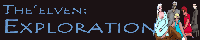
When writing romance the best advice I can give you is that you need to be patient. You need to spend time developing characters so that the reader is interested in them enough to care who they end up with and if they are happy. Furthermore when you are writing a romance, you are writing a thesis on interhuman relations, seriously, keep that in mind. When two people connect in a story they do it for a reason, be it fate, common interests, related behavior and habit, or in acknowledgement of appreciation (a deep analysis of love is what makes something like Scott Pilgrim so great, don't assume you just know what love means, really sit down and think about it). Writing love is like cooking chicken, you need to take it off the grill at just the right time. Wait too long and it'll burn, the experience will be tedious, insipid and a chore to get through, but if you take it off too soon you'll get Salmonella.
So I guess what I'm saying is that if you want to read The Elven be prepared to clear out a few days for some good old fashion vomiting. If that sounds cruel don't read too far into that I just like my little metaphor.
But yeah, romance is ham handed in the Elven, and that's a problem because this is the central theme. The story opens by establishing who is gay and straight, single and taken, and such before even mentioning the setting or the fact that this is about Elves with magic powers. It comes off as shallow, like a high school crush (though in its defense a crush is what the comic defines most attractions as anyway, so maybe that's the idea) which as I'm sure you can recall is interesting only to the two people involved. The comic moves on to develop the environment and characters after this point, but it does little to improve on this flaw because of the rate at which characters will step aside to discuss who they have their eyes on, a rate that almost never exceeds five pages. It is too much and sucks all the subtlety out of the story. My advice is to start shying away from having characters openly discuss the way of the heart for both thematic and logistical effectiveness, save that for right before a major event or at a moment of mass vulnerability, it's when the readers will be interested in the character's feelings the most. Especially in the later chapters The Elven explores the magical nature of the setting more, but there is definitely room for more of it.
The art in the Elven is very simple and it showed in the first few chapters, you won't find any detail or shading which looks especially odd in the context of backgrounds like fields and skies. As of now backgrounds are more fleshed out and characters have more features to things like hair, there is shading and a wider range of expressions. That said the lines are very poor, sorry I can't pull this punch. In cartooning, because this is the art of simplification, if a line doesn't flow the reader will feel it. By flow what I mean is that you should strive to use as few lines as possible (remove the pen from the paper as seldom as you can). For instance, when drawing a face do not think of it as a cheek, a chin, a neck and an ear but the silhouette of all that. I know it is a subtle distinction but it is a subtle habit, doing this will get you to stop less and differentiate only when you need to. The lines lack variation (altering the thickness of lines while maintaining flow can be done either by angling the pen as you draw or going back over the line in the same fashion with a thicker pen) as well, and in a comic that seems to be going for Masking Effect (backgrounds more detailed to a degree than characters) you really need to start doing it. Finally the characters need a wardrobe change. The main cast are still wearing what they came in with, mostly tank tops, tee shirts and slacks. It's boring and in a fantastic setting you really don't have an excuse for it. Have them stumble across some magic gear and accessories maybe, or at the very least give the current clothes some details and patterns to them, something.
Last edited by SergeXIII on Wed Jun 15, 2011 1:43 pm, edited 2 times in total.
-
Dutch!

- Red galah
- Posts: 4644
- Joined: Sat Jun 19, 2004 4:39 am
- Location: The best place on this little blue rock
- Contact:
Re: Webcomic Above You VI - Return of the Comics
First off, an apology of sorts to Serge, as it has taken far too long to find the time to get around to putting this up for him. I read the strip about a fortnight ago, but the end of second term means report writing and various other work related bits and pieces (including being tired beyond belief and getting through the last five days of the term on the smell of an oily rag!  ) but here we go! It's Sunday night, I have a moment to scratch myself, and I have NOTHING I NEED TO BE UP EARLY FOR TOMORROW!!
Okay...
THIRTEENTH CHILD - By Serge! (But you knew that)
I'm going to be fair right from the outset and let you all know that this style of comic strip, in design, artistic style and genre, is well removed from what usually keeps my interest, or even perks my interest in the first place. So keep that in mind as I run through this piece of writing!
Despite having all that against it, from my standing, I found it quite quick to read through (only 58 strips to this point now), and I didn't find it a chore in the slightest. There are chunks in there I don't understand, or had trouble working out just which way the author was trying to mould his work, but it took me only a night or three to get through it in a few half hour sittings. I'm going to run through the ups and downs I noted in Thirteenth Child, and you people can be the judge on the merits of what I have to say.
ART STYLE
I quite like the author's chosen art style for this current project. It is quite bold and brightly toned, despite it being a very noir-like setting and situation. While there is often a lot of darkness in the environments, the contrast between the shadows and the colours he chooses works very well. I am looking at it like an old Dick Tracy throw back in that regard, although I'd suggest the character designs are somewhat simpler in design (making them easier to see clearly against backgrounds, not making 'simpler' appear as though it's lower in worth, mind you). It looks like a more laid back noir style story with the art style, what I would expect to see in current Batman cartoons and so forth. Just... well, more fun to look at. I'm not a superhero fan in the slightest, and Saturday morning cartoons are getting more and more disappointing to me, but that is another matter entirely!
If there is one glaring issue I have with the art design and the way it all fits together on the page, it is actually to do with the lettering. It's almost entirely hand written, which of itself is fine. Except I found it very small and more often than not hard to read, particularly when squashed into some speech bubbles that were too small to fit the dialogue, or when the lines of writing began to turn down every now and then to fit within the curves of the speech bubbles themselves. Just didn't seem well planned in that regard. I have to admit there were more than a few times where I just glossed over some of the dialogue of the characters in scenes because I couldn't read it clearly enough. For a page or two early on I thought it would be okay because the text became computer generated, but that quickly reverted back to hand written again. I like the handwritten effect, I just found it very small and too hard to read too often.
STORY
I found the story, particularly early on, jumped around too much. It was almost like there were three or four different stories taking place completely independent of each other. I was assuming they were intended to merge together before too long, and they did, but I still was left with the feeling, particularly early on, that I was reading two different stories, and the characters I thought of as the Men In Black still didn't seem to be important in the story to me, even now they are intwined with the other half of the cast. I actually found their scenes hard to understand.
Once we got to the young kid wandering the streets and being sought after for who knows what important reason, though, it picked up. I really enjoyed this part of the story, and found the previous plot point above tended to get in the way of finding out what I really wanted to know, which was this kid Lenneth. I think you handled that chapter that predominantly dealt with her and the 'regular' people in the cast really well. I cared for what happened to the kid and want to know more and see them look after her properly, etc. I didn't really get that from any of the other scenes so far. The action scenes were fun to look at, but to me they didn't really have much to do with the story yet.
So, that side of Thirteenth Child (which I suppose is the girl who no doubt turns out to be the thirteenth child - I don't think that's going to be classed as a spoiler here!) I found quite entertaining and interesting. The scenes dealing with Ghost (who looks cool and interesting, mind!) and the Men In Black just felt like they were from a different story and seemed rather out of place. Someone with a superhero or more noir type background or interest, though, could very well catch pieces I completely missed, so by no means take that as a definite fault.
The other point that I felt stood out was the direction of the story. To me it seems a very serious tale being told, with dark undertones and shadowy characters and secrets and all that cool stuff that makes you want to turn the page. There were times though when I wasn't sure whether the author tried to throw lighter moments in or actively make it a humour comic as well. I found I was reading back over some dialogue exchanges thinking 'Is this meant to be funny, or have I just read it in a dark, 1940s sort of mind set and completely missed the change of tone?' I guess the humour, when it came in, was occasionally jarring and felt a little out of place against the rest of the story. The examples I think best show that are when the layabout guys are either painting in their house and playing computer games (which seemed a little cliche to me anyway) chat and throw your regular two guys on a couch banter back and forth it just didn't seem to fit into the tone of the rest of the strip. Little things like that.
When the humour came out of the situation and was understated more though, I appreciated those moments much better because it felt like it was following the tone of the whole story and worked much better.
CHARACTER
My first, and I think probably most important, point here will be character voice. My only concern in this regard is for Lenneth herself. Let me know if I'm wrong, but as a 'kid' who has never been outside her abode for whatever reason her parent had, I had a strong feeling that she was talking far to adult for someone of her age and situation. I find this tends to be a common pitfall. Kids don't talk like adults or use the same sentence structures and word phrasings we do. This can be a picky subject of mine because I know I work to try to keep my child character's dialogue flowing like kids DO speak, and I get it wrong some of the time and get grumpy when I can't fix it to make my joke work! I just found Len seemed to be much older and worldly than the story had told us she was. Just something to think about.
Mind you, she may well be 20 or something for all I know, but she struck me as being about 12 at the most.
Okay... this is going to cover the Cast page as well.
The cast page gives information that doesn't seem to come up in the archive at all. I found much of it irrelevant, to be honest, or at best giving away bits and pieces that must be coming later in the archive. For example here, I take from the Ghost's character blurb where it tells us that the only person to regularly communicate with him is Lisa Irving (the Girl In Black!) who was instantly attracted to his mode of operation, etc, etc, but... we don't see any of that yet in the comic. We know they have some sort of 'working partnership' going on, but that's it. We don't need to know that sort of stuff in the cast blurbs just yet. I guess it just felt too early in the story being shown and told to have that sort of information fed to us on a plate if we looked into the character pages.
Lastly, with character, I'm going to give the Author Insertion a bit of a whack. Sorry.
The character appears in the story with the same name as the author, and surprise surprise, is sitting there playing computer games on a couch and, naturally, just happens to also draw webcomics. Again, this stood out mainly because I felt it had no place in the story being told, or the environment and setting it was being told in. Things like that, I suppose, are what made me feel like I was regularly flicking channels between ads instead of watching just one story. I really got the feeling that this character had nothing at all to do with the story (and the cast page entry for the character all but confirms this anyway). If that was the case, then why even include him?
IN CLOSING
While, reading back, it may appear I have given it a good old belting with the Hit Stick, I enjoyed reading much of Thirteenth Child, despite not being a fan of the genre or art style used. For me, and note I only claim that it is for me, it has a few glaring issues with the way it is presented and in parts, written, but if dark, secretive noir styled stories and detectives and fly by night crime fighting mysterious figures is right up your alley, then by all means, give Thirteenth Child a run! You'll find a whole lot to appreciate! I did, and will pop in every few weeks to see how poor Lenneth goes. Do give it a shot if this is your sort of story, and feel free to contradict me on anything I state here that is proven false because I have not been aware of any conventions involved.
All the best, Serge. It generally looks great, but... yeah... maybe fix up the handwriting so it's easier for me to read everything they say!
Last edited by Dutch! on Sun Jul 03, 2011 2:52 am, edited 1 time in total.
Remember when your imagination was real? When the day seemed
longer than it was, and tomorrow was always another game away?

longer than it was, and tomorrow was always another game away?
-
VeryCuddlyCornpone
- Cartoon Hero
- Posts: 3245
- Joined: Tue Feb 10, 2009 3:02 pm
- Location: the spoonited plates of Americup
- Contact:
Re: Webcomic Above You VI - Return of the Comics
duuuutch
I read a good part of your comic a loooong time ago, but it is time to give it a good full read through, especially since you have climbed back aboard the Forum Train
Edited to add the crying infant.
----------------------------------------------------------------------------------
School Spirit, by Dutch!.
After I finished reading this comic, I decided to try waiting a few days before I sat down to write a proper review, wondering whether the waiting period would help temper the overwhelming feelings of praise I feel for it that would lead to a rabidly positive review. Alas, I am still enamored with the comic, and have decided to not waste any more time and give it a write-up anyway.
A bit of background- I have been intending to read School Spirit for quite some time, I think a few years ago I had gone to the site and meandered around the supplementary pages but hadn't read any significant amount. Since then it has always remained on my "to read" list, each time I saw Dutch's banner or avatar smiling pleasantly at me and reminding me "I need to read that at some point."
Now that I've finally read the comic, I see that my eagerness was well-founded. I'll admit it now, in case you were looking for me to make juicy and critical commentary, that I have no real complaints about the comic. As I read, any issue that I considered raising was quickly cancelled out by the charm and earnest nature of the story.
School Spirit has been online since 2003 and has amassed a considerable archive of over 1,000 strips. This may seem daunting to a new reader, but the strip is consistent enough that one could jump in now and catch up later if need be. However, the archive is an easy read, and I'll admit I got a bit sentimental when I finished it and had no more new pages to look at, as it had become a nice nighttime routine.
The comic follows a group of elementary school kids, their teachers, and their other-worldly friends who "live" in the nearby cemetary. The subject matter is suitable for all ages, and doesn't attempt to seem dark or edgy, a combination that many writers think is synonymous with high quality. School Spirit, instead, is whimsical and sweet, without becoming cloying, trite, or sugar-coated.
School Spirit takes place in Australia. I love reading about places and cultures outside of America, and School Spirit was no let down. It shares a lot about Australian culture, touching on historical, geographical, literary, and pop-culture aspects (and many others too). For those having some trouble with the slang, Dutch has been kind enough to include a Strine page, to translate the Strine for you. In addition, author commentary under the comics may also shed light on references that could be foreign to readers. School Spirit, appropriate given its title, is a learning experience as well as a source of entertainment.
Storylines are usually short, about 10-15 pages each, although a handful may be longer or briefer depending on subject matter. The comic is well-written, upbeat, and humorous, often using puns as punchlines. It's tough to go through the archive reading the jokes and looking at the friendly character designs without having a smile on your face. The positive and lighthearted nature of the comic is consistent from start to finish, although some strips are rather poignant and solemn (especially those regarding ANZAC Day and other war-related memorial days) and some are very touching and sweet.
The art upon first glance didn't seem to have changed all too much over the course of the comic, until partway toward the end of the archive I perchanced to sneak back to the first chapter and was quite impressed with the changes that had occurred. The style that Dutch has been using over the near decade has not been switched out for a new one, but rather has been refined over the years. Anatomy has improved and backgrounds have grown more detailed and picaresque when they need to be. The character designs are warm and likeable, particularly for Old Bill, Mr. Kelly, and that goat that appears every now and then
At the beginning I had some difficulty telling the children apart, however now I find it no trouble at all, I suppose it sorted itself out as I read. The head-sized ears make me think of chimpanzees- I'll confess that before I started reading the comic I didn't know that they were actual human children
Heh, as I read, I kept thinking to myself that the art looked really familiar but I couldn't quite put my finger on what it was. I figured it out. Remember those old classroom computer games from the 90's, like JumpStart First Grade and its ilk? That's what it reminds me of- same simple lines and coloring, except School Spirit has far more personality and emotion
Characters have gotten to be more expressive over time- little changes in the way Dutch draws parts of the face have helped quite a bit. One problem is that the characters (particularly the children) look fine when facing profile or three quarter view, but when they face directly forward or are angled away from us to show the back of the head, proportions get really distorted and their heads seem to be much thinner as opposed to their usual width. There's also one recurring punchline where Cody says something foolish as Brylcreem throws his head back, as if to say "oh brother." Brylcreem's head looks really weird there, like a rubbery-pancake shape that got kind of rolled back and folded there. There are times though where the character expressions are just perfect, such as this strip, where I can't tell you how long I couldn't stop giggling over Cody's face in the last two panels.
As for the characters themselves, gee whiz. I really like this cast a lot. Seriously- there's not an unlikeable character in the bunch, even the grumpy old ghost in the cemetary (because you KNOW he's got a soft spot somewhere, tucked away inside). The spirits intrigue me the most, and I can't wait to learn more about them as their stories are revealed further. With regard to the children, like the TV show Recess, the comic does a great job of endowing the children with varied, recognizable, and relatable personalities.
That's all that I can think of at this time. My apologies that I can't construct a more critical, helpful review, but Dutch has ironed out the flaws that I initially was wary of. I really enjoyed reading this comic and look forward to following it in the future. I recommend this to anyone who works with children in some capacity, as well as anyone who is in the mood for a pleasant, feel-good collection of stories. Excellent work, Dutch!
Last edited by VeryCuddlyCornpone on Thu Aug 18, 2011 2:01 pm, edited 1 time in total.
Don't kid yourself, friend. I still know how.
"I'd much rather dream about my co-written Meth Beatdown script tonight." -JSConner800000000
-
RobboAKAscooby
- Cartoon Hero
- Posts: 1140
- Joined: Thu Aug 07, 2008 1:00 pm
- Location: Brisvegas
- Contact:
Re: Webcomic Above You VI - Return of the Comics
Here I goes again:
Review of Loud Era
- First Thoughts -
Loud Era is an episodic story about the day to day lives of a group of teenage friends in 1917, sometimes the dialogue style is a little too modern for the setting however with the way most movies/tv shows/etc are nowadays I don't see this as a major issue but at times it is a little jarring.
A minor problem initially is that the first time I read through I had trouble keeping track of who was who by name, however the characters are written in such away that they stand out as individuals, it is simply a problem of too many characters being introduced at once.
- The Art -
The artwork in Loud Era is a very story-book style that compliments the story and setting, additionally it is a style that doesn't really resemble any of the current crazes going out there, it catches the eye without being an obnoxious "hey look at me" flashy style.
Colour work is all traditional, primarily with markers, and is for the most part well done but the quality does vary depending on what is coloured. Characters and foreground objects are always well coloured, with occasional bleed that all traditional colouring tends to have, however backgrounds can be a little sloppy sometimes and where background and characters meet there is a problem in so much as they often don't meet, often there tends to be a white outline around characters where the background colouring has stopped. As someone who also uses markers to colour I'm guessing this is due to either the trouble of colouring large areas with finicky borders or a bit of fear about bleeding onto your characters (which can happen quite easily), one solution would be to touch up those edges in your editing program. That being said this is an issue that has improved as the comic progressed.
The character designs are pretty unique from on character to the next (although at times a couple of the guys look too similar) and more often than not they stay on-model from frame to frame. A few times there are some framing or angle issues - like in the last frame where Clara looks two feet taller than the others - but again this is something that improves as the story progresses.
Also there is much expression in the characters, mostly in their faces but the use of body language to express mood is improving.
Overall the artwork is has it's own rather appealing character to it.
- Story & Writing -
So basically we have this group of about eight friends in highschool in 1917 who are dealing with all the usual teenage stuff (relative to the setting that is) such as parties and relationships and school plays and getting up to mischief, so it should be pretty relatable to most readers even if it is far outside the usual webcomic cliches.
There is a romantic melancholy underlying the writing, a rather wistful tone hiding behind the cheesy jokes and drama, the sense that somewhere down the line something bad is going to happen which is kind of sad because the characters are so likable.
Writing -wise you fall into what I have described before as the rolling-punchline style, not every page has a set-up and pay-off rather today's page may lead into tomorrow's punchline, and this is a style I am particularly fond of in ongoing stories - it makes you want to keep reading to see what happens next.
Characterization is fairly well done, if at times a little broad but you avoid falling into cliches, each character has their own distinct personality and they play off each other differently - it is very realistic to see the same kind of actions having different reactions depending on which friend is involved.
You'll notice I haven't touched much on the specifics of the story, and I won't, that's because I don't want to spoil anything for those who might read it, I will say however at no point while reading it did I have any trouble understanding it and none of the plot points or pay-offs felt unfair.
- Final Thoughts -
Loud Era is a funny and sweet little story with a likable cast and mostly solid writing, it's not flawless but it's charms far outweigh it's flaws.
I was already a fan coming into this review and will continue to be one.
Deviantart~tumblr"Your service is to the story and to the characters. Fuck the audience and fuck your own whims." - Yeahduff
-
McDuffies

- Bob was here (Moderator)
")
- Posts: 29957
- Joined: Fri Jan 01, 1999 4:00 pm
- Location: Serbia
- Contact:
Re: Webcomic Above You VI - Return of the Comics
I guess I should commend you, Scooby, for what seems like a lot of enthusiasm to progress and learn from some overwhelmingly negative reviews. I feel sort of guilty for not having much nice things to say about the comic, but anything else would in this case be breaking the rules of the game which you joined on your own, and the best I can do is try to be constructive.
I should stress that making a bad comic is not a bad thing. Every artist out there has produced hundreds of pages of bad comics before being able to do anything remotely good. Some of us have those, basically, teaching experiences, plastered all over internet and criticized to death. Others were spared of it by being private about their geginnings, or being born too early for internet. In any case, making a bad comic can only perhaps be considered bad if it doesn't lead up to something good. There's something really cool about reading some webcomic from it's shoddy beginnings to sometimesmajestic levels to which one's skills develop, an experience that we all project to, suggesting intrinsic potential in everyone.
That said I shall continue reviewing:
First of all I'll address the thing that rubs me wrong upon reading very first pages: "Director's comments" above below comic. I never like artist's comments, they always seem highly unnecessary and even detracting. They're ok if they're news or even blogs, but whenever they're about the content of the comic, it's bad.
That's what happens in "Sh!t Happens", where comments range from those that reiterate what happened in the comic to those that actually contradict it (whenever comic page fails to achieve what author had in mind). Sometimes you address nonexistent tension, other times you give up clues to what is yet to happen too early. Near the beginning, you are talking about characters as if we already know who they are and care for them, which at that point is impossible. Often, you talk about tension which we don't see in a comic. Early in the comic, you'd write a comment if only to comment how you have nothing to comment upon. Some comments were as inane as "this is an exposition page", something that shouldn't have to be said at all.
Storytelling is, in a way, an art of giving out informations in certain pacing and timing, to certain effect. Comments screw this up big time: they are giving up information untimely, ruining both pacing and timing, creating a lag of sorts behind every page. Not intended as a part of narrative, they are not considered by an author when he's planning his comic, yet they affect how it's read.
Worse yet, they are there as a constant reminder to author's presence. Again, storytelling is an art of building an illusion, making us believe that these characters are real and worth caring about. And yet there are comments that constantly remind us of author's presence, of the fact that characters are no more than his paper dolls. This goes double for comments like "I like to torture my characters" and the like, as they do that very literally. It kind of makes author look self-centered: he won't let his characters take center stage, he always pops to remind us: "I made this!"
Finally, comments make us aware of flaws in your storytelling. There's a gap between what you want to achieve and what you're capable of, and talking about what you wanted makes us very aware when you fall short of it. Your comments constantly oversell the comic. One time you mention that Max is some kind of genius, what we see in a comic contradicts that. Other times you talk about Max's big secret as something we should be puzzled by, even though the only hint to that secret is thrown two pages before that. Art teacher is described as creepy some two pages before can see that.
Now I know that some will say "well then don't read the comments" but they are there, short and inviting, and I believe that most of readers will read them even if they don't like them.
One simple thing you can do to instantly increase quality of your comic a bit is, drop the comments.
One thing I can say in favour of writing is, it's smooth and breezy and it's easy to start reading and then just go on reading to see what'll happen.
First flaw occures when we realise that there's never any real conflict in the comic.
A guy falls for the girl - then it promptly turns out that the girl likes him too. A gang attacks characters - they beat the gang to a pulp. A teacher is a sex predator - a teacher is fired without so much as an investigation. An obnoxious comic relief says something awful - an obnoxious comic relief is punched and thus brought to his place.
These are more bumps on the road than actual conflicts, and there's never a feeling that anything's at stake.
Take, for example, a relationship between Max and Sammy. This is a relationship made only of stuff that's nice and sweet about relationships. What about the rest, the part that would actually make their relationship look live and vivid? Wouldn't it be interesting if they also had some character traits that clash with each other?
Writing people being happy and good triumphing over evil must be a great pleasure, but fiction thrives on conflict. In answer to one of your Director's comments, no, you're not nearly sadistic enough to you characters.
Worse than that, once the story gets rolling, big gaping plotholes emerge.
First one appears when, whether a sexual predator is going to keep working at school or not, is decided not by an inquiry, testimonies, trial - but by who wins in a game of popular sport? What's more, this major decision for a serious school is made not by a dean or a board, but by one of the students. Yeah.
Let's talk about Max, the main character. We can skip for a moment the fact that he has a very disconcerting authority over the dean of his college. Max is a kind of guy who gives a sexual predator odds of actually keeping his job as a teacher, just so he could have himself a game of his favourite sport. What's more, Max brings a girl he's trying to woo to the team even though she's never played it before, so he further increases sexual predator's odds of keeping his job, just so he could get closer to a girl.
(Then again, as soon as Sammy steps on the board for the first time, she manages to keep up with the experiences players, so maybe the game is just really really easy?)
A director's comment notes than Max is supposed to be something of a genius. What we see on pages is more of astonishingly stupid - and kind of douche - just one of many cases where we're told what Max is like in comments, but not through comic storytelling.
Further more, said teacher who in first few panels act like a regular teacher, later turns out to be an exaggerated stereotype of a gang member, acting like one even on school's grounds. It becomes increasingly unbelievable that this guy could have ever worked as a teacher.
It appears that you should have proverbially killed your own children. Ideas that seemed great when you came up with them them may seem ludicrous to a reader. Any writer who tries to write a bit more complex narrative always faces challenge of believability: does this make any sense? is this believeable? is it consistent with what we know about characters? do characters acting like this make any sense? is it logical within the world as i established it? is it logical in relation to real world?
As a sf writer you'll probably be tempted to brush these concerns away by saying that in the world you conceived, these kinds of things are possible. You shouldn't though, as that would be a transparent rationalization; even fictional sf reality has to be consistent with what's previously established about it, it must seem functional and self-contained. A lot of praise goes to skills of a writer who establishes reality in which even very bizarre events seem believable. Your world, on the other hand, is too similar to real one to explain such bizarre events.
I should also advice you to rely on your own life experience more than on what you've learned from films, comics and pop culture in general. In a society as enveloped in pop culture as we are, this is very difficult, and purely fictional cliches manage to routinely sneak into realistic fiction. One's personal experience may be limited (specially when it comes to crime and violence) but it's still strangely universal, specially when it comes to human nature. Also it can be greatly expanded by research, even if only a brief wikipedia browse. Pop culture, on the other hand, is a source of rehashed artificial elements useful only for writing pulp, that only get more caricatural with every iteration.
Details just fail to flesh out. Max and Sammy are on verge of getting married, but we still don't know what makes their relationship work, what they do once cuddling and going out stops. In response to a question about this relationship asked by a reader, you can muster but a few flimsy common interests.
Obnoxious characters are recognized by groaning and eye-rolling of others, but things they say are never really that obnoxious - in fact, they're quite naive by usual standards.
And then there's my favourite webcomic trope, virgins who are saving themselves for marriage.
Why favourite? Well, back in the days, conservative comic writers tended to invoke this as part mary-sue, part oportunity for stealthy preaching (anyone remember GPF?) and it betrayed a lot more about authors than they were willing to admit. Coupled with that brief discussion about drawing from live nude posing followed by a sexual assoult, this gives Sh!t Happens an odd, probably unintended, conservative slant. Very odd, considering the amount of fanservice in it.
And let's face it - how likely is it to run into someone who's saving themselves for marriage these days? Not very much, specially outside of fundamental religious circles. How about someone who's saving themselves for marriage despite sleeping in the same bed as their boyfriend? How about being comfortable nude in front of said boyfriend they haven't slept with, despite being outspokenly shy about nudity?
I'm guessing you've heard a lot more criticism about your drawing than writing. I guess I may as well pile on and actually chance to say something new here and there. It can't be easy - there's a lot of things to be improved upon, it probably seems overwhelming. I'll try to stay away from tings I think aren't pressing matter, like lack of backgrounds.
Don't be alarmed though - it never gets to be less overwhelming. All accomplished artists I know have many problematic areas perhaps only they know about. It requires not only love of drawing, but also love of learning to draw, as it's a never-ending process. On the other hand, this means that drawing will never get boring as there'll always be a challenge, and granted - it gets much more fun once you get through basic stuff.
Easily the most pressing matter is that you always show your scenes from a bland isometric perspective. Most of your panels have a character either facing the camera, or standing besides someone who is facing the camera. Most of objects in any given scene, have a side that is facing the camera.
Although static scenes need to be presented in visually interesting fashion too, action scenes are particularly suffering. Yours is a comic about fast, violent sport. Tell me - does this page do justice to it's nature? You may want to analyze action scenes in manga comics to see how one such scene can be livened up by clashing various camera angles and points of view.
In simple words, Right angle: boring. 45 degree angle: only marginally better. Clashing of various angles (of trajectories, parts of the body or sides of objects): much better. A page with lots of objects of the same size: boring. Varying sizes and distances: much better.
I'd like to set you a challenge for the beginning: to try to proceed with a comic without ever drawing a character directly facing camera.
It brings us to another point: It's great that you are working on improving your anatomy, and it shows. But adverse effect of this is that your drawing is very stiff. Every line seems to be laboured, as you're trying to get things correct, I can almost imagine your hand clutching the pencil in a cramp.
As important as anatomy is, it's a discipline that leaves a lot of leeway and doesn't require perfectionism. You can get away with hand being a bit shorter or thinner than it should be; perspective tends to distort our view that way. What is more important is confidence. Try to loosen up when you draw, to make lines more fluid. As a preparation for drawing the comic, spend some time doodling and scribbling, and only when your hand is loosened up and your grip isn't tight, proceed drawing the comic.
Characters are always in these stiff, awkward poses. Before drawing a characters, try doodling stick figures on a separate piece of paper, don't bother whether they're physically possible or not, try to catch a figure in mid-movement, until you come with a pose that is loose and natural. Then use this pose in a comic. Better yet, anatomy books often have a section with variety of these stick figure poses, which you can use to practice.
You can't draw hair. Max's looks like a helmet, and every female character with bangs of different colour looks like she has a poorly placed wig on top of her actual hair. You should work on textures of hair, and also use some reference photos when coming up with haircuts (I use them. It's impossible for me to come up with a haircut without reference).
Mannerisms you adopted (the way you draw eyes, faces, etc) are a matter of personal preference, but they remind me of my issue with my first webcomic, mcDuffies, in which I adopted drawing square eyes and elongated faces and stuff, even though that was different from how I usually drew.
At the time I thought this would distinguish my comic from others, later I came to think it was distracting and limiting for me an an artist, effectively limiting what I could express on their faces and how I could design a new character.
I can picture you eventually rejecting these mannerisms in favour of less constrained drawing style, one that you're using away from your comic, one that would let you show greater range facial expressions than the current one.
We know that you work on your anatomy, and it shows in recent comics, however it's very easy to see which pages were interesting to you (bull body panels, splash pages) so you worked on them more, and which aren't.
Consistency is one thing that makes comics much more difficult than usual drawing. Many illustrators are great in their line of work, but when they try comics, they just don't have consistency that is required. It's also a problem that many amateur comic artists struggle with (you and me included).
Problems with consistency increases with any comic drawn with somewhat realistic bodies but caricature heads. For one, many artists have problems deciding whether neck, heads and female breasts should follow the size of the head, or the size of the body. Also, inconsistencies with size of body related to head are usual, as artist draws what feels natural to him at the moment, and doesn't check the character sheet.
I suggest you go easy on fanservice. I'm not against fanservice itself, quite the contrary, but troubles with anatomy, stiff poses, rigid linework, all work against you. In that combination, lingerie pinups can pass, but panty shots and the like are really more of fan disservice.
But even if those problems weren't there, I don't think there's anything sensual about your particular style, nothing that lends itself to erotic imagery. Eroticism requires not only tecnical skills, but also ability to evoke touch through visual medium, certain smoothness, certain... I don't know what exactly, but just drawing girl's panties does not mean instant eroticism.
Anyways, I don't see how fanservice could have any positive role in a kind of comic that you're trying to make. Fanservice is a very tricky thing and I've seen only a few comics where it wasn't out of place, not including those that are mainly about fanservice to begin with.
Of course, drawing nudity is necessary for any artist who wants to progress and I'd never in a million years discourage you from it, even putting it in a comic, but even then there's a lot of difference between fanservice and just plain nudity.
Ultimately, if you like drawing fanservice, by all means draw it, but it deserves warning that the way you're doing it, it's not exactly nice to look at.
I guess something should be said about the fact that you practically start your comic with a panty shot. The idea to start this way is perhaps one of those favourite children you should have killed. I guess it's not unlikely way for two people to get attracted to each other, after all "Goodbye Colombo" starts in a similar manner, albeit in a more elegant and discreet manner. But there's something unnerving about the fact that you have us see your main female character's panties before we even learn a single thing about her character.


Re: Webcomic Above You VI - Return of the Comics
Wow, it's been a long time since I reviewed a comic. I hope I remember how.
Little White Knight:
The first thing that you notice when reading Little White Knight is that the art is very good. The comic has a simplistic but very expressive art style, which makes for great facial expressions and clear and detailed fight scenes. Backgrounds are also complex and the entire comic is painstakingly shaded, you can really tell how much work Srdjan puts into each page. The only criticism of the art I have is that some of the members of the king's court are a bit hard to tell apart, but thankfully in historical spain people tend to announce themselves before talking so this isn't a major issue.
The story of Little White Knight is a little slow to get going, but it is also pretty interesting. LWK blends historical drama and comedy, and the mixture of the two results in a semi-serious tone that makes for easy reading. The plot twists are easy to see coming, but the main plot thread isn't the sole focus of the comic, a lot of the strips are devoted to minor characters having funny discussions about spain and the time period. It's fun to read and gives the setting a lot of depth, but it can make the pacing of the story feel a little slow. It does pick up after you've read about half of the archives, though.
Speaking of pacing, there's also an ongoing meta-narrative about dreams running throughout the story. The premise for Little White Knight was presumably inspired by a dream, and Srdjan muses over the nature of dreams and the concept of historical fiction both in the guise of the narrator and through various characters in the story through a number of surreal strips that interject the story at various points. This is probably where the comic has the most significant pacing issues, some of these segments go on too long and don't contribute much to the main story or setting. I can appreciate that it's an effort to add depth to the story, but it doesn't mesh as well with the rest of the story as it could.
As for the humour, it's a little above average. Nothing struck me as especially hilarious, but it's generally jovial and the comic never feels stale or like it's trying too hard. Some of the jokes are a little off-colour, but that's pretty much par for the course in historical works and it's never too offensive. The jokes work well to balance out the serious moments in the story, when the comic can go from a swordfight to a conversation about a brothel is when it's at it best.
Overall, Little White Knight was a fun comic and I enjoyed reading it. At no point during the writing of this review did I feel like I had to force myself to keep reading, most of the time it was that I had to force myself to keep reviewing. Which I think speaks well to the high quality of the work.
Also, a technical note, the comics in the chapter "drill" seem to be broken.
Of my comics, Comic Creatorz would make the most sense to review, since it's the one that's still actively updating. Not that you're not welcome to read the others or anything.
What Lies Beyond - A Psychological Fantasy Novel
Stuff that updates sometimes:


I also did phbites.comicgenesis.com and hntrac.comicgenesis.com way back when.
Stuff that updates sometimes:
I also did phbites.comicgenesis.com and hntrac.comicgenesis.com way back when.
-
Adorabledesolation
- Regular Poster
- Posts: 117
- Joined: Mon Nov 24, 2008 10:53 am
- Location: I not only drive the short bus, I'm also a passenger!
- Contact:
Re: Webcomic Above You VI - Return of the Comics
Remember, I've never done this before.Terotrous wrote:
Of my comics, Comic Creatorz would make the most sense to review, since it's the one that's still actively updating. Not that you're not welcome to read the others or anything.
Review of Comic Creatorz
The first thing I notice going into the site is the clean uncluttered interface, it may be a little too uncluttered. It’s probably because my laptop is widescreen, but the sidebar is set all the way to the far left and the comic is centered - which leaves a huge empty gap between the sidebar and the comic itself.
One of my big gripes is going to a comic and having to search for navigation cues, a reader shouldn't have to search around and perform experiments to get to the next strip (unless it's done that way on purpose- as torture.) Happily Comic Creatorz has the navigation buttons clearly marked. The distant sidebar also has easy to read buttons.
Extras have nothing to do with the actual comic, but wow, I love a site with extras! Comic Creatorz didn't have very many extras and it's almost as if the little bit that was there was an afterthought. I'm not sure The Comic Creatorz Newsbox should go into the fanart section. It would make more sense if it went into the Linkz page, (which only had one working link!)
Enough of the other stuff, on to the comic: Comic Creatorz is about two guys at college who try their hand and making a webcomic. Between studying, going to classes and eating from the cafeteria's awful meal plan, they try to squeeze in an update or two.
Anyone who's worked on their own webcomic can relate to the procrastination and distraction these guys suffer through. A large amount of the jokes are aimed at the ComicGenesis crowd, which made me feel special. (In a good way, not in a, you-can-read-to-me-slowly, way) The comic inside the comic pokes fun at every wretched cliché possible. Considering the author of Comic Creatorz also ran How Not to Run a Webcomic, I would expect nothing less.
I don't have too many critical things to say about the comic itself, mostly because I liked it.
The college kids are all fairly generic (all the comic-in-a-comic characters are too, but that can be considered part of the joke.) The humor is inoffensive, pleasant and easy to read. Some of the jokes were really funny and got me chuckling.
Comic Creatorz has a minimalist drawing style, and almost no backgrounds. That’s OK because the simplicity of the art suits the minimalist storytelling and it's still easy to tell what's going on. There are two or three scenes were the "bad artist" does some bad art- but the bad art looks just like the regular art. Unfortunately, I'm not sure if that was done on purpose.
To sum up, I enjoyed Comic Creatorz, I didn’t love it, but I did like it.
I'm about to get meta here and ask for a review of my review. Seriously.
Last edited by Adorabledesolation on Mon Jun 20, 2011 7:26 am, edited 5 times in total.
-
VeryCuddlyCornpone
- Cartoon Hero
- Posts: 3245
- Joined: Tue Feb 10, 2009 3:02 pm
- Location: the spoonited plates of Americup
- Contact:
Re: Webcomic Above You VI - Return of the Comics
Any story that produced the likes of Foodbox is certainly worth reviewing
Okay. I won't enter this thread any more until I've written the reviews I've already signed up to give. FWIW, I'm partway done with Schoob's THERE I GO AGAIN WHY DO I KEEP ADDING THE "H" IN THERE
EDITED TO ADD REVIEW <3
Adorable Desolation Review.
Adorable Desolation has been running since November of 2008 and is a bit short of a hundred strips according to the archive. It tells the story of a shopclerk who has lost his memory, as well as a woman named Leasel who appears to have been hired to help him get it back.
I have a hard time detailing quite how I feel about this comic, as my feelings are neither strongly positive nor strongly negative. I'll discuss what I liked first and then talk about things I think could use some improvement.
I like the characters. I particularly like Leasel and think she is the most well-rounded. She's funny and assertive without being cliche. Shopclerk himself seems nice enough, although I wish that we knew a bit more about him by now. However, I am aware that there are other aspects of the story that perhaps need to be set up before we learn more about him in particular.
The art is very fluid and full of emotion. You definitely get a sense of movement when looking at the characters- there is no rigidity or flatness to them which is nice to see. Body language is used to convey things outside of the text.
My issues, though, lie mostly with the art. The beginning of the comic is particularly sloppy, as most comics are wont to be, but improves over a matter of a few pages for the most part. The coloring toward the beginning of the comic is a bit messy- there's a lot of gray between the lines and the color within them. Again, this does improve.
One other problem I have with the art is character consistency. I don't have trouble telling characters apart, as their designs are varied enough, but sometimes I have trouble knowing that the same character is being pictured multiple times. Facial features don't seem to be set in a firm manner and change from page to page and even from panel to panel. So try to work on character consistency and hone what you want their designs to be.
Lastly, anatomy is irregular as well. As I said before, you really get a sense of motion out of the comic, unfortunately there are lots of anatomical errors that can't really be ignored given the semi-realistic style of the art. If you don't do this already, you may find it is helpful to sketch out sort of a skeleton figure before you put down your official lines. If you already do this, then I give the general advice "work on anatomy." Practice proportions and shapes of human figures, but also try to maintain the movement your comic already has, because it would really be a shame for you to lose that.
Adorable Desolation is a cute little comic. I prefer stories that are mundane, so once magic started getting introduced more prominently I lost a bit of interest, but this would not be offputting to most readers as most people I've talked to seem to like fantasy at the very least more than I do Good on you for making as much improvement as you already have, and I hope that my review will help you find new ways to better your work.
Okay. I won't enter this thread any more until I've written the reviews I've already signed up to give. FWIW, I'm partway done with Schoob's THERE I GO AGAIN WHY DO I KEEP ADDING THE "H" IN THERE
EDITED TO ADD REVIEW <3
Adorable Desolation Review.
Adorable Desolation has been running since November of 2008 and is a bit short of a hundred strips according to the archive. It tells the story of a shopclerk who has lost his memory, as well as a woman named Leasel who appears to have been hired to help him get it back.
I have a hard time detailing quite how I feel about this comic, as my feelings are neither strongly positive nor strongly negative. I'll discuss what I liked first and then talk about things I think could use some improvement.
I like the characters. I particularly like Leasel and think she is the most well-rounded. She's funny and assertive without being cliche. Shopclerk himself seems nice enough, although I wish that we knew a bit more about him by now. However, I am aware that there are other aspects of the story that perhaps need to be set up before we learn more about him in particular.
The art is very fluid and full of emotion. You definitely get a sense of movement when looking at the characters- there is no rigidity or flatness to them which is nice to see. Body language is used to convey things outside of the text.
My issues, though, lie mostly with the art. The beginning of the comic is particularly sloppy, as most comics are wont to be, but improves over a matter of a few pages for the most part. The coloring toward the beginning of the comic is a bit messy- there's a lot of gray between the lines and the color within them. Again, this does improve.
One other problem I have with the art is character consistency. I don't have trouble telling characters apart, as their designs are varied enough, but sometimes I have trouble knowing that the same character is being pictured multiple times. Facial features don't seem to be set in a firm manner and change from page to page and even from panel to panel. So try to work on character consistency and hone what you want their designs to be.
Lastly, anatomy is irregular as well. As I said before, you really get a sense of motion out of the comic, unfortunately there are lots of anatomical errors that can't really be ignored given the semi-realistic style of the art. If you don't do this already, you may find it is helpful to sketch out sort of a skeleton figure before you put down your official lines. If you already do this, then I give the general advice "work on anatomy." Practice proportions and shapes of human figures, but also try to maintain the movement your comic already has, because it would really be a shame for you to lose that.
Adorable Desolation is a cute little comic. I prefer stories that are mundane, so once magic started getting introduced more prominently I lost a bit of interest, but this would not be offputting to most readers as most people I've talked to seem to like fantasy at the very least more than I do
Last edited by VeryCuddlyCornpone on Wed Sep 14, 2011 6:40 pm, edited 1 time in total.
Don't kid yourself, friend. I still know how.
"I'd much rather dream about my co-written Meth Beatdown script tonight." -JSConner800000000
-
MixedMyth
- Cartoon Villain
- Posts: 6319
- Joined: Wed Feb 27, 2002 4:00 pm
- Location: Niether here nor there
- Contact:
Re: Webcomic Above You VI - Return of the Comics
Pending review here.

-
Bookwyrms2

- Newbie
- Posts: 13
- Joined: Thu Jun 04, 2009 9:05 am
- Contact:
Re: Webcomic Above You VI - Return of the Comics
First Impression - MixedMyth has several webcomics under her belt, and I was a big fan of Mixed Myth (the webcomic) when it was being published, so I had fairly high expectations going into the review and overall, I was not disappointed. The artwork is, on the whole, very good, and the writing is clever and inventive. It is essentially a gag comic, which was a bit of a surprise, but the gags on the whole work, and the content is varied enough to stay interesting.
Artwork - As I mentioned the artwork is very good. The style is highly developed and expressive and the color work is amazing. While there are occasional errors, they are the kind of nitpicky mistakes that I wouldn't even mention to someone who was still struggling with the basics (such as the linework on the very first panel here, where the texture lines on the mesa extend down through the roof-line of the building, skewing the illusion of distance). More importantly, none of the mistakes are consistant problems - they're either one time occurances (like the linework) or they improve. For example, while the artist has problems drawing profiles in the early comics, they are very well executed in the later pages. The one suggestion I may have might not even be approrpiate to this particular comic given its nature. While the color work is very well done, there do seem to be places where the drawing is driven by the color rather than the illustration itself. Given the timeless / sequenceless feel of the comic overall, this actually works for it, but I don't think the technique would work as well in a comic with an actual storyline. Overall though, it is an absolutely gorgeous comic, so I really can't say much else here.
Story - As I mentioned, this is a gag comic and it really doesn't have a storyline. While there are recurring characters, and some of the gags extend for 2-3 pages or are revisited in later comics, there is no story to speak of. That said, the comic is obviously targeted at a 'geek' audience and the breadth and scope with which it approaches its audience is truely impressive. Going from superheroes to computer games to table-top RPGs to politics (ok, I don't get the political references, but that's probably just me) it encapsulates geek subculture very well. While it seems that MixedMyth often aims for the weird or surreal rather than the 'ha-ha' funny, the writing is very clever and some of the comics made me burst out laughing.
Final Impression - This strikes me as a very personal work. While the principle character is never identified as the author, you definately get that feeling from the work. Overall, it's a beautiful and witty insight into the mind of a consumate geek (and I mean that in the best way). I highly recommend the comic.
Charlie 'Rikiji' Crawford
http://bookwyrms.comicgenesis.com/
http://bookwyrms.comicgenesis.com/
-
Dutch!
- Red galah
- Posts: 4644
- Joined: Sat Jun 19, 2004 4:39 am
- Location: The best place on this little blue rock
- Contact:
Re: Webcomic Above You VI - Return of the Comics
Oh dear. Where did the Mitt'n'Magic person go? I was a month or so into their archive looking to post something up later on, and now they've been eaten by a spam bot! :O
Remember when your imagination was real? When the day seemed
longer than it was, and tomorrow was always another game away?
longer than it was, and tomorrow was always another game away?
-
Dutch!
- Red galah
- Posts: 4644
- Joined: Sat Jun 19, 2004 4:39 am
- Location: The best place on this little blue rock
- Contact:
Re: Webcomic Above You VI - Return of the Comics
I'm assuming after this long without a response that this thread is dead.
Bring on round number 7 at the end of the year!
Bring on round number 7 at the end of the year!
Remember when your imagination was real? When the day seemed
longer than it was, and tomorrow was always another game away?
longer than it was, and tomorrow was always another game away?
-
VeryCuddlyCornpone
- Cartoon Hero
- Posts: 3245
- Joined: Tue Feb 10, 2009 3:02 pm
- Location: the spoonited plates of Americup
- Contact:
Re: Webcomic Above You VI - Return of the Comics
Dutch! wrote:I'm assuming after this long without a response that this thread is dead.
Bring on round number 7 at the end of the year!
NOOOO!! I am partway through your archive!! And I have kind things to say!!
(this message is not participant in the critiquing thread, if you are replying to my message review Dutch or Serge instead!)
Don't kid yourself, friend. I still know how.
"I'd much rather dream about my co-written Meth Beatdown script tonight." -JSConner800000000