Thanks guys. I knew what I was opening myself up for.
Well, the pencils are there because it is a flashback. Regular comics are inked. It is unfortunate that the first issue in it's entirety is a flashback. (what is up so far that isn't filler is considered by us to be half an issue) So if that's a concern for you, read on. In another month it'll be less prevalent. For now i will take note that it could stand to be a bit more well defined and will use a heavier hand. As for the font- Ed chose it. (I'm Kari) I'll suggest a change. The computer end of things is all done by Ed- and I have discussed the inappropriateness of using MS paintbrush with him already. What does it do to fonts that you guys don't like? Explain it to me like I'm five.
As for the filler sketch in color- Mindlighter is an illusion. I tried to make that (and the fact that he's a tiny bit of a jerk) clear- note his lack of legs in that panel. But, apparently it comes off as a fakey pose. As for the sloppy coloring- indeed. I did it in an hour on a bristol scrap. that's why it's filler. As for my poses, well, I'm not used to drawing small enough to scan, I'm used to rigid portrait poses, and this comic is one part cheese anyway. Some people are actively trying to look FABulous! I'll work on it.
As for our overall page layout: AUGH!!!!!!!! I KNOW!!!!!! Neither of us knows HTML. It took us two weeks just to make it visible on non firefox. So that's a work in progress.
Webcomic Hate
-
Dreamaniaccomic

- Cartoon Hero
- Posts: 1096
- Joined: Mon Jul 07, 2008 11:17 am
- Location: In my head.
- Contact:
Re: Webcomic Hate
Yeah, html can screw with anyone.
I recomend checking out http://www.webmonkey.com/. They've got color charts with the codes for almost every color under the sun, as well as cheat sheets, tutorials...
Go check it out.
It's a flashback? Shouldn't you have, you know, explained that earlier?
If you are used to drawing rigid portrait poses, then make the comic about something other then superheroes.
A superhero comic needs to look DYNAMIC! That means movement lines, wind, whatever it takes to make the characters look like they are in ACTION.
I don't care if he's an illusionist, you still need to have feet. The placement of the word bubbles probably didn't help the look you were going for...
Dreamaniac
Has a thing for bandannas...
Has a thing for bandannas...

Re: Webcomic Hate
Do you have a teeny tiny scanner? Are you used to drawing on really big sketchbooks?Industrialpowersart wrote: I'm not used to drawing small enough to scan,
If you don't have a scanner that can handle at least letter-size, get one. If you're using large paper you can stitch the pieces of the image together, or use a digital camera (although with that you have to be careful about lighting).
There are certain things that I do use MS Paint for, but you have to work around its weaknesses. You must start with really large images and scale them down when they're done, to avoid pixellation. You should use it only where you want sharply delineated areas of flat color. It's best used with very sharp, black-and-white original images. It's just as hard to use well as any other image program, and it's not as flexible, so most experienced artists don't use it.
It's much easier to use other programs for lettering, because the letters won't be pixellated no matter what size you make them. As for the frames of your word bubbles, there isn't a really good way to cut them out in Paint so that they look good and unified with the picture. Their edges need to either blend into the art, or stand out with their own edge, not the edge of a weird white rectangle.
Papyrus is not a reading font, it is a decorative font. It can be used in small amounts, for titles and short phrases, at a large size. Papyrus is deceptively simple, but it has too large a discrepancy between its overall height and the heights of the lower case letters, which come out very small; the caps take up too much of the space in the bubbles. A lot of your lettering is too small to read easily at the size you've made it, because it's Papyrus. A good font for reading will still be legible in those sizes. Plus, it's amazing how tired you can get of reading a decorative font if it goes on long enough. The simpler and clearer a font is, the more comfortable it is to read for long pieces of work.
I do like your shading, though. And I definitely understand the desire to draw dynamic poses for the very reason that it's hard; my characters are definitely stiff at times. I have a great book about how to draw fight scenes (but I haven't had a real opportunity in my storyline to use it yet). Keep trying!


Re: Webcomic Hate
I agree, because the digital coloring was crappy, I was just saying it wasn't print friendly.I dunno, I like the pencils a lot more than I like the attempts to digitally colour.
Also, I'm almost positive the font he was using was Fine Hand or a derivitive of and not Papryus.
Can I just say that first and foremost, to most professional typographers, there are a list of fonts that make your work look unprofessional. They are.What does it do to fonts that you guys don't like? Explain it to me like I'm five.
1) Comic Sans.
2) Brush Script.
3) Ariel.
4) Papryus.
Visuals time!
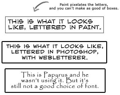
Wendybird's description of why Papryus and other non-comic fonts are bad is very good. Half of the comic is the story and you need it to be comfortable to read. Paint is bad to letter in because it pixelates the font, you're very limited on the bubbles you can make and you can't make larger outlines around them.
I have one more thing to say.
Half the comic is the art.
You have to hook people.
It might get better later, but you have one shot to hook people and that has to be right from your first page. Most people will not sit through subpar pages even if they're promised it will get better. I love your story, I honestly and truely do, and I see some good base technique in your art, which is why I had it bookmarked. I think it'll get better as it goes, I really do.

-
Industrialpowersart
- Regular Poster
- Posts: 43
- Joined: Wed Jun 25, 2008 3:13 pm
Re: Webcomic Hate
Kari, the artist, not Ed, the writer/ letterer talking here. That's "crazywriterguy."
I want to make it clear that I appreciate the feedback. But, I'm going to explain how some of this came about anyway.
I didn't advocate the choice of papyrus. However, I didn't realise it would strain anyone. (the one I liked might have been worse) I'm legally blind (yes, really,) and I can read it. That's usually my measuring stick. However, "can read it" may be the beginning of the sentence "I Can read it but it's annoying as hell." Also I have a huge monitor, so may not have realised how small it would be to many people. Anyway that is absolutely the kind of thing that we need to know, but that nobody had told us yet. If we put the whole thing in an annoying font, Dude, really. It's like having broccoli in your teeth. Someone should say something.
The scanner is eight and a half by eleven- which would be fine if the work weren't so detailed. I am used to working on HUGE! CANVASES! in PAINT! This is a bit of a detour for me. So yeah, I'm working on getting a little more movement into my work I figure it this way- if I can get good at making it look like people are flying or getting shot, maybe the next time someone wants their portrait done, they won't look so- classically bored- in the way that people have put up with for centuries, but maybe they shouldn't.
Here's how the creative process works on this thing. Ed and I took turns GM'ing. Yep, this used to be a homebrew role playing game. We realised between us that we had enough plot for YEARS of an actual comic. So, he's converting our stories into scripts, we hammer out the details, I draw it, and hand it over. He scans it in and does the word balloons. Sometimes my editing gets lost in the shuffle- like the bank robbery happened in oh, 1978 which i thought we ought to have a caption tell you. But no. Now that a lot of people have been confused on that point, that suggestion is being given more weight. As for the fact that it's a flashback being utterly lost: i wish we had indicated it a little harder, but we DID indicate it. Page one- Surge (the narrator) begins to reminisce.
If I were doing the computer end of things, I'd be using photoshop. But, it would also be taking me ten years to do. Tiz a trade off. So I ask again- Convince my writer not to use MS paintbrush. I don't think anyone has been able to do that, yet.
OK this is going to eat at me if I don't say something. Dreamaniac- OUCH! Did I suggest you shouldn't be drawing people if you're no good at hands? Even though this is a thread entitled "webcomic hate" I'm trying to be HALFWAY supportive, here. Anyway, I'd rather face my weaknesses head on and overcome them.
Conversely, Pimpette- thanks.
So. . . is anyone else brave enough to come forward and get flayed? I'm not touching anyone's comic in criticism unless given express permission.
OH PS. Metruis and Wendybird, i appreciate the font advice- thanks. I'll pass that along.
Oh for the record- the digital coloring isn't me, either.
Re: Webcomic Hate
I don't want to get flayed because you see how critical I'm being on you guys? I'm five times harder on me. (dies) I can't take it right now because I've already ripped the pages I have up into Simon-sized pieces, stomped on them and light them on fire. I absolutely hate my own work. I love criticism, I just don't want it in an 'I hate comics' thread if necessary. I mean, normally I'm nicer and run in much more detail over the good points, but this is a webcomic hate thread. At this point I don't desire flayage since I'm still slowly pushing at improvement myself, for all the flaws I picked up right off the start. I haven't quite tweaked things to the point I want yet, but once I have, then I'll probably make a thread and request criticism formally to see what people like and don't like and absolutely hate out of what I've done so far. But I've never been ADVERSE to criticism either. Just adverse to the shredding apart flaming of death.  I get enough of that from me.
As I said before, though, I had IP bookmarked for a reason, I wouldn't mind visiting again because the art is interesting even and it's a great story.
So, here.
STOP USING MS PAINTBRUSH FOR LETTERING. We do not care if it's easier for you to use or you love it to a million pieces or whatever.
We care about it looking good.
IT DOES NOT LOOK GOOD.
MAKE IT LOOK GOOD.
I'm not kidding. You're an amazing writer, you have a great story going on, but you don't know how to put it on top of art. Give your artist the script and let her do it, or learn to letter, which cannot be done in MS Paintbrush. Use Photoshop, get Gimp, hire someone, have your traditional artist here hand letter it, anything but Paint.
<3, T.
This is a moment where your writer needs to learn that his preferences do not come first. He is irritating his potential readers by making it difficult to read and doing subpar lettering.
I'd still suggest you do it yourself in Photoshop. He should have it typed out, you can take it and copy and paste it and all you have to do is use the marquee tool to draw bubbles and boxes around them, if he types them out as he wants them to appear... it should only take you a couple minutes. Still, your art's pretty dang good for legally blind, here.
See, I don't think the traditional art looks that bad. It's different from a lot I see and with a bit of work it'll look really good. It's the digital stuff that's slapped on that really jars. It looks digital, and that's the problem. Might I add I appreciate you replying in depth and explaining how these things came about? I think it's a valuable resource for comic artists, to see these things bounced back and forth.
Also, I PMed you about your HTML.
As I said before, though, I had IP bookmarked for a reason, I wouldn't mind visiting again because the art is interesting even and it's a great story.
So, here.
Dear writer of Industrial Powers:If I were doing the computer end of things, I'd be using photoshop. But, it would also be taking me ten years to do. Tiz a trade off. So I ask again- Convince my writer not to use MS paintbrush. I don't think anyone has been able to do that, yet.
STOP USING MS PAINTBRUSH FOR LETTERING. We do not care if it's easier for you to use or you love it to a million pieces or whatever.
We care about it looking good.
IT DOES NOT LOOK GOOD.
MAKE IT LOOK GOOD.
I'm not kidding. You're an amazing writer, you have a great story going on, but you don't know how to put it on top of art. Give your artist the script and let her do it, or learn to letter, which cannot be done in MS Paintbrush. Use Photoshop, get Gimp, hire someone, have your traditional artist here hand letter it, anything but Paint.
<3, T.
This is a moment where your writer needs to learn that his preferences do not come first. He is irritating his potential readers by making it difficult to read and doing subpar lettering.
I'd still suggest you do it yourself in Photoshop. He should have it typed out, you can take it and copy and paste it and all you have to do is use the marquee tool to draw bubbles and boxes around them, if he types them out as he wants them to appear... it should only take you a couple minutes. Still, your art's pretty dang good for legally blind, here.
See, I don't think the traditional art looks that bad. It's different from a lot I see and with a bit of work it'll look really good. It's the digital stuff that's slapped on that really jars. It looks digital, and that's the problem. Might I add I appreciate you replying in depth and explaining how these things came about? I think it's a valuable resource for comic artists, to see these things bounced back and forth.
Also, I PMed you about your HTML.
-
McDuffies

- Bob was here (Moderator)
")
- Posts: 29957
- Joined: Fri Jan 01, 1999 4:00 pm
- Location: Serbia
- Contact:
Re: Webcomic Hate
It might mean that Duff has finally read one Daniel Cloves comic too many.TheSuburbanLetdown wrote:You keep using that word. I don't think it means what you think it means.Yeahduff wrote: You hipster.


-
Bustertheclown

- Cartoon Hero
- Posts: 2390
- Joined: Tue Oct 05, 2004 9:17 pm
- Location: ATOMIC!
- Contact:
Re: Webcomic Hate
Inconceivable!McDuffies wrote:It might mean that Duff has finally read one Daniel Cloves comic too many.TheSuburbanLetdown wrote:You keep using that word. I don't think it means what you think it means.Yeahduff wrote: You hipster.
"Just because we're amateurs, doesn't mean our comics have to be amateurish." -McDuffies
http://hastilyscribbled.comicgenesis.com
http://hastilyscribbled.comicgenesis.com

Re: Webcomic Hate
Constructive criticism is awesome.
It's nice to finally start seeing it again in a not kicking you in the balls while they're doing it sort of way.
It's nice to finally start seeing it again in a not kicking you in the balls while they're doing it sort of way.
Caught in the headlamp glare of your own blinding vanity/Mesmerised by the stare of your shallow personality
Gorging the junk food of flattery you drag your fat ego around/Everyone floored by the battering you give to whoever's around
Oh Narcissus you petulant child admiring yourself in the curve of my eyes/Oh Narcissus you angel beguiled unsated by self you do nothing but die
Gorging the junk food of flattery you drag your fat ego around/Everyone floored by the battering you give to whoever's around
Oh Narcissus you petulant child admiring yourself in the curve of my eyes/Oh Narcissus you angel beguiled unsated by self you do nothing but die
-
Pimpette

- Cartoon Hero
- Posts: 4147
- Joined: Sun Jan 25, 2004 10:13 pm
- Location: Comi-what now?
- Contact:
Re: Webcomic Hate
Okay, okay, it's not papyrus. Looked enough like it to me - either way I still thought it was okay in the small doses that were up there.
I do concede the point that it would look terrible in large blocks of text.
I also add my two cents to the hat of persuading the writer to not use MSPaint.
If s/he is so bent on not using anything else... then yes, the artist should do it. Obviously you (the artist) have a much better grasp on what actually looks nice; you should wield your pen or other sharp items in the direction of the writer and take over the lettering.
Because it really really does look horrible in some places. Jagged edges are bad.
I will now go through and read the whole thing, as opposed to skipping around the pages that were linked by.. um.. whoever it was who reviewed before me. I can give a more detailed review after that... but I think the points have been made already so I probably won't.
also
You can tear apart P&A if you like... it'll be remarkably easy as the early art (almost five years ago, holy shit) is terrible and I don't think the story makes a whole lot of sense.
But any suggestions I can get on it (especially the latest batch of updates) are welcome and helpful. I especially want to hear what people are thinking about the newer digital lettering (as opposed to my sloppy handlettering) and the word bubbles, which I am still not satisfied with.
That and I always like to hear if people can make sense of any of the storylines or not. I can... but I wrote it so I don't think I count.
If you feel like picking apart Shenanigan you can do that too - but as we only have about thirteen pages up so far... I don't know if it's enough to base a solid opinion on.

-
Redtech

- Regular Poster
- Posts: 532
- Joined: Thu Aug 17, 2006 9:15 am
- Location: 'Terror central' London
- Contact:
Re: Webcomic Hate
Corrected, and if you really feel like gourging your eyes out, Meiosis needs a kick in the arse after 2 missed updates (so what am I doing on the forum then?!)Industrialpowersart wrote: So. . . is anyone else DAMNED STUPID enough to come forward and get flayed? I'm not touching anyone's comic in criticism unless given express permission.
I think Photoshop is hugely expensive, hugely complicated and hugely difficult to learn if one is only using it for lettering! I'm a Paint-Shop-Pro user which is now part of Corel's Photosuite I believe. PSP is simple to use, although it may be "too" simple for advanced techniques such as semi-transparent text or various special effects. There's always The GIMP though, because 'free' is better than 'Microsoft Free'.
Sometimes the failed experiments are the ones that don't try to kill you

-
Industrialpowersart
- Regular Poster
- Posts: 43
- Joined: Wed Jun 25, 2008 3:13 pm
Re: Webcomic Hate
Heh. Well for those of you who are brave, I will get back to you later, with detailed critiques. Hey, some of us know how to be polite. I promise not to cross the line from construction into destruction.
That said, you guys have failed to convince me that I'm not a great artist, without regard to visual acuity, about which I should probably not have informed you.
You HAVE convinced me to change the font, incorporate bolder lines, and avoid drawing even filler art on a roughly five by seven. A friend of mine who can be described as a "web guy" will be tweaking the site, although I appreciate all the HTML help.
-
Rcmonroe

- Regular Poster
- Posts: 323
- Joined: Fri Jun 09, 2006 3:34 pm
- Location: Southwest USA
- Contact:
Re: Webcomic Hate
I have two disparate responses to this, both of which are true:McDuffies wrote:It might mean that Duff has finally read one Daniel Cloves comic too many.TheSuburbanLetdown wrote:You keep using that word. I don't think it means what you think it means.Yeahduff wrote: You hipster.
1. It's impossible to read too many Daniel Clowes comics, and
2. That being said, Yeahduff has probably read about fifty too many.

-
TheSuburbanLetdown

- Destroyer of Property Value
- Posts: 12714
- Joined: Wed May 05, 2004 8:38 pm
- Location: explod
-
Yeahduff

- Resident Stoic (Moderator)
- Posts: 9158
- Joined: Tue Aug 05, 2003 4:16 pm
- Location: I jumped into your grave and died.
- Contact:
Re: Webcomic Hate
Hell, I don't read enough Clowes.
And dropping White Stripes lyrics in casual conversation is gonna get you called a hipster. You can't take the effect and make it the cause.
And dropping White Stripes lyrics in casual conversation is gonna get you called a hipster. You can't take the effect and make it the cause.

I won't be the stars in your dark night.
-
TheSuburbanLetdown
- Destroyer of Property Value
- Posts: 12714
- Joined: Wed May 05, 2004 8:38 pm
- Location: explod
Re: Webcomic Hate
You can speak of these mythical beasts all you want, but the bottom line here is that I hate you. So I'm just going stay here. Enjoying my coffee.

-
Turnsky

- Cartoon Hero
- Posts: 1488
- Joined: Fri Feb 13, 2004 8:11 pm
- Location: Devonport, Tasmania
- Contact:
Re: Webcomic Hate
http://www.dafont.com/search.php?psize=m&q=letteromaticMetruis wrote:*trimmed down because of inordinate length for a quote*
this is the font most folks use, it's simple, clear, and doesn't look like it came out of Microsoft's font toolkit.
that said, Dafont does have a lot of lettering fonts available.
onto MSPaint, it's not a -bad- program per se (personal bias notwithstanding) but there's far more flexible and powerful programs out there, such as the Gimp, paint doesn't have the antialiasing features that a lot of the more modern image editing programs use these days.

"when a hero dies, he becomes a legend, that legend, with time, becomes a myth, then a fable, that fable, is then carved in stone, and when that stone crumbles, it is lost" - Takahn.
Re: Webcomic Hate
I never said you weren't a great artist, I said you could improve. You were searching for critique, and that can include even the most amazing art from the most amazing artist EVER.Industrialpowersart wrote:Heh. Well for those of you who are brave, I will get back to you later, with detailed critiques. Hey, some of us know how to be polite. I promise not to cross the line from construction into destruction.
That said, you guys have failed to convince me that I'm not a great artist, without regard to visual acuity, about which I should probably not have informed you.
Because no one is without the ability to improve.
Actually, I'm glad you posted that. I'm glad to see someone stretching themselves even with a weakness. It's pretty inspiring, actually.
I would beg to differ, I see a LOT of different lettering fonts used, I can go to one place and be told 'most people use this' but for all my reading, I see a lot of different styles. Webletterer and Digital Strip are pretty frequent. There's a lot of lettering fonts and I think most people either go to Blambot or DaFont to get them, yeah. The one you linked is a great looking lettering font, definately.Turnsky wrote:this is the font most folks use, it's simple, clear, and doesn't look like it came out of Microsoft's font toolkit.
Thanks for trimming me. I hate when people unnecessarily quote large lengths.

Re: Webcomic Hate
Sir, you must be joking.Yeahduff wrote:And dropping White Stripes lyrics in casual conversation is gonna get you called a hipster. You can't take the effect and make it the cause.
The White Stripes are at least four years old. What sort of hipster would be caught dead quoting them now?
Oh, and to actually contribute to the conversation: I pretty much swear by Digital Strip and Blambot in general. Good, readable, suits my work.

-
Bustertheclown
- Cartoon Hero
- Posts: 2390
- Joined: Tue Oct 05, 2004 9:17 pm
- Location: ATOMIC!
- Contact:
Re: Webcomic Hate
Because now it's ironically unhip to quote such a passé blast from the past, and irony is always hip.Jekkal wrote:Sir, you must be joking.Yeahduff wrote:And dropping White Stripes lyrics in casual conversation is gonna get you called a hipster. You can't take the effect and make it the cause.
The White Stripes are at least four years old. What sort of hipster would be caught dead quoting them now?
"Just because we're amateurs, doesn't mean our comics have to be amateurish." -McDuffies
http://hastilyscribbled.comicgenesis.com
http://hastilyscribbled.comicgenesis.com