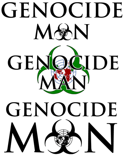
I'm working on a logo for my next comic. Just had the idea and couldn't get it out of my head unless I tried it.
Which variation looks best for a title splash?
Tag lines:
"Life is funny. Death is funnier. Mass slaughter can be hilarious."
"A hero with the power to make you laugh...while he's destroying the human race."
Yeah, another high concept comic, but funny this time. All suggestions are welcome. Not working on the actual comic until 2008, most likely, so there's plenty of time to modify things.
I read it as Genocide Moon myself. Multiple circles, "automatic typo correction syndrome..." Have you read The Stand? M-O-O-N, that spells toolbox! Anyways, I got what it said a second later, and I do very much like the overall concept. Maybe put the symbol in "GenOcide" rather than "man?" It's not centered, but you don't have to have a symmetrical logo.
If I were you I wouldn't worry about people reading "genocide" as "suicide". Personally, I read it as "regicide man". Thought maybe it was a comic about Oliver Cromwell.
I have to agree that putting the symbol in the middle of "man" makes it look like "mon", though. Maybe if you used a triangular symbol instead?
Fourth Floor wrote:If I were you I wouldn't worry about people reading "genocide" as "suicide".
Sorry. That was my faulty memory. I made the reply in haste without the original post easily to hand.
Mon stays, though.
You can always put the words next to or under the logo, like with the Comic Genesis logo. Just... move them around until they seem like they're in a good place.
Thanks, all. Hmmn. I was hoping that the logo was triangular enough to look like an 'A'. If not then you're right -- I probably should separate it from the text entirely.
Or perhaps reversing the logo (globe on the outside, biohazard symbol inside) could make it sub for the 'O'. I'll look at that.
I like the first one best...having "MAN" the same size as "GENOCIDE" seems a bit much. The second one is good, but there is too much color. When I think of genocide (not like I do very often), the color of black comes to mind. Not green and red. Sooo, you may want to stick with blacks, grays, and whites. But since I like making logos (and can't resist the awesomeness of this logo), I'll give a few ideas I got from looking at yours...
Suggestion A (Placement):
GENOCIDE (logo here) MAN
The benefit of this style would be that you could use it as a long banner at the top of the website. It would look good without looking too cluttered.
Suggestion B (Style of logo):
Try to make it so that the tri-circle thing isn't much bigger than the globe thingie. Then put the globe thingy on top in such a way so that when the lines intersect with the tri-circle thing they invert in color...like, from black to white or something. It'll look quite awesome.
Suggestion C (Combo of A and B):
Take my suggestion of B and make it look like "GENOCIDE MAN" is wrapping around it like a ring or something. You remember the way "DAILY PLANET" was wrapped around the globe on the top of Clark Kent's newspaper place? That style of thing. That way, not only is the logo compact, it looks awesome and doesn't detract from any of the individual things.
Hope I helped...even if only a little bit. =)
<a href="http://subconscious.comicgenesis.com"><img src="http://www.maj.com/gallery/NomadicPhoen ... /large.png" alt="Click Here to go to Subconscious!" border="0"></a> If you ever need help website / tech-wise...don't hesitate to ask! =)


