Rebirth of Webcomic Above!

For discussions, announcements, non-technical questions and anything else comics-related or otherwise that doesn't fit in any of the other categories.
Perk_daddy
Regular Poster
Posts: 321
Joined: Thu Jun 15, 2006 5:58 pm
Location: Utah
Contact:

Post by Perk_daddy »

Broken Mirror

Art: The art on this comic is absolutely professional-quality; beautiful colors that evoke whatever mood the writer is trying to convey, and excellent linework that gives it a true comic book feel. Characters are easily distinguishable and show emotion through their facial expressions. I can't rave about the artwork enough!

Storytelling: Some might complain about the slow pace of the story, but I don't mind. My only problem was the beginning few pages that were a bit too wordy, and the poetic language was okay, but I thought a little unnecessary. There was little substance to the text, and I thought it would have worked almost as well without any text in the first few pages.

I like how the reader is dropped in the middle of a situation (Galen dealing with the abuse heaped on him at home and school, Xara and Nora's sibling rivalry and medical issues, etc) and is left to pick it up as it goes along. Enough is revealed about the characters and their situations to make the reader get to know the characters and feel for them, at the same time not revealing too much information at once. The reader wants to get his questions answered! Will Galen escape his situation? Will he ever see his girlfriend again? What's happening to Nora? I know I'll be checking back to see.

Site: the site is designed well. A lot of space is devoted to the comic, which deserves all it can get to show off the artwork. I can only suggest that the most recent comic be posted on the home page instead of a small link to it. Most webcomic readers are pretty much conditioned by now to expect it. That's a matter of opinion, though, and doesn't take away from the comic itself.

I wish it updated more often; and yes, this complaint is hypocritical :wink: . But hey, work this good can't be rushed, can it?

One of my favorite comics. Highly recommended to anyone!
Last edited by Perk_daddy on Mon Mar 05, 2007 1:38 pm, edited 1 time in total.
ImageImage

User avatar
Arkaina
Regular Poster
Posts: 37
Joined: Wed Dec 27, 2006 4:21 pm
Contact:

Post by Arkaina »

Cooties. Well, Cooties is about (from what I can tell so far) a group of kids starting their first day in middle school, and some challenges they face in entering this new jungle (being the lowest on the food chain again). But aside from dealing with the troubles of puberty and classes, there's also an alien invasion to worry about as the Q'utee (sounds like Cootie) begin taking over the minds of the people on earth and making them their slaves.

Art

The style is very simple, and really reminds me of the old peanuts. But one thing I noticed is that unlike your regular strips in the funnies, there's more detail put into the scenery, especially in the first few strips. The colouring at first was a bit choppy, but those mistakes appear to be corrected by now. The colours are basic, but the simplicity goes really well with the character designs and the story itself.

Writing

I'm really surprised, I didn't think I would like the humour in Cooties (no offence). I imagined it would have been a bit corny and such a drag to sift through, but it's actually pretty funny. Despite being naive middle school kids, the children are actually pretty witty, and I laughed out loud a few times.

The artist seems very aware of keeping continuity. When Jake runs off to catch the alien, Nathan's mother offers to go looking for him. This isn't brought up again for some time until Nathan goes to check in the office if his mother found Jake. I found just this little tidbit helpful in keeping the two plotlines together, unlike some comics which just let everything go their seperate ways.

I also noticed one gag where Jake made a pun refering to George Lucas instead of Gene Roddenberry. I had to reread the joke a few times as I was sure George Lucas did not make Star Trek. But the joke was corrected by another character in the next strip. Whether this gag was intentional or not, I don't know, but it was nice to see the artist take a mistake and make it work.

Site

The site could use a bit of work. It pains me to see a good comic without a good site to match. In terms of colour, the green is a bit too bright and could stand to be a bit duller. And gradients are a big no-no. In terms of content, right now it's very basic, but it would be nice to have a cast page, maybe a gallery as well.

I would highly recommend finding a designer to spice up the site a bit. Although the comic is great, the site I find is it's biggest downfall and reflects poorly on the series.

Final Thoughts

I really liked Cooties and I think I'll continue to keep up. 8/10. I highly recommend it to anyone and I hope the strip continues to grow.
Last edited by Arkaina on Thu Mar 01, 2007 1:31 pm, edited 3 times in total.
Image

User avatar
Spqrblues
Regular Poster
Posts: 324
Joined: Fri Jul 14, 2006 8:22 pm
Location: Forum Romanum
Contact:

Post by Spqrblues »

<STRIKE>Okay, I think I understand how this works (I hope): Placeholder for Arkaina.</STRIKE>

ARKAINA

It's a wonderful self-indulgence to have a reason to lie on the couch on a sunny Saturday and read a webcomic from start to current installment.

I was glad for a chance to review Arkaina. In the areas the artist is good, she really excels. But there are areas that are weak, too. That only makes sense. Not every work is going to be perfect from the get-go. At the risk of sounding stuffy, because I don't know how many comics Cheryl has created in the past, I'd consider Arkaina to be a great early-career effort, a steppingstone to future work. The "About" section says Arkaina was created nine years ago--I'm not sure whether that means the story concept was created, or the actual writing, and whether the artist was a kid when she first wrote it, or whatever. The FAQ indicates that the art is being created now.

Website
All the usual categories are in the sidebar, each page containing just enough information (the cast section can expand as time goes on). The site is nice to look at, with as warm a palette as the comic itself, but the banner image pushes the actual comic (or other content) almost off the screen on my laptop. I'm sure most users have a similar problem. This is a waste of screen real estate that doesn't add to the comic. If the artist doesn't want to make the banner shorter, I suggest using the large banner on a separate "intro" page (I know some people don't like those) with navigation links and update information (like The Antagonist). Then put the latest comic installment on its own page with a smaller banner at the top. The comic itself is tall anyway (in "page" format rather than "strip" format); I was mildly irritated by having to scroll twice to see the latest installment. Okay, that's not that hard, but why have any barrier between the reader and the story at all?

Also, when going through the archives, the last "next" arrow doesn't click through to the current comic. In general, though, I am liking the next and previous arrows, set at the vertical center of the page, very much.

Story
The prologue explains: It's the year 2063, and the offspring of demons and angels fight for supremacy over an earth that is almost bare of natural resources, and someone called Lady Arkaina is the people's hope for setting the world right again. Personally, I don't like having to read a page of set-up before getting into the good stuff of a comic--you know, the part with pictures. But I wouldn't have minded if the first page had an illustration or if the words were superimposed over a landscape or some such thing. In a printed comic, we'd have the cover art and maybe a facing page to enhance the presentation of a chunk of back-story, rather than just type. Also, I almost missed the last sentence, waaay down at the bottom of a big blank space. That'll work if the comic is printed. But since it's currently online, and there's no art on this page, there's no reason to make this page so tall that the last sentence is likely to fall off the bottom. I only scrolled down because I'm reviewing the comic. As a casual reader, I'd have just clicked the next arrow. And speaking of that last line, why is the comic called Arkaina if this isn't her story?

The story proper starts with disruption and mystery, a nice young guy who frowns a lot (Matt), an interesting young gal who runs a lot (Sonja), and a kitty (who doesn't like a guy with a kitty?). The mystery ratchets up, then the story lets loose with some action and, as of the current comic, is still revving up the action.

Some of the dialogue gets a little cliche ("Get out here right now or the kid gets it"). And some of the world-logic is fuzzy. I'm not entirely sure why bat-winged beings who can bounce back after getting shot are surprised that the black-winged guy can handle getting stabbed, but Matt's invulnerability is a big plot point. Maybe if we'd seen bat-winged people getting shot/stabbed in the heart or getting a throat slit and actually dying, we'd understand that some wounds are different.

Of course, Matt on his own, beating up bad guys and healing himself, would not be interesting (no threat), so he has charge of Sonja, who can probably be damaged; and then there's Joel, who... well, we don't know anything about him yet, he's only been around for a few pages. He and Matt have history over some chick, whatever, I'm not really interested in two guys fighting over possession of a girlfriend, I'll wait and see how Matt's hurt ego influences his interaction with Joel and I'll wait and see what role Joel plays as the story continues.

My understanding of who's a bad guy and who's a good guy wobbled a bit going into chapter 3. One would think the bat-wings are nastybad, but Matt gets angry with Sonja for being a criminal, even though he fights off the people who are after her, so... Well, it could be that I read through too quickly to get it. Matt hasn't heard about Arkaina, and his motivations for helping Sonja aren't all that clear. Is it really just for the possibility of getting paid? He just seems angry, and just going along with the plotline, just kinda wanting to help her because she needs help.... I dunno. I'd have liked to see more of his and Kathy's desperate financial situation. Heck, maybe if he'd chosen to feed the cat the last food in the cupboard rather than feed himself.

I wondered why they think being on a train will keep them safe from flying commandos.

Also, for a world dangling at the end of its rope (after decades of struggle, "energy, food, clothing are now considered a luxury," states the Prologue), there are a lot of shops, a large variety of clothing, fancy shoes and impractical heels, regular train service, lush forests and meadows, and nice looking apartments with potable running water. I think I saw a couple of boarded-up windows.

Twice, the artist explains herself in a footnote, for example: "I know it may seem like Kathy is a bit of a nasty person, but she only acts this way when she smells a business opportunity." No, no, please--don't tell me, let me learn who Kathy is over the course of the story; or let me go ahead and think she's nasty; or just don't show her as being nasty. The story itself does make it clear a few pages later that her actions come from desperation to earn some cash. Let the readers get to know her by what she does. Don't tell us how to feel about her. We'll probably rebel.

Art
The art has an angular, stiff quality, but the artist has an excellent sense for cinematic scenes (this gun angle); and using shapes and poses and palette to set the mood; and unusual perspectives. She expresses a broad range of body language and gesture. It's just that often the proportions and foreshortening aren't right.

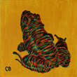
The colouring is straightforward, simple, and easy on the eyes, very autumnal, which suits a world in decline. There are several great uses of dramatic lighting (I think the artist would do a kickass job as a colourist). The artist has a very 3D vision, like a sculptor able to see the characters and world from all sorts of different directions, and communicates this on the page. But the anatomy is inconsistent, all over the place.

Sometimes it's hard to distinguish faces (this woman looks a lot like our hero). Toward the end two new characters are introduced, and, honestly, the guy has the same face as Matt and the woman has the same face as Kathy, and so do women in the background.

I've said this above, but I'll reiterate: Don't explain the comic in a footnote. ("Note: Just so you know, Matt rolled up his sleaves in the seventh panel, that's why his shirt's different in the eigth.") Either have confidence the audience is processing both your art and the words, or change the art so that you communicate everything you intend.

I like seeing the artist take on so many action scenes, but on this page there's a lot going on, and I can't tell what. There's some pretty work in the gallery but the quality is inconsistent. Always nice poses, great gestures, the ones in colour have a nice palette; but often the proportions and foreshortening are just wrong. For example, an arm pointed toward the viewer will look larger, not tiny, but often in this comic it's drawn just the opposite. There are a lot of reference books out there with either photos of models or pencil sksetches or ink drawings showing poses from different angles, and there are books specifcally about foreshortening, and even books about foreshortening for comics. I encourage the artist to look into them (probably easier to find in print than online). It's not something that becomes natural immediately (I struggle so much with proportion myself), but over time, it does become second nature. I'd love to see this artist reach her full potential.
Last edited by Spqrblues on Sat Mar 03, 2007 10:08 am, edited 1 time in total.

User avatar
Duralict
Regular Poster
Posts: 96
Joined: Tue Jan 23, 2007 10:21 am

Post by Duralict »

SPQR Blues

Art: I really like your art style - it's got the heavily posed, formal atmosphere of a fresco, and the characters have heft to them. You clearly have a strong grasp of anatomy, composition, and shading, but I think the part that impressed me most was the physicality of the characters - they're always dynamic, even when they're just standing still. The use of body language is impressive. If there's a weak point in the art, it's the facial expressions - characters seem mostly stuck in one version or another of deadpan. This kind of works with your art style, because of the fresco feel and the expressive body language, but it does make some of your more emotive scenes feel a little flat. I like your colored strips, but the palette is a bit loud, and nothing seems to cast shadows. I really like how different everyone looks - it's very easy to tell the characters apart, and they all look like real people.

Writing: The scenes are very measured. I'd say you actually have some minor pacing issues - although your dialog is very strong and you're adept at cramming a lot of expository information into short, natural conversations, the story as a whole feels metered out, and we're kind of trudging from one plot point to the next. The character development is interesting and engaging, but the plot feels very "and then this happened" - although I definitely feel like you're building up to something in the future, the minor arcs are sort of bland. Example: there's a lengthy flashback where our hero meets and marries a woman with a young son, both of whom go down on a ship our hero's patron had sunk to punish him. This is strong stuff, but it's delivered in the same narrative tone and beat as the scene in which he attempts to find lodging. There's just not a strong sense of climax or resolution for the minor story arcs.

I really like the historical notes you periodically include above or below the comic, by the way, and the big draw for me with the comic isn't the plot or characters but rather the stunning sense of atmosphere - your worldbuilding is exemplary, and easily the strongest part of the comic.

Site: It's easily navigable. The color scheme is very loud and distracts from the black-and-white comic a bit too much for my taste; it's also inconsistent. You have a nice synopsis page. Overall, the site's pretty bare, and your front page seems thrown together. The archives don't suffer from this at all and look great, but the colors and the front page could use some attention.

Areas of excellence: A clear storyline progression, and attractive, expressive art make it a great comic in its own right. It's also reliably updated several times a weak and makes great use of the daily strip format. The biggest strength is definitely the atmosphere, especially the attention for background detail - both artistically and historically - and the worldbuilding.

Areas for improvement: The site is relatively slapdash, though functional; the plot feels monotonous in places. However, the weaknesses don't seem to be holding the comic back so much as simply not being on par with the strengths.

Overall, a professional-quality newspaper-style daily serial. I recommend it to anyone with even a passing interest in the Roman Empire. Impatient people will probably get quickly bored and move on, but there's a lot there for anyone willing to give it the attention it deserves.
Last edited by Duralict on Sat Mar 03, 2007 4:27 pm, edited 2 times in total.
Image
intended for mature audiences.

User avatar
Col
Cartoon Villain
Posts: 5089
Joined: Mon Jan 12, 2004 9:40 am
Location: Uncertainty
Contact:

Post by Col »

*** INFORMATIONAL POST ONLY ***

List of the damned...

K-Dawg owes Circle Arcadia a review

TRI owes School Spirit a review

netpoet owes Strange Happenings a review

ryclaude owes Sorcery 101 a review

sorcery101 owes LagoMorphine a review

Mo owes Little White Knight a review

mvmarcz owes IMO a review

Eve Z. owes Strange Happenings a review

LibertyCabbage owes Zoology a review

mcDuffies owes Operation: Neko a review

Dragonkingdoms owes Little White Knight a review

perk_daddy owes The Broken Mirror a review

duralict owes SPQR Blues a review

Everyone else is awesome by default.

*** INFORMATIONAL POST ONLY ***

Next person should review Necropolis, above... do *NOT* choose mine, please.

Jesslynstormheart
Regular Poster
Posts: 58
Joined: Mon Jun 19, 2006 12:46 pm
Contact:

Post by Jesslynstormheart »

I'll review Necropolis. [Placeholder]

Art:
I really like the heavy line art and deep color themes that you use. It really helps set the mood of the story. One thing that is a big plus is that the art is good from the beginning. Most webcomics start out somewhat weak artistically and show gradual improvement over time. You had a head start there. There are some nice effects going on as well. For instance, the water and reflection on pg. 2, the way you portray losing consciousness on page 6 and the dark eyes on page 25 to name a few.

The backgrounds, when you use them, are excellent and really add to the atmosphere. There are times when the backgrounds seem a little blank or even completely white, which can jar a little when we are accustomed to seeing those heavy and moody lines that you use so well. If you're short on time with some of the panels even a simple gradient would be helpful.

The anatomy is sound from my point of view and done well. My only nitpick is that most of the women seem a bit masculine to me. That's ok, if that is your intent. The reason they come across masculine is because their eyebrows are thicker than average and their jawlines are broader. Vanessa is the only one that looks feminine to me. The men look like men and you seem to have a good grasp of their facial structures.

There are times when the word balloons are a bit close to the words making the words seemed somewhat crammed in. Just something to keep in mind.

Story:
The setting is very intriguing. It's a futuristic setting where man has gone and screwed things up, killing most of the human population in the process. Much like what could possibly happen in the real world if the wrong people are in power or get ahold of the wrong technology. Since the setting isn't all that far-fetched and a possible reality it gives the whole story that much more of an eerie feel. So you have an excellent canvas to work with.

Minor nitpick. When the scenes change there seems to be something missing with the flow. It might just be me so feel free to ignore. I just feel like I'm walking into a room where people are in midconversation. And then I have to catch up with what they are talking about. It took me a minute to figure out when they were hallucinating as well. One idea would be to add a haze around the panels to establish a hallucinatory state? Or maybe that's the plan to have readers kind of figure it out as the conversation is going on. If that's what you're aiming for then you could stick with that.

I couldn't help noticing that Andrew seemed quick to trust and team up with Adam considering he shot him. He, also, seemed a bit underwhelmed by the fact. It's not impossible that they would join up but I could imagine a heated exchange prior.


Website:
I really like the dark background/theme. It really goes along with the atmosphere of the story. I can tell you've put a lot of thought into mood setting with your art and design scheme. Either that or you have a natural talent for it. Your banner rocks! The words in the menu are a bit hard to read and I could imagine some people missing the menu all together. Consider going with a lighter grey for the wording to add more contrast? The site is easy to navigate, which is a big plus considering there are so many webcomics that make navigating their site seem like solving a complex puzzle. I think it would be cool if you designed some navigating buttons to add a little pizzazz. The words seem a bit generic.

Overall, I think this is an excellent comic that shows lots of unique artistic style and an intriguing setting. Very promissing.
Last edited by Jesslynstormheart on Sun Mar 04, 2007 11:19 am, edited 1 time in total.

User avatar
[geoduck]
Cartoon Hero
Posts: 1455
Joined: Mon Feb 02, 2004 12:48 pm
Location: Pacific NW
Contact:

Post by [geoduck] »

Jesslyn Stormheart.

First off, anyone approaching this comic should be aware that to date the titular heroine has spent most of her time duelling hand-to-hand in arenas. There is blood and violence and a whole lot of near-nudity. Take this as either a warning or recommendation.

Even though this doesn't bother me as much as some, I regret that I still have to be harsh in my comments. First of all, there's the art. While the depiction of the characters is passable (if unextraordinary) the creator really needs to work harder on his backgrounds; if your characters are fighting in an arena, you need to show the arena, not just draw a wall/row of columns and slap in a color gradient. I understand backgrounds are a pain; as noted in the review of my own strip below, I don't do it enough myself. But it has to be done if you want to excell.

The same problem, essentially, extends to the plot, where it is far more damaging. Again and again, the reader is told things instead of being shown them. We're told about the Blood Wars. We're told about Jesslyn's childhood. We're told that she liked her servent before he died. We're told that by winning again and again in the arena, that she's "brought the whole system crashing down". (And then shown that nothing has changed, and she has to flee the arena to escape being assassinated.)

If you want to draw in readers, you need to thrust them into the plot, get them interested, and then start doling out background info. Examples: instead of a massive Human/Dwarf/Elf infodump in the very first strip, have the first time that anyone mentions Elves be when Jesslyn makes her disparaging comment about her assigned "uniform". Show Blood War ruins as Jesslyn travels to Keldor. Instead of jamming in a flashback scene showing her father being inducted into the Chaos Phalanx, have Jesslyn run into a CP unit led by... "Daddy!?"

And while I like a bit of George W. Bush bashing as much as the next guy, you could have been a little more subtle about it. (Unless it turns out that this is a distorted post-apocolyptic re-telling of real-life events, which again, would be interesting.)

Bottom line, you appear to be more interested in drawing the fight scenes instead of creating a coherent plot. If that is what you (and your regular readers) want, fine, cool, go for it. But don't waste time half-assing everything else.

Good things: the fight with the Owlbear is impressively nasty and gorey; it's a pity you waved the Magic Healing Wand and wiped away all the consequences. Jesslyn would be a far more interesting character if she kept a few of those scars. The "seduction" scene in the Mage School ended on a nicely creepy note; that was probably your best artwork.

Random site-design comments: If you're going to have a ratings warning posted on the site, you need to put it where people can see it before they read the strip. I'd advise swapping the ratings box and the voting buttons. Your navigation buttons are a little hard to read; maybe make the words brighter. If only for copyright purposes, you might want to put your name somewhere on the site.
Last edited by [geoduck] on Mon Mar 05, 2007 11:59 am, edited 1 time in total.
"gooey-duck". A clam. Not a snail.
Image

User avatar
Aiken
Regular Poster
Posts: 210
Joined: Wed Jul 26, 2006 6:30 am
Location: Lincoln, England
Contact:

Post by Aiken »

The Mansion of E

Story
The story of the Mansion of E revolves around just that. A giant mansion brimming with monsters, mysterious devices, beaver sharks and time space anomalies.
I have to say that I love the idea of the near limitless mansion, which the owners have no control over to be a great concept, almost reminiscent of Rose Red. (I’d say without the death and mysterious disappearances, but reading the comic that simply isn’t the case.)
This of course allows the author limitless possibilities where the plot is concerned, and sets the comic in a surreal universe which gives the whole comic a vague Pratchett feel to it. This especially comes through with the history of the Family of E, which routinely comes up in conversation whenever something surreal or just plain weird is encountered.
That being said I did find that the story archs tend to drag on, and by the time the characters have achieved their objective I’d forgotten that was what they were after.

Artwork
At first glance the artwork is very simple and a bit rough at times with shaky lines and simple backgrounds. However given that the writing is mainly for comedy value, the art does fit the theme. After all, the artwork in antihero for hire is pretty rough, but I still love it for the comedy.
The supernatural creatures are all imaginative in their appearance and the traps and gadgets all look sufficiently dangerous and confounding. Therefore all the art could really gain from is smoother lines, and possible varying line thickness, to make the characters pop out of the background.

Website
The website, while fairly plain does fit the comic quite well. The blue maze background fits the theme nicely, and the appearance is clean and clutter free. The navigation is easy and hassle free, and the extra content is all there. I especially like the recap page, mainly because there’s over 1000 strips to get though, and there ain’t no way im doing that in a hurry. (Not without loosing a good few hours atlest)
<a href="http://sci.comicgenesis.com"><img border="0" src="http://sci.comicgenesis.com/images/sigbanner.jpg" width="282" height="70">

User avatar
Glarryg
Regular Poster
Posts: 355
Joined: Mon Mar 14, 2005 8:27 pm
Contact:

Post by Glarryg »

Review of Substitute Class Imago

I have to admit that I might have missed it somewhere, but I'm not sure what the title actually means; I thought there was a school involved. This is a fairly new comic, so there was not a huge archive to use for a review. That being said, there seems to be a lot of potential in this work.

ARTWORK
The artwork is not terribly impressive, but it's not awful either. Some work can be put into perspective and consistency with character proportions. The characters tend to have similar facial construction to the point of not being able to tell them apart very well when the comic is not in color; some variation would work nicely, and could be introduced slowly so as not to jar the readers with a "new" cast. Action scenes are somewhat awkward, and it would be better not to change the "camera angle" too quickly (e.g. if someone gets punched and starts to fall to the left, have him keep falling to the left in the next panel or else it might look like he's lunging forward after being punched). Imagine what it would be like to watch a fight scene in a movie if the camera was moving too much. Still, it is apparent that the artist has the ability to improve on these things, which makes me look forward to seeing how the comic's look matures over time.

WRITING
The story follows three agents of a futuristic task force assigned to apprehend industrial thieves. It's not a terribly original concept, but there is some potential for interesting chemistry among the characters, which is something that stories like this need more. The human angle in a sci-fi story can easily be overlooked in favor of action, but a well-done character-driven story can really make this comic stand out (which is not to say that the action has to be dropped or necessarily minimized). It's too early to say where the story is going at this point, but there is a lot of material that can be mined from the setting and characters. This would be a good comic in which to use some first-person narration, either by a single character through the entire comic or by a different character for each "book."

SITE
Site navigation is clear and simple. The archive organizes the comics into books, allowing the reader to find them according to page numbers. Although a calendar-style archive might be nice in addition, it's hardly a sticking point, as the page-style archive is clear enough.

OVERALL
As was mentioned before, the biggest thing this comic has going for it is potential. It is by no means a poor comic, but it's a little early to tell exactly where things are going. Some work on the art would help, and as long as the story doesn't get bogged down in too much sci-fi fluff there's a lot that can be done to make this comic unique.

Glarryg
Last edited by Glarryg on Thu Mar 22, 2007 5:11 am, edited 1 time in total.
http://www.squidninja.com - Dude. Buy a shirt. Seriously.

User avatar
Spqrblues
Regular Poster
Posts: 324
Joined: Fri Jul 14, 2006 8:22 pm
Location: Forum Romanum
Contact:

Post by Spqrblues »

I'll do another. I'd hesitated, because I just did one, and also Squid Ninja isn't the type of comic I regularly read--but reading a type of comic I don't regularly read could be a good experience. So. Placeholder.

User avatar
Dutch!
Red galah
Posts: 4644
Joined: Sat Jun 19, 2004 4:39 am
Location: The best place on this little blue rock
Contact:

Post by Dutch! »

Bugger it. I'll jump in again. I've been meaning to give this one a look over for a while.

Might not get it all done before next week, but them's the breaks. I'll get it in as soon as I can.

It won't be a month and a half, that's for sure.
Remember when your imagination was real? When the day seemed
longer than it was, and tomorrow was always another game away?
Image

Post Reply