The Necropolis disappointed me a bit. The first page is strong: it’s a stylistic scene that conveys the story in a clever way. But things go downhill from there.
The art is functional. The scenes are conveyed clearly. That’s an accomplishment many webcomics can’t seem to hit. Take it to the next level. Show me some dynamic perspectives. Use special effects and lighting to convey not just action and scene, but emotion and mood as well.
The character’s faces look like mush. Their bodies are stiff and often posed like department store mannequins. You're doing a lot of things right, but there's always room for work on anatomy, structure and all that other artsy bullshit.
Backgrounds are interesting, especially the first page. But like I said, it’s downhill from there. I understand half-assing the backgrounds. I do it too. But I can’t condone so much empty space in interior scenes. When you’re drawing a room, reference an actual room. In fact, when you draw anything, reference an actual anything. Google Image baby.
The plot is cliché: mysterious disease results in post-apocalyptic world with pockets of crazy people struggling for survival. But, cliché as it may be, it’s a genre that has plenty of space for originality. At only 20 pages, there’s time to take it somewhere interesting. Hop to it.
The dialogue is webcomic standard. The “Normal” character speaks the way we all do, except is over-explanatory and usually stilted and kind of obnoxious. The “Smart” character talks like Mary Poppins. The “Crazzyy” characters talk to themselves or someone who isn’t there. Narrative paragraphs make you sigh and skim them. It’s not all bad though. The back and forth between some of the characters reads well.
The characters are pretty bland so far in terms of design and personality. The two leads look like pallet swaps of each other. One has an eye patch. Also, the women are beastly. Go check out the cover of any of the Grand Theft Auto games. You’ll find extremely diverse looking characters that still maintain that pseudo-realistic style I think you’re going for. I’m not saying you should copy that style…but I wouldn’t mind it.
I guess you’re planning to follow the tried and true rpg/webcomic standard formula for adventure: Take one lone dude with a sarcastic wit, preferably with some memory loss. Have him do shit for a few pages. Introduce a second character as an enemy. Altercation. They form a team. This is where Necroplis is at page 22. I’m assuming down the road we meet 2 or 3 other wacky companions? Whatever. I have to admit, I like a lot of crap that follows that pattern, but work on making the union of the group a little less contrived then the joining of Adam and Drew:
Adam: “Hey I want to go with you now instead of killing you”
Drew: “hmmmm well you did just shoot me but…uh… ok because…..uhhhh. because it’s convenient for the plot”.
And no, even that exact dialogue wouldn’t be good. 4th wall breaking jokes are PLAYED.
Now this last bit isn’t a criticism, just some food for thought. I may be reading a bit too much into it, but this comic is kind of heavy on the gay. Evidence: male characters are often posed in a cutesy/dainty manner; Drew can’t keep his clothes on; Drew and Adam look like they’re on the verge of making out in every scene; Adam drops to his knees at the site of Drew; all the women look like men and are mean bitches; hetero relationships are wacked (zombie loving soldier, Adam loves a hallucination); the second page.
If that’s what the author intends, more power to ya. The homoerotic post-apocalyptic adventure is a genre that’s rarely tapped. I just thought I’d give a heads up in case that wasn’t the your intent. Also, Adam needs to trim that bush.
IN SUMMATION: Necropolis clocks in at 22 pages and I had to force myself past the first 5. Still, it has more potential then most the crap out there. Keep putting pages up and challenge yourself. REACH FOR THE STARS!
love
Dave Ryan
Rebirth of Webcomic Above!
-
Mrdaveryan
- Regular Poster
- Posts: 101
- Joined: Mon Jan 23, 2006 9:37 pm
- Location: Conshohocken
- Contact:

Website: It looks great! When I was reading the comic earlier, the title looked horrible with its bright colors against the faded look of the rest of the site and the comic. I'm pleased to see you changed the font and colors to something that goes better with the look and feel of the rest of the site. I'm still a little torn over the use of all those colors; your pallete isn't as varied in the actual comic, but at the same time the various colors can work off the idea of how hyper this comic is. In the end, I hated the title at first, but since the change, it's moved into the territory of "Meh." I think you could work with it a little more to really make it a part of the comic, rather than a multi-colored title with generic font that's tilted around for whackiness. But at least the colors aren't so vibrant.
Hmm... I just looked through it again really quick, and now I'm wondering if I'm remembering things wrong, and thought the title to your comic was the same as the titles to your chapter pages. That might have been the case, now that I'm looking at the first comic again. Still, my opinion of the title stands, and I think you should really consider changing those chapter titles. That font and colors are just plain ugly.
The rest of the site works well. You don't have anything on the front page that detracts from the comic, which is great. Your character page is fun with all the silhouettes of upcoming characters. It adds a bit of excitement seeing how much you still have planned for the comic. Thank God you put in the buttons that take you to the next readable character bio, because I doubt most people would feel like running through all those shadows trying to find the ones they can see. The only thing I don't understand is the "Limits" in the character bios. The descriptions suggest it's supposed to be their power or fighting style, but I don't understand the icons and chart at all. Maybe it's something from another comic or game or cartoon meant for those who understand it. If it isn't pivotal to the story, I wouldn't worry about explaining it.
Art: Fantastic! It suits the style of story perfectly. It has a great mixture of anime/videogame/graffiti styles to it. The true joy are the action scenes. These are some of the best ones I've seen in a long time. The flow is smooth and understandable majority of the time, and the characters ooze so much movement in all their actions. It feels like they could fly right off the screen. Too often a fight scene can feel slow and awkward due to a lack of skill in pacing and perspective, but this comic's got it down. I feel like I'm watching a cartoon that's on crack, and it must be oh, so sweet. Now that I really think about it, a lot of this reminds me of FLCL, which is a very good thing.
I really like the muted colors too. Anything stronger would be too much. And the looseness of the lines and color application adds to the pacing of the fight sequences.
You do have a few problems with perspective and angles though. Examples:
The last panel in this comic took me a while to understand. I think if you'd pulled the shot farther out so we could see more of the building, we'd realize what has happened. I thought it was a mushroom cloud at first, then finally figured out it was the top of the building with the smoke spewing out.
The second to last panel in this comic would have worked better if you'd drawn in a background. The guy looks like he's just floating there. It's awkward, and the white pulls the attention away from the rest of the comic and it's darker colors.
The middle panel. ACK! Weird, pointless angle! Totally destroys the flow of the comic. All of a sudden the reader is being forced to tilt his head to figure out what he's looking at. This is where your biggest problem is, I think. The wild perspective and angles work for most of the action scenes, but when you pull something like this in a comic of someone talking, it throws things out of whack. The guy's already leaning against the wall like a bad s.o.b., putting it at such a wild angle is overkill.
A similar case happens here, in the last panel. Though it is admittedly during an action sequence, the lines of the sword going off-panel throws me for a loop. If you'd shown the point of the sword, it might have helped, I think. Putting the character at a shot that was straight up and down would kill the kinetic pacing, but the way it's drawn where we can't make out the body and appendages makes it tricky to get our bearings. I would just use this as an example of being careful how you do these angles with some of your characters (at least when they're completely covered in a cloak and hat).
While I liked seeing how the characters reacted differently to the situation in the last panel of this comic, things were a little confusing at first. Again, good idea, but a little poorly executed. The perspective gets flattened with the sidewalks, and the giant doesn't even look like we're seeing him from above. The panels showing close-ups of the main characters covers up so much of the map that it's hard to figure out what it is we're looking at for a second. Also, it's hard to figure out what to read first. In the end, you could read it either way and it works, but figuring that out broke up the narrative.
Those are just little things I wanted to point out to you to keep in mind for future comics. I love the fact that you're challenging yourself with perspective and movement, and you'll only improve from the continuous experimentation.
Story: It's fine. It's a little early to get a real handle on what's going on and where things are going. We don't really know the relationship between McFly and Eugene and Ralph. Perhaps he was in the White Hearts with them? And we don't know who/what the White Hearts are yet. Looks like there's a lot of backstory and explanations about this world to come still, which I'm interested to read about. I'm glad not all the characters talk like McFly. I'm not a big fan of all the language, as it feels like lazy writing to me. Since it was the very beginning of the story, I was worried that's what we were going to be reading the whole time, but the other characters have their own unique quirks. McFly and Eugene are the most similar, though McFly's got worse language. Honestly, now that I know not everyone talks like him, I'm don't see the writing as lazy, since it's just the way the character is written.
The opening sequence to the whole comic is fantastic with the fiddle-playing cat and demons falling from the sky. Definitely interested to see where that goes.
All-in-all, you've got a good comic going here. The action sequences are the best things about it right now, but it also looks like there's a lot more to cover in regards to backstory and future characters, creating the possibility of this having a strong story as well. Looking forward to seeing more!
Last edited by Col on Fri Mar 02, 2007 11:11 pm, edited 1 time in total.
-
Eve Z.

- Dead Humanoid Walking
- Posts: 983
- Joined: Mon Sep 25, 2006 2:55 am
- Location: At the Morgue =P
- Contact:
Review for Strange Happenings
Art
- is simple but fitting and expressive. That guy, Troyer is the prototype of a dumb guy with no place to live and easy to deceive. His face - bald, big nose, small eyes, overall makes me even imagine how his voice sounds like. What made me a bit confused is that looking at a side, he seems to have a mustache.
I have nothing to complain about it, since it's your style and also Black and White. It's in a classic style, meant to make you laugh.
Writing
This comic is overall funny. Troyer rents a house from Mr Weever that tells him the place is not hunted and then we find out that actually Mr Weever is a disguised ghost, who plans to take Troyer's money and scare him away. It's funny that Troyer who said that Ghosts freak him out is not scared by him or P.J. at all.
What seemed weird to me is that Troyer has never seen a fall and has no idea of either of the seasons. He could heard of them at least. I know the scene is amusing, but it's also odd, even though he's a Canadian. And how come he discovered this so late - in November. Leaves begin to fall (normally) at the middle of September.
The site
it's simple and easy to navigate. I don't have much to say about it. The black background fits with the theme.
...
This comic gave me a grin, but it's something I kind of seen before. The prototypes are a bit common. Or classic to sound better. Maybe it's just me. you took them and you placed them in your comic to see what happens when they meet. This is a good thing.
I don't know what I have to say more now. I'll continue reading it.
Art
- is simple but fitting and expressive. That guy, Troyer is the prototype of a dumb guy with no place to live and easy to deceive. His face - bald, big nose, small eyes, overall makes me even imagine how his voice sounds like. What made me a bit confused is that looking at a side, he seems to have a mustache.
I have nothing to complain about it, since it's your style and also Black and White. It's in a classic style, meant to make you laugh.
Writing
This comic is overall funny. Troyer rents a house from Mr Weever that tells him the place is not hunted and then we find out that actually Mr Weever is a disguised ghost, who plans to take Troyer's money and scare him away. It's funny that Troyer who said that Ghosts freak him out is not scared by him or P.J. at all.
What seemed weird to me is that Troyer has never seen a fall and has no idea of either of the seasons. He could heard of them at least. I know the scene is amusing, but it's also odd, even though he's a Canadian. And how come he discovered this so late - in November. Leaves begin to fall (normally) at the middle of September.
The site
it's simple and easy to navigate. I don't have much to say about it. The black background fits with the theme.
...
This comic gave me a grin, but it's something I kind of seen before. The prototypes are a bit common. Or classic to sound better.
I don't know what I have to say more now. I'll continue reading it.
Last edited by Eve Z. on Sat Mar 03, 2007 1:02 pm, edited 4 times in total.

...what goes around, comes around.
-
Hallonpress
- Regular Poster
- Posts: 111
- Joined: Fri Oct 13, 2006 2:22 am
- Location: Malmö, Sweden
- Contact:
Review of Synthetic Life
Art
It was the art that made me want to read Synthetic Life. You know how it goes, you see a banner that looks interesting, you click on it, and you give the comic a second or two to decide wether it should go on your "to read" list. Well, this one passed it. Not having a lot of time, I already have a lot of comics on that list, so this was a good opportunity to not only get enough motivation to read it, but be able to give and recieve opinions, which CAN be fun (yeah though very scary...).
Now that I've read the comic, I have found both good and bad things about the art. What I liked the most was the design of the character Michelle, obviously. Apart from being the focal point of the story, she also acts as a hook for new readers ("Hey, cute robot girl!" *click*). But she's not only cute, she is also instantly recognizable, mainly because of her large, sad eyes. It makes her iconic, and that's a good thing.
The other main character, Sean, is even more iconic, with his little beard, thick hair and strange glasses. Great. But, for some reason I personally thought it made him look like kind of a "slimy" character, which he obviously isn't supposed to be. I don't really know why I reacted that way, and it's probably just me.
The only flaw with the design that I can think of, apart from that, is Newton's two androids (Spade 1 & 2). They look like villains straight out of a gothic fantasy manga, and I thought that was a little out of place in this story. Not a big problem, I can live with it, either way. But they also look far too much alike. I understand that was the idea, but I confused them many times, and that disturbed the flow of the story. I would've given them different clothes to make it easier to tell them apart. As it was, I could only tell which one was which by their collars.
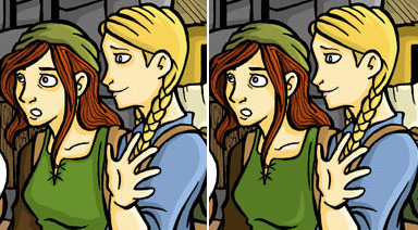
While the artwork is ambitious, with different angles, perspective and foreshortening, and almost all the pages are in in full color (wonderfully shaded) - while it is that ambitious, the artist's technical abilities aren't advanced enough to keep up with it at times. Perspective is WAY off (though I think it may have improved a bit over time). I would recommend Eve Z to study basic perspective - find a tutorial or a book at the library - because it's a shame the the backgrounds should be the way they are when the characters look so good.
The layout of the panels threw me off several times. I kept reading them in the wrong order. Sometimes this was remedied by the use of pointing arrows, but that's not a good solution in the long run. As a rule of thumb, the panels should be lined up with each other, in the order that the reader is supposed to read them, as such:
<img src="http://img.photobucket.com/albums/v611/ ... panels.jpg">
Follow the red lines... In this example it should be read A B C D, not A C B D. This is a common problem with new comic creators - I used to make this mistake all the time, myself.
Also, there are far too many panels squeezed in on most of the pages (in the beginning, as much as 13 panels!). This makes the comic look cluttered, and makes the above problem even worse. But the comic does clear up, little by little as it goes along, and I hope it will continue to do so.
Even with all thet said, considering this is Eve Z's first webcomic I'm still impressed with the art. She has a lot of strong points to begin with, and I think it will only get better.
Writing
The concept is interesting, if not unique. A scientist (Sean) creates an advanced robot girl (Michelle) to prove that it's possible to make machines that are able to have real emotions and dreams. Sean has a father with a mysterious past, an evil arch nemesis (Newton), and a wacky robot sidekick (BoBo). Sounds like a setup that works. But unfortunately, it takes a lot of work to make advanced stories like this work smoothly, and Synthetic Life has problems.
For one thing, the dialogue. It seems apparent that Eve Z is not a native english speaker (but correct me if I'm wrong - I'm not one myself). The english is a bit crude, with spelling and grammar mistakes all around, and lines that just don't sound right in my ears. It's a shame, since it takes away all subtleties, which this comic could have used. It also makes it harder to get into the story when all the characters sound like they try to speak a language they havent quite mastered.
This far into the story, I'm still confused about some of the character's motivations. Much of the story has involved Sean's father, but we still know next to nothing about him, why he went to prison and why he acts the way he does. Newton is supposedly evil, but why and in what way? Even Sean leaves me a bit confused at times. I'm sure it will all be clear eventually, but the way the story is told, those things doesn't seem like a priority to the author.
What I mean is, I like slow paced storytelling, I don't want to be fed all the details at the outset, because then it would just get boring after a while. But when a story moves past a point where the reader expects an explanation to take place, and it doesn't, it's very frustrating. I had that feeling when Sean's father was taken out of prison. I expected a long talk father to son, where they - if not cried tears of joy - at least got to know each other again after all those years. Also, I thought they would discuss Michelle, the heart, the reason Sean's father was imprisoned, and the reason Sean was so sure he was innocent. Among other things. But they hardly talked at all.
What to tell the readers, when, and how to weave those things into the story to make the characters seem believable, is very hard. There are big blockbuster movies that fail at that. And I'm not sure what to suggest to make it better. A general rule to keep in mind is that the reader never know as much about the story and the characters as the creator does. It's a common problem when starting out writing stories; the characters are so vivid in the author's head that she/he doesn't notice that what is actually written down doesn't convey that feeling to others. I have much first hand experience of that.
That's pretty much it. Great art, great colors. Some fine character designs. Work on perspective and page layouts. The concept of the story is good, and it unfolds in interesting ways, just try to make plot points and character motivations a bit more evident. Try to improve your english if possible.
Well done and good luck!
-Mattias
Art
It was the art that made me want to read Synthetic Life. You know how it goes, you see a banner that looks interesting, you click on it, and you give the comic a second or two to decide wether it should go on your "to read" list. Well, this one passed it. Not having a lot of time, I already have a lot of comics on that list, so this was a good opportunity to not only get enough motivation to read it, but be able to give and recieve opinions, which CAN be fun (yeah
Now that I've read the comic, I have found both good and bad things about the art. What I liked the most was the design of the character Michelle, obviously. Apart from being the focal point of the story, she also acts as a hook for new readers ("Hey, cute robot girl!" *click*). But she's not only cute, she is also instantly recognizable, mainly because of her large, sad eyes. It makes her iconic, and that's a good thing.
The other main character, Sean, is even more iconic, with his little beard, thick hair and strange glasses. Great. But, for some reason I personally thought it made him look like kind of a "slimy" character, which he obviously isn't supposed to be. I don't really know why I reacted that way, and it's probably just me.
The only flaw with the design that I can think of, apart from that, is Newton's two androids (Spade 1 & 2). They look like villains straight out of a gothic fantasy manga, and I thought that was a little out of place in this story. Not a big problem, I can live with it, either way. But they also look far too much alike. I understand that was the idea, but I confused them many times, and that disturbed the flow of the story. I would've given them different clothes to make it easier to tell them apart. As it was, I could only tell which one was which by their collars.
While the artwork is ambitious, with different angles, perspective and foreshortening, and almost all the pages are in in full color (wonderfully shaded) - while it is that ambitious, the artist's technical abilities aren't advanced enough to keep up with it at times. Perspective is WAY off (though I think it may have improved a bit over time). I would recommend Eve Z to study basic perspective - find a tutorial or a book at the library - because it's a shame the the backgrounds should be the way they are when the characters look so good.
The layout of the panels threw me off several times. I kept reading them in the wrong order. Sometimes this was remedied by the use of pointing arrows, but that's not a good solution in the long run. As a rule of thumb, the panels should be lined up with each other, in the order that the reader is supposed to read them, as such:
<img src="http://img.photobucket.com/albums/v611/ ... panels.jpg">
Follow the red lines... In this example it should be read A B C D, not A C B D. This is a common problem with new comic creators - I used to make this mistake all the time, myself.
Also, there are far too many panels squeezed in on most of the pages (in the beginning, as much as 13 panels!). This makes the comic look cluttered, and makes the above problem even worse. But the comic does clear up, little by little as it goes along, and I hope it will continue to do so.
Even with all thet said, considering this is Eve Z's first webcomic I'm still impressed with the art. She has a lot of strong points to begin with, and I think it will only get better.
Writing
The concept is interesting, if not unique. A scientist (Sean) creates an advanced robot girl (Michelle) to prove that it's possible to make machines that are able to have real emotions and dreams. Sean has a father with a mysterious past, an evil arch nemesis (Newton), and a wacky robot sidekick (BoBo). Sounds like a setup that works. But unfortunately, it takes a lot of work to make advanced stories like this work smoothly, and Synthetic Life has problems.
For one thing, the dialogue. It seems apparent that Eve Z is not a native english speaker (but correct me if I'm wrong - I'm not one myself). The english is a bit crude, with spelling and grammar mistakes all around, and lines that just don't sound right in my ears. It's a shame, since it takes away all subtleties, which this comic could have used. It also makes it harder to get into the story when all the characters sound like they try to speak a language they havent quite mastered.
This far into the story, I'm still confused about some of the character's motivations. Much of the story has involved Sean's father, but we still know next to nothing about him, why he went to prison and why he acts the way he does. Newton is supposedly evil, but why and in what way? Even Sean leaves me a bit confused at times. I'm sure it will all be clear eventually, but the way the story is told, those things doesn't seem like a priority to the author.
What I mean is, I like slow paced storytelling, I don't want to be fed all the details at the outset, because then it would just get boring after a while. But when a story moves past a point where the reader expects an explanation to take place, and it doesn't, it's very frustrating. I had that feeling when Sean's father was taken out of prison. I expected a long talk father to son, where they - if not cried tears of joy - at least got to know each other again after all those years. Also, I thought they would discuss Michelle, the heart, the reason Sean's father was imprisoned, and the reason Sean was so sure he was innocent. Among other things. But they hardly talked at all.
What to tell the readers, when, and how to weave those things into the story to make the characters seem believable, is very hard. There are big blockbuster movies that fail at that. And I'm not sure what to suggest to make it better. A general rule to keep in mind is that the reader never know as much about the story and the characters as the creator does. It's a common problem when starting out writing stories; the characters are so vivid in the author's head that she/he doesn't notice that what is actually written down doesn't convey that feeling to others. I have much first hand experience of that.
That's pretty much it. Great art, great colors. Some fine character designs. Work on perspective and page layouts. The concept of the story is good, and it unfolds in interesting ways, just try to make plot points and character motivations a bit more evident. Try to improve your english if possible.
Well done and good luck!
-Mattias
Last edited by Hallonpress on Fri Mar 02, 2007 2:45 am, edited 1 time in total.

-
RemusShepherd

- Cartoon Hero
- Posts: 2011
- Joined: Fri Jan 21, 2005 2:23 pm
- Contact:
Review of What Birds Know.
I mentioned in the discussion thread that the art in WBK seemed wrong to me somehow, in a way that I couldn't quite place. I'm glad I got another chance to review the comic, to flesh out that fuzzy, unhelpful criticism.
What Birds Know is a comic that is apparently set in a medieval or fantasy society. The story so far follows three girls who are having adventures while performing a task in the wilderness.
The website has been mentioned by other reviewers, so I won't go into it much. I found it difficult to use at first but easy enough once I fiddled around a bit. Even if it is a little confusing it's a very nice site, with hidden 'easter egg' artwork and character bios, and it's all meant to absorb you into the comic as much as possible. Just a few slight tweaks for usability and clarity and it'd be fantastic.
As for the art, it's professional, with clean, magnificent-looking line work and vivid coloring. There are occasional exaggerations of proportion that are jarring (look at the three sizes of Elia's head here). There are also some experiments with perspective that seem unnecessary, but I do the same thing -- it keeps the visuals interesting.
But there's something I don't like about the art...and I think it's the shading. The shading is distracting and wrong. Keep in mind that I'm a low-talent amateur critiquing a professional's work, but there are shading techniques here which I do not understand and I do not like. I hope my ignorant sparring is at least helpful.
The most apparent shading problem is what I'll call 'raccoon eye syndrome'. Shading around the eyes is just wrong, with large dark areas under the eyeball where the cheek should be fully lit. To give you some examples, here are some raccoon eyes early in the strip and here are some raccoon eyes later that look just as bad. There is no distinct improvement in the art over the course of the strip, which isn't a bad thing when it's professional work.
But the shading is wrong in other places. Characters seem to all have their own light sources -- indeed, each part of a character's anatomy might be lit from different directions. It all has the effect of making these wonderfully lined characters look two-dimensional, which is a shame.
I think I'll try to make this point by performing the unforgivable: I shall attempt to improve the art of someone who is a much, much better artist than I am.
The original is on the left; my edited version is on the right. On Elia (the blonde) I only fixed the raccoon eyes and changed the bizarre shading on the bridge of her nose. On Vandi (the redhead) I fixed the raccoon eyes, fixed the shading of her hair on her skin (and added a little shading in the hair itself), and made her torso three-dimensional (assuming the light is coming mostly from the right side). I think these slight edits help to make the characters pop out, instead of looking like paper cutouts. One thing I didn't fix was Elia's hand in the foreground, because even though I know it looks wrong I don't know what to do with it.
(edit: Two things I should mention. I'm using a CRT monitor, and several people using LCDs have told me in chat that those two images look identical. Maybe it's so subtle it doesn't show on LCDs. And second, I'm colorblind, so maybe shades pop out more for me, and the original looks perfect to those with good color vision. Sorry, don't mean to be confusing, just trying to help best I can.)
These shading problems are *minor*. Look at everyone who has been drooling over the artwork in What Birds Know -- they didn't notice any of these problems. I'm a dick for mentioning them. But I did notice them, and they did interrupt my enjoyment of the comic's otherwise beautiful art, so I felt bound to say something.
Let's talk about writing. The writing in WBK is dripping in excellent characterization, with frequent flashbacks to add history and depth to the characters. The plot, however, moves slowly. Nothing wrong there, it's a stylistic choice of storytelling. Those looking for action and excitement won't find much of it here; this comic is for those looking to empathize with a pack of fully realized characters.
I only noticed two suspension-of-disbelief problems in the story that interrupted my reading. For one, this is from all appearances a medieval society, yet all the girls are nineteen years old. A nineteen year old woman in medieval times is an *old maiden*, not a schoolgirl. By rights, all three of these girls should be married with kids by now.
And two -- minor story spoiler here: Eating mushrooms you don't recognize is *suicidal*, and everyone should know that -- medieval foragers most of all. The girls eventually do realize how stupid that little meal was, but not for many pages, and I suspect many readers will start screaming 'MORONS!' at their monitor like I did.
But let me stress that all the criticisms I've mentioned are very minor problems in a comic with almost flawless art and rich, character-heavy storytelling. I don't know why, but I want to use the word 'groovy' to sum up my description of What Birds Know -- it is what it is, laid-back, fun, and shiny-pretty.
I mentioned in the discussion thread that the art in WBK seemed wrong to me somehow, in a way that I couldn't quite place. I'm glad I got another chance to review the comic, to flesh out that fuzzy, unhelpful criticism.
What Birds Know is a comic that is apparently set in a medieval or fantasy society. The story so far follows three girls who are having adventures while performing a task in the wilderness.
The website has been mentioned by other reviewers, so I won't go into it much. I found it difficult to use at first but easy enough once I fiddled around a bit. Even if it is a little confusing it's a very nice site, with hidden 'easter egg' artwork and character bios, and it's all meant to absorb you into the comic as much as possible. Just a few slight tweaks for usability and clarity and it'd be fantastic.
As for the art, it's professional, with clean, magnificent-looking line work and vivid coloring. There are occasional exaggerations of proportion that are jarring (look at the three sizes of Elia's head here). There are also some experiments with perspective that seem unnecessary, but I do the same thing -- it keeps the visuals interesting.
But there's something I don't like about the art...and I think it's the shading. The shading is distracting and wrong. Keep in mind that I'm a low-talent amateur critiquing a professional's work, but there are shading techniques here which I do not understand and I do not like. I hope my ignorant sparring is at least helpful.
The most apparent shading problem is what I'll call 'raccoon eye syndrome'. Shading around the eyes is just wrong, with large dark areas under the eyeball where the cheek should be fully lit. To give you some examples, here are some raccoon eyes early in the strip and here are some raccoon eyes later that look just as bad. There is no distinct improvement in the art over the course of the strip, which isn't a bad thing when it's professional work.
But the shading is wrong in other places. Characters seem to all have their own light sources -- indeed, each part of a character's anatomy might be lit from different directions. It all has the effect of making these wonderfully lined characters look two-dimensional, which is a shame.
I think I'll try to make this point by performing the unforgivable: I shall attempt to improve the art of someone who is a much, much better artist than I am.
The original is on the left; my edited version is on the right. On Elia (the blonde) I only fixed the raccoon eyes and changed the bizarre shading on the bridge of her nose. On Vandi (the redhead) I fixed the raccoon eyes, fixed the shading of her hair on her skin (and added a little shading in the hair itself), and made her torso three-dimensional (assuming the light is coming mostly from the right side). I think these slight edits help to make the characters pop out, instead of looking like paper cutouts. One thing I didn't fix was Elia's hand in the foreground, because even though I know it looks wrong I don't know what to do with it.
(edit: Two things I should mention. I'm using a CRT monitor, and several people using LCDs have told me in chat that those two images look identical. Maybe it's so subtle it doesn't show on LCDs. And second, I'm colorblind, so maybe shades pop out more for me, and the original looks perfect to those with good color vision. Sorry, don't mean to be confusing, just trying to help best I can.)
These shading problems are *minor*. Look at everyone who has been drooling over the artwork in What Birds Know -- they didn't notice any of these problems. I'm a dick for mentioning them.
Let's talk about writing. The writing in WBK is dripping in excellent characterization, with frequent flashbacks to add history and depth to the characters. The plot, however, moves slowly. Nothing wrong there, it's a stylistic choice of storytelling. Those looking for action and excitement won't find much of it here; this comic is for those looking to empathize with a pack of fully realized characters.
I only noticed two suspension-of-disbelief problems in the story that interrupted my reading. For one, this is from all appearances a medieval society, yet all the girls are nineteen years old. A nineteen year old woman in medieval times is an *old maiden*, not a schoolgirl. By rights, all three of these girls should be married with kids by now.
And two -- minor story spoiler here: Eating mushrooms you don't recognize is *suicidal*, and everyone should know that -- medieval foragers most of all. The girls eventually do realize how stupid that little meal was, but not for many pages, and I suspect many readers will start screaming 'MORONS!' at their monitor like I did.
But let me stress that all the criticisms I've mentioned are very minor problems in a comic with almost flawless art and rich, character-heavy storytelling. I don't know why, but I want to use the word 'groovy' to sum up my description of What Birds Know -- it is what it is, laid-back, fun, and shiny-pretty.
Last edited by RemusShepherd on Mon Feb 19, 2007 9:34 pm, edited 2 times in total.
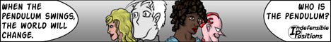

Review of Indefensible Positions
This was a comic that this reviewer knew about for some time, but did not start reading until a few months ago. When it touts itself as a comic of "superheroic philosophy, it does not disappoint.
ART
It has been said that good writing will make up for subpar artwork, but that the reverse is not true. This comic typifies that sentiment, in that the writing is easily superior to the art. That is not to say that the art is bad; for one thing, it is very well colored, and the layout of the panels and use of varying "camera angles" is very well planned. In many places, however, the characters appear stiff, and sometimes not proportionally sound. At times a person's face will appear too small for his/her head, or smashed too far down his/her skull. Action is sometimes portrayed awkwardly. It is not by any means a difficult comic to look at, and it is clear that the artist does have a good grasp of human anatomy. It is nice to see that the cast is crafted from a variety of body types, and that not everybody is the same height, weight, or build. It bears repeating that the creator's use of color is often very artful.
WRITING
Finding another well-written comic on CG is bittersweet; on one hand, it's nice to see a story that has clearly had some serious thought put into it. On the other hand, it's tough to see good work not get the exposure that it deserves. The story revolves around a host of characters who, in one way or another, have gotten mixed into the proverbial yet very real battle between order and chaos. Or more specifically, the gods of Order and Chaos, as portrayed by the reincarnations (in a way) of Generals Ulysses Grant and Robert E. Lee from the U.S. Civil War. Each character has his or her own story, and most of them possess super powers of one variety or another. Part of the creativity involved in the setting lies in giving each character a special kind of power: Orbstar, for example, can generate force fields using a comic book-type gadget, while Tricia uses incantations to cast spells like a witch. Beneath each power, however, lies a specific branch of ideology that goes deeper than the explanations given in this review. Going too far into those would spoil some of the fun of reading the comic, though, so it is enough to say that the phrase "superheroic philosophy" could not be more appropriately used. There is a lot of thought-provoking material in the work; matters of ontology, morality, and even theology are debated throughout the action. It may offend a few in the way the story handles religion, but most of those people would probably be offended by other aspects of the content like the violence and sexuality (implied, not exposed) in the tale. At its heart, however, the comic is a thinking person's superhero story. Character personalities are distinct, which can often be overlooked in a comic of this type (one notable character not yet mentioned is Debbie, who can be both comical and very deep or even sad). Worth mentioning is the chapter-based presentation of the story; each main character gets his or her own chapter, but the story still moves linearly. That is, Chapter 8, "Frank's Story," picks up where Chapter 7, "Hooli's Story," left off, so the reader is not jumping back and forth through time as the comic moves on. It is interesting to see who will be featured next, and how their part of the tale will play out and affect the rest of the creator's world. Overall, it is a very engaging tale.
SITE
The site is simple and easy to navigate. File sizes aren't too big, considering it's a color comic, and there is plenty to look at and read to make each page worth waiting for.
OVERALL
Another easy recommendation from this reviewer. Despite a few shaky bits in the artwork, the comic is well-written, well-produced, and well worth the time for any mature reader looking for a pithy story with an expertly written cast. One question this reviewer always asks about a webcomic is: "Would I want to buy this as a book?" Indefensible Positions is a comic that is worth buying.
Glarryg
http://www.squidninja.com - Dude. Buy a shirt. Seriously.
*** INFORMATIONAL POST ONLY ***
The following people still need to write their reviews...
Legostar Galactica - Reviewed by SergeXIII, incomplete
Circle Arcadia - Reviewed by K-Dawg, incomplete
School Spirit - Reviewed by TRI, incomplete
Strange Happenings - Reviewed by netpoet, incomplete
Sorcery 101 - Reviewed by ryclaude, incomplete
Orange Revolution/Deep/Freedom Fries - Reviewed by yeahduff, incomplete
8:1 - Reviewed by The Neko, incomplete
LagoMorphine - Reviewed by sorcery101, incomplete
Point Guardian - Reviewed by mcDuffies, incomplete
Little White Knight - Reviewed by Mo, incomplete
IMO - Reviewed by mvmarcz, incomplete
Necropolis - Reviewed by mrdaveryan, incomplete
Bad Ass Muthas - Reviewed by Col, incomplete
Strange Happenings - Reviewed by Eve Z., incomplete
Synthetic Life - Reviewed by hallonpress, incomplete
All other reviews are complete, great job folks!!!
*** INFORMATIONAL POST ONLY ***
Next person should review Squid Ninja, above... do *NOT* choose mine, please.
Last edited by Col on Tue Feb 20, 2007 5:04 am, edited 1 time in total.

Squid Ninja.
Website -
It could be better, but then again it could be worse. Everything is fairly simple and easy. The two biggest things i can note are that you have text on top of the background, and that your navigation buttons all look the same at a glance.
The text can be sort of hard to read on the background. It's not a huge deal unless you try to read something other than the comic. You could easily fix it by just putting everything in a table with a white background, like the news on the front page. The problem with the buttons is that the second flipper head thing on the first and latest buttons sort of blends in.
The archive page just has the calanders on it, which doesn't make it particularly easy to find a certain page. You should at least have your dropdown box there, but you'd be better off with a list of links to the storylines.
You might want to consider a redesign, not because of funtionality issues, but because the page looks like something straight outta 1996. It shouldn't go at the top of the list, but it's something to think about.
Writing -
I'm not sure what to say about the writing. I was rather scared at first, as i have no idea how to review a gag a day stirp except to say "it was funny" or "it was not funny". Eventually you get thrown into this highly complex world with a bunch of characters and places and all that jazz that writers jibber jabber on about. It throws you for a bit of a loop - so much so that i'd reccomend you going back and pruning those first comics or something.
The thing i noticed most was a lack of motivation on the character's parts. I have no idea why people are doing what they are doing. I think you need to have more character moments - times when nothing much is really happening, but we're finding out about these people in a non="Hello, my name is Mr. Exposition" manner. (Definitely the best line in Austin Powers.)
Stuff seems to come out of left field a lot. Like, the scene with the nose thing, or the "i'm a tiny thing shaped like a moon and i want you to be my cage fighter" scene. (Sorry, i have a terrible memory for anything but useless facts.) It makes the whole thing feel like a bunch of quasai-randomly connected fight scenes.
Art -
Stop using GIF. The dithering looks horrible in the gradients, the lines look slightly aliased, and those linux type people will give you the stink eye.
You actually have fairly competent art. My main problem with it is that the greyscale tends to mush together. You're getting better at it, but at times i think i'm looking at a big blob of grey. Especially anything with a ninja in it. You might consider switching to colour. Even flat colour would be nice - it would add significantly, and it shouldn't really add too much time to production since it seems you're already shading digitally.
I think part of the "blob problem" is that you need to work on your panel composition. A lot of the time the word bubbles seem overly large, people get cut off, and things need more space to breathe. The other thing that will help with the problem would be some line variation. All your lines are the same thickness - variation will help bring characters out and push backgrounds in.
Speaking of speech bubbles - i'm sorry, but i don't like the font. You went through a lot of them, this one is by far the best of the lot, but i don't think it's quite there yet. I think you could get by with hand lettering if you tried really really hard. Just remember that you're not writing, you're drawing letters.
As far as the actual drawing goes, you've obviously got influences, and they show through. I think it holds you back a little though. I don't know if you do this, but it's a good thing to try every once in a while. Just try and draw something familiar in a completely different style. Perhaps you could draw Ikago in the style of an old WB cartoon, or an old Disney cartoon, or as realistically as possible, or like an american comic.
The really annoying art quirk, for me, is hands - you hands go from large but acceptably so to downright gargantuan collosal wads of flesh and bone that i'm not entirely sure an arm could hold up and back again in three panels sometimes. (Ok, some hyperbole, but you get the idea.)
I hope some of that's helpful to you, i'm not a terribly good reviewer.
Last edited by C.w. on Wed Feb 21, 2007 12:20 am, edited 1 time in total.

This is: A review
To be up front about it, this is not a comic. It is not really a story, either. It is an illustrated series of paragraphs. Each installment is a short prose sketch of a person, place, or thing, accompanied by a drawing of it.
The result is quirky and original. There is nothing else on Comic Genesis like this.
Since it uses the standard Comic Genesis apparatus for updating, each installment page is named in the YearMonthDay format. There is nothing special about the order in which the items were posted, however, and the "chronological navigation" option is hidden by default. Instead, you navigate the site by following connections between various entries. For example, Mrs. Harrison's Bonsai Birch links to Mrs. Harrison (who owns it) and Miss Weiz (who cares for it). If some future item relates the the bonsai, then the page for the bonsai will be updated so that the two items link to one another. You can also jump to a random item you haven't seen yet.
The site navigation works well, including the javascript that holds together some of it. The prose portion of each entry is text, rather than a graphic image of text. This means that the author cannot use cool fonts or layout, but it also means that the text shows up clearly on the screen and can be displayed at an arbitrary size. (When I am not wearing my glasses, I up the font size.)
One small quibble: The text of each entry is in a narrow column to the right of the illustration. For readability, I would have preferred if each illustration were a float and the text widened out below it.
Another quibble: When reading it, I am not sure that the illustrations add anything for me. This is not really a problem, because they certainly don't detract from the prose.
The content of each entry often places the item in a broader context. For example, one entry mentions how post-Apocalyptic future Earthlings believe that Abraham Lincoln was some kind of squamous William Wallace. In this way, the descriptions slip from quotidian detail about houseplants to bizarre revelations from the future and back again. Whether this kind of juxtaposition is charming or jarring is a matter of taste, but I like it.
Another quibble: Some entries are written so that the present tense is roughly now. So a young woman's tastes are described in the present tense, and her childhood is in the past tense. Other entries are written as if from the point of view of the distant future, with everything but a brief mention of the apocalypse in the past tense. (I have not noticed any entries written from the point of view of the past.) This makes entries disjointed, sylistically cutting up the web of connections that the author has strung together.
Quibbles aside, This is: Worth a look.
-
Jackhass
- Cartoon Hero
- Posts: 3243
- Joined: Wed Jun 23, 2004 3:34 am
- Location: Starring in your latest sex dream.
Ninja Verses
Art - Well, it's stick figures. Black and white stick figures at that. With no backgrounds. The art isn't altogether unappealing or anything...it's fine, but it's absolute bare bones with little effort put into improving (the first comic in the archives looks about like the last one, despite the fact that this comic has apparently been going since the late 90s).
Writing - This one's a "concept" comic...basically every comic is a single panel with "Regular Ninja" kicking some different variety of Ninja in the head. These other Ninjas range from "Fortune Cookie Ninja" to "Kirby Dots Ninja" to "All the Characters from Wuthering Heights that I can remember from Having Pretended to read it in High School" Ninja. You get the idea.
I have nothing against concept comics...they can be addictive and when they're done right (like with say, Daily Dinosaur Comics) they can be impressive. Unfortunately these kind of comics are carried almost entirely by their writing and thus require some really sharp writing to work, and Ninja Verses falls short of that level.
Far too many of the Ninjas that Regular Ninja kicks seem to have been created to set up really cheesy puns. And I mean really cheesy. Sometimes they are so cheesy they enter "so bad it's good" territory...but most of the times they're just lame. When it's not serving up cheesy puns, Ninja Verses is serving up references that are so obscure that I can't imagine the vast majority of readers will understand them. There's also an annoying obsession with typical "nerdy" interests...I don't know if this is the kind of stuff the creator likes personally, or if he just thinks his Internet readership will appreciate it, but there's far too many forced Star Wars/Star Trek/LOTRs references.
It's not all bad or anything though...the concept is a good one, and while it often made me groan or scratch my head it was very readable. I zipped through the archives with no problem. Often a bad comic will just defeat me, I'll read half a dozen and can go no further...I read right along through a few hundred and didn't feel fatigued at all...I almost felt the classic addictive quality of the concept comic kicking in. I was almost a little disappointed when I came to the end. There is a certain amount of undeniable appeal here that's hard to put into words.
Also there were a handful of strips that actually did hit the mark and were genuinely funny. Unfortunately for everyone 1 good one there were 5 to 10 that were cheesy puns or made no sense. Oh, and the extended Jack Chick parody missed the mark pretty badly I'd have to say.
Website - Ultra-simple...it doesn't even have a header/banner. It kind of fits the art and you can tell the simplicity is somewhat intentional, but it kind of goes too far. Surprisingly though, the archive section is really well put together. There a lot of fancier looking websites that could do with a archive this well done.
One strange quirk...for some reason, every comic has all the dialog and a description of the scene written out beneath it. Why? It seems completely pointless, and this space would be better used to provide explanations for some of the more obscure references, which are some of the comics are in dire need of.
Overall - The concept is a good one and the comic is overall likeable and quite readable...almost a little addictive. Unfortunately too many cheesy puns and obscure references without any explanations provided drag the comic down. Ultra simple art and a similarly simple website would be forgiveable if the writing was pulling it's weight, but all too often it doesn't.
All in all I'd give it a 6/10...likeable but ultimately a bit mediocre.

-
LibertyCabbage
- Cartoon Hero
- Posts: 4667
- Joined: Tue Jan 25, 2005 4:08 pm
- Location: bat country
- Contact:
Review of Zoology
"You know, sometimes it's nice to have a friend who doesn't know what you look like..." - Shandy, from Zoology
I'm going off on a jet plane tomorrow (incidentally, for the very first time after seeing Snakes On a Plane) so I figured I might as well knock out this review now. Otherwise, it might seem like I'm the kind of asshole who goes off on a jet plane without writing a review.
The comic has a pretty unique style in the way both animals and humans are rendered. Even though Zoology would be considered a furry comic, Jackhass' drawings outside of the comic have shown me that he's quite capable at drawing people, so it's a credit to his ability as an artist to be able to draw both animals and people well. Also, the animals look somewhat humanish and the humans look somewhat animalish, and this works amusingly to blur the lines between the two. I've noticed that comics which are largely furry-based often have a special way of drawing humans, I suppose since in that context the humans are approached as a strange kind of ape (which we are) as opposed to a separate and higher level of existence which is the usual perception.
In describing Zoology's aesthetics, the best word to use would be minimalistic. The characters are static and not very detailed, the backgrounds are generally non-existent, and there's little variety in perspective. However, Jackhass makes great use of this minimalism which helps him keep the comic clean and simple but also appealing and effective. There's a big difference between Zoology, though, and other comics that are typically associated with minimalism, such as Cyanide & Happiness, White Ninja, and Toothpaste For Dinner. One key element is that Zoology's simple backgrounds are not only subtle but are well-composed to establish mood and contrast without taking attention away from the characters and dialogue. Here's an example of radial gradients, which are very easy to do, being used to effect, and I think that 5th panel works great even though the background looks really easy to do. This one shows mood shift well, as the first white panel reflects the innocuous situation (from the alligator's perspective), then a sudden contrast with a dark gradient showing danger and confrontation, followed by a radial gradient which emphasizes the action of the panel and its significance in terms of plot resolution, and then the soft gradient reflecting the gross and comedic but happy ending. I think that without this background dynamic, the strip wouldn't be dramatic enough for the "REGURGITATE!" substitute to work. Here's another example of minimalism done well; it's surprisingly effective for a strip that has four identical panels and a homogenous gradient background. However, in this case, the distortion of the gradient adds a lot of visual flavor and again show's Jackhass' skill with simple backgrounds. Some simple effects, like screentones, are also used, and Jackhass mixes in simple hand-drawn backgrounds too which helps prevent the comic from being too abstract. The comic is ripe with simple but effective backgrounds like these, and I think that the typical reader probably wouldn't even notice that they're there, which, IMO, is a testament to their quality. This minimalism is also used well in terms of the writing, because while Baker's and Shandy's pens are never shown in the comic, the wall separating them is a prominent aspect of the strip, and this reflects the psyche of the characters and their overwhelming interest with each other, and also adds a sad but amusing quality to the strip that the wall is so simple but also so powerful and antagonistic.
Zoology is mostly a comic about different relationships, those being Baker & Shandy, the octopi, the zookeepers, the gerbil father and son, and Ernest Ape (with himself), each of which I'll write about individually. There are similarities and problems among the different stories, though. For one, the comic is very male-oriented in its perspectives, which I assume is primarily due to the author being male. While the comic has a style of approaching male mentality in a condescending but honest way that's charming and amusing (at least I wasn't bothered by it despite being a male), I think the one-sidedness is limiting the content. Not only does the strip focus too much on the males, but it seems to me like the females are written by a guy and not as natural as they should be. Not that it's a big issue or an uncommon one, but I thought the females in the comic are pretty flat and unlikeable, and the comic is much more based around the desires and actions of the males towards the females rather than anything the female does or says. Then again, it might make the comic more interesting and amusing to have it be male-oriented like this, but I think it would benefit from having the females be written better and being more developed and there being a more neutral perspective.
The comic has a newspaper style in numerous ways, and I'm not sure how well this works in the webcomics environment. One big concern is the overemphasis on holidays as a theme for comics. This is a popular subject for newspaper comics, since A) it's universal, B) it's unoffensive, C) it provides a theme for writers taxed by daily comics. I don't think these reasons apply here. It might just be my own tastes, but I find holiday comics to generally be uninteresting and redundant, and they're not as practical in webcomics because there's a lot more freedom here in subject matter. Same thing with cursing; in the comic, cursing is self-censored and clean, and I don't see any reason you need to be censoring yourself. If you're adverse to cursing yourself then don't worry about it, but I'm just reminding you that even though Zoology is like a newspaper comic that it's still a webcomic and so it has a different audience and environment.
Another concern with the writing is that it tends to be somewhat clumsy in its execution. Particularly, punctuation marks are often not used correctly or are noticably absent, and there are also typos and spelling errors in the comic. This isn't a big deal, although I would pay more attention to it and possibly get someone to proofread the strips before posting them.
Baker & Shandy: I think this relationship is handled particularly well as a concept, even if the characters aren't that interesting or amusing. Their dynamic is basically a criticism of racism and a testament to the negative impact it has on cultures and relationships. Baker & Shandy get along great, and the reason that they're interested in each other is because, due to the wall separating them, they imagine each other as being a member of the same species (or race.) So, it's really sort of ironic because even though the wall is so limiting and oppressive towards them, the wall's concealment is the only reason that their relationship exists. So, it's optimistic that they've overcome their differences (their "racism") because of this and would probably be accepting of each other if they ever get passed the wall, but it's also sort of tragic that a wall separating them was necessary to bring them together (in that they're driven by a fantasy) and that they would've probably rejected each other due to their differences. It's amusing, though, how easily they assume the animal on the other side is their own species and how easily this assumption manifests itself into a powerful force (to the point where Baker is willing to do anything to get passed the wall.)
Octopi: This is a more typical sort of situation, but handled well, amusingly, and interestingly. I think this one's my favorite and sums it up pretty well. Angsty is very easy to relate to, and that helps his appeal a lot. Probably most of the guys on this forum are like him, and I think there's a self-mockery self-contempt thing going on with him. Like, that we enjoy seeing Angsty suffer because we dislike ourselves. The relationship is pretty interesting since both octopi are so anti-social, problematic, inept, and have low self-esteem. Whereas Angsty is bad at relationships because he's so inexperienced, it seems that the female octopus (whose name I don't remember) has been in too many bad relationships so she's cynical and pessimistic but also understanding. The reason that the female octopus keeps Angsty around is partly because she pities him and partly because it helps her self-esteem to have a guy try so hard to win her over. Not that it's any surprise when they keep breaking up and getting back together. So, I guess this depressed loser guy and depressed loser girl relationship is fun to see develop because it's both realistic and problematic.
Zookeepers: I thought this relationship was pretty flat and uninteresting. Whereas the guy is another depressed and clueless loser like Angsty, the woman has no flaws and makes no mistakes, and also mostly puts up with the guy out of pity. Not that they have an actual relationship, but they do interact a lot and the guy is trying to make a relationship so it seems to count. So, I'd like to see more flaws and problems with the female character, and I'd like to see the relationship develop more, even if it's slowly, since even though the guy is an idiot he's still a sympathetic character (especially since he didn't choose to be a zookeeper.)
Gerbils: Heh, this one's pretty cute. The Dad is pretty childish and immature himself, but since he's a parent he's responsible for his son. I'm wondering where the mother is in this, though, since she's never mentioned but there's no explanation given for her absence. Anyways, the kid's problems are pretty relevant to cartoonists of any age, as I'm sure we're all aware of what it's like to have our work criticized and rejected by others. However, since it's a little kid, it's more cute and innocent than sad. Then again, it seems more than likely that the kid will grow up into an Angsty so there is a darker undertone there. Parenting relationships are pretty over-done in comics, though, and the emphasis on comics is what's keeping it going. I'd suggest shaking it up by introducing the mother or developing the kid and making him older, as it's been explained in the comic that gerbils age pretty fast. Generally, it's a cute set-up but it doesn't seem to have much longevity to it.
Ernest Ape: These strips are ten times funnier than anything else in the comic. Every one was done well and cleverly. When I see an Ernest strip, I know I'm probably gonna be laughing by the end of it. His extreme narcissism is great, and when he's not on air he's either checking himself out in the mirror or dressing up in stylish suits. His advice is so retarded that it's funny to try to imagine how bad his previous relationships were (if there even were any.) The ambiguity of the callers is hilarious, especially in the sense that it's usually unclear whether it's an animal calling or if it's a human calling who has no idea that he's getting relationship advice from an ape in the zoo. I wouldn't change anything about the Ernest comics, and even though they're fairly sparse it only makes it funnier because they're usually in the middle of a sequence when they're least expected. Definitely the best part of the comic.
In order of favorite to least favorite, I'd say, Ernest, Octopi, B&S, Gerbils, Zookeepers, in that order.
Overall, I found the comic to be pretty interesting and enjoyable. The art's great and fine as is, whereas the writing's better than average and could use some work. You might wanna consider pitching Zoology to some newspaper syndicates, as I think it's good enough although the content might be too sophisticated and comics with storylines to this extent are uncommon. Still, though, keep it up! You clearly have a knack for this and I think at this point you mostly just need to practice and experiment and refine your skills.
Last edited by LibertyCabbage on Tue Mar 06, 2007 11:06 pm, edited 1 time in total.


"Seems like the only comics that would be good to this person are super action crazy lines, mega poses!"

If I'm not mistaken, Orange Revolution has already been reviewed. However, I do believe that it would most definitely not hurt the author, Liberty Cabbage, to be provided another review!
Art:
From the eyes of a casual internet expeditioner, the art appears simplistic, but the shading adds a whole lot of flavor to the comic, much like turning a plain flank steak into a flavorful fajita, which is a compliment!
Writing:
Since there is only one chapter of work up, and you're aiming for an elaborate storyline, I can only grade it as incomplete until the most of the story plays out, much like slow-cooking a slab of beef brisket for hours.
From what I've read so far, I do feel drawn into the story somewhat; in fact, I think I will have to add it to my regular reading rotation just to see how this story is supposed to fold out. If not, if the cult slaughter at the beginning is anything of worth, I do look forward to the potential morbid humor.
*additional opinion
It took me a while to think on this, but I do want to say something about the pacing of the story. The format of OR is similar to that of Megatokyo (please don't cringe at this comparison!) and Dr. McNinja (a compliment!) in that each update is a page of panels.
However, with OR being on a once-a-week update schedule compared to those aforementioned comics being three-a-week, the storyline buildup will feel slow, and aside from the devoted readership, it'll seem hard to reel in new readers if they don't have the patience to see a story unfurl slowly.
I am all for choosing your own update schedule for the sake of quality control and convienence, but for a story-based comic, very slow-pacing could be a real killer if you don't have a deep archive to give the casual reader a reason to stick around and watch it grow.
It's up to you and your artist though.
Website:
I like what the layout is trying to accomplish for the most part. The graphics match up the mood of the comic, and navigation is right where it needs to be, much like a turkey that comes complete with the mashed potatoes and stuffing.
My complaints though is that for the sake of aesthetics, I'm not a real big fan of tag-board. Fan interaction is pretty sweet, but personally, it makes the site appear as an eyesore width-wise. I think it can be rearranged into a more comfortable spot at the bottom of the page, but since you and the artist have separate newsblogs, I'm not too certain about where else you could place it.
Also, I think that you should try and find a font for the site that matches the mood of the comic? When I scroll down from the comic to the text, I feel sort of let down by the generic fonts.
But these are more nitpicky opinions rather than imperative issues, so set the priority at whatever you would like.
Overall:
So far I like what I see. I can't do a complete judgment on writing yet, but it's good so far.
Last edited by Zhongda on Mon Feb 26, 2007 9:06 pm, edited 3 times in total.
****INFORMATIONAL POST ONLY****
Also, don't post anything other than a review in this thread. The discussion thread is where you go to make comments about what's posted here.
To the next person who posts here, do not review my comic. Review Zhongda's comic instead.
No, being that you have posted, you are volunteering to critique one of Liberty Cabbage's comics. Read through one of them, then edit your post with the critique. You can post an announcement over at this discussion thread to let LC know that you have his review up. And the next person to post will critique your comic. Hence why this is called Webcomic Above. Read the rules in the first post of this thread!Zhongda wrote:I don't know about you guys, but I-I am pumped up to critique someone's comic and get my own critiqued.
Problem is... looking at how things have played out so far, there's no one for me to review?
Also, don't post anything other than a review in this thread. The discussion thread is where you go to make comments about what's posted here.
To the next person who posts here, do not review my comic. Review Zhongda's comic instead.
-
Dave Against The Machine
- Cartoon Hero
- Posts: 1643
- Joined: Mon Dec 19, 2005 9:58 pm
- Location: Spontaneously combusting at will.
- Contact:
Review for Somewhere I Belong.
ART:
The style seemed to work well for the nature of the comic. Though I must say it did seem a bit messy at times. Main problem I really had with it where pencil lines. You seem to have gotten better with it since the beginning of the comic. But you can still see them behind the ink. Some of the strips, on one panel there wasn’t much, and the next, it looked like you didn’t even attempt to get rid of them. There didn’t seem to be much evolution of the art style, but then again, it hasn’t been up for that long. But in my opinion, I like a comic where it looks the same throughout the comic.
STORY:
It really didn’t seem to have really much of a storyline to it. Almost seemed like a gag a day, yet with certain characters, the strips connected on some sort of level. I did like the way you would end one series of strips with a joke from another series. Like the emo boy one, where he ends up shooting blood out of his wrist at the end of a strip.
SITE:
It worked well. The buttons seemed to work. Only thing is the blog. Most sites I see with a blog have it in a little window like box, where it can scroll down, rather than having to scroll the whole page down.
Overall I liked the comic. I nearly killed myself laughing on some of them.
Last edited by Dave Against The Machine on Fri Feb 23, 2007 10:46 pm, edited 1 time in total.

-
Black Sparrow

- Cartoon Anti-Hero
- Posts: 6973
- Joined: Fri Jul 22, 2005 9:04 am
- Location: Violating your restraining order
- Contact:
Let's see what we have here. Home by Seven is fairly short (only 15 comics), so the critiquing process is less likely to be accurate. Ah well, we'll do it anyway. 
The Writing
Home by Seven is a playful take on the teenage superhero fantasy. Sam is a girl who dreams of kicking bad guy butt, but is blocked by such annoyances as bus fare, a curfew, and the police. The gags are in a classic style, with a fantastical build up followed by an abrupt return to reality in the last panel (as seen here, here, and here). The only issue I ever had was between this page and the one directly after it. The transition between characters and gag styles is a bit jarring. The writing style switches from short superhero gags to a fantasy gag with longer buildup. It took me a moment to realize that the redhead was even the same character as the one from the last page (you might have slipped Sam in the background of the new page to aid the transition, if only in the first panel). Just... be aware of flow, I suppose.
Overall, the gags were fairly successful in getting me to chuckle, but I admit that none of them had me rolling on the ground with laughter. That's a skill that I can't help you with, since I'm lousy with jokes, but I'm sure others here will gladly offer advice on how to get sidesplitting gags. Overall, the writing's pretty good. Not the best I've read, gag-wise, but it's got potential.
The Art
First of all, I'm going to say that you're heading in the right direction. The characters have an inherent geometry that they stay loyal to. Designs are simple and consistant. True, there is a paperdoll-like stiffness to your character designs, but at this point, your best bid for improvement is mainly through practicing from observation and waiting for time to tell its tale.
That said, here are a couple areas you'll want to improve on:
-Female anatomy. I remember having the same discussion with you back when you flashed the title page through chat... your girls are shaped like guys with boobs. This is a common problem in artists who use themselves as their primary model (myself included... I have the opposite problem). Now, I'm not saying that you need to make Sam's breasts bigger or anything (they're perfect size for a teenager, actually), but breasts aren't the only thing that differentiates males from females. Males have small heads, broad shoulders, long torsos, and long limbs. Females have larger heads, narrow shoulders, pinched waists, and shorter limbs. At the moment, your greatest downfall is giving your women long torsos. Typically, a woman's waist cinches just under the rib cage (don't believe me? lookie here(NSFW)) Hips flare out from there in a pretty pear shape. Men are top heavy, and women are bottom heavy (granted, there are exceptions, but use this as a rule of thumb for now). If your local art center offers any life art classes, with models, take them. That's the best way to figure out unfamiliar figures... by drawing them realistically, then converting them into cartoon style.
-Eyes You have what I call "pre-anime eyes," which consist of two lines with a circle in between them. It's kind of a pseudo-anime style, the eyes being open on the sides. These are the exact same eyes that I drew when I started drawing. They are functional, true, but there's only so much expression you can derive from two straight lines and a circle--most eyes are far more organic than that. Look to your favorite artists, be they superhero style to cartoony style, and study how they draw their eyes. What are the dominant shapes? How do these help form expression? Don't get stuck on one eye style; experiment.
-Backgrounds Again, this is something I've struggled with too (keep it up, and you will be my mini-me). Your backgrounds lack definition in some instances (here, in particular). In others the backgrounds are prefectly detailed, so I assume it's more a matter of laziness on your part. I'm a hypocrit in saying this, but don't skimp on backgrounds. We need them to get a sense of where we are, even if all the characters are doing is talking to one another.
Also... one more thing... be mindful of the size of your comics. Not width-height size, but "omfg this thing takes forever to load wtf 300 kb?!" size. You have flat colors; the comic should NOT be 300 kb on flat colors. Compress it, or experiment with gifs.
The Site
I have nothing to say about this, other than MAKE A SITE. Your site is crucial to the presentation of your comic. Play with the layout; put up cast and extras pages; make it all sorts of pretty colors... this icky blah vanilla site doesn't do ANY comic justice.
Also, make sure you check your webpage in multiple browsers. The black background does not show in Mozilla. (if you need a copy of Mozilla, just download one. It's free!)
Overall
"Home by Seven" is a bit shaky at the moment, due to its artistic failings, but the gag writing decently carries it. Practice every chance you have to improve your art skills, and you'll really have something.
Last edited by Black Sparrow on Sat Feb 24, 2007 2:12 pm, edited 3 times in total.
This is going in my notebook titled "Things I Didn't Know about Surface Dwellers."


-
McDuffies

- Bob was here (Moderator)
")
- Posts: 29957
- Joined: Fri Jan 01, 1999 4:00 pm
- Location: Serbia
- Contact:
So ok, I'm allowed to trash Operation Neko around a bit, am I?
I might as well start with listing a bunch of manga stereotypes and get over with it:
-Well, I think that artistically the biggest problem is that it's hard to differ male from female characters. I seriously had situations where I read a dozen of pages with some character thinking that it's female, only to realise that it's male. Even more so, in attempt to make the difference more obvious, you tend to draw females, sometimes, overblown feminine, almost caricatural (http://operationneko.comicgen.com/d/20070125.html). I think that you should work on drawing some more masculine males, I understand that the style of comic you've been working works with a sort of stereotype of uni-sex art style, but I think that masculine males are an often occurence in comics so much that you'll need to draw them in any comic sooner or later. And if you try to draw them the way you drew males in this comic, the impression you want just won't come across. Hell, "Operation Neko" seems to be filled with what's supposed to be tough-minded men, but they mostly seem like either snotty boys (Gavin) or sleazy pimps (Magnus).
-There's been a lot said about right to left orientation, but I'm not sure anyone mentioned how even while you right to left, you think left to right. Check this page, for instance: (http://operationneko.comicgen.com/d/20061114.html) It's an important point, I think, that she's flying out of the panel and, consequently, out of the page, but in this layout, end of the page is on the oposite side. Left to right artists often, perhaps subconsciously, form the action so that the overal movement in the page is from left to right, because that emphasizes progression, while movement from right to left, to an extent, marks regression, returnin. In a comic with different orientation, I find, it should be oposite, but you still base most of your action from left to right.
-I always found some often used terms like "hero" or "mercenary" to be very unnatural. When a character proclaims himself "a hero" (point a bit unrelated to Operation Neko as noone is a hero there), I can't see it the other way than breaking the 4th wall, terms like "hero" exist only in video games, and it only sounds like a video game hero anknowledging that he's a video game hero... Now, "mercenary" is a bit different, but perhaps it's a term that fits to a much more different setting, medieval fantasy or something, but it seems like on that level, you feel the same because when a character pops a term "mercenary" in your comic, it sounds like he's saying that word for the first time in his life.
-Of course, it's completely a different issue why they always have to be mercenaries or something like that. Walthery made a loved comic series "Natacha" in which main character was mere stewardess. And she had more exciting adventures than most of mercenaries out there.
-Cute stuff and bishie. Frankly, I found the character who is half-cat half-bare-chested boy who acts as if he's mildly retarded - rather creepy. Actually, I think that insisting on cute elements for their own sake can often undermine any dramatic charge.
-Usual manga stuff like chibis and explanation signs, not bad per se but while I'm naming stereotypes of the genre, they round up the picture.
All in all, you get the impression of "Operation Neko" as some sort of self-conscious camp, almost a send-up in that matter. It's apparent that it's a work of a fan who, in deciding whether to acoid all the cliches or to hit them all, one extreme or the other, picks the other option.
The strength of "Operation Neko" writing is, though, the moral ambiguity. It's good that you don't try to ultimately make your characters have the same perspective as you or the average reader have. It's cool, they seem unconcearned with whether what they're doing is right, and those who would be, seem oblivious. I do get irritated when characters in a comic are supposedly tough and rough mercenaries but end up acting like tree-huggers.
There is a problem, though, the impression that comic was going nowhere (aside from last month or two). The pacing was rather slow, dunno if I should bring my own example, but with that much comics in LWK archive I was already at the half of first book (which inself is the half of entire series). And I was following much more characters and story arcs. You may say that I just prefere faster, more efficient pacing, but I've always felt that comic as a medium asks you to be efficient and that you can't allow yourself as much empty walk as, say, a fiction writer or film director can.
Dunno, it feels like you know where you want your comic to go, you have some vision of it, so you know what's supposed to happen and when it's supposed to happen, but you have to idea how to fill the time till then - so you fill it with conversations that don't add up to anything. Perhaps in such situations it's better to think twice, introduce an extra story arch or just think of something that's entertaining enough to keep reader's attention.
Now art. You're strongest when you draw big illustration-like pictures (http://operationneko.comicgen.com/d/20070124.html), the atmosphere is delightfully foggy, what with choice of colours and pencil drawing which, with it's smudginess complements colour (I'm sure, though, that people might criticise you here and there for that pencil line. I personally like it, when it goes with colour). Whatever you do now, I think that that atmosphere might became something your comic is reckognizable for.
Unfortunately, the level of detail and overall effort visible in comic drops some when it's ordinary pages with lots of panels. Sometimes you can see that there's a lot of detail in colouring of the faces, but then it's spoiled by cop-out grayscale backgrounds in every panel (http://operationneko.comicgen.com/d/20060502.html). When you arange backgrounds smartly in pages, they can unify the page, and sometimes when they lack them, the page may seem like just a bunch of panels that are thrown together without order. The page above, for instance, could use establishing the wall behind them, be it with their shadows, some (brick-like) patters, or some gym equipment hanging from walls.
Else? Your style is very likeable, your anatomy is fine, you're capable of rendering very nice pages. I can't help but having a good feeling about you quitting "Operation Neko" (though your fans might kill me for saying this). With "Operation Neko", you're confined with genre cliches and anything you try to do outside of them seems out of place. Though that way you might became artist on spot, I think that your writer's development would suffer. You know how you say that in order to grow as an artist you have to challenge yourself, to draw different angles, perspectives, actions - and noone became a top artist by always drawing talking heads. Well, I feel that the same is with writing, and for that you need more space for challenge than what you gave yourself with "Operation Neko" (I can only guess where a comic would go from this point on, though).
When I quit "mcDuffies", well, I feel that that's done good for me because I was free to explore those basic storytelling things like introducing characters, stories, places, new styles, again and again - instead of sticking to already (clumsily) established ones and writing more and more on them. I think that you'll do just fine.
Last edited by McDuffies on Tue Mar 06, 2007 10:17 pm, edited 2 times in total.


-
Dragonkingdoms
- Regular Poster
- Posts: 564
- Joined: Mon Oct 17, 2005 11:08 am
- Location: A little place at the southeast end of America
- Contact:
Placeholder for Little White Knight.
Note: review Dawn of a New Era, not Dragon Kingdoms. I want to know how things are going, especially with the more recent pages.
Note: review Dawn of a New Era, not Dragon Kingdoms. I want to know how things are going, especially with the more recent pages.
-
Warofwinds
- Cartoon Hero
- Posts: 1088
- Joined: Sat May 08, 2004 7:46 pm
- Location: Beneath stormy skies
- Contact:
EDIT: review
Misc:
1) please put the recolored pages BACK where they belong. Don't throw previous pages in between new pages because all it does is confuse the reader.
2) take out the previews. If you leave previews in after updating, they are no longer cool. They are only 1 more click between a reader and that new page.
3) Penis jokes with giants get old...fast. Please take out those pages and put them in a separate gallery or something.
The above 3 points were my biggest gripes while reading.
Story: Well, it's weak and more than a little confusing. Is Dragon Kingdoms supposed to be a prequel to this? If so, when beginning a new comic based on a previous one, it is customary to provide these new readers with at LEAST a little information on what's happened. You kinda did with Stefan and William, but then all of these things just got thrown in. Like magic-casting, family relationships, and titles like "the failure."
After reading your story, I'm incredibly confused as to what is going on, why, and how it all started. You skipped the introduction and dumped everyone right in the middle of a fight scene or something with backstory up the wazoo.
Recommend: clarification, and not in the form of text. Also, not in the form of a single comic like this one. If you find that you HAD to make that comic, then you're doing something wrong. If you don't already, write out your script page by page, give it to someone else who's never read/seen/heard of your comic, and see if they understand what's happening. If they don't, clarify more.
Characters: Also weak. They fluctuate by extremes. One minute William is saying he'd never hurt anyone and the next he's threatening to kill people. Stefan goes from wimp to "OMG, I am not teh failure take that!" and we're left to wonder, WTF?
All of your characters (Except Queen Karen, oddly enough) suffer from being 1-dimensional. Making a character 3D does not meaning giving him or her opposite qualities, it means exploring strengths and weaknesses, flaws, likes and dislikes. So far, your characters are either a) extremely juvenile or b) extremely violent.
Recommendations: read some good fantasy books, pick out your favorite character, and think about WHY you like him/her the most.
Art: Well, from beginning to end of this comic, you do show improvement. Your backgrounds have gotten stronger when you've taken the time to do them, and your coloring has gotten better. I also detected hints of shading in this page. Flat color is fine to use for now, since it looks like you're just now getting the hang of coloring without leaving those ugly white edges. Kinda. I'm assuming you're using at least GIMP here, though some pages look as though they've simply been filled in using the paintbucket in MSpaint. I hope I don't need to tell you that kind of look screams 2 things: amateur and laziness. GIMP allows layering, right? There are many, MANY, tutorials out there that show you how to improve coloring skills. I suggest you look some up.
Disregarding color, your linework also shows improvement. Some things, clothing and hair especially, is more detailed. Expressions also are better. Your anatomy though...needs a lot of work. You can do a front view of a person from shoulders up and make it look ok, which is probably why most panels are composed of such.
What I see the most:
Head, side view: your people need chins, which are NOT necks up to the mouth. Also, the back of the head sticks out behind the ears. This is the brain area. Your characters have no cerebellum
Arms: The elbow is midway between the fingertips and shoulder, and often falls at hip level. This page especially sticks out as an example. One, the guard's left arm is longer than his leg. His other, shorter, arm, seems to make up for the excesive length of the other by being so short. In the second panel, Stefan's right arm has the elbow WAY too high.
Hands: The thumb appears usually on the SIDE of the hand, not next to the other 4 fingers. It's called an opposible thumb because it uses a different muscle, and is placed so that it can grab things, against the other fingers. In the same example as used in the "arms" section, well, Stefan's hands speak for themselves I think.
Recommend:
1)Draw your own hands, a lot.
2)Draw people from photographs/magazines first, and outline their edges. Look at faces especially, chins and heads. If you can, draw out their bones and see where the joints are. Now, draw them and learn from example.
3) When you can do 2, draw people around you.
Alright, that's it for me. Hope that helps. If you have any specific questions, I'll be checking the discussion thread.
Last edited by Warofwinds on Tue Feb 27, 2007 2:41 pm, edited 1 time in total.
-Kez


-
Vorticus

- Backrub Fiend
- Posts: 6163
- Joined: Thu Feb 19, 2004 8:24 pm
- Location: Walking on sunshine
- Contact:
Review:
ART
It's nice to see your art improve from the beginning to the latest pages and I see you've added color to the archives from the last time I read through them. The later pages especially you've got the shading working in a great way. That said there's always room for improvement.
Your heads need work. There has been improvement but the faces on all your characters look the same from the front. From side or 3/4ths view the characters have well defined heads, from the front their heads look blobby and flow poorly into their necks. I suggest working with the chins especially as neither Talon, nor Vrin, nor Ravar appear to have wide chins from the side view but from the front their chins don't taper like they have narrow chins. Also the noses have a similar problem. From the sides the noses appear to be quite prominent features but from the front they looked smushed. I suggest narrowing the nose when you have a straight on shot. In fact, narrow the entire face. Next is the most important art thing you need to know
Show. Don't. Tell.
Your earlier work is rife with action scenes that fall flat because there's text obscuring action that needs no narrating. In your later work you seem to have noticed this problem and made efforts to not have action covered by text but there are still places where the dialog is unnecessary. For example the recent comic where Talon goes to bathe in the river. He falls in accidentally and the picture of this makes it perfectly clear what happened to him, but there's still the white text telling us what's going to happen the panel before it happens. If you have time you should go back to your older pages and take the text off many of them.
There are places where the text is useful, like the point where Ravar warms himself after swimming the river, but those are few and far between. With that I move onto...
WRITING
Your writing is strong through out the comic and I feel myself drawn into the story at several points. The prologue is strong and the present is strong, however there's trouble in between. There's a lack of story points tying the past and present together. Yes it's the same world, yes there's some recent revelations that tie them together but the extensive storytelling in the prologue simply isn't justified by what's happening in the 'present' story arc. If you want to keep the prologue as is, you need to have some story relation between the characters the reader spent many many pages reading about and the characters who we're reading about in the 'present'. This story tie in needs to happen soon. Otherwise go back and edit the prologue so it explains more about the story parts that are happening in the present, specifically more about this Key that's shown up, and much less about the characters (Weapons Master, Ian, Caspian) who have no apparent relevance to the 'present' part of the story.
WEBSITE
The cursive handwriting text at the top is a little difficult to read but other wise the site setup is good and intuitive.
OVERALL
Overall this comic is a good read that I would recommend to anyone who likes the fantasy genre. Most people won't notice the few bumps in the art and writing and will find it an enjoyable read. Looking forward to more from this comic.
Last edited by Vorticus on Thu Mar 01, 2007 4:20 pm, edited 2 times in total.

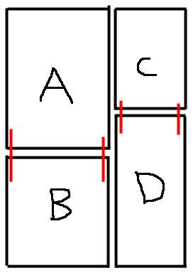
Obviously still relatively new to the webcomic scene, the first element of 'Mad Hat' to strike me was that the main character recalled Mike from Monsters Inc, (not that I've watched the aforementioned movie for a long time, hence the probable rust encrusted memories, but hey...he was green and had one eye! ) Here we have an eponymous, not entirely amorphous blob who can quite often be found in strips wearing a hat...the title figures. So far I've detected only a hint of an underlying storyline, which is frequently departed from, so for now I'm assuming that it is based mainly on jokes and gags. I didn't find it especially amusing as a whole, but then I've never been one for strips that exist soley to present a sequence of single page constrained humour; that said a couple of pages made me smile - particularly the strip satarising the common depiction of writing with squiggly lines.
The latest pages are certainly the most interesting, as it is in these that the first traces of a plot are beginning to emerge, whilst still maintaining a thread of humour. It'll be interesting to see where the story goes.
The thing that I found most unappealing was the constant change in the size and layout of the strips. With often no thematic links between them, this approach makes many of the earlier comics seem simply to be a disparate collection of captioned sketches. However, I imagine this is very much a matter of individual expectations of what a comic should be and could be an attempt at experimentalism.
The art isn't brilliant, but it isn't terrible either. There's some decent shading in places, but the line art is not at all confident and the anatomy of human characters is some way off the mark. I'd recommend the usual observing real people/other artists' techniques/life drawing to improve this. Also of course, a lot will come with practice and perserverence with the comic.
The site is functional, tidy and easily navigable, so really no qualms there at all.
In short, this is a promising project and with some practice artistically, continuity between the pages and perhaps a continuing storyline intercepted with jokes, it should turn out pretty well.
Last edited by El on Sat Mar 03, 2007 2:29 am, edited 1 time in total.
The twenty-first century is when the whole world changes. Now see how it ends.
