Rebirth of Webcomic Above Discussion
-
Black Sparrow

- Cartoon Anti-Hero
- Posts: 6973
- Joined: Fri Jul 22, 2005 9:04 am
- Location: Violating your restraining order
- Contact:
-
Black Sparrow
- Cartoon Anti-Hero
- Posts: 6973
- Joined: Fri Jul 22, 2005 9:04 am
- Location: Violating your restraining order
- Contact:
Ah! Doppy attack!
It's his own fault for looking so smug.Mo wrote:Your avatar looks like you'd enjoy watching that.Black Sparrow wrote:Lego's avatar makes him look like he's about to burst out crying. Awwww.
This is going in my notebook titled "Things I Didn't Know about Surface Dwellers."


-
Dr Legostar

- Cartoon Villain
- Posts: 15660
- Joined: Tue Jun 15, 2004 1:40 pm
- Location: right outside your window.
- Contact:
i'm not gonna cry.... i promised myself i wouldn't!
i have a festive hat! Look! LOOOOOK!
i have a festive hat! Look! LOOOOOK!
-D. M. Jeftinija Pharm.D., Ph.D. -- Yes, I've got two doctorates and I'm arrogant about it, what have *you* done with *your* life?
"People who don't care about anything will never understand the people who do." "yeah.. but we won't care."
"Legostar's on the first page of the guide. His opinion is worth more than both of yours."--Yeahduff
"People who don't care about anything will never understand the people who do." "yeah.. but we won't care."
"Legostar's on the first page of the guide. His opinion is worth more than both of yours."--Yeahduff

Yes, you all have fun whilst I dig through garbage for nutrients.
OOH! AN ORANGE PEEL!
Oh, noticed my review finally showed up, thanks Perk! (they read top to bottom, left to right)
OOH! AN ORANGE PEEL!
Oh, noticed my review finally showed up, thanks Perk! (they read top to bottom, left to right)
Caught in the headlamp glare of your own blinding vanity/Mesmerised by the stare of your shallow personality
Gorging the junk food of flattery you drag your fat ego around/Everyone floored by the battering you give to whoever's around
Oh Narcissus you petulant child admiring yourself in the curve of my eyes/Oh Narcissus you angel beguiled unsated by self you do nothing but die
Gorging the junk food of flattery you drag your fat ego around/Everyone floored by the battering you give to whoever's around
Oh Narcissus you petulant child admiring yourself in the curve of my eyes/Oh Narcissus you angel beguiled unsated by self you do nothing but die
-
Perk_daddy
- Regular Poster
- Posts: 321
- Joined: Thu Jun 15, 2006 5:58 pm
- Location: Utah
- Contact:
You're welcome! And that's the thing, they really don't all the time. Here:TdotOdot2k wrote:thanks Perk! (they read top to bottom, left to right)
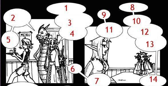
Here's the order in which you meant the balloons to be read. The natural place for a reader to start is on balloon #2 since it's in the top left corner. Sure, balloon #1 is a teeny bit higher up, but at first glance it looks like it's part of a larger bit of text spoken by that same character that is read after balloons #2 and #5. Also, the reader will naturally go from balloon #10 to balloon #12. There's no indication for the reader to go #11 except for #12 not making sense.
Upon looking at how you've got it set up, I can see that it works if you're always reading the balloon that's higher than the next one, but noone wants to get out their ruler to read a comic. Maybe I'm being way too nit-picky, but it did bother me.


No, don't get me wrong, I respect your opinion. I just always read up and down, left and right, and thats how that strip is laid out. Except #7. That one is bad, but thats back when I cared about keeping my strip closer together. I since learned I could move the panels around based on how much room my balloons need.
Unfortunately that also labelled me as "Infinite Canvas/Panel", and I dislike that to the point I'm pretty much redoing all the strips. Except the new ones I put out. Those ones look fine.
Unfortunately that also labelled me as "Infinite Canvas/Panel", and I dislike that to the point I'm pretty much redoing all the strips. Except the new ones I put out. Those ones look fine.
Caught in the headlamp glare of your own blinding vanity/Mesmerised by the stare of your shallow personality
Gorging the junk food of flattery you drag your fat ego around/Everyone floored by the battering you give to whoever's around
Oh Narcissus you petulant child admiring yourself in the curve of my eyes/Oh Narcissus you angel beguiled unsated by self you do nothing but die
Gorging the junk food of flattery you drag your fat ego around/Everyone floored by the battering you give to whoever's around
Oh Narcissus you petulant child admiring yourself in the curve of my eyes/Oh Narcissus you angel beguiled unsated by self you do nothing but die
-
ShineDog

- Regular Poster
- Posts: 974
- Joined: Sat Jan 17, 2004 12:56 am
- Location: Ayrshire, Scotland
- Contact:
Welll
normally people read from top to bottom only if after they clear the "line" the text first appears on. On that example panel bubble 1 is far to near to the level of bubble 2, that it would be very very common for someone to misread it. I would have.
its one of the more common layout problems people face.
even if it was more seperated vertically, i think you are going to have a majority of people misreading it, because people start at the top left and because of that the first panel the eye is drawn to is not the panel you want them to read.
Jaw droppingly large strawberry desserts.

Balloons 8, 9, and 10 are a good example of how the average comic reader will follow the dialog. Separating the statements with stems betwen the balloons helps to clarify things. Without seeing the dialog, though, one might tend to clump 10 together with 12 and 13. Same thing with 1, 3, and 4. Also bear in mind that one character does not need to have all of his/her balloons connected as long as each one is clearly pointing to the proper speaker.
Glarryg
Glarryg
http://www.squidninja.com - Dude. Buy a shirt. Seriously.
Meh, it's okay. I'll put this advice to use. I'm redrawing the series, hence why updates are slim. The story is pretty accurate to how I wanted it, so it will remain pretty much the same, but certain characters shouldn't be there. Like superman, in the last strip.
I just find it odd my large fanbase (back in the day) never pointed this out to me.
I appreciate the input, and will put it to use.
I just find it odd my large fanbase (back in the day) never pointed this out to me.
I appreciate the input, and will put it to use.
Caught in the headlamp glare of your own blinding vanity/Mesmerised by the stare of your shallow personality
Gorging the junk food of flattery you drag your fat ego around/Everyone floored by the battering you give to whoever's around
Oh Narcissus you petulant child admiring yourself in the curve of my eyes/Oh Narcissus you angel beguiled unsated by self you do nothing but die
Gorging the junk food of flattery you drag your fat ego around/Everyone floored by the battering you give to whoever's around
Oh Narcissus you petulant child admiring yourself in the curve of my eyes/Oh Narcissus you angel beguiled unsated by self you do nothing but die
The way you have it doesn't make it necessarily unreadable. It just slows things down depending on the specific layout. I've seen comics that will number the dialog balloons at the beginning or top of each one to clarify this kind of thing; that might be a simpler/faster way to redo the archives.
Glarryg
Glarryg
http://www.squidninja.com - Dude. Buy a shirt. Seriously.

")


-
RemusShepherd

- Cartoon Hero
- Posts: 2011
- Joined: Fri Jan 21, 2005 2:23 pm
- Contact:
I don't think it's necessary to redraw them, they still look good.hallonpress wrote:The example with Elia's head is interesting. I've never noticed, but I see it now. That is, not so much its size as its shape. It looks really weird. To our defense I'll have to say that this is the beginning of the story, a year ago, and I hadn't quite nailed how to draw her yet. Pages 1-23 are going to be redrawn anyway when we find the time.
No, no, no! Your perspective is *never* wrong, it's well-done everywhere. What I mean is that there is usually a reason for extreme tilting and strange POVs -- they're used in action scenes, to show disorientation of the POV character, etc. They make the reader uneasy or excited. But your perspective gets crazy during the calmest periods of the story. It's the timing in your use of perspective that I don't understand.But what do you mean by "unneccesary experiments" with perspective? I don't understand. Does it mean that you think the perspective is wrong?
Examples:
http://whatbirdsknow.atspace.com/wbk10.htm (2nd panel)
http://whatbirdsknow.atspace.com/wbk66.htm (4th panel)
http://whatbirdsknow.atspace.com/wbk119.htm (2nd panel)
As a counter-example, the wrestling between Vandi and Dores was an appropriate time to shift perspective, because there was action going on. And you did.
There's nothing wrong with any of this. The perspective is correctly drawn, the panels look good. It's just...unnecessary. As I said, I thought you were doing it just to keep things interesting, and that's a valid reason.
I think you're right about the improvement over time, especially in proportions. It's hard to notice because the initial pages are so nearly perfect.I respect your opinion about the shading around the eyes, even if I don't agree with you. I do think that there is improvement in the overall art over time, though.
And you don't have to respect my opinions -- I'm a rank amateur compared to the artist of What Birds Know.
I can't tell where the light is coming from in this scene -- above (Vandi's chest), from the right (most of Elia), from into the page (Vandi's hair lock). My edits were made assuming the light is from the right, and that Elia wasn't blocking it on Vandi.Again, I'll point out that this is a panel from the beginning of the story, that will be redrawn. And sorry, but to me, your version looks a lot more flat than what we did. It may be more correct - even if I have some doubts about that too; wouldn't Elia block out the light on Vandi's chest, making your highlight on her boob wrong too? And shouldn't the underside of her boobs be slightly darker anyway, since they are protruding and cast shadows by themselves?
Absolutely! But my point is that when the shading was wrong, I didn't think they looked three dimensional. Sometimes, like in this scene, they look like paper cutouts. But even that can be an artistic choice, and if that's the choice being made then ignore me.In any case, it may be more correct, but we SOMETIMES let go of realism on purpose to shade the characters in a way that makes them look three dimensional (?).
Whoa, whoa whoa.It is weird that you find such glaring problems in the departments that we have recieved the most praise in; perspective, and the use of color. Makes me wonder what to think. But different people see different things, and you can't please everyone...
Not hard at all to buy that. But it hasn't been revealed to the readers yet. Almost nothing has been revealed to the readers about this world. I understand that the story is rolling out slowly because of the focus on characters, but right now (with nothing more fantastic than a mysterious explosion and a mushroom-induced hallucination) it looks like it's set in a normal medieval society. If you don't tell the readers vital information, they will make their own assumptions. As a writer you can use that to your advantage, but it can also bite you if you're not careful.Says who? This isn't medieval society, it isn't Germany in the year 1410, it's fantasy. It's A medieval society, but in a different world. This is a very deliberate move on our part. We are strong supporters of feminism, and we hate clichés. This society is still on a medieval level when it comes to technology, but on a social level, it's far more advanced. It's a modern, medieval society. Is that really so hard to buy?RemusShepherd wrote: I only noticed two suspension-of-disbelief problems in the story that interrupted my reading. For one, this is from all appearances a medieval society, yet all the girls are nineteen years old. A nineteen year old woman in medieval times is an *old maiden*, not a schoolgirl. By rights, all three of these girls should be married with kids by now.
It would have been easy to drop hints about extended life span. Mention a number of years during the talk with Alvan. Mention anyone's ages other than the girls -- if Alvan is in his 50s and still spry, that's a clue. Similarly with the mushrooms. Have the girls recognize the potential danger, even if they dismiss it immediately afterward.
Dores: "And I checked, those mushrooms are safe to eat. At least I'm pretty sure they are."
Vandi: "Didn't you skip that day in class?"
Elia: "Let's eat!"
(Looking over the incident again, I see it's possible that Dores did it on purpose, despite her protests to the contrary. If that'll be revealed later, I withdraw the entire mushroom criticism.
You've been very, very reluctant to give any information out about this world...don't be surprised if your readers start filling in the blanks with wrong information.
Any other concerns? I really am trying to help, here.


-
Mrdaveryan

- Regular Poster
- Posts: 101
- Joined: Mon Jan 23, 2006 9:37 pm
- Location: Conshohocken
- Contact:


Squid Ninja review is up. If you want my notes Glarryg, just ask.
While i'm here, thanks for the review fecundity.
I tried forever to get variable width text, but it just didn't work out with the way i wanted to get the indentations in the text to work. When i'm retooling the pages for achival i'll look into it again though.
I became well aware of the tense problem a while back, but i've just been putting it off because i'm a lazy bum - the same reason why the code to display the 'comics' (yes, it's not a comic... but there's no good one word description for it that i know of.) hasn't been updated since the days of yore. Another of the many things to do during my two week break.
Also: Bonus points for using the words squamous and quotidian.
While i'm here, thanks for the review fecundity.
I knew putting the text as text was a good idea for exactly that reason. I'm glad somone put it to good use.fecundity wrote:The prose portion of each entry is text, rather than a graphic image of text. This means that the author cannot use cool fonts or layout, but it also means that the text shows up clearly on the screen and can be displayed at an arbitrary size. (When I am not wearing my glasses, I up the font size.)
One small quibble: The text of each entry is in a narrow column to the right of the illustration. For readability, I would have preferred if each illustration were a float and the text widened out below it.
I tried forever to get variable width text, but it just didn't work out with the way i wanted to get the indentations in the text to work. When i'm retooling the pages for achival i'll look into it again though.
I became well aware of the tense problem a while back, but i've just been putting it off because i'm a lazy bum - the same reason why the code to display the 'comics' (yes, it's not a comic... but there's no good one word description for it that i know of.) hasn't been updated since the days of yore. Another of the many things to do during my two week break.
Also: Bonus points for using the words squamous and quotidian.
It's called a transcription, and more comics need to do it. I'm not entirely sure blind people are going to get all that into webcomics, but search engines certainly do like text. I put a search box on my page - because of the text it's actually useful, and i don't have to rely on OhNoRobot. I get related searches because i have hidden (or less than hidden) text transcriptions on most everything.Jackhass wrote:One strange quirk...for some reason, every comic has all the dialog and a description of the scene written out beneath it. Why? It seems completely pointless, and this space would be better used to provide explanations for some of the more obscure references, which are some of the comics are in dire need of.

-
Jackhass

- Cartoon Hero
- Posts: 3243
- Joined: Wed Jun 23, 2004 3:34 am
- Location: Starring in your latest sex dream.
Why would writing out all the dialog for the comic benefit blind people? They wouldn't be able to read it either.c.w. wrote:It's called a transcription, and more comics need to do it. I'm not entirely sure blind people are going to get all that into webcomics, but search engines certainly do like text. I put a search box on my page - because of the text it's actually useful, and i don't have to rely on OhNoRobot. I get related searches because i have hidden (or less than hidden) text transcriptions on most everything.Jackhass wrote:One strange quirk...for some reason, every comic has all the dialog and a description of the scene written out beneath it. Why? It seems completely pointless, and this space would be better used to provide explanations for some of the more obscure references, which are some of the comics are in dire need of.
As for the search box thing...he has no search feature, and his archive is done well enough that you don't need one.
-
Joel Fagin

- nothos adrisor (GTC)
- Posts: 6014
- Joined: Mon Mar 29, 2004 1:15 am
- Location: City of Lights
- Contact:
