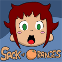
The Chronicles of Avernyght: Ragtime: Poppett's Story
This is an enjoyable read. The layout is gorgeous, with the dark background suggesting that something ominous is in store, but also presented with a lot of intricate detail, and the beautiful star pattern suggesting a very magical, mystical mood. I was reminded several times of the Wizard of Oz: the almost scarecrow-like appearance of the main characters; the straight, bright road in the first comic made me look twice to make sure it wasn't made of yellow bricks; and the "wicked witch" antagonist were all there. I can tell there is a wondrous story to be told here.
I like the art. The characters are drawn in a simple, straightforward style, and their bizarre appearance makes for a unique cast. The characters and background are nicely detailed, too. My only suggestion would be to move the "camera" around a bit; here's an example of one page that looks a little static, where some different angles would have made for a more interesting page.
The story is good so far. You give away just enough information so that I know what I need to, but want to keep reading to see what happens and how this world came to be. I love this sort of format, where the reader is dropped into a setting where things aren't known, and everything is left to be discovered as the writer leads us along. The characters are interesting, and I can tell you've fleshed them out in your mind before putting them down on paper (or screen, as the case may be).
I only noticed one time where the layout was a little difficult to tell which way to read; I'm sure as you keep drawing you'll keep improving. The black word balloons sometimes make it hard to tell who's speaking when the background is dark, too; just wanted to point that out.
Overall, this is a comic I'll be sticking with. Can't wait to see what happens!
Rebirth of Webcomic Above!
-
Perk_daddy
- Regular Poster
- Posts: 321
- Joined: Thu Jun 15, 2006 5:58 pm
- Location: Utah
- Contact:


-
Linkara

- Cartoon Hero
- Posts: 2211
- Joined: Mon Apr 17, 2006 2:29 pm
- Location: Lizard-Inclined Neo Clone Republitarian Band-Aid Spokesman
- Contact:
Perk reviewed me on Choice Comics, it's only fair I return the favor. ^_^
Art: Very simplistic style, with most of the adults in the beginning tending to be only a smidge taller than the kids. This got better with the introduction of the "Men in grey" and the teachers. Continuity from strip to strip is very nice and backgrounds are very well-done, even when it's just a drab grey room. The only complaint I really have is that sometimes, although its clear upon examination that all the colors are filled in appropriately, the thin inking lines sometimes makes it easy for one to think on a cursory glance that you had tried to color the strip in, say, Photoshop with multiple layers but forgot to fill in the space between the black lines and the color of the object.
Writing: Superb! Right from the getgo, this is an hilarious strip, with only the occasional dud that doesn't seem to fall right. It's obvious that the author is an unabashed geek, referencing Star Wars, Star Trek, and the occasional other scifi convention along the way. It really captures the spirit of Elementary school kids moving up into the world of Middle school, a difficulty I myself faced. I recall being in shock that we didn't stay in the same room all day and, of course, the fear of no longer being the top dogs of the school. A wonderful recurring gag (and I hope to see more of them) has been Nate's blushing when it comes to Carmen. There's obviously some sort of attraction between the two, but they're too young to truly grasp what's happening (or are just afraid to admit it).
Site: The site, however, could use a lot of work. It's very minimalistic so far, with only the strips, a tagboard, and a link to the author's blog. A character page would be nice, or at least an "about" page to any new readers who might be interested in looking at the comic but don't want to trudge through the archive. Also, the white background, while working well with the bright feel of the comic, doesn't really scream "professional!" Perhaps a different color or a gradient map? Also, while it fits perfectly well on my computer at a 1280x1040 display, the header map may be a wee bit too long for other computers with smaller monitors, further discouraging new readers.
Overall: 9/10. The content is great, a nice all-ages read which really gives it a one-up, but the site could definitely use a little perking up.
Last edited by Linkara on Tue Feb 06, 2007 10:17 pm, edited 1 time in total.

Quote of the Moment: “Greetings, my friend. We are all interested in the future, for that is where you and I are going to spend the rest of our lives.” ~Criswell~
-
The Neko

- A Blithe ray of Schadenfreude
- Posts: 3878
- Joined: Tue Mar 18, 2003 6:16 pm
- Location: New York City
LIGHTBRINGER
I don't have too much to say about the website, since that is the least of this comic's worries. It's pretty dull and boring, but it's functional. The archive works, but would probably be better off without all the "fan art" peppered throughout it. The logo at the top is a bit too tall, and thus pushes the content further down the page than it should be. I think if the author's name wasn't so huge, it would probably save a good amount of space. Really, the only way this can be fixed is if the author looks around at more professional sites and sees how they're laid out and designed, or to hire someone to make his site for him.
I'm trying something new here, as the art has already been commented upon in previous reviews. My only written comments on the art are similar to the "it's drawn by a child" section in the Dragon Kingdoms review. The difference, however, is that there is some rudimentary sense of construction and proportion here, but it really doesn't seem to help make the characters any more stable or realistic, often resembling people in the process of melting, almost always drawn exclusively in profile or straight-on. Background perspective is also highly lacking.
The following images are my responses to people who think that art is completely subjective and also serves as a critique on the layouts and composition. Any offense taken is the reader's fault for noticing the differences.
Covers:
Internal Dialogue:
Monologue:
Action Sequences:

The author has mentioned a few times that he intends to put these together into a trade paper back and sell it to the public. It is in this reviewer's opinion that he should be braced for disappointment. In its current state, neither the art nor the writing are at the level to print. In fact, the only way this could be printed is if the author was to pay a vanity press to produce it.
And this is where we get into the writing, which is something I'd say is just about as weak as the art. Many of the pages contain more text than art and in order to pull that off, the text had better be damn good. Unfortunately, it's not. It reads like a novel, but not a good one. The internal dialogue is long-winded and often contains pointless details and characterization. I feel that a lot of that is to somehow create justification for the character's actions or to explain their backgrounds in a lazy, slapdash way. At other times, it is to cover up the author's inability to illustrate scenes in a meaningful way by telling the audience what is going on. Really, not every thought has to be written out, and this amount of narration renders the whole concept of sequential art meaningless. There's more inner dialogue than there is spoken, and it seems that there is no balance to be found between the two. Additionally, so much of the heavy-handed/ham-fisted philosophizing and interpreting can be reduced to much simpler terms. Speaking of heavy-handed, there were a few strips that became platforms for the author's conservative views. It's one thing to have a bias, it's another to awkwardly insert a direct sermon of it in the middle of a story, especially if it comes from the author's mouthpiece who has been established as the morally superior immaculate, fautless protagonist. It's clumsy and transparent if not handled correctly.
Other times, pages consist of a lone image of a character expositing their entire background or to explain their philosophy. This becomes boring very quickly. In fact, whenever I came to a new page like this, I swore out loud because they were so frustrating to go through. The worst parts were when characters would have to mention something for the convenience of the plot. Need a character with technical expertise? Well in their dramatic childhood, they were apprenticed to an electrician! Boy howdy, that sure was easy! Author doesn't want to draw a headset anymore? Thank goodness they've got a techie whiz, they can make it so you don't see it anymore! YAY CONTRIVANCE!
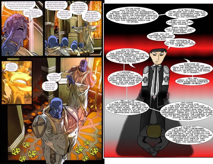
The most frustrating thing I encountered in the writing was this page. Not only does it lack subtlety and drone on and on, apparently there wasn't enough space on the page to explain everything. If you cannot explain something like that in the space provided it is either a complete failure of writing, or incompetence at how to write for the medium entirely. Either the audience is so stupid that every single details and possible semantic clue has to be hashed out to be understood, or the writer just doesn't know how to condense anything. And really, the images add nothing to the diatribe. Comics are supposed to be a union of images and text in order to create meaning, that is the whole point of the medium. I suggest reading some Scott McCloud.
One of the main themes in Lightbringer is moral relativism, in that it asserts that there is no such thing. It's a black and white view of the world, and the main sins of the villains are not just "being evil" (characterized bombastically by partaking in sexual abuse, rape etc. which the author seems fixated on as a characterization) but having the belief that they are somehow performing good deeds through their evil. This is treading on unsteady ground, especially in the postmodern era. Really, the whole thing seems like an attempt to redo Steve Ditko's Mr. A. Since there is a lot of moral absolutes being tossed around by characters, logic flaws are sure to follow. If I have to read another page of characters standing around in the middle of a battle justifying themselves, I'll rip out my hair and jump out my 6th story window. Even works of classic literature such as Candide have more subtlety than this. In fact, I might suggest reading some classics to gain an understanding of portraying a philosophical view through actions and situations rather than just stating it bluntly.
I think the story would be much more interesting if there was actual moral opposition for the hero, rather than just submitting him to strawman character after strawman character, as well as allowing characterization to come out through spoken conversations and actions, personalities affecting the manner in which they speak or how they view situations. Really, cutting down the length it takes for a character to state a thought would also be nice.
If there is a lot of text that needs to be stated, it might be best to split it up amongst several panels, that way it changes the pacing and allows you to add nuance to the character's voice. If someone in a live-action film had the same expression and stance as they were talking, like in the frustrating page mentioned earlier, you'd find it unusual, and boring. When people talk, they change modes, gesture, and often perform simultaneous action. This is how you balance a large amount of text with images.
The best advice I can give right now is that the author needs to read some classic literature, look at the mechanics of the comic genre, and get out of the simplistic mode of storytelling where resolutions and explanations are abundant, easy, and all too convenient.
As for the art... that's going to take a lot of training.
I don't have too much to say about the website, since that is the least of this comic's worries. It's pretty dull and boring, but it's functional. The archive works, but would probably be better off without all the "fan art" peppered throughout it. The logo at the top is a bit too tall, and thus pushes the content further down the page than it should be. I think if the author's name wasn't so huge, it would probably save a good amount of space. Really, the only way this can be fixed is if the author looks around at more professional sites and sees how they're laid out and designed, or to hire someone to make his site for him.
I'm trying something new here, as the art has already been commented upon in previous reviews. My only written comments on the art are similar to the "it's drawn by a child" section in the Dragon Kingdoms review. The difference, however, is that there is some rudimentary sense of construction and proportion here, but it really doesn't seem to help make the characters any more stable or realistic, often resembling people in the process of melting, almost always drawn exclusively in profile or straight-on. Background perspective is also highly lacking.
The following images are my responses to people who think that art is completely subjective and also serves as a critique on the layouts and composition. Any offense taken is the reader's fault for noticing the differences.
Covers:
Internal Dialogue:
Monologue:
Action Sequences:
The author has mentioned a few times that he intends to put these together into a trade paper back and sell it to the public. It is in this reviewer's opinion that he should be braced for disappointment. In its current state, neither the art nor the writing are at the level to print. In fact, the only way this could be printed is if the author was to pay a vanity press to produce it.
And this is where we get into the writing, which is something I'd say is just about as weak as the art. Many of the pages contain more text than art and in order to pull that off, the text had better be damn good. Unfortunately, it's not. It reads like a novel, but not a good one. The internal dialogue is long-winded and often contains pointless details and characterization. I feel that a lot of that is to somehow create justification for the character's actions or to explain their backgrounds in a lazy, slapdash way. At other times, it is to cover up the author's inability to illustrate scenes in a meaningful way by telling the audience what is going on. Really, not every thought has to be written out, and this amount of narration renders the whole concept of sequential art meaningless. There's more inner dialogue than there is spoken, and it seems that there is no balance to be found between the two. Additionally, so much of the heavy-handed/ham-fisted philosophizing and interpreting can be reduced to much simpler terms. Speaking of heavy-handed, there were a few strips that became platforms for the author's conservative views. It's one thing to have a bias, it's another to awkwardly insert a direct sermon of it in the middle of a story, especially if it comes from the author's mouthpiece who has been established as the morally superior immaculate, fautless protagonist. It's clumsy and transparent if not handled correctly.
Other times, pages consist of a lone image of a character expositing their entire background or to explain their philosophy. This becomes boring very quickly. In fact, whenever I came to a new page like this, I swore out loud because they were so frustrating to go through. The worst parts were when characters would have to mention something for the convenience of the plot. Need a character with technical expertise? Well in their dramatic childhood, they were apprenticed to an electrician! Boy howdy, that sure was easy! Author doesn't want to draw a headset anymore? Thank goodness they've got a techie whiz, they can make it so you don't see it anymore! YAY CONTRIVANCE!
The most frustrating thing I encountered in the writing was this page. Not only does it lack subtlety and drone on and on, apparently there wasn't enough space on the page to explain everything. If you cannot explain something like that in the space provided it is either a complete failure of writing, or incompetence at how to write for the medium entirely. Either the audience is so stupid that every single details and possible semantic clue has to be hashed out to be understood, or the writer just doesn't know how to condense anything. And really, the images add nothing to the diatribe. Comics are supposed to be a union of images and text in order to create meaning, that is the whole point of the medium. I suggest reading some Scott McCloud.
One of the main themes in Lightbringer is moral relativism, in that it asserts that there is no such thing. It's a black and white view of the world, and the main sins of the villains are not just "being evil" (characterized bombastically by partaking in sexual abuse, rape etc. which the author seems fixated on as a characterization) but having the belief that they are somehow performing good deeds through their evil. This is treading on unsteady ground, especially in the postmodern era. Really, the whole thing seems like an attempt to redo Steve Ditko's Mr. A. Since there is a lot of moral absolutes being tossed around by characters, logic flaws are sure to follow. If I have to read another page of characters standing around in the middle of a battle justifying themselves, I'll rip out my hair and jump out my 6th story window. Even works of classic literature such as Candide have more subtlety than this. In fact, I might suggest reading some classics to gain an understanding of portraying a philosophical view through actions and situations rather than just stating it bluntly.
I think the story would be much more interesting if there was actual moral opposition for the hero, rather than just submitting him to strawman character after strawman character, as well as allowing characterization to come out through spoken conversations and actions, personalities affecting the manner in which they speak or how they view situations. Really, cutting down the length it takes for a character to state a thought would also be nice.
If there is a lot of text that needs to be stated, it might be best to split it up amongst several panels, that way it changes the pacing and allows you to add nuance to the character's voice. If someone in a live-action film had the same expression and stance as they were talking, like in the frustrating page mentioned earlier, you'd find it unusual, and boring. When people talk, they change modes, gesture, and often perform simultaneous action. This is how you balance a large amount of text with images.
The best advice I can give right now is that the author needs to read some classic literature, look at the mechanics of the comic genre, and get out of the simplistic mode of storytelling where resolutions and explanations are abundant, easy, and all too convenient.
As for the art... that's going to take a lot of training.
Last edited by The Neko on Wed Feb 07, 2007 11:40 am, edited 1 time in total.
jag saknar självförtroende
-
Prettysenshi
- Bork Bork Bork
- Posts: 2269
- Joined: Thu Jun 24, 2004 8:23 am
- Location: Anywhere else but here....
- Contact:
Edit: DONE
To Neko:
Art: First off, I think Neko comic's coloring is pretty bland. It's really flat, and the colors don't jump out at me. You're pretty good with expressions, and I think if you put more work into the expressions, the pages would jump at me more. Plus, I think that using shadows would be better, like even if it was just cel shading. That way, it's not just flats to look out throughout the whole archive.
Your anatomy is kinda lacking, like in the faces of your drawings. Straight forward views are always kinda annyoing for me to look at in your drawings, cuz the heads suddenly get so skinning and long. Also, it's nice that your faces became more detailed. Before, it was nothing more than lines with a dot under it, and now I can see pupils and irises and that's nice.
Plus, I think you work on backgrounds pretty well. It's a gag comic, so I don't expect really elaborate backgrounds, but I think that if you put some more work on backgrounds instead of gradient as often as you do, it would make the pages prettier. I know you're trying to improve your artwork, so I won't linger on it, but the jump from Jan 06 to July 06 is just great!
Story: It's a gag a day comic, and there's usually not much to say about story in this case, cuz it's not really an ongoing comic. However, in terms of gags, I don't find some of your jokes particularly funny. I'm not a big fan of crude humor, like this page. It kinda made me cringe. Really violent jokes or just jokes involving pain and the injury of eyes in particular just make it difficult for me to laugh, but that's just me. I assume that you know your audience and what they find funny, so you draw to cater to that audience. Since I know a few of your fans, I'm sure you're doing a good job in that department, so all the better. Other pages made me smile some, and even gave me a giggle, but that's kinda it. However, I think that's cuz I'm not a part of the audience that you write your comic for.
I think you've set up a really good cast though. Really diverse in personalities, which I like, and help with changing up the jokes and plot some. Some of the characters are just kinda out there and weird, like this guy, but I he doesn't annoy me and I think he's one of the funnier characters in the comic, probably cuz of his randomness.
Design: I really not a fan of white backgrounds, even though the title graphic is done pretty well, I wish you'd use a subtle color for the background, something that won't strain the eyes. Same for your newsbox. Black on yellow isn't very nice to read. Your cast page is excellent, but I don't understand why your cast page is done in flash, and you didn't design the rest of your pages in flash. You obviously have a knowledge of it, and I think you could do well if you tried it with the rest of your website's pages.
To summarize, your art is pretty good Neko, but I think you need more work on faces, especially at various angles. I'm not a fan of the humor either, but that's less on your talent for being funny, and more so on the audience that you're writing for. If you put more effort into your webpages, I think that your website will be a lot more interesting, cuz so far, it just passes the "decent and navigative" mark. All in all, good job.
To Neko:
Art: First off, I think Neko comic's coloring is pretty bland. It's really flat, and the colors don't jump out at me. You're pretty good with expressions, and I think if you put more work into the expressions, the pages would jump at me more. Plus, I think that using shadows would be better, like even if it was just cel shading. That way, it's not just flats to look out throughout the whole archive.
Your anatomy is kinda lacking, like in the faces of your drawings. Straight forward views are always kinda annyoing for me to look at in your drawings, cuz the heads suddenly get so skinning and long. Also, it's nice that your faces became more detailed. Before, it was nothing more than lines with a dot under it, and now I can see pupils and irises and that's nice.
Plus, I think you work on backgrounds pretty well. It's a gag comic, so I don't expect really elaborate backgrounds, but I think that if you put some more work on backgrounds instead of gradient as often as you do, it would make the pages prettier.
Story: It's a gag a day comic, and there's usually not much to say about story in this case, cuz it's not really an ongoing comic. However, in terms of gags, I don't find some of your jokes particularly funny. I'm not a big fan of crude humor, like this page. It kinda made me cringe. Really violent jokes or just jokes involving pain and the injury of eyes in particular just make it difficult for me to laugh, but that's just me. I assume that you know your audience and what they find funny, so you draw to cater to that audience. Since I know a few of your fans, I'm sure you're doing a good job in that department, so all the better. Other pages made me smile some, and even gave me a giggle, but that's kinda it. However, I think that's cuz I'm not a part of the audience that you write your comic for.
I think you've set up a really good cast though. Really diverse in personalities, which I like, and help with changing up the jokes and plot some. Some of the characters are just kinda out there and weird, like this guy, but I he doesn't annoy me and I think he's one of the funnier characters in the comic, probably cuz of his randomness.
Design: I really not a fan of white backgrounds, even though the title graphic is done pretty well, I wish you'd use a subtle color for the background, something that won't strain the eyes. Same for your newsbox. Black on yellow isn't very nice to read. Your cast page is excellent, but I don't understand why your cast page is done in flash, and you didn't design the rest of your pages in flash. You obviously have a knowledge of it, and I think you could do well if you tried it with the rest of your website's pages.
To summarize, your art is pretty good Neko, but I think you need more work on faces, especially at various angles. I'm not a fan of the humor either, but that's less on your talent for being funny, and more so on the audience that you're writing for. If you put more effort into your webpages, I think that your website will be a lot more interesting, cuz so far, it just passes the "decent and navigative" mark. All in all, good job.
Last edited by Prettysenshi on Wed Feb 07, 2007 1:02 pm, edited 8 times in total.

-
Dutch!

- Red galah
- Posts: 4644
- Joined: Sat Jun 19, 2004 4:39 am
- Location: The best place on this little blue rock
- Contact:
Okies. I gave Angry a try really early on, but I'll see how it's turned out in the two years since.
EDIT: Okay. Gave it the full read through. Here we go.
From what I have gathered from several years hanging around here, Angry D. Monkey appears to be a popular choice of webcomic for those frequenting this forum. It's regularly mentioned in favourite lists by posters who are part of the ComicGenesis and Cornstalker groups, which is a notable achievement, it must fairly be said.
It must also be said that, even now I've read through the entire archive, I really can't see why. It's not that there's anything particularly wrong with it, it's just that what is in the archive seems to be a mishmash of strange characters who, with a few exceptions, don't seem to grow or develop, and at worst are little more than one joke figures. The entire second half of the strip has the feel of being little more than one continuous ComicGenesis Forum Jam.
I know this review is starting with much the same effect as a Panzer regiment through Poland, but I thought I'd get that out first.
I should also probably say that I really like the author's personality on the forums and I enjoy his humour and presence around the traps and the way he handles himself. So I hope this doesn't come across as an attack against him, because I reckon he's a bloody good bloke. The comic is just somewhat disjointed and, well, downright weird to me.
Let's go back though, and point out the bits and pieces I think Angry D. Monkey does really well, eh? If you're still reading, K-Dawg, remember to smile, eh?
ART:
The art works. It works really well... as far as the colours go. I love the colour of Angry D. Monkey. It's bright, bold, defined, clear and generally crisp. The further into the strip, generally the better and more effective the colouring became. The characters are drawn simply, and generally work. It does give me the impression of being based on current Saturday morning cartoon shows. I get the feeling of a strong, strong Dragon Ball Z influence though. Otherwise, that side of the art works really well, and it also complements the website design as well. I do really appreciate the use of bright, bold colours without making the strip look horrible. It generally looks great.
WRITING:
I found it relatively weak at the beginning, but more on that later. It picked up and I was actually really getting into the story when we find out the links between Angry and his little brother. That part of the story was working and is the best character development in the strip. Then it seemed to finish and the story moved on elsewhere and started to go downhill. I would suggest going back to this chapter or two and look at how you worked that part of the story. Bring more of that development back because I think that fell by the wayside somewhat later on.
Ton is probably the most developed character. He's friendly, naive, simple, and loyal. I can understand how he has become a favourite. He is the character who is written the best. The others don't seem to have developed much past their original beginnings. Ton has developed so far past them he can't even see their headlights on the road behind him. At the same time though, Ton can still come across quite regularly as a one or two joke character.
WEBSITE:
This is great. I really like the way it's all put together. The colour schemes are wonderful and really suit the whole set up. Top marks. I can't really suggest anything here. You've done a good job.
Okay. Here's where I think the strip is lacking. Or in some cases, here's where I think the strip has trouble picking up the interest of certain readers (if I can consider myself a regular reader. For argument's sake, let's assume I can! )
ART:
The style changes a lot. Back and forth. Often in the same edition. I think it's called chibi, eh? When the characters look fat and round and seem to lose all fingers and toes and look like playdoh versions of those Russian dolls you stack inside each other. To me it just throws any continuity of the artwork out the window with yesterday's bathwater. To be honest, I think I would have found it much easier to read if these particular style choices were removed and the art remained in it's original style. Keep in mind though that I am fully aware that this particular style may well be an entire art world I am completely ignorant of, eh?
WRITING:
The story appears quite simplistic in several areas, which isn't necessarily a failing, but at times it appears to have little major direction or development. Many of the jokes are simple and seem to rely on juvenile humour (not child-like humour, there's a difference) or slapstick violence. This leads me to my earlier point about one joke characters. Okay, Angry has two jokes. He fights everything and is relatively invincible and often ends an episode in Astroboy fashion by hitting something and saying Angry's equivalent of 'Take that!' or 'There!', or he swears at people and calls Ton a nasty name. Aphrodite is all about sex and that, and I found that got old very, very quickly. Ton is the best character developmental wise, but even he seems to rely solely on imitation Dragon Ball Z kicks and being naive. This is why I believe the segment dealing with Angry and Ton and Happy's backstory and their ties to the Island were so much better and why I found it disappointing that the story then regressed to other plots. Those few chapters around the early middle of the story made reading the archive worthwhile.
The final part in regards to the writing, and probably the area I think will make it difficult for Angry D. Monkey to garner any large readership beyond the walls of this forum, is that the entire last half is little more than a jam festival featuring cameo after cameo of CG and Cornstalker avatars. It seemed to be four or five chapters devoted to injokes and featuring just about everybody who was anybody from both forums wandering in for no apparent reason other than to give them a quick plug.
And no, I'm not disappointed that I wasn't included.
TO TIE IT ALL UP:
Angry D. Monkey generally looks bright and friendly and is definitely quite unique in its style. The few chapters dealing with the links between Angry and his brother were great to read and really began to develop the characters, but beyond that the story and characters appear very two dimensional.
I will reiterate once again though that I recognise it's relative popularity here but cannot see what makes it so except maybe that many read it because they are featured in it themselves.
I would like to also reiterate that the style choices and fight scenes and what not are most probably stemming from a style and genre that I know and understand absolutely nothing about. So yeah, take this how you will, but I hope I've at least pointed out some areas that you may wish to focus on. If you take nothing from this review for whatever reason, I hope that you do at least look at trying to make the characters more three dimensional.
On a final note...
I still do like you K-Dawg! Don't send Angry round to kick my bum, eh?
Cheers.
EDIT TWO!
Struth, that ended up longer than I thought. No wonder it's past my dinner time...
EDIT: Okay. Gave it the full read through. Here we go.
From what I have gathered from several years hanging around here, Angry D. Monkey appears to be a popular choice of webcomic for those frequenting this forum. It's regularly mentioned in favourite lists by posters who are part of the ComicGenesis and Cornstalker groups, which is a notable achievement, it must fairly be said.
It must also be said that, even now I've read through the entire archive, I really can't see why. It's not that there's anything particularly wrong with it, it's just that what is in the archive seems to be a mishmash of strange characters who, with a few exceptions, don't seem to grow or develop, and at worst are little more than one joke figures. The entire second half of the strip has the feel of being little more than one continuous ComicGenesis Forum Jam.
I know this review is starting with much the same effect as a Panzer regiment through Poland, but I thought I'd get that out first.
I should also probably say that I really like the author's personality on the forums and I enjoy his humour and presence around the traps and the way he handles himself. So I hope this doesn't come across as an attack against him, because I reckon he's a bloody good bloke. The comic is just somewhat disjointed and, well, downright weird to me.
Let's go back though, and point out the bits and pieces I think Angry D. Monkey does really well, eh? If you're still reading, K-Dawg, remember to smile, eh?
ART:
The art works. It works really well... as far as the colours go. I love the colour of Angry D. Monkey. It's bright, bold, defined, clear and generally crisp. The further into the strip, generally the better and more effective the colouring became. The characters are drawn simply, and generally work. It does give me the impression of being based on current Saturday morning cartoon shows. I get the feeling of a strong, strong Dragon Ball Z influence though. Otherwise, that side of the art works really well, and it also complements the website design as well. I do really appreciate the use of bright, bold colours without making the strip look horrible. It generally looks great.
WRITING:
I found it relatively weak at the beginning, but more on that later. It picked up and I was actually really getting into the story when we find out the links between Angry and his little brother. That part of the story was working and is the best character development in the strip. Then it seemed to finish and the story moved on elsewhere and started to go downhill. I would suggest going back to this chapter or two and look at how you worked that part of the story. Bring more of that development back because I think that fell by the wayside somewhat later on.
Ton is probably the most developed character. He's friendly, naive, simple, and loyal. I can understand how he has become a favourite. He is the character who is written the best. The others don't seem to have developed much past their original beginnings. Ton has developed so far past them he can't even see their headlights on the road behind him. At the same time though, Ton can still come across quite regularly as a one or two joke character.
WEBSITE:
This is great. I really like the way it's all put together. The colour schemes are wonderful and really suit the whole set up. Top marks. I can't really suggest anything here. You've done a good job.
Okay. Here's where I think the strip is lacking. Or in some cases, here's where I think the strip has trouble picking up the interest of certain readers (if I can consider myself a regular reader. For argument's sake, let's assume I can!
ART:
The style changes a lot. Back and forth. Often in the same edition. I think it's called chibi, eh? When the characters look fat and round and seem to lose all fingers and toes and look like playdoh versions of those Russian dolls you stack inside each other. To me it just throws any continuity of the artwork out the window with yesterday's bathwater. To be honest, I think I would have found it much easier to read if these particular style choices were removed and the art remained in it's original style. Keep in mind though that I am fully aware that this particular style may well be an entire art world I am completely ignorant of, eh?
WRITING:
The story appears quite simplistic in several areas, which isn't necessarily a failing, but at times it appears to have little major direction or development. Many of the jokes are simple and seem to rely on juvenile humour (not child-like humour, there's a difference) or slapstick violence. This leads me to my earlier point about one joke characters. Okay, Angry has two jokes. He fights everything and is relatively invincible and often ends an episode in Astroboy fashion by hitting something and saying Angry's equivalent of 'Take that!' or 'There!', or he swears at people and calls Ton a nasty name. Aphrodite is all about sex and that, and I found that got old very, very quickly. Ton is the best character developmental wise, but even he seems to rely solely on imitation Dragon Ball Z kicks and being naive. This is why I believe the segment dealing with Angry and Ton and Happy's backstory and their ties to the Island were so much better and why I found it disappointing that the story then regressed to other plots. Those few chapters around the early middle of the story made reading the archive worthwhile.
The final part in regards to the writing, and probably the area I think will make it difficult for Angry D. Monkey to garner any large readership beyond the walls of this forum, is that the entire last half is little more than a jam festival featuring cameo after cameo of CG and Cornstalker avatars. It seemed to be four or five chapters devoted to injokes and featuring just about everybody who was anybody from both forums wandering in for no apparent reason other than to give them a quick plug.
And no, I'm not disappointed that I wasn't included.
TO TIE IT ALL UP:
Angry D. Monkey generally looks bright and friendly and is definitely quite unique in its style. The few chapters dealing with the links between Angry and his brother were great to read and really began to develop the characters, but beyond that the story and characters appear very two dimensional.
I will reiterate once again though that I recognise it's relative popularity here but cannot see what makes it so except maybe that many read it because they are featured in it themselves.
I would like to also reiterate that the style choices and fight scenes and what not are most probably stemming from a style and genre that I know and understand absolutely nothing about. So yeah, take this how you will, but I hope I've at least pointed out some areas that you may wish to focus on. If you take nothing from this review for whatever reason, I hope that you do at least look at trying to make the characters more three dimensional.
On a final note...
I still do like you K-Dawg! Don't send Angry round to kick my bum, eh?
Cheers.
EDIT TWO!
Struth, that ended up longer than I thought. No wonder it's past my dinner time...
Last edited by Dutch! on Wed Feb 07, 2007 11:28 pm, edited 2 times in total.
Remember when your imagination was real? When the day seemed
longer than it was, and tomorrow was always another game away?

longer than it was, and tomorrow was always another game away?
Oh heck. I'm no great reviewist, and a bit of a slow reader, but I've been meaning to give SS a go through.
(Placeholder!)
(Placeholder!)


"Yeah, that's the bridge pier (expletive). I thought it was the center. Oh (expletive)." ~ From the transcript of the recording device on board the ship which struck the San Franciso Bay Bridge last year, causing a 50,000 gallon oil spill.
-
McDuffies

- Bob was here (Moderator)
")
- Posts: 29957
- Joined: Fri Jan 01, 1999 4:00 pm
- Location: Serbia
- Contact:
Ok. "Sharing a universe".
It's another comic that develops, both artistically and literary, with emphasis on artistically. Starts off as poorly drawn gag comic with unimpressive punchlines, but then develops and this developing is a process that's still going on. Which means that I don't think author has found a balance he needs and he's probably gonna do a lot of shifting left and right.
But it makes reviewing a bit tricky because I'm supposed to look at the current iteration and the state comic's in now, because, what's the point of reviewing stage from which the artist has moved?
Now, the first thing I notice when looking at an average "Sharing the universe" comic is that it's of rather small dimensions. My resolution is 1024x800 which is very common; But comics seem tiny on my screen, and with them characters in panels look tiny too. This, to an extent, obscures nuances of inking and also makes it harder to see the advancement of art, the way how artist changed his style and level of details. I would suggest leaving comics a bit larger in finished product.
Other than that, comic mostly relies on a bit heavier outline which is then filled with smudgu gradient shading. This combination always looks a bit awkward to me, because lines make impression of sharpness, and filing the softness. But many comics out there do it exactly this way and people often don't find anything wrong with it.
The style is pseudo-manga and it's creditable that artist doesn't just lift entire visual vocabulary from pseudo-manga, in other words, characters don't sweatdrop or blush every couple of panels like pseudo-manga characters often will. It's interesting that characters here are a bit chibi-like, in that their torso is unproportionally short, legs thick, heads round, ie entire figure looks like a figure of a child. As a stylistic choice, this only makes a problem when a child character actually occurs, when our only hint of the age is height.
I should also note that latest comics show tendency to draw heads too small compared to body, probably in effort to shift from previous head-too-big proportions. Too big head is lesser evil than too small, and given not very realistic nature of this comic's style, I think that larger heads are actually more appropriate than any realistic proportions.
Incidentally, there are some variations of camera positions, not anything exciting or dramatic, but enough to avoid monotony. Knowing that most of comics of this kind settle with just one camera position, that's admirable.
There really isn't any story, comic preferes to go for small everyday life stories, or rather snippets of life, with emphasis on workplace, romance, rooming and sometimes, but very inconsistently, fish-out-of-water element - which means that Lynette will sometimes handle new things very maturely, yet sometimes she'll be as dense as a rock. This follows writer's willingness to deal with this aspect of the comic rather than internal logic of the story. In other words, sometimes he'll cop-out out of dealing with things when he (presumably) doesn't feel like it.
This was particularly noticeable in early stages of the comic, when Lynette just arrived to earth and the fish-out-of-water element was more pronounced. Some of inconsistencies were awful (when Lynette draws her imagined apartment inside of cardboard box, she actually draws modern-day middle-class apartment. But she has just arrived from medieval-like setting and she is far from a middle class person - we find it hard to believe that idea of a dream home of one princess is a cosy middle-class apartment) and things got much better when comic passed that stage to where we can assume that Lynette is knowledgeable about things in general.
Yet comic would benefit from exploiting this premise. Take, for example, little arch where Lynette tries to make a home-made contraception recipe and there's a mature handling of the old/modern duality where we see differences between Lynette's and Alison's views of sexual habits. It can go very well beyond the superficial "Lynette likes swords, everyone looks stunned at her" approach.
We know that this is the basic premise of the comic and I see no reason not to exploit it heavier. Take this, for instance: Lynet is a princess. How does that reflect on her approach to things? I find that this part of premise is very underdeveloped, the way how she gets used to worse conditions, the way she agreeably works as a maid - basically, the fact that she's a princess is used just for occasional throwaway jokes.
Further, Lynette is an elf. This is literally never used as a device, people aren't even startled at her appaerntly weird ears. Though I agree that constant attention on ears would be tiring, I still think that something can be made out of differences between elf culture and human culture. Any DnD fan (there's quite a lot of them around) would easily name differences between elf and human culture, and some of them, when brought together, would be worth some good comedy. But that's another underdeveloped premise.
The way it is, it pretty much looks as the comic is a daydream of fantasy nerd, elf premise, princess premise, even fantasy premise, are introduced and then taken nowhere. The impression is that they're there just because author thinks that elves are cool, princesses are cool, fnatasy is cool - The wide-eyed, naive, childish attitude of said princess isn't uncommon as cliche either. But there's a big backlash in webcomics and many people will be put off from it by mere mentioning of elves, let alone introducing them for decorative purposes only.
But actually, there's a burden of previous sins that comic has to carry. Right at the beginning, there are two inserted pages explaining that comic will get better and saying that first 100 pages or so can be considered a prologue. Therein lies a problem, isn't hundred comics too long for prologue? I don't feel like reading three months worth of comics before actual story kicks in. Ironically, in there 100 comics we get introduced to some interesting characters, intriguing backstory, and then all of that is abandoned in favour of modern day setting and those characters are later seen only in fan art. Somehow, snappy maid and clumsy magician seem like more interestiong characters than an average cute neighbour who happens to be gay.
While we're at that, comic early walks through some awfully common steps in "wacky adventures" genre. These include lesbian jokes (neighbours think that two of them are lesbians for no apparent reason) and superhero parody - both of these would usually be my cue to stop reading and it might be my guilt for not letting a comic develop from then on (as it does) but I've just seen those plots one time too many.
Anyways, back to present. I mentioned how comic doesn't have a distinct storyline, the whole setup somewhat prepares you for some kind of epic story that should later occure - probably because most of such comics do wade into an epic story after several obligatory comical storylines. So it takes some time to get used that this comic isn't actually going that route (which isn't bad thing at all) but instead chooses to tell small, everyday, workplace and romantic stories. Then when you get used to that comic is, so to say, not going anywhere, you stop expecting it and settle with enjoying stories and situations as they come.
Although current murder case storyline gets me a bit worried. Not only that it shows signs of ambitiousness now that I got used to small, but it also shows signs of being heavy handed - as serious (murder-related) storylines often will in the middle of comedy comic.
But I think that what this comic is going for right now is actual breaking of cliches. I think that the realisation of problems of the early comics came somewhere in the middle, and that from that point author is trying to work with that premise by inverting it. It shows signs of that tendency here and there, in small things;
For instance, in tendency to draw characters chubbier and more realistically proportioned (breast and waist - wise) than you'd expect; With content such this is, with all these various working uniforms and unconvenient situations, with elfs and comedy, you'd expect a comic to be sexually charged and unbashedly fanservicy - and yet, it's almost assexual in this interpretation.
For mature handling of some themes; Like repercussions of sex, visit to gynecologist,
For curious introduction of two comic-in-comic mini stories, first being a fantasy parody, other being snippets of romantic pulp novels. Etc.
But though the comic does try to break some codes (while keeping others at convenience) I find that this process can't be done in little steps and in the corners of the eye. Reconstruction of the genre has to be decisive and sharp, perhaps even shocking in the way in which it introduces new elements to familiar setting.
To sum up? Once you get through those old comics, you get to the comfortable ground where cute characters are doing things that can tackle your interest, yet it fals to an extent to a "wacky roommates" scheme (example: romantic subplots or lesbian jokes). I see attempts to step out of this route, and I'm interested to see if author will go all the way. Of course, I'd like to see more development between characters (Tim is on to something. I wonder where it's taking) and less of situational comedy where someone enters the door while someone else is doing or saying something awkward so everyone blushes and feels uncomfortable for a moment.
That's about it. I didn't strictly divite it into good/bad sections, author knows what he wants to do with his comic and what accords with his intentions. Probably the most important thing is that he's viably developing his skills which is probably the most certain grant for future quality of the comic.
Last edited by McDuffies on Mon Feb 12, 2007 6:46 am, edited 1 time in total.


-
Keffria

- The Wimpy Teaching Assistant (Mod)
- Posts: 3748
- Joined: Tue Jun 17, 2003 12:07 pm
- Location: not-France
The website, at least, I will deal with separately. Frankly, it's bland and the background doesn't suit the comic. I understand that you use your WCN site as a hub for your various comicking projects, but isn't there a way to customize the page so that it fits your comic's mood better?
I think I'll take a different approach and split the rest of my review into the good (of which there's a lot) and the bad (of which there are a few critical points).
The good, and miscellaneous commentary.
I'm kind of torn about this page: on the one hand, ending the flashback mid-page is a good way to make the story flow better. On the other hand, the title graphic breaks up the flow, anyway, so it's a moot point. The parallels between the two halves of the page - Helen being discovered, in one case doing something weird, deviant; and in the other, just reading - are neat. I'm talking too much about one page; let's move on.
The porn movie part in the beginning. It was an interesting effect, making it so grainy - practically impossible for the reader to see anything titillating. I think it helped to take the attention away from the porn flick in particular, allowing the reader to focus on Helen's reaction and reflect on the theme of exploitation that runs through the comic - the reader, like Helen, is an outsider. This page is the same. Conversely, the comic is filled with other, clearer, equally blatant instances of film exploitation (that shot of Helen's friend eating, or the extended commercial scene). In a way, the chicken commercial scene is overkill; I enjoyed the subtler eating scene just before it. At any rate, sex, exploitation and fetishes are worked into the comic in a way that showcases and interrogates them without making me feel like the author himself is a deviant (except maybe the chicken bit, which was probably too much fun to draw ~_^).
I should point out that I like the way you're not afraid to experiment with camera angles. They don't always turn out so well (there's a wonky-looking stairway scene I forgot to flag when I was reading), but other ones look pretty good and add visual flair.
I love this page. A couple of pages about false displays of emotion, and bam! abrupt transition to a sex scene. It's the little things like this that I really enjoy in your comic. (Also, an aside: kudos for actually showing breasts instead of having people wrap themselves up in sheets.)
You know, in a way, this comic seems more like a concept for a film than one for a comic - I mean, a film about snuff films containing commercials and films within the film. Not an insult; I haven't read any comics quite like this.
The Bad.
Frankly, your artwork is sloppy. Your heads are often too big, and some characters' faces seem to change wildly over the course of the comic or even a page. Helen is the worst contender. Lines don't always close, rough work can be seen underneath some panels, borders are crooked, and lines extend out beyond the actual boxes. Sometimes, your shading is good, but even on that page, there are places where it's blocky-looking and doesn't even fill in the entire space it ought to. I commend you for doing backgrounds, but they, too, are sloppy-looking. I, too, am opposed to rulers in the inking process, but you might want to consider roughing backgrounds out with a ruler before taking your pen to them.
This page is shockingly unsubtle with its characterization. I already had the impression that Helen was an incredibly curious person, and having a text box shout it in my face is jarring. I'd much rather this be left unsaid, or else hinted at in dialogue (actually, you hint at it later on, anyway, when Helen's having lunch with Tom). Also of note on this page is the crazy-wonky perspective on the second-last panel. I know what you're trying to draw, but it's quite far off the mark; the last panel, in contrast, is much better-done. Another example of excessive exposition is this page, especially since we don't know her brother well enough to know or care how he thinks.
The plot starts to get bogged down; Helen is led on a wild goose chase from potential information source to potential information source, and although each conversation is interesting in its own right, I don't feel like the plot is progressing very much. I know she's really curious about snuff films, but the only purpose this running-around might possibly serve would be to parody films of a similar nature - and actually, after a while, it became oddly funny to me. But as the plot progresses, little writing errors begin to irk me more and more. Come on, really. They don't even have dollar-store badges; this is sloppy. I also take issue with conversations like this. We're edging into heavy-handed philosophy territory here; conversations are becoming less likely, more text-heavy, and less interesting.
Basically, at this point in the story, "Kill'er Now" seems to be stuck in a rut. Helen goes from info-dump to info-dump without uncovering much of anything. The video-store theft part was a puff of fresh air, in that it had the potential for some suspense and looked as though it might resolve a mystery or end in some action - but nothing came of it.
But probably my biggest piece of advice: It's very important that you find an editor. Blatant grammatical errors get in the way of comprehension and prevent the reader from taking your work seriously. Leaving aside the language barrier, there are a lot of pure typos: text issue like "1" instead of an exclamation mark, or a "/" at the end of a line, or batches of text inexplicably outside the balloons... It's really sloppy.
The bottom line is that your pages look rushed, art and text-wise, and it's the biggest detractor for new readers. On the one hand, you're crazy-prolific, but on the other, you *will* find it hard to get people to read your comics if it doesn't even look like you could be bothered to put a moderate amount of effort into them. I'm not sure how frequently "Kill'er Now" updates these days - are you still following the Lazy Grind update schedule? You may want to consider bumping it down to twice weekly, even, so that you can take the time to ink and shade and text-up your comic.
Closing blargh.
I really liked "Kill'er Now" for the first half~ish of the comic; the intriguing premise allowed me to mostly ignore my art-related misgivings. But now that the story seems to have slowed down, these issues are harder to ignore.
Last edited by Keffria on Wed Feb 07, 2007 5:11 pm, edited 2 times in total.
Website: The entire website goes right along with the comic very naturally. Not having any color is a good idea as it might draw people's attention away from the comic. A few things though...
The front page is crazy busy. The vines above and below the comic have too many lines in them and makes the page feel crowded in. I like the idea of them being there to separate things, but I think it would look better if they were simplified. It's very crowded below the comic with your links, chatbox, Cornstalker box, and news. Maybe move the links to your links page? Also, while someone else said they didn't like the white text on black, I disagree and find it much easier to read as opposed to black text on white. I'd suggest keeping the text white. Otherwise you'll end up having one more box on the page. I do think the news-text could be bigger though, to make it pop out and be a little more readable.
But my main thought is that you should think about simplifying things a little bit on the main page. The comic sticks out for the most part when there's a lot going on in it, but there are times when it just blends in with the rest of the page. Perhaps changing the picture of Aldus next to it somehow? That, surprisingly, doesn't bother me as much as the other things I've listed, even though there doesn't really seem to be any point for it to be there. The fact that you don't have as much grays in that picture as you do in the comic helps differentiate the two, and I think that's why it doesn't bother me as much as I thought it would.
A few other quick points on the website: Character page is great. I like that the archives will be broken up into chapters, but at the same time, maybe provide a way for people to find a specific comic, like a dropdown menu? It's a little frustrating to have to click through all the comics to find that one specific comic a person might be looking for. Your About page was jarring, as I was expecting to find another webpage in the style of your site, and instead found myself in a forum thread. The thread was amusing, but I was disappointed that it wasn't an actual page about the story or your reasons for doing it since the story is so unique.
Despite all these critiques of the website, I do enjoy the fact that it is definitely made to be for your comic. The two work together very well.
Art: You have a fantastically unique style that I always enjoy looking at. I love the way you use gray tones not only as shadows, but texture as well. Do not stop doing this, as it adds a huge amount of depth to the artwork. I do want to say though, that I'm disappointed to see you using less blacks now than you did at the beginning of the comic. Your first and second comics are incredibly lush with the mixture of whites, grays, and especially the blacks. Bird Man's hair really pops out, as opposed to the light gray highlights he has after the first two comics. Perhaps it saves time for you by not including the blacks, but I'd suggest bringing them back if you're so inclined. The contrast would help sharpen things up quite a bit, especially in moments where there's a bright light. The comic where the tree is going up in flames looks very flat, when there should have been stronger blacks in the shadows, and could have heightened the drama a lot more. When there's a fire that big rage that close to the characters, the shadows should be a lot darker.
Your characters for the most part all have unique looks, though I could see moments where everyone looks the same as well, such as in this comic. I understand that it's a crowd scene, and making everyone have a unique look is putting a lot more time into one shot than you probably want to take, but I'm mostly using it to make a point. The most consistent feature all your characters is longness. Both in their faces and bodies, they feel very stretched out. I'm not saying they're out of proportion; that's hardly a problem you have to worry about. It's just that it seems like all of them have that feature in the structure of their faces, even if they have different eyes, noses, and mouths. Keep in mind that people come in all shapes and sizes, and changing the features up for each one can help us get to know the character better.
I love it when you put a lot into your comics. Whenever there's a background, the comic comes to life because you put so much into it. However, it makes your blank backgrounds stand out like crazy. The mix is okay in this comic, but the lack of backgrounds really sticks out in the very next comic and the one after that (I'm mostly referring to the first panel in that last example). I think it's a case of being too good at your backgrounds. Your blessing and your curse, to be ridiculously dramatic. I don't want you to kill yourself trying to throw in a rich background in every panel, but to consider putting something in there to break up the white space.
There are moments when you have problems with character perspectives and posing. The first panel in this comic has Aldus pulling Bird Man, but it's really awkward. His arm looks like it was cut off, and you barely notice the hand pulling birdman, who looks like he's too far away. Also, Aldus' run is a little too cartoony. Then, in the next comic, second panel, Aldus looks like he's not even in the same scene as Birdman. He isn't looking at him or facing him when trying to hold the knife to his throat. In fact, it looks more like Aldus is pushing Birdman aside, and the knife just happens to be near-ish his neck. Think about these poses, and even see if you can find an example to work off of if you're not sure how it would look. Other than occasional problems like these, your characters look very tangible and have a good pose and flow to them. They're very solid, but don't feel weighed down at the same time. A great quirk to your style.
One more quick thing: I support the idea of putting a thicker line to your characters and a lighter line to the backgrounds. I think that would help out a lot.
Story: It seems like it's a little early to tell, but I like the looks of things so far. You've got an interesting character with Bird Man, and I like the mix of fairy tale and Renaissance. I'm looking forward to having the characters fleshed out too. Right at the moment, we don't know too much about them. One thing to be careful of is Aldus. While I've heard people say he looks like Harry Potter, he reminds me of another webcomic character (you're really not going to like this): Dominic Deegan. Right at the moment, there are a lot of similarities, it seems like. Both can see the future, both wear glasses, both have a heroic but sheepishness to them. That's how it seems right now. There's just similarities there that I can't help but see, and I'm sure they'll end up being fairly different from each other. I just wanted to point that out right now so you at least had that in mind when continuing with this character. Your story is miles apart from that comic and most others, but your main character needs some more to him to make him stand out.
Since your comic's so good, I thought I'd be a little more nit-picky with things. I hope all that made sense and helped out in some way. Can't wait to see where it goes from here!
Last edited by Col on Wed Feb 07, 2007 8:59 am, edited 1 time in total.
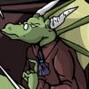
-
Sorcery101
- Regular Poster
- Posts: 160
- Joined: Sat May 14, 2005 2:45 pm
- Contact:
Placeholder
Okay, sorry it took so long. I wasn't actually sure which one of your comics I wanted to reveiw so I actualy read through all of them to see which one I could say the most about. Superfreaks only had 5 pages so that was quickly out and Tales of the Traveling Gnome (but just one comment on the ToTG is that it kinda bothered me there were so many panels that had the speach bubble take up more room than the art) and Tales of Pylea both gave me this feeling that it was just the tip of the iceburg for something much much grander so any reveiw of those would do the full story justice. So here is one of the Knights of Vesteria.
Website: The website is simple and is very functional. The wooden sign look of the navagation was a nice touch to give it a tiny bit more spiffiness than the average website. Then bar on the left side of the page though feels a bit like everything was kinda through up there all willy nilly. Maybe you could rearrange it to let the reader know which of those random things up there are the most importent by how big they are and what order they are in. At the moment it feels like whats most importent is the cornstalker newbox and then the comics Net writes. Where are the other comic Tdot makes seems like it's the least importent thing on there. Comes off as being in the lazy grind is even more importent then the Elfvenbath link. So with that left side I'd just decide what you what the hyrarchy to being concerning those links and plan it accrodingly.
Writing: (since this is really a reveiw for Net I'm gonna focus on this). To be honest the begining almost made me want to leave the comic. I was getting told a lot of things rather than being shown them. And in a comic I'd saw that's a no no. It doesn't really grab my attention and I think this little history lesson could very easily be condenced. So much so that I could bit up reading from page 6 and be absolutely fine. The transistion on page 6 to from introduction to actual story and characters was very smoothly done. Once the focus went to the characters and away from this huge epic feel I got into the story more. The fight was very nicely paced and the diolog for the main characters gave me a good feel for who it was the story was dealing with. There were a few lines by those through away bad guys in the bar like "we have better ideas in mind for her" which seemed kinda lame and cliche, but that's the nature of random badguy people. The main characters all have failry easy to recongize speech patterns. The big tough guy Panda's kinda annoyed (but that's more a personal thing), but his speech pattern definately makes him stand out a bit more. Some times your captions gave this redundant feeling to the scene. They came off as captions for the sake of putting on a caption. Especially, during the scene where the monk from the temple of war was goign through the woods. If it's dark out and the aera has been established as a rough place, we know goign out alone at night in the middle of the woods is gonna be dangerous. We don't need to be told that in the caption. It felt like getting beaten over the head with the fact that he was going to be attacked. Now the caption about the port town after that scene works well because it's telling us information that isn't obivous. Though it seems to run on a bit too long like the intro. Just keep in mind that in a comic it's better to show it than to say it.
Art: Right off the bat, some of the hatching Tdot does seems slopy. The line don't usually reach the contour line of the object they are shading and just changing that one thing could strengthen his art more. There are a few anatomy problems tha could be fixed with practice and time. Tdot does a goof job with the spot on blacks during the night time scenes and I wish he used them a bit more with the day scenes. Like when they are walkign around in the port, it would be nice if he decided which side is east and then put in some long spot black shadows to to show that it's dawn. A basic light weight thing he can keep in mind for the future is giving things closer to the veiw a thicker line weight will make them pop out more and give the comic more depth.
Last edited by Sorcery101 on Wed Feb 07, 2007 3:51 pm, edited 1 time in total.
Could be worse; could be raining.
http://sorcery101.net
http://sorcery101.net
-
CaptainClaude
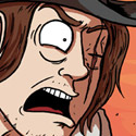
- Witty British President
- Posts: 5647
- Joined: Wed Mar 02, 2005 6:50 am
- Location: SITTING ON A BOMB IN A GREENHOUSE.
- Contact:
-
Americangothic

- Regular Poster
- Posts: 658
- Joined: Sat Oct 21, 2006 10:31 pm
- Location: Nashvegas
- Contact:
Reckless Youth Critique.
Well Claude, I see lots of good things going for it. The first time I ever went to your sites, I liked the colors, the over all style, the obvious art talent. The big question was...why did I never go back?
The first time I went, I looked at your archive drop down and saw that there were a ton of chapters, so I never even touched the oldest archives and jumped straight to “Night of the Living Goth” because it sounded funny. I enjoyed it a lot, so when I was done, I started sashaying here and there and then decided to quit. Because “Night of the Living Goth” had 50 pages or so, I guessed that your archive was HUGE and decided not to read it. I read what was up of the latest chapter then forgot about the whole thing because I became entranced with Hellroy.
This time, I started from the very beginning with the intent of finishing it to the very end. So here we go.
Art: You have talent. No argument about that. There is consistency in character faces, figures and design. Over time you have improved in drawing up your scenes and use of space, distance and backgrounds. You do multiple figures in a panel well, which is where many comic artist suffer. They can draw standard front-on or ¾ figures well (probably from years of drawing up their D&D characters), but can't get figures to relate to each other in a group scene. You are also inventive in your character designs. They are fresh and unique. If they are influenced by another artist's artwork, I cannot tell it.
Artistic flaws: The black pages with colored ink you use for chapter pages need to go or be improved. Not until the Chapter 8 one can I see it clearly because you have used a lighter value. The average reader shouldn't have to study an image for several moments to figure out what it is. On my new 19” LCD monitor, the images aren't so bad. On my school's 15” old monitors, all I see are big black boxes with vague colored lines. On my one year old laptop...it's hard to see as well.
You're never going to know what kind of equipment your viewer is going to have, so prepare for all of it. It's probably a real disappointment to a dial-up user to wait for a page to load and then all they get is a big black square because they have a crappy monitor. Other than that..the art is good and needs little discussion from me.
Web design: No obvious flaws. My only suggestion is lightening up the text-buttons for “giftart”, “archives”, “links”, “profiles” and “extras”. On my laptop and LCD, they look great. On an older monitor there is not enough of a value contrast with the background and so they fade from view.
Writing: Here is where I have to ask some tough questions.
What is your intent with this comic?
What is the format of your comic?
What is the genre of your comic?
What are you trying to tell me as your reader?
For the first 100 pages or so I couldn't tell if it was supposed to be a gag-a-day or a story driven comic. There would be two or three pages of story, then a gag, then another story page, then a gag, then something that swooped down from no where and confused me, then some more story... you get the idea. I kept thinking back to “Night of the Living Goth” which was a complete and fully developed story arc and then I wondered where you were trying to lead me. Were you really leading me to that chapter? Were all previous chapters leading me up to that climax and conflict? Or were you just toying with me?
A good story has certain characteristics: it starts of with a “Hook”-- the thing that peaks the reader's interest immediately with a BLAM. It has foreshadowing, making the reader know that something great and fantastic is coming up ahead...something much more powerful and gripping than “the Hook”. It will have a peppering of backstory/back fill to give the character depth. It will have scene description (which in comics we get to cheat on by drawing them instead of describing them). We have character development through dialog (which is 70% of what your first 9 chapters do..we learn about Claude by him talking to others). In many stories there is internal dialog (which Claude has none. He can barely rub two sticks together). Then there is “problem escalation” leading to “major conflict” then “conflict resolution” where all the ends are tied up neatly into one big package.
If you were to graph out a story, it should look like a slowly rising line. It starts at the beginning on the baseline and steadily creeps up to the major conflict where all the action is. Unfortunately, Reckless Youth's story doesn't creep up steadily. We don't start getting to the meat of Claude's story until chapter 10 and 12 where Lucifer and God are introduced. Up until chapter 10, I feel like I am being led around in circles. Chapters 10 and 12 are almost the “Hook”- I suddenly got really interested in the main character Claude. This “Hook” should be in chapter one or two...readers need that BLAM.
Once I am hooked, chapter 13 starts off great with #158...I'm thinking “Great! Another chapter all about Claude!”..then I'm disappointed when it turns into gag strips, then I get excited again when it looks like story line-- good foreshadowing of a future bad guy, but then it goes back to gags. Chapter 14 is interesting, but once again I keep asking myself...where is Claude's destiny in this? How does this really relate to the main character? Is this Hellroy baby going to show up later as an adversary? Then..I'm left hanging. Chapter 15 is a great story arc which explains much and ties up some lose ends in my mind, then chapter 16 starts the story arcing process all over again...hook, backstory, conflict, etc. and tells me more about Claude as a person.
The point is, your archives are leading me the reader in a million different directions. I'm getting lost, I'm getting my hopes up, I'm getting frustrated and then I'm leaving. You've lost me as a reader.
I suggest backwards engineering your future story lines. Come up with a fully developed story of one large plot or multiple story arcs then figure out how much of that story you want to tell in what amount of time. Cut it into months, then cut it again into weeks so you know exactly what is going to happen when. Stay concise and clear. Organize, organize, organize.
I also suggest going through all your 2004 and 2005 archives and weeding it out. Look at the story lines and not the art. Take out the odd pages that do not support your story lines or that lead the reader away from your main purpose...once again..you have to ask yourself “What is my main purpose? What is the intent with this comic?”
last paragraph was edited out...my mistake.
Last edited by Americangothic on Thu Feb 08, 2007 6:05 pm, edited 2 times in total.

Review for American Gothic Daily
Here we go! Another neat comic to add to my bookmarks, thanks to this thread.
Art
Very pleasing. Very strong sense of proportion and scale of the human form (unusual for a lot of webcomics), and I love the style of coloring and shading. There are some real lush, standout panels here, like when Luke first picks up Millia for their date.
The lettering style doesn't stand up to the art, unfortunately, and actively detracts from it in spots. Eschewing traditional outlines for word balloons in favor of white space can make it difficult in spots to see where dialogue is coming from, and causes the bubbles to blend in with the white space around characters. (Not the best example, but the quickest I can find -- check out the "Marcus??" in today's update. It's clear from context there that it's coming from Millia, but the bubble blends with the whitespace around two characters and the tail is hard to spot.)
The actual lettering font has varied a few times, and has definitely changed for the better. Comparing today's update to, say, http://americangothic.comicgenesis.com/d/20070126.html shows a strong improvement, but I'm not sure if it's a change in fonts or a change in the way you've scaled the image. The current cast page is a strong candidate for a relettering: it's a great concept (and I may have to steal that group picture idea), but the dialogue is cut off in spots and difficult to read.
(Yeah, I'm harping on the lettering. That's because the art is really, really good, and deserves lettering to complement it!)
Story
It may be too early to really judge the story, as it feels like we're still in introduction mode -- I notice that there are some characters on the cast page, like the other witches, who haven't shown up yet. As it stands, though, it's definitely keeping me interested, and Millia is a sympathetic character.
(Sympathetic to the point that Luke's behavior towards her is seriously, seriously creepy, such as that nocturnal visit. If this is going to evolve into a romance between the two of them, you'll have your work cut out making Luke into a likeable protagonist.)
One thing that jumped out at me, early on, is that Millia seems a little too naive for someone with her background and abilities. She's been raised as a witch, has powers of Sight -- and her first reaction when her grandmother brings up the existance of supernatural creatures is to question Anna's senility? It just seems that she'd be a little more open to the possibility or at least less surprised by it, given her own nature.
On a purely technical level, you might want to keep an eye on proofreading. There's a scattering of word usage errors, such as "principle" for "principal," "you're" for "your," and such -- things that a spellchecker won't pick up, alas. These errors are few and far between, but worth cleaning up.
Oh, and I love the bits with Millia's dobermans.
Website
Simple and functional. It has just what it needs, and nothing more; frankly, I much prefer that to sites that pour on complexity and noise. I'm not sure about the art in the background of the directional buttons, as it looks a little cluttered to me, but I think that's just a matter of personal style.
How does having both a chatbox on the front page and a forum work out for you, by the way? Does one detract from traffic in the other?
Overall -- good comic, well worth reading, and I'll be checking it out in future.
Last edited by CSchaefer on Thu Feb 08, 2007 8:50 am, edited 1 time in total.

-
LibertyCabbage
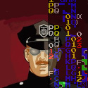
- Cartoon Hero
- Posts: 4667
- Joined: Tue Jan 25, 2005 4:08 pm
- Location: bat country
- Contact:
Review of Sharper
Writing:
Sharper is a story about a fictional River Stone City where ruthless mobsters and lawlessness rule the streets. Conceptually, it's a pretty standard gangster story set-up, although the author delivers it with particular skill and refinement. The story centers around Pendegast Scrimm, an "average" and "expendable" mobster with big ambitions who's mixed up in the city's affairs. Right away from the beginning when Scrimm is shown weilding a serpent-headed cane (a symbol of the Devil) he's presented as a repulsive character, and throughout the story he sometimes acknowledges his role as "the bad guy" which he seems fairly comfortable with. Still, he has a loveable loser persona about him and goes about his affairs in a fun and often humorous way, especially in tandem with his friend and bodyguard Simon. I found Simon to be a very likeable and funny character, as his cool and cautious demeanor pits him as the straight man against Scrimm's recklessness, but Simon also has a psychotic sadism and a mysterious past that makes him interesting and also quite dangerous. A lot of the humor in the comic involves Scrimm discouraging Simon from committing some unnecessary act of violence. It's also amusing in that, while Scrimm is presented as this sort of devilish villain, he often acts as Simon's moral superior. All in all, I think they make a great pair and compliment each other's attributes, and the author's skill is demonstrated here with his ability to deal with two well-rounded characters interacting frequently (in contrast, the norm tends to be an eccentric character paired with a flat character.) In regards to the title of the comic, I interpret it to be a reflection of how the protagonist Scrimm sees River Stone City as being dull, worn-down, soft, and that he's going to prevail because he's harder, rougher, and sharper.
The atmosphere of the city adds a lot of tension to the story, as there's always this pretense that the smallest screw-up can lead to death and it's always ambiguous who's a friend or foe. The author does this particularly well with the mob boss Finch, whose "invitations" are quite ominous, especially with his sadomasochistic Australian henchman The Mod being the deadliest guy around. In addition, Scrimm is regarded as such an unimportant guy that it'd be a minor act for someone to get rid of him, and he'd almost certainly be dead if his bodyguard Simon wasn't so good at his job. But, there's never really much feeling of ease, and almost all confrontations in the story could easily become violent, so the author does a good job of constantly keeping the story tense even when there's not anything particularly noteworthy going on.
The supporting characters are well-developed and effectively written. Scrimm's girlfriend, Emily, is a prostitute, and it's sardonically fitting that a whore is the only one that could be attracted to a character as lowly and villainous as Scrimm, and visa versa, and they do seem to relate to and understand each other pretty well. She's even more ruthless than he is at times, as shown when she's ready to do torture that Scrimm is timid about. "Ruby Tuesday" and Agatha round out Scrimm's colorful network of helpers (Ruby's nerdy lack of social skills is portrayed amusingly) and the corrupt and incompetent policemen duo add some flair as well.
Sharper can also be quite funny at times. It isn't a comedic comic, but the jokes and playful attitude help keep the story fun and amusing and prevent it from getting too serious or pretentious.
The main theme of the stories in the comic so far tend to be of a big and powerful foreign organization getting involved in River Stone City's affairs, and Scrimm being called upon to remedy the situation. He stumbles a lot along the way, and his plans don't turn out quite like he hoped, but in the end he's successful and gains something from the affair. Scrimm's amusing in this way, as even though bad things happen to him often, I get a sense that the internal logic of the comic dictates that he always succeeds in the end, so the comic never really gets too serious. It's sort of like if Batman's tied up and dangling over a pit of acid -- you know that, due to the internal logic of Batman's world, Batman will somehow escape and save the day, because, well, he's Batman, and that's what Batman does. So, it's more of a game of wondering how Scrimm will get out of the mess than wondering if he'll get killed or not. I expect that the author has some surprises in store for the future, however.
A consistent motif in Sharper is a lack of emotion and attachment in the characters. Nobody in the comic ever expresses any significant amount of emotion and they all try hard not to care about anyone besides themselves, as in Stone River City emotion equals weakness. There's a moment of guilt and regret in Scrimm's dream sequence, but it doesn't manifest in reality. It's sort of a hypocritical system at work in the comic, as everyone seems aware of how awful the city is and how evil they are, but everyone seems too concerned about gaining power to do anything and ends up only making things worse. It's a primitive system of natural selection -- the strong survive and get on top, and the weak get killed or taken advantage of. Of course, anyone could always leave the city, but everyone's pretty confident that they have what it takes to be #1 and I think also that the characters prefer this ruthless, violent, and lawless society to a "normal" existance. Anyways, this emotional deficiency is pretty notable and startling, and there's never anger, or sadness, or fear, and even when such things seem appropriate the characters are careful not to show or express it. Even the antagonists don't show emotion; for example, Halim Said is just dutifully carrying out his promise of vengeance but he's never openly angry or bitter. Throughout the entire comic, no one ever displays any emotion besides sort of a confident grin, and in place of emotion is only masochism and sadism. While homogenous, I think this attitude is handled well and gives the comic personality and uniqueness. However, the big problem with it is that it's a huge detriment to the comic visually, which is where I'll get to the irredeemably bad part of the comic, the art.
Artwork:
Sharper is a superb example of strong pacing, characterization, and story construction, but due to problems with the artwork it can never be a good comic. First of all, the characters are much like computer-generated Barbie dolls: stiff, blank stare, emotionless, empty. There's barely any deviation in any of the characters from this sort of generic default configuration, and, as such, everyone in the comic always has a calm, confident, empty grin. The faces are usually quite accurate because the characters don't express emotions anyways, but times like the last panel here are well off. In this particular instance, Scrimm communicates through his dialogue that he is quite shocked and repulsed, but this is not shown whatsoever on his face in the previous page.
The main problem with the generic faces, though, is that a comic needs to use both the writing and art in its storytelling to be effective, and Sharper highly disregards its art. In most pages, there just isn't any visual information outside of dialogue source and basic plot progression. I noted some particular examples here,here, here, and here. This is sometimes referred to as "talking heads", where the comic's artwork does nothing besides showing a head to point a speech bubble at, and this is a common problem in "writing-based" comics such as this one. However, the writing in Sharper is far above the norm, so it's pretty disappointing that the comic is so plagued by this aspect. I suspect that, for the majority of the pages, you could remove all the artwork and just write the characters' names in their places and the page would work the same. However, this leads to my next complaint: empty backgrounds.
The backgrounds and settings are blatantly devoid and unrealistic, regardless of location. Whether it's indoors, outdoors, on the streets, or in a restaurant, there are never any miscellaneous people around and there are never enough objects or detail to make the scene look believable. In the earlier pages, the textures are quite simple and unrealistic, and while they get somewhat better as the comic progresses, the comic relies more and more on empty black backgrounds. Sometimes the darkness is used to good effect, or in the Said death sequence, but in most cases I feel like it's more just laziness than anything. For the death pages, the blackness conveys an exaggerated sense of isolation and a surrealistic experience -- most black panels strewn throughout the comic have no such context. It's essential to realize that, since the Barbie doll characters are so stiff and unexpressive that the backgrounds and environment design are much more important than in a regular comic where the characters are more vivid and dynamic. A big problem I noticed is the lack of people, objects, or even dirtiness in social environments. Look at these examples. I noticed that whenever a character is in the streets or is driving, there are never other people or cars out there, and there's no context for this emptiness. The most plausible explanation is that it'd take too much effort to create background people and cars so they're left out. This not only hurts the immersion of the story (restricting it due to artist's limitations) but also betrays the atmosphere of the environment. This is supposed to be a dirty, run-down, lawless mob city, yet there's no litter or dirtiness. Again, I don't think this is in context with the plot, but rather that the author decided it isn't worth the effort to add these background elements, and to that I disagree. While the author has created interesting characters and tense plotlines and pacing, the emptiness pervading the comic takes away from it and makes the characters seem less like people that are part of a fictional world and more like just computer-generated pictures with speech bubbles pointing to them. It's simply an issue of believability, that these characters exist somewhere, and that even if they don't really exist their feelings and goals do, as these things can manifest in abstract. Consider the restaurant scenes. Not only is there not any food, drinks, cutlery, etc, anything to make it seem like a restaurant, but there are no waiters or other patrons or anything. Do these things matter to the plot or have valuable interactions with the characters? No, but it helps foster a setting, an environment, a world for the characters to live in. It's the same with any visual medium. If there's a restaurant scene in a film, the director didn't hire actors and actresses and dress them up nice and arrange all the nice scenery because it's cheap or easy to do so, and even in a traditional comic it isn't easy to draw. But, like I mentioned above, what else is there to look at? The characters are emotionless and are identical to the other 200 times they've appeared in the comic, so if the visual interest isn't in the characters then you have to place it on the environment and the arrangement and composition of characters and clothing.
Another major concern in the comic is the concept of Show vs Tell. Sharper has a very bad habit of explaining what the characters are doing or looking at instead of showing it. This is another failure to use the visual nature of the medium and present the artwork as a contributing presence to the story. Notable examples:
1, saying what the bodies look like instead of showing it
2, Emily mentions she was at a "popular shopping district", yet it was completely empty when she was there
3, a dramatic scene is described, none of it is shown. Girl dying in his arms would've been a great visual.
4, describing Said's emotions instead of showing his face
5, Scrimm says the place is a dump but all we see is its lousy lettering. It's something, but inadequate.
6, Scrimm saying he's been thrown out and "SLAM" isn't visually adequate. It's an action! It's interesting! It should be shown!
Not only are the characters stiff and unemotional, but the technology of the artwork looks quite dated. I realize that the author is only an amateur, but it reminds me of the computer graphics from the early-to-mid 90's so it's a bit lacking in the visual flair. While I'm not expecting anything on the level of the Dreamland Chronicles, something more basic, like Corridor Z, can have an aesthetic appeal to it with some effort. One problem with the art in Sharper is that the way the clothes look on the bodies consistently seems off. This problem is shown well here and here, as it seems most noticable regarding breasts and genitals. Someone with more knowledge in computer art could probably elaborate on the specifics. The action sequences are also rather stiff, clumsy, and generally not that appealing, like here, for example. Also, there's some noticable copy-pasting going on in the bookshelf here, here, and here, although I'd be a lot more forgiving about this if there was more visual information in the comic. Since the characters always look the same, the background becomes more visually interesting. I also felt that other digital techniques in the comic, such as aging, are done poorly.
Overall:
The author is clearly competent in writing thoughtful and amusing dialogue and coming up with interesting and well-paced plots, but he has a lot to learn about writing for the comic medium and how to use visual information. I feel like he isn't putting as much time or effort into the comic as is required to make it appealing, and it's quite disappointing since I feel Sharper could've been an excellent comic had the artwork been done and used better. I wouldn't have been so harsh about the artwork if the writing wasn't so much better by comparison, and I believe that the author is a talented individual who could really make something noteworthy if he applies himself more. Some comics can get by with bad artwork, and Sharper isn't one of them. So, the author should either get some training in digital arts, or cut back on updates, or get someone else to draw the comic, but he shouldn't let his abilities go to waste by working on a project without giving it his full effort.
Last edited by LibertyCabbage on Sun Feb 18, 2007 7:00 pm, edited 1 time in total.


"Seems like the only comics that would be good to this person are super action crazy lines, mega poses!"
-
Yeahduff

- Resident Stoic (Moderator)
- Posts: 9158
- Joined: Tue Aug 05, 2003 4:16 pm
- Location: I jumped into your grave and died.
- Contact:
Orange Revolution.
Recently, syndicated columnist Cal Thomas lamented that we're living in the age of the anti-hero. Of course, Cal Thomas is a backwards-ass caveman who chisels his columns out on slate in a primitive monosyllabic dialect that is deciphered by the syndicate's editors who add such modern touches as articles and linking verbs, but he does have a point. An attitude of mistrust and hostility towards most forms of authority is prevalent these days, especially among the youth.
Surely this is nothing new in itself, but in light of an increasing number of public figures who we're supposed to be looking up to falling from their lofty perches, including cheating sports stars, unhinged movie stars, and dishonest and secretive government officials, the attitude of mistrust has evolved into a collective paranoia, and one of the ways it's manifesting itself is in the increasing popularity of confused moral and political works such as Johnny the Homicidal Maniac and V for Vendetta that make violent statements about how many young people see the world.
Orange Revolution is a product of this paranoia. The comic's set in a city covered in darkness where it always seems to be night, and concrete grey is brightest value you'll likely find. The buildings are imposing and featureless, the people look exactly the same. The press is a joke and the government doesn't bother hiding it's complete disregard for the rights and the lives of its citizens.
Fitting, then, that the two main characters are mass murderers. One happens to be employed by the government. He's Limeboy, and he brings the detached, seen-it-all, yeahyeahyeah attitude to his profession you'd expect from a mercenary. "If I killed you now, they'd hardly pay me anything at all," he tells a vanquished foe. "I need you to become more of a problem first."
He joylessly satisfies the whim of his boss, a sixgun-toting "ivy league cowboy" who treats agents like action figures and assigns missions based on what seemed pretty cool on last weeks X-Files reruns. He controls the striking hand of the government with the enthusiasm of a child at the arcade, punctuating his biddings by firing his guns into the air. It's likely no coincidence that he resembles George W. Bush.
The latest of these biddings ends in Limeboy meeting our other anti-hero, Orangenius. He's more mysterious than his citrusy counterpart. We don't know what his deal is, or how weapons appear in his hands seemingly from out of nowhere. Limeboy doesn't give him much time to explain, and it's not like Orange has any desire to share anyway. They begin fighting almost immediately, Orangenius enraged at even the sight of a government agent.
It's early in its development, so it's hard to tell where it'll go. But there's a lack of specificity and detail in this world, and in the characters. Heavy black lines are scratched across the page, supplying the darkness in this world, and they succeed in evoking a dirty, threatening environment, but it also makes it difficult to see anything more than five feet in front of the camera. Oftentimes it's near impossible to distinguish between a government office, a bare apartment, and a city street, so little detail is given.
The characters are blank slates thus far too. The only things distinguishing Lime and Orange right now are Lime's shades and trenchcoat and Orange's pottymouth. There's no reason to care about either one of them, and indeed we may wonder if we'd all be better off if they ended up killing each other. Other than them, all the faces we've seen have been the identical bug-eyed profiles of The General Public, who only ever show up if victims are needed. If there are women in this world, they're either so androgynous you wonder if gender even exists or they all wisely lock themselves indoors at all times.
Orange Revolution has a strong sense of style, but it's in need of refinement. There are hundreds of Dystopian stories out there, and what distinguishes the good ones from the unmemorable are the details. At this early stage there's nothing setting Orange Revolution apart, just a few more anti-heroes in an age full of them.
Last edited by Yeahduff on Mon Feb 26, 2007 9:32 pm, edited 1 time in total.

I won't be the stars in your dark night.
-
The Neko
- A Blithe ray of Schadenfreude
- Posts: 3878
- Joined: Tue Mar 18, 2003 6:16 pm
- Location: New York City
8:1
Because I'm such a cliché, predictable asshole, I'm going to start with the website. It's pretty bleak, but I guess one could say that it's befitting the style of the comic we're dealing with. However, there's a big difference between bleak, bereft of detail, and under-designed. A snazzy website, however, would actually be a detriment, so there's a delicate balance to be heeded. "The End of Things" is a good example of a simple site that has a design focus that doesn't draw attention from the main attraction: the comic. (The site features a basic, clean cut layout, where the links to extra pages are at the top, centered, under a logo, followed by a comic and some news; bare bones, but not enough to look lazy.) I think 8:1 could stand to benefit from a bit of an update in the characters section as well. The character designs have changed for the better, and it'd probably be good to showcase that. The copyright at the bottom of the page is also woefully outdated, and should probably be updated.
Let's move on to the art. In the beginning, the comic seemed to have a much more stylized, cartoonish, graphic quality to it. Charles' head was almost exactly the shape of a waning crescent moon, and Mary resembled Jane Lane from Daria. Over time, the characters were given a more human look without completely tipping the scales towards realism. The combination of human form with a more graphic quality is not uncommon to many of the indie comics that appear to be set in America's heartland. They feature bleak, empty scenery with crisp, cartoony, yet oddly human characters without using hyperbolic "character acting" found in action or humor comics. The author of 8:1 appears to be trying for a "Ghost World" kind of style, but ends up creating something that looks a bit more muddy, scribbled, and resembling one of Charles' charcoal pieces. I think the purpose of making the world more graphic and less detailed is to draw attention to the characters and the emotions, separating them from the world and making them distinct to the audience, a process that resembles pathology (removing the part from the whole and then studying it under a microscope). In 8:1, the distinction isn't as strong, with exception to the times where the author hasn't finished or put in a background, which is more common in later updates.
I think the figures themselves could benefit from more confident line, and tightening up the anatomy, particularly in the faces. Characters like Jason and Mr. Chabon have a bit of the melted-face syndrome, which makes it difficult to really see them as strong characters. Of particular offense to me is the eyes. I'm really not a fan of how the eyes are drawn in this comic. I think perhaps some more research in how people draw them could help. Although I think the eye shape might be a symptom of the facial issues as a whole. The body anatomy, however, is quite strong, which really helps in the scenes where non-standard perspective is used to liven up scenes and to create new moods. The strongest aspect of 8:1's art is the economy and framing of each shot, which prevents the comic from appearing static, and gives it a more cinematic quality. If the muddiness and uneasiness could be toned down a little, and the anatomy (particularly the faces) tightened and structured, there would be great improvement. I think looking at comics like "Ghost World" would serve as a good guide.
Alright, let's get into the best part of 8:1, the writing. Even if the art turns you off, it is worth reading just for the quality of the story and the characters. Duffy has the incredible ability of creating dialogue that is highly realistic and authentic without going too far into the stumbling, broken way in which most people speak. (This is mostly a narrative convention found in TV and Film as to not frustrate the audience and to punctuate the meaning, using dialogue that's "crisp". Unfortunately, it can become overblown to the point of lyricism in some cases.) The characters have a bit of inscrutability about them that keeps you interested; they're not open books and don't easily fit into simple, one-word descriptions. Despite the bohemian, disenfranchised youth focus of the narrative (or at least of the protagonists), careful attention is paid to stereotypically "shallow" characters as to give them enough depth to become believable and not just strawmen targets for the author to pummel. Jason, Melanie, and the artist couple (I can't remember their names at the moment) have thoughts and desires beyond their stereotypes. In fact, one of the most interesting sections was the discussion about the nature of art between Charles and the avant-garde artists.
The inner-world musings of Mary are also noteworthy. I find that many webcomics provide only cursory glances of character's inner thoughts and psychology, using trite word balloons to express reactionary thoughts to current situations, or just wandering around thinking about something else. But with characters like Mary, their environment becomes a self-study of where they've come from, where they are, and where they are going. As she goes back to her old "haunts", Mary becomes keenly aware of who she used to be, and looks back not with romantic idealism, but with a sense of greater understanding. It's a more interesting running commentary, and far less literal than musing about the goings-on of the main narrative arc, which is what many comics will do instead. They'll walk through the streets and sit in the bar and ruminate on the drama that had happened just before, as if the background has almost no influence on their mindset. 8:1 departs from this trope and becomes much greater because of it.
In the end, the comic itself seems to suffer from the same malaise and issues of the character Charles. The art is unstable and messy like his art, and the site resembles the inaction of his life and the depressing state of his living quarters. While this resemblance is interesting on one level, it repels and might explain the sorry state of his existence, alienated from others and longing for something he claims he's jaded toward.
Last edited by The Neko on Tue Feb 27, 2007 3:50 pm, edited 1 time in total.
jag saknar självförtroende
-
Komiyan
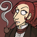
- HOLD ON TO YOUR INTERNETS!!
- Posts: 2725
- Joined: Sun May 16, 2004 11:35 am
- Location: Hrmph.
- Contact:
Yokai, here we go.
Art-
The progression of the art is certainly very promising. Characters started out with a few anatomical flaws, but that's been corrected for the more recent strips, so cool. There's more detail in faces, and well, in general now, but I am glad you toned down the facial lines, as they did make everyone look rather old. The thinner lines you're using look much better than the older, thicker lines, and faces have developed more structure. On that note, it'd be good to see you do more with the lines themselves. They don't really do much as it is. I think someone's beaten me to this, but varying the line width would really add some depth.
Nice to see you playing with expressions a little more, too, but like someone said you can sorta sweep them into 'sarcasm' and 'extreme' categories, so it's getting there, but not quite there yet. The final panel here was excellent, but on the most recent one, there's something lacking in the panic on the doctor's face in panel three. Ditto with the Superman comic.
I love when you experiment with different styles- copying the Spongebob style, the New Yorker, etc. That comes off very well, and the art will compliment the joke perfectly. This one in particular really worked.
Someone commented on the colour being flat- to be fair, I don't think shading would add an awful lot to the usual style. In fact, I ended up doing a quick cell-shading job on one panel-
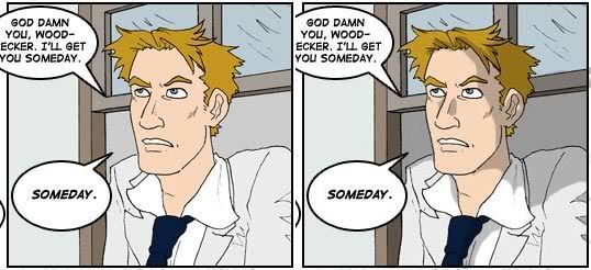
and to be honest, I don't think it added much, but that choice is really up to you. Perhaps some heavier inking or shading by someone who isn't me would help, but I really don't think so. The less overcomplicated the art, the more the joke shines through. Senshi commented that the colours don't 'jump out', and I'm glad of that fact, as it wouldn't suit the strip at all.
Writing-
Gotta admit, this sort of humour does appeal to me. Seems to be a hard style to write for, as it's very easy to tip over from 'ooh, that's harsh but true' to outright insulting. You target the bulk of the internet's 'cliques'- furries, vampyres, d&d players etc, and a lot of these people won't be able to laugh at themselves. So, not that this is anything new to you, but don't be surprised if your writing gets a negative reaction from people who prefer bunnies and cuddles to this. Some just won't get on with the 'shock' comedy you're presenting, and while this isn't exactly your fault, it's something you need to bear in mind when hearing feedback.
As I said, though, the writing really does get me. I've mentioned the Bananas in Pyjamas comic before, and oh god the Flintstones one. The jokes are well-thought out and hit the right spot. The only point where it could fall down as a cohesive comic rather than a one-shot gag strip is the characters. I find it pretty hard to tell who's who as I trawl through the archives, which doesn't take away from the humour, but it can be seen as a problem. The only person I could really pick out of a lineup is Alex, as he's used so much. I think the problem there is that every character, Billy and some nameless extras aside, has the same character trait of 'sarcastic, dry and witty'. It sorta blurs the lines. The faces sorta add to this- it's only really the hair that'll distinguish one character from another. Since i do the same, really, I couldn't tell you how to fix it exactly. Try varying noses and eyes, etc.
What else... all gag comics will have the same problem, in that they can be hit or miss, depending on the personal opinion of the reader. That's not really something you can alter, though.. To be honest, I wouldn't bother with fart jokes, you can do better than that. I can see the gross out nature of some of the strips (Winnie the Pooh in particular, and the Flinstones) offending some people to the point where they consider it puerile. Again, this is a matter of taste, but be prepared for a lot of people to think that.
I like that you're trying out slightly longer jokes, or mini plotlines, really, it's opening you up to a lot of new ideas. it's not been explored fully yet, so it's hard to comment, but it ought to be a good thing.
All in all- I really do enjoy it. The main problem you're going to run across is people saying they don't get it, or it's not their thing, and that's something that you'll just sorta have to deal with. The art has developed a lot, so keep that up, just a push on the expressions and some work on the lines would be nice.
Sorry this didn't have more points to improve on, but honestly, nothing really jumped out at me. Mostly I'd just like you to take the plunge and start updating again.
Art-
The progression of the art is certainly very promising. Characters started out with a few anatomical flaws, but that's been corrected for the more recent strips, so cool. There's more detail in faces, and well, in general now, but I am glad you toned down the facial lines, as they did make everyone look rather old. The thinner lines you're using look much better than the older, thicker lines, and faces have developed more structure. On that note, it'd be good to see you do more with the lines themselves. They don't really do much as it is. I think someone's beaten me to this, but varying the line width would really add some depth.
Nice to see you playing with expressions a little more, too, but like someone said you can sorta sweep them into 'sarcasm' and 'extreme' categories, so it's getting there, but not quite there yet. The final panel here was excellent, but on the most recent one, there's something lacking in the panic on the doctor's face in panel three. Ditto with the Superman comic.
I love when you experiment with different styles- copying the Spongebob style, the New Yorker, etc. That comes off very well, and the art will compliment the joke perfectly. This one in particular really worked.
Someone commented on the colour being flat- to be fair, I don't think shading would add an awful lot to the usual style. In fact, I ended up doing a quick cell-shading job on one panel-
and to be honest, I don't think it added much, but that choice is really up to you. Perhaps some heavier inking or shading by someone who isn't me would help, but I really don't think so. The less overcomplicated the art, the more the joke shines through. Senshi commented that the colours don't 'jump out', and I'm glad of that fact, as it wouldn't suit the strip at all.
Writing-
Gotta admit, this sort of humour does appeal to me. Seems to be a hard style to write for, as it's very easy to tip over from 'ooh, that's harsh but true' to outright insulting. You target the bulk of the internet's 'cliques'- furries, vampyres, d&d players etc, and a lot of these people won't be able to laugh at themselves. So, not that this is anything new to you, but don't be surprised if your writing gets a negative reaction from people who prefer bunnies and cuddles to this. Some just won't get on with the 'shock' comedy you're presenting, and while this isn't exactly your fault, it's something you need to bear in mind when hearing feedback.
As I said, though, the writing really does get me. I've mentioned the Bananas in Pyjamas comic before, and oh god the Flintstones one. The jokes are well-thought out and hit the right spot. The only point where it could fall down as a cohesive comic rather than a one-shot gag strip is the characters. I find it pretty hard to tell who's who as I trawl through the archives, which doesn't take away from the humour, but it can be seen as a problem. The only person I could really pick out of a lineup is Alex, as he's used so much. I think the problem there is that every character, Billy and some nameless extras aside, has the same character trait of 'sarcastic, dry and witty'. It sorta blurs the lines. The faces sorta add to this- it's only really the hair that'll distinguish one character from another. Since i do the same, really, I couldn't tell you how to fix it exactly. Try varying noses and eyes, etc.
What else... all gag comics will have the same problem, in that they can be hit or miss, depending on the personal opinion of the reader. That's not really something you can alter, though.. To be honest, I wouldn't bother with fart jokes, you can do better than that. I can see the gross out nature of some of the strips (Winnie the Pooh in particular, and the Flinstones) offending some people to the point where they consider it puerile. Again, this is a matter of taste, but be prepared for a lot of people to think that.
I like that you're trying out slightly longer jokes, or mini plotlines, really, it's opening you up to a lot of new ideas. it's not been explored fully yet, so it's hard to comment, but it ought to be a good thing.
All in all- I really do enjoy it. The main problem you're going to run across is people saying they don't get it, or it's not their thing, and that's something that you'll just sorta have to deal with. The art has developed a lot, so keep that up, just a push on the expressions and some work on the lines would be nice.
Sorry this didn't have more points to improve on, but honestly, nothing really jumped out at me. Mostly I'd just like you to take the plunge and start updating again.


Darken-
Sometimes, we dismiss comics mainly because of how they look, or how they seem to fall into a certain stereotype of a genre. Most of the time, we are correct; as work on webcomics is semi-immune to criticism, and there are no specific penalties for mediocrity. You get a lot of shit out there. But every once in a while, we end up being pleasantly surprised. That's Darken for me.
Art:
On the surface, this might look like the dozens of "manga" comics out on the web. From the anatomy, facial structure (and the occassional "chibi" panels), it looks like a paint-by-numbers Japanese comic. It's competent, but I've seen it done better.
Well, that was my initial impression anyway. After taking a dive into the archives, I started to notice something she's been doing. Something amazing. Something that distinguishes it's art from the others. Panelling.
No page, no panel is wasted, no action ineffecient. Each part of a page flows into the other, perfectly timed in sync with the dialogue and the events in the comics. I'll go as far as saying that she's about (or almost) on the same level as Kazu Kibuishi in this regard. It's almost like looking at a movie storyboard.
The only problems I can pick out are the occassional proportional problems, anatomy-wise. But the competent pencil-work, shading, and facial compositions kept my eyes off these niggles.
And, it's a major step up from Captain Greyhound.
Story:
I hate to repeat myself, but I've been caught off-guard by Darken's storytelling as well. In the first 15 pages or so, you're led to believe that this is textbook DnD cud. I had to roll my eyes at the numerous NWN-ish references, overused character profiles, and cliches that littered the beginning of Darken. I don't mean to offend, but it had the feel of a low-budget Dungeons and Dragons film.
Then yet again, Kate pulls another ace off her sleeve. She injects substance into the characters.
I don't know when it started, or what panel triggered it, but I suddenly developed empathy towards the characters - even ones I didn't expect to have it with. Sure, liking the strapping lads Gort and Casper is not that hard - but when you start to hold your breath for the likes of Michaelus (heck, even Jill), you can't help but wonder how, when, and where the heck Kate snuck up on you, to deliver a rather scrumptious can of narrative candy.
Seriously. How?
Site:
Pretty okay. It took me a while to find the nav buttons - either I'm blind, or stupid, or it needs to be moved somewhere more visible.
Bottom Line:
A satisfying dungeon romp, with enough spice in it to distinguish it from the heap. 4/5.
Last edited by Levi-chan on Fri Feb 16, 2007 6:59 pm, edited 1 time in total.