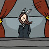
Art: Considering it's a photocomic, it's harder to make a judgment on the artwork. However, I will say that the photos taken tend to come out very well, without any light glares or reflections on some of the more reflective legos. Special effects are minimal, but that's to be expected given the (mostly) cheap nature of the comic. However, it should be noted that going the extra mile to actually add a glow to the lightsabers is pretty nice and adds a nice mystique. However, sometimes it becomes sort of impractical, like in recent comics that feature a character venturing through total darkness with only the lightsaber to illuminate things. Maybe it's my lack of scientific knowledge, but it seems to me that it should be illuminating more than just the character's face (unless the character is in a rather open space, which isn't implied). Another suggestion to help improve the appearance - when doing scenes set in space, perhaps instead of cutting and pasting the legos onto a black background and stars, they could be photographed on top of a black surface and then stars added in later.
Story: Like Futurama, Legostar Galactica likes to have fun with every science-fiction convention it can get its hands on (or from whatever Lego sets tie in to established TV shows/movies). It nicely weaves together a bunch of different scifis without having much problems with the various continuities, instead opting to make jokes about them (a particular favorite is when Shauna's cat Conway is introduced as Ambassador Meowmix and the station crew buys it easily). Sometimes jokes are harder to come across, especially in a few recent strips where it's mostly action-oriented or plot-driven. However, for the most part, it's consistantly funny and it really draws the reader in. The best recurring stuff is, of course, Late Night With Boba Fett.
Site: Functions very well, with the design resembling Star Trek's LCARS user interface. The fanart section could probably use some updating, however, but that's of little consequence considering most of the action is driven on the main comics. On that same token, the "Others" button is pretty much useless, sad to say, since all of those could be included in the "Links" section. The archive is extensive since it goes back three years with updates every weekday, but once the reader starts in, it's impossible to get away from it. I should know - when I first read it, I spent the next day and a half going through all of it. The storyline dropdown is especially nice, with links to every little storyline done, be it a single strip or twenty.
Overall: 9.5/10. It's funny, it's got a nice, reliable site, and it's LEGOS. Why aren't you reading it?
Rebirth of Webcomic Above!
-
Linkara

- Cartoon Hero
- Posts: 2211
- Joined: Mon Apr 17, 2006 2:29 pm
- Location: Lizard-Inclined Neo Clone Republitarian Band-Aid Spokesman
- Contact:
Last edited by Linkara on Sun Feb 04, 2007 6:54 pm, edited 1 time in total.

Quote of the Moment: “Greetings, my friend. We are all interested in the future, for that is where you and I are going to spend the rest of our lives.” ~Criswell~
-
Robin Pierce
- The Establishment (Moderator)
")
- Posts: 1610
- Joined: Thu Jul 28, 2005 11:48 am
- Location: Should we check the internet? :S
- Contact:
Edited: Lightbringer review. WARNING; LONG.
Righto. Let’s start with the art.
You’re trying, that’s obvious. Especially with perspective. And your grasp on that – when it comes to buildings and such, is actually pretty good. But.
Drawings:
Let’s stat with Anatomy 101. I’ll go from head to toe. Here are two images I whipped up quickly – based on some of your more recent work, and Loomis’ sketches of the ideally proportioned man and woman.

Overall, your heads are far too big, and lopsided. Actually, most of your characters are wobbling a bit to the right; I had to straighten out Hanna to make her usable in a comparison. The hairlines are too high, dragging the ears up with them. No matter how you smile, one’s mouth does not gravitate that far away from the centre of the face. The neck’s too short. The shoulders and torso are relatively correct in placement (woo!) but are too thin. These are superheros! They’re meant to be somewhat muscled, not spindly. Men’s upper bodies have a triangular shape (connect the red lines from the shoulder to the waist), not a square shape.
The arms are too short; the hands are different sizes in every panel – often different sizes from EACHOTHER in the same panel. Make sure you keep your arm lengths consistent. Same goes for legs.
On Hanna. Well, Ping made a quick tutorial at some point or another on how to draw breasts. They are NOT a W shape. Follow the red lines compared to your drawing of Hanna. Again, women’s bodies do not go straight down, no matter how flat chested they are. We have this annoying little thing called a rib cage. It’s all sorts of useful for protecting our lungs, and such, and it makes a few changes to the anatomy from the way you’ve drawn it.
The purple circles that are sketched in, are where her elbow and WRIST should be. When you swing limbs out, make sure they’re the same length that they’d usually be. This is a consistent problem.
Next. All your drawings of people are pretty much the same. They’d fail the silhouette test – not only between two females or two males, but between genders as well! You’ve gotten a bit better at that since you started, but still have a ways to go. Also, I couldn’t help but notice that you only ever draw your characters from the front, the back, or in profile. Let’s switch it up with some 3/4th angles once in a while!!
In regard to your backgrounds ---- Square boxes are not buildings, they’re square boxes. Add some variety! Look up different kinds of architecture. Use references (but don’t trace). The best artists still use references for things they’re not good at, and looking at things you don’t know how to draw is one of the only ways you’ll improve.
Inks:
The inked lines are jagged, at best. Try smoothing those out. I don’t know whether you’re inking digitally or with pens – either way it’ll come with practice. If you ARE inking digitally, zoom in before you ink – it’ll smooth the whole thing out quite a bit.
Colours:
Ouch. They’re jarring, and VERY bright – especially in the first few pages, where your city’s downright neon. Your shading needs work as well. Keep in mind that light sources are rarely right in front of you, and your shadows should be consistent (during the scene).
Contrary to popular belief, white clothing DOES show shadows! Whether these shadows are in a darker cream, a light blue, or grey, is very much dependant on the environment. White reflects light, and thus reflects colours as well. If your characters were in a club with coloured neon lighting, for example, white clothes would be shadowed with the different colours of the light.
OH. And. Gradients do not automatically result in good colouring. So many people use them as a fall back mechanism when they can’t figure out where the shadows go. Your use of them is spotty, at best, and on some of the buildings, it’s just painful - http://lightbringer.comicgenesis.com/d/20070119.html especially when you switch gradient patterns in two places where light should be falling in the same way.
One last thing on the colouring. Lens flares? Don’t use them unless you’re at an angle where you’re looking directly at the sun, and even then, don’t use the photoshop filter, but make em yourself. (http://lightbringer.comicgenesis.com/d/20060330.html )
Writing:
Half of this comic reads like a novel, the other half reads like a cheap attempt to carry over the artist’s own philosophical views. It sounds preachy – especially when you factor in the commentary underneath some of the comics. I read comics to be entertained, not educated (unless I’m reading an educational comic).
The character development is ridiculously fast. Within one chapter the protagonist goes from emo mopey to “I’m the luckiest man alive!” and after that there’s close to no further development, apart from the occasional ‘oh dear I can’t beat this villain”
Within two chapters he goes from tearing himself apart over not being a pacifist, to saying he’s going to enjoy beating up some people. That doesn’t seem quite right to me, unless he secretly has a split personality disorder.
When I said the comic read like a novel, this is why:
The one-page expositions are incredibly painful to read and look at. My eyes just glaze over them completely. And you’ve talked about the difference between good and evil at least twice – extensively. It’s getting old.
Work on your pacing, particularly for action sequences – Ie: http://lightbringer.comicgenesis.com/d/20061016.html
You’re drawing a comic, NOT writing a novel. The idea behind that –especially in a super hero comic, is to DRAW the action, not write it out in prose and hope that someone finds it compelling.
Stop with the internal monologue, or cut down on it. I don’t need to be force-fed character motivation every five pages. Give the readers some credit in figuring stuff out. SHOW more, write less.
Oh, and while we’re on the topic of text, your speech bubbles need a proper black border, and need more room around the text. They also need to contain far less, and there need to be less of them on a page. Keep it simple.
Site Layout:
I’m not sure how extensive your knowledge of coding is, overall, but you may want to rethink your entire site design.
The most prominent problem is that you don’t seem to have regulated the size of the text that the browser shows. Thus, on my screen – for example – your text underneath the comic is HUGE. … if this is actually intentional, and not just a glitch, then shame on you because it makes me scroll further down on a page that already has mass amounts of scrolling.
The scrolling. Oh god the scrolling. I’d suggest making the header for the comic smaller. There’s no need to have a gigantic box at the top that has less than ten words in it. Your navigation system is functional, but boring as hell. The colour scheme of the website doesn’t make it any more interesting, as you’ve stuck with straight black and white (this, by the way, being torture on the eyes. White text on a black background is jarring and generally hurts to look at after a bit).
There’s no link back to home from any of the extra pages. As I’m used to just being able to click “home” on a nice button, this jumped out at me.
Take the filler out of the archives. If people want to look at other people’s art, they’ll go to the fanart gallery.
Oh and, by the way, when you claim to have an artist AND a writer.. it helps if you credit the copyright to both of them. Not just one.
I think that’s really all I had to say on the matter, it’s 3 am and I’m half dead. GOOD NIGHT.
Righto. Let’s start with the art.
You’re trying, that’s obvious. Especially with perspective. And your grasp on that – when it comes to buildings and such, is actually pretty good. But.
Drawings:
Let’s stat with Anatomy 101. I’ll go from head to toe. Here are two images I whipped up quickly – based on some of your more recent work, and Loomis’ sketches of the ideally proportioned man and woman.
Overall, your heads are far too big, and lopsided. Actually, most of your characters are wobbling a bit to the right; I had to straighten out Hanna to make her usable in a comparison. The hairlines are too high, dragging the ears up with them. No matter how you smile, one’s mouth does not gravitate that far away from the centre of the face. The neck’s too short. The shoulders and torso are relatively correct in placement (woo!) but are too thin. These are superheros! They’re meant to be somewhat muscled, not spindly. Men’s upper bodies have a triangular shape (connect the red lines from the shoulder to the waist), not a square shape.
The arms are too short; the hands are different sizes in every panel – often different sizes from EACHOTHER in the same panel. Make sure you keep your arm lengths consistent. Same goes for legs.
On Hanna. Well, Ping made a quick tutorial at some point or another on how to draw breasts. They are NOT a W shape. Follow the red lines compared to your drawing of Hanna. Again, women’s bodies do not go straight down, no matter how flat chested they are. We have this annoying little thing called a rib cage. It’s all sorts of useful for protecting our lungs, and such, and it makes a few changes to the anatomy from the way you’ve drawn it.
The purple circles that are sketched in, are where her elbow and WRIST should be. When you swing limbs out, make sure they’re the same length that they’d usually be. This is a consistent problem.
Next. All your drawings of people are pretty much the same. They’d fail the silhouette test – not only between two females or two males, but between genders as well! You’ve gotten a bit better at that since you started, but still have a ways to go. Also, I couldn’t help but notice that you only ever draw your characters from the front, the back, or in profile. Let’s switch it up with some 3/4th angles once in a while!!
In regard to your backgrounds ---- Square boxes are not buildings, they’re square boxes. Add some variety! Look up different kinds of architecture. Use references (but don’t trace). The best artists still use references for things they’re not good at, and looking at things you don’t know how to draw is one of the only ways you’ll improve.
Inks:
The inked lines are jagged, at best. Try smoothing those out. I don’t know whether you’re inking digitally or with pens – either way it’ll come with practice. If you ARE inking digitally, zoom in before you ink – it’ll smooth the whole thing out quite a bit.
Colours:
Ouch. They’re jarring, and VERY bright – especially in the first few pages, where your city’s downright neon. Your shading needs work as well. Keep in mind that light sources are rarely right in front of you, and your shadows should be consistent (during the scene).
Contrary to popular belief, white clothing DOES show shadows! Whether these shadows are in a darker cream, a light blue, or grey, is very much dependant on the environment. White reflects light, and thus reflects colours as well. If your characters were in a club with coloured neon lighting, for example, white clothes would be shadowed with the different colours of the light.
OH. And. Gradients do not automatically result in good colouring. So many people use them as a fall back mechanism when they can’t figure out where the shadows go. Your use of them is spotty, at best, and on some of the buildings, it’s just painful - http://lightbringer.comicgenesis.com/d/20070119.html especially when you switch gradient patterns in two places where light should be falling in the same way.
One last thing on the colouring. Lens flares? Don’t use them unless you’re at an angle where you’re looking directly at the sun, and even then, don’t use the photoshop filter, but make em yourself. (http://lightbringer.comicgenesis.com/d/20060330.html )
Writing:
Half of this comic reads like a novel, the other half reads like a cheap attempt to carry over the artist’s own philosophical views. It sounds preachy – especially when you factor in the commentary underneath some of the comics. I read comics to be entertained, not educated (unless I’m reading an educational comic).
The character development is ridiculously fast. Within one chapter the protagonist goes from emo mopey to “I’m the luckiest man alive!” and after that there’s close to no further development, apart from the occasional ‘oh dear I can’t beat this villain”
Within two chapters he goes from tearing himself apart over not being a pacifist, to saying he’s going to enjoy beating up some people. That doesn’t seem quite right to me, unless he secretly has a split personality disorder.
When I said the comic read like a novel, this is why:
The one-page expositions are incredibly painful to read and look at. My eyes just glaze over them completely. And you’ve talked about the difference between good and evil at least twice – extensively. It’s getting old.
Work on your pacing, particularly for action sequences – Ie: http://lightbringer.comicgenesis.com/d/20061016.html
You’re drawing a comic, NOT writing a novel. The idea behind that –especially in a super hero comic, is to DRAW the action, not write it out in prose and hope that someone finds it compelling.
Stop with the internal monologue, or cut down on it. I don’t need to be force-fed character motivation every five pages. Give the readers some credit in figuring stuff out. SHOW more, write less.
Oh, and while we’re on the topic of text, your speech bubbles need a proper black border, and need more room around the text. They also need to contain far less, and there need to be less of them on a page. Keep it simple.
Site Layout:
I’m not sure how extensive your knowledge of coding is, overall, but you may want to rethink your entire site design.
The most prominent problem is that you don’t seem to have regulated the size of the text that the browser shows. Thus, on my screen – for example – your text underneath the comic is HUGE. … if this is actually intentional, and not just a glitch, then shame on you because it makes me scroll further down on a page that already has mass amounts of scrolling.
The scrolling. Oh god the scrolling. I’d suggest making the header for the comic smaller. There’s no need to have a gigantic box at the top that has less than ten words in it. Your navigation system is functional, but boring as hell. The colour scheme of the website doesn’t make it any more interesting, as you’ve stuck with straight black and white (this, by the way, being torture on the eyes. White text on a black background is jarring and generally hurts to look at after a bit).
There’s no link back to home from any of the extra pages. As I’m used to just being able to click “home” on a nice button, this jumped out at me.
Take the filler out of the archives. If people want to look at other people’s art, they’ll go to the fanart gallery.
Oh and, by the way, when you claim to have an artist AND a writer.. it helps if you credit the copyright to both of them. Not just one.
I think that’s really all I had to say on the matter, it’s 3 am and I’m half dead. GOOD NIGHT.
Last edited by Robin Pierce on Sun Feb 04, 2007 5:47 pm, edited 1 time in total.


Commissions currently at Sale Prices, for details click third link
-
Keffria

- The Wimpy Teaching Assistant (Mod)
- Posts: 3748
- Joined: Tue Jun 17, 2003 12:07 pm
- Location: not-France
Soooo, a review for Robin's "Astorauth"... I will try to be harsh. :3
Website
What can I say? Gorgeous. There's only one major issue: the main title. It's too small, and the addition of "pick your poison" makes it look more like a banner than an actual title graphic. The image itself looks old - your work has improved so much! You shouldn't be displaying old stuff on the main page. A smaller issue: as with emvee's site, the lack of clearly labeled navigation buttons is a bit vexing for new readers. I'm also not fond of the font choices for your title/menu buttons; I find them bland. Personal taste, though.
Art
I continue to gush: You show substantial improvement. I mean, I saw the original archives, and the changes between the original first page and the latest page are just astounding. Really. (Even from the first redo pages to the latest.) It's a case of an artist realizing her shortcomings and actually getting up and improving her work instead of just defending her "personal style". Especially great is the transition from bad manga-style to something more American in flavour, and I enjoy your use of solid black for shading, something that is often difficult to pull off.
Still, issues remain. My chief gripe is with your faces, which often have too much detail. For example, here; lines that would look fine in a close-up shot just make zoomed-out faces look wonky and occasionally skeletal. You also have issues with eye alignment; it's one of the most noticeable faults, when one eye is slightly higher or lower than the other.
Continuing with face-related criticism, characters basically have three facial expressions: (1) Talking (Alec in the first panel); (2) Half-smile (Just about everyone on this page); and (3) Frowny (Gaven here, Daren on the next page). Granted, this becomes less of an issue as the comic progresses - for example, Alec does manage to convey shock when, in recent pages, he discovers what happened to Liam - but the bulk of your archive is made up of characters who look pretty but don't show much emotion. Even their poses tend to come across as stiff, as on this page (Alec on the horse).
Writing
I keep having characters thrown at me before the previously-introduced ones have gotten in more than a few words. You have an expansive - dare I say epic? - cast, but the only ones that strike me as particularly memorable are Mika and maybe Daren. Alec is rather bland, and I don't feel as though I know him (or know anything about him) although he's been the main focus of this latest chapter. Everyone else kind of comes together in a big blur of names and faces, and the prologue is particularly bad for this. I can see how it might be relevant to the story as a whole in the future, but at this point, it's a lot of name-dropping; in fact, I honestly question whether the prologue should be there at all.
Astorauth seems to be stuck in introduction-mode, basically. Each chapter begins "in medias res" and introduces a different set of characters that are vaguely connected to the overarching narrative - but just as explanations are offered and the intrigue begins for each set, we skip over to a new story. Each story is interesting in itself, but when jammed together without progressing over the course of months, they're disorienting and off-putting.
The bottom line:
This is a very pretty comic, the occasional art-related qualm notwithstanding. In fact, the art alone should be sufficient to hold many readers (myself included). However, in spite of Astorauth's fairly substantial archive, I still haven't invested anything in the characters. They're there, they talk, plots are hinted at, but I'm mostly looking at the art.
Last edited by Keffria on Sun Feb 04, 2007 6:19 pm, edited 2 times in total.

I like to be brisk about these things so here we go.
I read Aldus when it had about ten comics, and I admit I was a little mystified. The art is fantastic, but the story breezed along so quickly that I scarcely had any idea what was going on. Now that there are a few more comics, I have a better idea.
Art: AAAAAAAA. Part of me hates you, Miss Keffria. The richness of Aldus' world is something that is definitely beyond me. Something I yearn for in my own comic. The black and white art is really breathtaking, and the greyscale is very rich. There is one thing I dislike about it, and that would be that the line variation is so spotty on your character. When I see line variations on your comic, it makes my heart go pitter-pat. It could be a stylistic choice, and I respect that, because the other art of yours I've seen has had a lot of long thin lines. But seriously, I love the backgrounds, but because of the lack of line variation, the charaacters sometimes blend right into the background. I do love the character designs so. There are also some perspective issues, like in the last panel on this page, where I suddenly thought the bird man had become gigantic.
Story: Even though more comics are up, I still get the sense that everything is going on too fast for me to comprehend it. In rereading it, it makes a whole lot more sense, but the first go around didn't really jive. I mean, the smoking man, the woman and her son... It all seemed to be a little disjointed. This is the introductory story, so it's forgiven, but if/when there is further development, I want it to be a little bit more cohesive. A little bit more development on Aldus and his past and why he sees people's futures and duh duh duh... So far it's all very introductory and while that's acceptable now, if it went on like this for too much longer, I'd get bored of it.
Website: Your website is awesome. 'Nuff said.
Sorry I didn't have enough bad stuff to say... I liked it too much.
Last edited by Ryuko on Sun Feb 04, 2007 7:33 pm, edited 1 time in total.

-
Dr Legostar

- Cartoon Villain
- Posts: 15660
- Joined: Tue Jun 15, 2004 1:40 pm
- Location: right outside your window.
- Contact:
Edit:
Review for the Green Avenger
I had the pleasure of reading through the Green Avenger just a few days ago, got through it all in one sitting and was hoping to review it earlier but someone beat me to the punch, but now I have the chance, so here goes.
The Website
It’s green. Very green. This is not a bad thing; I simply wanted to make the statement. Green. Navigation was easy though some of the buttons look a bit rough around the edges, but it doesn’t detract from the overall greenness... err look of the site.
Green.
The Art
There has been a tremendous improvement in the art since the green avenger started, through practice and concentrated effort the whole thing looks much better now, and I hope that improvement continues because while it looks much better now than it did when it started there is always room for improvement. Specifically the current shading technique makes things look a bit more jagged than they should be and the depth of field is from time to time hard to gauge, making the scenes look more flat than the 3-d they are intended to have. However these things have already been improving over time and as long as Ryuko is aware of it, I see all of this improving further with future installments.
The Writing
What I like most about the writing of green avenger is that it feels very real, even though a great deal of the cast are superheroes, most of them without any particularly important back story or “radiation/science experiment gone wrong/ blah blah blah” they all feel more like real people rather than larger than life characters which are all too common in superhero comics (print or web). This humanity and the “small town superhero” aspect, and less than globally dire circumstances plaguing their world makes the comic, again, feel more real and identifiable. The relationships don’t feel forced and the players in those relationships are the same awkward kids we’ve all been at one time or another. I found it very easy to read and got through it very fast. I look forward to seeing what Ryuko will do with her characters.
Overall I like where the comic has been, I like where it’s going and I like how it’s getting there. The art could use improvement, but it’s been showing improvement since the start and seems like to continue with time.
Green.
-D. M. Jeftinija Pharm.D., Ph.D. -- Yes, I've got two doctorates and I'm arrogant about it, what have *you* done with *your* life?
"People who don't care about anything will never understand the people who do." "yeah.. but we won't care."
"Legostar's on the first page of the guide. His opinion is worth more than both of yours."--Yeahduff
"People who don't care about anything will never understand the people who do." "yeah.. but we won't care."
"Legostar's on the first page of the guide. His opinion is worth more than both of yours."--Yeahduff
Sorry this took so long, but I’ve been really busy.
Okay, Lego Star Galactica
Site
Good
Easy to navigate, quick to load, and looks quite spiffy.
Bad
The blog is a bit out of the way, but its not that big of a deal.
Art
Good
- At first the comic doesn’t give much variety in the camera angles used, it just zoomed in and out and made the visual aspect rather dull. Now it’s a different story.
- You sure have some fancy legos.
Bad
- The floor of the ship is green, and that is really confusing. Often it is hard for me to tell just where the hell everyone is. Maybe some decals on the walls or more computer blocks, some windows with a starry backdrop would help here. However, this tends not to happen as much to date.
-
Writing
[/i]Good[/i]
- The characterization is great.
- It interesting. Story lines do not overstay their welcome.
- The running gags tend to be pretty good, such as Luke Skywalker and whining.
Bad
- Don’t use any musical gags. The comic medium suffers from not being able to pull off some types of gags and music is one of the. “Ominous Music” or “[Musical Note] Andy Griffith Song” will not get the desired effect. At the most, just use a single note, I find this reads better. On the same note you need some onomatopoeia like here http://legostargalactica.comicgen.com/d/20030604.html
- Many of the jokes are a bit dull for my taste, but I think that is a matter of quality inconsistencies. There a lot of jokes that feel like they belong in a Sunday newspaper or in a joke book for kids, and that is okay, but then you have things like a cursing robot (I get the joke, but use cartoon profanity here, “fuck” is completely inappropriate for the atmosphere of this comic) and blurred out lego sex. I think you need to pick an audience.
- There are many text heavy moments, especially when Skip talks, like here: http://legostargalactica.comicgen.com/d/20030410.html it isn’t fun to read that. I know that’s the joke, but spread that out a bit dude.
- http://legostargalactica.comicgen.com/d/20021120.html see that? Don’t do that. Basically your going “Hey look, Chewbacca!” and expect me to go “Oh I know who that is” and start laughing.
- I like when you break the fourth wall, like when recasting Larry whenever you need a monster, but I think it would be funnier if you brought less attention to it.
Overall
Good
- While the jokes are still a little dull for my tastes for a comic with profanity and the like Lego Star is a well written comic with excellent use of legos.
Bad
- Onomatopoeia. Use it.
Last edited by SergeXIII on Mon Feb 26, 2007 6:51 am, edited 2 times in total.


I'll have a pop at G'Nerds.
The Art:
It's come on immensely since the beginning. The first strips were quite difficult to look at due to not being inked, and the art itself was quite unsure and shaky. When it changed to computer colouring, it had a jarring pixelated look. Now this has been fixed, but it still has a way to go. I think you could benefit a lot from experimenting with your line widths more, and adding some shading, as sometimes it looks a little too flat.
The Writing:
As a *gasp* non-gamer, I didn't get a lot of the strips... While it is a gaming comic, you should still make more of an effort to make the jokes funny whether or not you've played the game in question (imho). I was surprised at how funny I did find some strips though, (I have quite a silly sense of humour sometimes ) Sometimes though, it can be quite hard to figure out just what is going on. For example, I found this one incomprehensible the first few times. Try to make it clearer what's supposed to be happening.
The Site:
Is fine, I didn't come across any errors. I guess my only complaint was that the nav buttons and banner are very outdated looking compared to your current artwork.
You've improved so much since you've started, I'm looking forward to where you'll be in a year's time. Good luck!
The Art:
It's come on immensely since the beginning. The first strips were quite difficult to look at due to not being inked, and the art itself was quite unsure and shaky. When it changed to computer colouring, it had a jarring pixelated look. Now this has been fixed, but it still has a way to go. I think you could benefit a lot from experimenting with your line widths more, and adding some shading, as sometimes it looks a little too flat.
The Writing:
As a *gasp* non-gamer, I didn't get a lot of the strips... While it is a gaming comic, you should still make more of an effort to make the jokes funny whether or not you've played the game in question (imho). I was surprised at how funny I did find some strips though, (I have quite a silly sense of humour sometimes
The Site:
Is fine, I didn't come across any errors. I guess my only complaint was that the nav buttons and banner are very outdated looking compared to your current artwork.
You've improved so much since you've started, I'm looking forward to where you'll be in a year's time. Good luck!
-
Rcmonroe

- Regular Poster
- Posts: 323
- Joined: Fri Jun 09, 2006 3:34 pm
- Location: Southwest USA
- Contact:
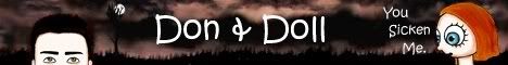
Don & Doll
I’m never sure whether Doll is actually talking to Don or whether their conversations exist only in Don’s imagination. Ultimately, it doesn’t matter; either way it is clear that Don is chronically at odds with the rest of the world. The author and artist occasionally use Don and Doll’s (real or imagined) conversations to tell jokes (usually dry, dark gags), but most often they use them to paint their stark picture of a haunted, isolated young man.
Don is awkward around both strangers and acquaintances. he’s occasionally hostile towards others, although usually not without provocation.
For the purposes of the review, I’m going to guess that Doll’s lines are all in Don’s head, although I think the comic can be read either way without missing its point.
Don uses Doll’s vocalizations in various ways: to ruminate on his self-loathing (here and here); as an excuse to avoid contact with others, and as a mouthpiece for his hostility towards others.
The artwork is stiff, creepy, ethereal, and jarringly effective. Don is almost always shown in mugshot views, which can be read as a comment on the (self-imposed?) limitations of his world. His expressions are generally flat and lifeless; he doesn’t smile, he doesn't frown, he just exists.
This is not a negative review. Unless I’m reading this strip wrong, the author and artist have accomplished exactly what they have set out to do. It’s not a happy comic. It’s a depressing comic. It does not, however, wallow; it merely portrays a darker, less happy side of life, one that everybody can relate to if they don’t find it too painful to acknowledge. This portrayal may be too much for some, but I like this strip. To me it effectively reveals an intensely personal statement that resonates, and that’s what art is for.
Last edited by Rcmonroe on Mon Feb 05, 2007 4:34 pm, edited 1 time in total.

-
Legendary

- Cartoon Henceman
- Posts: 1071
- Joined: Sun Jul 23, 2006 6:30 pm
- Location: I are serious member. This are serious post.
The Art: It's fairly simplistic, but it's not bad by any stretch of the imagination. The early art is rough (John's expression in the final panel here is one of the examples that leaps to mind), but it's steadily improved since then, although John's profile still looks pretty awkward with his hooked nose and large chin. Not sure whether or not that's intentional, but since Miriam has stated that she found him attractive, I'm assuming it's not. Profiles can be tough; keep practicing.
The lettering is good. I have no trouble reading it, and it all fits into the panels without getting cramped or filling up too much space.
Backgrounds are bland and unnoticeable. In a primarily character-driven comic, this is forgivable, but I'd advise you to keep working on it. You never know when drawing a setting will be important to the comic, and practice is the best way to prepare for this.
The Writing: This is, in my opinion, the best part of the comic. I rarely have seen any moments in the comic where I thought, "Wait, a real person wouldn't say something like that." Exposition is given out through natural-sounding dialogue rather than, "here is Person A, he is profession B," or "this is location M, let me tell you Interesting Fact N about it."
Out There's a gag comic, and the gags are, by and large, good. Looking back, I can't think of a single comic where I didn't get the joke. There were certainly a few where I thought the joke was only mildly funny or even fell flat, but I always understood what was going on and what was supposed to be funny. On the other hand, I can't really think of that many that were laugh-out-loud hilarious, although they're definitely there, mostly the ones with Clayton and James.
Which is not necessarily to say that they're the best characters. The story in Out There is usually just as compelling as the punchlines, if not more. While "The Thrilling Adventures of Messrs. Clayton and James" might have funnier gags, I doubt I'd enjoy it as much on it's own.
The Web Site: Simple and Functional. Not bad, doesn't hurt the eyes, but it's not all that great, either. The strip blends in, but the ads really stand out. Since the comic should be the center of attention, I'd suggest placing it a bit more prominently in the window, if possible. Or if you have any choice in ad selection at Keenspace (though I doubt it), go for ones that don't contrast with the background so harshly.
Suggestions: Work on the art. What you have is good, but that's not an excuse to stay where you are. You've been improving steadily since the beginning, so I guess I don't really need to tell you to keep doing so. For specific suggestions, there's profiles and other body issues (Necks don't bend this far, at least not without great discomfort) that are admittedly pretty minor. Work on backgrounds more.
Take a few more risks with your writing. The punchline is often fairly predictable, which I suppose is a downside of having clearly defined characters.
As a whole, Out There is very good, and it's one of the comics in my personal top ten. I tried to keep this review a bit more critical than I'd usually be, because I assume that's what this thread is for, but anywhere else, I'd gush about Out There.
Last edited by Legendary on Mon Feb 05, 2007 5:55 pm, edited 1 time in total.
I set my ATM card's number to "0001" because I'm number one!
-
Jackhass
- Cartoon Hero
- Posts: 3243
- Joined: Wed Jun 23, 2004 3:34 am
- Location: Starring in your latest sex dream.
Review of Legendary!
Art - Well...it's stick figures. But it's obviously intentionally simple and the artist has done a good job of hiding their limitations. Everything also looks nice and clean and colourful and fairly slickly put together. It's not going to win any awards for it's art, but it's functional and inoffensive.
Writing - This is where the comic really shines...it's concept isn't exactly the most original. We've seen plenty of comics that lampoon videogames, particulary RPGs...but this is really one of the best in my opinion.
The writer manages to shine a light on pretty much every RPG cliche/convention you can think of (and even tons I never even really considered and just have blindly accepted while playing) in a funny/clever way. Seeing the characters dealing with these strange cliches and conventions as part of their everyday life is always quite amusing, as are some of the complex explanations the author comes up with for a lot of the strange inconsistencies that exist in these games. I often found myself thinking "it's so true!" when the author would pick on certain annoyances of the genre (like how the stuff that happens in the FMV cutscenes seems to take place in a totally different universe than the game you're actually playing) and then laughing a few seconds later when the author would weave the observations into a genuinely funny punchline.
Oh, and the comic isn't just a bunch of unrelated observations and gags either...the entire comic so far has been telling a single continuing epic storyline. The author does a great job of keeping the storyline moving smootly while having almost every strip have a genuinely funny gag/punchline...doing both of these things at the same time is *not* easy, and the author has been achieving it for over 100 comics straight now. Impressive!
The only real negative I can see in the writing is that it is quite niche...basically if you don't like/play Japanese style RPGs you won't really "get" this comic. But then I don't think it's really intended to be a comic that appeals to everyone...the author has zeroed in on Japanese RPG fans and I think they should get a big kick out of the writing.
Website - Very simple, but it kind of suits the comic. Just like the art it's simple but clean and functional. Given the storyline driven nature of the strip though, it's in dire need of a cast page and "story so far" section.
Overall - Really well written comic that manages to tell a good story while at the same time being consistently sharp and funny. While not everyone will "get" it, fans of Japanese-style RPGs will love it. Art is simple, but clean functional and generally appealing. Website looks fine, but is a bit sparse. All in all, I'd give it an 8/10. If you're an RPG fan it's a very worthwhile read.
Last edited by Jackhass on Tue Feb 06, 2007 3:30 am, edited 3 times in total.

-
Warofwinds
- Cartoon Hero
- Posts: 1088
- Joined: Sat May 08, 2004 7:46 pm
- Location: Beneath stormy skies
- Contact:
Zoology:
Primary impression: Hella cute.
Art: There’s a solid style that is pleasing to the eye through out all the pages. I have no qualms with it. I actually like it being in grayscale too. Adds a certain atmosphere…ambience? Dunno the word. Anyways! Here, it looks as though you are expressly and consciously sticking to newspaper type format, which I guess is ok. I’m one of those people who thinks webcomics ought to take full advantage of the format. I do like how you vary panel size a lot, even if not the overall layout. Any desire to experiment here? Or are you trying to get published in a newspaper?
Script: For the most part right-on. My favorite strips so far are the ones without much text, like the croc snapping up the quacking ducks, the sheep eating the flowers and the restless tentacle strip. I find the only strips I don’t like are the ones about the hamster dad and his kid. IMO, most of those ones are aim-and-miss. Many times, they seem to peek over the fourth wall….they don’t shatter it to itty bitty pieces mind you, but they most certainly thin it a bit. I don’t find either the kid or the dad likeable, and the arcs seemed not to fit in well with the other characters. Speaking of the 4 main arcs, I like how you shift around after 3-5 or so of the same characters. Very refreshing, and not much gets stale. There was not a single strip however that was laugh-out-loud funny, though I got the impression that was far from your goal. I do like it like this. It’s subtle and endearing.
All the characters have distinct personalities (I love the crocodile) and attitudes. The little touches like a moustache or tie or thick eyebrows or buck teeth go a long way giving them almost instant likeability. The ultra-cute-yet-evil antagonist needs some filling though. All the other characters have multiple facets, but this one has only one. I’d like to see some deeper stuff about him other than stealing the key.
Site: Functional and extremely simplistic. While cutting the fat is good, your site is only bare bones. I also don’t like the dropdown archive. If you’re going to do that, I suggest listing only the arcs and not every single strip, especially not only by date. How about making section “the story so far” a little bigger? Putting it in a more prominent table? I would also like your view buttons either above or below the comic in a horizontal fashion, but that’s just me.
Overall: I like. As I said, it's endearing. I've checked the comic out before but had always been interrupted and never bookmarked it. That has been remedied.
Last edited by Warofwinds on Tue Feb 06, 2007 9:05 pm, edited 2 times in total.
-Kez


-
Netpoet
- Cartoon Hero
- Posts: 1356
- Joined: Thu Feb 24, 2005 9:19 am
- Location: Hiding from my employers in the interwebs!
- Contact:
*** INFORMATIONAL POST ONLY ***
it'll be easier to list just the ones that are incomplete, so here goes.
Antics - Reviewed by Liberty Cabbage, incomplete
Angry D. Monkey - Reviewed by Mixed Myth, incomplete (in progress, she says.. :p )
TTG - Reviewed by Dark Spider, incomplete
Legostar Galactica - Reviewed by SergeXIII, incomplete
Legendary - Reviewed by Jackhass, incomplete
Zoology - Reviewed by WarofWinds, incomplete
All other reviews are complete, great job folks!!!
*** INFORMATIONAL POST ONLY ***
Next person should review The War of Winds, above... do *NOT* choose one of mine, please.
>Net

-
RemusShepherd

- Cartoon Hero
- Posts: 2011
- Joined: Fri Jan 21, 2005 2:23 pm
- Contact:
War of the Winds Review
This is a difficult comic to review, because the art and storytelling has gone through several distinct stages. It'd be hard to review them all -- and somewhat worthless, as the artist obviously knows and has corrected many of the early mistakes.
WotW is split into a long prologue titled 'The Past', and then subsequent chapters. There are stylistic differences between them but not many at first. The true breakpoint in this comic comes sometime around chapter 3, where the art shifts from poor, to competent, to excellent by chapter 5. I can only conclude that the artist consumed the brain of some very talented person and absorbed their powers. I made a checklist of all the problems I saw early on in the comic, and had to check them off one by one as those problems were corrected in later pages. It's really a fascinating transition.
Okay, let me go through the early comic quickly. WotW begins as a creation myth of a fantasy world, and then tells the story of a long battle set in that world and its survivors. The early pacing is very slow -- the 'Past' prologue is about one-third of the entire archive, and less things happen in it than in just one of the other chapters. The text is often small and hard to read, with outlined text used instead of speech balloons. The colors are very muddy and the shadings very soft and vague. The drawn anatomy is poor and facial expressions are very flat.
All of that -- and I mean all of it -- is fixed by chapter four. Anatomy is now spot-on (for comic book purposes; it's not photorealistic nor should it be). Facial expressions are well-done and exaggerated in attractive ways. Colors are brighter and backgrounds are lush (though often intentionally blurred). Even the panel layout has improved dramatically, and the comic has adopted a portrait format rather than the wide landscape images that would occasionally break the site layout in the early days of the comic.
Since the art is now superior to mine, I don't have a lot of constructive suggestions on it. I'd like to see the rushed updates, which are in black and white, colored of course, and I'm sure they will be as soon as possible. I don't like all the colors used in speech balloons (both the balloons and their outlines) -- I feel they can distract from the art -- but that's a stylistic choice. Maybe just make them less saturated. The characters' eyes are still the weak point in the art -- though much better, sometimes they're still a little flat or exaggerated as pinpoints too small. The artist is going back to redo old pages, but considering how much story they have to tell I'd suggest abandoning the old stuff and heading for the finish line before fixing the past.
That's about all I can say about the art. Let's talk story.
Most of WotW is told via narration alongside the pictures -- sometimes long blocks or narration, but more often many short prose sentences. When there is heavy narration, it feels more like an illustrated novel than a comic. Sometimes the narration exposes glaring omissions in the art (one panel talks about 'bright red, fiery eyes' that are not shown) and sometimes the narration is unnecessary (showing someone looking down in horror next to the text, 'Ian looked down in horror'.) Oh, one other thing I should mention are the occasional typos (a few words missing in comics #24, #115 and others). Proofreading would help.
The narration has diminished in the later chapters but has not completely gone away. It's to the level where it's a stylistic addition, instead of driving the story, and I think that's a good level for it to be. The concepts in the world of WotW are sometimes pretty alien and need explanation, and it would be difficult to have characters say aloud all that needs to be said.
Still, there's a platitude in writing -- 'show, don't tell'. I'm not sure how it applies to comics, but in general I think that if the art can carry the story it's best to let it do so. I think the creator realizes this, and has shifted the storytelling appropriately since chapter 4. Reducing the narration is also important because, well, the prose is usually pretty purple -- overinflated, flowery, and cliched. The less narration the better.
The story itself is not cliched so far, and I love the world that's been created here...even if we've seen maddenly little of it. The pacing is still not very quick but a lot better than it was, with many things happening including action scenes and interesting character development. There are a lot of secrets and unanswered questions, though, and the slow pace carries the risk of frustrating the reader. We've seen the macguffin (the object essential to the plot) but we know almost nothing about it, including why everyone wants it. Powers and histories have been hinted at for every character but still not explained. In short, there is Too Much Suspense, and I worry that all these questions will be answered for the reader via a massive, jarring, ugly infodump. That needs to be avoided, but the more secrets you layer onto the story the harder an infodump will be to avoid. (We're getting one right now, in fact. At least someone got fried during it, making it more interesting. ) It does help that updates are pretty frequent -- every five days is the goal, with announcements of progress on the main page.
There's a reason for the pacing and prose, though -- the entire story that the comic is based upon is available in the 'Story' section, in the form of a prose novel. I really don't want to review the novel after going through all this effort to review the comic, but a quick glance tells me it's written at about the level of an internet fanfic. Nothing wrong with that, but I want to emphasize that the novel's prose and pacing is not helping the comic. If the creator followed the prose a little less tightly it would improve the comic immensely.
The website I'm not crazy about. The ads at the top, plus the comic banner, mean that scrolling is required before the comic is visible on my 1024x768 pixel screen. I like the bar on the left, although it's a bit cluttered as it contains shoutbox, schedule announcements and an 'Ask the characters' section. Below the comic there is a blog in small, hard to read font with a distracting background pattern. The site is functional but not friendly.
In addition to the Story section, there are many other extras offered, including maps, history, and a glossary of terms. I can't recall any comic anywhere on the internet that has more extras attached to it. There are literally about three novels worth of material here in addition to the comic itself. That's a good thing! But I wouldn't -- hell, I *couldn't* -- delve so deeply into the world of War of the Winds unless I was a fanatic for the comic. Fanatics, though, have found the promised land.
In summary, this is a comic with art that has transitioned from poor to excellent in two short years, and promises a lot of cool eye candy to come in the future. The writing is a little inconsistent, especially when it comes to pacing and the awkward narration, but it is improving as quickly as the art has improved. There is additional material that more than makes up in quantity what it may lack in written quality. And probably most importantly, this comic is obviously a labor of love that knows where it is going.
This is a difficult comic to review, because the art and storytelling has gone through several distinct stages. It'd be hard to review them all -- and somewhat worthless, as the artist obviously knows and has corrected many of the early mistakes.
WotW is split into a long prologue titled 'The Past', and then subsequent chapters. There are stylistic differences between them but not many at first. The true breakpoint in this comic comes sometime around chapter 3, where the art shifts from poor, to competent, to excellent by chapter 5. I can only conclude that the artist consumed the brain of some very talented person and absorbed their powers.
Okay, let me go through the early comic quickly. WotW begins as a creation myth of a fantasy world, and then tells the story of a long battle set in that world and its survivors. The early pacing is very slow -- the 'Past' prologue is about one-third of the entire archive, and less things happen in it than in just one of the other chapters. The text is often small and hard to read, with outlined text used instead of speech balloons. The colors are very muddy and the shadings very soft and vague. The drawn anatomy is poor and facial expressions are very flat.
All of that -- and I mean all of it -- is fixed by chapter four. Anatomy is now spot-on (for comic book purposes; it's not photorealistic nor should it be). Facial expressions are well-done and exaggerated in attractive ways. Colors are brighter and backgrounds are lush (though often intentionally blurred). Even the panel layout has improved dramatically, and the comic has adopted a portrait format rather than the wide landscape images that would occasionally break the site layout in the early days of the comic.
Since the art is now superior to mine, I don't have a lot of constructive suggestions on it. I'd like to see the rushed updates, which are in black and white, colored of course, and I'm sure they will be as soon as possible. I don't like all the colors used in speech balloons (both the balloons and their outlines) -- I feel they can distract from the art -- but that's a stylistic choice. Maybe just make them less saturated. The characters' eyes are still the weak point in the art -- though much better, sometimes they're still a little flat or exaggerated as pinpoints too small. The artist is going back to redo old pages, but considering how much story they have to tell I'd suggest abandoning the old stuff and heading for the finish line before fixing the past.
That's about all I can say about the art. Let's talk story.
Most of WotW is told via narration alongside the pictures -- sometimes long blocks or narration, but more often many short prose sentences. When there is heavy narration, it feels more like an illustrated novel than a comic. Sometimes the narration exposes glaring omissions in the art (one panel talks about 'bright red, fiery eyes' that are not shown) and sometimes the narration is unnecessary (showing someone looking down in horror next to the text, 'Ian looked down in horror'.) Oh, one other thing I should mention are the occasional typos (a few words missing in comics #24, #115 and others). Proofreading would help.
The narration has diminished in the later chapters but has not completely gone away. It's to the level where it's a stylistic addition, instead of driving the story, and I think that's a good level for it to be. The concepts in the world of WotW are sometimes pretty alien and need explanation, and it would be difficult to have characters say aloud all that needs to be said.
Still, there's a platitude in writing -- 'show, don't tell'. I'm not sure how it applies to comics, but in general I think that if the art can carry the story it's best to let it do so. I think the creator realizes this, and has shifted the storytelling appropriately since chapter 4. Reducing the narration is also important because, well, the prose is usually pretty purple -- overinflated, flowery, and cliched. The less narration the better.
The story itself is not cliched so far, and I love the world that's been created here...even if we've seen maddenly little of it. The pacing is still not very quick but a lot better than it was, with many things happening including action scenes and interesting character development. There are a lot of secrets and unanswered questions, though, and the slow pace carries the risk of frustrating the reader. We've seen the macguffin (the object essential to the plot) but we know almost nothing about it, including why everyone wants it. Powers and histories have been hinted at for every character but still not explained. In short, there is Too Much Suspense, and I worry that all these questions will be answered for the reader via a massive, jarring, ugly infodump. That needs to be avoided, but the more secrets you layer onto the story the harder an infodump will be to avoid. (We're getting one right now, in fact. At least someone got fried during it, making it more interesting.
There's a reason for the pacing and prose, though -- the entire story that the comic is based upon is available in the 'Story' section, in the form of a prose novel. I really don't want to review the novel after going through all this effort to review the comic, but a quick glance tells me it's written at about the level of an internet fanfic. Nothing wrong with that, but I want to emphasize that the novel's prose and pacing is not helping the comic. If the creator followed the prose a little less tightly it would improve the comic immensely.
The website I'm not crazy about. The ads at the top, plus the comic banner, mean that scrolling is required before the comic is visible on my 1024x768 pixel screen. I like the bar on the left, although it's a bit cluttered as it contains shoutbox, schedule announcements and an 'Ask the characters' section. Below the comic there is a blog in small, hard to read font with a distracting background pattern. The site is functional but not friendly.
In addition to the Story section, there are many other extras offered, including maps, history, and a glossary of terms. I can't recall any comic anywhere on the internet that has more extras attached to it.
In summary, this is a comic with art that has transitioned from poor to excellent in two short years, and promises a lot of cool eye candy to come in the future. The writing is a little inconsistent, especially when it comes to pacing and the awkward narration, but it is improving as quickly as the art has improved. There is additional material that more than makes up in quantity what it may lack in written quality. And probably most importantly, this comic is obviously a labor of love that knows where it is going.
Last edited by RemusShepherd on Wed Feb 07, 2007 5:41 pm, edited 1 time in total.


Reasoned Cognition is one of the landmarks of the ComicGenesis world. In this strip Ryan Kolter answers science questions sent to him by readers.
The writing of this strip is exactly as good as advertised in Ryan's signature. He can take a complicated subject and present it in an entertaining, easy to understand manner. I didn't catch RC oversimplifying or misrepresenting any of the issues dealt with; for a nitpicking ex-mathie like me, that's a big compliment. He sometimes deviates from the question at hand, but like Ronnie Corbett these deviations are part of his charm. The comic manages to be both educational and entertaining without sacrificing one for the other.
I do have a few criticisms about the writing. The interplay between ABOL and the artist is fun, but suffers from the fact that they both have the same speaking voice. Some of the filler/going on hiatus/coming off of hiatus strips could probably stand to be pruned from the archive.
The art of this series is, unfortunately, also exactly as advertised. That is to say it's bad. My biggest problem with the art isn't that Ryan draws poorly, it's that RC often degenerates from a comic to a series of paneled paragraphs. I feel like there should be a picture of some kind in each panel; preferably, there should be some kind of interaction between visual elements in each strip.
Ryan often complains that he has no artistic talent, but I think he's better than he thinks he is. ABOL and Tess are both quite pretty in a "WinAmp visualization" kind of way. His panels are usually very well laid out as well. The cat he drew for the cloning question is worlds better than the slug he drew for the salt-on-slugs question, so I think he's improving.
The site itself is easy to navigate. My only complaint is a lack of consistency- the archives are accessed through a text link, but all the other navigation links have buttons. One of the buttons in the top bar is marked "reserved" and has no function; this space could be used for the archive. Most of the interface is monochrome, but the text at the bottom of the page has a garish blue border that seems out of place. I think the muted colors of the interface buttons complement the subtle coloration of ABOL.
To conclude, I enjoy this comic a lot. It's worthwhile reading both for those who love science and those who know nothing about it... speaking of which, I should probably send the link to my mother.
Last edited by Ataraxia on Tue Feb 06, 2007 8:23 am, edited 1 time in total.

-
Mon Ami

- Cartoon Hero
- Posts: 1025
- Joined: Sat Oct 15, 2005 12:27 pm
- Location: Bringing on the PAIN
- Contact:
Edit: This was a long time coming, please forgive me for the delay Ataraxia.
So! Lets get right to it. I'm going to break this up into pre and post-issues because it seems that there is a vast jump between the two.
Um, at first the stuff prior to 2000 (mostly the skits that were from 1995 - 1996) confused me mostly. Probably because I did not grasp the meaning or what precisely was the intent behind them other then you just wanting to put them up there to show and get feedback maybe?
Mindless Theatre: First off, the text is very hard to read, you probably already know this so I am not going to harp on it. Also I can barely recognize the features of what the art is suppose to be which you also probably already know and it is obvious from having read through your archives that there has been a vast improvement. So I do not need to talk about that either.
Martyr w/o a Cause: In the beginning, there was a lot of text, and tiny text making it also hard to read. It's good you decided to go with computer fonts thankfully or else I do not think I could have read it. I'm not very good with writing per say, so the only thing that I could mention is that it seems this should be written and described into some sort of short story and not the genre of comic because the main character just has a lot of inner monologue that will not quit and the illustrations do not seem to really help the actual story itself.
Outside: The art is really grainy. If that was the intent, it probably should be re-thought, I can barely make out what is going on in each panel or the expressions of the humans which I think are pretty important to the thought. I read through your own critique on the piece on the first page of it and could not agree more. 'Nough said about that.
In the Snow: The first page has a really good example of how text can be incorporated into a panel! I loved that part and will probably use it in some later incarnation for my own work. This short is clear in its story and art, of course there are some technical details regarding the bodies and how they move, but you have definitely improved having read through your other more recent stories so I'll wait to point out any errors I see later down the list on your new stuff.
Too Late: The narrative explains the concepts well that a normal reader (like myself) who does not understand the intricate details of the brain and how it may function. Other then that the point of the story does not really make itself apparent or understandable. If I knew more about the author and what his thought process was going into the creation of it, it would probably make more sense. This being said, I think the stories in the pre section seem to be more aimed for a personal measure then a public one. Unless the reader knew more behind the book then what is presented to her/him, it would make it accessible to a bigger number of people.
---
Now comes the post stuff.
Are You Boring?: Its pretty cute actually, ending panels on the third last page made me chuckle. I find that in all your stories though it is unsettling because we never have a solid character base or setting to ground from and kinda use it as a reference for the situations that you create with your characters. When the reader shuffles through the story and just gets comfortable it abruptly ends up to this point which is driving me to distraction sad to say x-x: On that note, your art is improving but the paneling is static, this is a good example of what I mean: http://ataraxia.comicgenesis.com/d/20060203.html . On your previous pages they had dynamic flare to them, what happened? All I see are either six or nine perfect square boxes, where is the panning? Or close-ups?!
--- More to come ---
Last edited by Mon Ami on Fri Feb 09, 2007 11:15 am, edited 2 times in total.

-
The Neko

- A Blithe ray of Schadenfreude
- Posts: 3878
- Joined: Tue Mar 18, 2003 6:16 pm
- Location: New York City
Antics
Because I'm a repetitive douche, I'll start off the review much like the others by looking at the website. It's good! The site has a design scheme that is cohesive and highly functional, and the mood fits the content logically. Of particular note is the archive, which is organized by chapter. This is a great idea for a serialized comic, and makes it easier to figure out one's place within the grand scheme of things. The only negative thing I can see about it is that the archive didn't make itself apparent to me when I was first looking for it. It's separate from the rest of the buttons on the top bar, which one assumes is the go-to place for site features. Currently the updates blog is empty, so maybe an introduction would be nice so people aren't staring at a test-pattern, if you will.
I personally find that jumping from a site to a wiki for a site feature a bit disorienting. Websites are like an experience, and it's a chance to portray information with a specific purpose and style. When you switch to a wiki, you're at the mercy of other editors and there's a sudden style change, which is a little jarring and takes you out of the experience. While the wiki does offer a few additional benefits, I find that having a more integrated site is more interesting.
The artist of Antics is competent and knows what she's doing. She has a good sense of proportions and the characters have depth and believable mass despite the Japanese influence, which is often very graphic and abstract. Additionally, some of the page layouts are very nice, making full use of the "camera", if you will. Character views are not always straight on or profile, and there is use of closeups and long shots to create variation and keep the scenes from becoming stale or visually boring. The poses range from naturalistic to dynamic, another Japanese influence, and add to the visual flair. The use of the page is also well-done, in that there's no huge gaps of empty space, which is the pratfall of many an amateur webcomic author. However, this is all when it's at its best.
Sometimes, it looks like this. After the author has displayed such ability in the earlier pages, (and indeed, some of the prologue pages are stunning in their own right), it is almost mystifying that you'd get pages that look rushed and at points incomprehensible. At other times, anatomy goes out the window as characters move their heads 180-degrees around, or have giraffe-neck syndrome.
Part of the issue is that the characters and the background tend to melt together and become muddy noise, figures and actions difficult to pick out of the fuzz. Unlike the Japanese influence, it lacks enough of the graphic cut and contrast to make important aspects distinguishable from the noise, and to make movement clear. The character designs are also difficult to distinguish. The hairstyles are different, but the faces, the clothing, and the hair colour are the same, despite the descriptions listed by the author in the info wiki. Unless the characters are addressing each other, it is almost impossible to figure out who is who. However, this might be attributable to the general muddiness mentioned earlier. I think the best thing to do at this point is to study Japanese comics that are more graphic and clear, perhaps to see how they make the situations and characters either accessible or distinguishable. Off the top of my head, I can probably suggest "MPD Psycho". It's a bit mature and very bloody, but the art is crisp.
Now we get to the most difficult part of this review, the writing. Since the comic has only been running for a short time (and I get the feeling that it is a "reset" from an earlier incarnation), it is hard to really get a handle on where the story is going and indeed how the characters are portrayed. However, I'd say that if by chapter 2 I am unable to recognize the personalities of the two main characters, there's something wrong.
The prologue serves a purpose, but seems to exposit a lot of information at once, and at times contains some spelling errors and awkward wording. ("Hollow" versus "hallow", etc.) While it is nice to know that there is a mythos behind the world and its creation/current status, it's too much to give away before the comic even begins. This seems to be a problem in many fantasy comics, as the author is so excited about their world that instead of letting the reader see how it works, they have to tell them about it right away in the exposition.
Of particular note is this page, which seems only to exist to provide flimsy pretext for the existence of the catgirls. It might have been more interesting for them to see how this trait expresses itself and later find out the truth of it. At this point, it seems that if they do find out why, the audience will be told for a second time, which would render the prologue redundant.
After the prologue, the comic slides from a glacial pace to an almost frenetic one. It starts off with a bit of a cliché: a recurring dream and a character waking up from said dream, late for school. Suddenly the plot jumps and within two pages the characters have already been thrust to Cephiro er, I mean Dona. Really, we're not given enough time realize that the characters are originally from Earth or even what nation they come from or any real indication of their personalities or life before that. The loss of normalcy thus contains no drama for the reader, since they weren't aware of it to begin with.
I think the comic mostly suffers from over-excitability. It seems like the author has a lot of ideas and really wants to get them out as soon as possible, which damages the pacing. It's like listening to a friend who is excited about a project, who spits out chunklets of ideas and information at such a rapid pace that it becomes a bunch of incomprehensible smash. Simply put, there's too many ideas at once, and they haven't been organized in a way that makes it easier for people who are not familiar with the author's vision to comprehend it in a meaningful way. Balancing a work with comedy and drama is already difficult, since drama needs to have time to cultivate, as opposed to comedy which works best when readers do not dwell on logic and consequences. At times, it really needs to slow down.
Call me a traditionalist, but writing should not include "*rambles*" and various emoticons. That is what the dialogue and character portraits are for, respectively. Worst of all was "*is falling at the moment*", which reads like a chat transcript, and not a comic. A few of the small words outside balloons like "heh" or "meep" actually work, but too much of it can become tiresome and pointless.
The last weakness I can point out is that the characters really haven't established distinct personalities yet, which is something really important for a comic. We have to care for them and to understand why something they do is funny, inspiring, sad, or triumphant. I think that this might be emblematic of the ADHD feel of the work as a whole.
There are some good ideas in here (a fantasy comic not borrowing from Tokien or D&D for one), and there are a few things that pique my interest to see where it'll go and how other humanoids might appear, but the current visuals and pacing leave me a bit addled. A little more research into the originating style (Japanese comics), might remedy a bit of this.
Last edited by The Neko on Tue Feb 06, 2007 4:23 pm, edited 2 times in total.
jag saknar självförtroende
-
LibertyCabbage
- Cartoon Hero
- Posts: 4667
- Joined: Tue Jan 25, 2005 4:08 pm
- Location: bat country
- Contact:


-
EvilChihuahua

- Regular Poster
- Posts: 720
- Joined: Sun Mar 05, 2006 4:59 pm
- Location: Canadaland
- Contact:
Go For It.
Art: Really good. Your characters have a great range of expression, and you have a good grasp of anatomy and perspective, so the reader can focus on the jokes rather than trying to figure out what the characters are doing in a panel. (Which happens allto often in webcomics) The colour's also well done. It's bright, which fits the atmosphere of your comic, but not eye-scarringly so.
Writing. Your comic is...interesting in this regard. Alex is cynical. Very cynical. That's a good foundation to build jokes off of, especially with all of the easy targets for his wrath. However, I feel sometimes that that's the entire comic. Now granted, it's not all Alex being Smart-Alexy. There's also other people being stupid. In the end, about 95% percent of the jokes consist of making fun of stupid people. Now, not to say that that's not a noble goal, but sometimes it seems that there's not anything else to the comic. If he wasn't so damn good at it, the thing would get old quick. The only variety among the strips is the way in which the stupid people are made fun of, exept when you do strips making fun of pop ure, by saying again, that it's stupid.
Don't think that that means i don't like the strip, however. I'm pretty cynical myself, so I enjoy it.
The Site: Easy to use, good looking, I haven't had any problems with it.
Last edited by EvilChihuahua on Tue Feb 06, 2007 8:48 pm, edited 1 time in total.
note: any l337 used in the previous post was used ony to avoid the poster's Cybersitter. 
Art: You're art has come a very long way from when you started. One thing that bugs me though is characters have a tendency to lose all arms and turn into a strange super deformed state Like This, it breaks for the rest of the comic greatly since characters seem to go from a regular expression to an extreme expression. So the super deformity just feels out of place. especially when the style of super deformity changes like here Filler comics are in the archives and even though this isn't a serial comic I still feel like it breaks the feel of the rest of the strip. The compression on your images is a little hard on the eyes and your word bubbles change every strip. You're sense of anatomy seems ok except your characters tend to bend in extreme impossible ways for instance what he's doing with his neck in the 2nd panel of the above mentioned strip would most likely be mighty painful. Or his arms in this strip. The comic has progressed to a good point, but keep working on it. You're female characters and older characters could use some work.
Writing: I don't really like the writing in the begining of this comic, the jokes aren't that funny but they really try to be. As the comic goes into it's first arc it begins getting better and I think short arcs are really better for your writing. You have a little issue with character introduction. You throw people into strips and just assume we know who this person is and their relationship with the main character. Take some time to give us a name and possibly relation in strip, you can't rely on the blurbs beneath comics to explain every strip, if you have to then the comics aren't doing their job.
Website: Please please PLEASE pick a new font for your site. It's hard to read and hurts my eyes. Also the way it writes "Angst is a five letter word" is so very hard to read, then you shrink it for the comics themselves and it's 100% unreadable. I said it before to senshi but you must be VERY careful with how you use display fonts.
It's hard to give this an overall rating as it seems to be in the midst of some overhauling.
Keep it up and just continue improving.
Last edited by Mvmarcz on Tue Feb 06, 2007 5:31 pm, edited 1 time in total.

NJ: "You know the drill, you're AWESOME!"
I am the artist formerly known as M2