I started about a month back and remain completely unsure of the art style and some characters. And just generally would like critisim advice or feed back of any kind
http://litm.comicgenesis.com
'Nother Newbie also looking for feed back
-
LibertyCabbage
- Cartoon Hero
- Posts: 4667
- Joined: Tue Jan 25, 2005 4:08 pm
- Location: bat country
- Contact:
Quick tips:
1) Your bubbles are too sloppy, so I'd recommending doing both the bubbles and the text on the computer with Photoshop or GIMP or something.
2) Your cramming too much stuff into your pages, giving them a crowded look. A related problem is that your strips are generally too small. You have a lot of room to work with so there's no reason to make the comic so tiny. Look at the sizes other comics are doing.
3) Start doing backgrounds. They really help to establish the setting. Otherwise it seems like your characters are floating around in whiteness.
Overall, the comic's pretty awful, but once you start improving on the basics it should be a lot better. You seem to still be experimenting a lot and trying new things though so hopefully you're in the right direction.


"Seems like the only comics that would be good to this person are super action crazy lines, mega poses!"


When drawing the comics, you should allot space for the speech balloons and other text. Right now it looks like you're just cramming it into the edges of each panel.
The borders for the speech balloons don't look very good as they are. You should probably draw them as boxes with rounded corners or ellipses. That's what I do on my comics pages; you can see an example here:
http://ataraxia.comicgenesis.com/d/20060825.html
I think you should increase the size of your pages. Right now it's too small to read easily. This, along with the hand-drawn speech balloons, makes it very hard to follow what's being said.
How are you producing the images? It looks like you're drawing them with pencil, scanning them into the computer, then tracing them in an art program. You might get better results if you ink them on the paper then scan them into the computer using your scanner's black and white setting. In any case you should really try experimenting with the black and white setting of your scanner, or at least the contrast controls in your paint program.

Actually I do draw them by hand in a sketch then draw it a second time and ink it. But in several of the previous ones I've forgotten to erase or failed to erase properly. In the first comics, the ones without the 3-4 panel look were given the text by hand, after those my text was from the computer but the balloon problem is do mainly to my poor skill with a mouse. Thanks much for the advice about backgrounds and balloons.
regarding the size I think I could probably either make it a in a full page or increase the size. I'd have to try expirementing with either one. But I've already completed them up to 12/08/06, and since I switched to a different editor they have been coming out whiter. I've also been thinking about doing it in color.
regarding the size I think I could probably either make it a in a full page or increase the size. I'd have to try expirementing with either one. But I've already completed them up to 12/08/06, and since I switched to a different editor they have been coming out whiter. I've also been thinking about doing it in color.

I would also like to see the speech balloons made a little clearer. In addition, I would like to see the line between the panels be a little thicker.
Here's something that I do that may work for you as well. I do each panel seperately, then assemble them in a template I made, and then add the word balloons (generally, I leave the top 1/3 of a panel open for talking, and adjust it as required). It will take a bit longer, but I think it will help with the clarity of your art and ease of reading for us. (It will be easier for us to get interested in the story an characters if we aren't distracted by the cramped look).
If you work better doing it all at once on a page, do this: Keep the pages you make as the "storyboard" or first draft.
Whatever you do, be sure to show us in this thread! I'm looking forward to seeing how you progress as a cartoonist and writer.
-
Oualawouzou

- Cartoon Cop (Moderator)
")
- Posts: 1548
- Joined: Fri Jan 10, 2003 7:47 am
- Contact:
Regarding the word balloons, they will always look horrible if you draw them with a mouse. Don't your image editing program has a tool to draw circles and ellipses? Also, take a moment to proofread... Sometimes you use punctuation marks, sometimes you don't. Sometimes you use capital letters, sometimes you don't (and when you do use them, it's not always where you should). Basically, that with the other problems mentionned above give off a strong "I don't care" vibe. Given that they are otherwise relatively simple comics, I would strongly advise re-working your buffer instead of post-poning improvements by 3 months and a half.

I do my inking by hand, too, but you'll find that you don't even need to erase the pencil if you scan in black and white (provided you use the right brightness and contrast settings [I forget what I use and I can't check since I'm not at home] and don't make extremely dark pencil marks [I assume you're not since you've been erasing the pencil.])litm wrote:Actually I do draw them by hand in a sketch then draw it a second time and ink it. But in several of the previous ones I've forgotten to erase or failed to erase properly.
Try scanning in black and white and screwing around with the brightness and contrast.

There's a Civilization on my Fork - Updates Sometimes
-
Chibiartstudios

- Regular Poster
- Posts: 978
- Joined: Thu Apr 08, 2004 11:33 pm
- Location: Right behind you!
- Contact:
OK, best advice I can give you is to slow the heck down.
Seriously, if you want people to read this then you have to put in the work. To do that you have to slow down and make sure the angles/ composition/ anatomy/ etc. are alright. It's not easy at first (especially when you are new) but the better you are at edditing your own work the better you will beacome.
Next up, I think you need to take some time with a sketchbook and draw real objects. I'd say spend at least 15 minnutes a day minimum after comic drawing time. The better you are at drawing real objects the better you will be at cartooning. Anatomy, for example, will be vastly improved if you do this.
Oh! and your erasing problem can be solved by getting a white plastic eraser. Pink ones ALWAYS smudge and leave crap behind (Grrrrr! CAS kILL puny erasers that ruin his nakey drawings!).
Lastly I'd recomend getting a proper photo editing program. I suspect that you are using paint (or something like it) and frankly that just won't cut it. Your text bubbles are the biggest, but far from the only, reason why this is so.
Once you do that you will find scanning a cleaner image MUCH easier. I'd recomend pure B&W scanning at AT LEAST 300dpi. Use oval tool to create the speach bubbles (look it up, it's around. Or ask us! ^_^) add text, and you will have a MUCH better product.
Good luck!
Help me live my childhood dream of becoming the head of an evil corrupt corporate conglomorate:

Oh..wow...where to begin...?
Speech Bubbles:
The speech bubbles should be done in photoshop, or even the MS paint circle/square/etc tool would be an improvement. Never do a speech bubble by hand or mouse unless you are Gooo~oood. with a capital G.
General Appearance:
The overall look need big improvement. I mean I can see the pencil and the crud on your paper. No one on the face of the planet can avoid this problem. Solution? Use a nice eraser, not those pink ones or the ones on the back of your pencil. Then scan in black and white and if you must, use the eraser on your photo-editing program to get rid of large blemishes. and play aroung with the contrast setting. Or even Threshhold, But I don't like threshhold m'self. But each to his own. Aaaanyway,
Forgeting to do stuff or doing it poorly?
Solution:
Buckle down. think. put your heart into it. Get ready for some work. This is work. Whether it's fun to you or not, it is work and you have to dig in.
Did that make sense?
Lastly, and I know this sounds bad and is cliche but it's dang true: Practice, practice, practice. It is the key to eternal...erm..everything. Yeah...it is.
Artsist and Editor of GBC
http://gbc.Comicgenesis.com

A webcomic about life...the life of toys, anyway...
Updates Monday and/or whenever I darn well fell like it.
zomg! I`m surfing the net on my wii!
http://gbc.Comicgenesis.com
A webcomic about life...the life of toys, anyway...
Updates Monday and/or whenever I darn well fell like it.
zomg! I`m surfing the net on my wii!
Oualawouzou, you're right and I changed stuff around. I changed the comic to a full page and set the change for this friday in place of the original comic. The ones that don't look like they were scanned in black & white were mainly older ones from a time when I didn't do anything in black & white.
I'm using the Adobe Photoshop Editor and after taking heed of the advice on this thread I tried using the oval shape but when I tried to either erase or alter the ballon, to connect it to others, it just pushed around the barrier. I was able to use paint for that part and while it seems like it came out ok I'd like advice on Adobe.
I also drew a background but I have trouble adding color on the computer, unless it was something like just the walls or floors. I also thickened the panel barriers, and used a white eraser rather than pink.
- Attachments
-
- 20060901.jpg (133.79 KiB) Viewed 1479 times
Put more time in to the text as well. Generally I put sound effects (like the "whump" and "gasp" in that example) in capitals, but that's a matter of personal preference I suppose.
Example:
http://litm.comicgenesis.com/d/20060818.html
Extreme lack of capitalization there.
And for the love of dog, NEVER use internet acronyms like "OMG", "BRB", "LOL" or anything else UNLESS someone is actually typing that on a computer.
Example:
http://litm.comicgenesis.com/d/20060707.html
You used "BRB" in that one.
To be quite honest, I haven't really read it so I don't know if you've made any actual spelling mistakes, but just in case, make sure to spell check EVERYTHING. One way would be to try typing up the dialog in MS Word and spellcheck it on there, then copy and paste the text into whatever image editor you decide to go with.
Example:
http://litm.comicgenesis.com/d/20060818.html
Extreme lack of capitalization there.
And for the love of dog, NEVER use internet acronyms like "OMG", "BRB", "LOL" or anything else UNLESS someone is actually typing that on a computer.
Example:
http://litm.comicgenesis.com/d/20060707.html
You used "BRB" in that one.
To be quite honest, I haven't really read it so I don't know if you've made any actual spelling mistakes, but just in case, make sure to spell check EVERYTHING. One way would be to try typing up the dialog in MS Word and spellcheck it on there, then copy and paste the text into whatever image editor you decide to go with.
There's a Civilization on my Fork - Updates Sometimes
WOW!!! What a great improvement!! It is very easy to see how you took the suggestions of the cartoonists above to heart. The lines and panels are MUCH clearer. I can see that you included a lot of detail without over-working the scene, too. For example: The pinholes on the bulletin board are a great detail. Also, There are a LOT of action lines in the first panel, but since the the work is done much cleaner, they do not obscure the scene.
You used a feedback thread exactly as it was intended. Keep on writing and drawing your comic, Litm, and it will only look better and better.
You used a feedback thread exactly as it was intended. Keep on writing and drawing your comic, Litm, and it will only look better and better.

Gutter space: make each frame actually separate and give a liiiiittle room on the side of the comic so it's not such a jarring transition.
Oh, and go to BlamBot for some free fonts. Badaboom! is excellent for sound effects.
I don't really follow what's happening in that last page of yours, but it may just be that it's black and white so hard to tell characters apart and... is that a reality scene or imagination sequence? I can't tell, though I imagine that if I bothered to read the archives it'd be apparent.
And... don't chain word balloons together like that. There *are* good ways to do it, but mostly I see it done fugly. It's a good try at something that is difficult to work just right but you'd be better off dropping it or going back to some comic books and seeing other ways to work it if you're up for trying it.
-Fiona
The Vodka Club! Updates Mondays.

The Vodka Club! Updates Mondays.
-
Chibiartstudios
- Regular Poster
- Posts: 978
- Joined: Thu Apr 08, 2004 11:33 pm
- Location: Right behind you!
- Contact:
Good Improvement already! If I where giving points I'd double your score!
Now, the next thing I'd recomend is that you invest mroe time into inking. Particularly in your frames. Your frames should be as straight and clean as you can make them. Measuring them out (I.E. Measuring out x inches from the top in either side to make sure you get the line perfectly level) or using a T-square would be a great help in this.
Next I'd pick up a really good book on perspective and start practicing. You'd be surprised by how much even faked perspective can pretty up a drawing.
Help me live my childhood dream of becoming the head of an evil corrupt corporate conglomorate:
-
EvilChihuahua

- Regular Poster
- Posts: 720
- Joined: Sun Mar 05, 2006 4:59 pm
- Location: Canadaland
- Contact:
-
Chibiartstudios
- Regular Poster
- Posts: 978
- Joined: Thu Apr 08, 2004 11:33 pm
- Location: Right behind you!
- Contact:
It does, but I personally find it harder to draw the what's inside the frame without seeing it there for myself on the paper. There are ways around this, of course, but I find it to be simpler just making sure the frames are drawn well in the first place and cut out some extra work.EvilChihuahua wrote:If I were you, I would do my panel borders on my computer. It gives a much cleaner line.
But by all means people, try it. Experimentation never hurts! ^_^
Help me live my childhood dream of becoming the head of an evil corrupt corporate conglomorate:
-
EvilChihuahua
- Regular Poster
- Posts: 720
- Joined: Sun Mar 05, 2006 4:59 pm
- Location: Canadaland
- Contact:
I used to just do a guide line in pencil, which I would not erase, and then cover it with a thick black line on my computer. Not the hardest thing to do.chibiartstudios wrote:It does, but I personally find it harder to draw the what's inside the frame without seeing it there for myself on the paper. There are ways around this, of course, but I find it to be simpler just making sure the frames are drawn well in the first place and cut out some extra work.EvilChihuahua wrote:If I were you, I would do my panel borders on my computer. It gives a much cleaner line.
But by all means people, try it. Experimentation never hurts! ^_^
note: any l337 used in the previous post was used ony to avoid the poster's Cybersitter. 
-
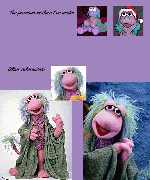
Garneta
- Holding Out for a Hero
- Posts: 6518
- Joined: Sat Feb 04, 2006 3:14 pm
- Location: Fraggle Rock
- Contact:
That's pretty much what I do too, only in white. My panel lines are terrible when I do them by hand, so it's basically the only way I can get them straight. Another bonus to this is that I can get them all exactly the same width, which I couldn't do by hand without a lot of extra work.EvilChihuahua wrote: I used to just do a guide line in pencil, which I would not erase, and then cover it with a thick black line on my computer. Not the hardest thing to do.