To discuss the comic, make announcements, and have it serve as a medium for the speculation, commentary, fanart, and conversation that goes along with it.
Let's brainstorm about how we want the site to look.
I think we should use a black background with white text, at the top will be our logo, which will be a picture of a needle and headshots of our main characters unless someone has any better ideas, and we could have an iv bag going down the side of the page with all the page links on it.
Normally, I like links to be at the top of the page so there's more horizontal room below, but I think the IV bag is a good idea, and it obviously wouldn't work very well horizontally.
Once the domain propogates, I'll set up a forum for our use, and we can discuss collective matters there.
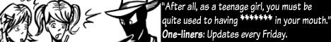
One-liners: Come for the laughs, stay for the abuse.
If noone else likes the idea of a black background, it's no big deal, but I am vehemently opposed to a white one. Most people don't like to stare at lightbulbs.
One-liners: Come for the laughs, stay for the abuse.
I second my original ideas on the site design. ;-)
White would complement the needles/IV Bag theme, but my eyes don't much appreciate it either. As much as it may be overused, I'd go with either black or a subdued shade of blue.
I've designed a logo but alas Charter has denied me internet Once hey get their shit up and going again, I'll post it. I think it looks cool and I hope you guys like it.
It's not bad, but I think we should use a logo that can fit in standard size buttons. 468x60, 88x31, and so forth. Also, I think our logo and site design should be grungy, to reflect the connotations of "intravenous."
One-liners: Come for the laughs, stay for the abuse.
Shishio wrote:It's not bad, but I think we should use a logo that can fit in standard size buttons. 468x60, 88x31, and so forth. Also, I think our logo and site design should be grungy, to reflect the connotations of "intravenous."
I was thinking more of a hospital-like sterility, but either way could work.