Freedom isn't fried...

-
LibertyCabbage
- Cartoon Hero
- Posts: 4667
- Joined: Tue Jan 25, 2005 4:08 pm
- Location: bat country
- Contact:


-
LibertyCabbage
- Cartoon Hero
- Posts: 4667
- Joined: Tue Jan 25, 2005 4:08 pm
- Location: bat country
- Contact:
Yay!!
Ok I think I'm getting the hang of this so I won't post any more comics here ... thx to everyone for being awesome superfriends, I can't believe how much my comic has improved in such a short time =p
Ok I think I'm getting the hang of this so I won't post any more comics here ... thx to everyone for being awesome superfriends, I can't believe how much my comic has improved in such a short time =p


"Seems like the only comics that would be good to this person are super action crazy lines, mega poses!"
-
Blackaby

- Regale her
- Posts: 3441
- Joined: Wed May 25, 2005 3:34 pm
- Location: Sitting on the pudge.
- Contact:
Hey. I'm no expert on comicing and I don't even draw mine, so I have no advice on 'making things better'. But your comic has always made me laugh a heck of a lot, and I'm always calling over friends to check it out. I doubt I've spent more time on a comic, reading & re-reading (or holding the browser open so my housemates can come over and say, "What the frik? What the frik are you reading?!") since I went through the PA & Thin H Line archives about a million years ago.
Er, my all time favourite has to be http://freedomfries.keenspace.com/d/20050517.html . BEHOLD THE RAPTURE!!! I knocked over a good half-bottle of Pepsi because of that dem comic. I also say "THE RAPTURE IS STARTING" loudly when people start saying uninteresting things to me. Then I leave. It's groovy, man.
Er, my all time favourite has to be http://freedomfries.keenspace.com/d/20050517.html . BEHOLD THE RAPTURE!!! I knocked over a good half-bottle of Pepsi because of that dem comic. I also say "THE RAPTURE IS STARTING" loudly when people start saying uninteresting things to me. Then I leave. It's groovy, man.


-
LibertyCabbage
- Cartoon Hero
- Posts: 4667
- Joined: Tue Jan 25, 2005 4:08 pm
- Location: bat country
- Contact:

Sigh...OK. To be constructive then.....
1) Use a ruler to draw your panel borders. A (presumably) deliberately sloppy style, with deliberately sloppy lettering with deliberately sloppy borders just makes the whole thing look...well, sloppy. Using a straight edge for the panels will provide a clean space in which to explore your style. Freehand borders should be an effect, not a mainstay.
2) As has been mentioned before, use a computer font for lettering. At the very least, if you must hand letter, use a ruler or Ames guide to set guide lines before you letter. The variance in letter size and font height makes this strip physically difficult to read.
3) Resize your strips to fit on a monitor. I'm running mine at 1152 x 864 and it's just wide enough to accomodate your strip. Readers do not like to scroll, and especially do not like to scroll sideways for some reason. Resize to accomodate 800 x 600, or at least 1024 x 768.
4) After you scan, but before you post, do some contrast correction on the strip so it does not look like it was drawn on the back of a napkin. Make your white areas white, not gray, and your work will shine more.
Your strip has a crude style that I, personally, do not care for...as should be obvious by now. The writing eludes me, and I fail to see any humour at all, but I guess that's my beef. Objectively speaking, however, a few more technical tweaks could make a huge difference to the apparent quality of the strip, and do not require any great amount of skill to execute. Improving the technical aspects lets the reader focus more on the content than the execution.
Take it for what it's worth.
Visit "The Journals of Simon Pariah"
http://simonpariah.keenspace.com
http://simonpariah.keenspace.com
-
LibertyCabbage
- Cartoon Hero
- Posts: 4667
- Joined: Tue Jan 25, 2005 4:08 pm
- Location: bat country
- Contact:
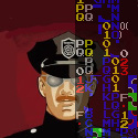
Yeah I started doing that stuff because of this thread ... here's my latest example
About the size, I haven't thought about that... I'll check it out.
About the size, I haven't thought about that... I'll check it out.
"Seems like the only comics that would be good to this person are super action crazy lines, mega poses!"
