Colouring help (aka, "Artistic skills, whaaaa?")

Think your comic can improve? Whether it's art or writing, composition or colouring, feel free to ask here! Critique and commentary welcome.

Post Reply
User avatar
BOMC
Cartoon Hero
Posts: 1339
Joined: Tue Apr 27, 2004 5:13 am
Location: with your mom

Colouring help (aka, "Artistic skills, whaaaa?")

Post by BOMC »

I'm not quite dead yet!

Am in need of critiquing for my colouring. If you can suggest anything that would make this image look better, please suggest it (that is colour-wise only, not art-wise, as this is an oldish drawing that I just use for colouring practice)

Image
-Grace (BOMC)

User avatar
Jackhass
Cartoon Hero
Posts: 3243
Joined: Wed Jun 23, 2004 3:34 am
Location: Starring in your latest sex dream.

Post by Jackhass »

Well...I'm no colouring expert myself, but the colour's kind of flat and the skin colour isn't quite right. The skin tone's too dark and grey-ish for what's supposed to be (I'm assuming) a white girl.
Image

A zoo full of cute yet uproariously funny animals...how can you go wrong?

My Keenspace Forum!

User avatar
Mvmarcz
Cartoon Hero
Posts: 3623
Joined: Wed Jul 21, 2004 10:17 pm
Location: Louisiana
Contact:

Post by Mvmarcz »

give the shading more dimension. Like make the shadows do more than outline it. and add maybe a highlight or two. Wrinkles in fabric cause shading, the muscles in your body cause shading, check out the other thread on coloring where
LAGtheNoggin wrote:Since people are asking "How?" and my fumbling efforts have been refered to, I guess it's polite I show some sources.

This was posted by some guy on Polycount a few years back, print it out, stick it up:
http://i3.photobucket.com/albums/y87/LA ... n/misc.jpg

These pages and onwards are good from Loomis
http://d538518.u320.bigcrawler.com/FigureDrawing/76.htm

Spicey Curry Brush tutorial - just got it so haven't given it a try, looks good though.
http://www.deviantart.com/view/24105181/

Other than that, forget line as anything real when you study. All line is is human video compressed shapes. Real shapes are differences in value and tone, focus on studying that. It helps if you can think of the shape from every angle too, I imagine "what can this light see from up here?" It needs practice.

And finally, some good stylistic reference for computer colour:
http://-seed-.deviantart.com/gallery/
http://jayaxer.deviantart.com/gallery/
:D theres a good one on lighting
Image
NJ: "You know the drill, you're AWESOME!"
I am the artist formerly known as M2

User avatar
LAGtheNoggin
Cartoon Hero
Posts: 2532
Joined: Sun Feb 17, 2002 4:00 pm
Location: the sea side
Contact:

Post by LAGtheNoggin »

You said "colour-wise only, not art-wise" but colour painting is art, so I'm a little confused. Do you mean colour as in use thereof, or do you mean colour as in painting?

If you mean use; use of colour is OK, purple black and blue, non offensive and works well. Nicely identifiable. The skin tone is chocolatey and an OK mid value, I'd recommend getting greater saturation on the skin shadows though, and maybe more warmth in there.

Painting, well, that needs a little practice. I recommend trying to visualise shapes in 3D, know the typical light configuartion (3 point lighting) and study how shapes look under such conditions. Here's a rather advanced 'basic' CG painting tutorial.

The links I posted over here might also prove useful. [edit: whoops, they've been quoted already]

Hope that helps.
Last edited by LAGtheNoggin on Sat Nov 12, 2005 1:54 pm, edited 1 time in total.

User avatar
BOMC
Cartoon Hero
Posts: 1339
Joined: Tue Apr 27, 2004 5:13 am
Location: with your mom

Post by BOMC »

Jackhass wrote:Well...I'm no colouring expert myself, but the colour's kind of flat and the skin colour isn't quite right. The skin tone's too dark and grey-ish for what's supposed to be (I'm assuming) a white girl.
It's supposed to be dark and shadowy... there was a dark blue background to the picture, but for some reason it didn't save with the image.
-Grace (BOMC)

User avatar
BOMC
Cartoon Hero
Posts: 1339
Joined: Tue Apr 27, 2004 5:13 am
Location: with your mom

Post by BOMC »

LAGtheNoggin wrote:You said "colour-wise only, not art-wise" but colour painting is art, so I'm a little confused. Do you mean colour as in use thereof, or do you mean colour as in painting?[/url].
What do you mean by painting? I didn't paint any of this picture. I mean critique the way I coloured the picture, not the way the picture itself is drawn.
-Grace (BOMC)

User avatar
LAGtheNoggin
Cartoon Hero
Posts: 2532
Joined: Sun Feb 17, 2002 4:00 pm
Location: the sea side
Contact:

Post by LAGtheNoggin »

I use the word painting when someone uses colour, tone, and shape all together to create artwork on a computer, like you just have as soon as you started shading.

I'm getting confusing and tied up into semitics here, sorry:

Colour = hue (red, blue, green etc)
Tone = Light and dark
Shape = The visual space held by an object, defined by its profile / contour.

Don't hold me on that, I'm really no expert. But since you seperated art from the colour I thought you might specifically be referring to the colour on its own, which is, well, just the colour of things, not their shape or tone - tone being something you used very little of, which lead to further confusion.

Look, uh, if you want to colour things to look 3D and whatnot, then that's pretty much painting. Check painting tutorials and stuff, and then, if you want, chuck on big black contours to make it look comic-y.

User avatar
Bluebug
Regular Poster
Posts: 246
Joined: Wed Mar 06, 2002 4:00 pm
Contact:

Post by Bluebug »

Yeah, technically coloring is also art - so in order to critique the coloring, we'd have to, by extension, also critique the art. Yay, for semantics :P

Anyway, I'm a proponent of a picture is worth a thousand words, so here's a quickie coloring tutorial for you. Like LAG and M2 have said, you need to understand the 3 dimensional structure of things before you can shade them. If it helps, take a random reference and specifically look at how the shadows and highlights fall on objects.

Image

I couldn't help but notice she didn't have eyebrows ... :)

Hope that helps. I suggest you also take a look at the Coloring Technique Sharing thread. It gives you a look at how different people color.
Last edited by Bluebug on Sat Nov 12, 2005 3:44 pm, edited 2 times in total.
Image

User avatar
Snackbot
Regular Poster
Posts: 201
Joined: Fri Nov 11, 2005 8:49 am
Location: Lurking
Contact:

Post by Snackbot »

My two cents are mostly about the black top of the shirt. This is a picky comment, but it may be helpful.

First off, nothing is REALLY black the way computer black is black. The shoulder area of your character draws my eyes in like a black hole but at the same time are made very flat because of the lack of color (read: tone) variation. Since it's a comic and stylized character, using absolutes like absolute black and absolute white are fine, but they tend to make the composition look less believable. So basically just a tiny highlight that defines shape on the shoulders or even shading the entire dark area a slightly less dark version of a dark gray and adding a shadow would suffice.

Other than that, I think it looks good. I'd second the comment on making sure you know where shadows and light really do fall on the character. Light source the most important factor of adding shadows, but as you said the background did not save and the light source is fairly ambiguous, so as long as YOU know where it's all coming from it shouldn't be too hard to convince US.
ImageImageImage <a href="http://snackbot.deviantart.com">My DeviantArt</a>

User avatar
BOMC
Cartoon Hero
Posts: 1339
Joined: Tue Apr 27, 2004 5:13 am
Location: with your mom

Post by BOMC »

bluebug, that Quickie Coloring Lesson is the coolest thing ever. Just so you know.

Thanks for the comments and help, everyone!
-Grace (BOMC)

User avatar
Bluebug
Regular Poster
Posts: 246
Joined: Wed Mar 06, 2002 4:00 pm
Contact:

Post by Bluebug »

Thanks :) Good luck coloring.
Image

User avatar
Kirb
A BUSINESSSS MAAAAAAAAANNNNNN
Posts: 1828
Joined: Sun Jan 09, 2005 12:07 am
Location: I'll wrestle you for him.
Contact:

Post by Kirb »

zomg, Grace is alive!? :O

I was going to give you advice, but it seems everyone stole what I was going to say... a day before saying it.
ImageImage
*^*^*^*^* http://spacejunkarlia.com/ *^*^*^*^* <- New Comic
*^*^*^*^* http://deadgeargame.com/ *^*^*^*^* <- New Game
Image Best Compliment: MrBob: "Kirb may suck, but at least he isn't annoying."
Image

User avatar
BOMC
Cartoon Hero
Posts: 1339
Joined: Tue Apr 27, 2004 5:13 am
Location: with your mom

Post by BOMC »

Here is my second attempt at this piece:

Image

I tried to do it as much as possible without looking at bluebugs guide, so that I wouldn't just be copying it.

Thoughts?
-Grace (BOMC)

JexKerome
Cartoon Hero
Posts: 2529
Joined: Wed Apr 21, 2004 5:02 pm

Post by JexKerome »

Much better!
Faith is what credulity becomes when it finally achieves escape velocity from the constraints of terrestrial discourse- reasonableness, internal coherence, civility, and candor. Thus, the men who commited the atrocities of September 11 were neither cowards nor lunatics of any sort, but Men of Faith- perfect faith- and this, it must finally be acknowleged, is a terrible thing to be.

User avatar
Legendoftrinity
Regular Poster
Posts: 38
Joined: Fri Aug 19, 2005 10:08 am
Location: beaverton OR
Contact:

Post by Legendoftrinity »

Hey, on your second one, try coloring the areas that will be shaded the darkest (like armpits, crotch, etc...) again to make them darker, then smudge them to make it look more even. Oh, and if you aren't allready, try using a fuzzy brush, set to soft light, using black; this is what I personally use to shade, though I use GIMP, but I think it's the same in PS.

Have fun and good luck! ^_^
Check out my comic ^_^

Image

Wp
Cartoon Hero
Posts: 1335
Joined: Fri Jul 09, 2004 9:08 am
Contact:

Post by Wp »

Awesome site with coloring advice and lots of other stuff:

http://www.itchstudios.com/psg/art_tut.htm

User avatar
Levi-chan
Cartoon Hero
Posts: 1498
Joined: Mon Feb 14, 2005 8:34 pm
Location: THE TOOBS

Post by Levi-chan »

SHIT-HOT!

Anyhoo - why not try being more generous with with shading? Make the lows little darker, and you should be set. :)

Good luck!

User avatar
LAGtheNoggin
Cartoon Hero
Posts: 2532
Joined: Sun Feb 17, 2002 4:00 pm
Location: the sea side
Contact:

Post by LAGtheNoggin »

wp wrote:Awesome site with coloring advice and lots of other stuff:

http://www.itchstudios.com/psg/art_tut.htm
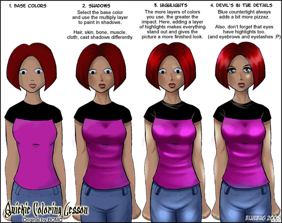
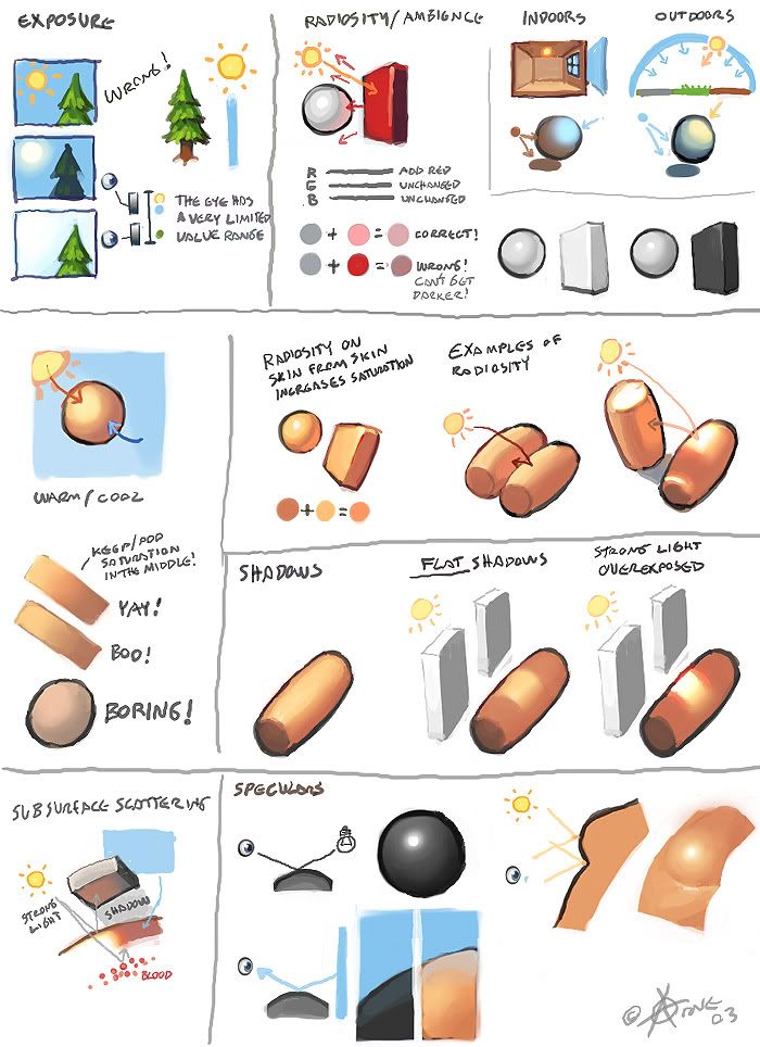
That page is my Lord. And I always wondered how to find that bloke again.

Thanks man!

JohnLynch
Regular Poster
Posts: 43
Joined: Thu Sep 01, 2005 9:45 pm
Contact:

Post by JohnLynch »

bluebug wrote:Image
I wish to create a shrine to you :P
Image

User avatar
Bluebug
Regular Poster
Posts: 246
Joined: Wed Mar 06, 2002 4:00 pm
Contact:

Post by Bluebug »

Ooh! A shrine? I always one of those :P Thanks for the compliment though, I needed that. Been a bad week ^^;;

wp: That is one awesome tutorial. Now THAT artist needs a shrine. Though I'm assuming he gets paid to do art ... which is even better ^_^

BOMC : Much better! My only nitpick is that the folds in her shirt aren't very realistic. Look at your own shirt in the mirror and examine how it folds along the body. Also ... layers cast shadows. Thus, the edge of the shirt should be casting a direct shadow on her pants. Otherwise the entire edge look a bit too flat and non 3 dimensional. Like Levi I'd suggest making the shadows stronger. But other than that, keep up the great work.

I've got another coloring tutorial on my newly created deviant art account. It's a bit more complex and detailed than the one above.

My Deviant Account
Image

Post Reply