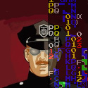
I worked on this pic for my BuzzComix vote incentive. Tell me if it looks okay. I put alot of time into the shading, and the background. ALOT. I was also wondering if anyone thinks that I should shade my comics like this as well. Just wondering.
The character is Sarah Aelynn, one of the main characters of my webcomic, Circle Arcadia: KotG, as linked in my signature. She doesn't normally look like that. I kinda dressed her up.
I hope you like it. **crosses fingers** And if you do, I'll use it for my Buzzcomix vote pic. Thanks.
Help me out here.
-
Prettysenshi

- Bork Bork Bork
- Posts: 2269
- Joined: Thu Jun 24, 2004 8:23 am
- Location: Anywhere else but here....
- Contact:
Help me out here.
- Attachments
-
- buzzcomix vote pic.jpg (43.25 KiB) Viewed 2996 times
-
Phalanx

- The Establishment (Moderator)
")
- Posts: 3737
- Joined: Thu Mar 06, 2003 11:46 am
- Location: Superglued to the forum by Yeahduff
- Contact:
It's a nice pose, but a few anatomical errors.
Her left eye (the one from the viewer's right) is too much to the right. Move it closer to the nose.
Secondly, her erm... breast seems to be missing. The lower half of her breast should be visible through that armpit gap.
A few corrections and I'm sure it'll look great for your vote pic
Her left eye (the one from the viewer's right) is too much to the right. Move it closer to the nose.
Secondly, her erm... breast seems to be missing. The lower half of her breast should be visible through that armpit gap.
A few corrections and I'm sure it'll look great for your vote pic

-
Prettysenshi
- Bork Bork Bork
- Posts: 2269
- Joined: Thu Jun 24, 2004 8:23 am
- Location: Anywhere else but here....
- Contact:
That would be kinda hard after I shaded everything. To change her eye and move it might ruin the color scheme on her face. Unless you have any tips on that.Phalanx wrote:It's a nice pose, but a few anatomical errors.
Her left eye (the one from the viewer's right) is too much to the right. Move it closer to the nose.
Hmmm. I didn't notice that. Let's just say that her breast are really, really small.Phalanx wrote:Secondly, her erm... breast seems to be missing. The lower half of her breast should be visible through that armpit gap.
Thanks.phalanx wrote:A few corrections and I'm sure it'll look great for your vote pic
-
Phalanx
- The Establishment (Moderator)
- Posts: 3737
- Joined: Thu Mar 06, 2003 11:46 am
- Location: Superglued to the forum by Yeahduff
- Contact:
If you have photoshop, use the stamp tool on a different layer, or just copy the eye area and paste on a diff. layer. Position the eye in the right place, then eat away on unwanted areas with the eraser tool set on soft brush so it blends in.prettysenshi2k6 wrote:That would be kinda hard after I shaded everything. To change her eye and move it might ruin the color scheme on her face. Unless you have any tips on that.Phalanx wrote:It's a nice pose, but a few anatomical errors.
Her left eye (the one from the viewer's right) is too much to the right. Move it closer to the nose.
-
Prettysenshi
- Bork Bork Bork
- Posts: 2269
- Joined: Thu Jun 24, 2004 8:23 am
- Location: Anywhere else but here....
- Contact:
Okay, I fixed the eye---I don't have Photoshop, but there were tools in GIMP that pretty much did the trick, and I added her breast under her armpit. Is that everything? I think it still looks good. Oh, and btw, thanks for the tip. Because of you, I learned about two tools in GIMP that I never knew about, along with some new tricks. Thankies!Phalanx wrote:If you have photoshop, use the stamp tool on a different layer, or just copy the eye area and paste on a diff. layer. Position the eye in the right place, then eat away on unwanted areas with the eraser tool set on soft brush so it blends in.prettysenshi2k6 wrote:That would be kinda hard after I shaded everything. To change her eye and move it might ruin the color scheme on her face. Unless you have any tips on that.Phalanx wrote:It's a nice pose, but a few anatomical errors.
Her left eye (the one from the viewer's right) is too much to the right. Move it closer to the nose.
- Attachments
-
- buzzcomix vote pic.jpg (43.27 KiB) Viewed 2981 times
-
Black Sparrow

- Cartoon Anti-Hero
- Posts: 6973
- Joined: Fri Jul 22, 2005 9:04 am
- Location: Violating your restraining order
- Contact:
She's just picky because she's a phenomenal artist. It's pretty good, but maybe do some more work on the wings?
Look up some references online to see how feathers look when they're all mashed together. The best I can say is maybe dab a little light blue in the along one sid of each feather to get a more 3D shadow effect. Right now the wings seem a little flat.
Awesome pose and shading.
Look up some references online to see how feathers look when they're all mashed together. The best I can say is maybe dab a little light blue in the along one sid of each feather to get a more 3D shadow effect. Right now the wings seem a little flat.
Awesome pose and shading.
This is going in my notebook titled "Things I Didn't Know about Surface Dwellers."


2 things: you missed colouring in a little spot of the sky under her right wing, and there're a few little white lines in her hair where you didn't colour right to the edge which would look a lot better (imo!) if you did. Otherwise very nice 8)

If you like penguins, ninjas, and/or the colour blue, come see!
-
Phalanx
- The Establishment (Moderator)
- Posts: 3737
- Joined: Thu Mar 06, 2003 11:46 am
- Location: Superglued to the forum by Yeahduff
- Contact:
Incidentally, I'm not sure if GIMP can do this, but if you have your magic wand set to Non-contiguous, and then select the white areas near the lines that shinyhugh pointed out, you can select almost all of the white spots at once. Then you can run everything near the wings over with a red brush and not worry about painting over the areas you coloured.shinyhugh wrote:2 things: you missed colouring in a little spot of the sky under her right wing, and there're a few little white lines in her hair where you didn't colour right to the edge which would look a lot better (imo!) if you did. Otherwise very nice 8)
Glad to help and happy to hear you learned a few new things
Not sure if you're talking about prettysenshi or me, but if that's the case,Black_Sparrow wrote:She's just picky because she's a phenomenal artist.
Personally I've learnt more about digital colouring from these forums than anywhere else, I think.
-
LibertyCabbage
- Cartoon Hero
- Posts: 4667
- Joined: Tue Jan 25, 2005 4:08 pm
- Location: bat country
- Contact:


-
Prettysenshi
- Bork Bork Bork
- Posts: 2269
- Joined: Thu Jun 24, 2004 8:23 am
- Location: Anywhere else but here....
- Contact:

The rendering's fine, it's the drawing that's giving you trouble. It's a lot like spending a half hour drawing an eye, only to realize it doesn't line up with the rest of the face. It happens to all of us. A simple understructure system cleans most of it up. As a guy with several winged characters in his own comic, I thought I'd try something here -

What I changed -
You want to draw the body before you draw the wings. (I'm not sure if you did here or not, but that's how I work.) It gives them more of a growth look and they can add emotion to your pose much in the same way eyebrows work. Shoulders are also extremely important, since they help you point your figure correctly. The Egyptians prefered to render parts of the body in certain positions, but this causes a twisting when everything doesn't line up. (Shoulders in profile, face in front view, stuff like that.) The neck's a little too tall, too far to the right, and I get the feeling the head's turned too far back for the pose. The lengths of the forarms and biceps are a little inconsistant with each other and big for the body type.
I hope you didn't find that overly critical or anything. The piece itself is nice, it's just important to have it structured solidly before you put all the time in to rendering it. I trained as an animator for awhile and I'm still struggling with anatomy, myself

-
Prettysenshi
- Bork Bork Bork
- Posts: 2269
- Joined: Thu Jun 24, 2004 8:23 am
- Location: Anywhere else but here....
- Contact:
Wow. I never have been artistically critizied where someone actually took my work and drew red stuff all over it. I'm not offended, kinda, but it is different. I am grateful for the advice, however. So thank you for that.Townie wrote: I hope you didn't find that overly critical or anything. The piece itself is nice, it's just important to have it structured solidly before you put all the time in to rendering it. I trained as an animator for awhile and I'm still struggling with anatomy, myself
Um, as for the lines around her back, I'm guessing that you mean that her posture is wrong. Well, I'm a huge fan of J. Scott Cambell, one of the minds behind Danger Girl, and if you know his work, he keeps his work realistic, but distorts certain areas for sexual appeal, etc. That's what I was going for. I'm kinda like that with all of my art. Real, but not completely. But like I said, thanks for the advice.
I'll keep all that in mind next time I make artwork.
I was trying to imply a structure but I did it in photoshop so it went flat. Woulda worked better with an actual pencil. Anyway, I'm a fan of Campbell's myself. (I've got a copy or two of the preview 1/2 issue of Dangergirl sitting around where you see the pencils.) The thing you have to remember is getting the structure solid. Really simple figures can look convincing because of how they're built. Stylization is fine, but only if it helps the drawing. A lot of people online have a pattern they always use to draw a face, for example. It's all well and good for drawing that one face, but you can't turn it because it's a flat design. It doesn't have any dimension. Style is largely something you pick up while making a drawing, not something you set out for when you put pencil to paper. I say this because nobody wants to end up on the other end of the stylization spectrum - that's right, Rob Leifeld
-
Mercury Hat

- Iron Lady (ForumAdmin)
")
- Posts: 5608
- Joined: Sat Jan 24, 2004 1:57 pm
- Location: Hello city.
- Contact:
Stylization is fine and dandy, but it really helps to know the anatomy first. Like townie said, style should develop naturally as you put your own touches into drawing something. You can't convincingly bend the rules of anatomy without knowing what they are, first.


<Legostar> merc is all knowing, all seeing, and not caring
-
Krytos55
- Regular Poster
- Posts: 87
- Joined: Fri Jan 09, 2004 9:51 pm
- Location: Cincinnati, OH, United States of Robot Facisim v2.0
- Contact:
the one thing that bothered me, the hair looks like it's suffering from bad jpeg compression due to the fine white line betweent he color and the ink, to fix that in the future though simply add color with a brush tool in PS on a layer underneath your lines if you set them on multiply.

Updates Wednesdays
-
Prettysenshi
- Bork Bork Bork
- Posts: 2269
- Joined: Thu Jun 24, 2004 8:23 am
- Location: Anywhere else but here....
- Contact:
I do, but all of my work that's not digitally drawn with the mouse is just a handful of sketches---that's an understatement. I tried scanning for a while, but I didn't like the final outcome, so I use mouse-drawn work for my online work.Sortelli wrote:You said that you do these entirely on the computer with a mouse, if I remember correctly? Do you do any art on paper as well?
Why do you ask?
-
Sortelli

- Cartoon Villain
- Posts: 6334
- Joined: Sat Aug 10, 2002 7:15 pm
- Location: in your grandpa's clothes, I look incredible
- Contact:
Because it shows, honestly, the picture itself looks like something you were working on bit by bit rather than as a whole, so it doesn't have any flow. Her pose looks unnatural.
The coloring, on the other hand, looks just fine, so don't worry about that. I'm sure with enough practice you will be able to use your mouse to make a well-balanced composition, but I've always had to rely on paper for that myself. Spend a more time laying the picture out in sketches on paper or use your mouse to make the kind of base lines Townie used so that you can build her pose up before you finish it off with clean lines and coloring.
That way you can still get away with a little distortion to create a pose that is appealing to the eye as a whole.