Coloring Technique Sharing

Think your comic can improve? Whether it's art or writing, composition or colouring, feel free to ask here! Critique and commentary welcome.

Post Reply
User avatar
Bluebug
Regular Poster
Posts: 246
Joined: Wed Mar 06, 2002 4:00 pm
Contact:

Coloring Technique Sharing

Post by Bluebug »

Cool thread idea. There should be a "coloring" version of this thread so people can experiment with various color styles.

Here's my contribution to the thread:

Image

In case someone wants the setup : it's at night, with the moonlight shining down on them. So here's a chance to try your hand at dramatic lighting and shading :)
Last edited by Bluebug on Sun Mar 27, 2005 6:44 am, edited 1 time in total.
Image

User avatar
Faub
The Establishment (Moderator)
Posts: 3698
Joined: Tue May 20, 2003 2:53 pm
Location: Missouri, USA
Contact:

Post by Faub »

You know, that's a really good idea. :D

User avatar
TheBladeRoden2
Regular Poster
Posts: 609
Joined: Sun Sep 21, 2003 10:40 am
Location: Kirby Asgard
Contact:

Post by TheBladeRoden2 »

so where's the template?
"i just want to get back to life, but for that i just need to get dead" -boby
Image
JR Productions Risen: The Forum

User avatar
Bluebug
Regular Poster
Posts: 246
Joined: Wed Mar 06, 2002 4:00 pm
Contact:

Post by Bluebug »

Sorry, I must have messed up my links.
Image

User avatar
TheBladeRoden2
Regular Poster
Posts: 609
Joined: Sun Sep 21, 2003 10:40 am
Location: Kirby Asgard
Contact:

Post by TheBladeRoden2 »

now it makes sense :)
"i just want to get back to life, but for that i just need to get dead" -boby
Image
JR Productions Risen: The Forum

User avatar
Faub
The Establishment (Moderator)
Posts: 3698
Joined: Tue May 20, 2003 2:53 pm
Location: Missouri, USA
Contact:

Post by Faub »

A coloring attempt:
Image

And here's one for coloring.
Image

User avatar
Bluebug
Regular Poster
Posts: 246
Joined: Wed Mar 06, 2002 4:00 pm
Contact:

Post by Bluebug »

Love the painterly style, faub. The color scheme you used for the male elf makes him look like Link for some reason.

Your realistic style doesn't lend itself well to the usual cell style coloring I use, so I opted for a watercolor look instead. It gave me a great opportunity to experiment, but I still have trouble achieving the textured, slightly impressionistic look. How many layers are you using to achieve that look? And are there any general tips you can give me?

Image
Image

User avatar
Smight
Regular Poster
Posts: 861
Joined: Fri Dec 17, 2004 4:50 am
Location: A Dark Place
Contact:

Post by Smight »

So here's my try. Simple cell shading so...yea.
Attachments
elfcoloring.jpg
elfcoloring.jpg (41.84 KiB) Viewed 6855 times
I remember caring... It was nice.

User avatar
KathleenJ
Cartoon Hero
Posts: 1479
Joined: Fri Jan 01, 1999 4:00 pm
Contact:

Post by KathleenJ »

What a great idea for a thread. I couldn't resist giving faub's harpist a try.

Image
Image

User avatar
Faub
The Establishment (Moderator)
Posts: 3698
Joined: Tue May 20, 2003 2:53 pm
Location: Missouri, USA
Contact:

Post by Faub »

Awesome! I really like the shine you got with the red hair, bluebug. Is that just a flat color or did you do something to it? I love the details in kathleenJ's right arm too. :D

Layers for the dead elf drawing:
- normal, base color
- normal, 30-40% opacity color 2 for blush and some highlights
- normal, 100% opacity color 3 for the dark marks in the hair
- multiply, 30% opacity blue shadow
- multiply, 30% opacity brown/red shadow
- overlay, ~80-100% opacity white/yellow highlights

For the shadows I used a large airbrush with pressure sensativity and smudged the edges a bit when they got too harsh. The slight grittiness is from saving as Jpeg.

I did the whole thing in about an hour and a half.

User avatar
Phalanx
The Establishment (Moderator)
Posts: 3737
Joined: Thu Mar 06, 2003 11:46 am
Location: Superglued to the forum by Yeahduff
Contact:

Post by Phalanx »

Nice idea indeed!

I tried faub's harp-girl: this came out extraordinarily messy... I think my style suits higher resolutions better.

I also did a colour of the my ink on the other thread
Attachments
faubharp.jpg
faubharp.jpg (59.26 KiB) Viewed 6818 times
daenon-mmsahr-clr.jpg
daenon-mmsahr-clr.jpg (24.8 KiB) Viewed 6822 times
Image
The Jaded - Action. Adventure. Danger. For Hire.
Lonely Panel - Explore. Travel. Comics.

User avatar
Faub
The Establishment (Moderator)
Posts: 3698
Joined: Tue May 20, 2003 2:53 pm
Location: Missouri, USA
Contact:

Post by Faub »

It still turned out quite cool.

Image
This was my version of the harp girl (originally posted in the artwork thread in GD).

User avatar
Warofwinds
Cartoon Hero
Posts: 1088
Joined: Sat May 08, 2004 7:46 pm
Location: Beneath stormy skies
Contact:

Post by Warofwinds »

I'll submit one of my most current inked pics for this, though I don't know if anyone will want to color it. I would however, be very interested in how others' style would differ from my own, because I'm coloring this as my April teaser image.... Hence my other post...with a half-way colored version of this pic.

Image

For the (very)large version, go to http://warofwinds.keenspace.com/inkex.html
-Kez
ImageImageImage

Magius del Cotto
Regular Poster
Posts: 36
Joined: Wed Nov 24, 2004 12:33 am

Post by Magius del Cotto »

Well, here's my take on it:

Image

Not as good as some of the other stuff here, but not that bad either.
Magius out.
<a href=http://dom.keenspace.com>Image</a>
Sometimes, you're more than you think you are.

User avatar
Bluebug
Regular Poster
Posts: 246
Joined: Wed Mar 06, 2002 4:00 pm
Contact:

Post by Bluebug »

faub: I used linear dodge for the hair highlights. Thanks for the tips. You make it sounds so easy :)

Smight : That blood is gorgeous. I like how you've got it trickling down her shoulder as well.

Magius : That's a really neat texture that you created. What kind of brush did you use to get that effect?

Here's my version of the coloring for the elves. If anyone has any critiques for it, please do post here (just try and ignore the fact that his far hand isn't holding her head at all -_-; ).

Image
Image

User avatar
Sput
Needs an Oil Checkup
Posts: 2831
Joined: Wed Mar 23, 2005 8:43 pm

Post by Sput »

oooh, once i finish colouring my next page i will pick one to colour >:3


As for my lineart, it's not the VERY best I can do, but I find it extremely cute. I bring you: pimp!Apollo. He's normally just a highly amusing Soldier Assistant, but hey he found the pimp stuff, and who am I to deny him?
Attachments
PIYAMP.jpg
PIYAMP.jpg (85.76 KiB) Viewed 6767 times
lazy sput is lazy.

Magius del Cotto
Regular Poster
Posts: 36
Joined: Wed Nov 24, 2004 12:33 am

Post by Magius del Cotto »

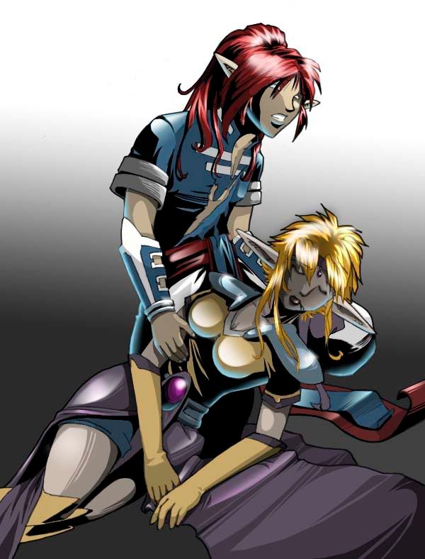
bluebug wrote:Magius : That's a really neat texture that you created. What kind of brush did you use to get that effect?
Well, here's a step by step of my process - a process I like because it is a very forgiving technique:

1: Copy the base BW image, and process it until you get a good 2 color depth image (just the lines, a white background, etc).
2: From that, you'll create 2 other layers: a copy of the background information (which I call flatte) and a copy of the original lineart (depending on your preferences, either as Multiply or as Darken - make sure the lines are dark enough for that, though)
3: Create a new layer, titled Dropshadow. This is where you'll put all the shadows that you want to have a specific impact. Once you're done, put it at 50% opacity.
4: Duplicate that layer, fill the remaining uncolored areas with white, and trace the side opposite of where you want the light to come from with black. Once done, set it at 10% opacity and rename it Light/Shadow1 (I just use LS1).
5: Duplicate and trace around the lines you added in LS1. Name LS2
6: This layer, you'll want to trace around everything. This will give the entire image much more depth than otherwise. Rename LS3
7-9: Duplicate, trace the shadows you've done before, occassionally adding new 'starts' for clothes wrinkles, etc. Once you reach LS5 or 6, you should pretty well have the entire picture in black (looking at the layer overview) with only a few spots for highlights. Don't worry if it doesn't look all that great yet. That will be handled with the next step.
10: Go through each of the LS layers and Blur More app. 10-20 times. You want the layers to blend.
11: If you want the texture I got, once you've blended the layer, apply the Paintbrush Strokes effect (using PSP7). This will give that particular layer the effect, and as you add it to the other layers, the effect will stack. There are a few other textures that work with this (and have their own look), but I'll leave that up to you to find.
12: Once done (make sure you've save the layers!), merge and save as your preferred file type.

With this method, you can mess up fairly horrendously with placing the shadows, and it won't be overly obvious. However, there are a few things you'll absolutely need:
The Flatte layer
AND
The original Lineart layer

Since this does rely on bluring lines that you've placed right at the edge of the lineart, it means that you'll end up with a blobby grey halo around the character if you don't have the flatte set up. Also, since this is lightening at the same time it's darkening (one of the reasons I like this technique), the lineart tends to suffer if you don't have the top layer to 'redo' the lines.
Overall (depending on how long it takes to color the base image), this should take you app. 1 hour to do.
Now, if you're working with multiple 'parts' of the pictures (IE: character, bed, curtains, etc), I would suggest you 'build' the picture bit by bit. Start with the character, then what they're interacting with, etc. You'll use everything but what you're coloring as the flatte (copy merged each time you finish a section). At least, that's what I've found works (and I've played with this technique quite a bit).
Hope that helps all you aspiring colorists out there.
Magius out.
<a href=http://dom.keenspace.com>Image</a>
Sometimes, you're more than you think you are.

User avatar
Caduceus
Regular Poster
Posts: 452
Joined: Mon Jun 07, 2004 10:16 pm

Post by Caduceus »

Okay, this took awhile and it still doesn't look quite finished. Some nice stuff going on, though.
Attachments
harpgirl2.jpg
harpgirl2.jpg (81.34 KiB) Viewed 6726 times
Caduceus
Marianne

User avatar
Humbug
Cartoon Hero
Posts: 1772
Joined: Thu Oct 14, 2004 3:05 am
Location: Not here.
Contact:

Post by Humbug »

Wow, nice work everyone. I'd love to join, but I'm too busy coloring one of my own. :(

User avatar
Faub
The Establishment (Moderator)
Posts: 3698
Joined: Tue May 20, 2003 2:53 pm
Location: Missouri, USA
Contact:

Post by Faub »

Post the line art. :D

Post Reply