I'm new, just waiting for my keenspace account to setup, but I've already got 8 pages of my comic done. I'm working in pencil media, as I have trouble with inks. My problem is smudging, and baloons, I should think. The scans turn out nicely enough though. Check my comic and please, be honest, what could be fixed? (pages 2 and 8 are really messed up. I might redo them completely. I LOVE 4, but my baloons on all pages could be better.)
samples are here http://sugarwater.enacre.net/comic.htm there are actually 8 images, 7 and 8 link from 6.
Thanks!
Lee
A critique...


Eh...
Well, I re-did the whole first page with CG coloring and such. It looks more basic, but its less rough. Have a look, tell me what you think?
comic1.jpg
comic1.jpg
-
Phalanx
- The Establishment (Moderator)
")
- Posts: 3737
- Joined: Thu Mar 06, 2003 11:46 am
- Location: Superglued to the forum by Yeahduff
- Contact:
There's a levels tutorial for darkening your lines somewhere in here. I'm a great advocate of pencilled comics (hell I do one myself), but not when they give me eye-strain. 
Page 1: The girl's arriving at a small lonely town. Shouldn't she be looking at the landscape instead of the camera?
Page 2: Not that I'm one to speak, but you could benefit on using a ruler to draw geometric objects like houses...
The font you are using (comic sans, right? *shudder* has jagged edges and doesn't really go well with the type of comic you are trying to portray) Try http://www.blambot.com
Page 4: Nice. The layout's pretty cool on this one.
Page 5: Oh... that Shen Long was a guy?!
Page 6: writing 'sparkle' 'sparkle' for effects somehow doesn't work for me. It's like drawing a character flatly saying "Jin!!! (sob sob) Nooo!". A comic is a visual medium, so if the character is sparkling, draw just the sparkles instead of narrating them. Word effects are for things that c annot be seen such as sounds.
And using the line tool to create a blush on the cheeks doesn't work either.
Page 7: It's amateurs, not ametures. Good spelling is very important. When in doubt, consult http://www.dictionary.com
It's just my opinion, but your style reminds me of what I call 'pseudo-manga'. That is, you seem to be trying to imitate the manga style without understanding basic anatomy first. Some pages feel like they have been lifted from a manga or manga tutorial book. The poses are very stiff and unnatural.
Anyway, you wanted honesty. Here it is.
Don't feel disheartened. Everyone improves with time. Starting a comic is as good a reason to practice as any.

-
Thingschange

- Regular Poster
- Posts: 104
- Joined: Sat Mar 13, 2004 7:12 am
Well, while I'm not sure I'm entitled to comment being a mere beginner myself (who just received his first account... "<a href="http://thingschange.keenspace.com/">The more things change</a>", which you can look at if you want to see where my advice is coming from in terms of my own style.</a>, ) but here's my $0.02
I can't get your coloured images to load but that may just be my computer, I've been having a little bit of trouble with the internet today for some reason. So these comments are only on the penciled pictures.
1. Aside from the recommendation about the visibility issues, may I suggest with the hair that you focus on drawing it as being seperate from the head. By having the hair drawn onto the circle of the head it looks too flat.
Draw the head-oval first and then draw the hair larger around it.
2. Why on page five do you feel it is necessary to specify that it is to be continued? Given that it is a webcomic one assumes it will continue until you read "the end", or find it hasn't been updated in a year. You do it again on page 8 as well.
3. The badump badump heartbeat on page 6 would probably look better without the outgoing lines around them as this indicates an expanding sound rather than one like this which is repetative and quiet. Writing it a few times in smaller writing over the heart itself would probably be more visually effective.
4. I'm with phalanx on writing the sparkles... perhaps though if you wanted to keep them (i.e. you're not confident enough that your sparkles look like sparkles) use a theosaurus to figure out a sound based equivalent of sparkle which you'd be excused in writing.
5. Your computer drawn art which you've mixed with the pencil drawn is made exceedingly obvious by its sharp edges and that the scanning artifacts dissappear from the background... that solid white draws the eye and not necessarily in a good way.
6. Strangely aroused?? I'd avoid this personally in a serious comic, it'll have the less mature half of the audience (like myself) giggling to themselves.
7. I'd recommend "Perspective for comic book artists" by David Chelsea (published in 1997 by Watson Guptill publications) for a solid technical grounding in perspective to help with your problems in background and furniture.
Hope it helps... don't give up though, improvement comes with practice and a comic is a good incentive to keep you practising.
Coming May 1st - Things Change. A look at the darker side of the possible future.

I don't ink my comic either, so maybe I can offer some insight. Also, what graphics program are you using?
1. Most of it's been said already regarding contrast and darkening the lines. The layout is ok, but I would like to see the town and not be told what it is.
2. His head in the upper-left panel looks wierd. Like it's reversed or something. I can't say exactly why it's wrong, but I just get the feeling that the head and body aren't lined up right.
3. It could benefit from thicker lines dividing the panels.
4. The layout is good, same contrast and line suggestions from previous critiques apply.
5. Lines surrounding the dialogue were a little confusing on first glance because you established earlier that lines from dialogue pointed to the person speaking.
6. Dunbar and Wu look like chicks to me. It's not the hair on Wu as much as it is the shape of his head and the neck, I think.
7-8. Don't have much too say about these pages.
You seem to have a good enough eye for page layouts. Keep experimenting with them, it started to get a little boring when things fell into the 4-panel mode. I 'd also suggest a book on cartooning, not manga, but cartooning in general. It'll help with facial expressions and simplifying details.
Above all, just keep drawing and you'll keep progressing.
"The Last Star Fighter was a guy from a trailer park. And people from trailer parks are MEAN."
http://section3.comicgenesis.com
http://www.myspace.com/benmannix-because I'm just too lazy to have a Real Blog
http://section3.comicgenesis.com
http://www.myspace.com/benmannix-because I'm just too lazy to have a Real Blog
-
Faub

- The Establishment (Moderator)
- Posts: 3698
- Joined: Tue May 20, 2003 2:53 pm
- Location: Missouri, USA
- Contact:
Draw your pages much larger if possible. Your pencil lines are too thick. This is a manga style (as Phalanx says, pseudo-manga). It should be inked. Fred Gallagher may use pencil but he also draws on 11x17 card stock and shrinks it substantially so the pencil is less noticable.
Scan your pages at 300 dpi or higher. Then clean them up in Photoshop, PSP or GIMP. Your images are jpeg so I have to assume you're using one of those. The tool you want is either levels or curves. Levels will allow you to keep some of the pencil quality if that's what you want. Curves will let you darken the lines, making your pencil look more like fuzzy ink. Both will get rid of the gray fuzz in the background.
You don't appear to be taking advantage of some of the pencil's finer qualities (gradients, smudges to be used for texture, varying levels of shadow, shadows within shadows, etc.) I suggest you use curves to remove as much "pencil" as possible from your drawings.
Your file sizes are very good but you need to tinker with the settings to get the image to look a little cleaner. The jpeg artifacts really don't do justice to your pages. Please consider using GIF or PNG compression after you clean up the image. The file sizes should be comparable but the quality will be 100% better. Also, if you can't get the file size below 100k with PNG, you can reduce your page size (dimensions) a little more. Your fonts and characters are very large on the screen and can handle a little more reduction if necessary.
Fonts: Check out Anime Ace or Digital Strip
http://www.1001freefonts.com/
http://www.1001fonts.com/
Google search for "1001 free fonts"
That was the easy stuff. 8) Now for the hard stuff.
Perspective: Anime/manga backgrounds are intricately detailed. You get labeled as pseudo-manga mainly because you pay more attention to the characters than you do the backgrounds (that's not the only reason as Phalanx mentioned, but it's a very obvious flaw). Whenever possible, draw from photographs. Try to get your backgrounds as close to the original as possible. If not possible (fantasy backgrounds) try to be as detailed as possible and follow the rules. Example: don't draw trees the way you think they should look. Draw trees the way trees look.
http://sugarwater.enacre.net/page2.htm
You have one perspective for the trees in the background, one perspective for the house, one for the shed in the bottom right of the page, the fence appears to be broken and laying on its side as it moves to the left side of the page, etc.
Perspective Drawing is one of those big, useful books that you always pass over in the art store. It has a lot of information compressed into a neat package. There are MANY others out there. I can't find a really useful perspective tutorial online, though. Sorry.
Characters: *Anatomy/figure drawing rant* Poke around this forum. You'll find it.
I will say that your characters' features look pasted on. This is where understanding how the face works comes in handy. Even with the manga style where features are distorted from their natural proportions, the rules governing a face structure (skull, muscles, proportions and placement) still apply. Phalanx posted a link to a PDF file of a figure drawing book. You should download and use this file. (Sorry, no link. You'll have to poke around these forums a little more for it.)
http://sugarwater.enacre.net/page8.htm (first panel)
Bishies: I don't know if you're reading OO Strange Candy, but you appear to be doing some of the same things.
http://strangecandy.keenspace.com/d/20010322.html (The bottom two panesl.
Strange Candy is a parody of everything Japanese and pseudo-Japanese (MegaTokyo) and it doesn't try to hide this fact. "Sparkle Sparkle" is intended to make fun of the sparkly screen tones (over)used in shoujo manga in place of actual backgrounds.
Real shoujo doesn't sparkle so loudly.
http://www.atpictures.com/display.php?g ... ena009.jpg
http://www.atpictures.com/display.php?g ... ena034.jpg
All things CLAMP
It's amazing how hard it is to find good examples on the Internet. Too many garbage links.
Some good webmanga:
http://ju-lian.keenspace.com/ (serious shoujo. VERY detailed.)
http://pele.keenspace.com/ (less serious, characters will chibi on occasion - Soap Committee posts on general discussion quite a bit. You should PM her about screen tones)
http://www.ponju.net/ (piggy manga and discussion forum on everything manga there have been many posts on screen tones, finding and using)
(I'd point you a Kagerou, but the bishis there don't sparkle. They're generally psychotic in the bad way.)


-
Christwriter
- Cartoon Hero
- Posts: 1915
- Joined: Fri Jan 30, 2004 11:56 am
Well, I can't say much for manga-style effects (or anatomy) but I also run a pencil (colored!) comic, so I'll pitch in my two cents as well.
Darken. Please. It's almost painful to look at. I have bad eyes, and I know a large percentage of the population will also have bad eyes.
Also...try drawing with two pencils: a hard lead (B, HB or harder) and a very soft lead (4B, 6B or 8B) the lighter the first pencil, the less you have to erase because the darkening technique Phalanx teaches will remove some of the lines you don't want...and the darker pencil will let you keep those you do.
There is a wonderful discussion on how to make speech bubbles here...somewhere. The method I use is Photoshop...select the area around the text, fill with white, go to the Select menue, pick Modify/Border, enter the number of pixels I want as the "border" and then fill in the little outline I want. Takes about five minutes to get 'em all.
Try exparamenting with fonts to get the right one for your comic. The font you use doesn't have to have "Comic" in front of it. I use Arial text on mine and it fits the attitude I want...and when I want to get lyrical or creepy, I use Fine Hand with different colors (red Fine Hand is REALLY creepy)
Shading...depending on how much time you have, either use a pencil and hash it (draw lines going one way, then lines going the other, like you're trying to show a plad shirt,) then smudge it with a tortellion or a piece of toilet paper, or do it on the computer (this is faster). But shading...especially DARK shading, will make your drawings really pop.
Add wrinkles to the clothing. Draw out the body first and then put the clothing on top of it, so you know where to put folds and clingy places. Shade the wrinkles.
Buy How To books. There are plenty of good ones out there...spend about thirty minutes with them a day, or else draw with them sitting right next to you, and when you're not sure how to get something right, pick up the book. There are also several anatomy books for artists that show just what you need to know to draw and nothing else. In other words...the skeletons and muscles are drawn inside the skin. Ta-da!
CW
"Remember that the definition of an adventure is someone else having a hell of a hard time a thousand miles away."
--Abbykat, NaNoWriMo participant '04
Coloring tutorial It's a little like coloring boot camp. Without the boots.
<a href="http://blueskunk.spiderforest.com"> </a>
</a>
<a href="http://www.nanowrimo.org"> NaNoWriMo </a> --for anyone who has ever aspired to write a novel. Insanity is also a requirement.
--Abbykat, NaNoWriMo participant '04
Coloring tutorial It's a little like coloring boot camp. Without the boots.
<a href="http://blueskunk.spiderforest.com">
</a><a href="http://www.nanowrimo.org"> NaNoWriMo </a> --for anyone who has ever aspired to write a novel. Insanity is also a requirement.
Hi everyone. These tips are wonderful. Alot of what I've been looking for.
Graphics App: I use PhotoPlus 5.5 freeware, I do not have PhotoShop/PSP or Gimp because I cannot install them onto a school computer. La. My own computer is a Mac with Graphics Convertor, but I have no internet, so I deal with the lab computer.
The style is basically the style I've been drawing since grade 8, (I'm 21 now) and I've only recently started reading anime art tutorial books to improve my art a little.
If you haven't guessed, this is a Shonen-Ai story. I'll see what I can do about backgrounds, I've never been good at perspective and I took all 5 years of Advanced Visual Arts in High School. I'll have to find some books to help me with that, architectural art isn't really my style.
I may have to start this story from scratch anyway. ;__; I went to get my pages out of the folder I'd stored them in and there was water damage from a roof leak I didn't know existed! So all I have to work on is the images on my webpage. -.- I think I'll just redraw it, (and store it in plastic bags. O__O) but I'll have to buy new paper, I've been working on printer paper, which is all I have at the moment. (my ink pen has died at last. Recommended brands to replace it?) My other option is to work just in CG for now, since I have an interest in it, and come back to _this_ comic once I have the appropriate media to work with. (New Moons is only one of the stories I'll be doing set in Sugar Water, the main storyline after this will be set in modern time.)
Anyway, these comments were exactly what I needed to hear. I wasn't sure WHAT was wrong with my art, but I knew it was something, and you all have hit it on the nail. You never really understand how your art looks to others, just to you, and I'm happy to have heard some honest opinions here (my friends all say -I like it, great- but thats not really honest.)
Dee
Graphics App: I use PhotoPlus 5.5 freeware, I do not have PhotoShop/PSP or Gimp because I cannot install them onto a school computer. La. My own computer is a Mac with Graphics Convertor, but I have no internet, so I deal with the lab computer.
The style is basically the style I've been drawing since grade 8, (I'm 21 now) and I've only recently started reading anime art tutorial books to improve my art a little.
If you haven't guessed, this is a Shonen-Ai story.
I may have to start this story from scratch anyway. ;__; I went to get my pages out of the folder I'd stored them in and there was water damage from a roof leak I didn't know existed! So all I have to work on is the images on my webpage. -.- I think I'll just redraw it, (and store it in plastic bags. O__O) but I'll have to buy new paper, I've been working on printer paper, which is all I have at the moment. (my ink pen has died at last. Recommended brands to replace it?) My other option is to work just in CG for now, since I have an interest in it, and come back to _this_ comic once I have the appropriate media to work with. (New Moons is only one of the stories I'll be doing set in Sugar Water, the main storyline after this will be set in modern time.)
Anyway, these comments were exactly what I needed to hear. I wasn't sure WHAT was wrong with my art, but I knew it was something, and you all have hit it on the nail.
Dee
-
Thingschange
- Regular Poster
- Posts: 104
- Joined: Sat Mar 13, 2004 7:12 am
Shonen-ai? what's that...
-(captain google to the rescue)-
Ohhhhh, so THAT'S what shonen-ai means. Well I suppose perhaps he was "strangely arroused".
Technically my comic is also shonen-ai (in terms of contents), but since it's not a manga I wasn't really familiar with the term.
-(captain google to the rescue)-
Ohhhhh, so THAT'S what shonen-ai means. Well I suppose perhaps he was "strangely arroused".
Technically my comic is also shonen-ai (in terms of contents), but since it's not a manga I wasn't really familiar with the term.
Coming May 1st - Things Change. A look at the darker side of the possible future.
-
Faub
- The Establishment (Moderator)
- Posts: 3698
- Joined: Tue May 20, 2003 2:53 pm
- Location: Missouri, USA
- Contact:
If you're 21 and at college, take advantage of the drawing and design courses offered. They won't do anything but help you. If possible, get into a life drawing course. Whenever possible, draw real people whether they're people you know or people you see if like the food court or something. Keep your sketchbook with you at all times (except maybe the shower). Also, get into a creative writing course. Get your writing critiqued. Take advantage of this stuff while you can. Once you get out of college, none of these things will be available to you.
As for pens, Micron Prisma is good and I have been told by at least one professional artist that Sharpies are the greatest thing ever because they come in multiple sizes, they dry very fast and you can cover them completely with white. I was also told that Sharpies are for cons when you need to draw something fast. If you want to do artwork, use a brush an India ink. I don't go for that because it's liquid and difficult to carry with you.
As for pens, Micron Prisma is good and I have been told by at least one professional artist that Sharpies are the greatest thing ever because they come in multiple sizes, they dry very fast and you can cover them completely with white. I was also told that Sharpies are for cons when you need to draw something fast. If you want to do artwork, use a brush an India ink. I don't go for that because it's liquid and difficult to carry with you.
Le sigh?
Well, I've decided to try and re-hash the comic in CG for now, and maybe later when I have better supplies, and I've had a bit more practice I can move to pen and ink. (I'm good, but it takes me nearly 4-8 hours to do something as good as page 4, and by the time I'm done sketching I'm too exhausted to ink and edit. Eh, and I'm lazy)
Anyway, wonder of all wonders, I found speech and thought bubble tools in my shapes selector in PhotoPlus! So I downloaded a font from that link and fixed up page one. (tell me if you think another font would be better, and you have to COPY and PASTE the link because Geocities is sucky. Mind that if the bandwidth goes down, there is nothing I can do, fateback won't let me upload to their server right now for some strange reason!)
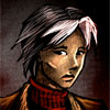
http://ca.geocities.com/dee_dolly7/comic1.jpg
So there's my example, if it doesn't load I'll edit the link. I fixed Long's hair so it looks more like a ponytail and less like he has a problem with his barber, (lol) and changed the storyline a tad, (gonna insert a few extra scenes with the town and surrounding forest in before the initial story with the Dunbar's. Mainly because Sugar Water has alot of magical history and I wanted to make it clear from the start that something magical lives in the woods. >P)
Hope you like. I haven't added any shading yet, I'll be working with my graphics application a bit more to see what kinds of effects I can get before I do it to my actual image.
Lee
Anyway, wonder of all wonders, I found speech and thought bubble tools in my shapes selector in PhotoPlus! So I downloaded a font from that link and fixed up page one. (tell me if you think another font would be better,
http://ca.geocities.com/dee_dolly7/comic1.jpg
So there's my example, if it doesn't load I'll edit the link. I fixed Long's hair so it looks more like a ponytail and less like he has a problem with his barber, (lol) and changed the storyline a tad, (gonna insert a few extra scenes with the town and surrounding forest in before the initial story with the Dunbar's. Mainly because Sugar Water has alot of magical history and I wanted to make it clear from the start that something magical lives in the woods. >P)
Hope you like. I haven't added any shading yet, I'll be working with my graphics application a bit more to see what kinds of effects I can get before I do it to my actual image.
Lee
-
Mercury Hat
- Iron Lady (ForumAdmin)
")
- Posts: 5608
- Joined: Sat Jan 24, 2004 1:57 pm
- Location: Hello city.
- Contact:
I don't know how in depth you want this, but here goes:
There isn't a background at all, just a bunch of leaves. If it weren't for his internal monologue, I wouldn't have any idea where he was.
His face doesn't have any expression at all. He should look quizzical if that's what he's thinking, but he just looks bored. He could also be frustrated, tired, etc, it depends on the mood you're setting and the character himself.
The style looks much better inked (I really can't stand penciled comics unless you really know what you're doing), but it looks like you just went over it with the pen tool in a painting program. The lines are very jerky. Also, it's extremely easy to tell what was done on the computer and what wasn't. In a comic, especially a pseudo-manga style one, it's best to do as much as possible by hand. Actually, now that I look closer, did you draw that on the computer? If you did, I would strongly recommend not doing the comic that way, unless you're super deft with a mouse, there's no way you can get the level of detail you'll need for your style.
Don't be afraid to ink by hand. Do practice first if you'd like by inking doodles. If you mess up slightly, that's okay, most mistakes can be fixed on the computer.
Work on placement of the thought bubbles. The second one looks like it's coming from his hair or shoulder.
His braid is just kinda floating out there in space. You probably just wanted to show how long it was, but that can be done easily with a side view.
The shadow under his chin is way dark. Shadows aren't pitch black like that. To do CG shadows, pick a color that's slightly darker than the skin color and use that. Also, if he's in the woods, he'd have shadows on most of his body from the overhead trees with little breaks of sunlight (this is why I don't do any of my scenes in the woods...).
The strap on his bag is very short and there doesn't seem to be any weight to the bag at all. If he's starting a new life, his bag should be bigger to hold all his possessions (even if he's poor, which I don't know if he is, he'd still have more stuff to carry).
Faub mentioned the link to the anatomy .PDF so find that (it's in a topic I started called "Help with Anatomy", it's in this forum) and work on it.
The highlights in his eyes are...confusing. In simplified manga/anime style, the highlight comes from one direction and it's usually the top left (your left) of the eye but it depends where the light source is. Smaller highlights can be added.
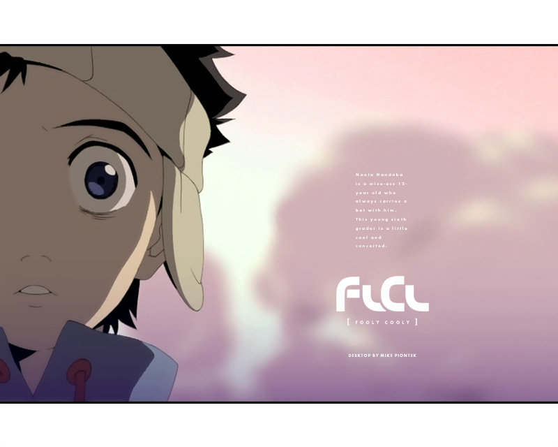
The lovely Miss Faye Valentine demonstrates: http://nicogold.free.fr/imgman/faye3_2.jpg
http://nicogold.free.fr/imgman/faye2.jpg
As well as Naota-kun:
http://log.tenseforms.com/robotspacer/u ... 00x600.jpg
And to a very simplified extent, Satoshi from Pok
There isn't a background at all, just a bunch of leaves. If it weren't for his internal monologue, I wouldn't have any idea where he was.
His face doesn't have any expression at all. He should look quizzical if that's what he's thinking, but he just looks bored. He could also be frustrated, tired, etc, it depends on the mood you're setting and the character himself.
The style looks much better inked (I really can't stand penciled comics unless you really know what you're doing), but it looks like you just went over it with the pen tool in a painting program. The lines are very jerky. Also, it's extremely easy to tell what was done on the computer and what wasn't. In a comic, especially a pseudo-manga style one, it's best to do as much as possible by hand. Actually, now that I look closer, did you draw that on the computer? If you did, I would strongly recommend not doing the comic that way, unless you're super deft with a mouse, there's no way you can get the level of detail you'll need for your style.
Don't be afraid to ink by hand. Do practice first if you'd like by inking doodles. If you mess up slightly, that's okay, most mistakes can be fixed on the computer.
Work on placement of the thought bubbles. The second one looks like it's coming from his hair or shoulder.
His braid is just kinda floating out there in space. You probably just wanted to show how long it was, but that can be done easily with a side view.
The shadow under his chin is way dark. Shadows aren't pitch black like that. To do CG shadows, pick a color that's slightly darker than the skin color and use that. Also, if he's in the woods, he'd have shadows on most of his body from the overhead trees with little breaks of sunlight (this is why I don't do any of my scenes in the woods...).
The strap on his bag is very short and there doesn't seem to be any weight to the bag at all. If he's starting a new life, his bag should be bigger to hold all his possessions (even if he's poor, which I don't know if he is, he'd still have more stuff to carry).
Faub mentioned the link to the anatomy .PDF so find that (it's in a topic I started called "Help with Anatomy", it's in this forum) and work on it.
The highlights in his eyes are...confusing. In simplified manga/anime style, the highlight comes from one direction and it's usually the top left (your left) of the eye but it depends where the light source is. Smaller highlights can be added.
The lovely Miss Faye Valentine demonstrates: http://nicogold.free.fr/imgman/faye3_2.jpg
http://nicogold.free.fr/imgman/faye2.jpg
As well as Naota-kun:
http://log.tenseforms.com/robotspacer/u ... 00x600.jpg
And to a very simplified extent, Satoshi from Pok


<Legostar> merc is all knowing, all seeing, and not caring
-
Thingschange
- Regular Poster
- Posts: 104
- Joined: Sat Mar 13, 2004 7:12 am
Well I disagree with mercury hat on one small point... I've seen many inked comics which do <b>some</b> shadows in full black ink and often they do this under the chin, and to good effect.
However they don't do a solid line like you have, instead they'll do an upside down triangle of black on the opposite side of the neck to the light source and use this to indicate the adam's apple in the case of men (in fact I think I've only ever seen this type of shadow on men).
I wanted to look for an example of this in some of my comic books but since my room is currently a film set I can't get to any of my comics (sob). If you look around, particularly at western superhero comics you should probably see what I'm talking about.
Another "but" is that it tends to be done in dark and shadowy comics whereas so far yours is very bright. Also since you apparently want to do romance in your comics, it might pay to simulate soft lighting instead of hard lighting (less clearly defined shadows) as this makes people look more attractive.
So in short I agree that the shadow is wrong, but I can see where you were coming from in using it.
Coming May 1st - Things Change. A look at the darker side of the possible future.
-
Mercury Hat
- Iron Lady (ForumAdmin)
- Posts: 5608
- Joined: Sat Jan 24, 2004 1:57 pm
- Location: Hello city.
- Contact:
Well, I didn't mean it was flat-out wrong, but since there aren't any other shadows on the body at all, it looks very out of place and way too dark. You'd get a dark shadow like that from dim lighting or a shadow being cast on the person already. Shadow on the person + shadow under the chin = double shadow = darker shadow than the others. If other shadows were present, it wouldn't stick out so much.
<Legostar> merc is all knowing, all seeing, and not caring
-
Thingschange
- Regular Poster
- Posts: 104
- Joined: Sat Mar 13, 2004 7:12 am
In further criticism (hopefully constructive):
1) I'll be honest, I don't like the thought bubbles. It may just be my style but the low number of bumps on the outside make it look a bit "funny" to me. The idea that every thought bubble in your entire comic will be identical fills me with dread, though any exact repetition of anything (even panel structure) can become painful.
2) Again this may just be my personal preference but I think speechbubbles look better with an outline around them. In photoshop this is easy to do, just draw the speechbubble in a different layer, then alter that layer's blending properties to "outer glow". With a black glow, blending mode of "normal" (on the outer glow itself, not the layer), and using "precise". There may be other ways to do this, but I personally find this one easy and nice to work with.
3) I still think that the hair is on a little too tight. Ignore for a second that you drew the image and look at it as a series of shapes... see how the head and hair together make a single shape? This isn't right. You've widened the top of the head oval to make the head wider but this wasn't what I meant. Instead draw the head shape, and then draw the hair as a larger shape on top of it.
4) With the costume, having the absolute straight lines of the threads at front makes it look like he stood in front of a mirror with a spirit level getting dressed in the morning. Putting those string lines at a slight angle would make the image more dynamic. I'd also recommend making them three dimensional instead of a flat line.
5) According to the shoulders he's walking right to left, yet the face is looking absolutely forward. Is he turning his head to give the camera an "aside"? I'd recommend a slight angle to the head always unless there's a very good reason why they're facing the camera. Watch any movie, look at the actors and tell me how often they look at the camera unless they're speaking to the audience (or the character you're filming a POV from).
6) If you intend english-speaking audiences to read this and have a panel structure that reads from left to right it's more dynamic to have your character facing left->right instead of right->left as you have now.
7) Someone mentioned in this thread earlier that manga always has very detailed backgrounds, though I hadn't heard this before you might want to consider that the background doesn't look anything like a woods. Not that this is necessarily a problem, it's symbolic of woods which may be enough.
8) Lose the braid in a full front on view. I know it represents your character but if your audience can't recognise him without the braid you need to add more distinguishing features rather than putting it into every shot like some product placement coke can.
9) Aaarg! perspective. His left shoulder is facing at maybe a 15 degree angle to the picture plane while the right shoulder looks closer to 45 degrees... and his head is 0 degrees. Judging by his bag, the centre of his back is sloping at closer to a 60 degree angle. But if you judge by his costume then he's facing centre on (the only time you'll ever get those exactly horizontal lines that I hate so much).
And that's it... don't be discouraged by my tone, you've clearly got some artistic talent that will help you develop your skills quickly with the practise this comic will give you.
Coming May 1st - Things Change. A look at the darker side of the possible future.