Well I checked out her dA (morbid curiosity gets the better of me again) and the first comment was praise for her racist comics so...VeryCuddlyCornpone wrote:I specifically was talking about the racist aspects as opposed to the rape stuff, though I shouldn't be surprised that there's just as much an audience for bigoty comics as rape comics.LibertyCabbage wrote:Nah, I think it's 'cause she's making money off this stuff. It's a business, and she's giving her customers what they want.VeryCuddlyCornpone wrote:And, despite having it explained to her time and time again, doesn't actually intend to change anything because TEE HEE she's just so innocent and European you see
I'll review your webcomic.
-
RobboAKAscooby
- Cartoon Hero
- Posts: 1140
- Joined: Thu Aug 07, 2008 1:00 pm
- Location: Brisvegas
- Contact:
Re: I'll review your webcomic.
 Deviantart~tumblr
"Your service is to the story and to the characters. Fuck the audience and fuck your own whims." - Yeahduff
-
LibertyCabbage
- Cartoon Hero
- Posts: 4667
- Joined: Tue Jan 25, 2005 4:08 pm
- Location: bat country
- Contact:
Re: I'll review your webcomic.
Webcomic: A Softer World
URL: http://www.asofterworld.com
Creator/s: Joey Comeau, Emily Horne
Run: 2/03-current
Schedule: ?
Section/s: Strips 981-1000
Website: It's a very simple layout, with the strips on a white background and the creators' comments at the bottom. Oddly, the page isn't centered in the browser window, even though this is a standard feature in just about every webcomic. The comments are also highly redundant, with all of them merely showing off stuff the creators have for sale. Because of this, readers see the cover of one of the creator's novels below almost every strip in the section.
The site's features are an About page, a store, a "random strip" button, and a page with links to the creators' other projects. It's a fairly average offering, but I expect a bit more from a webcomic that's been running as long as this one has.
Writing: A Softer World's meant for an audience who doesn't like sophisticated webcomics but nevertheless wants to feel sophisticated. Offering bite-sized bits of poetry, the comic provides an easy way for readers to obtain a certain desirable feeling: that they're smarter than readers who prefer more "pedestrian" comics. Being one of the most popular short-form webcomics, A Softer World has managed to attract a larger following than almost all of the webcomics that are actually sophisticated.
Brevity's the comic's biggest strength, but it's also its greatest weakness. With between three and six brief lines of text in each strip, the creators are able to mass-produce simple messages, providing frequent updates that are easily understood by the audience. The comics read like emo fortune cookies, iterating sensations of depression and loneliness without making an attempt to explore these emotions and make an intelligent contribution. The resulting text comes off as vain, as it relies on first- and second-person pronouns that highlight the significance of the person feeling these emotions rather than the significance of the emotions themselves. But this problem's largely caused by the comic's format, as the introduction of characters and their situation is always immediately followed by new characters and a new situation. A more elaborate format, such as having six or more panels, would allow for greater creativity and complexity, but that would require more effort from the creators and turn off readers who aren't looking for a deep reading experience. Some gag comics are able to successfully use the three-panel format, but they utilize cleverness, humor, or insight, none of which are present here. There are occasionally strips that are of a more upbeat nature, but their jokes are as lame as those found in the lamest gag comics.
Art: While the photography gives the webcomic a sense of novelty, it isn't handled in a creative way. Strips concerning loneliness show one person, while strips concerning relationships show two people. In a similarly obvious way, strips concerning attraction will have a photograph of an attractive woman, and a strip about the government shows a government building. The creators will occasionally offer an alternative by using blurry, claustrophobic imagery or generic backgrounds, but these images are unappealing and are neutral enough to be used in any context. The creators' signature tricks, though, are using grayscale photographs and a typewriter font, which make the strips look moody and artsy without adding any real substance. In addition, while the photography obviously requires less work than a drawn comic, the creators only use one photo per strip, often copy-pasting the image to create three panels out of it.
Overall: Despite the negativity of this review, I'm not in a position to call the creators' competence into question. That's because there's so little effort put into this webcomic that it offers no indication of what the creators are actually capable of. A Softer World is just an experiment gone wrong that ended up attracting a significant readership of people who think they're cool for reading fumetti instead of regular webcomics.
1/5


"Seems like the only comics that would be good to this person are super action crazy lines, mega poses!"
-
LibertyCabbage
- Cartoon Hero
- Posts: 4667
- Joined: Tue Jan 25, 2005 4:08 pm
- Location: bat country
- Contact:
Re: I'll review your webcomic.
Webcomic: Sinfest
URL: http://www.sinfest.net/archive_page.php?comicID=4709
Creator/s: Tatsuya Ishida
Run: 1/00-current
Schedule: Daily
Section/s: Strip 4,709, "Women Only Space 5"
The beginning of the strip is structured to show the adolescent development of a girl and the patriarchal oppression that accompanies each stage. The first panel, which shows a toddler, demonstrates anonymous online harassment and reflects the cruelty of subjecting misogyny and sexuality upon such an innocent, vulnerable target. The middle two panels then show two progressively older girls, one tormented by her peers (which are clearly implied to be boys) for daring to express herself artistically, and the other being antagonized by a hostile father figure. The final panel then has our heroine reach adulthood, in which she's neglected when occupying the sex- and violence-oriented patriarchal society. While these panels are successful at providing a dramatic victimization of women, they fail to address the reality of women oppressing other women. In the first panel, for example, I wonder, where's the mother figure who's responsible for insulating this toddler from online creeps? And in the next panel, couldn't it be other girls doing the bullying? The third panel shows a father being cruel, but aren't mothers sometimes cruel, as well? And with the last panel, it isn't difficult to imagine a man being neglected by a woman. Thus, a major flaw of the strip, which prevents it from serving as valid social commentary, is that it lacks positive portrayals of men and negative portrayals of women. Instead, it simply pretends that these exceptions don't exist, when, given the comic's own criteria, we know that this is inconsistent with reality. And a political comic like this relies heavily on reality to be relevant, especially when it's so obviously lacking in the humor department.
The ability for the creator to make meaningful content is also hindered by the decision to show the women as asexual children and the men as sexual adults. Not only does this strategy brand patriarchy with the taint of pedophilia, but it also appeals to the reader's sense that childhood should be a happy, innocent phase free of perversion and sexuality. Aside from being lazy, this adult-child dualism is highly problematic in that it prevents the consideration of healthy adult relationships, including those which recognize female sexuality. Further, if sex is a characteristic of patriarchy, then what context is lesbian sex placed in? It's clear that the strip's polemical nature has robbed it of the ability to respond to adult issues, forcing the creator to resort to ignoring them completely. However, at the same time, the comic's abrasive politics aren't consistent with a childlike perspective, either. This constant alternation between adolescent and mature viewpoints is highly confusing for readers and ruins any of the writing's potentially appealing aspects.
The strip concludes with the women forming a separate, perfect, matriarchal society, and this would be a poignant development if it marked the end of the comic's 13-year run. However, the comic continues the next day as if nothing had happened. If patriarchal oppression's blamed for all the problems in the comic's world, then, logically, how can a place free of patriarchal oppression be inherently problematic? It's unfortunate that the creator blatantly avoids addressing this issue, especially considering how little intellectual content the strip has. There's also no regard for the problem that such a radical restructuring of society can't actually happen spontaneously, as women would realistically attach themselves to a variety of ideological positions. There's another underlying factor at work here, though, which is how hopelessly dependent on feminist rhetoric the creator's gotten to be. He makes his living depicting women being abused by men, meaning that excluding men from the comic would be self-destructive.
It's an embarrassment to feminism that the most high-profile webcomic to champion its cause is so incompetently and unintelligently written. The ideas that all men are evil while all women are good, and that all men hate women and all women hate men, are so simplistic and nonsensical that it's baffling an adult would actually bother to publish them.
"Seems like the only comics that would be good to this person are super action crazy lines, mega poses!"
-
IVstudios

- Cartoon Hero
- Posts: 3660
- Joined: Sun Dec 14, 2003 11:52 am
- Location: My little office
- Contact:
Re: I'll review your webcomic.
While I generally agree that Ishida addresses feminism (and most other social issues) in a totally ham-fisted way that makes his comic look like something a misogynists would write to make feminists look like idiots; he is pretty good at one thing, and that's symbolism. All of his comics are steeped in (too varying degrees of subtlety) symbolism*, and you have to take that into account and be familiar with his shorthand in order to really get his comics. So in short I think you are taking this comic too literally.
It's pretty clear that each of those women represents not an individual woman, but aspects of womanhood; i.e. innocence, creativity, sexuality and liberty in the form of a child, an artist, a devil girl (which I've read enough of the comic in the past to know Ishida uses as shorthand for prostitutes and/or temptation) and the statue of liberty.
He shows each one tormented by some sort of oppression: loss of innocence through social media; being heckled; a lack of control over ones destiny; being ignored by american society (note the Uncle Sam hat). The final panel doesn't represent a total social overhaul, just the idea that women need a place to be women, either physically or figuratively.
*Except for the ones about his cat. Those are just blatant pandering.
-
LibertyCabbage
- Cartoon Hero
- Posts: 4667
- Joined: Tue Jan 25, 2005 4:08 pm
- Location: bat country
- Contact:
Re: I'll review your webcomic.
There are a bunch of different ways the comic can be read, and I chose the one I feel's the most useful for my tangent.
As for your conclusion, I think you're trying to validate Ishida's inconsistent writing too much. The implication is that his world's a nightmarish dystopia, but it's not so nightmarish and dystopian as to justify, in your words, a "total social overhaul." It's not a particularly coherent interpretation, and it'd be simpler to just regard him as being an incompetent writer.
As for your conclusion, I think you're trying to validate Ishida's inconsistent writing too much. The implication is that his world's a nightmarish dystopia, but it's not so nightmarish and dystopian as to justify, in your words, a "total social overhaul." It's not a particularly coherent interpretation, and it'd be simpler to just regard him as being an incompetent writer.
"Seems like the only comics that would be good to this person are super action crazy lines, mega poses!"
-
IVstudios
- Cartoon Hero
- Posts: 3660
- Joined: Sun Dec 14, 2003 11:52 am
- Location: My little office
- Contact:
Re: I'll review your webcomic.
I'm not sure where you're getting "nightmarish dystopia" from. Again, you seem to be overlooking the element of metaphor that saturates the comic.
I should also say that I don't particularly like Ishida's writing, and I'm not trying to defend it*. I just think your interpretations is off base. Ishida comes off to me as well meaning but tactless and desperate to seem deep. Whether or not you think his symbolism is any good or not, he definitely loves using it. Especially in his more abstract comics, like this one. (I don't know how you could interpret a woman dressed as the statue of liberty being ignored by Uncle Sam as anything other than a blatant attempt at symbolism.)
It just seems like you are intent on interpreting his work as trite, to the point where you are taking an overly narrow view of what is intended to be a broad idea. And you don't have to do that because the comic is still plenty trite, just not in the ways you are implying. It's completely unsubtle and overly simplistic; Ham-fisted and man-hating. But it's not petophilic or denying that women can be sexual. It's a portrayal of the impact misogyny can have on different aspects of the lives of women and how society tries to brush it under the rug. It concludes that women need to stick together to overcome it. A pretty decent idea, that he tries to convey by rubbing our noses in annoying "men are evil, women are perfect" rhetoric.
*To that end, when I said he's "pretty good" at symbolism, I had almost wrote "very good" and then I though, "No, he really isn't very good. He's pretty good at it.")
-
LibertyCabbage
- Cartoon Hero
- Posts: 4667
- Joined: Tue Jan 25, 2005 4:08 pm
- Location: bat country
- Contact:
Re: I'll review your webcomic.
OK, I'll do a Part 2 to explain it.IVstudios wrote:I'm not sure where you're getting "nightmarish dystopia" from. Again, you seem to be overlooking the element of metaphor that saturates the comic.
I'd prefer it if you judged my interpretation on the grounds of how well-supported it is by the comic, how relevant it is to understanding the comic, and how interesting it is. So, instead of suggesting that my tangent's bad because I didn't discuss Ishida's critique of American culture, I'd like it if you'd consider why I chose to ignore that particular instance of symbolism, or, maybe, explain further how including it would've made my tangent better.IVstudios wrote:I should also say that I don't particularly like Ishida's writing, and I'm not trying to defend it*. I just think your interpretations is off base. Ishida comes off to me as well meaning but tactless and desperate to seem deep. Whether or not you think his symbolism is any good or not, he definitely loves using it. Especially in his more abstract comics, like this one. (I don't know how you could interpret a woman dressed as the statue of liberty being ignored by Uncle Sam as anything other than a blatant attempt at symbolism.)
Part 2 will argue against that. Granted, I've only read a portion of the webcomic, so I can't write about it with complete confidence, but I'd rather risk being wrong than go through 4,700-plus strips just to make a point.IVstudios wrote:But it's not petophilic or denying that women can be sexual.
"Seems like the only comics that would be good to this person are super action crazy lines, mega poses!"
-
IVstudios
- Cartoon Hero
- Posts: 3660
- Joined: Sun Dec 14, 2003 11:52 am
- Location: My little office
- Contact:
Re: I'll review your webcomic.
In what way did I not do those things? I did not feel your review was well-supported, and I said so by pointing out how you ignored the element of metaphor, which is crucial to understanding the comic.LibertyCabbage wrote:I'd prefer it if you judged my interpretation on the grounds of how well-supported it is by the comic, how relevant it is to understanding the comic…
I think I'm confused as to whether you are reviewing Sinfest as a whole, or just that one strip. Because I would agree with a lot of your criticism and interpretations of the comic as a whole. I just don't find them to be present in this one page.
Though either way it doesn't make sense. If it's just this one strip you seem to be deliberately ignoring elements of the comic in order to make a point, which doesn't seem like a fair way to review something. You seem to be asking the comic to do more and show more than can be achieved in a single page:
If this were a larger, multi-page comic these would be valid criticisms. But in a one page comic there isn't time to go into that level of depth. It is a quick, broad metaphor. Even if you are trying to review this page in a vacuum and ignore Ishida's established shorthand, the metaphors are still obvious enough to be understood.I wonder, where's the mother figure who's responsible for insulating this toddler from online creeps? …
And with the last panel, it isn't difficult to imagine a man being neglected by a woman.
On the other hand, if you are doing the whole comic then only holding up one page to support your arguments doesn't work very well. Especially when this particular comic doesn't portray (in my opinion) a lot of the elements you want to draw attention to.
-
LibertyCabbage
- Cartoon Hero
- Posts: 4667
- Joined: Tue Jan 25, 2005 4:08 pm
- Location: bat country
- Contact:
Re: I'll review your webcomic.
I'm clearly still not getting through about it, and I don't really feel like trying to explain myself for a third time.IVstudios wrote:In what way did I not do those things? I did not feel your review was well-supported, and I said so by pointing out how you ignored the element of metaphor, which is crucial to understanding the comic.
I admit that the way I wrote this piece can be kind of confusing, as it isn't a review (despite being in a review thread) and there isn't an explanation given for its unusual nature, but, at the same time, I don't feel that it should it be this much of a problem to do things a little differently once in a while. However, I think some of the blame has to go to Sinfest for being so dumbed-down that it requires a more creative approach to writing about it. Maybe I shouldn't have bothered to write about it at all. But if it helps clear anything up, my tangent, while focusing on Strip 4,709, was based on all the strips posted since that one as well, which is a standard sample size I use when writing about gag comics.IVstudios wrote:On the other hand, if you are doing the whole comic then only holding up one page to support your arguments doesn't work very well. Especially when this particular comic doesn't portray (in my opinion) a lot of the elements you want to draw attention to.
Anyways, this discussion doesn't really seem to be going anywhere, so you might want to hold off till I post Part 2, which will be written in a more conventional manner.
"Seems like the only comics that would be good to this person are super action crazy lines, mega poses!"
-
IVstudios
- Cartoon Hero
- Posts: 3660
- Joined: Sun Dec 14, 2003 11:52 am
- Location: My little office
- Contact:
Re: I'll review your webcomic.
So then I take it you were just being meta? Well alright, fair enough. But now I feel like a jackass.
I really wanted to have a serious debate about his use of metaphor.
I really wanted to have a serious debate about his use of metaphor.
-
VeryCuddlyCornpone
- Cartoon Hero
- Posts: 3245
- Joined: Tue Feb 10, 2009 3:02 pm
- Location: the spoonited plates of Americup
- Contact:
Re: I'll review your webcomic.
It's still possible!IVstudios wrote: I really wanted to have a serious debate about his use of metaphor.
My issue with the writing is that the cleverness of the metaphor tends to be undermined by the ham-fistedness of the delivery. This leads to the cleverness coming across as triteness or desperate cliche instead of being, well, clever. I mean, not on the same level of Sarah Zero or something like that, but it usually seems to be just a few inches away from being a political cartoon (and in many occasions stepping right over that line).

Don't kid yourself, friend. I still know how.
"I'd much rather dream about my co-written Meth Beatdown script tonight." -JSConner800000000
-
LibertyCabbage
- Cartoon Hero
- Posts: 4667
- Joined: Tue Jan 25, 2005 4:08 pm
- Location: bat country
- Contact:
Re: I'll review your webcomic.
Uh...? Anyways, this is a silly thing to get into an argument about, so I'm glad to move on from it.IVstudios wrote:So then I take it you were just being meta?
Basically, yeah, although I feel that "lacking cleverness" is too mild of a criticism for how awful the writing is.VeryCuddlyCornpone wrote:My issue with the writing is that the cleverness of the metaphor tends to be undermined by the ham-fistedness of the delivery. This leads to the cleverness coming across as triteness or desperate cliche instead of being, well, clever. I mean, not on the same level of Sarah Zero or something like that, but it usually seems to be just a few inches away from being a political cartoon (and in many occasions stepping right over that line).
"Seems like the only comics that would be good to this person are super action crazy lines, mega poses!"
-
LibertyCabbage
- Cartoon Hero
- Posts: 4667
- Joined: Tue Jan 25, 2005 4:08 pm
- Location: bat country
- Contact:
Re: I'll review your webcomic.
Webcomic: Sinfest
URL: http://www.sinfest.net
Creator/s: Tatsuya Ishida
Run: 1/00-current
Schedule: Daily
Section/s: Strip 4,708-4,735
Demonizing ideological opponents is a commonly used rhetorical strategy, but the creator takes it to an extreme by literally associating men with demons and The Devil. And the creator makes it clear where men belong -- in Hell. However, despite every man in the webcomic being a porn-obsessed misogynist, they rarely face any consequences, as God, the only one who's able to punish them, is shown as merely being a cute, crybaby hand-puppet. This is the creator's Sinfest: a reality where sinful men dominate helpless women while God sulks.
In addition to being obsessed with sex, the men in the webcomic are obsessed with aggression and violence. This is best represented in the fourth panel of this page, where Uncle Sam, being a symbol for the negative aspects of American culture, stares at porn and bombs on a computer screen. Even the young, cross-wearing Seymour, who I'd expect to be an exception, participates in this culture of violence by idealizing Christians and Jesus as fighting against evildoers (1, 2). However, while clearly viewing women as sex objects, men aren't ever shown being violent towards women, instead resorting to crude forms of sexual harassment (1, 2, 3). Under these circumstances, the combination of hypersexuality, aggressiveness, misogyny, male dominance, and rejection by women makes it reasonable to imagine that rape is a pervasive element of Sinfest's patriarchal society, despite the creator displaying an aversion to showing sex or violence in the webcomic. The alternative to this, which is female sexuality and consensual sex, is portrayed in a negative way, with participants having demonic features, wearing skimpy clothing, and using their sexuality for financial and social gain. (This includes the women in the ubiquitious pornos, although none of them appear in the section, instead being replaced by symbols like hearts with demon horns and "XXX.") According to the comic's reasoning, every woman is either an asexual rape victim or a sinful prostitute, with the latter group still being sympathetic in the eyes of the creator since they're merely responding to being constantly pressured by men.
The dystopian world becomes more sinister when it's considered that all of these rape victims and prostitutes are drawn with large heads, round faces, and flat chests, making them look like toddlers and young girls. In contrast, the creator has no problem making it clear which men are children and which are adults, with the latter group having facial hair, being taller, and having more realistic proportions. This strip is another good example, as even though Harold's large head and short stature fit the creator's cutesy style, his hairy arms and stubble designate him as an adult, while a character with a similar build, lacking these features, appears to be a child. The creator gives no such physical cues for his female characters, with the exception of occasionally making one seem more childish by giving her a cat custome or a tricycle. Instead, he relies on a strip's context to convey age, as putting a character in skimpy clothes and inserting them into an adult situation is intended to imply that they're an adult. This strategy's handled extremely clumsily, as both the context and physical variance used to distinguish young girls and sexy adults are minimal at best. As much as the webcomic overtly antagonizes pornography and sexuality, it seems to me like something that a person attracted to sexy pictures of children would particularly enjoy reading. But the problems with age continue as the creator chooses to insert himself in the strip as a childish figure even though he's been making comics professionally for 20 years. In the strip I linked, he innocently shows his dog the drawing he's working on, and it looks like a scene out of Red and Rover, a comic about a 10-year-old. While the creator drawing himself as a child serves as evidence that he regards age as being flexible and symbolic, this mindset doesn't work in a webcomic as sexual as Sinfest.
This gag comic that shows girls being abused by perverted men over and over is more of a horror story than a funny or political strip. It's too dumb for feminists and too stale for a general audience, leaving its cute girls in varying levels of clothing being the main point of the comic. It's an awful concept that's clearly already been completely creatively exhausted by the creator, making the never-ending stream of daily strips feel like an exercise in sadism.
"Seems like the only comics that would be good to this person are super action crazy lines, mega poses!"
-
Peripheral Descent
- Regular Poster
- Posts: 41
- Joined: Tue Feb 19, 2013 11:07 pm
Re: I'll review your webcomic.
I was actually so baffled by this review, I went to read the comic. I started at the page you linked, and worked my way backward (so some of the storylines I read were backwards). This comic is like the reverse of a Bechdel test, where the thought and activity of every man revolves around women. Every male that exists in this comic portrays men in the worst possible light, with all of them willing "Oppressors" to the point where they don't even contend the title when labelled that way by the female cast. Every male is a willing member of the Patriarchy, and they all exist to wage a metaphorical war on the rights of women so that when the women strike back with violence, I suppose you're supposed to cheer.LibertyCabbage wrote: This gag comic that shows girls being abused by perverted men over and over is more of a horror story than a funny or political strip. It's too dumb for feminists and too stale for a general audience, leaving its cute girls in varying levels of clothing being the main point of the comic. It's an awful concept that's clearly already been completely creatively exhausted by the creator, making the never-ending stream of daily strips feel like an exercise in sadism.
It's really sad the comic is so pointedly sexist, because the art style is so pretty and colourful. The panels are dynamic, the lines are clean, the fonts are carefully chosen. The author even has a good sense of humour. http://www.sinfest.net/archive_page.php?comicID=4721 and http://www.sinfest.net/archive_page.php?comicID=4718 I liked, but only until I went back further into the archives and realized what the comic was about.
I've come across a lot of comics that have espoused some sort of viewpoint or another, usually with a strawman in place of the opposing side, and even when I agree with the viewpoint I won't read them because it cheapens my beliefs. Not every single man is an oppressing sexually harassing patriarch-upholding porn-watching creep.
LibertyCabbage, before you did your mini-review on the single page of Sinfest a few posts ago, did you read more
-
VeryCuddlyCornpone
- Cartoon Hero
- Posts: 3245
- Joined: Tue Feb 10, 2009 3:02 pm
- Location: the spoonited plates of Americup
- Contact:
Re: I'll review your webcomic.
Peripheral Descent wrote: LibertyCabbage, before you did your mini-review on the single page of Sinfest a few posts ago, did you read more
Damn, they got her.
Don't kid yourself, friend. I still know how.
"I'd much rather dream about my co-written Meth Beatdown script tonight." -JSConner800000000
-
Peripheral Descent
- Regular Poster
- Posts: 41
- Joined: Tue Feb 19, 2013 11:07 pm
Re: I'll review your webcomic.
VeryCuddlyCornpone wrote:Peripheral Descent wrote: LibertyCabbage, before you did your mini-review on the single page of Sinfest a few posts ago, did you read more
Damn, they got her.
The rest of my post. It has been eaten. Om nom nom
No, seriously, I don't know why I didn't finish my sentence. That's not like me. >.>
I think I meant to say,
"LibertyCabbage, before you did your mini-review on the single page of Sinfest a few posts ago, did you read more of the comic, or just the one page? I never actually look at the "Run" that you post (thought I know you only review a small section), but you seemed to have more knowledge about the comic than what you posted about from the one page."
-
LibertyCabbage
- Cartoon Hero
- Posts: 4667
- Joined: Tue Jan 25, 2005 4:08 pm
- Location: bat country
- Contact:
Re: I'll review your webcomic.
I read the 20 most recent strips like I would normally do for a gag comic, but the comic's so stupid that I didn't feel like reviewing it. So, I just thought it'd be more tolerable to focus on one page as an example, write something quick, and move on to a more interesting comic. In hindsight, it was kind of a fail since people seem to care about the comic, but at least Part 2 sort of makes up for it.Peripheral Descent wrote:LibertyCabbage, before you did your mini-review on the single page of Sinfest a few posts ago, did you read more of the comic, or just the one page? I never actually look at the "Run" that you post (thought I know you only review a small section), but you seemed to have more knowledge about the comic than what you posted about from the one page."
Right. Men in the comic aren't just perverts; they're obsessed with porn and hating women to the point that I can't imagine any of them having a functional life. You won't, for example, see a man in this comic talking or thinking about work, or sports, or video games, or pop culture, or anything that isn't directly related to feminism. There are a few religious and supernatural characters that are exceptions, but religion in Sinfest is a whole topic in itself.Peripheral Descent wrote:This comic is like the reverse of a Bechdel test, where the thought and activity of every man revolves around women.
There are only a few instances in the section where women actually "strike back," though, and I'd say it's much more common for women in the setting to strip or make pornos.Peripheral Descent wrote:Every male is a willing member of the Patriarchy, and they all exist to wage a metaphorical war on the rights of women so that when the women strike back with violence, I suppose you're supposed to cheer.
The art's great, but Ishida relies on it too much to distract from his crappy writing. Did you notice how all of his full-page comics don't have text? I mean, visual storytelling's awesome 'n' all, but he really wastes a lot of creative opportunities by doing this.Peripheral Descent wrote:It's really sad the comic is so pointedly sexist, because the art style is so pretty and colourful. The panels are dynamic, the lines are clean, the fonts are carefully chosen. The author even has a good sense of humour. http://www.sinfest.net/archive_page.php?comicID=4721 and http://www.sinfest.net/archive_page.php?comicID=4718 I liked, but only until I went back further into the archives and realized what the comic was about.
That's kinda the point of my Part 1. And whenever you get a potentially interesting character like Seymour, it's wasted on stupid crap like "Jesus vs. Voltron."Peripheral Descent wrote:I've come across a lot of comics that have espoused some sort of viewpoint or another, usually with a strawman in place of the opposing side, and even when I agree with the viewpoint I won't read them because it cheapens my beliefs. Not every single man is an oppressing sexually harassing patriarch-upholding porn-watching creep.
"Seems like the only comics that would be good to this person are super action crazy lines, mega poses!"
-
IVstudios
- Cartoon Hero
- Posts: 3660
- Joined: Sun Dec 14, 2003 11:52 am
- Location: My little office
- Contact:
Re: I'll review your webcomic.
An odd thing I've noticed about his art, and the art of a surprising number of comics, is that I prefer a lot of the older art to the recent stuff. It's not that they get worse, but for some reason I find the older, less polished art more visually interesting than the clean stuff.LibertyCabbage wrote:The art's great, but Ishida relies on it too much to distract from his crappy writing. Did you notice how all of his full-page comics don't have text? I mean, visual storytelling's awesome 'n' all, but he really wastes a lot of creative opportunities by doing this.Peripheral Descent wrote:It's really sad the comic is so pointedly sexist, because the art style is so pretty and colourful. The panels are dynamic, the lines are clean, the fonts are carefully chosen. The author even has a good sense of humour. http://www.sinfest.net/archive_page.php?comicID=4721 and http://www.sinfest.net/archive_page.php?comicID=4718 I liked, but only until I went back further into the archives and realized what the comic was about.
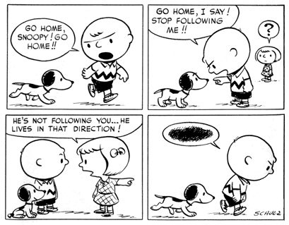
Another (non-webcomic) example of this is Peanuts. I love the early Peanuts art but I have no interest in the later. It seems mostly to affect gag-a-day strips. My theory is that because they were less experienced, they had to try harder in the old stuff where as the new stuff is done on auto-pilot. So even though the new art is more refined, it lacks the soul of the old stuff.
-
VeryCuddlyCornpone
- Cartoon Hero
- Posts: 3245
- Joined: Tue Feb 10, 2009 3:02 pm
- Location: the spoonited plates of Americup
- Contact:
Re: I'll review your webcomic.
Now that you've mentioned it, I've been noticing this more and more myself. I'm trying to think of a good example. I know I posted about Alleged Whiskey having this issue a few months ago, but that was less about the art getting too polished and clean and more about it feeling like the artists using stylized elements in a way that seems they forgot what those stylistic elements are supposed to convey, leading to an uncomfortable design.IVstudios wrote: An odd thing I've noticed about his art, and the art of a surprising number of comics, is that I prefer a lot of the older art to the recent stuff. It's not that they get worse, but for some reason I find the older, less polished art more visually interesting than the clean stuff.
I always thought that when you got to the point in your style when everything comes naturally and you don't even have to try anymore meant "you've made it." And like you said, for gag-a-day strips, especially if you use newspaper comics as an example, that's probably true- you want something that's functionally easy to produce so you can churn out enough of it each week to maintain an audience.It seems mostly to affect gag-a-day strips. My theory is that because they were less experienced, they had to try harder in the old stuff where as the new stuff is done on auto-pilot. So even though the new art is more refined, it lacks the soul of the old stuff.
Some people manage to tap into a style that really works fine, so it doesn't matter. Like Amazing Super Powers- the art has been approaching an asymptote of sameness over the past few years, but the style itself is dynamic enough and the writing witty enough that it works, and every now and then the guys include something heretofore unseen. You read the comic and you still get the sense that this is something fun for the dudes to produce, not just a chore that they're slapping out each week.
Don't kid yourself, friend. I still know how.
"I'd much rather dream about my co-written Meth Beatdown script tonight." -JSConner800000000
-
Peripheral Descent
- Regular Poster
- Posts: 41
- Joined: Tue Feb 19, 2013 11:07 pm
Re: I'll review your webcomic.
Wow, I've only ever seen Charlie Brown in the most recent art form. It looks like an entirely different person is doing the comic in the early stages. I always forget the more popular artists had to start somewhere, too.IVstudios wrote: An odd thing I've noticed about his art, and the art of a surprising number of comics, is that I prefer a lot of the older art to the recent stuff. It's not that they get worse, but for some reason I find the older, less polished art more visually interesting than the clean stuff.
Another (non-webcomic) example of this is Peanuts. I love the early Peanuts art but I have no interest in the later. It seems mostly to affect gag-a-day strips. My theory is that because they were less experienced, they had to try harder in the old stuff where as the new stuff is done on auto-pilot. So even though the new art is more refined, it lacks the soul of the old stuff.
Some people are really good at doing certain styles, but for some comics, I do notice they can get somewhat stagnant. You see the same basic posing showing up from strip to strip, the same face angles, the same level of shock...they don't try anything different, I guess. That's part of the fun of reading web comics - the medium changes throughout the life of each comic, usually. The art improves, the artist tries a different style, colours with different pens, shades with his own paint brushes. Even for an art form as simple as "Order of the Stick", there's a lot of awesome that goes into making new page (though I did lose my place and haven't read it for a long time).