
Should I color my comic, leave it greyscale, or b&w?
-
Uncaringmachine

- Regular Poster
- Posts: 550
- Joined: Tue May 03, 2005 11:29 am
- Location: Ye Old Savanny Georgia
- Contact:
Should I color my comic, leave it greyscale, or b&w?
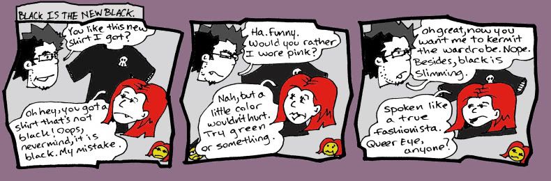
Here's a sample of it, and this is how I'm currently coloring the comic, with a different color behind the entire comic each strip, and now the dude has black and blue hair:
-
Dutch!

- Red galah
- Posts: 4644
- Joined: Sat Jun 19, 2004 4:39 am
- Location: The best place on this little blue rock
- Contact:
The bloke's hair might need some colour to balance the girl's. Check your speech bubbles, you split a sentence in the middle in that central panel. Also seems the third panel is too small, there's an excessive amount of green background above it to my eye.
Remember when your imagination was real? When the day seemed
longer than it was, and tomorrow was always another game away?

longer than it was, and tomorrow was always another game away?

-
Fabio Ciccone

- Regular Poster
- Posts: 327
- Joined: Wed Feb 07, 2007 3:42 am
- Location: São Paulo, Brazil
- Contact:


-
Uncaringmachine
- Regular Poster
- Posts: 550
- Joined: Tue May 03, 2005 11:29 am
- Location: Ye Old Savanny Georgia
- Contact:
The new background color is a huge improvement - see how the characters pop out more now, instead of being swallowed by the panel borders?Uncaringmachine wrote:How's this one? Do you think I should just stick with one darker color behind the panels? I'm totally new at the whole color thing. What do you mean by it's too saturated? Too bright?
Saturated means the color is very strong. If you're using Photoshop, find the Adjust Hue/Saturation function (it's in one of the menus) and move the slider to experiment. Less saturated colors look more like colored shades of gray, more saturated colors look like highlighter pens. Brightness generally refers to the strength of a color - not exactly how much light the monitor releases to make it, but you can think of it that way. Bright and saturated colors are both best used sparingly.

intended for mature audiences.
-
Dutch!
- Red galah
- Posts: 4644
- Joined: Sat Jun 19, 2004 4:39 am
- Location: The best place on this little blue rock
- Contact:
This has nothing to do with your colour questions...
But why do webcomics seem to have an urge to have a name for every single strip in an archive? I don't see it as necessary, but I'm happy to hear other sides of the argument.
But why do webcomics seem to have an urge to have a name for every single strip in an archive? I don't see it as necessary, but I'm happy to hear other sides of the argument.
Remember when your imagination was real? When the day seemed
longer than it was, and tomorrow was always another game away?
longer than it was, and tomorrow was always another game away?
-
RobertBlake
- Regular Poster
- Posts: 580
- Joined: Fri Jan 01, 1999 4:00 pm
- Location: United States
- Contact:

I prefer the Black and white... I find the color distracting to the artwork
<a href="http://beautifulsin.comicgenesis.com/"> <img src="http://img.photobucket.com/albums/v11/m ... 8.gif"></a>
-
Drugsmugglingcartoonist

- Regular Poster
- Posts: 98
- Joined: Thu Sep 06, 2007 1:42 am
- Location: England
- Contact:
