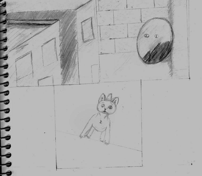
War wrote:It's rough, unclear and not much to go on.
I can't even tell what's supposed to be happening in the second panel.
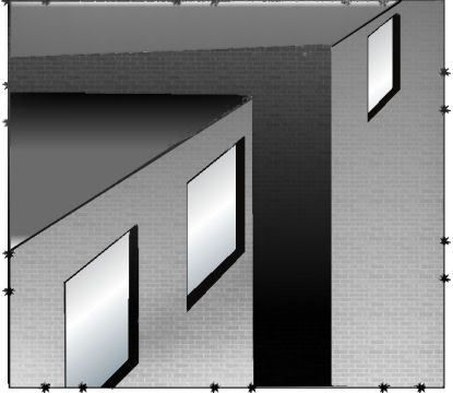
Use a ruler for the buildings, your lines are all over the place. If you don't fancy your final comic having dead straight lines ink freehand, but you need to underdraw with a ruler at least, your lines are all over the place and the perspective is just screwed.
As for the last panel, google for pictures of cats, draw lots of cats. I figure this cat is gonna be pretty prominent in the comic so you need to get cats down to pat. In particular, the bodyshape, currently it looks more like a stuffed toy than a real cat.
Thanks for the advice. I did the shape of the buildings with a ruler but I free handed the windows in math class. I do need a lot of work on my cats. I picked up an animal anatomy book as well as printed off a few pictures. The realistic version of him didn't turn out the best so I figured I would cartoonize him a bit.
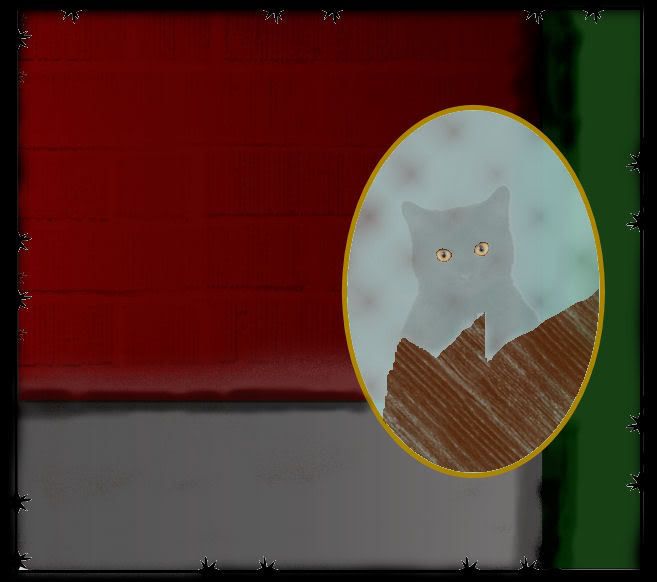
Thanks. That helped a lot and the mirror shards were a nice touch. But the thing it is leaning on is actually a dumpster.

Guess I should work on the second panel a bit more. Maybe add some text.
And lastly Thanks for the encouragement Dan. I'll make a better panel design with clearer boundaries after I fix it up a bit.
P.s.
Black Sparrow wrote:I agree with what the two wars said.
To add: I can't tell where the cat is in he third panel. Either some brickwork somewhere or detail of what's behind the cat would be a good idea... it just adds to the confusion of not knowing what's going on in the second panel.
Also, don't rush on those penciled in shadows... the one between the building in the first panel get really scribbly, especially at the bottom. It makes it look sloppy. So take the time to fill in shadowed areas completely.
If the cat's shading did not show up very well, then you're not doing it dark enough. I know that shading living organisms can be scary, so practice shading the cat darker before putting it into a comic... or don't shade it at all. There are a lot of comics and cartoons that get along fine without shading. Shading so light that it barely shows up just looks unprofessional.
Also, for your final comic: you'll want to have a copy of Photoshop or GIMP (free to download) just so that you can mess with the "Levels" of your scans. It'll make your whites whiter and your darks darker... making it look much cleaner.
I was thinking of adding brick but I wasn't sure if it would look better as space or with a wall. I probably should have done it a bit harder but I was going to fix it up on the computer when I had the base image down. I have GIMP, Photoshop, and Paintshop Pro. The only thing I did so far was mess with the levels so you could see the pencil lines better.
Catabolism: The breaking down of complex chemical substances into simpler ones by the living cells of the body, with the release of energy.


 Panel 1 still without words.


")


