Hello everybody,
Well, while I'll keep things simple in my comics, I am working on getting more variety in my line width for other miscellaneous art. So here is my latest try. I think it turned out rather nice, but I'd appreciate some feedback focusing on that element.
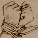
A word on the pic: it started out when I thought about that American McGee (I think that's the name?) Alice in Wonderland video game and the Wizard of Oz, and I wondered what a somewhat demented and creepy scarecrow would look like. For some reason, I think my drawing gives off a more Pimp Scarecrow vibe than a Creep Scarecrow one. But waddyawant. (ETA: the hands are how I wanted them to look: both with two fingers, one somewhat short and the other one abnormaly long and claw-like.)
Thanks!
Varying line width - looking for feedback
-
Oualawouzou

- Cartoon Cop (Moderator)
")
- Posts: 1548
- Joined: Fri Jan 10, 2003 7:47 am
- Contact:


That scarecrow looks GREAT! I think the varying line width gives the drawing a lot of depth. It is as if it were done with an inkbrush, like the old-school cartoonist-inkers. The line around the "hand" especially.
Aside from the fact that this is an animated scarecrow, it doesn't give me the "creep" factor either. He has a lot of character, especially in the face, but he looks sort of sad.
Aside from the fact that this is an animated scarecrow, it doesn't give me the "creep" factor either. He has a lot of character, especially in the face, but he looks sort of sad.
-
Oualawouzou
- Cartoon Cop (Moderator)
- Posts: 1548
- Joined: Fri Jan 10, 2003 7:47 am
- Contact:
Thanks for the comments. Yeah, he's not creepy, but it's not the first time I start with an idea and end up with something else on paper. 
The hardest part was to decide where to thicken the lines and where not to, I suppose I got that part relatively well since neither of you seemed to have a problem with it. Yay!
The hardest part was to decide where to thicken the lines and where not to, I suppose I got that part relatively well since neither of you seemed to have a problem with it. Yay!

Varying line width gives serious depth to an image. I'd say this is a great job. If I absolutely had to find something to suggest, mabey you should put a thicker outline around the outside of the character. Not the whole contour mind you, just the outline. When you add in a background or other characters, the thicker outline will help it stand out against other objects. (anything behind it should have a thinner outline)

Well, The only bad thing I can say is that he looks more sad or depressed than creepy. ^_^;;
Do you color? If you do maybe you can give him a dark, washed-out, colory look or something. If that makes sense, to make it creepyish.
But, ah, beside that it's great! I admire any one who can do ink width properly. Good job!
Do you color? If you do maybe you can give him a dark, washed-out, colory look or something. If that makes sense, to make it creepyish.
But, ah, beside that it's great! I admire any one who can do ink width properly. Good job!
Artsist and Editor of GBC
http://gbc.Comicgenesis.com

A webcomic about life...the life of toys, anyway...
Updates Monday and/or whenever I darn well fell like it.
zomg! I`m surfing the net on my wii!
http://gbc.Comicgenesis.com
A webcomic about life...the life of toys, anyway...
Updates Monday and/or whenever I darn well fell like it.
zomg! I`m surfing the net on my wii!