New Style

Locked
Xardion
Regular Poster
Posts: 27
Joined: Tue Feb 26, 2002 4:00 pm
Contact:

New Style

Post by Xardion »

Every now and then, I'll try to draw my characters in a more detailed way. Most of the time, it doesn't get past adding a neck. Lately, however, I've been working on a new style, and I've come up with a few sketches that I think are pretty good. Comments are welcome (and encouraged!)

Image
Sky

Image
Random girl with dress (check out the eyes)

Image
Violet and Tim

Image
Trace (she was supposed to wear glasses in the comic, but I had to change that due to my inability to draw them)


-Xardion
Image - A comic about an evil RPG Army

User avatar
CreedComics
Newbie
Posts: 10
Joined: Sun May 26, 2002 9:19 pm
Contact:

Post by CreedComics »

Hey Xardion,

I really liked the advanced versions of your characters, they're great! It's cool that you're constantly growing and evolving into a better artist.

Anyway, I made a few minor changes to your Sky picture, I think that if you make the waist less stretched out and the arms a bit slimmer at the end, and the legs a bit shorter your art will look even better. ( I edited the one you made to show you) My brother said you should also try to curve the hips a bit more for the women. (But we didn't do that in this edit)


Image
http://creedcomics.keenspace.com/images/doomchange.gif


Also, my brother (Creed) changed the colors you were using to be more like the pallet he uses and he says he likes the way you new pics are coming along. He says to keep practicing because he used to draw exactly like you.

Creed: Please feel free to try out this pallet I made for you Xardion, you might like it.....or possibly hate it. Let me know what you think. ^_^


Image
http://creedcomics.keenspace.com/images/doomcolors.gif


- Creedboy & Creed

Creed Comics - If you don't go, who will?
http://creedcomics.keenspace.com

User avatar
FlamingDeth
Regular Poster
Posts: 464
Joined: Fri Jan 01, 1999 4:00 pm
Contact:

Post by FlamingDeth »

...hn. The new style works, Xardion. Just make the waist a tad bit thinner and the hips a tad bit wider on the females...but that's all just anatomy.

Creed: Actually, I have NO clue whatsoever why ye think making the legs shorter would be better. Sure, might make the proportions more correct, but people rarely draw them the correct length 'cause then it doesn't look nearly as good.

Xardion
Regular Poster
Posts: 27
Joined: Tue Feb 26, 2002 4:00 pm
Contact:

Post by Xardion »

Creed: Thanks. I feel it's a good improvement over my current style at least, and I'm glad you agree.

As for the picture, you're right about the arms, but your legs seem too short. I haven't had a lot of experience, obviously, since you never see anyone's legs (and much less shoes) in the comic. But it looks better to me the other way.

You're probably right about the hips, but I can't get it the way I like for now. I guess I need to take this one step at a time.

Those colors are pretty cool, although dark. If I had time (and I wasn't so lazy) to shade, that would look pretty good.

Flamingdeath: Yeah, I'm still working on it.

And just for reading, here's another
Image
Umm... it's Jean

Thanks for the comments, and I hope to see more soon... yeah.

-Xardion
Image - A comic about an evil RPG Army

User avatar
Chains
Newbie
Posts: 19
Joined: Mon Jul 01, 2002 10:31 pm
Location: stank town
Contact:

Post by Chains »

Well as just Random Dude A who enjoys readin the comic, heres my opinion.
I like your new style Xardion, the arms and eyes(except the random chick in the dress, but those prolly just didnt come out right on paper or somethin, were they trin to convey emotion?)and height( leg length and such) are good, I wouldnt mind more hip definition on the females (maybe try givin them less torso width, maybe, ya know actually, Jean looks pretty damn good, she right on target, for my tastes at least) but whatever, it looks good as it is. The arms Creed drew look slightly better than yours Xardion but as for the palettes I could go either way really. So there is my $5.00 worth. Btw thats 5 Italian lyra so with the exchange rate I think it works out to half a penny. :lol: :lol: Anyway, hope you can decipher my messy post, and keep it up Xardion. DOOM ARMY RULES!!!! YEAH!!!!
The black wind howls...

User avatar
CreedComics
Newbie
Posts: 10
Joined: Sun May 26, 2002 9:19 pm
Contact:

Post by CreedComics »

Hey Xardion, I noticed that today's comic wasn't uploaded on time because I always go there around 12/1 a.m. EST to read it, but you fixed that. Anyway, I would like to see more of your new art when you get the chance. It's really good.

I also posted on your other board, and I have a Keenspace board now (Which involves my second post there).

Okay, later.

- Creedboy
Creed Comics- If you don't go, who will?
http://creedcomics.keenspace.com/

Xardion
Regular Poster
Posts: 27
Joined: Tue Feb 26, 2002 4:00 pm
Contact:

A couple more

Post by Xardion »

I've done a few more than this, but they're all sketches of characters that haven't appeared yet and other stuff that would give away future storylines.

Image
Gear (yeah, I know it's bad)


Image
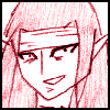
Tina (this one's ok, I guess)

I'd kind of like to do the comic like this. It's a nice change, and it gives me more room for detail. And it looks better, of course. There's really three main reasons that I can't.

1) The characters would be too big, which is bad for me for a reason that's kind of complicated.
2) It would take longer to draw each comic (although that's not a big deal, just annoying)
3) If I inked it, it would look terrible. And I'm not going to do all that extra work drawing just so it can look crappy after I ink it. This is the main problem, and if I could fix it, I wouln't mind the others. One of the reasons that the inking looks so bad is because the ink bleeds into the type of paper that I use (cheap copier paper.... being a poor webcartoonist bites) Most other kinds of paper work just fine, and the lines are very thin. If I can ever get my hands on some better paper, I'll at least try to do a comic in this style.

Oh yeah, and I wouldn't do it right now because I still need more practice with my newer style. I haven't had much time to work on it lately.
Image - A comic about an evil RPG Army

User avatar
Korota
Newbie
Posts: 3
Joined: Fri Jan 01, 1999 4:00 pm

Post by Korota »

Woot! I love this new style! It's really cool! I love this comic! WOOT!

BTW, first post here! :D

User avatar
CreedComics
Newbie
Posts: 10
Joined: Sun May 26, 2002 9:19 pm
Contact:

Post by CreedComics »

:o Xar you haven't used my colors yet, you don't like them?

^O^ I can make different ones if you want. ^_^
Creed Comics- If you don't go, who will?
http://creedcomics.keenspace.com/

Locked