I recently changed my art style from a 3 panel sprite comic to a b & w full page spread. I 've also started giving it more story and direction. I want a bit of advice as to how I can improve my comic further, from drawing the characters, to coming up with personalities and stories for them
I know this is probably the wrong place to be doing this, but I want a wide range of opinions, so general discussion is the best place to find it.
Also, anyone who helps out gets a free pie. (NB- Not strictly true!)
How can I improve my comic?
-
Theamazingsquad
- Regular Poster
- Posts: 155
- Joined: Tue Jul 27, 2004 8:36 am
- Location: Ballymena, N. Ireland
- Contact:
How can I improve my comic?
http://theamazingsquad.comicgenesis.com
Studying Architecture. Going to go to Art school instead
Comic slowly returning from Haitus
Life is grand.
Studying Architecture. Going to go to Art school instead
Comic slowly returning from Haitus
Life is grand.
I didn't like the semi-sprite part of the comic (I only read a month's worth of it) but I think that the last four panels where you started drawing the comic in a different style show a lot more promise.
What I'd do if I were you, well, I'd draw a prologue to those four strips and scrap the rest of the comic because to be honest I don't think many people would bother with the sprite part of it past the first few panels, and I'd have a solid storyline to carry the gags, aiming more for light humour than for mandatory punchline in every strip.
I like the way you draw and I think that it can only get more polished the more you do it, so keep at it Your first two drawn panels (of the last four panels I mean) are more pleasant to the eye, because of the clean, black lineart. The second two on the other hand are kind of greyish, which makes them amateurish. I don't know what materials, style and scanning you used but I think you were doing things right with the first two drawn panels, rather than the second two.
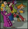
My favorite strip is the one with the old gal who wants to ring her friend, and I'm not talking just about your friend's script but also the drawing, it gave me Viz flashbacks and I like Viz. The huge index finger pointing in the panel where she's shocked is awesome
The webpage looks bad, sick-green Times New Roman in the title and pink buttons, wtf are you thinking? It doesn't have to be anything fancy but at least not offensive to the eye. On the other hand, I'm an old dinosaur, maybe you young people are all into neon pinks and greens these days. Also, if you write a rant under the comic, put it under the navigation buttons and not over them, I had to scroll down stuff I didn't plan on reading at that time, just to find the 'next' button. Considering the attention span of web users, you could lose people just because of that.
What I'd do if I were you, well, I'd draw a prologue to those four strips and scrap the rest of the comic because to be honest I don't think many people would bother with the sprite part of it past the first few panels, and I'd have a solid storyline to carry the gags, aiming more for light humour than for mandatory punchline in every strip.
I like the way you draw and I think that it can only get more polished the more you do it, so keep at it
My favorite strip is the one with the old gal who wants to ring her friend, and I'm not talking just about your friend's script but also the drawing, it gave me Viz flashbacks and I like Viz. The huge index finger pointing in the panel where she's shocked is awesome
The webpage looks bad, sick-green Times New Roman in the title and pink buttons, wtf are you thinking?
-
Theamazingsquad
- Regular Poster
- Posts: 155
- Joined: Tue Jul 27, 2004 8:36 am
- Location: Ballymena, N. Ireland
- Contact:
regarding changes
thanks for your ideas. I know what you mean about the rants, but I don't know how to make them appear below the buttons. I have no idea how to position them at all- I always thought they just went below the comic itself.
Also, about the grey line tones, It's because of the ink I use. I'm not very experienced with brush and ink, so the ink seems to 'dilute' or fade on the page. (maybe I shouldn't be using plain A4 paper)?
The brush and ink seems to take a long time, so I only intend to use it for storyline strips. Whenever I do a standalone gag, I think I'll stick just to pens because it's cleaner and more cartoony. I think it looks weird to have detailed drawing followed by a punchline. What do you think?
Finally: The font should be Matisse ITC, I dont know why it doesnt work... It makes the green look better.
Also, about the grey line tones, It's because of the ink I use. I'm not very experienced with brush and ink, so the ink seems to 'dilute' or fade on the page. (maybe I shouldn't be using plain A4 paper)?
The brush and ink seems to take a long time, so I only intend to use it for storyline strips. Whenever I do a standalone gag, I think I'll stick just to pens because it's cleaner and more cartoony. I think it looks weird to have detailed drawing followed by a punchline. What do you think?
Finally: The font should be Matisse ITC, I dont know why it doesnt work...
http://theamazingsquad.comicgenesis.com
Studying Architecture. Going to go to Art school instead
Comic slowly returning from Haitus
Life is grand.
Studying Architecture. Going to go to Art school instead
Comic slowly returning from Haitus
Life is grand.
Oh, well, it's because I don't have that font on my pc so it just defaults to Times New Roman. You could either have the title bar as an image, or use a font that people are likely to have on their machines.
By the way, if you want to save yourself time with the lettering, check out the free fonts for cartoons at Blambot.com, they look awesome and they save you a lot of time (unless you want to do your own hand lettering of course).
By the way, if you want to save yourself time with the lettering, check out the free fonts for cartoons at Blambot.com, they look awesome and they save you a lot of time (unless you want to do your own hand lettering of course).
-
Spoder Mon
- Regular Poster
- Posts: 60
- Joined: Sat Oct 30, 2004 7:21 pm
- Location: Spoder Mon
- Contact:

-
Kevin Wolf

- Cartoon Hero
- Posts: 1232
- Joined: Fri Jan 01, 1999 4:00 pm
- Location: Walking the Earth.
- Contact:
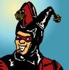
The first problem is the premise. There are scads and scads of superhero comics out there, some straight, mostly parodic, and very few of them are any good.
Second, your apparent lead character (Orlando) is absolutely pointless. His chief trait is that everybody hates him. This only works if the character is sympathetic in some way to the audience. Unfortunately, I hate Orlando too, therefore every "I hate you, Orlando" strip is a pointless excercise in obviousness.
Switching from C&P to hand-drawn is always a good idea (your "Men in Hats"-style desert backgrounds were, well, utter ripoffs). However, you still have a cast of characters that seem to be distinguished mainly by their respective levels of stupidity and/or despicability. It's really hard to care about what happens with these guys in your newer, story-driven format.
So...I really don't have any advice on how to fix your comic as-is. If you want to stick with a parodic superhero comic, that's fine, but you need some real characters first. Somebody up above suggested scrapping the whole C&P section and starting over again. Radical advice, but it might be for the best.
-
Theamazingsquad
- Regular Poster
- Posts: 155
- Joined: Tue Jul 27, 2004 8:36 am
- Location: Ballymena, N. Ireland
- Contact:
Thanks for your ideas. I'll take that into consideration. Maybe I will scrap all of the sprite panels, cos even I didn't like some of them...
How can I stop my ink from fading on the page then. Someone above said that my first two b & w strips were very easy on the eye, and I think this is because the ink is consistent. It was done by pen, which makes it clean, but also very flat. I would like to continue using a brush, but I also want it to be as pleasant as the penned strips.
Also, If I was to scrap the sprite strips, would it remove the ‘all your characters are stupid and despicable’ stigma?
http://theamazingsquad.comicgenesis.com
Studying Architecture. Going to go to Art school instead
Comic slowly returning from Haitus
Life is grand.
Studying Architecture. Going to go to Art school instead
Comic slowly returning from Haitus
Life is grand.
-
RPin

- Gentleman Pornographer
- Posts: 2930
- Joined: Fri Jul 18, 2003 8:12 am
- Location: I'm off to Brazil, bitches!
- Contact:
My personal guess is that no amateur artist should be concerned at redoing their first works all over again. I think they're fine where they are, if anything they show how much you improved.theamazingsquad wrote:Thanks for your ideas. I'll take that into consideration. Maybe I will scrap all of the sprite panels, cos even I didn't like some of them...
Also... I think I'm the only one here who actually likes your sprites. They're original, and I saw some potential there. Switching to hand-draw is never a bad thing, tho, so the choice is up to you.
-
Kevin Wolf
- Cartoon Hero
- Posts: 1232
- Joined: Fri Jan 01, 1999 4:00 pm
- Location: Walking the Earth.
- Contact:
-
Nyke

- Cartoon Villain
- Posts: 4704
- Joined: Thu Feb 27, 2003 6:02 am
- Location: OT AND GD HAVE MERGED! *jumps out the window*
- Contact:
Holy shit! Kevin Wolf came in!
*glomps Kevin Wolf*
*glomps Kevin Wolf*
My LJ | ComicGen CoH/V | Vampire/Amazon looking for Betas. Want to sign up? PM me. | Figure out my Avatar's joke, and win bragging rights.
-
Warofwinds

- Cartoon Hero
- Posts: 1088
- Joined: Sat May 08, 2004 7:46 pm
- Location: Beneath stormy skies
- Contact:
Killing him off is too easy. I want to see him suffer, and then point and laugh.
....oooo. In a bad mood right now.
I actually like the fact that I hate the main character, even though i don't really hate him. Poking fun at any celebrity can be funny as long as you don't overdo it. The classic mix of the idiot-who-thinks-he-smart/cool, the really cool guy, the horny-womanizer, strong-man and etc is classic for a reason. Good luck!
-Kez
-Kez


-
Kevin Wolf
- Cartoon Hero
- Posts: 1232
- Joined: Fri Jan 01, 1999 4:00 pm
- Location: Walking the Earth.
- Contact:

-
Tim

- Cartoon Hero
- Posts: 3285
- Joined: Wed Feb 11, 2004 10:42 pm
- Location: State of WA, formerly MA
- Contact:
Sometimes teeth are involved.Luprand wrote:Glomping: a tackle-hug, usually from behind.
--Sij
Alternate Delusions - Symbiotically Enhanced for Your Pleasure
A member of Comic Ostrich
I made a game. Download now!
A member of Comic Ostrich
I made a game. Download now!
-
Kevin Wolf
- Cartoon Hero
- Posts: 1232
- Joined: Fri Jan 01, 1999 4:00 pm
- Location: Walking the Earth.
- Contact:

Yeah, as a rule I never re-do anything.RPin wrote:My personal guess is that no amateur artist should be concerned at redoing their first works all over again. I think they're fine where they are, if anything they show how much you improved.
It's always better to take what you've learned and apply it to future works.

-
Theamazingsquad
- Regular Poster
- Posts: 155
- Joined: Tue Jul 27, 2004 8:36 am
- Location: Ballymena, N. Ireland
- Contact:
Once again, thanks for all your help, but I still want to know how I can improve my inking. Any ideas where I can get some info?
Also-
quote]
How exactly can I do this? I'm not asking for a complete tutorial you understand- half the fn is in the learning yourself. But any helpful pointers would be nice...
Also-
No, but thinking of your characters as something other than nails to hang speech balloons on would. Let them develop quirks, personalities, and reasons for acting the way they do.Kevin Wolf wrote:theamazingsquad wrote: Also, If I was to scrap the sprite strips, would it remove the ‘all your characters are stupid and despicable’ stigma?
quote]
How exactly can I do this? I'm not asking for a complete tutorial you understand- half the fn is in the learning yourself. But any helpful pointers would be nice...
http://theamazingsquad.comicgenesis.com
Studying Architecture. Going to go to Art school instead
Comic slowly returning from Haitus
Life is grand.
Studying Architecture. Going to go to Art school instead
Comic slowly returning from Haitus
Life is grand.
-
Kevin Wolf
- Cartoon Hero
- Posts: 1232
- Joined: Fri Jan 01, 1999 4:00 pm
- Location: Walking the Earth.
- Contact:
Your characters, so far, are a stupid film actor, a ninja, an arrogant jerk, a mysterious trenchcoat guy, and some big bearded super-viking (?). This is all that we know about them. I understand that you can't provide an entire background for five characters in a handful of comics, and you shouldn't. But we need to know something about them. Even in a gag comic, you've got to throw the reader a bone every now and then and explain a little about these people.
For instance, there's some woman (not gonna look the name up) that your arrogant, womanizing jerk character is always trying to go out with. Draw that character. She sounds like a potentially interesting person. Draw her, even if you'e afraid of drawing women. Finding out about her, what she looks like, how she resists his no doubt super-debonair advances, will benefit your comic, because it allows you to develop TWO characters at the same time.
The best way to flesh out your characters is to establish relationships between them. Everybody hates Orlando, but why? How does this lame-o know so many superheroes (lame ones, granted)?
And what's up with the trenchcoat guy? Does he have a name (maybe I missed it)? Do your heroes have secret identities? Day jobs? What are their superpowers? Where do they live? What do they like? What do they hate (besides Orlando)?