The FCBD package was waiting in the mailbox when I arrived home today. Wahoo! Sorry to all the people in North America who haven't received their comics yet...
This collection rocks, just as I thought it would. Everybody did a great job. That said, I do have some criticisms. If you think you may be offended then please skip the rest of this post.
I'll go through the book page by page. I'd be interested in reading if anyone else would like to do this as well.
Tales of the Traveling Gnome has gorgeous art and a beautiful layout, but I feel that the print version suffers from a lack of contrast. Maybe if the sampler were printed on whiter paper this would be less of a problem. Anyhow, it's not a big deal, the two pages still look great.
I like the 8:1 page a lot but I wonder if it would look better with the title at the bottom.
The FAUB page came out very well, I think. It's a bit too ad-like though.
I love Aldus Maycombe, but there's something about the FCBD pages that doesn't sit right with me. The layout feels too busy. The art itself is fantastic.
The Head Doctor Productions page is just perfect. Absolutely perfect. I've been meaning to link HDP from AT for a while now; I should take this chance to get around to it.
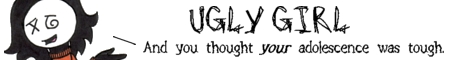
I think the hatching on the Ugly Girl page is a bit too close for print; too much of it came out looking black.
The End of Things pages came out nice. I also liked the Astorauth and Imo pages.
I felt that the Doppies pages, like the TotTG pages, didn't have enough contrast. I think the contest idea is brilliant.
I love the Phil Likes Tacos page. If I saw that page while flipping through this comic, I would definitely have to pick it up. It looks really nice in print. One problem is that the ending of the comic isn't as funny as the penultimate bit.
The Treading Ground page came out fine. Nice origin story.
Claude's pages are fantastic. There's a great sense of fun. I haven't read his comic before but now I'll have to give it a try.
The Strange Happenings page looks like a small comic blown up to fill an entire page... which I guess it is. The text is large and the inking is thick. Maybe Colin could've used several strips in newspaper size rather than one big one.
I hate to say this (because Pimpette and Legostar could kill me with a thought) but the Shenanigan page disappointed me. I didn't feel any comic tension between the two characters. There was no rhythm going on. I did like the ducks, though... vicious little creatures.
I like the art on the Cortland page, but the story didn't interest me... maybe because as an English major, it seemed all too familiar.
My first thought upon seeing the Undead Friend page was TEXT EXPLOSION. Yes, that phrase was in all caps in my head. Anyhow, after I took the time to read it, I laughed. The layout could have been better.
The SuperFreaks page looks very nice. Like FAUB, it's a bit too much like an ad.
The two Vesteria pages seem big and empty. There's no more than one page of material there. The art is nice, but like Strange Happenings it seems to be printed larger than it should be.
I didn't care for the story on The Foxfire Chronicles page; there's nothing there to show why this story is different from generic SF adventure. That was also a problem with many of the fantasy comics in the collection. The art is very good, though.
I liked the Man Who Hates Fun page, but the art seems like it didn't reproduce well. TMWHF is another webcomic I haven't read yet but think I should.
The Distant Eras page really lacks contrast. The pictures are all greyed out. It also appears to have been cut off at the top and bottom.
I didn't care much for the Antics page when I saw it online, but it looks much better to me in printed form. I like the way everyone glows. The story sounds very risque, which I'm sure will generate lots of hits.
The Inhumation page is well drawn and funny, but like the Vesteria page it seems like one page worth of material stretched out to cover two pages. I'm also sorry that the "Side of Fried" was edited out. I liked that.
The SPQR Blues page is beautiful but too crowded. I love Klio's art, as I think I've said several times before. I like the side sequence with the artist, and the dramatis personae at the top.
I think Reasoned Cognition page looks better in print than it did online. Make of that what you will.

The Green Avenger pages could have used a better background.
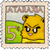
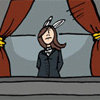
Hoo boy... the Ataraxia Theatre page. It's going to be a long list of things I dislike here. First off, the comic reads like an ad... I don't like that, and would change it if I had my time back. The text is too small. The page is a sequence of talking heads. It's full of words and there's nothing visual to really grab the reader's attention. The patterned background on top and flat grey on bottom are poor substitutes for actual scenery. The first seven panels are funny but the last three peter out. I could also say that the art isn't as good as the other contributors to the book but I'm sure all of us feel the same way (about our respective pages). On the plus side, I think it did reproduce well.
The Avernyght pages need more contrast. They printed dark and muddy. The text is a bit hard to read.
The Tales of Pylea page is beautiful. More than that,
it really whips the Mookie's ass. Unfortunately it doesn't let the reader know what the story is about, other than that it involves people hitting each other. Still, good art counts for a lot, the pacing of the page is good, and this may well prove to be a wise advertising strategy.
...
So these are my thoughts. I hope I don't sound too negative- as I said at the beginning, I really like the FCBDB and think everyone did a great job. Still, as long as we're talking about how to improve the book for next year, it's best to look at things critically.
Any chance of someone slipping The Neko a copy of the book?


")