Rebirth of Webcomic Above!

For discussions, announcements, non-technical questions and anything else comics-related or otherwise that doesn't fit in any of the other categories.
User avatar
Dutch!
Red galah
Posts: 4644
Joined: Sat Jun 19, 2004 4:39 am
Location: The best place on this little blue rock
Contact:

Post by Dutch! »

Okies. I'm gonna grab this one too.

I read through the first two pages and it mentioned waiting for a train to Richmond. Dunno yet if it's Melbourne or Sydney, but it's local enough for me!! :)

And the girl looks like Rachel Griffiths, so what can I do, eh?


Here we go then.


WEBSITE:

Does what it has to. Does it without being obtrusive. The website isn't the reason you come and read a comic though, so this part doesn't really need all that much space devoted to it. Suffice to say, it doesn't detract from the comic and doesn't bring attention to itself.

BUT...I did start to get a few popups while reading through the archives. I couldn't tell you what they were for because I clicked the little x before they could load properly.

ART:

Looks great. It's a soft, tender style beginning with sepia tones. One panel per update, and the story is told with short text extracts above and below the image, which is most cases works well. I like the consistent single images, almost as though it's a picture story book for big kids.

I don't think I even realised when the transition to full colour actually occurred. I was reading through and suddenly realised that the sepia tones had given way to colour while I was reading. They look great, even better for me than the original chapter. The dark, washed out tones used in some panels and backgrounds really work for me too. Reminded me of the good old made for TV Australian mini-series or movies in their composition. A little gritty, a little closed in maybe, but as an Australian, very, very familiar and comfortable. I don't know if this is the aim, but at least for me, I felt very familiar with the setting and location. It...felt like home, I guess.

There were some slight problems with body sizes and the way limbs and bits bent or curved in the earlier images, but most of that seems to have been brought under control now. I don't think this is a problem to worry so much over from this point on.

WRITING:

I enjoyed it enough to read through in one sitting, and I believe the artwork helped in this regard. You mentioned somewhere in one of your blurbs under the strip that it was emo stuff, and usually that whiny crap gives me the trots, but it wasn't so bad handled in this way. Again, I think it's the way the whole deal is handled with single images and the washed out sort of artwork.

In short, the character telling the story drives the plot along through what he tells us (although he's speaking to another character in a monologue as narrator) and it works well. It's a unique sort of strip, at least in that I haven't read any that read quite like it.

OVERALL:

Give it a shot. I think it looks quite unique and reads quite uniquely. I had a little bit of a bias going in though, being clearly based in real locations Down Here, but it seems to be growing into a good little story.

Cheers.
Last edited by Dutch! on Sat Feb 17, 2007 2:42 pm, edited 1 time in total.
Remember when your imagination was real? When the day seemed
longer than it was, and tomorrow was always another game away?
Image

User avatar
[geoduck]
Cartoon Hero
Posts: 1455
Joined: Mon Feb 02, 2004 12:48 pm
Location: Pacific NW
Contact:

Post by [geoduck] »

Although I can pretty much guess what any reviewer of my strip will say, I'll chip in and do my share..

School Spirit:

I read through some of the archives, and I don't have much to add that hasn't already been covered in the previous review here on the thread. The art is well done if not groundbreaking, with the standard note about the characters' big ears. The humor is gentle and pleasant enough, if, again, not terribly earth-shaking. (But that's sorta the whole point of the strip, isn't it?) Being a schoolteacher in Real Life, the creator certainly knows his chosen subject backwards and forwards, and it shows in the characters and their actions. He updates regularly, which is always a plus.

A couple of nitpicks about site design: the name of the comic is displayed at least three times on every - single - page, and that's at least once too many. Maybe consider dropping it from the "ruler" positioned under the comic. And you really don't need to have the tagboard/voting buttons on the archive pages, just on the main page.

I would disagree with the previous reviewer, and say that having an "Aussie slang" page would be helpful. Didn't you used to have something like that on the site, before moving it to the new location?

My last comment isn't a criticism, but more an explanation. Despite the strip's relative longetivity and many virtures, I don't read it much, and that's because of the above-mentioned gentleness. I'm not demanding graphic violence and foul language, which would be totally inappropriate, but I pretty much assume that if this strip is still being drawn five or ten years down the road, Cody and Casper and the rest will still be in the sixth grade, and still having pleasantly humorous adventures at school and in the cemetary. A lot of comics float through this sort of existence, and a lot of people enjoy reading them. My preferences are different. Not better, just different.

Bottom line: highly recommended if you like this variety of comic.
Last edited by [geoduck] on Fri Feb 09, 2007 1:47 pm, edited 1 time in total.
"gooey-duck". A clam. Not a snail.
Image

User avatar
Glarryg
Regular Poster
Posts: 355
Joined: Mon Mar 14, 2005 8:27 pm
Contact:

Post by Glarryg »

Alright, here goes...


First off, apologies to the creator; I have not finished reading the entire archives of the comic. In my defense, however, I felt that it was more important not to keep the creator waiting for his review. Also, I do feel that I have an accurate enough grasp of the comic to contribute something (plus, I am also hooked to the point where I will finish the archives no matter how long it might take me):

ART
The first thing anybody will probably notice about "Mansion of E" (MoE) is the simple, somewhat uninspired artwork. Hopefully this has not driven away too many potential readers, because they are missing out on a great comic otherwise. With an apparently rudimentary grasp of portraying anatomy, perspective, and action, the creator keeps the artwork simple, if not a little dodgy in places. Overall, the comic has a very "talking heads" look to it, wherein facial expressions draw the eye more than anything else in the pictures. That said, the faces can be surprisingly emotive, and sometimes contribute as much to the jokes as the dialog. If a bit more attention was paid to body language, the characters could be more expressive. Thankfully, the file sizes of the comics aren't too big, which moves things along fairly quickly for one who is perusing the archives. Words cannot express how annoying it is to wait five or even ten minutes to read a comic with only two lines of dialog, flat color, and barely anything happening (this can be found among comics within the entire expanse of the so-called "skill spectrum"). Thankfully, MoE avoids this faux pas by keeping images small and content within each comic high.

WRITING
Without a doubt, this is the comic's strong point. The story revolves around a huge cast of characters that live inside, around, and below the titular mansion. The three main characters, Rosemary Ripley, Mortimer, and Sylvester, are living above a powder keg of sorts, in that a host of monsters and otherworldly creatures roam the caverns beneath the mansion, fighting amongst themselves and worrying/debating/planning for the possibility that humans might still exist on the surface. What happens if the three protagonists are found by the community of monsters is the crux of the plot. Beyond that, though, there are a handful of mysterious characters with plans that may go far deeper than anybody involved with them might know. It is a very character-driven-- as opposed to plot-driven-- story, and, although this reviewer has no initial preference between the two, some consider character-driven stories to be better reading. Add a healthy dose of dry humor, sarcasm, and banter to the dialog, and what comes out is a witty narrative sure to capture the attention of anybody looking for a chunky tale of fantasy and intrigue. This reviewer was reminded a little of the work of Douglas Adams, wherein even dangerous situations are portrayed with a somewhat calm wink to the reader, as if everything will work out alright, even if the entire world is destroyed in the process. (In fact, had it not been for a brief biography about Geoduck on the site, this reader might have assumed that the creator was British.) The creator has weaved a world of his own, with a myriad of species of monsters, each with its own biology and culture. The relationships among the various races and communities is an already-established part of the setting, and the reader is not bombarded with loads of explanations regarding how the vast basement community works. It's a classic examples of "showing, not telling," and is the mark of a well-crafted tale. It makes the reader think, and makes events more interesting to uncover. Whatever qualms this reviewer might have with the artwork are more than silenced by the quality of the story itself.

SITE
The site is simple in an almost "Retro-Internet" sort of fashion. Whether this is intentional or not, it's not terribly fancy or eye-catching. Navigation is easy, though, and, as a dial-upper, this reviewer actually appreciates a site that doesn't shove a bunch of bells and whistles at the viewer.

OVERALL
Unless you're the type who might get hung up over the artwork, I can't recommend this comic enough. Intrigue, dry humor, and a knack for keeping things from getting boring or too bogged down in explanations are the hallmarks of this tale. If this comic was available as a graphic novel, even with a slight improvement in the art, this reviewer would buy it in a heartbeat.
Last edited by Glarryg on Sat Feb 17, 2007 12:59 pm, edited 1 time in total.
http://www.squidninja.com - Dude. Buy a shirt. Seriously.

User avatar
Rkolter
Destroyer of Words (Moderator)
Posts: 16399
Joined: Tue Jun 24, 2003 4:34 am
Location: It's equally probable that I'm everywhere.
Contact:

Post by Rkolter »

(deleted due to duplicate)
Last edited by Rkolter on Sat Feb 10, 2007 3:59 pm, edited 1 time in total.
Image Image ImageImage
Crossfire: "Thank you! That explains it very nicely, and in a language that someone other than a physicist can understand..."

Denial is not falsification. You can't avoid a fact just because you don't like it.
"Data" is not the plural of "anecdote"

User avatar
Rkolter
Destroyer of Words (Moderator)
Posts: 16399
Joined: Tue Jun 24, 2003 4:34 am
Location: It's equally probable that I'm everywhere.
Contact:

Post by Rkolter »

:EDIT:

Review of Indefensible Positions

Indefensible Positions is a twice-weekly webcomic that follows several characters with interlaced stories, allocating a chapter to each character's personal story, while following a broader line of an ongoing battle between the forces of Chaos and Order, as embodied by two men, who became avatars, who appear to be General Lee and General Grant, from the US Civil War.

There's no spoilers there - that's just the first couple chapters. The entire story thus far is interlaced with several philosophical questions, most of which come down to what can belief, even unconcious belief, create. The story suggests that belief solidifies into ideas, and ideas into memes, and those memes into actual physical manifestations of power. In Indefensible Positions, these manifestations are called demons, although it's best not to assume a link to the Christian firey horned variety. Belief does more in the story than just create demons; it can also hide them. What you really don't believe should exist, you may simply forget about, unless it sticks around long enough for you to remember.

You get to see what happens when people (and demons), and their beliefs (concious and unconcious), come into conflict. It's an interesting take on uncountable traditional religious stories. Stories you expect to have a moral at the end of. Morals are tidbits that you're to accept without really mulling over. Indefinsible Positions, if anything, offers an anti-moral. The things you mull over are the only things that matter.

Characters:
The characters are developed both in the overall storyline, and for many, in chapters that center on an individual character, that touches on what makes them what they are today. The storylines vary wildly - and honestly I can't go into them without giving away parts of the story. Each chapter better explains one character's reason for being what they are, and advances the story besides.

Art:
The artist has visibly improved throughout the story. Take as an example the first page and it's wobbly art, particularly around the doorways:

http://indepos.comicgenesis.com/d/20050201.html

To this one, 15 months later:

http://indepos.comicgenesis.com/d/20060523.html

The characters, the detail, and the ability to tell the story with the art, has grown with leaps and bounds.

The artist began to use color early on to highlight only important details, later, color became a regular feature, except for Foil, for reasons that become apparent further on in the story.

Now, sometimes does sometimes do grayscale, with color highlights, just to emphasize a detail. The clearest example being:

http://indepos.comicgenesis.com/d/20060207.html

I don't know if I liked this or not - there are other ways to draw attention to the face on the wall, especially given that later on, the face appears in color shots, and never fades into the background or is lost as a detail.

The art is not professional. But I don't think that detracts from the storytelling, and it is improving with time.

Writing:
There are a few times that I wish the artist would have taken the time to either break the writing up into a few pages, or conversely, added more writing. The key place this happens is in regards to Foil, the main character.

Foil never really questions the insanity that goes on around him. For example, at the start, he walks through a door and within three pages is chained into a room surrounded by people regarded as sexual deviants. This doesn't seem to phase him at all.

Later in the story, Foil goes to a room and performs a fairly significant shamanistic ritual where he summons the avatar of Chaos and speaks with him:

http://indepos.comicgenesis.com/d/20061031.html

Foil seems not only not out of his league, but a quite capable shaman. The problem - the only previous time we hear Foil has any interest in Shaman rituals is on the very first page of the comic over a year previously.

In fact, in the very next page, he's outright saying he is a shaman:

http://indepos.comicgenesis.com/d/20061103.html

We learn throughout the story that only special people can see the avatar of Chaos. Foil is surrounded by this people in the current chapter, however only Foil appears lost in thought or catches the significance of General Lee approaching them. This seems entirely out of character for the other characters, and with Foil himself - who again, seems to be thinking in a depth that there's no story background suggesting he's capable of this level of thought.

http://indepos.comicgenesis.com/d/20070109.html

There are other points in the comic that really could use a bit more backstory, but the ones surrounding Foil are the clearest to me.

One other thing I'll mention about the writing is the writer's choice of tackling issues that tend to incite people. Sex (with animals, demons, creatures with man-sized mosquito genetalia, etcetera), the existance of God (or Gods), the common beliefs of Good and Evil. This has turned people off to the story. And, that's really just the way it is. Some people will be offended in the reading of this story.

That said, the story is pretty good - and clearly progressing. The artist has said he has no time to do some of the stories he would like to do. I suggest he reconsider, if they provide clarity to the actions of his characters, he should make time to put them in.

Layout:
The layout of the comic is at best, simple. Text buttons, a basic background, the obligatory ad at the top, a newsbox and calendar in a simple table.

The cast bio page is also very basic, but has some key elements I like, including the first showing of the characters, and the artist's belief of the best appearance of the character.

The extras page and links page are also basic and to the point. The Author page has links to contact the author, and the author's livejournal.

Really, if you like glitzy layouts, you won't be impressed. But, to me at least, the point of the comic is the comic, not the packaging. So I'm not wholly upset by the barebones layout.

Overall:
Overall, I like Indefensible Positions. That's pretty clear from the fact I've read it since a little after it started. There are problems with the story - bits that have been left out that break the illusion. But the story itself is still a good one. The art supports the story, and has improved with time. Given their world, the characters are believable and you can empathize with them. I would suggest it to my friends who aren't too touchy.
Image Image ImageImage
Crossfire: "Thank you! That explains it very nicely, and in a language that someone other than a physicist can understand..."

Denial is not falsification. You can't avoid a fact just because you don't like it.
"Data" is not the plural of "anecdote"

User avatar
Jackhass
Cartoon Hero
Posts: 3243
Joined: Wed Jun 23, 2004 3:34 am
Location: Starring in your latest sex dream.

Post by Jackhass »

What the heck...I'll tackle Reasoned Cognition.

Reasoned Cognition

First off, credit should be given for actually doing something original...I've never seen anything quite like Reasoned Cognition out there, and in a world of 10 million "hey, let's do something about my friends and me playing videogames drawn in an anime style!" comics out there, that's refreshing.

The art is well...it's really more accurately described as diagrams rather than "art". There's nothing really artistic or visually appealing about it...but, when it has to be, it does a very good job of clearly illustrating often complicated concepts. In that respect it's a success.

The writing is often rather brilliant...condensing complicated scientific concepts that often could generously be described as "dry" and making them interesting and easy to understand...and hey, there's a few chuckle-worthy jokes tossed in there too! I often would find myself surprisingly immersed.

The website is ugly, but features-wise it's nicely done. The "Easy to Browse archive" is a particularly appreciated resource and it's well put together.

It's hard to rate or review Reasoned Cognition as a webcomic, because it isn't really a webcomic. As an amusing learning resource though it's definitely a success though. With more polish I really think Reasoned Cognition could have the potential to be one of those phenomenons that go viral and everyone on the web ends up knowing about...it's basic concept is really that well concieved and executed I think.

But ultimately it needs to look more professional and slick. Get a decent artist to do some art for you...you can then copy and paste that stuff and focus on the diagrams and whatnot you do well. Make the website look better and less Geocities circa 1996. Hooray for science!
Image

A zoo full of cute yet uproariously funny animals...how can you go wrong?

My Keenspace Forum!

User avatar
K-Dawg
I wanna LIVE
Posts: 4844
Joined: Fri Jan 01, 1999 4:00 pm
Location: Yes, let us check!
Contact:

Post by K-Dawg »

IMPORTANT PAY ATTENTION TO THIS:

Kolter screwed up, he's not suppose to make a new post with his review of remus from back on page 3. Whoever comes across this you are to post a review for Glarryg.

His comic is this one: http://www.squidninja.com/

REVIEW GLARRYG NEXT!
Image

Shocking news Angry D. Monkey

User avatar
Hallonpress
Regular Poster
Posts: 111
Joined: Fri Oct 13, 2006 2:22 am
Location: Malmö, Sweden
Contact:

Post by Hallonpress »

Hmm. Writing reviews is hard. But here goes. Review of Squid Ninja:

Art
---

Clearly manga inspired, but with a personal twist. It's very simplistic and a bit rough around the edges, especially the backgrounds, which are clear, but doesn't really work perspecive-wise. But with that said, I'm impressed by the mostly good layout of the panels, and the way the action scenes are drawn. Action is not the easiest thing to draw, but it works well here. You can easily follow the movement from panel to panel, and the characters look very dynamic. I love the way that the characters recoil when the take a punch (like on this page, for example: http://www.squidninja.com/d/20050706.html). Good work, there!

The quality of the individual pages varies. Most of the pages are inked and shaded, others just inked, and some are just sketches. Also, the font changes occasionally, even back and forth from one page to the other. I get the impression that the artist is still very much in a learning state, trying new things, and little by little finding his own style. His potential shows, and I think that he'll have grown a lot before this comic ends.

Story
-----

I was confused at first because the comic started out as a kind of a semi-funny gag strip, and so that's what I expected. But then things started to happen, and all of a sudden there were several distinct characters, a setting that keeps getting fleshed out, and a plot that turned out to be much more interesting and complex than I would've ever thought. As with the art, I get the impression that the creator is in learning, trying out a few things and then slowly finding his own niche.

The story revolves around the ninja Ikago, who was thrown out of his clan under mysterious circumstances. I really like Ikago. His a kick-ass kind of guy, but has soft spots he refuses to aknowledge (which opens for interesting future character development, perhaps?). And his tough-guy attitude is so over-the-top somtimes it gets really funny. The other main characters - Hyacint Petal and Spix McGraw - both have their own sub-plots, which are woven into the ninja story nicely. The comic picked up pace for real when the Eidolons were introduced - magical beings wich very strange appearances, like Nath All, the anthropomorphic nose!

All in all, the story has evolved into a fast-paced, fantasy ninja action story with many twists. I'm engaged enough to want to know what happens next. :)

Website
-------

Don't know what to say, here. Easy to navigate. Nothing fancy, but nothing that gets in the way of getting where you want. Looks good.

I guess that's it, then. ^_^
Last edited by Hallonpress on Mon Feb 12, 2007 3:29 am, edited 1 time in total.
Image

User avatar
Dotty
Cartoon Hero
Posts: 2434
Joined: Fri Sep 26, 2003 8:29 pm
Location: Drunk!
Contact:

Post by Dotty »

What birds know

Art - Absolutely flawless. A perfect example of how wonderful a webcomic can be done with a little bit of elbow grease, and a lot of patience. The strips flow seamlessly, and the panels play off one another. The comic just leaps off the page, it almost feels alive. The colors are lovely, and I feel this comic could work amazingly as black and white, or as color....but personally, I am glad you went with color. It just fits the gentle nature of the three main characters.

Writing - The characters seem quite real, which is a wonderful achievement. They play off each others quirks, so you get the idea they know each other....but sometimes things come up that just don't really click with me. Like at first they were hunting mushrooms...then out of the blue they're smoking a bowl. Then they're back to mushrooms...then they're all crazy except one of them, with the blonde having a laughing fit, and Vandi going out of her mind....then back to normal, now they're ragging on Vandi whom they feared poisoned for being perfect for some reason.

I wager it will all click in the end. That's the unfortunate part of reviewing an unfinished work; you can't read the mind of the author. There's a lot to what these people are doing I guess I'm supposed to just pass on as being part of their culture, but sometimes I wonder....like during one instance they mentioned "what have you been smoking?" ....welllll, about 30 pages ago there was a 3-5 page sequence of them sitting on a hill smoking a pipe. Dunno what was in it, but now I'm wondering.

All in all, very much alive, the writing is. The characters interaction with each other feels like real friends, and their curiousity for bizarre things, like random burial arches and towers (imagine building an arch every time someone died? D:) make them feel like they're youthful.

Again, some things don't click with me, but I'm sure it's either just me, or you haven't elaborated on it yet...because for the most part, everything is covered, or gets covered, and as we're onto a sequence about a young Vandi, I'm sure her perfection trait that was just brought up just now will become clear. Maybe thats what was bugging me about it. It was either really subtle, or not mentioned until right now. Who knows! THE BIRDS.

Site Design - The site looks pretty and everything, but navigation is very awkward. The comic in the pop-up thing...not a fan. I had to look for the first comic button (not used to it being in text at the top of the page...doesn't pop out at you either) and I've just never been a fan of archived comics with every individual page listed for navigation. (You see this in a lot of fantasy/manga/romance comics on the internet. You click on the comic button, and you get this:

Chapter 1:
1 2 3 4 5 6 7 8
Chapter 2:
1 2 3 4 5 6 7 8 9 10 11 12 13 14 15
Chapter 3:
1 2 3 4 5 6

...and so on. You've managed to display it in a fashion that doesn't offend my senses, which is impressive. I'm just a stickler for the Comicgen Calander/archived date format, I guess. I'm not complaining as much as I would for a comic whos navigational system is equivilant to the system I gave an example of above....because you AT LEAST gave me a previous/next button under your strips. THANK YOU. Now make the other morons do it.

I find your webcomics site very strange. Not very difficult to navigate, but different enough to be confusing, and to potentially put off a reader. Comic really should be on the front page. I can't stress this enough. Comic in the popup...again...don't like that. If a person has a sensitive enough pop-up blocker, it'll put them off reading this, cause they'd have to deactivate the blocker anytime they wanted to read. Weak.

Overall? I'm a reader now. This is comic was one of the most fun I've read in a long time. I look forward to further understanding the characters...and to learn WHAT THE BIRDS KNOW.
Last edited by Dotty on Sun Feb 11, 2007 9:26 am, edited 1 time in total.
Caught in the headlamp glare of your own blinding vanity/Mesmerised by the stare of your shallow personality
Gorging the junk food of flattery you drag your fat ego around/Everyone floored by the battering you give to whoever's around
Oh Narcissus you petulant child admiring yourself in the curve of my eyes/Oh Narcissus you angel beguiled unsated by self you do nothing but die

Perk_daddy
Regular Poster
Posts: 321
Joined: Thu Jun 15, 2006 5:58 pm
Location: Utah
Contact:

Post by Perk_daddy »

Elvenbaath

I like the site design. It's very straightforward, uncluttered, easily navigable, and there's plenty to keep a reader occupied, with the tagboard, forum, wiki page, and link to your blog.

The artwork is okay; there's definitely improvement going on as you continue to work. At the beginning it was hard to tell a lot of the characters apart, but recent strips make it much easier. The character placement, though, needs some improvement. They're almost always drawn eye-level, standing straight up in a 3/4 view. I would like to see more variety in camera angles, a few bird's-eye or worm's eye views, skewed angles for action scenes and jarring moments, maybe some more far-away shots to show off the world's environment a bit more. Also, something I'm noticing with more webcomics lately is the anime-style hairdos with long bangs that turn transparent when in the characters' faces. I don't get it.

The most noticable improvement in the art in your more recent comics is having panels spread out more, making use of the "infinite canvas"; this also makes for less crammed-in dialogue.

As for the writing, I like it. Intriguing story, and you have a way of making each comic end with either a little "cliffhangery", so that the reader wants to come read the next one, or making excellent use of punchlines.

I would suggest working on dialogue. Apart from one character in some of the the earlier comics, almost all of the characters sound the same. A little variety in the personal manner of speech of each character would add more personality to your cast and make for a more enjoyable read. As it is, it's almost like reading through text of characters speaking in the early Final Fantasy games. You have so much that you want the characters to get across to the reader that the way they say it is almost an afterthought.

Which also brings me to Elvenbaath's biggest problem: the word balloon placement. I've been reading comics for 20 years now (even those incredibly wordy Chris Claremont X-books), and I have real problems figuring out which balloon to read first and when to switch to another character's balloon mid-conversation. I can only imagine what a newb comic reader is going through trying to make sense of some of them without reading them through 3 or 4 times. It's very distracting and takes away from the reader experience. Here is an example of a couple of panels I had to read 3 times:
Image
For the most part it goes against the reader's natural inclination to read left to right, up to down. It's like putting a puzzle together, and not in an enjoyable way. There are several ways to fix that; I'll leave it up to you.

You do have a strength for writing; I'm anxious to see where the story leads. I hope this didn't sound like a negative review, 'cuz it's a good comic; it has the potential to be great, and I think you can bring it there.
Last edited by Perk_daddy on Sat Feb 17, 2007 7:19 am, edited 2 times in total.
ImageImage

User avatar
Col
Cartoon Villain
Posts: 5089
Joined: Mon Jan 12, 2004 9:40 am
Location: Uncertainty
Contact:

Post by Col »

*** INFORMATIONAL POST ONLY ***

This thread needed a bump to help remind people. All the incomplete reviews are...

Circle Arcadia - Reviewed by K-Dawg, incomplete
School Spirit - Reviewed by TRI, incomplete
Strange Happenings - Reviewed by netpoet, incomplete
Sorcery 101 - Reviewed by ryclaude, incomplete
Sharper - Reviewed by Liberty Cabbage, incomplete
Orange Revolution/Deep/Freedom Fries - Reviewed by yeahduff, incomplete
8:1 - Reviewed by The Neko, incomplete
Darken - Reviewed by Levi-chan, incomplete
Hopscotch! - Reviewed by Dutch!, incomplete
The Mansion of E - Reviewed by Glarryg, incomplete
Elvenbaath - Reviewed by perk_daddy, incomplete

All other reviews are complete, great job folks!!!

*** INFORMATIONAL POST ONLY ***

Next person should review Cooties, above... do *NOT* choose mine, please.

User avatar
Bruk
Newbie
Posts: 10
Joined: Sun Jan 21, 2007 1:58 pm
Location: BunnyLand

Post by Bruk »

Review for Cooties

Art: It's good, definitely "newspaper" quality. I especially like the variations in panel sizes, and shapes ( http://cooties.comicgenesis.com/d/20060801.html is a great example of this). There seems to be a bit of problems fully erasing your penciled text sometimes, but that certainly improves as the strip continues.
I had a tough time figuring out that Nathan's parents were actually adults, but the adults in the rest of the comic are much more adult looking, so maybe this had to do with the earlier style of the strip.
On http://cooties.comicgenesis.com/d/20060824.html the speech bubbles seemed to switch from smooth/traditional to jagged ones. From there they seem to switch back and forth between styles, which I found a tad odd. I preferred the traditional ones, but the more recent "jaggy" ones are better than the original "jaggy" ones.

Writing: I've read through it all.. and well, at first I was expecting a comic about middle school kids and how they still hated they opposite gender with a gag a day. But then it turned into some alien thing, which was quite the surprise! I liked the story a lot more than the jokes. The switching between Q'utees, and cooties is sort of odd, since the government agents use both.
The writing I really had a problem with was the commentaries, like this one: http://cooties.comicgenesis.com/d/20060912.html ..it's pretty obvious it's copy pasted, pointing it out does not decrease the shame value.
This commentary: http://cooties.comicgenesis.com/d/20060824.html ..really turned me off.


Site: The title is sort of ick. The yellow behind the characters is sort of MS-Paint-esque. Not sure if the little green-slug dude is something that appears in future strips, but haven't seen him yet. It's a little obvious that the word 'weekly' has been tacked on.
I'd say.. a major face lift on the title would work wonders here. Your art improves greatly as the strip goes on, but I have a feeling that the title may still be be from the original site design. Also I'd think it's more than an 'occasional' alien invasion in this strip, so maybe if you redo the title, you could indicate it more, put one of the Cooties in it or something!

Now let's talk about resolution problems...
At 800x600 (a very common resolution), there will be horziontal scroll because of the title only, as it's 900 pixels wide. Your comics are 650 pixels wide, so they would never cause horizontal scroll at 800x600.. If by chance you redo the title, I'd suggest a 750 pixel maximum width.
Now to the other end.. less common resolution. I run at 1440x900, and this is what I see when I go to your site (resized for bandwidth reasons):
http://bruk.org/cooties2.gif
..then there's this one:
http://bruk.org/cooties1.gif ..which could be confusing since they are not meant to be side by side like that.
There's several ways to solve this, but you may want to consider putting a text file between your DATEDa.jpg and DATEb.jpg with just a <br> in it (change the DATEb.jpg to DATEc.jpg)..which would probably be the easiest.

Overall: The strip is well done, but the site is sub-par, I could see where first time visitors could get turned off by the site and not get hooked in the story.
<a href="http://lagomorphine.com"><img src="http://lagomorphine.com/images/banner.gif" border="0"></a>

User avatar
Sorcery101
Regular Poster
Posts: 160
Joined: Sat May 14, 2005 2:45 pm
Contact:

Post by Sorcery101 »

place holder
Could be worse; could be raining.
http://sorcery101.net

User avatar
EvilChihuahua
Regular Poster
Posts: 720
Joined: Sun Mar 05, 2006 4:59 pm
Location: Canadaland
Contact:

Post by EvilChihuahua »

Review of Sorcery 101.

Art: Good. The linework is about as good as I think it can be without going digital, or drawing on larger paper and scaling it down to increase quality.
It's not distracting the way it is now, though. Color's applied well, and light and shading are used skillfully.

The one thing I do take a bit of an issue with, though, is that fact that the panel borders are a little rough. It looks like you color digitally, so would it be so hard to go over them with a black line? It would make it look a lot more professional. There're also smudges in the space between panels sometimes.

Writing: Definitely the comic's strong point. The characters all have distinct personalities, and the humor is all about the interactions between them, rather than working off cheap gags. I really, really like the character of Danny in particular.

I read all the way through the archives a little while ago, and I really felt that the stories flowed marvelously. I didn't get bored once. I'm at a loss as to how you managed to write a story with vampires and werewolves in it without it being angsty and awful.

The one beef I had was that you have frequent spelling and grammatical mistakes in your comics. It gave me the impression that English wasnt your first language. (Probably not true, but that's what I thought at the time) They're (thankfully) getting a lot less frequent though.

All in all, this baby goes on my must-read list!
note: any l337 used in the previous post was used ony to avoid the poster's Cybersitter. Image

User avatar
Axonite
Cartoon Hero
Posts: 1053
Joined: Thu Jul 31, 2003 4:06 pm
Location: NEPA
Contact:

Post by Axonite »

Angst is a Five Letter Word

The Comic: The anime look works well here (especially since some of the humor relies on it - and I guess a comic with chibi shoulder-beings wouldn't work so well without it!) and has shown definite improvement since the beginning. The lines were a bit rough on some of the early ones, with some stray marks and specks here and there (like this one, for example), but some of the more recent ones have looked very nice. (Though not quite as nice when they had a plain white background!) The humor is a little random at times, but there was enough that I liked. An occasional story arc does seem like a good idea, as long as it doesn't end with a sudden explosion, "Mmm. Pie." and a note saying you were getting sick of the story! It feels like a bit of a cheat, especially if the reader WASN'T sick of it. (And as you say, some people wanted to see more of Steve the torturer, who was pretty much just there for that story.) And the note brings me to...

The Site: The site works. Nothing too special, but it's clear enough where everything is. There are a couple broken images here and there (the links page, the missing image with the alternate text of "banner" on every page), and a couple comic images seem to be corrupted - this one looked like it stopped loading partway through on Firefox, and wouldn't even display on IE, and
this one just looked a bit odd in the final two panels. The filler and the notes explaining why the filler is there are a bit distracting sometimes - do we really need to know why "today's" comic isn't up and the filler is there instead months after the fact? This was especially distracting in the middle of the Zen master story arc. Maybe the filler could be taken out of the archives and put in a filler gallery of some sort?

The Verdict: I won't say it's my favorite comic ever, but I will say that I'll probably check it again from time to time. :)
Last edited by Axonite on Sat Feb 17, 2007 4:03 pm, edited 1 time in total.

ChaosBurnFlame
Regular Poster
Posts: 401
Joined: Sun Mar 21, 2004 8:45 pm
Contact:

Post by ChaosBurnFlame »

Review for station V3

Art: Somewhat simplistic, but at the same time I'd say 'charming' as well in its simplicity. Very early on you can tell what is what, which is a big draw for a beginner. Characters are instantly recognizable, and as the comic went on, subtle changes came along and the artist's style strengthened, or so I believe.

Story: I rarely read comics with witty oneliners like this, but I must admit, after going through the first 50 I had a grin on my face. I LOVE the plant character, and hey, when you write a comic where a potted plant becomes popular, then you've got something!

Areas of Improvement: I'd suggest a bit more work on the site's overall layout first of all. It's easy to navigate, but I know a much better site design is awaiting us. Also, while the characters are very recognizable, which is good for any style, I can't help but feel that a more detailed version of them may help and benefit the comic's overall feel. I like some elements of the new speckled backgrounds, but it feels like a half-thoughtout idea, try and experiment a bit more and see it through.

Overall, I'm going to keep looking at this one repeatedly, even though it doesn't quite fit what I usually go looking for in the way of a comic. Well done!
Last edited by ChaosBurnFlame on Thu Feb 15, 2007 6:37 am, edited 1 time in total.

User avatar
McDuffies
Bob was here (Moderator)
Posts: 29957
Joined: Fri Jan 01, 1999 4:00 pm
Location: Serbia
Contact:

Post by McDuffies »

Point Guardian, ok.
Looking at what I’d about to write, I have a fear I’ll be too rough. But this is a very ambitious comic, it seems, and author also seems to have in mind a professional career. He seems very devoted to this comic, aiming to develop it into a legacy, a kind of wide panoramic world such as the one of X-men, for instance. But if the comic has a problem, it’s not something you might justify as “well, it’s just a hobby”, not for this comic, I think.

It’s a classical superhero comic, meaning that it relies heavily on stereotypes of golden-age marvel and DC comics, so far that author admittedly makes some characters hommages of old Marvel characters. It’s not common to find that in Superhero nowadays, mostly superhero comics try to be revisionist in putting superhero comics in a realistic setting and rationalizing them into something that can be believable. Either that or they go for camp, anknowledging flakiness of original but looking at it as a mix of nostalgia and mockery. Here’s a comic that goes for straight-faced, serious return to old superhero concept. I’m wondering whether it’s a good approach at all, I always thought that the view of old superheroes as campy icons nowadays, is a sign that comic audience matured, and what this comic does is expecting that it doesn’t – that the world is as naively open-minded as in 40ies and 50ies. But it’s not, both in scientific and moral issues. I don’t think that the concept of a guy who gets superpowers by being struck by a thunder, nowadays, works, except in a campy setting, which this comic is not.

Really the only element of revision is the lack of smartass quips that was trademark for superheroes back then. So, no Spiderman saying something witty while kicking the villain, thank god. Instead, dialogues are much more leveled and timed, which means that you won’t hear a character heavily monologuing in a scene that supposedly happens in a bit of second. So from that side, comic is improvement of the concept.

What it does accept from its influences is awful simplification of moral issues. The reason why many people started revising Superheroes was, I think, that possibilities of inner research of moral questions were left blatantly unexplored back in early days. Here we have a comic that takes over the old scheme; sort of moral mapping, where we have good guys who are infinitely good and bad guys who are infinitely bad, and then we have a few shady guys thrown into the good guys, for good measure, to give it air of moral ambiguity. But you can see what I’m talking about simplification of moral issues in scenes where relationship between main characters and government is explored. As naïve as good will and collaboration of them is at the beginning, as is the later development where government tries to control superheroes and superheroes are “righteously” indignant. But comic’s tone never seriously questions righteousness of heroes, their motives or their right to do what they do. Just think: http://www.pointguardian.com/d/20051212.html he’s not comfortable with authorities knowing where he is. It’s never a question whether common people are comfortable with having such power going around controlled by just one person’s judgment.
There’s a line of thought that relates this approach back in golden age with political air of the times, what with the idea of someone mightier than you to whom you are supposed to infinitely trust and be thankful. It’s notable to mention than many of great authors of the time were extreme conservatives, and I’m only mentioning for one reason: to warn you that when you accept their concept, you implicitly accept political opinions that they’ve built into their comics, whether you realize it or not. Today, I think, average reader is not as open as before, to enjoy a story on its superficial level and not to question it’s implications, be them political or moral.

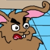
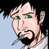
As far as I’m criticizing I’d like to note a few things about designs of characters. First one is that Ultra, the main character, with his concept, absolutely doesn’t deserve that position. He might be the blandest and uninteresting superhero character in the comic; asides from his goody-two-shoes nature, his powers are pretty much nothing interesting. I have a hard time actually remembering what they are; the only thing I know is that he’s supposed to be more powerful than the rest. But as to extent lack of inspiration in his concept, there’s design; just take a look at his signature letter, it looks more like a logo of building company than a sign of superhero; it’s static and closed shape, while I assume superhero would rather choose something dynamic, something that emphasizes movement and power. As to support this, the comic isn’t even based on him, even though he’s either central character or important paternal figure all through the comic.
The other character I have a problem with is Divine, an angel all with aura above her head. Simply said, pathos. Though I can imagine that author was proud with this concept, it goes to show that Faulkner’s assessment that writers should “kill their own favourite babies” was true. No matter how hard it is to discard them, sometimes ideas that you’re most proud of are the ones that don’t fit into the entire thing, either that or they work well only in your head.

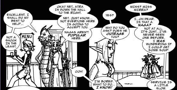
But I may be being too tough on this now, so for what it’s worth, I think that writing is up to standards of the ones it looks up. I seriously don’t think that writing of PG is any worse (it’s even better) than anything Stan Lee ever wrote. I just happen to think that it’s not a hard task at all. PG brings an interesting sub-storyline in introducing so-called children of main superheroes and as these characters appear to be troubled and unsure of themselves, unlike their parents, they turn out to be much more interesting than their parents. As usual, comic is better when it talks about ordinary lives of superheroes and how they deal with their situation, and less interesting when it indulges into lengthy action scenes. Action scenes would actually probably be much better if the art was better. On top of my head, I can think of this (http://www.pointguardian.com/d/20050125.html) scene; short, efficient and clever. Too bad, camera angles and poses make it look like everything happened in a span of few minutes, not in a matter of seconds.

Ironically, despite the conventional content, art would belong to some art-brute underground magazine rather than to mainstream comic books. Author does a lot of experimenting in inking field, changing tools often and advancing some in that field; it’s not surprise when you read that Jack Kirby is one of his main influences as it’s evident in the way he tries to use a brush, however, Kirby was anything but sloppy, and inking of this comic often is. There’s still lack of control over thickness of line, even though artist does a n effort to overcome it.
But the greatest surprise about art is how long the comic went without any improvement in pencil department. It seems like only recently author took some practice of anatomy, a bit strange for a superhero comic.
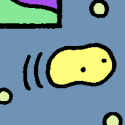
Art is very simplified, often, pages contain only bare necessities for conveying a story. You can see this on faces – they contain basic facial features necessary for recognizing characters, but nothing in department of shading or more subtle face lines, nothing that would flesh out emotion or mood on them.
There’s some use of screentones of which I approve, because it’s used functionally and rationally, usually to support the page (not to dominate it) and to give it a sort of abstract aura. The most interesting pages are the ones where author uses tricks with inking tools so represent some more or less abstract imagery. Like this one: http://www.pointguardian.com/d/20070209.html
In brief period when comic was coloured, colour was giving good results, helping unify elements that otherwise sometimes feel disjointed, and, overall supporting the mood.

Back when Keff reviewed me, she suggested that I should slow down and take my time with pages in order to get better results. Struggling whether to give advice that I myself don’t hold to, I still have to suggest that you do the same. Pro authors like quoting Herman Hypen who said, I think, that the first time he started drawing professionally was when he slaved over a single page for a month, and then somewhere during that month, he crossed the line between amateurish and professional, and later found that this line isn’t hard to cross once you manage it. That means that you learn more from executing one well-done page than from executing ten sloppy and half-finished pages.
Comic has commendable updating tempo of five days a week, for years without missing an update (except for some fillers here and there), but you have to decide what the priority is: telling more of the story or developing artistically.
Last edited by McDuffies on Fri Feb 23, 2007 11:46 am, edited 1 time in total.

User avatar
Mo
Cartoon Villain (GTC)
Posts: 5085
Joined: Sat Sep 03, 2005 6:55 am
Location: On the shoulder of a giant
Contact:

Post by Mo »

It may take me a few days, and I'm not really in the mood to face a review of one of my comics as I haven't updated in ages, but I must review Little White Knight! :D

(edit: please review IMO or Doppies, not MacFluffy & Clyde)

User avatar
Mvmarcz
Cartoon Hero
Posts: 3623
Joined: Wed Jul 21, 2004 10:17 pm
Location: Louisiana
Contact:

Post by Mvmarcz »

place holder for IMO
Image
NJ: "You know the drill, you're AWESOME!"
I am the artist formerly known as M2

User avatar
Duralict
Regular Poster
Posts: 96
Joined: Tue Jan 23, 2007 10:21 am

Post by Duralict »

Review of Avernyght.

Art: I really like your use of texture, and you have some great character designs. The art is very engaging and accessable. I know you were a little nervous about switching over to black and white, but aside from missing the awesome textures you had when it was colored the ink look is actually working very well. Your panel layouts are largely forgettable, but they serve the story and are nicely paced, so it works. Your weak point is definitely the environments - some of the backgrounds are light on detail and look a little shoehorned in, like the last three panels here. On the other hand, some of the backgrounds are extremely well-managed and dynamic, so this isn't a consistent problem so much as a mild imperfection. It does really bother me that none of the characters seem to be casting shadows most of the time. Overall, the art looks great and is totally in service to the atmosphere of your comic.

Writing: This comic flows really well, and you've found a way to sneak a lot of exposition into the character interaction. We're not very far in yet, so it's a little hard to say, but it seems like your plot has a definite direction and shape. Your characters are expressive and interesting. I'm intrigued to see where this goes next!

Site: Your logo is huge, and it bothers me that it's not centered. I'd complain about the size more if this was a smaller comic, but as the comic pages are too big to fit on one screen it's sort of a minor complaint. Your First/Previous/Next/Last buttons look great, but I totally read the Last one as "East" at first. Your Links page needs a more unified look - the spaces between banners are different at the top and bottom. The graphics all look great. The site could use a little detail work, but overall it's perfectly functional and easy to use, as well as being attractive.

Areas of excellence: Your characters are very expressive, and your world so far is engaging. You've got great pacing and the art is unusual and attractive.

Areas for improvement: Work on your backgrounds more, and tweak the website a bit. Don't forget about shadows in the art.

Overall, this is a very good comic with a lot of promise.
Image
intended for mature audiences.

Post Reply