Nah have a go at the webnovel if you like, it's all cool.JSConner800 wrote:Oh yeah, I should have specified. I'd like to take a look at your webnovel, unless you'd rather have another review of your comic. I'm openJSC, I'm assuming you're reviewing my comic but I'll leave the ??? just in case.
Webcomic Above You 2014 Review and Discussion
-
RobboAKAscooby
- Cartoon Hero
- Posts: 1140
- Joined: Thu Aug 07, 2008 1:00 pm
- Location: Brisvegas
- Contact:
Re: Webcomic Above You 2014 Review and Discussion
 Deviantart~tumblr
"Your service is to the story and to the characters. Fuck the audience and fuck your own whims." - Yeahduff
-
VeryCuddlyCornpone
- Cartoon Hero
- Posts: 3245
- Joined: Tue Feb 10, 2009 3:02 pm
- Location: the spoonited plates of Americup
- Contact:
Re: Webcomic Above You 2014 Review and Discussion
Neat! Thanks! I'll admit much of the colors/retro feeling is not actually intentional but if it's coming across that way, I'll take itTerotrous wrote:The main thing that sets Loud Era apart from other webcomics is that it is a period piece, it's set in a specific point in history and generally tries to be authentic to its setting. This is conveyed in several ways, but there's no question that the most effective one is through the art. Loud Era genuinely looks like a comic that might have been produced in the early 1900s. The art style is heavily inspired by traditional western cartooning, with heavy caricature and a lot of facial definition, which creates a unique look by today's standards all by itself, but what really separates this comic from others is the authenticity in the production techniques. Loud Era is inked, lettered, thatched, and coloured by hand, which goes a long way towards recreating the retro look. For example, in old comics, colours are not totally uniform, as they are in comics that are coloured using a computer, there are gradients and patterns in the colours, all of which are faithfully reproduced here. This even extends to the colour scheme, which is generally a bit too bright by modern standards and has a slightly faded look, which again matches the less advanced printing techniques of the day. And I have to give special credit to the backgrounds. Take a look at the first panel in this strip, for example, the level of detail here is incredible. Once again this is a callback to the golden days of cartooning, which were generally drawn full-page and featured elaborate hand-drawn backgrounds. Overall I really enjoyed the art.
Fair enough! Leon is a bit of an outlier there since with the other characters who have glasses, you can see their eyes. The way I'm using his opaque glasses in the comic is to suggest the idea of someone who, when wearing their glasses, that's kind of all you see- someone who takes their glasses off and looks entirely different. He's meant to be a little aloof compared to some of the cast so I kind of like having that masked visage type of a thing? Ugh this sounds really tooty but I think you know what I mean. It's kind of a fun challenge to draw him expressively without being able to use his actual eyes for emotional representation.My one minor beef is the way Leon's glasses are drawn, the opaque lenses seem a bit out of place with the rest of the comic. I suspect this is a more modern artistic convention compared to the rest of the art style.
This is something several folks have mentioned, and it's a valid complaint. The only thing I can say about your last sentence there is that pretty soon we do see that divide as different ones of them have different plans that are more appropriate. However, the fact that it's kind of been a nebulous aspect thus far in the comic is pretty weird and I don't really have any defense for that other than it's the story I came up with and it's what I went wiht.Unfortunately, I don't feel the writing and plot contribute quite as much to the theme of the comic. They're totally serviceable, but unlike the art there's not a lot here that really establishes Loud Era as a period work. The major plot threads so far have dealt with the high school prom, a musical, and a camping trip, which are basically staple storylines of any high school story written between 1900 and now, and the ways in which the time period would be relevant are frequently glossed over. For example, the first part of the story deals with graduation and the prom, and while I really enjoyed the twist ending at the very end of chapter 3, there's nothing here that wouldn't fit in any other high school strip. This is definitely a missed opportunity, because if the characters were to discuss their plans for after graduation, that would likely be totally different from how that conversation would go in a more modern setting.
Poor Ulysses is somewhat of an artefact for the time being. When I was developing Loud Era years ago, Uly's part was initially much bigger, but as I fleshed out the other characters more, his storyline got pushed back time-wise (and actually cut out, there were more scenes of him in the "pre-natal" chapters that have since been removed from the site- not that they really were that serviceable). I can see what you mean though, it's confusing for him to appear twice in the first chapter, again at the end in a flashback, and then nothing again until Chapter 4.... and I do have a very brief upcoming chapter that's centered around him but it's kind of an unusual narrative so I'm not sure it really counts. I wanted to introduce him as a character so that when his role *does* resume as originally planned, he'll have some significance to readers. I think if I could go back and do things over knowing what I know now, I should have devoted more time to him here and there.Even more unfortunate is the character of Ulysses, who serves as the comic's main tie to its time period. Unfortunately, he gets virtually no screentime and isn't connected to the main plot in any way. I was actually pretty confused by the new intro because it made it seem like Ulysses was the central character in the story and I kept trying to figure out how he fit into it before I finally clued in that he actually wasn't involved in the main storyline. Given his general non-participation in the plot, it probably would have been better for the intro to focus on Joseph, Eddie, or Marie instead, it'd make the first chapter a little easier to follow for new readers.
Hehe. It's funny that you link that strip in particular because I've done some research now and then on the way vernacular swearing was changing during that time period. Prior to the War, there was a lot more of a religious aspect in swearing- like you were literally condemning people verbally, plus all those fancy sentence-long curses that are considered characteristic of the 19th century and earlier. Around the war, I think it started with soldiers who then started bringing it back home, the swearing started to shift over to more vulgar terminology- shifting from religious/scatological references to words with more of a sexual innuendo.The strip also tends to fade back and forth between characters using generally period-appropriate dialogue and more modern slang, which is a bit jarring at times. This strip is probably the most egregious example, besides sounding out of place there's also no way a 1919 paper would ever allow that type of language, they'd have to be a lot more subtle about it. In general, I feel it would help a lot to always keep the time period of the strip in mind and look for ways to contrast past and present.
Er, what was my point here? Ah, that strip- to be fair to me, like I said earlier, Loud Era isn't supposed to seem like a comic *from* 1918, so I think that what the boys say to one another in the relative privacy of their social circle has a little more leeway than what would be considered acceptable in "mixed company." But yeah, I do have a problem with mixing in modern vernacular- I know IV has called me out on it before, I'm sure others have but I don't remember specifics. Sometimes a line sounds so natural in my head I can't imagine anyone at any point in history not having it in their jargon library
This is interesting to me as I usually assume people aren't reading my commentsBeyond this, I have a few minor issues regarding pacing and overall writing style. One fairly typical issue is that the comic suffers from some degree of "show, don't tell". Cuddly gives a little commentary on each page, and in some cases they contain vital aspects of plot information that aren't located elsewhere in the comic. The most prominent example of this occurs when one character's religion becomes a plot point. This has never been mentioned previously in the comic, nor has anyone treated this character differently up until now, it's just kind of mentioned in the commentary that this kind of thing was an issue at the time. I think it would have been a lot more effective if we had seen some backstory for this character (he's the only one who doesn't get a scene devoted to him in chapter 1) where his religion was established, and if his boss acted like a jerk to him about it, that way it wouldn't seem to kind of come out of nowhere. The cast page also contains some pretty vital information that the site unwisely advises you not to read for fear of spoilers, even though it doesn't really contain any. I was definitely a little confused until I read through the bios for the main characters because the story starts off right in the thick of things and it introduces a half dozen characters in so many strips.
Warning about spoilers on the cast page I just do to cover my ass in case I include some at some point, although I guess it doesn't really matter all too much. Yeah, my intro is still weak w/regards to all the characters. I've chopped up the beginning of this story so many times it's not even funny. Again, the sort of thing that if I could go back, knowing what I know now, I would pad out the intro better. I think it's definitely better now than it used to be (before my Frankenstein chopping/amputating), but it's not ideal. If I think of a better method someday I'd like to implement it, but for now I'll have to leave it alone so I don't go crazy.
Pacing's been a big issue I've struggled with, for sure. I appreciate you pointing it out. Chapter 4 in part was me trying to throw a bone to some characters that hadn't really been explored personally up to that point, but looking back on it now even just a year later I see how it could have been made stronger.Speaking of which, I feel the pacing in the comic could use a little fine tuning. From a plot perspective, chapter 4 is the most important one in the story, it contains several major events that shift the tone of the comic. It is also by far the shortest chapter, chalking in at less than half the length of the previous chapter, and much of that is an unrelated scene with Ulysses. I definitely would have expected to see more discussion of these events from the other characters in the story. These are really pretty typical issues when writing fiction that are pretty hard to avoid unless you plan everything you write really far in advance (which is hard with a comic), but they're worth noting anyway.
This warms my heart to hearOverall, Loud Era is definitely a solid effort and I can tell a lot of love goes into the production of this comic. The various issues I had with the writing didn't significantly impede my overall enjoyment, though I feel it could become something really special if the art and the writing meshed a little more cohesively. At the very least, the lovingly detailed backgrounds, expressive characters and vibrant colours elevate it beyond the typical high-school comic to become something more memorable.
Thank you for taking the time to read my oppressive archive and give me some fresh feedback. It was a lot of good food for thought and I am going to keep it in mind as I go forward. Thank you friendie <333333

Don't kid yourself, friend. I still know how.
"I'd much rather dream about my co-written Meth Beatdown script tonight." -JSConner800000000
-
IVstudios
- Cartoon Hero
- Posts: 3660
- Joined: Sun Dec 14, 2003 11:52 am
- Location: My little office
- Contact:
Re: Webcomic Above You 2014 Review and Discussion
Is anyone else having trouble viewing new posts in this thread? It's showing as having unread posts for me, but I can't view them.
…
So I probably won't be able to see if anyone actually responds to this.
…
So I probably won't be able to see if anyone actually responds to this.

Re: Webcomic Above You 2014 Review and Discussion
I'll be able to get to my review of Red Slime after this crazy weekend! LC, which stories did you have a part of? I'll be sure to pay special attention. For now, I'm just enjoying the 'channel-flipping' vibe. It's a fun read so far!

-
Cope
- Incompetent Monster
- Posts: 7378
- Joined: Sat Jul 31, 2004 8:37 pm
- Location: Masked man of mystery
- Contact:
The Astounding Untitled Review of the Untitled Comic!
Review of Comic!
So you wanted a title for this project, eh? Well, I'm afraid to say that I'm as terrible at coming up with titles as anyone. If I were to give it a name, it would probably be something like The Meandering Daydreams of an Aspiring Author, because that's all I can manage to see here.
Even if I wasn't familiar with you or your interests, I'd be able to peg Ashley Summers as a wish-fulfilling self-insert pretty much immediately; it's distractingly obvious. While I won't call him a Mary Sue (because, frankly, I find that term to be less than useless...but that's another story), I will say that he feels very bland and uninspired. Of course, he has no real flaws, but beyond that, he lacks much in the way of character traits at all. He's a world-renowned comic artist and he fawns over a pop star...and that's about it, really. It seems you've tried to portray him as a bit awkward, but this doesn't affect his interactions in any meaningful fashion. I guess he's also supposed to be charming because his love for Alexis Hope extends beyond the licentious concerns of mere flesh, encompassing an admiration for her inner beauty...but even that rings hollow to me, because seriously, how well could he understand a woman that he's only known through the lens of popular media?
But no matter! Our hero finally meets the object of his affection, and it turns out that she loves his work and is excited to see him! Which brings us to another problem: points of conflict are introduced into the story only to be summarily dismissed. Alexis' ex-boyfriend shows up and expresses his contempt for Ash, only for our hero to burn him with a zinger that the brute is too ignorant understand! Alexis is nervous about the award ceremony, only for the very next page to reveal that she won Artist of the Year! It's hard to get invested in the proceedings when everything just falls into the protagonists' laps.
Speaking of the protagonists, the love interest is as bland as the hero. I assume you're putting Alexis up on a pedestal and are loath to imbue her with anything that might make her interesting. As a result, the courtship between the two lovebirds is pretty boring and hokey; they lack chemistry because there's nothing to their personalities. A hopelessly sappy line like this is pretty hard to swallow at the best of times, and it really doesn't work here because it's all saccharine and no substance.
You've written that your initial plan was for this to be more of a short-form comedy strip, and the apparent attempt at story-telling was an unintended consequence of setting up the central relationship. Well, if that's the case, I'm afraid I still don't see much potential for the comic; the jokes so far have trended towards the trite end of the spectrum. I mean, one of the first gags has the guy pratfalling into the girl's boobs! It's like one of my Japanese animes. More importantly, the personalities are too lacking to suggest much in the way of entertaining interactions. The Wacky Roommate is the most overtly comedic member of the cast, but he's too hackneyed and one-dimensional to compensate for how boring our two mains are.
I feel awkward giving advice on your art; it's basically a case of the blind leading the blind. I believe you've improved somewhat over the years (although it's hard to make a comparison, as most of your old stuff is gone from the Internet), but the fundamental flaws remain. Your style is very...stiff. Your line is steady, but the posing is rather mannequin-like. You could stand to loosen things up a bit...perhaps putting some study into construction lines and practising poses with stick figures. Your anatomy is also quite bad. In particular, the designs of your girls seem copied from the hyperbolically slim proportions of Disney princesses, with no understanding of actual human anatomy being applied in the process. In the end, they just end up looking kind of bony. Also, if you're going to do line-shading, it should constitute more than a few quick scribbles to fill in the white space.
One thing that you have improved is your short-term pacing. I remember Shit Happens consisting of a lot of two-panel pages that made it feel like there wasn't much happening over the course of several pages....that doesn't happen anywhere near as often here. Still, you do have quite a few single-panel pages that bring the pacing to a screeching halt as it collides with a great big pile of padding. That sort of thing should be reserved for “big” moments, as opposed to things like a scene of a guy standing around in an airport.
My understanding is that you're less interested in crafting a compelling narrative because this story primarily exists as a therapeutic exercise....and that's fine! It's your comic...it should be only what you want it to be. However, if you would have people besides yourself experience this work, you should come to expect reviews like this one.


"I've always been fascinated by failure!" -Charlie Brown
-
Cope
- Incompetent Monster
- Posts: 7378
- Joined: Sat Jul 31, 2004 8:37 pm
- Location: Masked man of mystery
- Contact:
CTRL+C AND CTRL+V TO THE RESCUE
Also, I'm copying and pasting the missing posts over here so they don't get lost.
RobboAKAscooby wrote:Nah have a go at the webnovel if you like, it's all cool.Oh yeah, I should have specified. I'd like to take a look at your webnovel, unless you'd rather have another review of your comic. I'm openJSC, I'm assuming you're reviewing my comic but I'll leave the ??? just in case.
IVstudios wrote:Is anyone else having trouble viewing new posts in this thread? It's showing as having unread posts for me, but I can't view them.
…
So I probably won't be able to see if anyone actually responds to this.
djracodex wrote:I'll be able to get to my review of Red Slime after this crazy weekend! LC, which stories did you have a part of? I'll be sure to pay special attention. For now, I'm just enjoying the 'channel-flipping' vibe. It's a fun read so far!
VeryCuddlyCornpone wrote:Terotrous wrote:The main thing that sets Loud Era apart from other webcomics is that it is a period piece, it's set in a specific point in history and generally tries to be authentic to its setting. This is conveyed in several ways, but there's no question that the most effective one is through the art. Loud Era genuinely looks like a comic that might have been produced in the early 1900s. The art style is heavily inspired by traditional western cartooning, with heavy caricature and a lot of facial definition, which creates a unique look by today's standards all by itself, but what really separates this comic from others is the authenticity in the production techniques. Loud Era is inked, lettered, thatched, and coloured by hand, which goes a long way towards recreating the retro look. For example, in old comics, colours are not totally uniform, as they are in comics that are coloured using a computer, there are gradients and patterns in the colours, all of which are faithfully reproduced here. This even extends to the colour scheme, which is generally a bit too bright by modern standards and has a slightly faded look, which again matches the less advanced printing techniques of the day. And I have to give special credit to the backgrounds. Take a look at the first panel in this strip, for example, the level of detail here is incredible. Once again this is a callback to the golden days of cartooning, which were generally drawn full-page and featured elaborate hand-drawn backgrounds. Overall I really enjoyed the art.
Neat! Thanks! I'll admit much of the colors/retro feeling is not actually intentional but if it's coming across that way, I'll take itLoud Era is meant to take place in that time period, it's not necessarily supposed to look like it could have *run* during that time period, if that makes sense. But the fact that the visuals are working in that regard is a good thing. I'm glad to hear you've been enjoying the backgrounds, I'm working now to include the more often and put more effort into them as well.
My one minor beef is the way Leon's glasses are drawn, the opaque lenses seem a bit out of place with the rest of the comic. I suspect this is a more modern artistic convention compared to the rest of the art style.
Fair enough! Leon is a bit of an outlier there since with the other characters who have glasses, you can see their eyes. The way I'm using his opaque glasses in the comic is to suggest the idea of someone who, when wearing their glasses, that's kind of all you see- someone who takes their glasses off and looks entirely different. He's meant to be a little aloof compared to some of the cast so I kind of like having that masked visage type of a thing? Ugh this sounds really tooty but I think you know what I mean. It's kind of a fun challenge to draw him expressively without being able to use his actual eyes for emotional representation.
Unfortunately, I don't feel the writing and plot contribute quite as much to the theme of the comic. They're totally serviceable, but unlike the art there's not a lot here that really establishes Loud Era as a period work. The major plot threads so far have dealt with the high school prom, a musical, and a camping trip, which are basically staple storylines of any high school story written between 1900 and now, and the ways in which the time period would be relevant are frequently glossed over. For example, the first part of the story deals with graduation and the prom, and while I really enjoyed the twist ending at the very end of chapter 3, there's nothing here that wouldn't fit in any other high school strip. This is definitely a missed opportunity, because if the characters were to discuss their plans for after graduation, that would likely be totally different from how that conversation would go in a more modern setting.
This is something several folks have mentioned, and it's a valid complaint. The only thing I can say about your last sentence there is that pretty soon we do see that divide as different ones of them have different plans that are more appropriate. However, the fact that it's kind of been a nebulous aspect thus far in the comic is pretty weird and I don't really have any defense for that other than it's the story I came up with and it's what I went wiht.
Even more unfortunate is the character of Ulysses, who serves as the comic's main tie to its time period. Unfortunately, he gets virtually no screentime and isn't connected to the main plot in any way. I was actually pretty confused by the new intro because it made it seem like Ulysses was the central character in the story and I kept trying to figure out how he fit into it before I finally clued in that he actually wasn't involved in the main storyline. Given his general non-participation in the plot, it probably would have been better for the intro to focus on Joseph, Eddie, or Marie instead, it'd make the first chapter a little easier to follow for new readers.
Poor Ulysses is somewhat of an artefact for the time being. When I was developing Loud Era years ago, Uly's part was initially much bigger, but as I fleshed out the other characters more, his storyline got pushed back time-wise (and actually cut out, there were more scenes of him in the "pre-natal" chapters that have since been removed from the site- not that they really were that serviceable). I can see what you mean though, it's confusing for him to appear twice in the first chapter, again at the end in a flashback, and then nothing again until Chapter 4.... and I do have a very brief upcoming chapter that's centered around him but it's kind of an unusual narrative so I'm not sure it really counts. I wanted to introduce him as a character so that when his role *does* resume as originally planned, he'll have some significance to readers. I think if I could go back and do things over knowing what I know now, I should have devoted more time to him here and there.
The strip also tends to fade back and forth between characters using generally period-appropriate dialogue and more modern slang, which is a bit jarring at times. This strip is probably the most egregious example, besides sounding out of place there's also no way a 1919 paper would ever allow that type of language, they'd have to be a lot more subtle about it. In general, I feel it would help a lot to always keep the time period of the strip in mind and look for ways to contrast past and present.
Hehe. It's funny that you link that strip in particular because I've done some research now and then on the way vernacular swearing was changing during that time period. Prior to the War, there was a lot more of a religious aspect in swearing- like you were literally condemning people verbally, plus all those fancy sentence-long curses that are considered characteristic of the 19th century and earlier. Around the war, I think it started with soldiers who then started bringing it back home, the swearing started to shift over to more vulgar terminology- shifting from religious/scatological references to words with more of a sexual innuendo.
Er, what was my point here? Ah, that strip- to be fair to me, like I said earlier, Loud Era isn't supposed to seem like a comic *from* 1918, so I think that what the boys say to one another in the relative privacy of their social circle has a little more leeway than what would be considered acceptable in "mixed company." But yeah, I do have a problem with mixing in modern vernacular- I know IV has called me out on it before, I'm sure others have but I don't remember specifics. Sometimes a line sounds so natural in my head I can't imagine anyone at any point in history not having it in their jargon libraryI've tried more to be careful w/regards to this in later years though- for instance http://loudera.smackjeeves.com/comics/1 ... ful-woman/ in this strip Eddie was originally supposed to say "put the moves on" instead of "make a move on," but I had the good sense to double check the slang and it turned out to be a lot younger- like from the 70's IIRC.
Beyond this, I have a few minor issues regarding pacing and overall writing style. One fairly typical issue is that the comic suffers from some degree of "show, don't tell". Cuddly gives a little commentary on each page, and in some cases they contain vital aspects of plot information that aren't located elsewhere in the comic. The most prominent example of this occurs when one character's religion becomes a plot point. This has never been mentioned previously in the comic, nor has anyone treated this character differently up until now, it's just kind of mentioned in the commentary that this kind of thing was an issue at the time. I think it would have been a lot more effective if we had seen some backstory for this character (he's the only one who doesn't get a scene devoted to him in chapter 1) where his religion was established, and if his boss acted like a jerk to him about it, that way it wouldn't seem to kind of come out of nowhere. The cast page also contains some pretty vital information that the site unwisely advises you not to read for fear of spoilers, even though it doesn't really contain any. I was definitely a little confused until I read through the bios for the main characters because the story starts off right in the thick of things and it introduces a half dozen characters in so many strips.
This is interesting to me as I usually assume people aren't reading my commentsI don't deliberately put any information I actually think is needed there because I know people might not read it. I didn't want to bring Leon's religion/ethnicity up more explicitly earlier in the comic because, while I had long ago had a scene I kind of wanted to include, it felt kind of unnecessary and I preferred the subtlety with which it's mentioned here. Leon's friends don't mention it because it doesn't really affect their friendship that he's Jewish, but for Clarabelle to pursue a romantic relationship with him is a different story- think of people you might know who have a friend who is [ethnicity] but wouldn't date someone that ethnicity, or wouldn't want their sibling/son/daughter to date someone that ethnicity.
Warning about spoilers on the cast page I just do to cover my ass in case I include some at some point, although I guess it doesn't really matter all too much. Yeah, my intro is still weak w/regards to all the characters. I've chopped up the beginning of this story so many times it's not even funny. Again, the sort of thing that if I could go back, knowing what I know now, I would pad out the intro better. I think it's definitely better now than it used to be (before my Frankenstein chopping/amputating), but it's not ideal. If I think of a better method someday I'd like to implement it, but for now I'll have to leave it alone so I don't go crazy.
Speaking of which, I feel the pacing in the comic could use a little fine tuning. From a plot perspective, chapter 4 is the most important one in the story, it contains several major events that shift the tone of the comic. It is also by far the shortest chapter, chalking in at less than half the length of the previous chapter, and much of that is an unrelated scene with Ulysses. I definitely would have expected to see more discussion of these events from the other characters in the story. These are really pretty typical issues when writing fiction that are pretty hard to avoid unless you plan everything you write really far in advance (which is hard with a comic), but they're worth noting anyway.
Pacing's been a big issue I've struggled with, for sure. I appreciate you pointing it out. Chapter 4 in part was me trying to throw a bone to some characters that hadn't really been explored personally up to that point, but looking back on it now even just a year later I see how it could have been made stronger.
Overall, Loud Era is definitely a solid effort and I can tell a lot of love goes into the production of this comic. The various issues I had with the writing didn't significantly impede my overall enjoyment, though I feel it could become something really special if the art and the writing meshed a little more cohesively. At the very least, the lovingly detailed backgrounds, expressive characters and vibrant colours elevate it beyond the typical high-school comic to become something more memorable.
This warms my heart to hearI appreciate the criticisms and am pleased that most of them tended to sway toward the earlier parts of the comic (or at least the examples you gave) which gives me some hope that I'm "getting there," wherever "there" may be for now.
Thank you for taking the time to read my oppressive archive and give me some fresh feedback. It was a lot of good food for thought and I am going to keep it in mind as I go forward. Thank you friendie <333333
"I've always been fascinated by failure!" -Charlie Brown
-
LibertyCabbage
- Cartoon Hero
- Posts: 4667
- Joined: Tue Jan 25, 2005 4:08 pm
- Location: bat country
- Contact:
Re: CTRL+C AND CTRL+V TO THE RESCUE
TY, Cope.
Oh, cool, I'm glad you're having fun reading it. *thumbs up* I did some copy editing and lettering (which should be credited on the pages), but I was mainly involved in an editorial role. That included reviewing scripts, matching up artists with stories, coordinating between the contributors, getting cover illustrations, and just trying to get each issue done by the end of the month (as it was originally posted online in 2009-2010 as a monthly web magazine). Some of the stories in the comic were already completed and were used with the creator's permission, but a good amount of the stories are original content created specifically for the magazine.djracodex wrote:I'll be able to get to my review of Red Slime after this crazy weekend! LC, which stories did you have a part of? I'll be sure to pay special attention. For now, I'm just enjoying the 'channel-flipping' vibe. It's a fun read so far!


"Seems like the only comics that would be good to this person are super action crazy lines, mega poses!"
-
RobboAKAscooby
- Cartoon Hero
- Posts: 1140
- Joined: Thu Aug 07, 2008 1:00 pm
- Location: Brisvegas
- Contact:
Re: Webcomic Above You 2014 Review and Discussion
Thanks Cope.
I don't really have much feedback here. Nothing I can argue against.
Truthfully I should be embarrassed, I'm a better writer than this, but I just seem to keep failing with comics.
As I think I said, responding to LC, I should have just started with them in the relationship since that's where all my ideas are/were. As such I just rushed this intro part and botched it, I tried to drop a few seeds for later stuff but I could have found better ways to do that later.
One thing I'd like to mention, that obviously didn't come across well (due to my poor execution) is that Alex wasn't exactly telling the truth here, I tried to drop a little "she doth protest too much" into her reactions but, well, I'm not that good obviously.
Thanks for the comment about pacing.
You guys have no idea how hard I've been working on trying to loosen up my art.
I'm not saying that as a "Stop picking on me" type of thing, I'm pretty disappointed in myself for how little improvement seems to be happening.
Definitely going back to full colour, I'm decent at that.
Well, wish me luck as I try to turn this pumpkin, if not into a shining coach, at least into a tasty pumpkin pie.
Confession time:
I knew this comic was bad. It wasn't until I was checking links the day before W.A.Y. that I realised just how bad but by that point I'd been pushing W.A.Y. so much that it would have been lousy of me to back out.
Also I was gonna do that copy/paste thing for the missing posts, thanks for saving me the trouble.
Also, also, unless there's a comic I REALLY want to review I think I'm gonna tap out now, I've still got JSC's review of the Flying Tigers webnovel to come (boy am I glad LC didn't jump in on that one).
Deviantart~tumblr"Your service is to the story and to the characters. Fuck the audience and fuck your own whims." - Yeahduff
-
IVstudios
- Cartoon Hero
- Posts: 3660
- Joined: Sun Dec 14, 2003 11:52 am
- Location: My little office
- Contact:
Re: Webcomic Above You 2014 Review and Discussion
Okay, here is my review of Masadjra:
Art
Good: There is some nice character stuff going on. There is a lot of good motion and the body language and faces are very expressive. There are also a lot of interestingly composed shots with dynamic camera movement.
Bad: The shot compositions are often too ambitious, I think. There are a lot of dramatic close ups and weird backgrounds and cropped shots that seem like an attempt to add mood, but make the action confusing. This page is a good example where it gets a bit over the top. There are so many moody shots and closeups and such that I really don't know where this page is supposed to be taking place or where the characters are in the space. It's good that you tried to spice up what could have been a boring talking scene with some dynamic shots, but it went too far in the other direction. It also feels like the closeups and odd cropping is done as a way to avoid drawing backgrounds.
Another drawback is that despite the comics unique and interesting setting, it lacks a sense of place. I don't really have any feel for the world this comic takes place in, largely due to the crudeness of a lot of the backgrounds. This page could really have been something, giving both a sense of the world itself in the top panel and the city it takes place in on the bottom, but the backgrounds seem crude and rushed and lose all impact. Things in chapter two are looking much better though, and you seem to be on the right track as far as improving goes.
Writing
Good: A very unique setting and the plot doesn't want for ambition. You clearly have big plans for your world and what happens in it.
Bad: I don't really know or care about what's going on. I have virtually no idea who anyone is or what motivates them. There's like, this kid who is heir to some throne, and he can turn into a monster or something? Or maybe he can't? And he has like an adopted sister who everyone hates because she's adopted? And she get's kicked out of the city and then there's some race going on? Or wait, now she's killing people, so maybe it's a battle? Or a game of capture the flag? Where they kill people? And has no spectators? And some of the people can turn into monsters? And she wins the game of capture the flag, which is bad? So she starts killing a bunch of other people?
To your credit, it's pretty obvious that there is a deeper meaning behind everything that is going on. But since I have no idea what that meaning is, I can't really care about what's happening. I don't know what Whini is doing or why, so I don't care if she succeeds or fails. I haven't seen enough of her character to care if she dies. There is this bit where we get to see some of her character, but her only two emotions seem to be aloof moping and rage. She's got that sort of "noble, stoic and totally boring" character thing going on.
But like the art, there seem to be nice improvements in chapter two. These two pages give way more character development for T and Lotlca and do more to endear me to them than the entirety of chapter 1 gives to Whini and Rat. I still don't really know what's going on, but I at least care about the people involved.
There is also a lack of flow to some of the dialogue, it often feels unnatural. They often
have odd breakups
or pacing. Or sometimes worded they are in a way that is odd. That, plus all the offhand references to things the characters know about but we don't makes a lot of the dialogue hard to follow. Maybe when you are writing you could try reading it out loud to see how it sounds. And remember that just because you know all the little details about your world doesn't mean the reader does. It's good to throw a little slang or cultural references into the characters speech, but too much is alienating. I see you have a page of terms to help with some of that, but it's a pretty boring solution to the problem.
Site Design
Good: I really like the site design. The mesoamerican theme fits well with the comic and looks pretty cool. The cast page especially looks good.
Bad: I have no real criticism for the site design other than the alignment of the navigation buttons is off when viewed on my iPad and there are some spacing issues then the page window is resized. There are also a few pages that seem a bit light on content, but I assume they will eventually fill out.
Over all
I think the main shortcoming of this comic is that it's too ambitious, both in the writing and the art. I guess it's not a bad thing that you have big ideas, but if you half-ass the execution than you just end up with a confusing and boring comic. If I were to just look at Chapter 1 I wouldn't think this comic had much potential, but Chapter 2 is showing marked improvement and I think there is definite potential.
-
Cope
- Incompetent Monster
- Posts: 7378
- Joined: Sat Jul 31, 2004 8:37 pm
- Location: Masked man of mystery
- Contact:
There IS a possum! I'm not crazy!!
also that possum scares the crap out of me.IVstudios wrote:Site Design
Good: I really like the site design. The mesoamerican theme fits well with the comic and looks pretty cool. The cast page especially looks good.
Bad: I have no real criticism for the site design other than the alignment of the navigation buttons is off when viewed on my iPad and there are some spacing issues then the page window is resized. There are also a few pages that seem a bit light on content, but I assume they will eventually fill out.
"I've always been fascinated by failure!" -Charlie Brown
-
VeryCuddlyCornpone
- Cartoon Hero
- Posts: 3245
- Joined: Tue Feb 10, 2009 3:02 pm
- Location: the spoonited plates of Americup
- Contact:
Re: There IS a possum! I'm not crazy!!
OH MY GOD!!!!!!!!!!!!!!!!!!Cope wrote:also that possum scares the crap out of me.IVstudios wrote:Site Design
Good: I really like the site design. The mesoamerican theme fits well with the comic and looks pretty cool. The cast page especially looks good.
Bad: I have no real criticism for the site design other than the alignment of the navigation buttons is off when viewed on my iPad and there are some spacing issues then the page window is resized. There are also a few pages that seem a bit light on content, but I assume they will eventually fill out.
edit: IV since it's the weekend now I ort to be able to put the cows out to pasture
Don't kid yourself, friend. I still know how.
"I'd much rather dream about my co-written Meth Beatdown script tonight." -JSConner800000000
-
RobboAKAscooby
- Cartoon Hero
- Posts: 1140
- Joined: Thu Aug 07, 2008 1:00 pm
- Location: Brisvegas
- Contact:
Re: Webcomic Above You 2014 Review and Discussion
UPDATED:
Okay a few more reviews done, a bunch more to be done.RobboAKAscooby wrote:List so far:
Scooby's comic being reviewed by LibertyCabbageDONE
Red Slime being reviewed by Djracodex
Masadjra being reviewed by IVstudiosDONE
Inhumation being reviewed by Cuddly
Loud Era being reviewed by TerotrousDONE
What Lies Beyond being reviewed by Scooby
Scooby's comic being reviewed by CopeDONE
Cerintha being reviewed by JSConnor800
Steels Salvation being reviewed by Cuddly
Loud Era being reviewed by Scooby
Flying Tigers being reviewed by JSConnor800
Steel Salvation being reviewed by robybang
Artie The Opossum being reviewd by ...
Deviantart~tumblr"Your service is to the story and to the characters. Fuck the audience and fuck your own whims." - Yeahduff
Re: Webcomic Above You 2014 Review and Discussion
Too excited to poop!IVstudios wrote:Okay, here is my review of Masadjra:
Yeah, yeah I need to work on this. I've got a pretty large setting that all connects, and I need to show it more. From the temple on the volcano, to the tombs on the volcano that the temple is on (Which is not shown...), by the city, to the arena around the city and eventually a hole in the ground that is below the city, I need to start including more recognizable landmarks gratuitously.IVstudios wrote: Art: ...Another drawback is that despite the comics unique and interesting setting, it lacks a sense of place.
IVstudios wrote:Writing
I'm working on it, and every review is helping me round out what and how I do. For next WAY, my hope is for this section to improve and not repeat itself.
I'm glad that it shows I am improving, because I feel like I might be getting a little better at this (after those feelings of never getting better at this. Success is measured in imaginary centimeters, my friends).IVstudios wrote:Over all
I think the main shortcoming of this comic is that it's too ambitious, both in the writing and the art. I guess it's not a bad thing that you have big ideas, but if you half-ass the execution than you just end up with a confusing and boring comic. If I were to just look at Chapter 1 I wouldn't think this comic had much potential, but Chapter 2 is showing marked improvement and I think there is definite potential.
THANK YOU IV!!

*edit [/side note] I did not read the previous posts, lol
Other side note: Really didn't think possum would be seen too often, I will make him more subtle. But he is supposed to be a little frightening, lol
-
RobboAKAscooby
- Cartoon Hero
- Posts: 1140
- Joined: Thu Aug 07, 2008 1:00 pm
- Location: Brisvegas
- Contact:
Re: Webcomic Above You 2014 Review and Discussion
Review of What Lies Beyond
What Lies Beyond is described by the author as "A psychological fantasy novel" which isn't quite an accurate description for the project. Instead it is more along the lines of an exploration of the mind and existence played out as a mystery set within a unique fantasy setting.
And that is quite possibly the best thing about What Lies Beyond, it is certainly unique.
WLB tells the story of several crews of cat-people who spend their nights sailing a seemingly infinite-yet-small sea and by day they enter the memories of human people known to them as Strangers where they seemingly help the Strangers complete a task before returning to their own world.
The central story focuses on captain Corsair in his search for friend/love-interest Sister and then his helping of Sister in her quest to deliver her message from one Stranger to another.
Site:
The biggest problems with this project lie in its presentation.
Now as a novel, one expects a lot of text and the light gray on dark gray makes reading the wall of text much easier on the eyes than if it had just been black text on a white background, however the lack of page constraint causes issues. I had to re-size my browser window in order to comfortably read the text. There is a reason that books and other print media generally restrict the width of text to about ten-to-fifteen words across, giving a narrower band of words eases the strain on the eyes as well as making it easier on the reader to follow on from one line to the next.
Beyond the formatting issues the site is also very empty, just a tiny banner at the top and three navigation buttons plus a small pic at the top of each chapter.
Speaking of the chapter pics, it would be better if the chapter titles were centered with the pic rather than left-aligned with the text.
The archives page is simply a list of chapters with no information, which is problematic for the purposes of an archive, most readers accessing the archive will likely be looking for a specific chapter to continue/re-read from. It would be better if there was some indication of what each chapter was, whether by a short description or a thumbnail of the chapter pic or even just the first line of each chapter.
There are no real extras to speak of, which is understandable as this is a novel being presented in an online format and most novels don't contain extras, but in the case of the complicated and unique universe presented here a few extras might help with the reading experience. A character page, a glossary or even just an about page would help to alleviate some of the unintended confusion.
I say unintended because clearly some of the confusion is part of the process in reading a story such as this.
Art:
The art here is restricted to a small pic at the heading of each chapter, usually illustrating a key scene.
Style-wise I'm not sure if the art fits with the story, the artwork is very cartoony and doesn't seem to allow for the complicated emotions experienced by the characters..
From a technical standpoint the art is kind of bland, the linework appears to be almost uniform in width, the colours are flat and little consideration seems to be given to backgrounds. There's also not much detail in the art, often with the women's dresses it is just a shaped block of colour. In fact with the exception of Pack's clothing most outfits seem to be just simple one colour no-detail shirts/pants/dresses which is a little disappointing considering the wide array of interesting settings the characters find themselves in.
The poses are very stiff, reminiscent of action figures or those simple flash animations from the early days of the internet and the mostly uniform line-width doesn't help. Chapter 13's pic is a good example, it's supposed to be a spirited sparring match but there's no energy expressed, the arms are stiff and I almost have the impression the two characters were drawn separately and then pasted together. In a real fight very rarely would one's arms be fully extended as if trying to stay as far from your opponent as possible, the two should be moving towards each other. Other examples of the stiffness are the dance scenes in chapters 6 and 17, again here the arms are very rigid and unnatural for the activity taking place.
A pretty noticeable problem with the anatomy is the length of the limbs and necks. These seem to change a lot and don't seem to match well anatomically with the rest of the bodies, necks are often over-long (chapter 18 and 27) and arms seem to bend in awkward places (chapter 6).
One particularly off-looking pic is the chapter 5 pic of Michelle, her backside looks like a separate part or segment (kind of like an ant). It's possible that this is just a problem with perspective as a similar separation of body parts seems to occur in chapter 29.
Writing:
The major impression after reading a few chapters is one of ADD, the story seems to flit very rapidly between a lot of different events in different settings before the reader really has time to get a grasp of what is occurring. As previously mentioned there is certainly a purpose to keeping the reader confused, to preserve the mystery behind the story, but the initial confusion is felt due to a lack of establishment. While dropping the reader into the middle of a story and letting them catch up is a valid (and often rewarding) form of storytelling, the uniqueness and scale of the universe created here would have benefited from a slower, more focused start.
For instance it took several chapters for me to realise that all of the main characters are these cat-people and even then I never understood why they are. However after a while I stopped wondering why and just accepted it, I don't know if this is to be explained in later chapters.
It wasn't until around chapter 6 that I began to get a grasp on the two separate worlds thing that is going on. After which I referred to the world's as the "Cat world" and the "Memories world" as this seemed to be the simplest way to describe them.
I don't want to say too much about the plot as pretty much anything I say could be considered a spoiler, it is a rather complex story underpinned by some serious questions about the nature of the protagonists' existence.
And leading to a lot of questions for the reader, which is the main enjoyment of reading this story, the constant trying to figure out the nature of these two worlds. I have my theory but I'm waiting for the completion of the story to find out if I'm right.
Back onto the technical standpoint, a minor annoyance is the appearance of characters who will then go half a scene without being identified by name. This is understandable when it comes to the Strangers but when it is their friends and crew members it becomes unnecessarily confusing. For example when Lapse appears on Pack's boat, this is a case where he has been looking/hoping for her but then when she arrives it's not apparent it's her until it's casually mentioned.
Many characters enter a scene like "a woman entered the room" when these characters are already known and the narrating character is well aware of who has entered their presence. Once or twice for dramatic purposes this is okay but the reader shouldn't be constantly waiting to find out who is having the conversation.
The character personalities and relationship dynamics are rather cliche, but with such a large cast it is probably for the best. The story would certainly benefit from a cast page, if only to help the reader keep track of the myriad of secondary and tertiary characters.
Also on the subject of characters I have a minor complaint.
The story starts off with a pretty classical 3-man-band structure of Corsair, Cross and Sabre, a nicely classical heroic - trio fearless leader, stable second and reckless youngster – it’s cliché but it works.
Then with the introduction of the other captains the core relationship seems to shift, it would be better if less focus was given to the adventures of and with the other captains.
It's one thing for the interactions with Sister to take a high priority as she is clearly an important part of Corsair's life but the other Captain's adventures lead to whole chapters diverging from the path.
Which is to say once the other captains become involved in Sister's quest the narrative becomes unfocused. Their adventures are in service to the main plot but perhaps should be presented as short stories told to Corsair during the captain's meet-ups rather than their own separate narratives.
Final Thoughts:
While reading this story I was constantly jotting down questions and in the end I've decided not to ask any of them in this review. The strength of the work is that it is a mystery that draws the reader in, causing them to ask questions and keep reading, searching for the answers. To ask the questions here would be a disservice to the story.
The story is certainly intriguing but requires some tightening from a technical standpoint, a more focused narrative would better serve the mystery being presented.
Overall it is a solid effort if however a little too ambitious in its scope. I would recommend giving it a read.
Deviantart~tumblr"Your service is to the story and to the characters. Fuck the audience and fuck your own whims." - Yeahduff

Re: Webcomic Above You 2014 Review and Discussion
Wow, I wasn't really expecting something so thorough. I agree with most of the points there and I'm not dissatisfied with the impact the story seems to have had on you. I do have a couple follow-up questions and thoughts though.
I have, however, gone in and made some formatting changes to the way it displays the text on the chapter pages, it now restricts the number of characters per line and the text is slightly bigger. I'd be curious to hear if this makes it easier to read now.
The story is also broadly split into 4 main arcs that all have names. However, again, both the names of the arcs and the chapters where they start and end are spoilers of a sort. However, those aren't huge spoilers so I might look at dividing up the Archives page that way.
One thing I do definitely recognize as being a problem is the fact that the link and visited link color are the same, which makes it hard to know what chapters you've already read. That's stupid and I've fixed it, the visited link colour is now very different from the regular one, so at least now you can easily tell how much you've read.
As you noted, much of the mystery and ambiguity in the story, particularly in the early chapters, is entirely intentional. A large part of the book is about trying to figure out exactly how the connection between the two worlds works (note that the characters do not fully understand this either). As such, I feel that info dumping information about the world or the characters in supplemental pages not only somewhat ruins the experience, it's also kind of "cheating" on my part. You're supposed to be able to come to various conclusions (which will not always be correct) just by reading through the story. Some questions are also deliberately left ambiguous, which is ruined if I provide my own interpretation of those events.
It's also worth noting that this story is the first book in a trilogy, so it will definitely raise more questions than it answers. Some events won't be totally clear until you read the second or third books, but I'm hoping you'll have forgotten about those questions by then so you won't see it coming when the answers are revealed.
Incidentally, I'm curious to hear your thoughts on the value of the chapter pictures in general. They actually take me a fairly long time to draw and I'm not totally convinced they really add a lot to the experience. I'm currently working on my second novel and I may not to chapter pictures for that one if people feel they aren't really enhancing the experience.
If you go back and read some of the earlier chapters after reading the later ones, you'll probably discover some clues in there that you didn't see the first time. The word choice in this story is generally very deliberate, any time you see a word choice that seems slightly unusual or out of place it's probably important.
And there's definitely a reason why they're cat people. I feel it should actually be somewhat solvable by chapter 32 or so, but if you don't get it yet you definitely should by the time you read the second book.
This concept is the major theme behind the third book in the trilogy.
Yeah, I definitely agree with this part. I've never been happy with the way the site displays the text, but unfortunately I don't really have a lot of control over it, Blogger isn't really meant for just making whatever kind of website you want, they restrict your use of HTML and Javascript in various ways so there's only so much you can do. I already had to use a fair bit of trickery to get it to have a different-looking main page and distinct pages for each chapter.RobboAKAscooby wrote:Site:
The biggest problems with this project lie in its presentation.
Now as a novel, one expects a lot of text and the light gray on dark gray makes reading the wall of text much easier on the eyes than if it had just been black text on a white background, however the lack of page constraint causes issues. I had to re-size my browser window in order to comfortably read the text. There is a reason that books and other print media generally restrict the width of text to about ten-to-fifteen words across, giving a narrower band of words eases the strain on the eyes as well as making it easier on the reader to follow on from one line to the next.
I have, however, gone in and made some formatting changes to the way it displays the text on the chapter pages, it now restricts the number of characters per line and the text is slightly bigger. I'd be curious to hear if this makes it easier to read now.
I agree, but it seems like it's impossible to change this. I think I just have to live with this one.it would be better if the chapter titles were centered with the pic rather than left-aligned with the text.
I went back and forth on this during the creation of the story. At one point, the chapters were going to have single-word titles, but the problem is that these instantly act as a small spoiler. For example, if you see a later chapter is called "Reunion", that instantly spoils you on part of the plot.The archives page is simply a list of chapters with no information, which is problematic for the purposes of an archive, most readers accessing the archive will likely be looking for a specific chapter to continue/re-read from. It would be better if there was some indication of what each chapter was, whether by a short description or a thumbnail of the chapter pic or even just the first line of each chapter.
The story is also broadly split into 4 main arcs that all have names. However, again, both the names of the arcs and the chapters where they start and end are spoilers of a sort. However, those aren't huge spoilers so I might look at dividing up the Archives page that way.
One thing I do definitely recognize as being a problem is the fact that the link and visited link color are the same, which makes it hard to know what chapters you've already read. That's stupid and I've fixed it, the visited link colour is now very different from the regular one, so at least now you can easily tell how much you've read.
Again, I thought about having these but they're generally not there to prevent spoilers. Even the names of a few of the principal characters in this story is a spoiler!There are no real extras to speak of, which is understandable as this is a novel being presented in an online format and most novels don't contain extras, but in the case of the complicated and unique universe presented here a few extras might help with the reading experience. A character page, a glossary or even just an about page would help to alleviate some of the unintended confusion.
I say unintended because clearly some of the confusion is part of the process in reading a story such as this.
As you noted, much of the mystery and ambiguity in the story, particularly in the early chapters, is entirely intentional. A large part of the book is about trying to figure out exactly how the connection between the two worlds works (note that the characters do not fully understand this either). As such, I feel that info dumping information about the world or the characters in supplemental pages not only somewhat ruins the experience, it's also kind of "cheating" on my part. You're supposed to be able to come to various conclusions (which will not always be correct) just by reading through the story. Some questions are also deliberately left ambiguous, which is ruined if I provide my own interpretation of those events.
It's also worth noting that this story is the first book in a trilogy, so it will definitely raise more questions than it answers. Some events won't be totally clear until you read the second or third books, but I'm hoping you'll have forgotten about those questions by then so you won't see it coming when the answers are revealed.
Yeah, the art is not great in general. It's never been my strong suit, even though I think the art in What Lies Beyond is better than it ever was in my comic and there's a couple pictures I think look pretty good there's at least as many I don't like. It's funny that you bring up Chapter 5, because that's by far my most hated of all of the chapter pictures. I've tried several times to adjust this one to not look like crap but it just doesn't really work. I'll probably totally redraw this one at some point.Art:
One particularly off-looking pic is the chapter 5 pic of Michelle, her backside looks like a separate part or segment (kind of like an ant). It's possible that this is just a problem with perspective as a similar separation of body parts seems to occur in chapter 29.
Incidentally, I'm curious to hear your thoughts on the value of the chapter pictures in general. They actually take me a fairly long time to draw and I'm not totally convinced they really add a lot to the experience. I'm currently working on my second novel and I may not to chapter pictures for that one if people feel they aren't really enhancing the experience.
The book was definitely written so that you would have a lot of questions. It was actually my original expectation that people would use the comments section to speculate on just what the heck is going on in this story (this is one way an online story can differ from a story published traditionally, it's more social), so the mysteries are written with a level of subtlety that I expected would require multiple people to solve. This ended up not being the case because people seem reluctant to post comments, so as the story has gone on I've edited the puzzles to be a little easier to solve. This probably results in the beginning of the book being "too hard", which I might go back and adjust slightly if I ever decide to do another editing pass on it.Writing:
The major impression after reading a few chapters is one of ADD, the story seems to flit very rapidly between a lot of different events in different settings before the reader really has time to get a grasp of what is occurring. As previously mentioned there is certainly a purpose to keeping the reader confused, to preserve the mystery behind the story, but the initial confusion is felt due to a lack of establishment. While dropping the reader into the middle of a story and letting them catch up is a valid (and often rewarding) form of storytelling, the uniqueness and scale of the universe created here would have benefited from a slower, more focused start.
For instance it took several chapters for me to realise that all of the main characters are these cat-people and even then I never understood why they are. However after a while I stopped wondering why and just accepted it, I don't know if this is to be explained in later chapters.
It wasn't until around chapter 6 that I began to get a grasp on the two separate worlds thing that is going on. After which I referred to the world's as the "Cat world" and the "Memories world" as this seemed to be the simplest way to describe them.
I don't want to say too much about the plot as pretty much anything I say could be considered a spoiler, it is a rather complex story underpinned by some serious questions about the nature of the protagonists' existence.
And leading to a lot of questions for the reader, which is the main enjoyment of reading this story, the constant trying to figure out the nature of these two worlds. I have my theory but I'm waiting for the completion of the story to find out if I'm right.
If you go back and read some of the earlier chapters after reading the later ones, you'll probably discover some clues in there that you didn't see the first time. The word choice in this story is generally very deliberate, any time you see a word choice that seems slightly unusual or out of place it's probably important.
And there's definitely a reason why they're cat people. I feel it should actually be somewhat solvable by chapter 32 or so, but if you don't get it yet you definitely should by the time you read the second book.
This is a deliberate style choice to keep you feeling somewhat off-balance as you read the story. Note that when the characters enter what you call the memories world, it also takes a moment for them to orient themselves to their surroundings (why is this the case...?). In the second book, there are some scenes that we see from "the real world" which don't do this, which helps give the two worlds a distinct feel.Back onto the technical standpoint, a minor annoyance is the appearance of characters who will then go half a scene without being identified by name.
I'm really glad you picked up on this, I was actually a bit worried that this concept was too subtle. Prior to the events of the story, Corsair's life is indeed extremely cliche, which is why during the first few chapters the broader concepts of the story are largely hidden and it seems just like a straightforward pirate story. He has his little band of adventurers and they go on thrilling escapades and that's the way he likes it. Unfortunately, as the events of the story unfold and more complications get introduced, this starts to fall apart. His life is arguably much more "complete" later on, but at the same time he's lost a fair bit along the way.Also on the subject of characters I have a minor complaint.
The story starts off with a pretty classical 3-man-band structure of Corsair, Cross and Sabre, a nicely classical heroic - trio fearless leader, stable second and reckless youngster – it’s cliché but it works.
Then with the introduction of the other captains the core relationship seems to shift, it would be better if less focus was given to the adventures of and with the other captains.
It's one thing for the interactions with Sister to take a high priority as she is clearly an important part of Corsair's life but the other Captain's adventures lead to whole chapters diverging from the path.
This concept is the major theme behind the third book in the trilogy.
What Lies Beyond - A Psychological Fantasy Novel
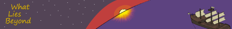
Stuff that updates sometimes:


I also did phbites.comicgenesis.com and hntrac.comicgenesis.com way back when.
Stuff that updates sometimes:
I also did phbites.comicgenesis.com and hntrac.comicgenesis.com way back when.
-
RobboAKAscooby
- Cartoon Hero
- Posts: 1140
- Joined: Thu Aug 07, 2008 1:00 pm
- Location: Brisvegas
- Contact:
Re: Webcomic Above You 2014 Review and Discussion
No problemo.Terotrous wrote:Wow, I wasn't really expecting something so thorough. I agree with most of the points there and I'm not dissatisfied with the impact the story seems to have had on you. I do have a couple follow-up questions and thoughts though.
Yeah, I've heard blogger is a tad restrictive. If you were considering a change of host you could try wordpress (not just saying because I use it), it has its limits as well but, at least with the template I'm using, it is a bit easier to read on.Terotrous wrote:Yeah, I definitely agree with this part. I've never been happy with the way the site displays the text, but unfortunately I don't really have a lot of control over it, Blogger isn't really meant for just making whatever kind of website you want, they restrict your use of HTML and Javascript in various ways so there's only so much you can do. I already had to use a fair bit of trickery to get it to have a different-looking main page and distinct pages for each chapter.
I have, however, gone in and made some formatting changes to the way it displays the text on the chapter pages, it now restricts the number of characters per line and the text is slightly bigger. I'd be curious to hear if this makes it easier to read now.
Pity. There's always the option to make the title part of the pic or a separate pic since that seems to center fine.I agree, but it seems like it's impossible to change this. I think I just have to live with this one.it would be better if the chapter titles were centered with the pic rather than left-aligned with the text.
I'm generally of the opinion that most people don't mind minor spoilers. For instance during the Harry Potter days when certain chapter titles would be revealed before the release of the books people actually enjoyed the speculation. But that's an individual thing.I went back and forth on this during the creation of the story. At one point, the chapters were going to have single-word titles, but the problem is that these instantly act as a small spoiler. For example, if you see a later chapter is called "Reunion", that instantly spoils you on part of the plot.The archives page is simply a list of chapters with no information, which is problematic for the purposes of an archive, most readers accessing the archive will likely be looking for a specific chapter to continue/re-read from. It would be better if there was some indication of what each chapter was, whether by a short description or a thumbnail of the chapter pic or even just the first line of each chapter.
The story is also broadly split into 4 main arcs that all have names. However, again, both the names of the arcs and the chapters where they start and end are spoilers of a sort. However, those aren't huge spoilers so I might look at dividing up the Archives page that way.
I do think that most people hitting the archive however would be re-readers so spoilers are less of a hassle.
That certainly helps a bit.One thing I do definitely recognize as being a problem is the fact that the link and visited link color are the same, which makes it hard to know what chapters you've already read. That's stupid and I've fixed it, the visited link colour is now very different from the regular one, so at least now you can easily tell how much you've read.
Something I kept thinking of is in the Dark Heavens books by Kylie Chan (if you haven't read them they're a supernatural action/drama based around Chinese mythology) at the back of the books is a small glossary that is mostly spoiler free but just kind of helps with the large (I mean ginormous) array of characters and terms.Terotrous wrote:Again, I thought about having these but they're generally not there to prevent spoilers. Even the names of a few of the principal characters in this story is a spoiler!There are no real extras to speak of, which is understandable as this is a novel being presented in an online format and most novels don't contain extras, but in the case of the complicated and unique universe presented here a few extras might help with the reading experience. A character page, a glossary or even just an about page would help to alleviate some of the unintended confusion.
I say unintended because clearly some of the confusion is part of the process in reading a story such as this.
As you noted, much of the mystery and ambiguity in the story, particularly in the early chapters, is entirely intentional. A large part of the book is about trying to figure out exactly how the connection between the two worlds works (note that the characters do not fully understand this either). As such, I feel that info dumping information about the world or the characters in supplemental pages not only somewhat ruins the experience, it's also kind of "cheating" on my part. You're supposed to be able to come to various conclusions (which will not always be correct) just by reading through the story. Some questions are also deliberately left ambiguous, which is ruined if I provide my own interpretation of those events.
I think if you could find a spoiler-free way to do something similar it would help some of the non-intentional confusion - even just a list of character like that placed each crew with their captain would be good as there seems to be about a dozen key characters.
Yeah there's sort of a mixed bag quality wise but it is certainly improved from your comic.Terotrous wrote:Yeah, the art is not great in general. It's never been my strong suit, even though I think the art in What Lies Beyond is better than it ever was in my comic and there's a couple pictures I think look pretty good there's at least as many I don't like. It's funny that you bring up Chapter 5, because that's by far my most hated of all of the chapter pictures. I've tried several times to adjust this one to not look like crap but it just doesn't really work. I'll probably totally redraw this one at some point.Art:
One particularly off-looking pic is the chapter 5 pic of Michelle, her backside looks like a separate part or segment (kind of like an ant). It's possible that this is just a problem with perspective as a similar separation of body parts seems to occur in chapter 29.
Well personally I'm all for chapter pictures (I do the same with my webnovel). Especially when it's presented on the site like that, I think taking away the pics would make things look really boring, there needs to be something on the page other than just text.Incidentally, I'm curious to hear your thoughts on the value of the chapter pictures in general. They actually take me a fairly long time to draw and I'm not totally convinced they really add a lot to the experience. I'm currently working on my second novel and I may not to chapter pictures for that one if people feel they aren't really enhancing the experience.
It wasn't so much the mysteries that were a problem as it was trying to get a grasp of the basic rules of the universe.Terotrous wrote:The book was definitely written so that you would have a lot of questions. It was actually my original expectation that people would use the comments section to speculate on just what the heck is going on in this story (this is one way an online story can differ from a story published traditionally, it's more social), so the mysteries are written with a level of subtlety that I expected would require multiple people to solve. This ended up not being the case because people seem reluctant to post comments, so as the story has gone on I've edited the puzzles to be a little easier to solve. This probably results in the beginning of the book being "too hard", which I might go back and adjust slightly if I ever decide to do another editing pass on it.Writing:
The major impression after reading a few chapters is one of ADD, the story seems to flit very rapidly between a lot of different events in different settings before the reader really has time to get a grasp of what is occurring. As previously mentioned there is certainly a purpose to keeping the reader confused, to preserve the mystery behind the story, but the initial confusion is felt due to a lack of establishment. While dropping the reader into the middle of a story and letting them catch up is a valid (and often rewarding) form of storytelling, the uniqueness and scale of the universe created here would have benefited from a slower, more focused start.
For instance it took several chapters for me to realise that all of the main characters are these cat-people and even then I never understood why they are. However after a while I stopped wondering why and just accepted it, I don't know if this is to be explained in later chapters.
It wasn't until around chapter 6 that I began to get a grasp on the two separate worlds thing that is going on. After which I referred to the world's as the "Cat world" and the "Memories world" as this seemed to be the simplest way to describe them.
I don't want to say too much about the plot as pretty much anything I say could be considered a spoiler, it is a rather complex story underpinned by some serious questions about the nature of the protagonists' existence.
And leading to a lot of questions for the reader, which is the main enjoyment of reading this story, the constant trying to figure out the nature of these two worlds. I have my theory but I'm waiting for the completion of the story to find out if I'm right.
If you go back and read some of the earlier chapters after reading the later ones, you'll probably discover some clues in there that you didn't see the first time. The word choice in this story is generally very deliberate, any time you see a word choice that seems slightly unusual or out of place it's probably important.
I understand that the nature of the universe is also one of the mysteries but at the same time the reader needs a bit of ground to stand on.
I'll go back to Harry Potter again (just because it's an easy choice) there are a lot of mysteries, both per book and in the overall story, but the time is still spent to give the reader a basic background, a foundation is laid for the castle to be built upon.
Perhaps if you spent a little more time with Corsair's adventures before the main storyline things would flow better, that way the reader would have a decent grasp of the two worlds thing before the mysteries begin. As it is the reader is trying to figure out how things work at the same time that the rules seem to be changing for Corsair and company.
Full disclosure, I'm only twenty-something chapters through but I felt (considering it is an ongoing project) I could make a decent review of what I'd consumed thus far.And there's definitely a reason why they're cat people. I feel it should actually be somewhat solvable by chapter 32 or so, but if you don't get it yet you definitely should by the time you read the second book.
This was more a case of in the "cat world" Corsair (or others) would be speaking to one of the crew/allies and it was just a normal scene but you didn't know who they were talking to until they were addressed by name. It seems unnecessary for such casual scenes, the confusion there really doesn't serve the narrative.This is a deliberate style choice to keep you feeling somewhat off-balance as you read the story. Note that when the characters enter what you call the memories world, it also takes a moment for them to orient themselves to their surroundings (why is this the case...?). In the second book, there are some scenes that we see from "the real world" which don't do this, which helps give the two worlds a distinct feel.Back onto the technical standpoint, a minor annoyance is the appearance of characters who will then go half a scene without being identified by name.
I understand what you're getting at but my complaint was more along the lines of this being Corsair's story and there being these big side-stories that don't offer much to that story.I'm really glad you picked up on this, I was actually a bit worried that this concept was too subtle. Prior to the events of the story, Corsair's life is indeed extremely cliche, which is why during the first few chapters the broader concepts of the story are largely hidden and it seems just like a straightforward pirate story. He has his little band of adventurers and they go on thrilling escapades and that's the way he likes it. Unfortunately, as the events of the story unfold and more complications get introduced, this starts to fall apart. His life is arguably much more "complete" later on, but at the same time he's lost a fair bit along the way.Also on the subject of characters I have a minor complaint.
The story starts off with a pretty classical 3-man-band structure of Corsair, Cross and Sabre, a nicely classical heroic - trio fearless leader, stable second and reckless youngster – it’s cliché but it works.
Then with the introduction of the other captains the core relationship seems to shift, it would be better if less focus was given to the adventures of and with the other captains.
It's one thing for the interactions with Sister to take a high priority as she is clearly an important part of Corsair's life but the other Captain's adventures lead to whole chapters diverging from the path.
This concept is the major theme behind the third book in the trilogy.
I mean it is interesting to see how the other captains work in the "real world" and it helps build their characters but in the end the story is usually back right where it left off. I think there are other ways that the same information could be delivered.
Also as I said before, I think a little more of Corsair's adventures prior to the story could help here. If he's going to go through this life-changing journey it would be better to know what his life was. We get the basics from the first few chapters of course, and that is kind of enough, but it would serve that dual purpose smoothing out some of the bumps in the narrative road.
Once the story is done, I will likely hit you up with a bunch of the questions and observations. I just really don't want to spoil things too much for potential readers.
Also (I start way too many sentences with also, and also and) the presentation/site things I pointed out are things I need to fix on my own project.
Deviantart~tumblr"Your service is to the story and to the characters. Fuck the audience and fuck your own whims." - Yeahduff
-
VeryCuddlyCornpone
- Cartoon Hero
- Posts: 3245
- Joined: Tue Feb 10, 2009 3:02 pm
- Location: the spoonited plates of Americup
- Contact:
Re: Webcomic Above You 2014 Review and Discussion
IV I'm having that weird glitching problem again trying to read your site 
this page http://ivstudios.net/inhumation/comic/035/
http://ivstudios.net/inhumation/comic/055/
http://ivstudios.net/inhumation/comic/074/
and on this page, the comic itself doesn't show, it just skips from above the comic to the nav buttons below it : http://ivstudios.net/inhumation/comic/070/
I need to pause for the time being but I'll keep you posted on other pages that are wonking out.
Don't kid yourself, friend. I still know how.
"I'd much rather dream about my co-written Meth Beatdown script tonight." -JSConner800000000
-
JSConner800
- Regular Poster
- Posts: 151
- Joined: Tue Jan 01, 2013 10:11 pm
Re: Webcomic Above You 2014 Review and Discussion
Okay, I've finally gotten off my ass and made some headway on this reviewing business. Here's the first (and only) actual webcomic I'll be reviewing for W.A.Y. 2014!
Cerintha
By Cope
Website
The site is sparse, but it gets the job done and it doesn't interfere with the comic itself. Some elements are spruced up with unique designs, like the title at the top and the individual section headers. I'd like to see that kind of attention to detail in the navigation links, since they're currently just plain hyperlinks. Also, on the subject of navigation, I think the site suffers from a lack of click-through navigation, as it forces readers to deal with the tiny little hyperlinks. Until you're able to create larger, more thematically appropriate navigation buttons, click-through navigation is a good quick fix.
Writing
I feel a bit strange commenting on just a single chapter of a larger (much, much larger) work, but Book II of Cerintha is relatively self-contained, and I was specifically asked to review this part of the story, so I'll assume that the massive archive comprising Book I is, for this purpose, a separate comic entirely. The story is set in ancient Phrygia, and follows a young sorceress named Kusatara as she becomes a pawn in the ongoing war between the Phrygian Empire and the barbarian hordes decimating their lands. I liked the historical fantasy concept, but the historical influence is much more prevalent in the artwork than it is in the writing. Many details about the time period are superficial, and even the fantasy elements are often glossed over. For example, the barbarian leader (who, despite being a major character in the story, is never given a name besides “boss”) wields a supposedly mystical sword, but the sword's origins and abilities are never explained, and since the barbarian leader can't wield it properly – again, for reasons never explained – we never see what actually makes the sword mystical. The last we see of this legendary weapon is when the barbarian leader unceremoniously throws it aside to engage Kusatara's mentor Humati in a stereotypical honor-bound fistfight. Perhaps the sword first appeared in Book I, or perhaps it'll come back later. But, as I said earlier, this story is supposed to be self-contained, and in that context, the sword just becomes another one of the many half-formed concepts that weave in and out of Book II, seemingly at random.
I'm not going to go through every instance of this, because I don't want to nitpick one element of the story to death, but I'll offer a few other points to provide a clearer picture of the issue. We're delving into SPOILER territory here, so if you're following Cerintha and you're not caught up yet, you may want to skip to the Art section. Anyway, I feel like many of the major plot points in Book II are glossed over, such as the sacking of Gordium and the massive time jump at the end (to say nothing of the WTF it was all a dream ending). In a single page, an entire city falls or an entire lifetime passes, but these jumps are jarring, rather than artful. In the case of the sacking of Gordium, it's a combination of tonal dissonance and just plain wasted potential. The barbarians are mostly portrayed as a ragtag band of goofs, so it's quite a leap to go from a bumbling gang to a city-decimating horde in the span of a page or two. Plus, by not showing the sacking of Gordium and just explaining it in the next page, you lose the dramatic impact that I assume this event is supposed to have. The time jump is similarly problematic, because Kusatara's arc feels like it's just beginning to pick up steam when it essentially skips right to the end. Proper pacing requires a careful balance between providing details to your reader and advancing the plot. You certainly know how to advance the plot, but sometimes the journey is just as important as the destination, and it seems like you regularly skip the journey just to get to the destination sooner. It's also a matter of knowing which details to focus on, because there are some scenes that receive a bit too much attention - the ten-page fight between Kusatara and the barbarian leader drags a bit unnecessarily, and would have a much greater impact if the reader knew who the barbarian leader was or had a better understanding of the conflict at large.
One more thing, and then I'll move on. I'm going to sound a little hypocritical here, because this is something that my own comic suffers from, but the tonal dissonance in this comic is really severe. It switches between jokes, drama, and outright slapstick in such a disorienting way that, at times, it's hard to tell what's supposed to be comedic and what's supposed to be serious. For instance, when Gordium is sacked and the Empress suddenly (almost cheerfully) suggests that she and her aides commit suicide, I wasn't sure if it was supposed to be a joke or not. I still don't know, because the Empress and her aides never appear or are mentioned in the story again. I suppose that suggests that they did kill themselves, but we never see or hear about their bodies. They just disappear from the story. There are other instances of misplaced comic relief, like the various awkward antics of the giggling barbarian, or Humati's tendency to run into things when her hood is on, or the random barbarian that talks like a valley girl in the middle of a serious argument about the horde's leadership. Of course, comic relief can be used to great effect in serious work, but I feel like the comic relief in this story is directly undermining the serious elements.
Art
This was my favorite aspect of Cerintha, as I really enjoyed how expressive and visually diverse the cast of characters is. Your art style is an interesting blend of old-school Western cartooning mixed with Hellenistic designs, and there's just a touch of anime in there to boot. The Hellenistic influences are strong enough that I could tell, right from the first couple of pages, when and where the story took place, and that's because you infuse the setting into your art much more vividly than in the writing. Everything from the clothing to the hairstyles to the architecture all fit with ancient Phrygia (or at least, the popular conception of ancient Phrygia). Kusatara's emotional range is particularly impressive, and that element alone went a long way toward endearing me to the character.
Something else I'd like to point out is that Book II has a mostly female cast, and yet it doesn't feel like it's trying to be an “all-female” comic. It feels very natural, and this is possibly due to the wide range of personalities and body types these characters have. The barbarian leader is towering and muscular, the Empress is short and fat, Kusatara is a little girl who actually looks and acts her age, and Humati stands out as the only female character with a conventional body type. This is a pretty bold move, considering that webcomics rely on selling with sex even more often than other forms of media, and instead of filling up your cast with eye candy to plaster all over your banner ads, you went for more diverse and compelling character designs instead.
Some of the action scenes look a little stiff (panel 2, for example), but this actually brings to mind the “action shots” in Grecian frescoes, and whether this was the intended effect or not, I still liked it. Kusatara's rage mode at the end looks a little too Dragonball Z for my tastes, and I feel like there are a lot of interesting ways to portray sorcery that you've neglected to tap into, so that's something to keep in mind if you ever go back to the character.
Conclusion
Even though Cerintha Book II: Part I: Gordium is supposedly a self-contained story, it feels unfinished, and due to the many unresolved or underdeveloped plot threads mentioned earlier, I was left a little unsatisfied at the end. I'm not sure what sort of place this story occupies in the comic at large – is it an extended spin-off? Is it foreshadowing? Is it a character introduction? Whatever it is, it's got some significant flaws in its current state, and only some of them can be corrected by returning to it later and tying up the loose ends. I really liked the art, and the dialogue is competent, if a bit overreliant on cliches. I think if you can work out your pacing issues (the bane of webcomics everywhere) and the tonal dissonance, you can improve your comic dramatically.

My eternal schlong unravels - VeryCuddlyCornpone
Re: Webcomic Above You 2014 Review and Discussion
Actually, I was originally going to use Wordpress, but I found the degree to which they would let me customize my layout was FAR more restrictive than with Blogger (unless you pay, which gets you more blogger level functionality). It's possible I'm just not experienced enough with Wordpress, I'll check out your site later to see what kind of format you have.RobboAKAscooby wrote:Yeah, I've heard blogger is a tad restrictive. If you were considering a change of host you could try wordpress (not just saying because I use it), it has its limits as well but, at least with the template I'm using, it is a bit easier to read on.
Actually I don't think there is, Blogger adds the title automatically, it doesn't even seem like I can choose not to show it.Pity. There's always the option to make the title part of the pic or a separate pic since that seems to center fine.
Maybe, but I think this particular story is particularly rooted in gradual discovery so I'm more wary of it. For example, if you were spoiled on what happens at the end of act 3 I think it would really hurt the book for you.I'm generally of the opinion that most people don't mind minor spoilers. For instance during the Harry Potter days when certain chapter titles would be revealed before the release of the books people actually enjoyed the speculation. But that's an individual thing.
I do think that most people hitting the archive however would be re-readers so spoilers are less of a hassle.
That's helpful to know, I honestly had no idea whether anyone even bothered looking at them or not.Well personally I'm all for chapter pictures (I do the same with my webnovel). Especially when it's presented on the site like that, I think taking away the pics would make things look really boring, there needs to be something on the page other than just text.
The pacing of the first act was actually one of the things I spent the most time debating during the creation of this book. I agree that as it stands, it throws a lot at you pretty fast. The problem was that if I slowed it down, then you don't even get a feel for what the plot is about for a few chapters, and by that point a lot of people may have lost interest. I felt I had to throw a few hints of something greater into the first few chapters so people wouldn't think it was just a silly pirate story.Perhaps if you spent a little more time with Corsair's adventures before the main storyline things would flow better, that way the reader would have a decent grasp of the two worlds thing before the mysteries begin. As it is the reader is trying to figure out how things work at the same time that the rules seem to be changing for Corsair and company.
It's possible that there should maybe be one more chapter inbetween chapter 2 and 3 that helps explain the rules of the world a little better. After I finish my second book, I'll probably take a quick look over the first book again to see if I might have to make any edits for consistency, and I might look at expanding that part of the book a bit more.
I kind of sensed you hadn't finished act 3 yet based on a couple things you wrote, but I won't say which ones so it doesn't spoil the surprise. I will say that I think there's a fweFull disclosure, I'm only twenty-something chapters through but I felt (considering it is an ongoing project) I could make a decent review of what I'd consumed thus far.
There's probably a few unnecessary instances of this in the early chapters, I'll admit. I've been removing some from the later chapters and I might go back and take a few out of the early ones.This was more a case of in the "cat world" Corsair (or others) would be speaking to one of the crew/allies and it was just a normal scene but you didn't know who they were talking to until they were addressed by name. It seems unnecessary for such casual scenes, the confusion there really doesn't serve the narrative.
If you ever read the rest of it, I'm curious if you'll still think the same thing towards the end. I think there's a pretty good payoff from the other characters as the story goes on.I understand what you're getting at but my complaint was more along the lines of this being Corsair's story and there being these big side-stories that don't offer much to that story.
I mean it is interesting to see how the other captains work in the "real world" and it helps build their characters but in the end the story is usually back right where it left off. I think there are other ways that the same information could be delivered.
What Lies Beyond - A Psychological Fantasy Novel
Stuff that updates sometimes:
I also did phbites.comicgenesis.com and hntrac.comicgenesis.com way back when.
Stuff that updates sometimes:
I also did phbites.comicgenesis.com and hntrac.comicgenesis.com way back when.
-
Cope
- Incompetent Monster
- Posts: 7378
- Joined: Sat Jul 31, 2004 8:37 pm
- Location: Masked man of mystery
- Contact:
Cerintha Gaiden
Hey, thanks for the review, Conner!
I was meaning to add some sort of navigation buttons to the site, but I was never able to design anything satisfactory....and then I just sort of forgot about it. Whoops...
The Blade of Ashur seems important, but in a lot of ways it really isn't. I intentionally leave a lot of questions unanswered, even important ones. For example, the sword's use and purpose remain undiscovered in order to present it as a relic of the Golden Age of Sorcery, a lost time that remains poorly understood. Sometimes I leave loose ends for the hell of it (like the queen's ultimate fate). I like my stories to retain unknown elements, rather like real history. I understand that doing this sort of thing leaves many frustrated, though.
(I will admit that the barbarian leader only remains unnamed because I never came up with a naming theme for the Cimmerians.)
As for the drawn-out, “Dragonball Z” action scene....yeah, you got me. I have a huge soft spot for shonen fighting series. It's a personal vice that I indulge in.
I like goofy comedy a lot, roughly as much as I like tragic melodrama, so I put both elements into my stories. I guess it's kind of like the way Bollywood films try to provide value for money by giving the audience a bit of everything (romance, action, songs, drama, etc.). Obviously, this is like mixing oil and water to you and a lot of other people, but I like doing things this way. Besides, if I did a more serious story, I'd really have to change the art style.
Thanks for the kind words about my drawings! It's kind of interesting that you liked my art and didn't care for my writing; usually, it's the other way around.
Yeah, they didn't actually all wear those Smurf hats in real life.Everything from the clothing to the hairstyles to the architecture all fit with ancient Phrygia (or at least, the popular conception of ancient Phrygia).
...oh yeah...totally intentional. Totally. Yep.Some of the action scenes look a little stiff (panel 2, for example), but this actually brings to mind the “action shots” in Grecian frescoes, and whether this was the intended effect or not, I still liked it.
I suppose I didn't make this clear, but while Book II as a whole is a self-contained story, the events of Part I: Gordium will work in tandem with subsequent chapters, even if Kusatara and Humati's story looks like some unattached side attraction right now. Some things will never be elaborated on, though. Sorry about that!Even though Cerintha Book II: Part I: Gordium is supposedly a self-contained story
"I've always been fascinated by failure!" -Charlie Brown