RobboAKAscooby wrote:
Review of Loud Era:
I finally have the time to properly respond to this now that my life is settling like a pile of leaves and I'm no longer feeling like i'm waiting for some shoe to drop

If it sounds like I just described a whole genre, well I suppose I did, Loud Era is very typical of the teen slice-of-life genre typified by the likes of Archie comics and every teen sitcom since the late 70s.
I dunno if I ever mentioned it here before, but Archie comics were probably my biggest influence starting from when I was like 9 or 10 years old in terms of art and storytelling. I try to stay a little less campy, though, but I think that ol' redhead still shines through here or there

Writing-wise it's pretty solid. From the beginning there is a general tone of hope and happiness that carries through to even the latest pages but along with that is a building undercurrent of something sad in the characters' future. I am especially worried for Uly, his time in the army and the few flashbacks to happy times just don't bode well.
Glad this is coming through. WWI and the immediately following period was a really weird time where you had a lot of optimism and hope but also a lot of bad shit that was leading to important social change. Different characters (mostly unintentionally) kind of carry out different themes I think were important to the period but also still can resonate today. Things start to break up pretty soon now that the kids don't/won't have the safety of high school and their "home network" to run to all the time.
Since the last time I reviewed (and especially since the first time) , you've cut down the beginning into a much tighter intro which does a much better job of introducing the characters in their broadstrokes, it’s easy to get a grasp of who’s who despite the large cast.
A good example is the first appearance of Cal, Aggie and Marie. In that one conversation it’s clear – Cal (hopeless romantic dreamer), Aggie (no-nonsense realist) and Marie (the weird one) – and this kind of economical intro pays off well enough for the rest of the cast.
Glad to hear this. I'm still not 100% satisfied with the opening, but have yet to think of a better way to do what I want to do. As with the new Joseph intro I added years after the fact, I'm never hesitant to go back and smack around some old pages if I see a better way they could be doing their job. If I ever come up with a preferable solution I'll undoubtedly go back into the ring, but for the forseeable future the opening is as good as it's gonna get, and much better than the old rambling Halloween chapter (or, and Schoob you'll remember, the chapter that PRECEDED that one... good grief, what was I thinkng)
The way you handle touching moments with a warm restraint is very welcome.
The scene with Tony and his Mamma after Aggie’s letter is a near perfect example of letting the art tell the story, the scene is simple and plays with only two words of dialogue that could have left off completely.
Contrast this with the more dramatic scenes, such as Aggie’s and Cal’s argument at the train station, and it sets a nice balance of tone.
You let each scene stand as what it needs to be.
This is great to hear, thanks. When I was working on the Tony/Mamma scene I kind of worried that like it was overly dramatic and lame and people were going to react with at best disinterest and at worst displeasure at my sentimentality.
Sometimes the dialogue is a little too modern but I don’t really think that’s much of an issue, you avoid using any millennial slang, more honestly it helps to make it readable to the modern audience. Having read plenty of comics from the 40s and 50s I have to say that if you tried to make the dialogue more period it would probably be more detrimental than helpful.
I think this is a valid point, as much as I agree with people who've pointed out my dialogical anachronisms. I've found difficulty employing certain types of slang from the period just because of how hokey they sound, like I feel they would yank somebody out of the narrative/immersion. In something like Lackadaisy it's not really an issue because every pixel of it oozes 1920s so there's no disconnect. It probalby sounds dumb given that my comic is called "Loud Era" because that gives one the expectation that the time setting is the most integral part of the comic, but what's really important to me is that readers can relate to the characters and feel at least somewhat of a closeness to them despite being a (in my case at least) 90 year age gap.
A minor niggling question I had was over the seeming disappearance of Tony’s idolisation of the boxer but surprise, by the time I got to the end there was a mention.
Yeah, that's my bad. That's one of my problems with insisting on writing such a large cast, little pieces might take ages to come up again. To be fair to myself, I try to keep it so that the things that are important and going to be necessary story-wise in the near future are mentioned/visible more regularly/apparently.
One final note on the writing, whenever the characters get over excited - whether it be Joseph swearing about his legs or Cal’s “Lee-onnn!” or Marie just generally being herself – I can’t help but see similarities with what you write on the forum/facebook/etc, it’s like moments that your own personality peeks through.
And quite entertaining.
Lmao. This really made me smile. I do put a lot of "myself" into the characters but it's difficult for me to tell objectively how much and what of it is actually coming through in the text.
The technique is really good, blending and shading is on par with most digital efforts which is impressive from a practical work. The times when the shading/lighting is done with pencil over marker is quite interesting, similar to the traditional hatching for shape but a little softer.
Cool! I'm getting better now with using traditional tools because I'm trying to be more bold about it and not trying to hide behind subtle techniques or using the computer to add effects I'm too "scared" to add physically and unundoablly.
The title card are a nice touch, obviously going for the silent film intertitle look, helps set up the feel of the idea that life is a play.
Thanks! That's another thing I want to touch up a bit, I want to change the home page so that instead of the gang all dripping off of Eddie's car, it's a silent movie theater with them all sitting/milling about in the seats and then on the screen you click where you want to go, navigation-wize.
Some early backgrounds have that white halo issue where you've been reluctant to colour too close to the characters. Other than that the backgrounds are well done, the level of detail is more or less equal to that in the character or other foreground objects.
You wanna know what that halo is
That's my obsessive and uneducated use of the "unsharp mask" function because i didn't know how to use levels/curves to add contrast

Expressions are another strong point, very clear without going to the overblown exaggerations that even a lot of “professionals” tend to fall back on.
Even when it comes to special effect panels like Cal’s “OMG I killed my parents” type moments it only pushes the boundary enough to illustrate the outlandishness of her panic/worry.
Thanks. I try to avoid trodden cartoon shortcuts because for the most part it would look jarring given the rest of the visual appearance of the comic. Marie gets most of the distinguishably wacky faces, followed probably by Clarabelle and then I guess Eddie when he has his maniacal break at the end of the prome chapter.
Character design is mostly excellent, although there are times that some male characters can be confused (especially in tighter shots), generally speaking the characters have individual appearances that also match their personalities. The range of body types is also a major positive, each of the girls has a distinct sillouette.
Overall the characters look and feel distinctly different but at the same time fit together clearly, at no point do any of them look as if they don't belong in the world you've created.
I'll probably inquire with you at the end of this chapter whether the dude-fusion has improved by that point. I'm trying to focus on the distincting qualities between them instead of just drawing them as Generic Cuddly-Pleasing Male #83.0. I can fully sympathize with and understand what is stereotyped as the male problem of drawing female characters all with the same figure and face
There are some anatomy issues, most noticeable is the occasionally too long arms. Often these issues seem to occur when the camera angle or perspective changes from the more standard straight angles so it’s possible the anatomy issues are linked to perspective issues.
Good call on the arms! I've noticed some of my zoom-out shots looking wonky and i think you've hit the nail on the head. I caught myself doing it during this scene actually. I think in general you're right about perspective issues, because that's when I actually have to like, you know, draw the bodies, and years of ARE U REDY FOR MY CLOSEUP MR DEMILLE stunted my growth in that capability path
Extras on the site are mostly art from/for swaps and contests, it would be nice to see a few stand alone art pieces of the Loud Era cast, maybe presented as photos or Cecilia's paintings. I understand that time constraints make it difficult for extra stuff but it is something that you might like to think about.
The archive is solid, very useful with the hover over thumbnails.
That's a cool idea, I've thought of photos before but paintings would be a neat tie-in as well. I always want to make extra stuff, but I always feel bad about taking time I could be using on my comic to do stuff that's like tangential. Plus the fact that I'm now displeased with the "yearobok" photos again and will at some point need to re-re-re-re-re-redo them -_-
I think one of the big things that makes me like this comic so much is that it avoids a lot of the things that I don’t like about so many other webcomics. It is a comedy/romance/slice-of-life/mushy-goofy-thing but never falls into the pitfalls of being too cartoony or overblown DRAMAOMG!!!!!!
For the kind of audience that Loud Era plays to it is a tremendously solid work. The artwork is fairly unique and hard to confuse with any other webcomics I've noticed. The charming lovable characters make up for the genre-trappings of the storylines.
Loud Era isn't the comic you go to for hard, edge-pushing intensity it is the comic you go to for a fun, well-written story.
This made me very happy to read

Thanks for the kind words. I've said it before, but I'd wrather write the comic as it is now, even though my audience isn't a vast troop by any means, but being satisfied with the fact that I'm avoiding cloying gimmicks that tend to make a story more popular but don't necessarily make it *better.*
Here's just a list of a few things I jotted down that made me smile/laugh/whatever...
Letter from Cecilia and the girly mag – first page
I never knew whether anyone would catch those.
Eyes look a little weird in extreme closeup with lack of pupils.
Thanks! Going to be mindful of this going forward.
Joseph swearing is very much like Cuddly on the forum.
Whaaaat? But I'm so caaaaalm and sereeeeene and you know I'm chill b/c I talk about poop!!!!
Gerry’s appearance kind of reminds me of that sparkly vampire twat.
LMAO. As an aside, in the Sim-neighborhood I have of my comic characters, Gerry and Thomas (the other guy there in the limo with them) are a gay married couple and raise the out-of-wedlock-babies born to other families.
(and no, I didn't realize until it was already happening that they are Tom and Jerry -_-)
Flashback violin scene, just how much age between Uly and Joseph? Also widdle cutie kiddo.
There's supposed to be 5 years between them- in that scene, Joseph is 7 and Uly is about to turn 12. That might change though because part of me wants Joseph to have been borin in 1899 but I don't know I have a good enough reason why yet to change it. Honestly in retrospect Joseph is probably too old to be willingly dressed all dandied up like that anymore but let's assume he likes looking that way and the decision is his own.

Drunk Eddie
The part where he screams while holding the bottle above his head out of everyone's reach is my boyfriend's favorite panel in the whole comic.

Marie’s face going out to see drunk Eddie is just bizarre.
LOL. It was originally supposed to be a normal face but then, for some reason, I
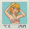
Sexy forest nymph Cecilia, who knew Cuddly had fanservice in her.
Hahahahahahahaha
Aaaaand the topless scene goes to the flattest-chested, longest-haired girl in the comic! That was fun to draw, though. I kinda wish they had the opportunity to show more skin more often. Freakin' early 20th century clothing.
Just what was Cal’s dream?
It kiiind of gets alluded to again in the near future
Thanks a million, Schoolb! I really appreciate that you took the time to reread over my comic and write me up a review again. Hopefully you'll enjoy the rest of this chapter, we're about a third of the way into it now IIRC.


