Rebirth of Webcomic Above!

For discussions, announcements, non-technical questions and anything else comics-related or otherwise that doesn't fit in any of the other categories.
User avatar
Hilarioushenry
Regular Poster
Posts: 107
Joined: Mon Feb 13, 2006 2:12 am
Location: Chicago, Illinois
Contact:

Post by Hilarioushenry »

Killbert, I don't think you give yourself enough credit when it comes to your comic. It's got an interesting style and the site itself is easy to use and pleasing to the eye. That said, let's break things down a bit and look at some of the elements of your comic. Since this is coming from me, you can take it with a grain of salt. However, I hope this is in some way helpful to you.

Art - You have a distinct style that I appreciate when it comes to web comics. It might be a bit rough at times, but overall it works. Some of the stuff in the beginning, like the photos used instead of drawings, weren't my favorites. But I could tell you were trying new things with it. Each strip seems to try something new and I think that's what makes it interesting.

If I could give one piece of advice for your art, it would be to perhaps spend some time with the backgrounds and maybe experiment some more with those. That way we can start placing ourselves in your world a little bit more. Even if you just want to do a joke per comic, some background would be nice.

Writing - While I really enjoy the other aspects of your comic / site, this happens to be my least favorite. Some of the writing is a bit weak and some of the plot stuff gets lost in the randomness of the comic itself. The random jokes, however, are pretty good and are fairly clever. My advice would be to just keep working at the whole writing thing and try new things. Try more characterization and see where that gets you. There's nothing cooler in a web comic than seeing character development. It gets the audience involved and they feel like their a part of the world you've created.

Website - I like the sketch-style you're going for with the website design. It fits VERY well with the style you've established for your comic and is very easy to use. Being as I'm a web design junkie, though, I tend to like more effective use of web space. The way your site is set up currently is fine, but I wonder what would happen if you arranged some of the elements around so that the navigation buttons were both above and below the comic and just a little bit smaller. Also, perhaps have an image for your title instead of just plain text, something that would fit the style you're going for in your site design. Might also consider making a separate page for the archives. Stuff like that.

But like I said, I'm a bit of a site design nerd so these sorts of things are going to jump out at me immediately.


Hopefully this critique helped a little. Your comic doesn't suck, it just has some more development to go through. Keep up the good work with the comic and I can't wait to see where you go with this.

:D
<img src="http://img.photobucket.com/albums/v116/ ... anner2.jpg" alt="Image hosted by Photobucket.com">
<a href="http://hilarioushenry.comicgenesis.com">http://hilarioushenry.comicgenesis.com</a> <b>- Tries to update three times a week...</b>

User avatar
Dutch!
Red galah
Posts: 4644
Joined: Sat Jun 19, 2004 4:39 am
Location: The best place on this little blue rock
Contact:

Post by Dutch! »

Okies, I'll jump in here then. I'll put a placeholder for Henry.

Okies. Turns out it didn't take me too long. There's only 29 strips up there at the moment anyway. I jumped in at the right time, eh? ;) Let's get this show on the road.

HILARIOUS HENRY

SITE:

It's very simple, very clear and concise. It all works, although there are a few links that aren't yet ready such as the information about the world of the comic, but that's cool. I'm in the middle of resetting up my site, so I've got the gallery to put up still too. The whole site though is clean, easy to navigate through, and is set up nice and compactly. The colours suit, the text and labels and buttons are nice and bold and it all fits together really well.

ART:

I really like most of it. Like the site itself, the artwork is nice and bold and clear. Again, it's simple, but don't get that confused with not drawn well. The choices of colours are usually very good and clear and contrast nicely. The characters are generally well defined in how they look and can easily be told apart, but then again, that's not so hard when one is a fox, the other is an emo rabbit, another is a small round-headed devil and the fourth appears to only be a shadow.

I like the changes between coloured and drawn backgrounds and backgrounds that seem to have been altered photographs and so forth. It all seems to fit well with the style of the strip. It appears that the artist never tries to do too much with the panels and the strip, yet makes sure they never do too little. I do really like the style of the artwork.

WRITING:

Okay. Here we go. Hilarious Henry could almost be sued for false advertising. I just didn't find it all that funny. It seems to wallow in the sort of humour that I think I outgrew many years ago, if I found it funny then anyway. Jokes seem to revolve around watching porn on the computer (and secretly enjoying it, etc), the ever present roommate webcomic jokes about sex, and the semi regular violence as a punchline. It just doesn't seem to really work.

At this point, although granted it is only 29 strips in, only Dante, the Emo bunny bloke, seems to be the only one beginning to be explored characterwise by the author. He's got a new girlfriend who he seems to have been out with once (and naturally she took him home to make like rabbits do). The other characters haven't really been explored, or even in some cases, explained. To find information about the devil I had to go to the information page. The fellow who is simply a silhouette and who's name I cannot remember reading, isn't on that page yet, and all I know about him is he seems to be the third monkey to help pay the rent. Is there a reason he is a silhouette?

Anyway, I think something that would help the strip would be to identify the characters a little more. The main character, Henry, seems to simply be there as the butt of as many jokes as possible, especially those that involve pain. To me the characters need to be developed, and possibly fairly quickly. This would help with humour writing, as you have their character strengths, flaws and habits that can bring the humour of the strip out.

OVERALL:

So, yeah. The site is great, really well designed as far as I can see. The artwork looks great. I really like the whole general look of the strip. In my case the humour just doesn't work for me, which to me was a real pity because the art and the site it is sitting in really work.

Good luck, try to use whatever constructive criticism you can from anywhere regarding your strip writing, because I think the rest of what you have is a good base to work with.

Cheers.


Good luck to whoever picks me up next. Bet you don't read through the entire archive!

Cheers.
Last edited by Dutch! on Sat Feb 03, 2007 12:14 pm, edited 1 time in total.
Remember when your imagination was real? When the day seemed
longer than it was, and tomorrow was always another game away?
Image

User avatar
Doublemint
Regular Poster
Posts: 56
Joined: Sat Oct 15, 2005 5:19 pm
Location: Iowa City, Iowa
Contact:

Post by Doublemint »

School Spirit:

I went ahead a read the whole archive, Dutch. Hope you don't mind.

ART: Just a caution that I don't feel totally qualified to judge art, but I did like what I saw in School Spirit. The "big ear" thing works for the children, making it look as if they're growing into themselves. The kids' designs are varied enough that I can tell them apart at a glace. The adults are a bit less successful. Miss Conway comes off as a bit stiff in her poses. This may be due to the fact you draw the children more often than the adults. The translucence of the spirits is well-done. I can see enough of their "bodies" to distinguish it from the background.

WRITING: It's a charming all-ages strip. It doesn't drown in schmaltz with the additions of hints of the adult world showing up now and again in things like the Soldier. The elementary school stuff covers a lot of ground (crushes, rivalries, friendships, ect.) and it works. I managed to get the jist of most of the Australian lingo you used, so that wasn't a stumbling block to enjoyment. The children act like children and talk like children, which is always a relief. Finally, anyone who can make a Helen Reddy reference gets a thumbs up in my book.

WEBSITE: I like the color scheme. It helps for your strip pop out. The "ruler" for the first/previous/next/last buttons is a nice thematic touch. All your other links are functional, save for the "Art" one (I get a white screen in both Firefox and IE). The "Cast" page is well done; doesn't give away too much information. The "History" section is an interesting read. Overall the site is well constructed.

Overall: 8/10
Last edited by Doublemint on Sun Feb 04, 2007 12:14 pm, edited 2 times in total.
Image

User avatar
SergeXIII
Cartoon Hero
Posts: 1809
Joined: Tue May 24, 2005 9:24 pm
Location: New Jersey
Contact:

Post by SergeXIII »

The Best and the Brightest

The Web Site
The Good
Loads quickly, and is easy to navigate, nothing is clashing…
The Bad
…however there’s not much there, just the blue and white box template. While there is nothing particularly nasty about this, it does render the site a tad boring. Also, the first comic button, “genesis”, leads me to a dead end, so go fix that.

The Art
The Good
I like the black and white color scheme with colored ties, but I think you should apply that to other things so that this feature isn’t exclusive to male students. Also, you used to draw black hair with several lines, which tends to look confusing, especially with your simplistic style. Eventually you switched that up to a solid black shape with a few white lines. I believe this works much better.
The Bad
You need to work on your proportions and anatomy, especially necks: they do not exist. For some instances this is kinda acceptable as neckties and dress shirts tend to cover the neck by a good amount, but it is present on too many characters. The shoulders need to be straighter, and the arms and hands are too small. The heads are too small compared to the rest of the body, and you may want to try using more than one shape for them.

The Writing
The Good
…well, it aint bad
The Bad
…it just aint interesting… to me at least. I see no problem to drive the plot, there is no real character development, and the jokes are kinda on the tame side. I have a hard time recalling who is who, to which I advise using names more often and spending more time with some characters. Creed and Fremont do not suffer from this stigma, but many students such as Cathar and Marcion do.

Overall
This comic is not that bad, but although it has some nice comics, it tends to be quite dull.
Last edited by SergeXIII on Sat Feb 03, 2007 7:39 pm, edited 1 time in total.

User avatar
The Neko
A Blithe ray of Schadenfreude
Posts: 3878
Joined: Tue Mar 18, 2003 6:16 pm
Location: New York City

Post by The Neko »

G'nerds 2000

I'll start off, much like my last review, with an overview of the website. It is, at least, functional. Navigation works and is clearly indicated, and navigating is pretty easy and intuitive. (Although I think the storyline dropdown should be under the comic and not at the bottom of the index page.) Unfortunately, the design and graphics of the site are quite ugly, and really don't match the intention of the comic. The background features a morose character leaning against an alley, illustrated in a pixellated black and blue. It seems counter to the image of a comedy about gamers and video games and really doesn't make sense in context to the comic. The header not only contrasts the site by looking like a banner ad placed on a GeoCities links page, but doesn't express the current drawing style at all, especially since there is a huge difference between the way the comic looks in the past and the way it looks now.

I think the problem with the overall design of the website is that it looks like a bunch of different thoughts with no real coherent line to draw them together, and if the excuse is "well, I'm so zany and wacky and that's why the site design doesn't make sense", then the author would deserve to have such a site. I think the site would benefit from looking at the design of the major webcomics and seeing how they order things, and how it is designed around one central idea or feeling.

The comic itself had highly inauspicious beginnings, the first three being comprised of 4th wall breaking introductions of characters, which was nigh unreadable because it was illustrated in poorly-scanned pencil, and doctors' handwriting. This trend of unreadability lasted for a long time, until late august of 2005, or when the author seemed to have switched to using the computer the letter, only to return once again to hand-lettering in scribbled gibberish. Luckily, the production is now completely computer-lettered, so now it is possible to actually read it. The characters have also been impossible to distinguish from each other, since they had the same unstable body structure and very similar hairstyles. In fact, it seems the author had so much trouble trying to show people which character was which that he had to draw name-tags and labels with arrows in several of the comics. The limitations on the art itself also made a good 90% of the action and plot indiscernible. The worst period was when it entrenched itself in the most nefarious of genres: the sprite comic. Luckily, that was promptly discontinued. There are also repeats of older comics in the archives, which were re-done in colour later, as to why the old unreadable ones are still in the archive is a matter that eludes me. A comic archive should read like a portfolio, any parts that lack sense, disrupt continuity, or confuse the reader are huge failings; keep it tidy!

The art has improved in a few ways over the course of the comic, through periods of varying awfulness. In its current state, it no longer has a problem with anti-aliasing or MS Paint visuals. The characters have skin tones now, which finally makes them resemble people. Unfortunately, the characters suffer from MegaTokyo syndrome, if the hair is stripped away, it is impossible to tell the difference between them. The style of the eyes also makes the characters look soulless and/or intoxicated. "It's my style" is not an excuse. If a style WORKS, it's appropriate. In this case, it doesn't and should probably be changed.

The art could get better if given direction, and looking at the current proportions and method, I think it might eventually lead to something more dynamic. However, this will require a lot of work and training. I think something worth studying would be the art style of Tetsuy Nomura in his new title "It's a Wonderful World". I can see some similarities there. I'd suggest that the author study how to construct characters, using 3D shapes (spheres, blocks, tubes) to construct the basis of the characters so they become believable in perspective and depth.

The author seems to have a lot of difficulty understanding the point of satire and parody. Using a certain genre convention has to have a specific purpose, adding to the joke rather than trying to cover up a failure or to make something mundane interesting.
For example, there is no reason that this needs to be old-time movie style. And really, it seems to me that the author has never seen an old film before in his life. (They have never been in sepia, ever.) Why is it drawn in this style? Is he pointing out similarities between the situation of being injured in a car and the corny style of old films? Is he using it as contrast to poke fun at how unrealistic and strange silent-era films are? Is there a point? Probably not.

I should also point out that THIS is not satire. This is Ctrl + Alt + Del. We are given indications that the author dislikes Dell, but the comic does not give any indication to why, nor does it add any commentary to the idea that is in any way original, witty, or funny. There has to be a truth to humor and a spin that people can't see from a mile away, or in this case, from the edge of the universe with the naked eye. A lot of observational humor needs subtlety. This one is more blunt than a nihilistic fifteen-year-old's blog.

Every once in a while, however, there is a comic that will have a point or an idea, but lacks the punch to really generate laughter or acknowledgment of humor from the reader. The camera took the picture, but the flash didn't go off. Really, that's the issue with so many jokes in this series. I can understand the concept, why the author might find the observation funny, but it is the presentation of that concept that will make or break the joke. This is through strong wording, timing, and control of the visuals. So far, the comic really has none of the three yet. The one comic that has come close to making an interesting comment in a funny or original way has been this one. The only thing that needs to be fixed is the last panel, which throws off the pacing, but otherwise it's salvageable.

I can see jokes that might be borrowed from other TV programs. This one resembles the ending of a Family Guy episode where Peter tosses Brian into a bunch of dish ware and says a speech that's almost identical to the 3rd panel. However, this could be coincidence.

Humor and comedy is something that you have to really study and deconstruct in order to apply to your own endeavors. There are a lot of concepts and rules to it, and it takes a long time to really cultivate. Once you find something that works, look at WHY it works.

G'nerds has made vast improvement from its beginnings, but not enough to make it good yet.
Last edited by The Neko on Sat Feb 03, 2007 2:25 pm, edited 3 times in total.
jag saknar självförtroende

User avatar
Sorcery101
Regular Poster
Posts: 160
Joined: Sat May 14, 2005 2:45 pm
Contact:

Post by Sorcery101 »

I'll place holder here and reveiw go for it.

Website: It is very clear and direct. I like the choice of colors you picked. They don't have eye burning saturation, but aren't too dull. Also, I like the fact that the blue is a tiny bit lighter and more saturated so that it's clear that the navigation and the blog links is where you want to direct the readers eye. The grey line next to the blue also helps with directing the reader's eye flow to the navigation. However, the spotlighted link square seems out of place. It's the only thing over that and kinda feels like it was tacked on at the last moment. I also feel that the cornstalker newsbox being so low on the page has the same feel. The gap inbetween the blog links and that newbox is too big and again has the same tacked on feel.

Art: I'm gonna focus on the newer style since I'm sure you've already taken what you liked and thrown out what you don't like from your older style. For the most part its good. However, everything is very very flat and lifeless to it. You do a good job with all the over the top expressions but the subtler ones just seem to blur together. So it seems like your people have two settings EXTREME and bored. The same goes for peoples body language. If they aren't being over the top then their body's come off as very stiff and it's amplified by the fact that most of your shots are close ups which only portray the character from the shoulder up. You're line work also adds to a lot of the flatness. With the exception of "Bunny Jesus died for our eggs", there isn't much variation in line weight. All the lines are thin and the few times things vary it's so subtle that it seems like it might have been unintentional. I'd suggest buying different tip size pens or if your using the computer to draw switch up the tips more often. Also, the coloring is very simple and flat. It might be nice to have at least some shadows to show form more.

Writing: I love your writing. You have this awesome dark sense of humor. You also do an amazing job making the text and images interdependent. Like in the "Barney my Pebbles!" one. Both the image and text wouldn't be funny (well maybe the image would) if it weren't for the other aspect of the comic. However, I'm not a big fan of when you do stuff with continuatity. The humor seems a bit forces compared to you're one shot comics.
Last edited by Sorcery101 on Sat Feb 03, 2007 3:16 pm, edited 1 time in total.
Could be worse; could be raining.
http://sorcery101.net

Gildedtongue
Regular Poster
Posts: 384
Joined: Tue Aug 24, 2004 9:26 pm
Location: Cave Creek, AZ
Contact:

Post by Gildedtongue »

Place holding Sorcery 101

Edit:

Heh, glad I managed to snag one of the better webcomics, woe to the guy who ends up reviewing mine.

Story/Characters: Ever read a fantasy book, or see a fantasy movie and wish the characters wouldn't act so prim and proper, or be a little less emo? Well, welcome to the world of Scorcery 101. The hero, Danny, who's a bit of Randal, Dante, and Jay rolled up into one vain, magic using horn-ball, is currently being schooled in the arts of magic. His teacher, the vampire Pat, avoids the usual stereotype of being a whiney, emo vampire in the fact that he's an elitist, posh, British twit whom wears clothing he feels comfortable with, rather than the usual black on black with black accessories. Danny's best friend Brad, a werewolf, and his mage hunter wife Ally, and their little terror of a daughter Rebecca fill up the cute and/or female needs of a comic. Finally, the dark and mysterious Seth, an old Vampire, fills out the need for random humour as he tends to just torment the living, rather than feeding off of them and killing them; Seth's also an old school vampire, preferring the Noir look, however, his attitude makes him be able to pull it off with style.

Site: Easy and straight forward. Basic list of places one might want to go to, as well as two choices of forums, character listing, and such. The basic colour is drab black, however this lets the main attraction, the comic, become a large highlight, so that's good.

Art: Though the art style is somewhat of a standard Manga look, it's easy to tell different characters apart, a feat especially for amateur comic artists of this style. Lots and lots of uses of great backgrounds, which I really need to get into, and good uses of facial expressions and poses.

Overall, this is definitely one of those comics that would contend for a top 50 ComicGen/Keenspot strip, probably a good shot for the top 25, even.

(and considering the number of different comics I read myself, a top 25 is a very small, and high percent ;) )
Last edited by Gildedtongue on Sat Feb 03, 2007 3:49 pm, edited 2 times in total.

User avatar
Black Sparrow
Cartoon Anti-Hero
Posts: 6973
Joined: Fri Jul 22, 2005 9:04 am
Location: Violating your restraining order
Contact:

Post by Black Sparrow »

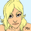
I get the feeling that you're not quite ready for a full review yet... but you posted in this thread, so here goes

The Art

Hmm... Okay, I don't want to sound harsh from the get-go... but I'm going to anyway.

Your art is not very good. There, I said it.

Glancing at your FAQs, you're pretty in touch with that fact. However, many artists say that they're bad artists in secret hope that someone will refute them and tell them that their art is awesome. I'm not going to do that. Your art style doesn't need polishing so much as it needs a full body job.

And saying that you have bad art does not make it excusable. People read comics to see pretty pictures to go along with a good story or funny jokes. If your drawing is not up to this task, write a book instead.

Of course, there has been some improvement in your style since the beginning, so I am aware that you are trying. You're just new; drawing is as much an issue of practice as it is an issue of talent. In order to develop your eye, practice by mimicking your favorite webcomics. I mean, print out pictures of the characters and trace them like there's no tomorrow. Pay attention to how your favorite artists (especially if they're furry artists) work with line and character design. How do they deal with the different character heads of the same species? How do they render different species? How does perspective change the apparent shape of the head? Learning how the good furry artists do it will help you unlock that mystical secret of drawing in an appealing manner. Also, practice drawing real animal heads too, so you learn what the animals look like in real life, instead of how cartoons tend to represent them.

One major issue in your art is that you can never figure out what's going on. This is mainly because your panels lack backgrounds. Sure, some have extra props, occasionally... but you continually fail to provide us with a sense of where we are. I've had this problem in my comic too... and it can be fixed by making your backgrounds more detailed. Add windows and cabinets if you're in a house, tables and wall paintings if you're in a cafe, and aisles and other people when you're in a shop. Backgrounds are a pain in the butt, I know, but your comic is hurting because of their lack.

Now, if you decide to add more detail to your backgrounds, I suspect you will come across a new problem, and that is distinguishing between objects. You use very thick lines, so details will inevitably get lost. Therefore, you should try drawing and scanning bigger. Invest in some nice Micron pens so that you have different thicknesses (thick pens for main outlines and thin ones for details. Mmm...).

Also, I suggest you download a copy of the GIMP (a free Photoshop-wannabe), and read some tutorials on how to color with it. The color helps greatly with the "I can't tell who is who" problem, but it generates the fresh problem of having those little white artifacts along the lines. Coloring with layers gets rid of those annoying little jaggies.

When all is said and done, it takes years, even decades, to fully develop your art style. So don't think that poor art means you'll never get better. I've been drawing for ten years, and my art is merely mediocre, by CG standards; and besides, everyone was new at one point. Drawing takes a lot of effort to learn, and a lot of good quality time with the pencil and sketchpad to develop your artistic eye. If you're serious about drawing, you can only keep working at it and hope that time will tell its tale.


The Writing

You're lucky I caught your review, I think. I don't mind furries, or gays. In fact, I have elements of both in my own comic. So no flames here about your choice in subject matter, at least.

You've got a spark for gag writing, I think. Some of these jokes made me chuckle ("Let's go back to where life made sense. Hi, I'm Greg.") But as I said before, your art really hampers your writing. Some of your jokes that rely on visual cues are completely lost, because I can't tell what those cues are. The characters are kind of hard to tell apart, despite being different hairstyles and... well... species (The one exception is the fairy drag queen, of course). This, too, makes the writing hard to comprehend. See above for suggestions.

Storywise, I'm not sure if this is supposed to be a gag-a-day or a gag-but-with-a-story comic. Most gag comics switch between, so it's no big... but try not to make us jump too much in logic by teleporting us to random places with no warning. In story comics, segueways are essential.

Now, time to talk about your biggest writing flaw: self-insertion. You break the fourth wall. A lot. And you're aware of it. "The Authour," as indicated by a floating goatee and glasses, makes appearances to joke/make excuses about late comics and haituses. This is a huge comic no-no. As readers, we don't know you, so there is no connection between us and "The Authour." Self-insertion just feels injokey and lame. It is not funny, so stop doing it. Furthermore, making excuses for missing or late comics is annoying, especially when you're reading straight through the archives like I did. The readers don't really care why the comic is late; they don't care that you have a real life outside that comic, because the comic is the only way they know you. If you can't keep up with your schedule, change it. I would rather have less frequent updates than all these annoying MSPaint "oh ho the Authour is making more excuses because he has a real life that makes him too busy to be reliable isn't that funny?" pages.


Website:

The website can be summed in one word: "blah." It's still the default, for heaven's sake, with a couple text links thrown in.

It may not seem like your website is that important... but this is fallacious thinking. Your website is an integral part to the presentation of your comic. This blanky-blah site with text links tells me that you're someone who doesn't really care about your comic. You've maybe delved into html once or twice, just to attach those links haphazardly at the bottom of the page.

This webpage needs some tender loving care, and badly. Give that to it by doing some quick html tutorials and sprucing up your site with a personal touch. If you're feeling particularly adventurous, make some buttons and "extras" pages. Look at your favorite webcomics to get a feel for what is effective and what isn't.

Your navigation is iffy. Granted, you've got the standard "next" "last" "previous" and "first" buttons in there... but I'd like to see somewhere you can go to get to a specific comic: an "Archives" page, if you will. Other extras pages, such as a "cast" page, are usually appreciated. "Cast" pages are especially important when you have a lot of characters. Again, look at your favorite comic sites to see what they do about it.


I realize that you don't have a lot of time to work on this... I understand the issue. I'm a college student too. But running a webcomic is a hobby that you need to be devoted to, or it just won't work. Make time in your schedule to work on the comic, or update on a less strenuous clock.

I'm sorry if anything seems harsh in this post. My inner webcomic critic tends to be pretty blunt, even if my self-consciousness attempts to sugar-coat it. This post was made with the assumption that you had ambitions about your comic, so if you don't, feel free to ignore it.

Whatever you do, good luck with it.
Last edited by Black Sparrow on Sat Feb 03, 2007 4:25 pm, edited 3 times in total.
This is going in my notebook titled "Things I Didn't Know about Surface Dwellers."
ImageImageImageImageImage
ImageImage

User avatar
Americangothic
Regular Poster
Posts: 658
Joined: Sat Oct 21, 2006 10:31 pm
Location: Nashvegas
Contact:

Post by Americangothic »

I first read this comic two months ago and haven't been back, so it was good to return to it and see what all has happened since.

Art- for this critique I started in chapter 3 and continued from there so I can focus on your most recent achievement. I saw many really good things-- excellent use of full color and shading, consistant art style. Characters are well developed visually through costume, body style and size -- each stand out on thier own and are easy to identify though thier faces all look very similar to me. Even in black and white, characters are enough dissimilar not to be confused. Great use of contrapasto-- torso/spine and weight shift look great!

Where the art can be improved: feet, boots/shoes and ankles do not have the same grace and attention to detail as the rest of the figures. Eyes are wide spread, which I understand is part of your particular style, but on rare occasion they seem too far apart. There should be more space between outer edge of eye and ear.

Site: I like the site because it is crisp and clean, good for dial up users. I normally do not like black backgrounds because I suffer from glacoma and eye strain, but because you use a good bright shade of blue for the text, it is comfortable to view. Raster text is also of a good size. I also approve of your reminder to read from right-to-left above each comic because some of us don't do it that often.

Site improvements: the bottom text would look much better if it was the same font as one of the others. It is not as polished as the rest.

Individual panels: it's the little things that get me. Some text bubbles have tails, some don't. The ones that don't make me wonder who is talking (except for the gray bubbles which I understand to be radio style communications). The inconsistancy stands out to me.

Archive page: chapter four links go from 4.25 to 3.26 to 3.33 That is an easy fix.

page 20060728 "data orb is in here" with an arrow...I think it would have been better to show a visual-- like a character plugging it in or attaching it to something...anything but "data orb is in here".

page 20060818-- "an explosion"...same theory. I would have loved to have seen a little visual, something like the "Kaboom" on 20060905 where it is text with flames in th back ground.

page 20070104-- I got confused on the drenching thing...didn't understand it completely until the next page. Small complaint, nothing big.

Your new coloring: I totally understand the need for black and white. I would like to suggest adding a little bit of chromatic grey and not sticking to just the 10%, 15%, 20% etc. grays. A little warm gray and blue-gray can go a long, long way to making your characters alive and warm.

Story: Good story so far, good use of backfill/backstory and action/conflict. Explinations are not overdone. You keep to the KISS principle...YAY!

The hardest part is keeping up with the characters. There are so many. It is hard to pick out one, two or three main characters and rank the others as supporting cast. (except for Neko who is well developed and very interesting) It seems like you are trying to develop each and every one of them fully in such a short time. It might be far better to grab one or two and really focus on them. I know that can be difficult when they work in large teams..but using Stargate as an example...we viewers know very little about the control room personel, but we know everything about SG1.

Gothia
Last edited by Americangothic on Sat Feb 03, 2007 9:30 pm, edited 1 time in total.
Image

User avatar
Mvmarcz
Cartoon Hero
Posts: 3623
Joined: Wed Jul 21, 2004 10:17 pm
Location: Louisiana
Contact:

Post by Mvmarcz »

Art: Traditional media stuff, Nice to see in webcomics as it's not done often and not done well even less. The word bubbles and fonts could use some work. The fonts are very thin and seem to change. ON the thin look here, the b in back in the second panel is only half there. again very choppy fontshere they need to be thicker and anti aliased. The black and white stuff is ok, a bit sketchy but still nicely done but here it switches to some very nice color. Oh and I must say this comics last panel made me laugh my ass off. But those fonts and bubbles are killing me.

Writing:
I like the story so far, the characters are interesting and the dialog is smooth. On the profanity, you have nudity and you don't try to censor it so I don't see why you censor the words. The way I see it if you're going to go for broke with the visuals saying the word "fuck" every now and then wont kill your readership, I had a mature ranked comic that did just fine without the other characters in place of letters. I actually think it takes away from the experience.
Once again I'm going to point out the fonts because since this is a visual media the poor typography does effect how the story comes across.

Website:
Very basic, needs some work, it's about the standard you see from new comics, but it works for what it is.
Last edited by Mvmarcz on Sat Feb 03, 2007 5:39 pm, edited 1 time in total.
Image
NJ: "You know the drill, you're AWESOME!"
I am the artist formerly known as M2

User avatar
Keffria
The Wimpy Teaching Assistant (Mod)
Posts: 3748
Joined: Tue Jun 17, 2003 12:07 pm
Location: not-France

Post by Keffria »

Okay, here we go, a review of "The Chronicles of Avernyght", by mvmarcz.

Website
First off, I really like your main page's design. The swirly-vines motif is perfect for a fairy-tale-like comic, and the colour scheme (dark with sparkles) is well-suited to a story that's taking place largely at night. However, I'm not a big fan of your first/previous/next/last buttons: they look jagged and there's no indication as to which button leads to the first page versus the previous one. I mean, for anyone who's navigated a CG site before, it's not much of an issue, but new readers who are also new to CG might be confused. Also, the copyright text at the bottom should be centered.

On your supplementary pages, I initially had trouble finding the "back" button (it's the compass, yes, I know), especially because it's small and hidden at the bottom of the page. In general, it's a good idea either to have a button saying something like "home", or have the title graphic link back to the main page. On your archives page in particular, I hate the big calendar; it's almost completely useless. Rather, I prefer seeing links to key moments in a chapter, or even just links to the first page of each chapter. Something to think about as your archive expands.

Going through the archives themselves, I find the page design detracts from the comic itself. Although, on the main page, the swirly vines and such are beautiful, I'd like to see less sparkly archive pages.

Art
First off, I like your character designs. They pass the silhouette test, for sure, and I really enjoy the little details - stitching, shading, scribbles, etc. They're surprisingly expressive for characters who don't have mouths. (This page and the one that follows are good examples.) Focusing a little more on the eyes couldn't hurt, though (sometimes it's hard to see them), and remember: these characters are dolls, so you can fling them around and pose them as you wish. ;)

The backgrounds, in contrast, leave something to be desired, mostly because of the lack of detail in some aspects of the background relative to other aspects. It's most apparent when the camera-view broadens (for example, in the opening pages, with the overhead view of Nox): the houses have hatching, but the ground is just a flat green expanse. You'll notice that in the next panel looks much better, as the level of detail in the background remains consistent. Or on this page.

Of note: I find that on most pages, it's as if the horizon-line is a cliff beyond which nothing can be seen other than the sky. It would be nice to see some trees or shadows of buildings or something to indicate that there's a world beyond the end of the road.

I should also say that my favourite page-sequence is the one in which Whisp and Poppet go into the tree. The light and shading effects are well-done (particularly the scribbly pen-shading. <3)

A few words on your text: Firstly, I like your text balloons, but black may not be the best colour-choice for them, given the dark colour-scheme of many of your pages. Secondly, they often seem too small for the text they contain; it makes them look cramped. I know it's awful to have to cover up one's artwork with balloons, but it makes the page look better - more polished - overall.

A thought on others' criticism: I know for a fact that you get sneers for the doll-like characters, allegedly "rip-offs" of movies like The Nightmare Before Christmas, and though the patchwork-characters do bear some resemblance, it isn't as if the comic itself is derivative of that movie or of anything I've seen that's in a similar art-related vein. (Though take this with a grain of salt, as I'm rather uncultured.)

Writing
I want to take a moment to praise you for your ability, for the most part, to immerse the reader in your comic's world without page after page of exposition. What I mean by this is that characters say things like "Good Kanu" or talk about their dreams, without adding awkward explanations for them - and yet, it's not confusing to the reader, because the illustrations and the context allow the reader to get the gist. Actually, when Whisp tells Poppet not to "thought project", I found the term a bit jarring, only because it sounded... erm... normal - though I don't know how one would phrase it otherwise without being confusing.

The first couple of pages are what force me to add the "for the most part" bit -- I can understand that this long back-story might be hard to explain through dialogue without it sounding forced, but on the other hand, there are some details that seem unnecessary. For example, right now, we don't really need to know that Contessa created the "Toujh", do we? Little details like this, though important to world-building, shouldn't be dumped on the reader all at once.

Actually, the dialogue generally flows well and characters - what little we have seen of them - seem to have their own voices and personalities. Contessa irks me a little; she seems, at this point, like the Evil Queen archetype, down to her sense of vanity, her forcing the female lead to brush her hair. Basically, she's an antagonist with no redeeming features - actually, one can barely even see her facial features, so she's both shallow character-wise, and inexpressive art-wise. ...Of course this is something that I grudgingly admit is pretty common in fairy-tales, but it's also hard to really hate a character who's so stereotypical. I maintain my hope that once I find out more about Contessa's "prisoner", I might feel something for her.

Overall
It seems clear to me that you have a well-developed fantasy world and a fitting visual style with which to tell stories about it. At the moment, it's held back by the stereotypical relationship between Contessa and Whisp, and by a few art-related issues, but neither aspect is sufficient to deter readers, particularly those who are fans of the fantasy genre.
Last edited by Keffria on Sat Feb 03, 2007 7:34 pm, edited 6 times in total.

User avatar
Biev
Regular Poster
Posts: 423
Joined: Wed Jun 07, 2006 1:20 am
Location: Montreal
Contact:

Post by Biev »

The Curious Adventures of Aldus Maycombe

First good point: at first glance, your main page made me want to read the story. It's the great range of shades that caught my eye first - then then lineart, followed by a title that promises amusing fantasy. And then - gasp! I realize that your character looks suspiciously like Harry Potter, and now what I'm curious to know is whether:

a) It's a parody
b) it's a rip-off, or
c) it's going to be so imaginative and unique, that I'll either forget all about Harry or start to think that he should be ashamed of trying to copy Aldus Maycombe.

Site

Let's start with that and get it out of the way : ) I used to be a web designer so forgive me if I nitpick.

People like me who get dizzy easily from looking at bright colors generally have a bit of a problem when looking and black and white sites, especially when trying to read white text on black backgrounds. Luckily you've given the main section links a neutral background, but I don't want to strain my eyes to read the cast page, for example. Actually this isn't such a big problem since there isn't much text on your site overall. I can't look at that vine pattern you have at the top and bottom of the screen, either. And I really want to, because it's pretty, but just catching it out of the corner of my eye makes me see all blurry. I wish you would have made it grey.

Overall though you've managed to pull off a mainly black and white site that is easy on the eyes, thanks to the clever use of grey around the main page, and the absence of superfluous elements on the others. Your main page is interesting to look at without overpowering the comic, great job designing it. It's clean and you've kept all the visual distractions at the bottom of the page so they can be ignored. You even keep all your link banners in grayscale, that's smart! The black and neutral grey really helps the lighter shades in your comic pop out. The navigation is pretty too. I like the vine theme, I'm waiting to see how it will tie into the story.

I like the little chapter description on your archives page. For such a short description to get me to want to read through your entire archives, it shows that you're a good storyteller.

Ok, enough about that.

Art

I want to give you a helpful critique but I haven't spotted any real problems with the art. Your style and characters are consistent from the start, with a nice level of detail and lovely backgrounds that fade when necessary so they won't be distracting. You actually take care to make the lines carry towards the focal point, which is something I don't notice in a lot of comics. The shading is subtle and effective, and while most people only use shading to give things more depth, you use it to add detail. Your lineart is always crisp, and I like how you make your lines thinner for farther objects. You like to make lines twirl, don't you? : ) I think the vine theme is definitely appropriate for you.

Your character design is interesting - so is the way you stylize everything in general, but I like the characters in particular, it gives them personality.

You use a wide range of grey shades, and it creates beautiful effects (especially in the water - your current page is gorgeous), but the most effective panels are the ones where you balance a few lighter shades with pure black elements, like on the very first page.

Your composition is excellent. You're good at optimizing space, the light / dark balance is good and there are very few panels that I could single out and not find interesting to look at. It all comes together very well on the page without feeling empty or crammed (something that I find really hard to do). I like when you experiment with the panel separation, especially when you make it crumble to show that the story falls apart here.

Perspective is good, with just enough dynamic angles and poses. Too much would kill the calm, surreal feel - you're dosing it right. Some of the positioning (when Aldus is running from the fire holding the knife and pulling What's-his-face by the hand, for example) makes me wonder why a person would twist themselves that way, but I chuck that up to those panels being a little more cartoony than the rest.

Anyway, I'm gonna stop gushing now. Your art style definitely makes this comic unique. It also looks very professional, I envy you : )

Story

Ok, I have to admit it. Your main guy is interesting and I've been so busy wondering where you were going with your story, I stopped thinking about Harry Potter after a few pages. It does help that you don't have Aldus wearing that scarf all the time. I'm also relieved that he's not waving a wand around. The way things are shaping up, he doesn't look like he's going to learn magic tricks and become wizard of the year. His foresight seems to be a bit of a double edged sword, and I kind of hope it will land him in more trouble than it can get him out of, since that's how things get interesting.

I like where the story seems to be going so far, but it's a bit early to comment on the plot. As I thought, you're a good storyteller, though! I like all the little interruptions - and the storytelling within the storytelling : ) It looks like you're starting small but working towards something bigger, giving us little peeks in advance, here and there. The introduction hinted at something interesting, at least. It's definitely going to keep me reading.

I can't really comment on the way you phrase things, since my english isn't really at that level (not my first language), but as far as I can tell the dialogue feels natural. The font you picked also matches the style of the story while still being easy to read, that's pretty rare.

Overall the story feels calm even when a lot is happening. Maybe because the art is soft and that makes it somewhat comforting. We know that everything is just following the course of fate, but we're still watching out of curiosity. It's the proper mood to achieve in a surreal story, I think. It could be frustrating, but it's not - I don't get the feeling that you're trying to confuse me. It's more like the world is built on strange rules, and as long as everything that happens follows them, despite being unable to explain what's going on we'll get the feeling that it's all coming together to make perfect sense.

Well, I seem to have run out of things to say. I'm not sure how helpful this critique will have been since I really haven't found much wrong with your comic at all, but if nothing else, you've gained a new reader.
Last edited by Biev on Sun Feb 04, 2007 7:09 pm, edited 2 times in total.

CSchaefer
Regular Poster
Posts: 188
Joined: Wed Feb 22, 2006 8:01 pm
Location: Joliet, IL
Contact:

Post by CSchaefer »

Fainting Spells

One of the things I love about this sort of thread, and the CGen forums in general -- the chance to get exposed to really neat webcomics I might otherwise not have seen. Like this one. :)

Art
Many webcomics use art to drive the story -- with Fainting Spells, it feels as though the story only exists to justify the artwork. This is one of those comics that grabs you by the eyes (er, metaphorically speaking) from page one, and there's a real sense of progression and improvement if you look between the earliest and most recent pages.

The artwork is striking and I'm really hard pressed to be critical here: great use of color, and the artist has an excellent eye for the human anatomy and proper proportions. From start to finish, Fainting Spells conveys a moody, dreamlike feel that really stands out from the crowd.

(One suggestion that does come to mind, is to watch the lettering -- on a few pages, the cursive lettering is very pretty, but a little hard to read in spots. It's infrequent enough that this might just be my lousy eyesight, however. <g>)

Story
Unfortunately, while the single-panel format works great for the artwork and mood, it doesn't serve the story nearly as well. The best example of this comes right at the beginning -- the flashback/explanation about running away from "Leaving Home" stretches out over nearly a month of updates. While it flows beautifully now, when I can read through the archive and absorb it all in one go, I can't imagine that it would play out quite as well with a single page/tiny step forward every couple of days.

That said, adding panels or going to a more traditional comic format would hurt the surreal feeling of the story, and I really wouldn't recommend changing it. It may just be that Fainting Spells, by its nature, will read better as a completed piece or at least in chapter-size chunks -- some things just don't work in the serial format. I have favorite webcomics that I check as soon as they're updated, and some that I go back and catch up on about once a month or so, and Fainting Spells is definitely in the latter category. I hope you're considering a print version at some point.

Website
Clean and functional. My only quibble is the characterless "Characters" link; you might want to remove it altogether until you get around to doing something with it (though I do agree with your reasoning there).
Last edited by CSchaefer on Sun Feb 04, 2007 7:40 pm, edited 2 times in total.
Image

User avatar
Netpoet
Cartoon Hero
Posts: 1356
Joined: Thu Feb 24, 2005 9:19 am
Location: Hiding from my employers in the interwebs!
Contact:

Post by Netpoet »

***** INFORMATION POST ONLY *****

The following have been completed.

Tales of Pylea - Reviewed by Komiyan, COMPLETE
Darken - Reviewed by MV, COMPLETE
Avernyght - Reviewed by Tdot, COMPLETE
Orange Revolution - Reviewed by K-dawg, COMPLETE
Metrophor - Reviewed by Tim, COMPLETE
Alternate Delusions - Reviewed by Dragonkingdoms, COMPLETE
Dragon Kingdoms - Reviewed by The Neko, COMPLETE
Go For It - Reviewed by thewarofwinds, COMPLETE
Circle Arcadia - Reviewed by C.W., COMPLETE
CW Comics - Reviewed by Sorcery 101, COMPLETE
Sorcery 101 - Reviewed by Jackhass, COMPLETE
Zoology - Reviewed by Linkara, COMPLETE
Lightbringer - Reviewed by Killbert-Robby, COMPLETE
Killbert - Reviewed by hilariousHenry, COMPLETE
Hilarious Henry - REviewed by Dutch, COMPLETE
G'nerds - Reviewed by the Neko, COMPLETE
Go for it - Reviewed by Sorcery 101, COMPLETE
Sorcery 101 - Reviewed by Gildedtongue, COMPLETE
The Manual - Reviewed by Black Sparrow, COMPLETE
American Gothic Daily - Reviewed by MV, COMPLETE
Avernyght - Reviewed by Keffria, COMPLETE
Best and the Brightest - Reviewed by Serge XIII, COMPLETE

Thanks to everyone that got theirs done so fast.

The following are incomplete and hopefully in progress.

Knights of Vesteria - Reviewed by Mon Ami, incomplete
Antics - Reviewed by Liberty Cabbage, incomplete
Angry D. Monkey - Reviewed by Mixed Myth, incomplete
The War of Winds - Reviewed by Net, incomplete
TTG - Reviewed by Dark Spider, incomplete
NieceWeb - Reviewed by PrettySenshi, incomplete
School Spirit - Reviewed by Doublemint, incomplete
Operation Neko - Reviewed by American Gothic, incomplete
Aldus Maycomb - Reviewed by Biev, incomplete
Fainting Spells - Reviewed by CSchaefer, incomplete

***** INFORMATION POST ONLY *****

Please note that the next person in line is CSchaefer's comic. Do not choose one of mine. Thank you.

>Net

User avatar
Kasaii
Regular Poster
Posts: 336
Joined: Fri Jan 01, 1999 4:00 pm
Contact:

Post by Kasaii »

I am always up for being a busybody opinion-giver. :)

A Review Of Sharper, by CSchaefer

WEBSITE: Clean and simple. The black look fits the comic quite nicely. I generally tend to prefer centre alignment for stuff, but that's because I have a symetrical brain; there's nothing actually wrong with left-aligning. ;)
There isn't much here, so there's not much to comment on, but it does look quite sleek.

I would make a small suggestion - have a small 'cast' page for secondary characters. The comic being black and white, some of them look fairly similar.

WRITING: I love the writing. I mean that. You've managed to write a set of characters that I can sympathize with as characters while still being rat bastards. Also, the dialogue is nicely snappy, in a good way. I've got to say, "It's motherf**king Sparticus up here." has got to be one of the best phrasings I've read in a while. Along with "I make productive discoveries about my personal limitations."

My only suggestion as far as writing goes is not to overdo the use of Bold/Italics for empahsis on sentances. Most of the time, they can stand by themselves, or at least should be able to. It makes it more noticeable when you use it if you don't use it as often. (And, actually, in a few places the emphasis seems to be on strange and slightly distracting words.)

ART: Interesting; the B&W really makes the CGI look nicer, possibly because the 'film noir' look helps blur some of the things in most CGI comics that makes it look more like dolls than people. Also, you have expressions down pat, and they are beautiful.

However, I would suggest being careful - not all of the textures translate well to B&W, and there are definately panels where I can't tell what's going on. This is more prevalent in the older stuff, so I would say just keep an eye on it, especially on darker shots. The downside of black and white textured is always the limited range of options for distinguishing things from one another.

OVERALL: Cool, I like it. This comic, I think, is going to have to be added to my "to-read" list, because now I want to know how the Lucky Star thing turns out. Curse you. ;)
"Consistancy is the hobgoblin of little minds."
Patchwork Champions. Note to self: You cannot read by laserlight.

User avatar
Bruk
Newbie
Posts: 10
Joined: Sun Jan 21, 2007 1:58 pm
Location: BunnyLand

Post by Bruk »

Patchwork Champions

Website: Sorry that I'm the most critical here, just a few major issues and a handful of trivial ones...
Major "technical" issues:
- Links to Archives, Cast, Gallery, and Links on your side bar do not work from your dailytemplate/archive pages. Example: Clicking Archive goes to: http://yeti.comicgenesis.com/d/archive.html instead of http://yeti.comicgenesis.com/archive.html This is very simple to solve of course, link to the full URL instead of just archive.html for your archive's template.

- Calendar below your comic has an unopened link to vote for you @ Buzzcomix.net before it, making it so if you try to click any of the dates it takes you to the vote page.

Minor "design" issues:
-Some of the pages have to be horizontally scrolled with monitor resolution @ 800x600 or below.
-Your 'Link of the Whenever' seems to push the logo down past the intended location a bit
-On longer pages, such as the archive, your background repeats causing some weird blue bars down the page. Instead of defining your background within the body tag ( body BACKGROUND="images/background.gif"), you could try doing it as a style, within the <head> </head> of your HTML document, put:
<style>
body{
background-image: url(http://yeti.comicgenesis.com/images/background.gif);
repeat: repeat-x;
background-color: #ffffff;
}
</style>

..this will make it so your background only repeats on the x axis (left/right) and not the y (up/down). Or just switch to a solid background like you have for your gallery for longer pages.

- On wide resolutions (1440 wide), the cast pages for Patchwork Champions/Malefico look differently than at smaller resolutions. A <BR> after each </p> would make the look more standard for varying resolutions. Actually I thought it looked pretty cool with the staggering on the wide resolution.

Art: Well it is a pixel comic, which puts quite a few restraints on the creator. You've handled it very well, the backgrounds are always very detailed and are good at setting the mood/scene. Pixel art can be a cruel mistress when it comes to emotions, but you're able to show them well when they are needed, especially with the robot ninja tree, which I found to be beautifully done.

Writing: I like the story so far, I've read through the first plot and skipped ahead to the most recent plot, since your archive is quite large to get through. Bad guys are the protagonists and the heroes are the antagonists gives us a fresh new look on the typical super hero world. Sometimes it is a little hard to figure out what Phil is saying, but I have managed to figure it out 95% of the time and it usually cracks me up when I do finally figure it. Besides that, I have no complaints about the writing, it's right up my alley.

Overall: Ninjas and robots- the only elements that any comic needs for awesomeness. *thumbs up*.
Last edited by Bruk on Sun Feb 04, 2007 1:20 pm, edited 1 time in total.
<a href="http://lagomorphine.com"><img src="http://lagomorphine.com/images/banner.gif" border="0"></a>

User avatar
Ryuko
Cartoon Hero
Posts: 1103
Joined: Thu Oct 14, 2004 7:05 am
Contact:

Post by Ryuko »

Review of Lagomorphine

Not much to see quite yet, but it seems like a cute little story. Let's start with the art. It's really quite cute, a little bit shaky, like I'll sometimes see in animation style. There is a little bit of an issue with characters not staying perfectly on model in every panel, but it adds to the entertaining juvenile quality the art has. In other words, it looks like something an incredibly talented little kid would do with crayons. ;) The colors definitely fit the subject matter, and contrast quite well with the line quality. The only issue I have is that line width seems a little arbitrary, there's no variation in some parts where maybe there should be, and some of the things that are further away aren't outlined at all, making the background look a little muddy. And here in the first panel it looks like the bunny in the background is floating. That's a huge error in perspective that makes the artist really seem lazy.

Writing, hmm. Let's see, it's pretty damn cutesy. Not that there's anything wrong with that, it fits the general feel of the comic. I think that some of the jokes are really quite adorable, but it was a little odd to see the words fwuffy and the phrase, "I'M COMING TO EAT YOU!" in the same comic. Not that it doesn't fit, it just makes me wonder what's coming. I'd also like to see exactly what kind of a world these bunnies are living in. Are they in a breeder's or a home? Also, what gender are they? (this is important as it's bunnies...) In one comic it's said that Kiwi is a female, but she's housed with Mr. Boot who is a male. Are they fixed bunnies? Just something I wonder about as a pet owner. :)

Overall: 7.5/10 Since it's just starting out, there's no way of judging, but it seems like it's got a lot of good stuff going on, and maybe only needs a little improvement.
Image

User avatar
Sorcery101
Regular Poster
Posts: 160
Joined: Sat May 14, 2005 2:45 pm
Contact:

Post by Sorcery101 »

Edit: Damn I was writting a reveiw for bruk and green avenger post while i was writign it. I'll just reveiw green averager now.

Website: Very cohesive and well themed. Comic's called Green Avenger so making everything green was a good choice. However, you have this big gap of wasted space to the right of your comic. I'd like it if you did something with that so it didn't feel so empty.

Art:

Background: I really really wish you had more backgrounds. There are a lot of times when it's just the characters hanging out in front of a gradient. I'm not saying you always most have background, but especially for the overly talking scenes like Green Avenger and the guy with the blonde streak in his black hair (I wanna say Jack? But I'm not sure if that's right) talking on the roof, there should be some backgrounds so the audience knows where they are. Now the background you do have I'd suggest working with preceptive a tiny bit more. Making of your backgrounds are straight one point preceptive, which gets boring after awhile. Maybe try switching it up with some 2 point or even 3 point in the scene where she is flying. Some 3 point in the flying scenes I think would really add some snazziness. Also, I'd recommend picking up a smaller tipped pen/blush/whatever you use to ink. Then use that for the line work with in the backgrounds. Or go the opposite route and get a thicker one for the out line of the characters (probably be better if the details were kept the size they are). It will add more depth and put more focus on the characters if they are drawn with a thicker like.

Characters: Your characters have some very nice body language. You can tell who they are feeling most of the time simple by their stance. However, I think you should look at anatomy a bit more. Their are times when they arms seem disjointed or their arm has been cut at the elbow. This is especially true for the action scenes. Maybe take a look at muscle books or some of the stuff online that was scanned from Andrew Loomis's books. Now while your people have good body language they also have very very good facial expressions. There is both the subtle and the extreme stuff mixed in there. However, the shape of their eyes makes them look cross eyed every so often. Also, a lot of your character have a very simliar look to them. I'm not saying you suffer from anime syndrom where if you shaved their heads they would all be the same person, that's not the case. You can fairly easily tell everyone apart. However, everyone has a very similar body type. The Green Avenger, Jamie, Jack, pretty much everyone, has the same body type. They are all the same height, build, and weight for the most part. A lot of artist do this without knowing. They draw what they are familiar with and give all the characters pretty much the same body type as them. You've made a few tries with old characters by making them a bit more puggy. But I'd try going beyond that and go for simpler stuff that suits their character. Like maybe since Jack's a firefighter give him boarder shoulders and a bit more muscluar (At the moment he kinda looks like I could beat him up and well male or female I should be able to beat up a fighterfighter). Maybe make Lavender Fay skinner/puggier since her powers don't deal with the physical too much. Maybe try varying how many heads taller certain characters are. So just maybe look are pictures of people with different body types and such and practice with that.

Coloring: You're coloring varies a lot. Sometimes it's very saturated and kinda childish, but other times (especially in the newest comics) you do a good job muting them down so they set the mood. Also, a lot of your coloring, while showing form well, conflicts. Like when Jamie is saying good bye to her mother in the last panel her head seems to have a drastically different light source that her neck.

Writing: Your character all have a very distinct voice and that's good. There were a few moments where Green Avenger's lines sounded pretty lame/cheesy but since she is the only one saying these borderline cheesy lines comes off as character trait. Don't know if it was intentional, but it's a nice way to make the main character distinct and is a fun character trait. And all the other characters have their own way of speaking that is pretty natural. I also like the mix of humor and action. To be honest though none of the characters really jumped out at me as interesting. If you suddenly decided to kill one of the characters I'm not sure I would care. Which I kinda like, lot of comics what to be serious and dramatic and make people really feel for the characters. I've yet to find a comic like that which tries to do that. Your's is definitely not that. It's a very fun story and it's enjoyable to read. But just in case you ever decide I feel like being dead serious with this serious arch, I would either ease into it very very slowly or just not do it. Some people might not consider this next part writing but I do since it would fall under script writing, but you have a nice variety of shots. You aren't limited to close up like some artists. And you have instinct for what the camera should be showing and when.
Last edited by Sorcery101 on Sun Feb 04, 2007 7:45 pm, edited 1 time in total.
Could be worse; could be raining.
http://sorcery101.net

User avatar
Dotty
Cartoon Hero
Posts: 2434
Joined: Fri Sep 26, 2003 8:29 pm
Location: Drunk!
Contact:

Post by Dotty »

Sorcery 101

Art-

Clean, very nice, and as it progresses it gets a little more animate. Backrounds have improved tremendously. Unlike previous reviewers, I have no issues with the art. It's the writing I have a hard time swallowing.

Your coloring has gone a long long way. Very impressive.

Writing-

Overall, pretty good once we got past the initial run of sex jokes. I laugh, I smile, I'm interested just enough to keep reading...all in all a good spot of light fun. Only real major issues I have you already know some of:

The initial flood of sex jokes. It just didn't fit the comic, in my humble opinion, and turned me off the comic last time I tried to plow through the archives. You already knew this one, though, so we won't focus. Sometimes I find the way the writing is laid out in the comic to be very confusing. IE, it's not clear in what order everyone is speaking. This for the most part gets corrected in the later installments, but it makes reading the archives difficult.

Other than that, occasionally wording doesn't fit. Moreso in strips of the past, again, but still present. Here is the best example I could find. "emo" doesn't really fit the gravity of the situation. Dude ate another dude. He more than likely has the right to be a little depressed. If he lost a candybar or something, and acted like that, yeah. That's being a bit emo. Over something really serious, though...meh.

Just so you know, you have me hooked enough to keep me reading, so you're doing something right. Generally, a fresh and interesting story. Playful most of the time, but serious when it needs to be...but not so much that it's getting annoying. Wonderful balance.

Website-

It doesn't confuse me. You've done your homework here. Looks nice, works fine. Don't have any issues with it.

What else can I say? Oh, I know. Elvenbaath would be jealous.
Last edited by Dotty on Sun Feb 04, 2007 7:54 pm, edited 1 time in total.
Caught in the headlamp glare of your own blinding vanity/Mesmerised by the stare of your shallow personality
Gorging the junk food of flattery you drag your fat ego around/Everyone floored by the battering you give to whoever's around
Oh Narcissus you petulant child admiring yourself in the curve of my eyes/Oh Narcissus you angel beguiled unsated by self you do nothing but die

User avatar
Dr Legostar
Cartoon Villain
Posts: 15660
Joined: Tue Jun 15, 2004 1:40 pm
Location: right outside your window.
Contact:

Post by Dr Legostar »

Edit:
Review for Knights of Vesteria

I would like to start off by saying that I was a fan of both Net’s writing and Tdot’s art before Knights of Vesteria ever started and I’ve been following it since it launched. However I went over the archives again with a critical eye so that I could give a reasonable review of it without seeing it through a fan’s eyes, so here it goes.

The Art

Overall I enjoy Tdot’s art style, it’s interesting and different and doesn’t seem like a rehashed copy of any popular style, which is something that tends to plague webcomics. I especially liked the look of the last few updates and I think it’s some of the best work I’ve seen him draw. However, there is a combination of pencil and ink that is apparent in the comics throughout that becomes a little bit distracting when you start to look at it. In some cases the pencil lines are used for shading, which is fine, though not preferred, but in a lot of cases the outlines of the original lines are still visible and while not overtly visible all the time they make the comic appear less professional than it could. The only other qualm I have with the art may just be a stylistic choice I disagree with but the look of the Gundars just looks to me like slightly larger than average people, I don’t really get the sense of them being “ogreish”, but like I said, this may be a stylistic choice of design that I simply disagree with.

The Website

Right off I like the carved in wood look of the navigation system on the page and had no problems with navigation of the comic or anything else. My only qualms with the website design are based on my being on dialup and things loading very slowly, but this doesn’t really count against the site as it does me.


The Writing

I like the flow and pacing of the comic so far, and while the introduction comics seemed like the dragged on a bit I think they were necessary to set up the context of the story and the text was important because it could not have been so easily described with just artwork. In fact when there are descriptions in the comic I found most of them well written and compelling. My big problem with the writing is the dialogue. First and foremost I feel that a lot of the characters just seem to be talking far too much, specifically during fight scenes. There are a lot of random one liners that don’t really feel like they fit, and from the way they’re in the comic I get the sense that maybe Net didn’t feel like they fit too well either. I can understand one character being very chatty during battles (specifically To’ng, it seems to fit him, and actually he was the one character talking too much during battle that didn’t feel strained), but too many of them are holding conversations in the midst of battle and it doesn’t feel right to me. In addition when some of the characters speak there is insertion of extra words that just don’t feel like they should be there, one of the best examples is the most recent comic in which the statement “as decreed by the gods we worship” is used. “we worship” just feels like extra words to me and feels cumbersome, I can’t picture someone saying it.

Knights of Vesteria is still fairly young, but I do like where it’s going and since I’ve read the forum fiction Net started it from, I know some of where it’s going. I would however like to see cleaner artwork and less chatty characters; at least those are my suggestions.
Last edited by Dr Legostar on Sun Feb 04, 2007 6:41 pm, edited 1 time in total.
-D. M. Jeftinija Pharm.D., Ph.D. -- Yes, I've got two doctorates and I'm arrogant about it, what have *you* done with *your* life?
"People who don't care about anything will never understand the people who do." "yeah.. but we won't care."
"Legostar's on the first page of the guide. His opinion is worth more than both of yours."--Yeahduff
Image

Post Reply