I wanted to shed a tear when the notepad I was working on disappeared when my computer crashed. I still can't stand to just use Word so my work is backed up every so often.
Anyway, the comic and the navigation buttons are slightly to the right because the vertical links are pushing the column inside the table where your comic and the navigation buttons are located. If you want to center that content, you would have to push the vertical links, newsbox, and calendar above or below the comic itself.
That can be done; I don't want to discourage you from formatting the page as you want it, but it's generally acceptable to have those links on the side of the comic. Another alternative might be moving the links above the comic and displaying them horizontally if you want the comic to be centered, and then the newsbox and calendar can be placed in a new row below in the table (if I have your idea correctly).
Also, you can practically use your indextemplate for your daily template. Are there any particular differences you want to have between the archived comics and the front page comic? For example, maybe you want to remove the comic news box for faster viewing of past comics or something?
Comic page formatting confusion
-
Jpac

- Regular Poster
- Posts: 180
- Joined: Tue Jul 25, 2006 9:29 pm
- Location: Oh, goodness. I'm here?
- Contact:
Re: Comic page formatting confusion

GooseBump City - A comic about life... the life of toys anyway. (We still aren't doing anything new)
Shapes, the Unanimated Series - It's seriously just a square, a triangle, and a circle (It's arrived, but not ready to be shown)
Halloween Cameo Caper 2009 . . . Sign up.
Currently reading: Atavism - Cope wins 'cause he replied first (I can't believe it concluded!)
Brothers (and Sisters) in Joining:
Hydriatus | evelynp | Xaybiance The Weird | poporetto | ]Blaze Series | Derek Dragomir | piggylove1940 | Synaptic-misfires
(I'm only allowed five URL's, so I'll just rotate)
-
InvaderScurk

- Regular Poster
- Posts: 54
- Joined: Fri Nov 07, 2008 10:48 pm
- Location: Irken think tank
- Contact:
Re: Comic page formatting confusion
Naw, my page as it is isn't too complicated right now, and I'd like to have all the features on each page. I also have a note for each page, and I'd like to have em displayed for each page.
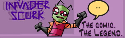
Invader Zim fancomic- updating Mondays and Fridays!
-
Jpac
- Regular Poster
- Posts: 180
- Joined: Tue Jul 25, 2006 9:29 pm
- Location: Oh, goodness. I'm here?
- Contact:
Re: Comic page formatting confusion
Code: Select all
<!DOCTYPE HTML PUBLIC "-//W3C//DTD HTML 4.01 Transitional//EN" "http://www.w3.org/TR/html4/loose.dtd">
<html>
<head>
<meta name="Generator" content="ComicGenesis HTML Generator BETA-4.1">
<title>Invader Scurk - ***todays_date***</title>
<link rel="stylesheet" type="text/css" media="screen" href="/screen.css" >
<link rel="stylesheet" type="text/css" media="handheld" href="/handheld.css" >
<link rel="stylesheet" type="text/css" media="print" href="/print.css" >
</head>
<body>
<table width="100%">
<tr>
<!-- I mentioned colspan before. All rows have to have the same number of
columns per row. Colspan tells the browser to "span the column" across
multiple cells/columns. In this instance, I told it to make on column that
spans three columns across. -->
<td colspan="3">
<!-- <div style="text-align:center"> -->
<div id="ad">
***advertisement***
</div>
<div class="container" id="index">
<div class="header">
<h1 class="title"><a href="http://invaderscurk.comicgenesis.com"><img src="/images/title.png" alt="Contact"></a></h1>
<h2 class="subtitle">Height discrimination is still discrimination</h2>
<h3 class="author">Written, drawn, and colored by Gabe Altomare</h3>
</div>
<!-- </div> -->
<ul>
<li class="horizontal"><a href="mailto:gabechat@charter.net"><img src="/images/contact.png" alt="Contact"></a></li>
<li class="horizontal"><a href="http://www.bungiehq.com/forum/index.php"><img src="/images/forum.png" alt="Forum"></a></li>
<li class="horizontal"><a href="http://cgwiki.comicgenesis.com/index.php/Comic:Invader_Scurk"><img src="/images/wiki.png" alt="Wiki"></a></li>
<li class="horizontal"><a href="http://internet-ninja.deviantart.com/"><img src="/images/gallery.png" alt="Gallery"></a></li>
</ul>
</div>
<div style="text-align:center">
<div class="main">
<div id="abovenav" class="nav">
<ul>
<li class="horizontal">***first_day***</li>
<li class="horizontal">***previous_day***</li>
<li class="horizontal">***next_day***</li>
<li class="horizontal">***last_day***</li>
</ul>
</div>
<div class="comic">
***todays_comics***
</div>
<div id="belownav" class="nav">
<ul>
<li class="horizontal">***first_day***</li>
<li class="horizontal">***previous_day***</li>
<li class="horizontal">***next_day***</li>
<li class="horizontal">***last_day***</li>
</ul>
</div>
<div class="storyling">
***storyline***
</div>
</div>
</div>
</td>
</tr>
<tr>
<td width="190" valign="top">
<!-- The <br /> tags are line breaks, just like if you pressed 'enter' on wordpad -->
***newsbox*** </td>
<!--This is a spacer like the one in the longer code above. I just didn't feel like
making any empty images. The " " is a space that serves as content -->
<td width="5"> </td>
<td width="826" valign="top" align="right">***calendar*** </td>
</tr>
</table>
<!-- Imitation is the sincerest form of flattery...and sometimes a necessity. -->
<div style="text-align:center">
<div class="news">
<h1>News</h1>
***todays_notes***
</div>
<div class="secondarylinks">
<ul>
<li class="horizontal"><a href="mailto:gabechat@charter.net">Contact</a></li>
<li class="horizontal"><a href="http://www.bungiehq.com/forum/index.php">Forum</a></li>
<li class="horizontal"><a href="http://cgwiki.comicgenesis.com/index.php/Comic:Invader_Scurk">Wiki</a></li>
<li class="horizontal"><a href="http://internet-ninja.deviantart.com/">Gallery</a></li>
</ul>
</div>
</div>
<div id="ad">
***advertisement***
</div>
<div id="footer">
<p>Invader Scurk is hosted on <a href="http://www.comicgenesis.com/">Comic Genesis</a>, a free webhosting and site automation service for webcomics.<br><a href="http://cwcomics.comicgenesis.com/generator">Html assistance</a> by <a href="http://cwcomics.comicgenesis.com">c.w.</a><span class="csscredit"> - see css file for css author.</span></p>
</div>
</body>
</html>
I think this will center the comic, and hopefully the calendar and comic newsbox will be in a nice position. Does this look anything like you'd envisioned. I noticed you fixed the daily template, so that's a really good thing. I also noticed the next chapter started. Do you already have many pre-made comics, or did you finally pass your buffer and now you're writing/drawing new ones?
GooseBump City - A comic about life... the life of toys anyway. (We still aren't doing anything new)
Shapes, the Unanimated Series - It's seriously just a square, a triangle, and a circle (It's arrived, but not ready to be shown)
Halloween Cameo Caper 2009 . . . Sign up.
Currently reading: Atavism - Cope wins 'cause he replied first (I can't believe it concluded!)
Brothers (and Sisters) in Joining:
Hydriatus | evelynp | Xaybiance The Weird | poporetto | ]Blaze Series | Derek Dragomir | piggylove1940 | Synaptic-misfires
(I'm only allowed five URL's, so I'll just rotate)
-
InvaderScurk
- Regular Poster
- Posts: 54
- Joined: Fri Nov 07, 2008 10:48 pm
- Location: Irken think tank
- Contact:
Re: Comic page formatting confusion
I had a buffer of 25 pages when the site went up, and when I got to about page 20 I started drawing pages again. But twice a week updates have caught up with me and I only have one more week of pages ready to go (two more pages). Then the updates will slow to once a week at best in most cases.
As for the newest bit of code you posted, you can see the result for yourself. The comic and all the things that should be centered are centered nicely, but all the things that were in the left column (links, calendar, ad) are now displaced throughout the page. Also, I recently made and uploaded some pictures to go with my links (when they are in the left column), all titled appropriately as Contact,Forum,Wiki, and Gallery in workspace>images. I tried to splice in the code needed to display those images, but it didn't seem to work. So if you could tweak the positioning of the left column stuff and somehow get those button images to display, that would open the way for my final two objectives.
Which are, simply put, to have a comment system of some sort under the news and some nice purple background boxes like in this comic. Of course I'm not going for anything as fancy as link buttons that spill over onto both columns, but it would be nice for some boxes to help all the elements of my page stand out. And that. Is the end of my ambitions. Or to clarify, as far as I am willing to go and as far as I am willing to ask you to go with me!
Invader Zim fancomic- updating Mondays and Fridays!
-
Jpac
- Regular Poster
- Posts: 180
- Joined: Tue Jul 25, 2006 9:29 pm
- Location: Oh, goodness. I'm here?
- Contact:
Re: Comic page formatting confusion
Oh goodness, I just saw a cute hyena in the news box below. I didn't know that was possible, lol.
Anyway, I can see the horizon; I feel like we're going to get to the end of the journey.
I see a bit of conflict here between the elements on the page regarding their spacing. There's just not enough room to squeeze the comic news box and calendar on the left without pushing the comic off center.
I might be behind in the times, but I have a 1024 by 768 pixel screen resolution. This image shows what the comic currently looks like on my screen. (The pirate's stylin' by the way.) The space to the left of the image just isn't enough for the calendar or newsbox to appear without pushing the image to the side.
Your comic's about 825 pixels wide, leaving less wiggle room than Awkward Zombie's 650 pixel wide comic. So it leaves us with a bit of a conundrum.
I know the centering of the comic is important, but I assume the positioning of the newsbox, links, and calendar on the side are equally important. Did you want those to be next to the comic, above, below, or perhaps positioned in some fanciful way that only Willy Wonka could love. I so enjoyed the diagonal moving elevator. Ahem, childhood nostalgia aside, where do the other pieces go?
I think it possible to squeeze the links in there. Maybe I'm on an outdated resolution? I wish there was someone here to confirm. Your call on however you want to place everything.
GooseBump City - A comic about life... the life of toys anyway. (We still aren't doing anything new)
Shapes, the Unanimated Series - It's seriously just a square, a triangle, and a circle (It's arrived, but not ready to be shown)
Halloween Cameo Caper 2009 . . . Sign up.
Currently reading: Atavism - Cope wins 'cause he replied first (I can't believe it concluded!)
Brothers (and Sisters) in Joining:
Hydriatus | evelynp | Xaybiance The Weird | poporetto | ]Blaze Series | Derek Dragomir | piggylove1940 | Synaptic-misfires
(I'm only allowed five URL's, so I'll just rotate)
-
InvaderScurk
- Regular Poster
- Posts: 54
- Joined: Fri Nov 07, 2008 10:48 pm
- Location: Irken think tank
- Contact:
Re: Comic page formatting confusion
Are one or all of the elements on the left too big to be on the left? If you say the links may be small enough to fit, then I'd have the links, with a background box to make em stand out, and the ad. Then I'd place the dropdown menu in the center, and the calendar centered underneath it.
Also, do you have any idea where I might go to get comments like on this page?
Reading over thirty webcomics gives me many ideas and examples as to what I want. I stated all my wants in the last post, but I forgot to mention the character and about pages, which we touched on earlier.
Also, do you have any idea where I might go to get comments like on this page?
Reading over thirty webcomics gives me many ideas and examples as to what I want. I stated all my wants in the last post, but I forgot to mention the character and about pages, which we touched on earlier.
Invader Zim fancomic- updating Mondays and Fridays!
-
Jpac
- Regular Poster
- Posts: 180
- Joined: Tue Jul 25, 2006 9:29 pm
- Location: Oh, goodness. I'm here?
- Contact:
Re: Comic page formatting confusion
It looks like both the calendar and news box might be a bit much. But I'll put in the code for them in a bit. And the about and Character pages wont be that bad. I't practically cutting out some stuff from your main page and replacing it with something else. I'll think I'll get another batch of code up today. Just running in and about right now.
About the comments page, I haven't seen what's typically used for comic genesis pages, per se. You'll notice that a lot of the time those types of comment pages are found on external sites where they have different options. The first two ideas that come to mind are having some type of external blog and an iframe (Dr Neo may have mentioned that earlier) and the comment box you looked at earlier, which might be possible to modify and make wider/ change colors on it, for a better effect.
I'll look into both, and maybe you can even start another thread or search those available to see about comment boxes. I think I'll do so too in a bit. It'd be nice to see a standard comment box that CG users use.
edit: So I don't have to do a second post. Though maybe I should...I don't know.
I notice you put the pieces on the left yourself. Good job! Do you like the way it looks? If so then I suppose you can move onto your character and about pages.
This code should be what you need to replace the current index/dailytemplate page with the about/character information page, for example:
Notice that <div style="text-align:center"> has been changed to <div style="text-align:left; padding:20">
I'm not sure if you'd want your about information centered. And the padding is to make sure the text has some space away from the content on the left.
You can begin typing your about page however you'd like to have it, and insert it where "A bunch of stuff in between" is.
As for the character page, there was code from earlier:
Tell me if anything's not clear. 
About the comments page, I haven't seen what's typically used for comic genesis pages, per se. You'll notice that a lot of the time those types of comment pages are found on external sites where they have different options. The first two ideas that come to mind are having some type of external blog and an iframe (Dr Neo may have mentioned that earlier) and the comment box you looked at earlier, which might be possible to modify and make wider/ change colors on it, for a better effect.
I'll look into both, and maybe you can even start another thread or search those available to see about comment boxes. I think I'll do so too in a bit. It'd be nice to see a standard comment box that CG users use.
edit: So I don't have to do a second post. Though maybe I should...I don't know.
I notice you put the pieces on the left yourself. Good job! Do you like the way it looks? If so then I suppose you can move onto your character and about pages.
This code should be what you need to replace the current index/dailytemplate page with the about/character information page, for example:
Code: Select all
<div style="text-align:center">
                           <div class="main">
                              <div id="abovenav" class="nav">

"A bunch of stuff in between"

                                </div>
                           </div>
                        </div>
Code: Select all
<div style="text-align:left; padding:20">
                           <div class="main">
                              <div id="abovenav" class="nav">

"A bunch of stuff in between"

                                </div>
                           </div>
                        </div>
I'm not sure if you'd want your about information centered. And the padding is to make sure the text has some space away from the content on the left.
You can begin typing your about page however you'd like to have it, and insert it where "A bunch of stuff in between" is.
As for the character page, there was code from earlier:
Code: Select all
<b>Cast of Characters</b>
<br>
    <table border="0" cellpadding="0" cellspacing="0" width="760">
       <tbody>
<!--START FIRST ROW. COPY MATERIAL BETWEEN THIS AND "END FIRST ROW" FOR ADDITIONAL ROWS -->
          <tr>
          <!--Notice that the height and width of the images or cell can be adjusted to your liking -->
          <td valign="top" width="125"><img src="link-to-your-cast-member-" alt="" border="0" height="179" width="158"></td>

          <!-- Spacer Cell, can be adjusted to your liking, best kept small. Make spacer.gif one dot the same color as your background -->

          <td width="13"><img src="../images/spacer.gif" alt="" border="0" height="13" width="13"></td>

          <!-- This is the third cell. It contains the character description. -->

          <td align="left" valign="top">
             <b>Character Name</b>
             <br>
             Description and such.
          </td>

          <!-- Once again, there's a cell with a blank image 13 pixels wide, this time
               placing space between the first character description and the second
               character image -->

          <td align="left" valign="top"><img src="../images/spacer.gif" alt="" border="0" height="13" width="13"></td>

          <!-- A repeat of the process you saw before. Character cell -->

          <td align="left" valign="top"><img src="another-character-image" alt="" border="0" height="179" width="158"></td>

          <!-- spacer -->

          <td align="left" valign="top"><img src="../images/spacer.gif" alt="" border="0" height="13" width="13"></td>

          <!-- Description cell -->

          <td align="left" valign="top">
          <b>Another Name</b><br>
           Description
          </td>
          <!-- This closes the row tag -->
          </tr>
<!--END FIRST ROW. COPY MATERIAL BETWEEN THIS AND "START FIRST ROW" FOR ADDITIONAL ROWS -->

<!--You'll notice that at each "<tr> a new row starts. Each
          "<td> within the "<tr> . . . </tr>" represents a cell-->
<!--Remember to keep it all between the "/tbody" tag -->
       </tbody>
    </table>
    <p>It doesn't hurt to say Thank you to the creators of of <a href="http://www.pennyandaggie.com/">
Penny & Aggie</a> for such wonderful code, from which I derived this set.</b>GooseBump City - A comic about life... the life of toys anyway. (We still aren't doing anything new)
Shapes, the Unanimated Series - It's seriously just a square, a triangle, and a circle (It's arrived, but not ready to be shown)
Halloween Cameo Caper 2009 . . . Sign up.
Currently reading: Atavism - Cope wins 'cause he replied first (I can't believe it concluded!)
Brothers (and Sisters) in Joining:
Hydriatus | evelynp | Xaybiance The Weird | poporetto | ]Blaze Series | Derek Dragomir | piggylove1940 | Synaptic-misfires
(I'm only allowed five URL's, so I'll just rotate)
-
Jpac
- Regular Poster
- Posts: 180
- Joined: Tue Jul 25, 2006 9:29 pm
- Location: Oh, goodness. I'm here?
- Contact:
Re: Comic page formatting confusion
The internet moves too quickly I didn't think I'd have a reason to post again but I just saw what looks to be a cool comment box.
Might want to check this comment box out. It looks like it may only show up on the index.html correctly (comments not dated especially for each day) but the design seems better than the original comment box from last page in this thread or so. It seems to have some nice customizable features. Seems worth a look.
I saw it on Student Union Champions. You can see what it looks like there.
About not having comments for particular days, its customization page seems to hint at the possibility of different "widgets" via link. So there might be some way to use the CG tags (maybe a date tag? Anyone think that might work?) to create different links for each day. Not sure.
GooseBump City - A comic about life... the life of toys anyway. (We still aren't doing anything new)
Shapes, the Unanimated Series - It's seriously just a square, a triangle, and a circle (It's arrived, but not ready to be shown)
Halloween Cameo Caper 2009 . . . Sign up.
Currently reading: Atavism - Cope wins 'cause he replied first (I can't believe it concluded!)
Brothers (and Sisters) in Joining:
Hydriatus | evelynp | Xaybiance The Weird | poporetto | ]Blaze Series | Derek Dragomir | piggylove1940 | Synaptic-misfires
(I'm only allowed five URL's, so I'll just rotate)